面试时怎么给面试官讲Flex?
这个问题很宽泛,其实最核心的问题不过是如何介绍Flex、如何背一些可能被问到的固定题、如何使用Flex实现一些简单的布局,接下来就按照上面的逻辑来写这篇文章吧
如何介绍Flex
我面试害怕两种题型:
1.我一定都不会的题
2.会一点但是面试官问的很宽泛,想看我的深度的题
现在我们解决的是后者
面试官:"你对Flex布局了解多少?讲一下吧"
嗯..很宽泛的问题,那么从何讲起呢?
首先我们要介绍Flex布局的基本概念,虽然很枯燥,但是用来开头确实很不错
首先我们要讲Flex的定义,什么是Flex
"弹性布局(Flex 布局)是 CSS3 引入的一种一维布局模型 ,通过为父元素设置 display: flex 使其成为弹性容器,其直接子元素自动变为弹性项;核心是让容器能灵活控制内部元素的排列方向、对齐方式、尺寸伸缩及空间分配,无需依赖浮动或定位即可快速实现居中、均匀分布等复杂布局,兼顾简洁性与适应性,是现代前端布局的核心方案。"
接下来我们讲Flex的优点,我相信面试官很想听这个,可以体现出我们有自己的思考,并不是看别人用这个我才用这个,最后我们举个例子去说明Flex的优点
"Flex布局,代码简洁高效 ,无需依赖浮动、定位等复杂方案,就能轻松实现元素在水平 / 垂直方向的精准对齐 ,同时支持元素根据容器空间自动伸缩,适配不同屏幕尺寸,大幅降低响应式布局的开发成本。
比如要实现一个导航栏,让 4 个导航按钮在容器内水平居中且均匀分布,传统布局可能需要计算按钮间距、处理浮动清除等问题,而用 Flex 只需两步:给导航栏父容器添加 display: flex 使其成为弹性容器,再补充 justify-content: space-between(让按钮沿主轴均匀分布,两端贴边)和 align-items: center(让按钮在垂直方向居中),无需额外计算尺寸,且当屏幕缩小时,按钮会自动调整间距以适应容器宽度,完美体现其简洁性与自适应优势。(诸如此类的例子都可以)"
接下来就是具体的Flex的具体属性的内容了,现在让我们更加深入一些,切入点是两个概念 容器和轴
"容器分为两个,一个是父容器,一个是子容器,顾名思义,父容器里面的就是子容器
轴分为两个轴,一个是主轴,另一个是和主轴垂直的轴,我们叫做交差轴"
接下来简单总结二者的关系
"弹性布局由父容器和子容器组成,通过主轴和交叉轴去控制子元素的排列方式"
接下来继续深入,我们开始切入Flex的具体属性
接下来我根据父容器和子容器分开来讲Flex的具体属性
在父容器中,主要是下面的六种属性
flex-direction:设置主轴方向,取值为row(默认,水平从左到右)、row-reverse(水平从右到左)、column(垂直从上到下)、column-reverse(垂直从下到上)。flex-wrap:控制弹性项是否换行,取值为nowrap(默认,不换行,可能溢出)、wrap(换行,第一行在上)、wrap-reverse(换行,第一行在下)。flex-flow:flex-direction和flex-wrap的简写,默认值为row nowrap。justify-content:设置弹性项在主轴上的对齐方式,常用值有flex-start(默认,靠左 / 上)、flex-end(靠右 / 下)、center(居中)、space-between(两端对齐,中间等距)、space-around(元素两侧间距相等)。align-items:设置弹性项在交叉轴(与主轴垂直)上的对齐方式,常用值有stretch(默认,拉伸填满容器)、flex-start(靠交叉轴起点)、flex-end(靠交叉轴终点)、center(交叉轴居中)、baseline(基线对齐)。align-content:当弹性项换行后(多行),控制多行在交叉轴上的对齐方式,取值与justify-content类似,默认stretch(拉伸填满交叉轴)。
上面用来给面试官讲足够了,但是我们有必要去深入学习一下上面的属性,万一面试官揪住某个属性继续追问呢?接下来,不是面试时间,是学习时间
一、flex-direction
flex-direction 是 Flex 父容器的核心属性,用于定义主轴方向 (子元素沿主轴排列),共 4 个常用取值row(默认,水平从左到右)、row-reverse(水平从右到左)、column(垂直从上到下)、column-reverse(垂直从下到上),接下来我们用直观的例子去体会这个属性的妙用
案例 1:默认值 flex-direction: row(水平从左到右)
xml
<style>
    /* 父容器:启用 Flex 布局,设置主轴为水平从左到右 */
    .flex-container {
        display: flex;
        flex-direction: row; /* 默认值,可省略,但显式写更清晰 */
        width: 400px;
        height: 150px;
        background-color: #eee; /* 灰色背景,方便观察容器范围 */
        gap: 10px; /* 子元素之间的间距 */
        padding: 10px; /* 容器内边距,避免子元素贴边 */
    }
    /* 子元素:彩色方块,带文字标识 */
    .flex-item {
        width: 80px;
        height: 80px;
        color: white;
        font-size: 20px;
        text-align: center;
        line-height: 80px; /* 文字垂直居中 */
    }
    /* 给不同子元素设不同颜色,区分顺序 */
    .item1 { background-color: #ff4444; }
    .item2 { background-color: #00c851; }
    .item3 { background-color: #33b5e5; }
</style>
<body>
    <h3>flex-direction: row(水平从左到右,默认)</h3>
    <div class="flex-container">
        <div class="flex-item item1">1</div>
        <div class="flex-item item2">2</div>
        <div class="flex-item item3">3</div>
    </div>
</body>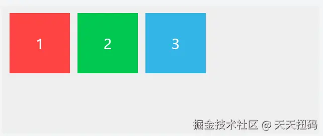
运行效果 :3 个彩色方块(红 1→绿 2→蓝 3)在灰色容器内水平排列,从左到右依次分布。
案例 2:flex-direction: row-reverse(水平从右到左)
xml
    <style>
        .flex-container {
            display: flex;
            flex-direction: row-reverse; /* 主轴为水平从右到左 */
            width: 400px;
            height: 150px;
            background-color: #eee;
            gap: 10px;
            padding: 10px;
        }
        .flex-item {
            width: 80px;
            height: 80px;
            color: white;
            font-size: 20px;
            text-align: center;
            line-height: 80px;
        }
        .item1 { background-color: #ff4444; }
        .item2 { background-color: #00c851; }
        .item3 { background-color: #33b5e5; }
    </style>
</head>
<body>
    <h3>flex-direction: row-reverse(水平从右到左)</h3>
    <div class="flex-container">
        <div class="flex-item item1">1</div>
        <div class="flex-item item2">2</div>
        <div class="flex-item item3">3</div>
    </div>
</body>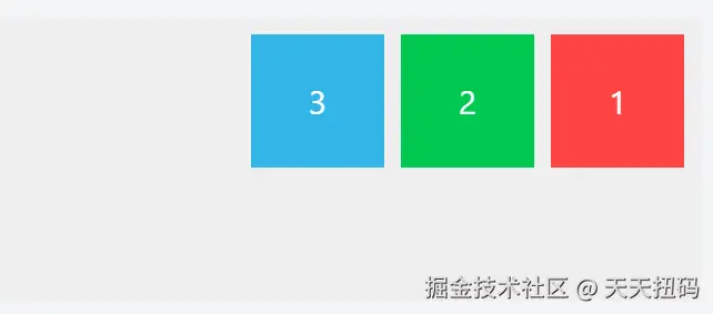
运行效果 :3 个彩色方块(蓝 3→绿 2→红 1)在灰色容器内水平排列,从右到左依次分布(顺序反转)。
案例 3:flex-direction: column(垂直从上到下)
xml
    <style>
        .flex-container {
            display: flex;
            flex-direction: column; /* 主轴为垂直从上到下 */
            width: 400px;
            height: 250px; /* 增高容器,容纳垂直排列的子元素 */
            background-color: #eee;
            gap: 10px;
            padding: 10px;
        }
        .flex-item {
            width: 80px;
            height: 80px;
            color: white;
            font-size: 20px;
            text-align: center;
            line-height: 80px;
        }
        .item1 { background-color: #ff4444; }
        .item2 { background-color: #00c851; }
        .item3 { background-color: #33b5e5; }
    </style>
</head>
<body>
    <h3>flex-direction: column(垂直从上到下)</h3>
    <div class="flex-container">
        <div class="flex-item item1">1</div>
        <div class="flex-item item2">2</div>
        <div class="flex-item item3">3</div>
    </div>
</body>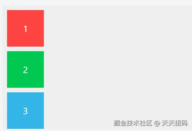
运行效果 :3 个彩色方块(红 1→绿 2→蓝 3)在灰色容器内垂直排列,从上到下依次分布。
案例 4:flex-direction: column-reverse(垂直从下到上)
xml
    <style>
        .flex-container {
            display: flex;
            flex-direction: column-reverse; /* 主轴为垂直从下到上 */
            width: 400px;
            height: 250px;
            background-color: #eee;
            gap: 10px;
            padding: 10px;
        }
        .flex-item {
            width: 80px;
            height: 80px;
            color: white;
            font-size: 20px;
            text-align: center;
            line-height: 80px;
        }
        .item1 { background-color: #ff4444; }
        .item2 { background-color: #00c851; }
        .item3 { background-color: #33b5e5; }
    </style>
</head>
<body>
    <h3>flex-direction: column-reverse(垂直从下到上)</h3>
    <div class="flex-container">
        <div class="flex-item item1">1</div>
        <div class="flex-item item2">2</div>
        <div class="flex-item item3">3</div>
    </div>
</body>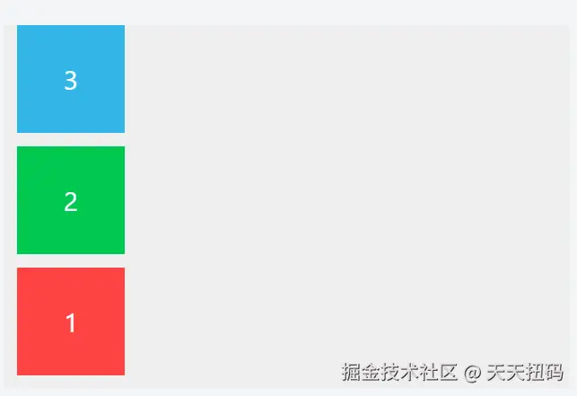
运行效果 :3 个彩色方块(蓝 3→绿 2→红 1)在灰色容器内垂直排列,从下到上依次分布(顺序反转)。
二、flex-wrap
flex-wrap 用于控制 Flex 容器内的子元素在总尺寸超过容器时,是否自动换行以及换行方向。它有 3 个常用取值,以下案例均为完整可运行的 HTML 文件,直观展示不同取值的效果差异。
nowrap(默认):强制不换行,子元素可能被压缩变形;wrap:自动换行,多余元素从容器顶部向底部排列(正常阅读顺序);wrap-reverse:自动换行,但多余元素从容器底部向顶部排列(反转顺序);
案例 1:默认值 flex-wrap: nowrap(不换行,子元素可能被压缩)
xml
<!DOCTYPE html>
<html lang="zh-CN">
<head>
    <meta charset="UTF-8">
    <title>flex-wrap: nowrap</title>
    <style>
        .flex-container {
            display: flex;
            flex-wrap: nowrap; /* 默认值:不换行 */
            width: 300px; /* 容器宽度固定为300px */
            height: 120px;
            background-color: #eee;
            gap: 10px;
            padding: 10px;
            border: 1px solid #ccc;
        }
        .flex-item {
            width: 100px; /* 单个子元素宽度100px,4个总宽400px > 容器300px */
            height: 80px;
            color: white;
            font-size: 20px;
            text-align: center;
            line-height: 80px;
        }
        .item1 { background-color: #ff4444; }
        .item2 { background-color: #00c851; }
        .item3 { background-color: #33b5e5; }
        .item4 { background-color: #aa66cc; }
    </style>
</head>
<body>
    <h3>flex-wrap: nowrap(不换行,子元素会被压缩)</h3>
    <p>容器宽300px,4个子元素各宽100px(总宽400px),不换行时会被压缩</p>
    <div class="flex-container">
        <div class="flex-item item1">1</div>
        <div class="flex-item item2">2</div>
        <div class="flex-item item3">3</div>
        <div class="flex-item item4">4</div>
    </div>
</body>
</html>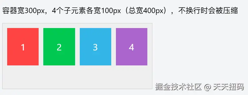
运行效果:4 个子元素会强行挤在一行,每个元素的实际宽度会被压缩(小于设置的 100px),以适应容器宽度,不会换行。
案例 2:flex-wrap: wrap(自动换行,第一行在上)
xml
<!DOCTYPE html>
<html lang="zh-CN">
<head>
    <meta charset="UTF-8">
    <title>flex-wrap: wrap</title>
    <style>
        .flex-container {
            display: flex;
            flex-wrap: wrap; /* 自动换行,超出部分排到下一行 */
            width: 300px;
            height: 200px; /* 增高容器,容纳两行子元素 */
            background-color: #eee;
            gap: 10px;
            padding: 10px;
            border: 1px solid #ccc;
        }
        .flex-item {
            width: 100px; /* 与案例1相同的子元素尺寸 */
            height: 80px;
            color: white;
            font-size: 20px;
            text-align: center;
            line-height: 80px;
        }
        .item1 { background-color: #ff4444; }
        .item2 { background-color: #00c851; }
        .item3 { background-color: #33b5e5; }
        .item4 { background-color: #aa66cc; }
    </style>
</head>
<body>
    <h3>flex-wrap: wrap(自动换行,第一行在上)</h3>
    <p>容器宽300px,4个子元素各宽100px,自动分成两行(第一行1、2,第二行3、4)</p>
    <div class="flex-container">
        <div class="flex-item item1">1</div>
        <div class="flex-item item2">2</div>
        <div class="flex-item item3">3</div>
        <div class="flex-item item4">4</div>
    </div>
</body>
</html>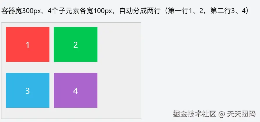
运行效果:子元素总宽超过容器时,自动换到下一行排列。第一行显示 1、2(宽度足够容纳 2 个),第二行显示 3、4,保持设置的 100px 宽度不变。
案例 3:flex-wrap: wrap-reverse(自动换行,第一行在下)
xml
<!DOCTYPE html>
<html lang="zh-CN">
<head>
    <meta charset="UTF-8">
    <title>flex-wrap: wrap-reverse</title>
    <style>
        .flex-container {
            display: flex;
            flex-wrap: wrap-reverse; /* 自动换行,但第一行在下方 */
            width: 300px;
            height: 200px;
            background-color: #eee;
            gap: 10px;
            padding: 10px;
            border: 1px solid #ccc;
        }
        .flex-item {
            width: 100px; /* 与前两个案例相同的子元素尺寸 */
            height: 80px;
            color: white;
            font-size: 20px;
            text-align: center;
            line-height: 80px;
        }
        .item1 { background-color: #ff4444; }
        .item2 { background-color: #00c851; }
        .item3 { background-color: #33b5e5; }
        .item4 { background-color: #aa66cc; }
    </style>
</head>
<body>
    <h3>flex-wrap: wrap-reverse(自动换行,第一行在下)</h3>
    <p>容器宽300px,4个子元素换行后,第一行(1、2)在下方,第二行(3、4)在上方</p>
    <div class="flex-container">
        <div class="flex-item item1">1</div>
        <div class="flex-item item2">2</div>
        <div class="flex-item item3">3</div>
        <div class="flex-item item4">4</div>
    </div>
</body>
</html>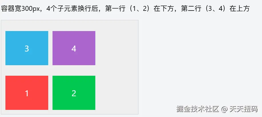
运行效果:同样会自动换行,但换行方向反转。原本应在第一行的 1、2 会显示在下方,原本应在第二行的 3、4 会显示在上方。
三、flex-flow
flex-direction 和 flex-wrap 的简写,默认值为 row nowrap。
简单举两个例子
案例 1:flex-flow: row wrap(水平方向 + 自动换行)
xml
<!DOCTYPE html>
<html lang="zh-CN">
<head>
    <meta charset="UTF-8">
    <title>flex-flow: row wrap</title>
    <style>
        .flex-container {
            display: flex;
            /* 等价于 flex-direction: row; flex-wrap: wrap */
            flex-flow: row wrap;
            width: 300px;
            height: 200px;
            background-color: #eee;
            gap: 10px;
            padding: 10px;
            border: 1px solid #ccc;
        }
        .flex-item {
            width: 100px;
            height: 80px;
            color: white;
            font-size: 20px;
            text-align: center;
            line-height: 80px;
        }
        .item1 { background-color: #ff4444; }
        .item2 { background-color: #00c851; }
        .item3 { background-color: #33b5e5; }
        .item4 { background-color: #aa66cc; }
    </style>
</head>
<body>
    <h3>flex-flow: row wrap(水平方向 + 自动换行)</h3>
    <p>等价于 flex-direction: row; flex-wrap: wrap,子元素水平排列且自动换行</p>
    <div class="flex-container">
        <div class="flex-item item1">1</div>
        <div class="flex-item item2">2</div>
        <div class="flex-item item3">3</div>
        <div class="flex-item item4">4</div>
    </div>
</body>
</html>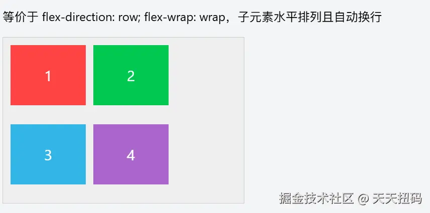
运行效果:子元素沿水平方向排列(左→右),总宽超容器时自动换行,第一行显示 1、2,第二行显示 3、4。
案例 2:flex-flow: column wrap(垂直方向 + 自动换行)
xml
<!DOCTYPE html>
<html lang="zh-CN">
<head>
    <meta charset="UTF-8">
    <title>flex-flow: column wrap</title>
    <style>
        .flex-container {
            display: flex;
            /* 等价于 flex-direction: column; flex-wrap: wrap */
            flex-flow: column wrap;
            width: 300px;
            height: 180px; /* 限制高度,触发垂直换行 */
            background-color: #eee;
            gap: 10px;
            padding: 10px;
            border: 1px solid #ccc;
        }
        .flex-item {
            width: 80px;
            height: 80px;
            color: white;
            font-size: 20px;
            text-align: center;
            line-height: 80px;
        }
        .item1 { background-color: #ff4444; }
        .item2 { background-color: #00c851; }
        .item3 { background-color: #33b5e5; }
        .item4 { background-color: #aa66cc; }
    </style>
</head>
<body>
    <h3>flex-flow: column wrap(垂直方向 + 自动换行)</h3>
    <p>等价于 flex-direction: column; flex-wrap: wrap,子元素垂直排列且自动换行</p>
    <div class="flex-container">
        <div class="flex-item item1">1</div>
        <div class="flex-item item2">2</div>
        <div class="flex-item item3">3</div>
        <div class="flex-item item4">4</div>
    </div>
</body>
</html>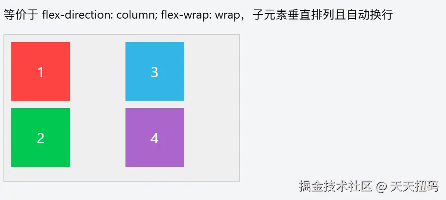
运行效果:子元素沿垂直方向排列(上→下),总高超容器时自动换列,第一列显示 1、2,第二列显示 3、4。
四、justify-content
justify-content 用于控制 Flex 容器内的子元素在主轴方向 上的对齐方式和剩余空间分配规则。它的效果取决于 flex-direction 定义的主轴方向(水平或垂直),以下案例均以水平主轴(flex-direction: row)为例,方便直观理解。
6 个取值的核心差异在于剩余空间的分配方式:
flex-start/flex-end/center:控制整体对齐,剩余空间集中在某一侧或两侧;space-between:强调 "两端贴边,中间等距";space-around:强调 "元素两侧间距相等"(边缘间距是中间的一半);space-evenly:强调 "所有间距(包括边缘)完全相同";
案例 1:默认值 justify-content: flex-start(靠主轴起点对齐)
xml
<!DOCTYPE html>
<html lang="zh-CN">
<head>
    <meta charset="UTF-8">
    <title>justify-content: flex-start</title>
    <style>
        .flex-container {
            display: flex;
            justify-content: flex-start; /* 默认值:靠主轴起点对齐 */
            width: 400px;
            height: 120px;
            background-color: #eee;
            padding: 10px;
            border: 1px solid #ccc;
        }
        .flex-item {
            width: 80px;
            height: 80px;
            margin: 0 5px; /* 小间距区分元素 */
            color: white;
            font-size: 20px;
            text-align: center;
            line-height: 80px;
        }
        .item1 { background-color: #ff4444; }
        .item2 { background-color: #00c851; }
        .item3 { background-color: #33b5e5; }
    </style>
</head>
<body>
    <h3>justify-content: flex-start(靠主轴起点对齐)</h3>
    <p>水平主轴下,子元素靠容器左侧(起点)排列,剩余空间在右侧</p>
    <div class="flex-container">
        <div class="flex-item item1">1</div>
        <div class="flex-item item2">2</div>
        <div class="flex-item item3">3</div>
    </div>
</body>
</html>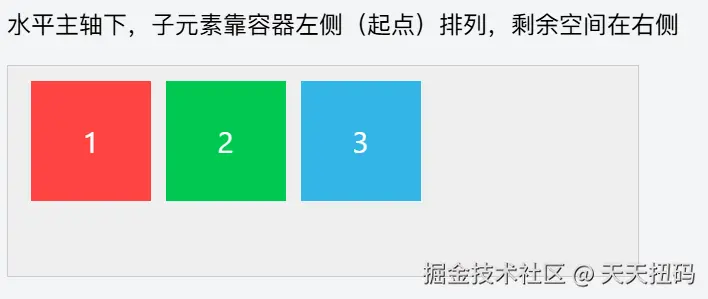
运行效果:3 个子元素从容器左侧(主轴起点)开始排列,右侧留下空白剩余空间。
案例 2:justify-content: flex-end(靠主轴终点对齐)
xml
<!DOCTYPE html>
<html lang="zh-CN">
<head>
    <meta charset="UTF-8">
    <title>justify-content: flex-end</title>
    <style>
        .flex-container {
            display: flex;
            justify-content: flex-end; /* 靠主轴终点对齐 */
            width: 400px;
            height: 120px;
            background-color: #eee;
            padding: 10px;
            border: 1px solid #ccc;
        }
        .flex-item {
            width: 80px;
            height: 80px;
            margin: 0 5px;
            color: white;
            font-size: 20px;
            text-align: center;
            line-height: 80px;
        }
        .item1 { background-color: #ff4444; }
        .item2 { background-color: #00c851; }
        .item3 { background-color: #33b5e5; }
    </style>
</head>
<body>
    <h3>justify-content: flex-end(靠主轴终点对齐)</h3>
    <p>水平主轴下,子元素靠容器右侧(终点)排列,剩余空间在左侧</p>
    <div class="flex-container">
        <div class="flex-item item1">1</div>
        <div class="flex-item item2">2</div>
        <div class="flex-item item3">3</div>
    </div>
</body>
</html>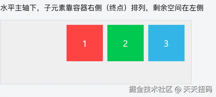
运行效果:3 个子元素从容器右侧(主轴终点)开始排列,左侧留下空白剩余空间。
案例 3:justify-content: center(主轴居中对齐)
xml
<!DOCTYPE html>
<html lang="zh-CN">
<head>
    <meta charset="UTF-8">
    <title>justify-content: center</title>
    <style>
        .flex-container {
            display: flex;
            justify-content: center; /* 主轴居中对齐 */
            width: 400px;
            height: 120px;
            background-color: #eee;
            padding: 10px;
            border: 1px solid #ccc;
        }
        .flex-item {
            width: 80px;
            height: 80px;
            margin: 0 5px;
            color: white;
            font-size: 20px;
            text-align: center;
            line-height: 80px;
        }
        .item1 { background-color: #ff4444; }
        .item2 { background-color: #00c851; }
        .item3 { background-color: #33b5e5; }
    </style>
</head>
<body>
    <h3>justify-content: center(主轴居中对齐)</h3>
    <p>水平主轴下,子元素在容器中间排列,剩余空间平均分布在左右两侧</p>
    <div class="flex-container">
        <div class="flex-item item1">1</div>
        <div class="flex-item item2">2</div>
        <div class="flex-item item3">3</div>
    </div>
</body>
</html>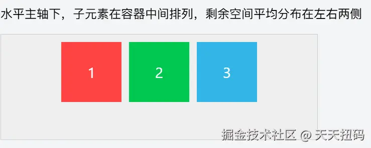
运行效果:3 个子元素整体在容器水平方向居中,左右两侧剩余空间相等。
案例 4:justify-content: space-between(两端对齐,中间等距)
xml
<!DOCTYPE html>
<html lang="zh-CN">
<head>
    <meta charset="UTF-8">
    <title>justify-content: space-between</title>
    <style>
        .flex-container {
            display: flex;
            justify-content: space-between; /* 两端对齐,中间间距相等 */
            width: 400px;
            height: 120px;
            background-color: #eee;
            padding: 10px;
            border: 1px solid #ccc;
        }
        .flex-item {
            width: 80px;
            height: 80px;
            color: white;
            font-size: 20px;
            text-align: center;
            line-height: 80px;
        }
        .item1 { background-color: #ff4444; }
        .item2 { background-color: #00c851; }
        .item3 { background-color: #33b5e5; }
    </style>
</head>
<body>
    <h3>justify-content: space-between(两端对齐,中间等距)</h3>
    <p>第一个子元素靠左侧,最后一个靠右侧,中间元素间距相等</p>
    <div class="flex-container">
        <div class="flex-item item1">1</div>
        <div class="flex-item item2">2</div>
        <div class="flex-item item3">3</div>
    </div>
</body>
</html>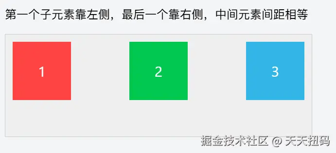
运行效果:第一个子元素贴左,最后一个子元素贴右,中间子元素之间的间距相等(无额外边距时)。
案例 5:justify-content: space-around(元素两侧间距相等)
xml
<!DOCTYPE html>
<html lang="zh-CN">
<head>
    <meta charset="UTF-8">
    <title>justify-content: space-around</title>
    <style>
        .flex-container {
            display: flex;
            justify-content: space-around; /* 每个元素两侧间距相等 */
            width: 400px;
            height: 120px;
            background-color: #eee;
            padding: 10px;
            border: 1px solid #ccc;
        }
        .flex-item {
            width: 80px;
            height: 80px;
            color: white;
            font-size: 20px;
            text-align: center;
            line-height: 80px;
        }
        .item1 { background-color: #ff4444; }
        .item2 { background-color: #00c851; }
        .item3 { background-color: #33b5e5; }
    </style>
</head>
<body>
    <h3>justify-content: space-around(元素两侧间距相等)</h3>
    <p>每个子元素左右两侧的间距相等,相邻元素间距是边缘间距的2倍</p>
    <div class="flex-container">
        <div class="flex-item item1">1</div>
        <div class="flex-item item2">2</div>
        <div class="flex-item item3">3</div>
    </div>
</body>
</html>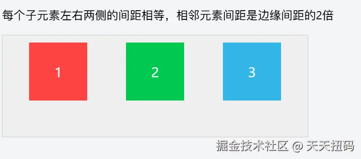
运行效果:每个子元素左右两侧的间距相同,因此相邻元素之间的间距是最左侧 / 最右侧间距的 2 倍。
案例 6:justify-content: space-evenly(所有间距完全相等)
xml
<!DOCTYPE html>
<html lang="zh-CN">
<head>
    <meta charset="UTF-8">
    <title>justify-content: space-evenly</title>
    <style>
        .flex-container {
            display: flex;
            justify-content: space-evenly; /* 所有间距(包括边缘)完全相等 */
            width: 400px;
            height: 120px;
            background-color: #eee;
            padding: 10px;
            border: 1px solid #ccc;
        }
        .flex-item {
            width: 80px;
            height: 80px;
            color: white;
            font-size: 20px;
            text-align: center;
            line-height: 80px;
        }
        .item1 { background-color: #ff4444; }
        .item2 { background-color: #00c851; }
        .item3 { background-color: #33b5e5; }
    </style>
</head>
<body>
    <h3>justify-content: space-evenly(所有间距完全相等)</h3>
    <p>容器左侧到第一个元素、元素之间、最后一个元素到容器右侧的间距完全相同</p>
    <div class="flex-container">
        <div class="flex-item item1">1</div>
        <div class="flex-item item2">2</div>
        <div class="flex-item item3">3</div>
    </div>
</body>
</html>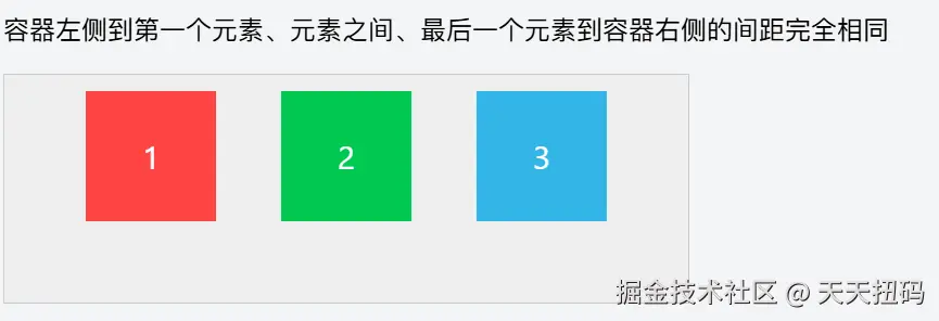
运行效果:容器左侧边缘到第一个子元素、子元素之间、最后一个子元素到容器右侧边缘的所有间距完全相等。
最后,容易混淆的就是下面的三个属性
space-between:强调 "两端贴边,中间等距";space-around:强调 "元素两侧间距相等"(边缘间距是中间的一半);space-evenly:强调 "所有间距(包括边缘)完全相同";
这里可以再理解一下
五、align-items
align-items 用于控制 Flex 容器内的子元素在交叉轴方向 (与主轴垂直的轴)上的对齐方式。当主轴为水平方向(flex-direction: row)时,交叉轴是垂直方向;当主轴为垂直方向时,交叉轴是水平方向。以下案例以水平主轴为例,聚焦垂直方向的对齐效果。
stretch:默认拉伸填充(子元素无固定尺寸时);flex-start/flex-end:靠交叉轴的起点 / 终点对齐;center:交叉轴居中(最常用的垂直居中方案);baseline:文字基线对齐(适合文本类布局);
案例 1:默认值 align-items: stretch(拉伸填满交叉轴)
xml
<!DOCTYPE html>
<html lang="zh-CN">
<head>
    <meta charset="UTF-8">
    <title>align-items: stretch</title>
    <style>
        .flex-container {
            display: flex;
            align-items: stretch; /* 默认值:拉伸填满交叉轴 */
            width: 400px;
            height: 180px; /* 容器高度大于子元素默认高度,方便观察拉伸效果 */
            background-color: #eee;
            padding: 10px;
            border: 1px solid #ccc;
        }
        .flex-item {
            width: 80px;
            /* 不设置高度,让其自动拉伸 */
            color: white;
            font-size: 20px;
            text-align: center;
            line-height: 80px; /* 文字垂直居中参考线 */
            margin: 0 5px;
        }
        .item1 { background-color: #ff4444; }
        .item2 { background-color: #00c851; }
        .item3 { background-color: #33b5e5; }
    </style>
</head>
<body>
    <h3>align-items: stretch(拉伸填满交叉轴)</h3>
    <p>子元素未设置高度时,会自动拉伸至与容器交叉轴高度一致(垂直方向填满)</p>
    <div class="flex-container">
        <div class="flex-item item1">1</div>
        <div class="flex-item item2">2</div>
        <div class="flex-item item3">3</div>
    </div>
</body>
</html>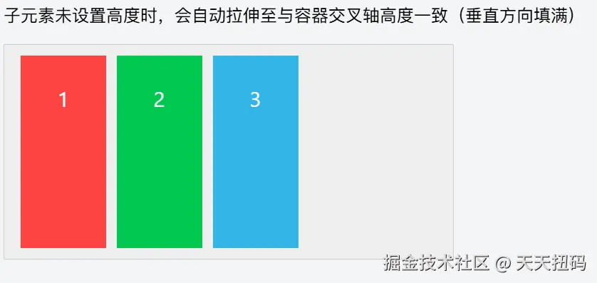
运行效果:子元素未设置高度时,会自动拉伸至与容器高度(交叉轴长度)一致,垂直方向填满容器。
案例 2:align-items: flex-start(靠交叉轴起点对齐)
xml
<!DOCTYPE html>
<html lang="zh-CN">
<head>
    <meta charset="UTF-8">
    <title>align-items: flex-start</title>
    <style>
        .flex-container {
            display: flex;
            align-items: flex-start; /* 靠交叉轴起点对齐 */
            width: 400px;
            height: 180px;
            background-color: #eee;
            padding: 10px;
            border: 1px solid #ccc;
        }
        .flex-item {
            width: 80px;
            height: 80px; /* 固定高度,方便观察对齐效果 */
            color: white;
            font-size: 20px;
            text-align: center;
            line-height: 80px;
            margin: 0 5px;
        }
        .item1 { background-color: #ff4444; }
        .item2 { background-color: #00c851; }
        .item3 { background-color: #33b5e5; }
    </style>
</head>
<body>
    <h3>align-items: flex-start(靠交叉轴起点对齐)</h3>
    <p>水平主轴下,交叉轴起点为容器顶部,子元素靠顶部对齐</p>
    <div class="flex-container">
        <div class="flex-item item1">1</div>
        <div class="flex-item item2">2</div>
        <div class="flex-item item3">3</div>
    </div>
</body>
</html>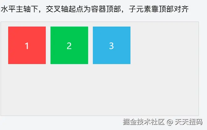
运行效果:子元素沿容器顶部(交叉轴起点)对齐,底部留下空白空间。
案例 3:align-items: flex-end(靠交叉轴终点对齐)
xml
<!DOCTYPE html>
<html lang="zh-CN">
<head>
    <meta charset="UTF-8">
    <title>align-items: flex-end</title>
    <style>
        .flex-container {
            display: flex;
            align-items: flex-end; /* 靠交叉轴终点对齐 */
            width: 400px;
            height: 180px;
            background-color: #eee;
            padding: 10px;
            border: 1px solid #ccc;
        }
        .flex-item {
            width: 80px;
            height: 80px;
            color: white;
            font-size: 20px;
            text-align: center;
            line-height: 80px;
            margin: 0 5px;
        }
        .item1 { background-color: #ff4444; }
        .item2 { background-color: #00c851; }
        .item3 { background-color: #33b5e5; }
    </style>
</head>
<body>
    <h3>align-items: flex-end(靠交叉轴终点对齐)</h3>
    <p>水平主轴下,交叉轴终点为容器底部,子元素靠底部对齐</p>
    <div class="flex-container">
        <div class="flex-item item1">1</div>
        <div class="flex-item item2">2</div>
        <div class="flex-item item3">3</div>
    </div>
</body>
</html>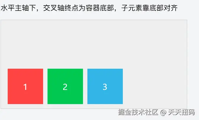
运行效果:子元素沿容器底部(交叉轴终点)对齐,顶部留下空白空间。
案例 4:align-items: center(交叉轴居中对齐)
xml
<!DOCTYPE html>
<html lang="zh-CN">
<head>
    <meta charset="UTF-8">
    <title>align-items: center</title>
    <style>
        .flex-container {
            display: flex;
            align-items: center; /* 交叉轴居中对齐 */
            width: 400px;
            height: 180px;
            background-color: #eee;
            padding: 10px;
            border: 1px solid #ccc;
        }
        .flex-item {
            width: 80px;
            height: 80px;
            color: white;
            font-size: 20px;
            text-align: center;
            line-height: 80px;
            margin: 0 5px;
        }
        .item1 { background-color: #ff4444; }
        .item2 { background-color: #00c851; }
        .item3 { background-color: #33b5e5; }
    </style>
</head>
<body>
    <h3>align-items: center(交叉轴居中对齐)</h3>
    <p>水平主轴下,子元素在容器垂直方向居中对齐,上下空白空间相等</p>
    <div class="flex-container">
        <div class="flex-item item1">1</div>
        <div class="flex-item item2">2</div>
        <div class="flex-item item3">3</div>
    </div>
</body>
</html>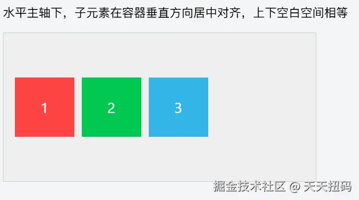
运行效果:子元素在容器垂直方向(交叉轴)居中,上下两侧的空白空间相等,是实现垂直居中的常用方案。
案例 5:align-items: baseline(基线对齐)
xml
<!DOCTYPE html>
<html lang="zh-CN">
<head>
    <meta charset="UTF-8">
    <title>align-items: baseline</title>
    <style>
        .flex-container {
            display: flex;
            align-items: baseline; /* 基线对齐 */
            width: 400px;
            height: 180px;
            background-color: #eee;
            padding: 10px;
            border: 1px solid #ccc;
        }
        .flex-item {
            width: 80px;
            height: 80px;
            color: white;
            font-size: 20px;
            text-align: center;
            line-height: 80px;
            margin: 0 5px;
        }
        .item1 { background-color: #ff4444; font-size: 24px; } /* 不同字体大小,更易观察基线 */
        .item2 { background-color: #00c851; font-size: 16px; }
        .item3 { background-color: #33b5e5; font-size: 32px; }
    </style>
</head>
<body>
    <h3>align-items: baseline(基线对齐)</h3>
    <p>子元素的文字基线对齐(而非元素本身对齐),常用于文本类元素</p>
    <div class="flex-container">
        <div class="flex-item item1">1</div>
        <div class="flex-item item2">2</div>
        <div class="flex-item item3">3</div>
    </div>
</body>
</html>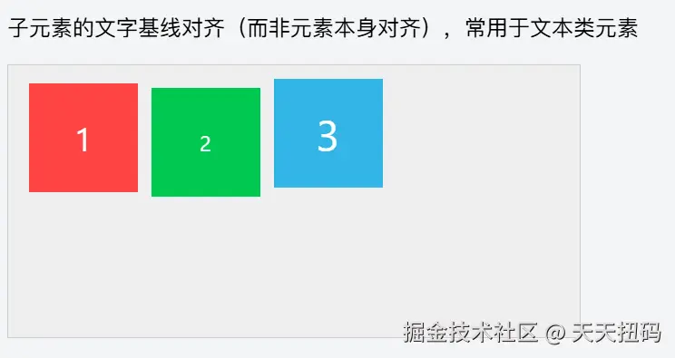 运行效果:即使子元素字体大小不同,它们的文字基线(字母底部对齐的参考线)仍保持在同一水平线上,而非元素本身的边缘对齐。
这时可能有人要问了------煮波煮波,为什么主轴对齐方式有justify-content: space-between,交叉轴对齐方式却没有align-items:space-between呢?
兄弟,我们来看一下一个细节,这个属性是align-items,操作的主要是"行内"这个维度的元素对齐方式,既然是"行内"肯定是单行,再交差轴上只有一个元素,那么这一元素怎么可以"分裂"开呢?所以就不会出现align-items:space-between这种东西
但是当有多行的时候,我们就可以发现,还是需要一个space-between属性来控制整体的行对齐方式,这个维度就是"行",而不是"行内"了,这个属性就是align-content
六、align-content
align-content 用于控制 Flex 容器内多行弹性项在交叉轴方向上的对齐方式和空间分配。它仅在以下两个条件同时满足时生效:
- 子元素发生换行(需设置
flex-wrap: wrap或wrap-reverse); - 容器在交叉轴方向有剩余空间(如高度大于所有行总高度)。
以下案例均以水平主轴(flex-direction: row)为例,展示垂直方向(交叉轴)上多行元素的对齐效果。
-
align-content与justify-content取值相似,但作用对象不同:justify-content作用于单行子元素在主轴的对齐;align-content作用于多行子元素 在交叉轴的对齐(必须配合flex-wrap: wrap);
-
与
align-items的区别:align-items控制单个子元素在交叉轴的对齐;align-content控制多行整体在交叉轴的空间分配;
案例 1:默认值 align-content: stretch(拉伸填满交叉轴)
xml
<!DOCTYPE html>
<html lang="zh-CN">
<head>
    <meta charset="UTF-8">
    <title>align-content: stretch</title>
    <style>
        .flex-container {
            display: flex;
            flex-wrap: wrap; /* 允许换行,否则 align-content 无效 */
            align-content: stretch; /* 默认值:拉伸填满交叉轴 */
            width: 400px;
            height: 300px; /* 容器高度远大于子元素总高度,产生剩余空间 */
            background-color: #eee;
            padding: 10px;
            border: 1px solid #ccc;
        }
        .flex-item {
            width: 100px;
            height: 80px;
            margin: 5px;
            color: white;
            font-size: 20px;
            text-align: center;
            line-height: 80px;
        }
        .item1 { background-color: #ff4444; }
        .item2 { background-color: #00c851; }
        .item3 { background-color: #33b5e5; }
        .item4 { background-color: #aa66cc; }
        .item5 { background-color: #ffc107; }
    </style>
</head>
<body>
    <h3>align-content: stretch(拉伸填满交叉轴)</h3>
    <p>多行子元素会拉伸高度,平均分配容器剩余空间,填满整个交叉轴</p>
    <div class="flex-container">
        <div class="flex-item item1">1</div>
        <div class="flex-item item2">2</div>
        <div class="flex-item item3">3</div>
        <div class="flex-item item4">4</div>
        <div class="flex-item item5">5</div>
    </div>
</body>
</html>运行效果:子元素自动换行后形成两行,两行会拉伸高度以填满容器垂直方向的空间(原本 80px 高的子元素会变高)。
案例 2:align-content: flex-start(靠交叉轴起点对齐)
xml
<!DOCTYPE html>
<html lang="zh-CN">
<head>
    <meta charset="UTF-8">
    <title>align-content: flex-start</title>
    <style>
        .flex-container {
            display: flex;
            flex-wrap: wrap;
            align-content: flex-start; /* 靠交叉轴起点对齐 */
            width: 400px;
            height: 300px;
            background-color: #eee;
            padding: 10px;
            border: 1px solid #ccc;
        }
        .flex-item {
            width: 100px;
            height: 80px;
            margin: 5px;
            color: white;
            font-size: 20px;
            text-align: center;
            line-height: 80px;
        }
        .item1 { background-color: #ff4444; }
        .item2 { background-color: #00c851; }
        .item3 { background-color: #33b5e5; }
        .item4 { background-color: #aa66cc; }
        .item5 { background-color: #ffc107; }
    </style>
</head>
<body>
    <h3>align-content: flex-start(靠交叉轴起点对齐)</h3>
    <p>多行子元素整体靠容器顶部(交叉轴起点)排列,剩余空间在底部</p>
    <div class="flex-container">
        <div class="flex-item item1">1</div>
        <div class="flex-item item2">2</div>
        <div class="flex-item item3">3</div>
        <div class="flex-item item4">4</div>
        <div class="flex-item item5">5</div>
    </div>
</body>
</html>运行效果:两行子元素紧贴容器顶部排列,底部留下大片空白剩余空间。
案例 3:align-content: flex-end(靠交叉轴终点对齐)
xml
<!DOCTYPE html>
<html lang="zh-CN">
<head>
    <meta charset="UTF-8">
    <title>align-content: flex-end</title>
    <style>
        .flex-container {
            display: flex;
            flex-wrap: wrap;
            align-content: flex-end; /* 靠交叉轴终点对齐 */
            width: 400px;
            height: 300px;
            background-color: #eee;
            padding: 10px;
            border: 1px solid #ccc;
        }
        .flex-item {
            width: 100px;
            height: 80px;
            margin: 5px;
            color: white;
            font-size: 20px;
            text-align: center;
            line-height: 80px;
        }
        .item1 { background-color: #ff4444; }
        .item2 { background-color: #00c851; }
        .item3 { background-color: #33b5e5; }
        .item4 { background-color: #aa66cc; }
        .item5 { background-color: #ffc107; }
    </style>
</head>
<body>
    <h3>align-content: flex-end(靠交叉轴终点对齐)</h3>
    <p>多行子元素整体靠容器底部(交叉轴终点)排列,剩余空间在顶部</p>
    <div class="flex-container">
        <div class="flex-item item1">1</div>
        <div class="flex-item item2">2</div>
        <div class="flex-item item3">3</div>
        <div class="flex-item item4">4</div>
        <div class="flex-item item5">5</div>
    </div>
</body>
</html>运行效果:两行子元素紧贴容器底部排列,顶部留下大片空白剩余空间。
案例 4:align-content: center(交叉轴居中对齐)
xml
<!DOCTYPE html>
<html lang="zh-CN">
<head>
    <meta charset="UTF-8">
    <title>align-content: center</title>
    <style>
        .flex-container {
            display: flex;
            flex-wrap: wrap;
            align-content: center; /* 交叉轴居中对齐 */
            width: 400px;
            height: 300px;
            background-color: #eee;
            padding: 10px;
            border: 1px solid #ccc;
        }
        .flex-item {
            width: 100px;
            height: 80px;
            margin: 5px;
            color: white;
            font-size: 20px;
            text-align: center;
            line-height: 80px;
        }
        .item1 { background-color: #ff4444; }
        .item2 { background-color: #00c851; }
        .item3 { background-color: #33b5e5; }
        .item4 { background-color: #aa66cc; }
        .item5 { background-color: #ffc107; }
    </style>
</head>
<body>
    <h3>align-content: center(交叉轴居中对齐)</h3>
    <p>多行子元素整体在容器垂直方向居中,上下剩余空间相等</p>
    <div class="flex-container">
        <div class="flex-item item1">1</div>
        <div class="flex-item item2">2</div>
        <div class="flex-item item3">3</div>
        <div class="flex-item item4">4</div>
        <div class="flex-item item5">5</div>
    </div>
</body>
</html>运行效果:两行子元素整体在容器垂直方向居中,上下两侧的空白空间相等。
案例 5:align-content: space-between(两端对齐,中间等距)
xml
<!DOCTYPE html>
<html lang="zh-CN">
<head>
    <meta charset="UTF-8">
    <title>align-content: space-between</title>
    <style>
        .flex-container {
            display: flex;
            flex-wrap: wrap;
            align-content: space-between; /* 两端对齐,中间等距 */
            width: 400px;
            height: 300px;
            background-color: #eee;
            padding: 10px;
            border: 1px solid #ccc;
        }
        .flex-item {
            width: 100px;
            height: 80px;
            margin: 5px;
            color: white;
            font-size: 20px;
            text-align: center;
            line-height: 80px;
        }
        .item1 { background-color: #ff4444; }
        .item2 { background-color: #00c851; }
        .item3 { background-color: #33b5e5; }
        .item4 { background-color: #aa66cc; }
        .item5 { background-color: #ffc107; }
    </style>
</head>
<body>
    <h3>align-content: space-between(两端对齐,中间等距)</h3>
    <p>第一行靠顶部,最后一行靠底部,中间行间距相等</p>
    <div class="flex-container">
        <div class="flex-item item1">1</div>
        <div class="flex-item item2">2</div>
        <div class="flex-item item3">3</div>
        <div class="flex-item item4">4</div>
        <div class="flex-item item5">5</div>
    </div>
</body>
</html>运行效果:第一行贴容器顶部,最后一行贴容器底部,两行之间的间距自动分配剩余空间(间距相等)。
案例 6:align-content: space-around(行两侧间距相等)
xml
<!DOCTYPE html>
<html lang="zh-CN">
<head>
    <meta charset="UTF-8">
    <title>align-content: space-around</title>
    <style>
        .flex-container {
            display: flex;
            flex-wrap: wrap;
            align-content: space-around; /* 行两侧间距相等 */
            width: 400px;
            height: 300px;
            background-color: #eee;
            padding: 10px;
            border: 1px solid #ccc;
        }
        .flex-item {
            width: 100px;
            height: 80px;
            margin: 5px;
            color: white;
            font-size: 20px;
            text-align: center;
            line-height: 80px;
        }
        .item1 { background-color: #ff4444; }
        .item2 { background-color: #00c851; }
        .item3 { background-color: #33b5e5; }
        .item4 { background-color: #aa66cc; }
        .item5 { background-color: #ffc107; }
    </style>
</head>
<body>
    <h3>align-content: space-around(行两侧间距相等)</h3>
    <p>每行上下两侧的间距相等,相邻行间距是边缘间距的2倍</p>
    <div class="flex-container">
        <div class="flex-item item1">1</div>
        <div class="flex-item item2">2</div>
        <div class="flex-item item3">3</div>
        <div class="flex-item item4">4</div>
        <div class="flex-item item5">5</div>
    </div>
</body>
</html>运行效果:每行上下两侧的间距相同,因此相邻两行之间的间距是第一行顶部和最后一行底部间距的 2 倍。
下面我们来详细分析一下align-items和align-content
align-items和align-content是冲突的吗
我们可以发现,align-items和align-content都是控制元素在交叉轴排列,那么二者的属性是否冲突呢?
不冲突,这里有一个区别
align-items是控制的"行内"维度的,并不在"父容器"的维度上,而align-content是在父容器的维度上的。
为什么有的时候align-items效果很明显,有的时候很不明显?
当在交叉轴上只有一行元素的时候,align-items的"行内",就成了"父容器",这时的"align-items:start"和"align-items:end"就是一个在父容器的头,另一个在父容器的尾部,但是如果有多行,align-items:start"和"align-items:end"就变为了在"行内"的上下,效果就会不那么明显
和讲完了父容器上的属性,接下来我们要讲子容器上的属性了
我相信,对于父容器上的属性我们都耳熟能详,但是子容器上的属性就略显神秘了,所以这里,正是我们和其他面试者拉开差距的关键
在 Flex 布局中,子容器(弹性项,即 flex-item)相关的属性主要用于控制单个子元素在 Flex 容器内的自身尺寸、对齐方式等。我们分为三类来讲------尺寸控制、对齐、辅助属性
那么,开始吧
一、尺寸控制相关属性
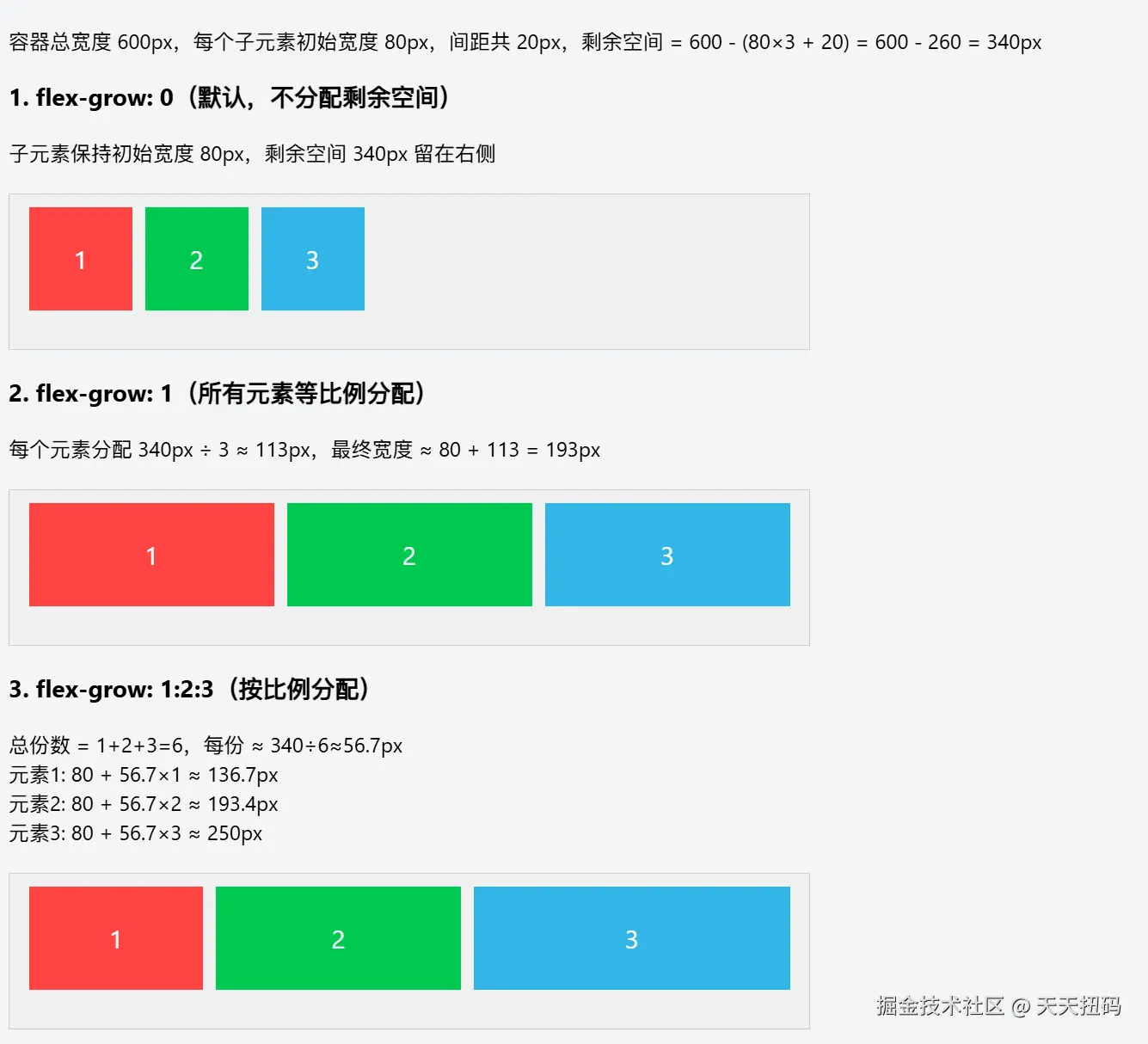
1. flex-grow(扩展因子)
当 Flex 容器在主轴方向有剩余空间时,子元素按照 flex-grow 定义的比例分配剩余空间,实现拉伸效果。
数字(默认值为 0,表示不参与剩余空间分配;若为 1,则等比例分配剩余空间)。
这里给一个可视化的例子来看一下
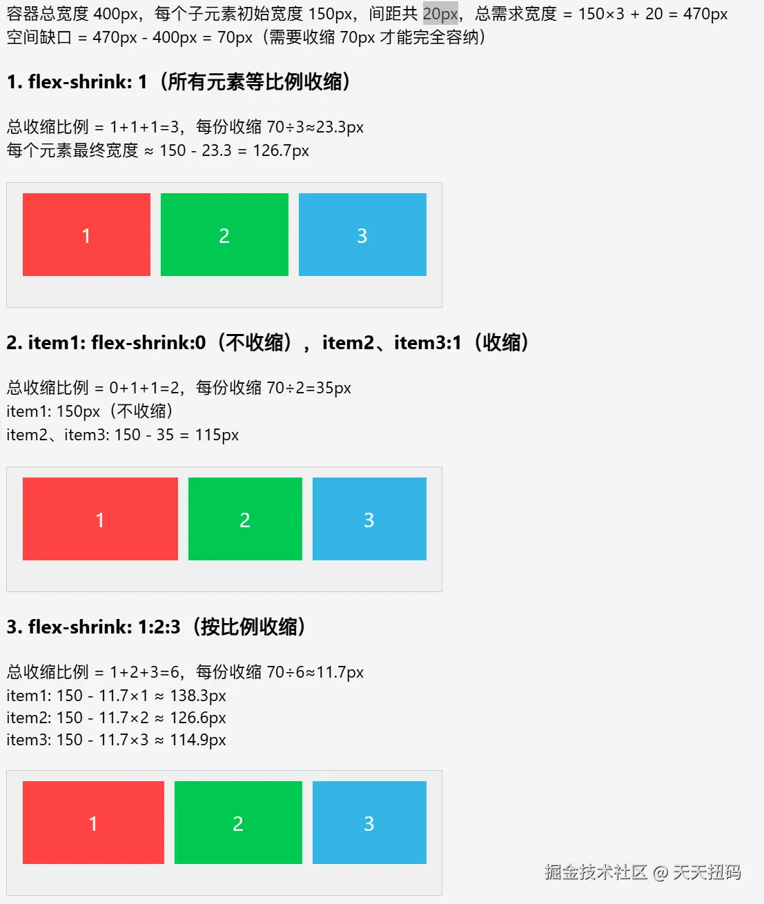
2. flex-shrink(收缩因子)
当 Flex 容器在主轴方向空间不足时,子元素按照 flex-shrink 定义的比例收缩,避免溢出。
数字(默认值为 1,表示空间不足时会收缩;若为 0,则不收缩)。
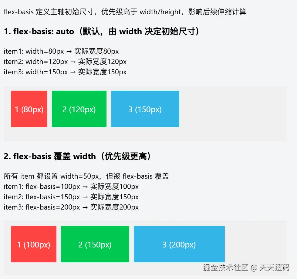
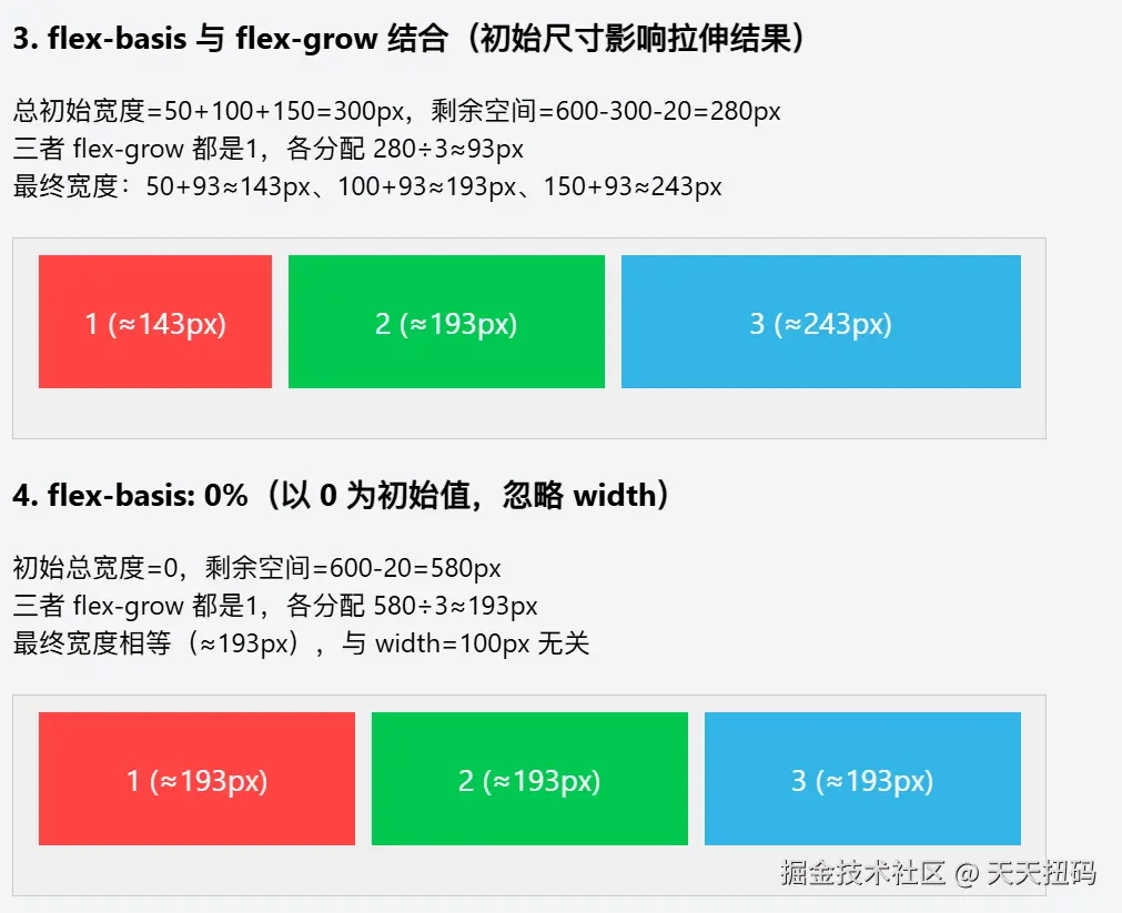
3. flex-basis(基准尺寸)
定义子元素在主轴方向上的初始尺寸,优先级高于 width(或 height,取决于主轴方向)。
auto(默认,由内容或 width/height 决定)、具体长度(如 100px)等。
4. flex(复合属性)
是 flex-grow、flex-shrink、flex-basis 的简写,推荐使用以简化代码。
flex: <flex-grow> <flex-shrink> <flex-basis>,常见简写值有:
markdown
-   `flex: auto`:等价于 `flex: 1 1 auto`,会灵活伸缩。
-   `flex: none`:等价于 `flex: 0 0 auto`,既不扩展也不收缩。
-   `flex: 1`:等价于 `flex: 1 1 0%`,等比例分配剩余空间或收缩。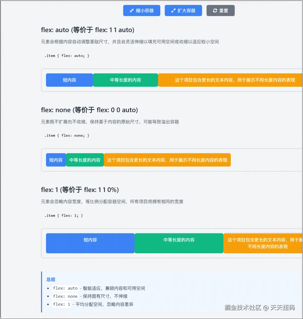
二、对齐相关属性
1. align-self
覆盖 Flex 容器的 align-items 属性,单独设置单个子元素在交叉轴方向的对齐方式。
与 align-items 相同,如 flex-start(交叉轴起点对齐)、center(交叉轴居中)、flex-end(交叉轴终点对齐)、stretch(拉伸填满交叉轴,子元素不能设置固定交叉轴尺寸)等。
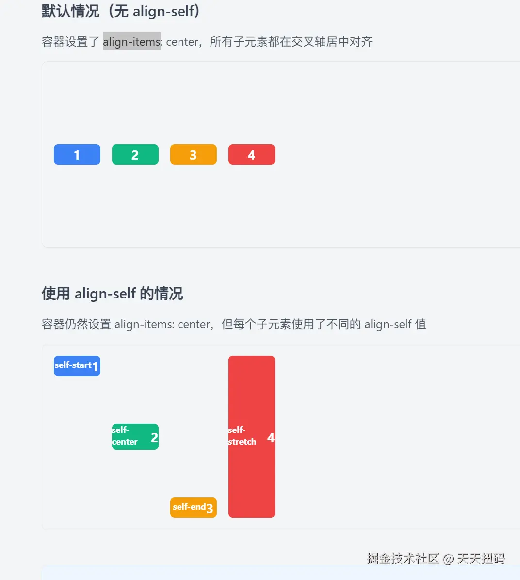
这里需要注意align-self 会覆盖 align-items 的设置
这种机制允许我们先通过 align-items 为大多数元素设置统一的对齐方式,再通过 align-self 为个别需要特殊处理的元素单独设置对齐方式。
三、其他辅助属性
1. order
控制子元素在 Flex 容器内的排列顺序,数值越小,排列越靠前。
整数(默认值为 0)。
这里我们可以给面试官讲三栏布局如何让中间的列先加载之类的,这里是加分项
这个其实很简单,就不做展示了
那么flex基础到这里就可以了,下面是两个常考的八股
解释一下flex:1,除了1还有什么其他的取值
这是一个考察几率很大的题,神奇的flex:1
在 CSS Flexbox 布局中,flex 是一个复合属性,用于设置 flex 项目(flex item)的伸缩能力,它是 flex-grow、flex-shrink 和 flex-basis 三个属性的简写形式。
flex: 1 等价于 flex: 1 1 0%,这里要介绍一下各部分含义
flex-grow: 1:项目在容器有剩余空间时,会按比例(与其他项目的flex-grow值相比)分配剩余空间,实现 "扩张"。flex-shrink: 1:项目在容器空间不足时,会按比例(与其他项目的flex-shrink值相比)缩小,实现 "收缩"。flex-basis: 0%:项目在分配空间前的初始尺寸基准为 0%(相对于父容器),实际尺寸主要由伸缩决定。
单值语法 、双值语法 、三值语法,这里可以快速过,可以和面试官讲下面的两个关键字
flex: none:等价于 flex: 0 0 auto(不伸缩,尺寸由内容或 width/height 决定)。
flex: auto:等价于 flex: 1 1 auto(优先按内容确定初始尺寸,再根据空间伸缩)。
这些取值的核心是通过调整 "扩张权重""收缩权重" 和 "初始基准尺寸",控制项目在 flex 容器中的空间分配方式。
实现中间先加载的三栏布局
如果碰到了这个题,什么双飞翼布局,圣杯布局,不要记了,flex直接暴力完成
css
/* 基础样式重置 */
* {
    margin: 0;
    padding: 0;
    box-sizing: border-box;
}

body {
    min-height: 100vh;
}

/* 容器使用flex布局 */
.container {
    display: flex;
    min-height: 100vh;
}

/* 中间内容区域 - HTML中优先定义 */
.main {
    flex: 1; /* 占据剩余所有空间 */
    order: 2; /* 视觉上显示在中间 */
    background-color: #f0f0f0;
    padding: 20px;
}

/* 左侧边栏 */
.left {
    width: 200px;
    order: 1; /* 视觉上显示在左侧 */
    background-color: #e0e0e0;
    padding: 20px;
}

/* 右侧边栏 */
.right {
    width: 200px;
    order: 3; /* 视觉上显示在右侧 */
    background-color: #e0e0e0;
    padding: 20px;
}
<div class="container">
    <!-- 中间内容区域 - 在HTML中先加载 -->
    <div class="main">
        <h2>主内容区域</h2>
        <p>此区域在HTML中优先定义,先加载</p>
    </div>


    <!-- 左侧边栏 - 后加载 -->
    <div class="left">
        <h3>左侧边栏</h3>
    </div>

    <!-- 右侧边栏 - 后加载 -->
    <div class="right">
        <h3>右侧边栏</h3>
    </div>
</div>
结语
这篇也是写的略显随意了,但是我觉得对复习和面试来说还是不错的