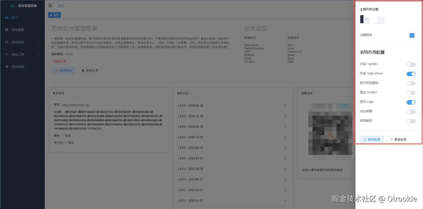
一、布局设置
在前端页面有一个布局设置,点开可以设置主题风格,颜色,是否显示标签页等功能。
1.1 路由
页面所有请求都是通过路由,先来看路由:src→router→index.js。 路由中引用了Layout,从项目中的 src/layout 路径导入一个默认导出的组件,并将其命名为 Layout
javascript
import Layout from '@/layout'在vite.config.js中通过resolve.alias设置了路径别名,将@映射到项目的src目录。import Layout from '@/layout' 实际上就是从 src/layout/index.vue 文件中导入默认导出的组件。
javascript
'@': path.resolve(__dirname, './src')除了登录,注册,404等页面外基本都用了Layout
javascript
// 公共路由
export const constantRoutes = [
  {
    path: '/redirect',
    component: Layout,
    hidden: true,
    children: [
      {
        path: '/redirect/:path(.*)',
        component: () => import('@/views/redirect/index.vue')
      }
    ]
  },
  {
    path: '/login',
    component: () => import('@/views/login'),
    hidden: true
  },
  {
    path: '/register',
    component: () => import('@/views/register'),
    hidden: true
  },
  {
    path: "/:pathMatch(.*)*",
    component: () => import('@/views/error/404'),
    hidden: true
  },
  {
    path: '/401',
    component: () => import('@/views/error/401'),
    hidden: true
  },
  {
    path: '',
    component: Layout,
    redirect: '/index',
    children: [
      {
        path: '/index',
        component: () => import('@/views/index'),
        name: 'Index',
        meta: { title: '首页', icon: 'dashboard', affix: true }
      }
    ]
  },
  {
    path: '/user',
    component: Layout,
    hidden: true,
    redirect: 'noredirect',
    children: [
      {
        path: 'profile/:activeTab?',
        component: () => import('@/views/system/user/profile/index'),
        name: 'Profile',
        meta: { title: '个人中心', icon: 'user' }
      }
    ]
  }
]

// 动态路由,基于用户权限动态去加载
export const dynamicRoutes = [
  {
    path: '/system/user-auth',
    component: Layout,
    hidden: true,
    permissions: ['system:user:edit'],
    children: [
      {
        path: 'role/:userId(\\d+)',
        component: () => import('@/views/system/user/authRole'),
        name: 'AuthRole',
        meta: { title: '分配角色', activeMenu: '/system/user' }
      }
    ]
  },
  {
    path: '/system/role-auth',
    component: Layout,
    hidden: true,
    permissions: ['system:role:edit'],
    children: [
      {
        path: 'user/:roleId(\\d+)',
        component: () => import('@/views/system/role/authUser'),
        name: 'AuthUser',
        meta: { title: '分配用户', activeMenu: '/system/role' }
      }
    ]
  },
  {
    path: '/system/dict-data',
    component: Layout,
    hidden: true,
    permissions: ['system:dict:list'],
    children: [
      {
        path: 'index/:dictId(\\d+)',
        component: () => import('@/views/system/dict/data'),
        name: 'Data',
        meta: { title: '字典数据', activeMenu: '/system/dict' }
      }
    ]
  },
  {
    path: '/monitor/job-log',
    component: Layout,
    hidden: true,
    permissions: ['monitor:job:list'],
    children: [
      {
        path: 'index/:jobId(\\d+)',
        component: () => import('@/views/monitor/job/log'),
        name: 'JobLog',
        meta: { title: '调度日志', activeMenu: '/monitor/job' }
      }
    ]
  },
  {
    path: '/tool/gen-edit',
    component: Layout,
    hidden: true,
    permissions: ['tool:gen:edit'],
    children: [
      {
        path: 'index/:tableId(\\d+)',
        component: () => import('@/views/tool/gen/editTable'),
        name: 'GenEdit',
        meta: { title: '修改生成配置', activeMenu: '/tool/gen' }
      }
    ]
  }
]
1.2 组件
1.2.1 Template模板部分
javascript
<template>
  <div :class="classObj" class="app-wrapper" :style="{ '--current-color': theme }">
    <div v-if="device === 'mobile' && sidebar.opened" class="drawer-bg" @click="handleClickOutside"/>
    <sidebar v-if="!sidebar.hide" class="sidebar-container" />
    <div :class="{ hasTagsView: needTagsView, sidebarHide: sidebar.hide }" class="main-container">
      <div :class="{ 'fixed-header': fixedHeader }">
        <navbar @setLayout="setLayout" />
        <tags-view v-if="needTagsView" />
      </div>
      <app-main />
      <settings ref="settingRef" />
    </div>
  </div>
</template>- 根容器:
- 使用动态class和style,根据主题设置背景色
- 根据设备类型和侧边栏状态添加不同CSS类
- 移动端遮罩层
- 当在移动端且侧边栏打开时显示半透明黑色遮罩
- 点击遮罩会触发handleClickOutside关闭侧边栏
- 侧边栏组件:
- 根据sidebar.hider状态决定是否显示侧边栏
- 主内容区域:
- 包含固定头部(导航栏和标签视图)和主要内容区域
- 根据设置决定是否显示标签页视图
- 集成设置组件
1.2.2 Script脚本部分
javascript
<script setup>
// 导入模块
import { useWindowSize } from '@vueuse/core'
import Sidebar from './components/Sidebar/index.vue'
import { AppMain, Navbar, Settings, TagsView } from './components'
import useAppStore from '@/store/modules/app'
import useSettingsStore from '@/store/modules/settings'

// 初始化设置状态管理实例,用于管理应用的主题、标签页显示等设置
const settingsStore = useSettingsStore()
//计算属性
const theme = computed(() => settingsStore.theme)
const sideTheme = computed(() => settingsStore.sideTheme)
const sidebar = computed(() => useAppStore().sidebar)
const device = computed(() => useAppStore().device)
const needTagsView = computed(() => settingsStore.tagsView)
const fixedHeader = computed(() => settingsStore.fixedHeader)

// 计算属性,判断是否需要固定头部
const classObj = computed(() => ({
  hideSidebar: !sidebar.value.opened,
  openSidebar: sidebar.value.opened,
  withoutAnimation: sidebar.value.withoutAnimation,
  mobile: device.value === 'mobile'
}))

// 根据侧边栏和设备状态返回相应的CSS类名对象,用于动态设置布局样式
const { width, height } = useWindowSize()
// 使用VueUse库获取窗口尺寸的响应式数据
const WIDTH = 992 // refer to Bootstrap's responsive design

// 定义断点宽度,小于该宽度视为移动设备
watch(() => device.value, () => {
  if (device.value === 'mobile' && sidebar.value.opened) {
    useAppStore().closeSideBar({ withoutAnimation: false })
  }
})

// 监听设备类型变化,当切换到移动设备且侧边栏打开时,关闭侧边栏并带动画
watchEffect(() => {
  if (width.value - 1 < WIDTH) {
    useAppStore().toggleDevice('mobile')
    useAppStore().closeSideBar({ withoutAnimation: true })
  } else {
    useAppStore().toggleDevice('desktop')
  }
})

// 响应式监听窗口宽度变化,当宽度小于断点时切换为移动设备模式并关闭侧边栏(无动画),
// 否则切换为桌面设备模式
function handleClickOutside() {
  useAppStore().closeSideBar({ withoutAnimation: false })
}

// 处理点击遮罩层事件,关闭侧边栏并带动画。
const settingRef = ref(null)
function setLayout() {
  settingRef.value.openSetting()
}
</script>- 导入模块
- 使用@vueuse/core的useWindowSize监听窗口大小
- 导入各种子组件(侧边栏、主内容、导航栏等)
- 状态管理
- 获取状态管理实例,用于管理应用的主题、标签页显示等设置
- 计算属性包括主题、侧边栏状态、设备类型等
- 自适应处理
- 监听窗口大小变化,当宽度小于992px时切换为移动端模式
- 移动端模式自动关闭侧边栏
- 交互方法
- handleClickOutside点击遮罩关闭侧边栏
- setLayout打开设置面板
1.2.3 Style样式部分
javascript
<style lang="scss" scoped>
// 引入mixin和变量模块,分别命名为mix和vars
@use "@/assets/styles/mixin.scss" as mix;
@use "@/assets/styles/variables.module.scss" as vars;

// 应用包装器样式,使用clearfix清除浮动,设置相对定位,占满全屏
.app-wrapper {
  @include mix.clearfix;
  position: relative;
  height: 100%;
  width: 100%;
// 当在移动设备上且侧边栏打开时,使用固定定位。
  &.mobile.openSidebar {
    position: fixed;
    top: 0;
  }
}

// 移动端遮罩层样式,黑色半透明背景,覆盖全屏,层级为999。
.drawer-bg {
  background: #000;
  opacity: 0.3;
  width: 100%;
  top: 0;
  height: 100%;
  position: absolute;
  z-index: 999;
}

// 固定头部样式,使用固定定位,宽度为100%减去侧边栏宽度(200px),宽度变化有0.28秒过渡动画
.fixed-header {
  position: fixed;
  top: 0;
  right: 0;
  z-index: 9;
  width: calc(100% - #{vars.$base-sidebar-width});
  transition: width 0.28s;
}

// 当侧边栏隐藏时,固定头部宽度为100%减去54px(折叠后的侧边栏宽度)
.hideSidebar .fixed-header {
  width: calc(100% - 54px);
}

.sidebarHide .fixed-header {
  width: 100%;
}

// 当侧边栏完全隐藏时,固定头部占满全屏宽度。
.mobile .fixed-header {
  width: 100%;
}
</style>- 移动端打开侧边栏时使用固定定位
- 不同状态下(隐藏侧边栏、移动端等)的样式适配
二、导航栏
导航栏在web页面上方,左侧是一个隐藏或展开侧边栏的按钮,紧挨着的是面包屑导航组件,右边是工具栏。 
2.1 Navbar组件
src→layout→components→Navbar.vue Navbar组件是系统的顶部导航栏,包含以下主要功能:
- 侧边栏控制:通过汉堡菜单控制侧边栏展开/收起
- 导航显示:根据设置显示面包屑或顶部菜单
- 快捷功能:搜索、全屏、主题切换、布局大小调整
- 用户信息:显示用户头像和昵称,提供个人中心和退出登录功能
- 项目链接:提供源码和文档的快速访问
- 响应式设计:移动端隐藏部分功能
这个组件整合了系统顶部的大部分常用功能,为用户提供了便捷的操作入口。
2.1.1 Template模板部分
javascript
<template>
  // 创建navbar容器,作为导航栏的根元素。
  <div class="navbar">
    // 汉堡菜单组件,用于控制侧边栏的展开/收起状态,点击时触发toggleSideBar方法
    <hamburger id="hamburger-container" :is-active="appStore.sidebar.opened" class="hamburger-container" @toggleClick="toggleSideBar" />
    // 面包屑导航组件,当不使用顶部导航时显示,显示当前页面路径。
    <breadcrumb v-if="!settingsStore.topNav" id="breadcrumb-container" class="breadcrumb-container" />
    // 顶部导航菜单组件,当启用顶部导航时显示。
    <top-nav v-if="settingsStore.topNav" id="topmenu-container" class="topmenu-container" />

    // 右侧菜单容器,包含各种功能按钮和用户信息
    <div class="right-menu">
      // 非移动设备上显示以下内容
      <template v-if="appStore.device !== 'mobile'">
        // 头部搜索组件,用于快速搜索菜单项
        <header-search id="header-search" class="right-menu-item" />
        // 显示项目源码链接的组件,使用Element Plus的tooltip提示"源码地址"。
        <el-tooltip content="源码地址" effect="dark" placement="bottom">
          <ruo-yi-git id="ruoyi-git" class="right-menu-item hover-effect" />
        </el-tooltip>
        // 显示项目文档链接的组件,使用Element Plus的tooltip提示"文档地址"。
        <el-tooltip content="文档地址" effect="dark" placement="bottom">
          <ruo-yi-doc id="ruoyi-doc" class="right-menu-item hover-effect" />
        </el-tooltip>
        // 全屏切换组件,用于切换页面全屏状态
        <screenfull id="screenfull" class="right-menu-item hover-effect" />
        // 主题切换组件
        <el-tooltip content="主题模式" effect="dark" placement="bottom">
          <div class="right-menu-item hover-effect theme-switch-wrapper" @click="toggleTheme">
            <svg-icon v-if="settingsStore.isDark" icon-class="sunny" />
            <svg-icon v-if="!settingsStore.isDark" icon-class="moon" />
          </div>
        </el-tooltip>
        // 布局大小选择组件
        <el-tooltip content="布局大小" effect="dark" placement="bottom">
          <size-select id="size-select" class="right-menu-item hover-effect" />
        </el-tooltip>
      // 结束非移动端条件渲染
      </template>

      // 用户信息下拉菜单,显示用户头像和昵称,提供个人中心链接和退出登录功能
      <el-dropdown @command="handleCommand" class="avatar-container right-menu-item hover-effect" trigger="hover">
        <div class="avatar-wrapper">
          <img :src="userStore.avatar" class="user-avatar" />
          <span class="user-nickname"> {{ userStore.nickName }} </span>
        </div>
        <template #dropdown>
          <el-dropdown-menu>
            <router-link to="/user/profile">
              <el-dropdown-item>个人中心</el-dropdown-item>
            </router-link>
            <el-dropdown-item divided command="logout">
              <span>退出登录</span>
            </el-dropdown-item>
          </el-dropdown-menu>
        </template>
      </el-dropdown>
      // 设置按钮,当启用设置功能时显示,点击打开设置面板
      <div class="right-menu-item hover-effect setting" @click="setLayout" v-if="settingsStore.showSettings">
        <svg-icon icon-class="more-up" />
      </div>
    </div>
  </div>
// 结束navbar容器
</template>
2.1.2 Script脚本部分
javascript
<script setup>
// 导入Element Plus的消息框组件,用于确认对话框
import { ElMessageBox } from 'element-plus'
// 导入所需子组件
import Breadcrumb from '@/components/Breadcrumb'
import TopNav from '@/components/TopNav'
import Hamburger from '@/components/Hamburger'
import Screenfull from '@/components/Screenfull'
import SizeSelect from '@/components/SizeSelect'
import HeaderSearch from '@/components/HeaderSearch'
import RuoYiGit from '@/components/RuoYi/Git'
import RuoYiDoc from '@/components/RuoYi/Doc'
// 导入状态管理模块
import useAppStore from '@/store/modules/app'
import useUserStore from '@/store/modules/user'
import useSettingsStore from '@/store/modules/settings'

// 初始化各状态管理实例
const appStore = useAppStore()
const userStore = useUserStore()
const settingsStore = useSettingsStore()

// 切换侧边栏展开/收起状态的方法。
function toggleSideBar() {
  appStore.toggleSideBar()
}

// 处理下拉菜单命令的通用方法,根据命令类型调用相应函数
function handleCommand(command) {
  switch (command) {
    case "setLayout":
      setLayout()
      break
    case "logout":
      logout()
      break
    default:
      break
  }
}
// 退出登录方法
function logout() {
  ElMessageBox.confirm('确定注销并退出系统吗?', '提示', {
    confirmButtonText: '确定',
    cancelButtonText: '取消',
    type: 'warning'
  }).then(() => {
      // 确认后调用用户登出方法并跳转到首页
    userStore.logOut().then(() => {
      location.href = '/index'
    })
  }).catch(() => { })
}

// 定义并实现setLayout事件发射方法,用于通知父组件打开设置面板
const emits = defineEmits(['setLayout'])
function setLayout() {
  emits('setLayout')
}

// 切换主题模式方法,调用设置存储中的切换主题功能
function toggleTheme() {
  settingsStore.toggleTheme()
}
</script>
2.1.3 Style样式部分
javascript
<style lang='scss' scoped>
// 导航栏基础样式
.navbar {
  height: 50px;
  overflow: hidden;
  position: relative;
  background: var(--navbar-bg);
  box-shadow: 0 1px 4px rgba(0, 21, 41, 0.08);

  // 汉堡菜单容器样式
  .hamburger-container {
    line-height: 46px;
    height: 100%;
    float: left;
    cursor: pointer;
    transition: background 0.3s;
    -webkit-tap-highlight-color: transparent;

    &:hover {
      background: rgba(0, 0, 0, 0.025);
    }
  }

  // 面包屑容器左浮动
  .breadcrumb-container {
    float: left;
  }

  // 顶部菜单容器绝对定位
  .topmenu-container {
    position: absolute;
    left: 50px;
  }

  // 错误日志容器样式
  .errLog-container {
    display: inline-block;
    vertical-align: top;
  }

  // 右侧菜单样式容器
  .right-menu {
    float: right;
    height: 100%;
    line-height: 50px;
    display: flex;

    &:focus {
      outline: none;
    }

    // 右侧菜单项通用样式
    .right-menu-item {
      display: inline-block;
      padding: 0 8px;
      height: 100%;
      font-size: 18px;
      color: #5a5e66;
      vertical-align: text-bottom;

      &.hover-effect {
        cursor: pointer;
        transition: background 0.3s;

        &:hover {
          background: rgba(0, 0, 0, 0.025);
        }
      }
      // 主题切换按钮样式
      &.theme-switch-wrapper {
        display: flex;
        align-items: center;

        svg {
          transition: transform 0.3s;

          &:hover {
            transform: scale(1.15);
          }
        }
      }
    }

    // 用户头像容器样式
    .avatar-container {
      margin-right: 0px;
      padding-right: 0px;

      .avatar-wrapper {
        margin-top: 10px;
        right: 5px;
        position: relative;

        .user-avatar {
          cursor: pointer;
          width: 30px;
          height: 30px;
          border-radius: 50%;
        }

        .user-nickname{
          position: relative;
          left: 5px;
          bottom: 10px;
          font-size: 14px;
          font-weight: bold;
        }

        i {
          cursor: pointer;
          position: absolute;
          right: -20px;
          top: 25px;
          font-size: 12px;
        }
      }
    }
  }
}
</style>
三、侧边栏
web页面左侧的侧边栏
3.1 Sidebar组件
src→layout→Sidebar→index.vue Sidebar组件实现了完整的侧边栏导航功能,具有以下特点:
- 可配置性:支持显示/隐藏Logo、主题切换、折叠/展开等配置
- 动态菜单:根据权限动态生成菜单项
- 主题支持:支持多种主题和暗黑模式
- 状态管理:与应用状态管理集成,保持状态同步
- 自适应:根据屏幕大小和设置自动调整布局,颜色和样式根据主题动态调整 通过组合Logo、SidebarItem等子组件构建完整的侧边栏界面
3.1.1 Template模板部分
javascript
<template>
  // 创建侧边栏容器,根据showLogo的值决定是否添加'has-logo'类
  <div :class="{ 'has-logo': showLogo }" class="sidebar-container">
    // 条件渲染Logo组件,当showLogo为true时显示,传递collapse属性控制Logo的折叠状态
    <logo v-if="showLogo" :collapse="isCollapse" />
    // 使用Element Plus的滚动条组件包装菜单内容,设置包装类名为scrollbar-wrapper
    <el-scrollbar wrap-class="scrollbar-wrapper">
      // 创建Element Plus菜单组件,并设置以下属性
      <el-menu
        // 当前激活的菜单项
        :default-active="activeMenu"
        // 控制菜单是否折叠
        :collapse="isCollapse"
        // 菜单背景色
        :background-color="getMenuBackground"
        // 菜单文字颜色
        :text-color="getMenuTextColor"
        // 只保持一个子菜单展开
        :unique-opened="true"
        // 激活菜单项的文字颜色
        :active-text-color="theme"
        // 是否使用折叠动画
        :collapse-transition="false"
        // 菜单模式为垂直
        mode="vertical"
        // 菜单主题类
        :class="sideTheme"
      >
        // 遍历sidebarRouters,为每个路由创建SidebarItem组件,传递路由信息和基础路径
        <sidebar-item
          v-for="(route, index) in sidebarRouters"
          :key="route.path + index"
          :item="route"
          :base-path="route.path"
        />
      // 结束菜单和滚动条组件
      </el-menu>
    </el-scrollbar>
  </div>
</template>
3.1.2 Script脚本部分
javascript
<script setup>
// 导入所需组件和模块
import Logo from './Logo'
import SidebarItem from './SidebarItem'
import variables from '@/assets/styles/variables.module.scss'
import useAppStore from '@/store/modules/app'
import useSettingsStore from '@/store/modules/settings'
import usePermissionStore from '@/store/modules/permission'

// 获取路由和各状态管理实例
const route = useRoute()
const appStore = useAppStore()
const settingsStore = useSettingsStore()
const permissionStore = usePermissionStore()

// 计算属性,获取权限存储中的侧边栏路由
const sidebarRouters = computed(() => permissionStore.sidebarRouters)
// 根据设置决定是否显示logo
const showLogo = computed(() => settingsStore.sidebarLogo)
// 获取侧边栏主题设置
const sideTheme = computed(() => settingsStore.sideTheme)
// 获取当前主题颜色
const theme = computed(() => settingsStore.theme)
// 根据侧边栏是否打开决定菜单是否折叠
const isCollapse = computed(() => !appStore.sidebar.opened)

// 根据暗黑模式和主题设置获取菜单背景色
const getMenuBackground = computed(() => {
  if (settingsStore.isDark) {
    return 'var(--sidebar-bg)'
  }
  return sideTheme.value === 'theme-dark' ? variables.menuBg : variables.menuLightBg
})

// 根据暗黑模式和主题设置获取菜单文字颜色
const getMenuTextColor = computed(() => {
  if (settingsStore.isDark) {
    return 'var(--sidebar-text)'
  }
  return sideTheme.value === 'theme-dark' ? variables.menuText : variables.menuLightText
})

// 根据路由元信息决定当前激活的菜单项
const activeMenu = computed(() => {
  const { meta, path } = route
  if (meta.activeMenu) {
    return meta.activeMenu
  }
  return path
})
</script>
3.1.3 Style样式部分
javascript
// 设置侧边栏容器背景色,使用v-bind绑定计算属性
<style lang="scss" scoped>
.sidebar-container {
  background-color: v-bind(getMenuBackground);
  // 设置滚动条包装器背景色
  .scrollbar-wrapper {
    background-color: v-bind(getMenuBackground);
  }

  // 设置菜单样式
  .el-menu {
    border: none;
    height: 100%;
    width: 100% !important;

    // 设置菜单项和子菜单标题在悬停时的背景色
    .el-menu-item, .el-sub-menu__title {
      &:hover {
        background-color: var(--menu-hover, rgba(0, 0, 0, 0.06)) !important;
      }
    }

    // 设置菜单项文字颜色,并为激活状态的菜单项设置特殊颜色和背景
    .el-menu-item {
      color: v-bind(getMenuTextColor);

      &.is-active {
        color: var(--menu-active-text, #409eff);
        background-color: var(--menu-hover, rgba(0, 0, 0, 0.06)) !important;
      }
    }

    // 设置子菜单标题文字颜色
    .el-sub-menu__title {
      color: v-bind(getMenuTextColor);
    }
  }
}
</style>
四、顶部栏
页面上方的菜单栏,开启后会在页面上方显示一级菜单 关闭状态: 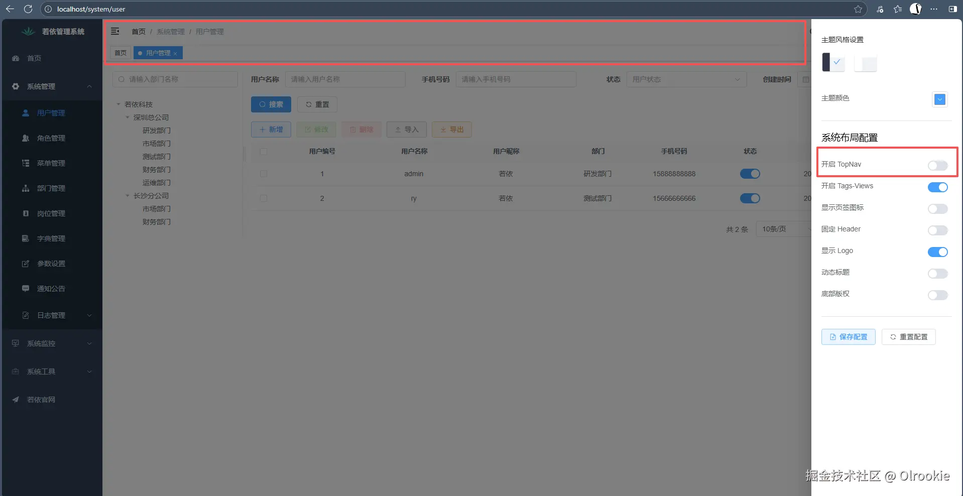
打开状态: 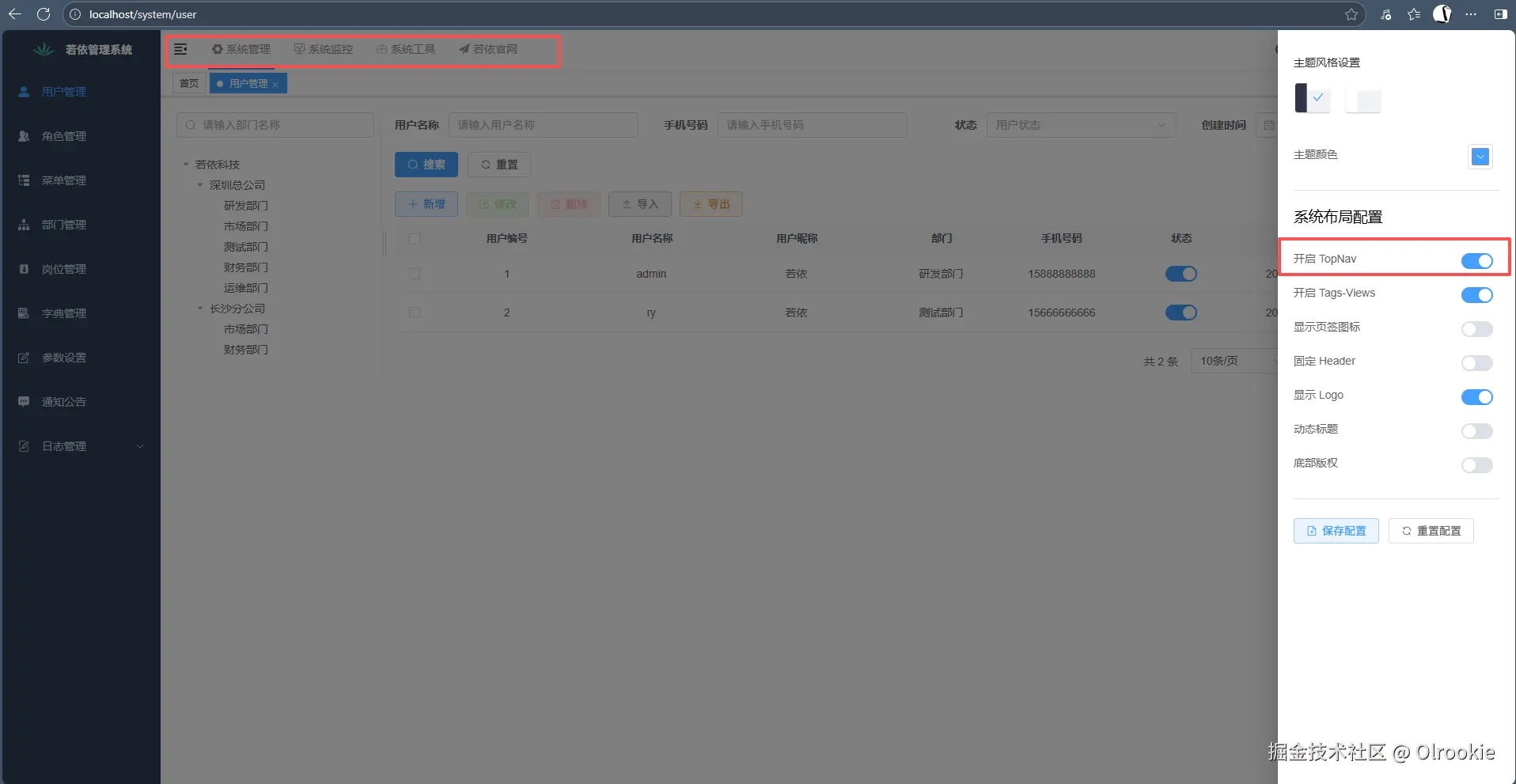
4.1 TopNav组件
src→components→TopNav→index.vue TopNav组件是一个基于Element Plus的顶部水平导航菜单,主要功能包括:
- 动态菜单显示:根据路由配置动态生成顶部菜单项
- 菜单折叠:当菜单项过多时,自动将超出部分折叠到"更多菜单"下拉中
- 自适应:根据屏幕宽度动态调整可见菜单项数量
- 路由联动:与侧边栏菜单联动,点击顶部菜单项可切换侧边栏内容
- 多类型链接支持:支持内部路由跳转和外部链接新窗口打开
- 主题定制:支持主题颜色定制
该组件充分利用了Vue 3的响应式特性和组合式API,结合Element Plus组件库实现顶部导航菜单。
4.1.1 Template模板部分
javascript
<template>
  <el-menu
    // 绑定当前激活的菜单项
    :default-active="activeMenu"
    // 设置为水平模式
    mode="horizontal"
    // 菜单选项被选择时的处理函数
    @select="handleSelect"
    // 禁用菜单项的省略显示
    :ellipsis="false"
  >
    // 遍历显示顶部菜单项
    <template v-for="(item, index) in topMenus">
      <el-menu-item :style="{'--theme': theme}" :index="item.path" :key="index" v-if="index < visibleNumber">
        // 如果菜单项有图标则显示SVG图标
        <svg-icon
        v-if="item.meta && item.meta.icon && item.meta.icon !== '#'"
        :icon-class="item.meta.icon"/>
        // 显示菜单项标题
        {{ item.meta.title }}
      </el-menu-item>
    </template>

    <!-- 顶部菜单超出数量折叠 -->
    <el-sub-menu :style="{'--theme': theme}" index="more" v-if="topMenus.length > visibleNumber">
      // 折叠菜单的标题
      <template #title>更多菜单</template>
      // 显示被折叠的菜单项
      <template v-for="(item, index) in topMenus">
        <el-menu-item
          :index="item.path"
          :key="index"
          v-if="index >= visibleNumber">
        <svg-icon
          v-if="item.meta && item.meta.icon && item.meta.icon !== '#'"
          :icon-class="item.meta.icon"/>
        {{ item.meta.title }}
        </el-menu-item>
      </template>
    </el-sub-menu>
  </el-menu>
</template>
4.1.2 Script脚本部分
javascript
<script setup>
// 导入模块
import { constantRoutes } from "@/router"
import { isHttp } from '@/utils/validate'
import useAppStore from '@/store/modules/app'
import useSettingsStore from '@/store/modules/settings'
import usePermissionStore from '@/store/modules/permission'

// 顶部栏初始化
const visibleNumber = ref(null)
// 当前激活菜单的 index
const currentIndex = ref(null)
// 隐藏侧边栏路由
const hideList = ['/index', '/user/profile']

const appStore = useAppStore()
const settingsStore = useSettingsStore()
const permissionStore = usePermissionStore()
const route = useRoute()
const router = useRouter()

// 主题颜色
const theme = computed(() => settingsStore.theme)
// 所有的路由信息
const routers = computed(() => permissionStore.topbarRouters)

// 顶部显示菜单
const topMenus = computed(() => {
  let topMenus = []
  routers.value.map((menu) => {
    // 过滤隐藏菜单
    if (menu.hidden !== true) {
      // 兼容顶部栏一级菜单内部跳转
      if (menu.path === '/' && menu.children) {
          // 如果是根路径且有子菜单,使用第一个子菜单
          topMenus.push(menu.children[0])
      } else {
          // 否则直接使用该菜单
          topMenus.push(menu)
      }
    }
  })
  return topMenus
})

// 设置子路由
const childrenMenus = computed(() => {
  let childrenMenus = []
  routers.value.map((router) => {
    for (let item in router.children) {
      // 处理子路由路径
      if (router.children[item].parentPath === undefined) {
        if(router.path === "/") {
          router.children[item].path = "/" + router.children[item].path
        } else {
          if(!isHttp(router.children[item].path)) {
            router.children[item].path = router.path + "/" + router.children[item].path
          }
        }
        router.children[item].parentPath = router.path
      }
      childrenMenus.push(router.children[item])
    }
  })
  // 合并常量路由和处理后的子路由
  return constantRoutes.concat(childrenMenus)
})

// 默认激活的菜单
const activeMenu = computed(() => {
  const path = route.path
  let activePath = path
  // 根据当前路由路径确定激活的菜单项
  if (path !== undefined && path.lastIndexOf("/") > 0 && hideList.indexOf(path) === -1) {
    const tmpPath = path.substring(1, path.length)
    if (!route.meta.link) {
      activePath = "/" + tmpPath.substring(0, tmpPath.indexOf("/"))
      // 显示侧边栏
      appStore.toggleSideBarHide(false)
    }
  } else if(!route.children) {
    activePath = path
    // 隐藏侧边栏
    appStore.toggleSideBarHide(true)
  }
  activeRoutes(activePath)
  return activePath
})

// 设置可见菜单项数量
function setVisibleNumber() {
  const width = document.body.getBoundingClientRect().width / 3
  // 根据屏幕宽度计算可显示菜单项数量
  visibleNumber.value = parseInt(width / 85)
}

// 处理菜单项选择
function handleSelect(key, keyPath) {
  currentIndex.value = key
  const route = routers.value.find(item => item.path === key)
  if (isHttp(key)) {
    // http(s):// 路径新窗口打开
    window.open(key, "_blank")
  } else if (!route || !route.children) {
    // 没有子路由路径内部打开
    const routeMenu = childrenMenus.value.find(item => item.path === key)
    if (routeMenu && routeMenu.query) {
      let query = JSON.parse(routeMenu.query)
      router.push({ path: key, query: query })
    } else {
      router.push({ path: key })
    }
    appStore.toggleSideBarHide(true)
  } else {
    // 显示左侧联动菜单
    activeRoutes(key)
    appStore.toggleSideBarHide(false)
  }
}

// 激活路由
function activeRoutes(key) {
  let routes = []
  if (childrenMenus.value && childrenMenus.value.length > 0) {
    childrenMenus.value.map((item) => {
      if (key == item.parentPath || (key == "index" && "" == item.path)) {
        routes.push(item)
      }
    })
  }
  if(routes.length > 0) {
    // 设置侧边栏路由
    permissionStore.setSidebarRouters(routes)
  } else {
    appStore.toggleSideBarHide(true)
  }
  return routes
}

// 声明周期钩子
onMounted(() => {
  // 监听窗口大小变化
  window.addEventListener('resize', setVisibleNumber)
})

onBeforeUnmount(() => {
  // 移除事件监听
  window.removeEventListener('resize', setVisibleNumber)
})

onMounted(() => {
  // 初始化可见菜单项数量
  setVisibleNumber()
})
</script>
4.1.3 Style样式部分
javascript
<style lang="scss">
// 菜单项基本样式
.topmenu-container.el-menu--horizontal > .el-menu-item {
  float: left;
  height: 50px !important;
  line-height: 50px !important;
  color: #999093 !important;
  padding: 0 5px !important;
  margin: 0 10px !important;
}

// 激活菜单项样式
.topmenu-container.el-menu--horizontal > .el-menu-item.is-active, .el-menu--horizontal > .el-sub-menu.is-active .el-submenu__title {
  border-bottom: 2px solid #{'var(--theme)'} !important;
  color: #303133;
}

// 子菜单项样式
/* sub-menu item */
.topmenu-container.el-menu--horizontal > .el-sub-menu .el-sub-menu__title {
  float: left;
  height: 50px !important;
  line-height: 50px !important;
  color: #999093 !important;
  padding: 0 5px !important;
  margin: 0 10px !important;
}

/* 背景色隐藏 */
.topmenu-container.el-menu--horizontal>.el-menu-item:not(.is-disabled):focus, .topmenu-container.el-menu--horizontal>.el-menu-item:not(.is-disabled):hover, .topmenu-container.el-menu--horizontal>.el-submenu .el-submenu__title:hover {
  background-color: #ffffff;
}

/* 图标右间距 */
.topmenu-container .svg-icon {
  margin-right: 4px;
}

// 菜单箭头样式
/* topmenu more arrow */
.topmenu-container .el-sub-menu .el-sub-menu__icon-arrow {
  position: static;
  vertical-align: middle;
  margin-left: 8px;
  margin-top: 0px;
}


</style>