🌟 前言
现代 Web 开发中,流畅的动画效果对用户体验至关重要。Web Animation API 提供了浏览器原生的 JavaScript 动画控制接口,相比传统方案,它提供更精细的控制、更优的性能和更强的组合能力。
Web Animation API 主要 API
| API | 描述 | 用途 |
|---|---|---|
| Element.animate() | 创建并返回一个 Animation 对象 | 用于在元素上创建动画 |
| Animation | 动画对象的构造函数 | 表示单个动画实例 |
| KeyframeEffect | 关键帧效果对象的构造函数 | 定义动画的关键帧和效果 |
| AnimationTimeline | 动画时间线接口 | 管理动画的时间控制 |
| AnimationEffect | 动画效果接口 | 定义动画效果的基本结构 |
| Document.getAnimations() | 获取文档中所有动画 | 返回文档中所有活动动画的数组 |
| Animation.play() | 播放动画 | 启动动画播放 |
| Animation.pause() | 暂停动画 | 暂停当前动画 |
| Animation.reverse() | 反向播放动画 | 以相反方向播放动画 |
| Animation.seek() | 跳转到指定时间点 | 设置动画播放位置 |
| Animation.finish() | 完成动画 | 快速完成动画播放 |
| Animation.cancel() | 取消动画 | 停止并取消动画 |
| Animation.updatePlaybackRate() | 更新播放速率 | 改变动画播放速度 |
| Animation.playbackRate | 获取或设置播放速率 | 控制动画播放速度 |
| Animation.startTime | 获取或设置开始时间 | 控制动画开始时间 |
| Animation.currentTime | 获取或设置当前时间 | 获取或设置动画当前位置 |
| Animation.effect | 获取或设置动画效果 | 获取或设置动画效果对象 |
| Animation.timing | 获取或设置动画计时 | 配置动画的计时属性 |
| Animation.pending | 判断动画是否挂起 | 检查动画是否处于挂起状态 |
| Animation.playState | 获取动画播放状态 | 获取动画当前状态 |
| Animation.ready | 动画准备就绪的 Promise | 当动画准备好时触发 |
| Animation.finished | 动画完成的 Promise | 当动画完成后触发 |
| Animation.onfinish | 动画完成事件回调 | 处理动画完成事件 |
| Animation.oncancel | 动画取消事件回调 | 处理动画取消事件 |
| Animation.onremove | 动画移除事件回调 | 处理动画移除事件 |
unsetunset🏗️ 一、核心概念解析unsetunset
1. 基础动画实现
php
const element = document.getElementById('myElement');

// 基础动画示例
const animation = element.animate(
  [
    { opacity: 0, transform: 'translateY(-50px)' },
    { opacity: 1, transform: 'translateY(0)' }
  ],
  {
    duration: 800,      // 动画时长(ms)
    easing: 'ease-out',  // 缓动函数
    fill: 'forwards'    // 保持结束状态
  }
);

// 播放动画
animation.play();
2. 关键帧序列详解
php
// 多关键帧序列示例(包含偏移设置)
const complexAnimation = element.animate(
  [
    { transform: 'scale(1)', backgroundColor: 'blue', offset: 0 },
    { transform: 'scale(1.5)', backgroundColor: 'purple', offset: 0.3 },
    { transform: 'scale(1.2)', backgroundColor: 'red', offset: 0.7 },
    { transform: 'scale(1)', backgroundColor: 'green', offset: 1 }
  ],
  {
    duration: 2000,
    iterations: Infinity,
    direction: 'alternate'
  }
);
unsetunset⚙️ 二、精细控制技术unsetunset
1. 动画控制函数
javascript
// 创建动画
const bounceAnimation = element.animate(
  [{ transform: 'translateY(0)' }, { transform: 'translateY(-100px)' }],
  { duration: 1000 }
);

// 控制方法
const playBtn = document.getElementById('play');
playBtn.addEventListener('click', () => {
  if (bounceAnimation.playState === 'paused') {
    bounceAnimation.play();
  } else {
    bounceAnimation.pause();
  }
});

// 跳转到特定时间点
document.getElementById('jump').addEventListener('click', () => {
  bounceAnimation.currentTime = 300; // 跳转到300ms位置
});

// 速率控制
document.getElementById('speedUp').addEventListener('click', () => {
  bounceAnimation.playbackRate *= 1.5; // 加速50%
});

// 结束后重置
bounceAnimation.onfinish = () => {
  element.animate(
    [{ transform: 'translateY(0)' }],
    { duration: 300, fill: 'forwards' }
  );
};
2. 动画事件监听
ini
const fadeInAnimation = element.animate(
  [{ opacity: 0 }, { opacity: 1 }],
  { duration: 1500 }
);

// 事件监听
fadeInAnimation.onstart = () => {
  console.log('动画开始');
};

fadeInAnimation.onfinish = () => {
  console.log('动画完成');
  element.textContent = '动画完成!';
};

fadeInAnimation.oncancel = () => {
  console.warn('动画被取消');
};

fadeInAnimation.onremove = () => {
  console.log('动画被移除');
};
unsetunset🚀 三、高级动画技术unsetunset
1. 复合动画:序列执行
php
// 动画1:平移
const moveRight = element.animate(
  [
    { transform: 'translateX(0)' },
    { transform: 'translateX(200px)' }
  ],
  { duration: 1000 }
);

// 动画1结束后触发动画2
moveRight.onfinish = () => {
  // 动画2:旋转
  const rotate = element.animate(
    [
      { transform: 'translateX(200px) rotate(0deg)' },
      { transform: 'translateX(200px) rotate(360deg)' }
    ],
    { duration: 800 }
  );

  // 动画2结束后触发动画3
  rotate.onfinish = () => {
    // 动画3:返回原点
    element.animate(
      [
        { transform: 'translateX(200px) rotate(360deg)' },
        { transform: 'translateX(0) rotate(0deg)' }
      ],
      { duration: 1200, easing: 'cubic-bezier(0.68, -0.55, 0.27, 1.55)' }
    );
  };
};
2. 复合动画:并行执行
php
// 同时执行多个动画
const parallelAnimations = [
  element.animate(
    [{ transform: 'scale(1)' }, { transform: 'scale(1.5)' }],
    { duration: 1500, easing: 'ease-in-out' }
  ),
  element.animate(
    [{ backgroundColor: '#3498db' }, { backgroundColor: '#e74c3c' }],
    { duration: 1500 }
  ),
  element.animate(
    [{ borderRadius: '0px' }, { borderRadius: '50%' }],
    { duration: 1500 }
  )
];

// 监听所有动画完成
Promise.all(parallelAnimations.map(anim => anim.finished)).then(() => {
  console.log('所有并行动画完成');
});
3. 时间轴协调
php
// 创建时间轴
const timeline = new DocumentTimeline();

// 动画A:移动
const moveAnim = element1.animate(
  [{ transform: 'translateX(0)' }, { transform: 'translateX(200px)' }],
  {
    duration: 1000,
    timeline  // 指定时间轴
  }
);

// 动画B:在动画A后立即开始(延迟1秒)
const colorChange = element2.animate(
  [{ backgroundColor: 'blue' }, { backgroundColor: 'red' }],
  {
    duration: 1000,
    timeline,
    delay: 1000  // 1秒延迟
  }
);

// 控制整个时间轴
const playTimeline = document.getElementById('playTimeline');
playTimeline.addEventListener('click', () => {
  moveAnim.play();
  colorChange.play();
});
4. 路径跟随动画
php
// 使用路径数据创建动画
const path = document.getElementById('motionPath');
const moveAlongPath = element.animate(
  [
    { offsetDistance: 0, offsetPath: `path('${path.getAttribute('d')}')` },
    { offsetDistance: '100%' }
  ],
  {
    duration: 3000,
    iterations: Infinity,
    direction: 'alternate',
    easing: 'ease-in-out'
  }
);
unsetunset📊 四、高级应用示例unsetunset
1. 无限循环背景动画
javascript
function createBackgroundAnimation() {
  const colors = ['#ff9ff3', '#feca57', '#ff6b6b', '#48dbfb', '#1dd1a1'];
  const container = document.getElementById('bgContainer');

  colors.forEach((color, i) => {
    const dot = document.createElement('div');
    dot.className = 'bg-dot';
    dot.style.backgroundColor = color;
    container.appendChild(dot);

    // 对每个点创建随机动画
    dot.animate(
      [
        {
          transform: `translate(${Math.random() * 100}vw, ${Math.random() * 100}vh) scale(0)`
        },
        {
          transform: `translate(${Math.random() * 100}vw, ${Math.random() * 100}vh) scale(1)`,
          opacity: 0.7
        }
      ],
      {
        duration: Math.random() * 5000 + 3000,
        direction: 'alternate',
        iterations: Infinity,
        easing: 'cubic-bezier(0.445, 0.05, 0.55, 0.95)'
      }
    );
  });
}

createBackgroundAnimation();
2. 物理效果弹跳动画
php
const ball = document.getElementById('ball');
const ballAnimation = ball.animate(
  [
    { transform: 'translateY(0)', easing: 'ease-in' },
    { transform: 'translateY(300px)', easing: 'ease-out', offset: 0.3 },
    { transform: 'translateY(100px)', easing: 'ease-in', offset: 0.5 },
    { transform: 'translateY(280px)', easing: 'ease-out', offset: 0.7 },
    { transform: 'translateY(150px)', easing: 'ease-in', offset: 0.8 },
    { transform: 'translateY(300px)', easing: 'ease-out' }
  ],
  {
    duration: 2000,
    iterations: Infinity,
    composite: 'add'  // 与其他变换叠加
  }
);
3. 3D 变换动画
php
const cube = document.getElementById('cube');

// 创建3D旋转动画
cube.animate(
  [
    {
      transform: 'rotateX(0deg) rotateY(0deg) rotateZ(0deg)',
      filter: 'blur(0px)'
    },
    {
      transform: 'rotateX(180deg) rotateY(180deg) rotateZ(0deg)',
      filter: 'blur(2px)'
    },
    {
      transform: 'rotateX(360deg) rotateY(360deg) rotateZ(180deg)',
      filter: 'blur(0px)'
    }
  ],
  {
    duration: 5000,
    iterations: Infinity,
    easing: 'cubic-bezier(0.215, 0.610, 0.355, 1.000)'
  }
);

// 添加透视效果
cube.parentElement.style.perspective = '1000px';
4. 滚动驱动动画
php
// 创建滚动驱动的时间轴
const scrollTimeline = new ScrollTimeline({
  scrollSource: document.scrollingElement,
  orientation: 'block',
  timeRange: 1000
});

// 元素随着滚动变化
const scrollingElement = document.getElementById('scroll-element');
scrollingElement.animate(
  [
    { opacity: 0, transform: 'scale(0.5)' },
    { opacity: 1, transform: 'scale(1)' }
  ],
  {
    duration: 1000,
    timeline: scrollTimeline
  }
);
unsetunset🎯 五、性能优化技巧unsetunset
1. GPU 加速最佳实践
css
// 使用 transform 和 opacity 属性可触发 GPU 加速
element.animate(
  [    { transform: 'translate3d(0, 0, 0) scale(1)', opacity: 1 },    { transform: 'translate3d(100px, 100px, 0) scale(1.5)', opacity: 0.7 }  ],
  { duration: 1000 }
);

// 避免触发重排的属性
// 推荐使用:transform, opacity, filter
// 尽量避免:width, height, padding, margin
2. 高效动画组合
php
// 使用 GroupEffect 进行复杂动画编排
const fadeIn = new KeyframeEffect(
  element,
  [{opacity:0}, {opacity:1}],
  {duration: 1000}
);

const moveRight = new KeyframeEffect(
  element,
  [{transform:'translateX(0)'}, {transform:'translateX(200px)'}],
  {duration: 1000}
);

// 串行动画
const sequence = new SequenceEffect([fadeIn, moveRight]);

// 并行动画
const parallel = new GroupEffect([fadeIn, moveRight]);

// 创建动画
const sequentialAnimation = new Animation(sequence, document.timeline);
const parallelAnimation = new Animation(parallel, document.timeline);
unsetunset✅ 六、完整示例unsetunset
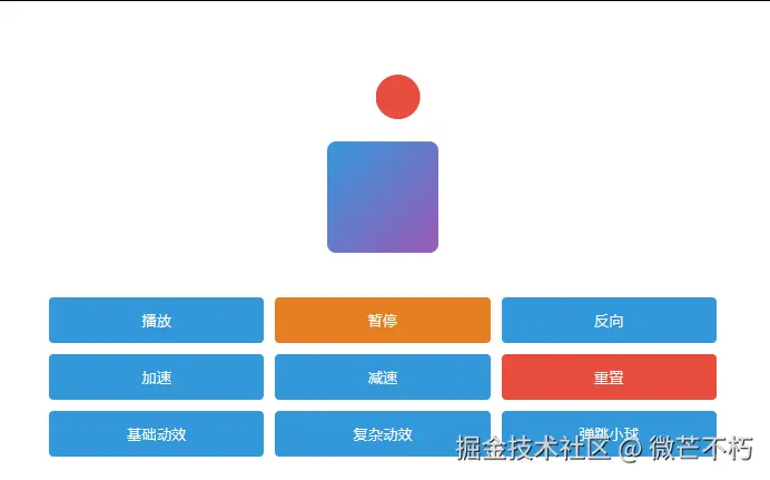
xml
<!DOCTYPE html>
<html>
<head>
  <style>
    .box {
      width: 100px;
      height: 100px;
      background: linear-gradient(135deg, #3498db, #9b59b6);
      border-radius: 8px;
      display: flex;
      justify-content: center;
      align-items: center;
      color: white;
      font-weight: bold;
      position: relative;
      will-change: transform, opacity;
      margin: 40px auto;
    }

    .ball {
      width: 40px;
      height: 40px;
      position: absolute;
      top: -60px;
      left: calc(50% - 20px);
      background: #e74c3c;
      border-radius: 50%;
      will-change: transform;
    }

    .controls {
      display: grid;
      grid-template-columns: repeat(3, 1fr);
      gap: 10px;
      max-width: 600px;
      margin: 20px auto;
    }

    button {
      padding: 12px;
      border: none;
      background: #3498db;
      color: white;
      border-radius: 4px;
      cursor: pointer;
      transition: background 0.2s;
    }

    button:hover {
      background: #2980b9;
    }

    button.pause {
      background: #e67e22;
    }

    button.reset {
      background: #e74c3c;
    }
  </style>
</head>
<body>
  <div class="box" id="animatedBox">
    Web Animations
    <div class="ball" id="ball"></div>
  </div>

  <div class="controls">
    <button id="play">播放</button>
    <button id="pause" class="pause">暂停</button>
    <button id="reverse">反向</button>
    <button id="speedUp">加速</button>
    <button id="slowDown">减速</button>
    <button id="reset" class="reset">重置</button>
    <button id="combo1">基础动效</button>
    <button id="combo2">复杂动效</button>
    <button id="combo3">弹跳小球</button>
  </div>

  <script>
    const box = document.getElementById('animatedBox');
    const ball = document.getElementById('ball');

    // 创建基础动画
    const boxAnimation = box.animate(
      [
        { transform: 'rotate(0deg)', boxShadow: '0 0 0 rgba(0,0,0,0.1)' },
        { transform: 'rotate(360deg)', boxShadow: '0 10px 20px rgba(0,0,0,0.3)' }
      ],
      {
        duration: 2000,
        iterations: Infinity,
        easing: 'ease-in-out'
      }
    );
    boxAnimation.pause();

    // 创建小球弹跳动画
    const ballAnimation = ball.animate(
      [
        { transform: 'translateY(0)' },
        { transform: 'translateY(100px)', offset: 0.3 },
        { transform: 'translateY(30px)', offset: 0.6 },
        { transform: 'translateY(80px)', offset: 0.8 },
        { transform: 'translateY(60px)', offset: 0.9 },
        { transform: 'translateY(70px)', offset: 1 }
      ],
      {
        duration: 1000,
        iterations: Infinity,
        direction: 'alternate'
      }
    );
    ballAnimation.pause();

    // 控制函数
    document.getElementById('play').addEventListener('click', () => {
      boxAnimation.play();
      ballAnimation.play();
    });

    document.getElementById('pause').addEventListener('click', () => {
      boxAnimation.pause();
      ballAnimation.pause();
    });

    document.getElementById('reverse').addEventListener('click', () => {
      boxAnimation.playbackRate *= -1;
      ballAnimation.playbackRate *= -1;
    });

    document.getElementById('speedUp').addEventListener('click', () => {
      boxAnimation.playbackRate *= 1.5;
      ballAnimation.playbackRate *= 1.5;
    });

    document.getElementById('slowDown').addEventListener('click', () => {
      boxAnimation.playbackRate *= 0.75;
      ballAnimation.playbackRate *= 0.75;
    });

    document.getElementById('reset').addEventListener('click', () => {
      boxAnimation.cancel();
      ballAnimation.cancel();
    });

    // 组合动画示例
    document.getElementById('combo1').addEventListener('click', () => {
      const colorAnimation = box.animate(
        [
          {background: 'linear-gradient(135deg, #3498db, #9b59b6)'},
          {background: 'linear-gradient(135deg, #9b59b6, #e74c3c)'}
        ],
        {duration: 1500, iterations: 2}
      );
    });

    document.getElementById('combo3').addEventListener('click', () => {
      // 创建小球路径动画
      const moveBall = ball.animate(
        [
          { transform: 'translateX(0)' },
          { transform: 'translateX(150px)' },
          { transform: 'translateX(0)' }
        ],
        {
          duration: 2000,
          easing: 'ease-in-out',
          iterations: Infinity
        }
      );
    });
  </script>
</body>
</html>
本指南展示了 Web Animation API 的强大功能,通过掌握这些技术,您可以创建高性能、流畅的 Web 动画体验。在线示例:[v0.kestrel-task.cn/11.html](https://link.juejin.cn?target=http%3A%2F%2Fv0.kestrel-task.cn%2F11.html "http://v0.kestrel-task.cn/11.html")