在网页开发中,表单元素的尺寸控制一直是前端工程师面临的一个细微却棘手的问题。2023 年,CSS 推出了 field-sizing 这一全新属性,目的是解决长期以来表单元素尺寸计算不一致的痛点。
想象这样一个场景:
用户在个人简介里敲下第一行字 → 输入框往下扩了一格;继续敲,继续扩;删除,又缩回去。整个过程没有滚动条、没有「右下角拖拽小三角」,也没有 setTimeout 去量 scrollHeight。
这就是本文的主角 ------ field-sizing: content。
1. 为什么「表单尺寸」成了历史难题?
1、规范层面的「固定思维」
- 在 CSS2 时代,<input>、<select> 被定义为 replaced element ------ 外观和尺寸由「用户代理」硬编码。
- CSS 只能改它「外壳」的 width/height,却永远无法像普通 <div> 那样让内容去撑开它。
2、开发者层面的「三段式」痛苦
- 先给元素一个「足够大」的固定高 / 列数;
- 用 JS 监听 input/scroll 事件,测量 scrollHeight;
- 同步回 style.height,还要处理换行、粘贴、删除、换字体、缩放等边界 case。
3、用户体验
- 文本被遮挡 → 用户以为「字数已上限」而提前结束输入;
- 出现双滚动条(外层页面 + 内层 textarea)→ 移动端极易误滑;
- 可拖拽小三角在 80% 网站里被 resize:none 干掉,用户失去最后自救手段。
field-sizing的出现就是来一次性把这三层难题打包带走。
2. 语法 & 计算模型
css
field-sizing: fixed | content;| 值 | 含义 | 应用于 |
|---|---|---|
| fixed | 默认,行为与今天完全一致 | input、textarea、select |
| content | 让内容决定元素自身尺寸 | input、textarea、select |
1、计算细节
- 对 inline-axis (宽度方向)
- input / select:行为等价于 width: max-content; min-width: 0;
- 对 block-axis (高度方向)
- textarea:行为等价于 height: max-content;但保留可换行逻辑;
- 元素仍然受 min/max-width/height、maxlength、rows 等「硬性」约束;
- 如果同时写了 width: 200px; field-sizing: content;,前者退化为 fallback ------ 在内容为空时保底,有内容时以内容为准。
2、和「内在尺寸」关键字的区别
- max-content | fit-content | min-content 只能让「块级盒子」跟随内容;
- field-sizing 则直接把表单元素本身变成了可伸缩的 inline-level replaced box,无需再包一层 div。
3. 用法
3.1 textarea
html
<!DOCTYPE html>
<html lang="zh-CN">
<head>
  <meta charset="UTF-8">
  <title>field-sizing 一句话示例</title>
  <style>
    textarea {
      field-sizing: content;
      /* 限制最小/最大尺寸,避免"消失"或"爆炸" */
      min-height: 2.5em;
      max-height: 10em;
      width: 100%;
      font-size: 1rem;
      padding: .5em;
      box-sizing: border-box;
      resize: none;
    }
  </style>
</head>
<body>
  <h3>输入框会自己"长高":</h3>
  <textarea placeholder="随便写几行,删几行......"></textarea>
  <!-- 没有一行 JavaScript!-->
</body>
</html>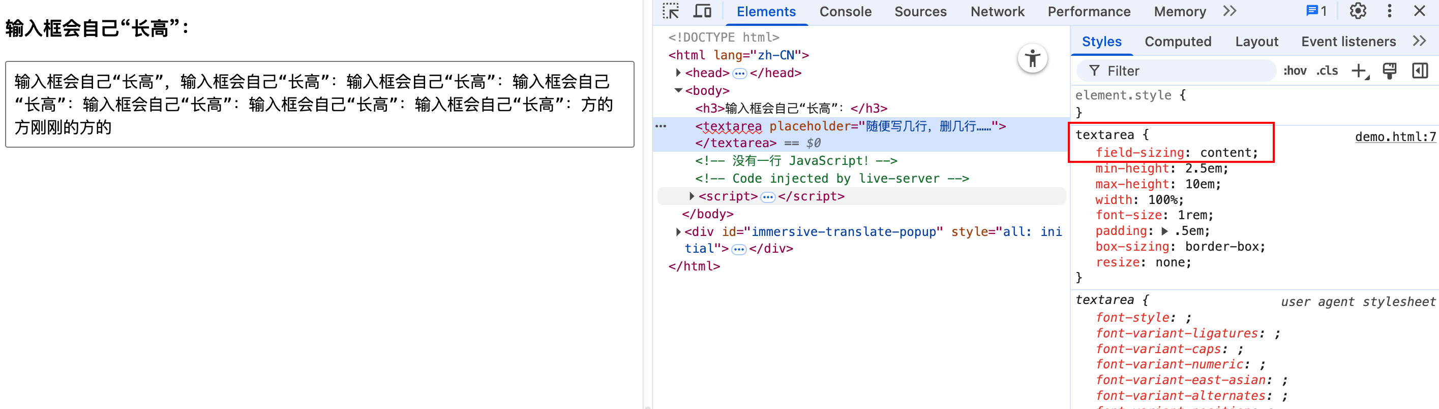
无需一行 JS,并关掉右下角拖拽,体验更明显。
3.2 input
html
<!DOCTYPE html>
<html lang="zh-CN">
<head>
  <meta charset="UTF-8">
  <title>搜索框示范</title>
  <style>
    /* 核心样式:让搜索框随内容变宽 */
    .search-input {
      field-sizing: content; /* 宽度 = 内容长度 */
      min-width: 8ch;
      max-width: 40ch;
      transition: max-width .3s ease;

      font-size: 1rem;
      padding: .4em .6em;
      border-radius: 4px;
      outline: none;
    }
    .search-input:focus {
      max-width: 60ch;
    }
    body {
      height: 100vh;
    }
  </style>
</head>
<body>
  <input class="search-input" placeholder="搜点什么...">
</body>
</html>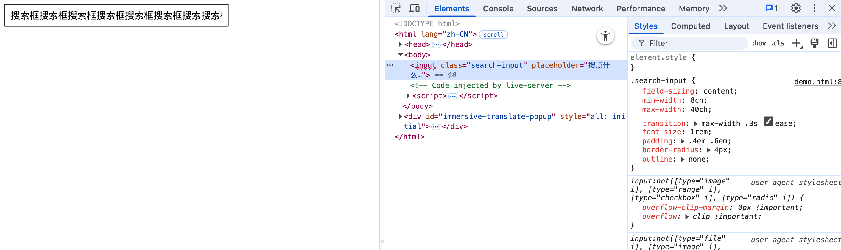
需要注意:
field-sizing: content 对 宽度 生效了,但 高度 并没有被"打开",<input> 天生是 单行盒子,浏览器只会横向继续排字,不会自动换行,于是出现横向滚动。
3.3 select
html
<!DOCTYPE html>
<html lang="zh-CN">
  <head>
    <meta charset="UTF-8" />
    <title>field-sizing</title>
    <style>
      /* === select 随选中项变宽 === */
      select {
        field-sizing: content; /* 宽度 = 当前选中项长度 */
        min-width: 6ch; /* 空态保底 */
        font-size: 1rem;
        padding: 0.3em 0.5em;
        border: 2px solid #3d7ed9;
        border-radius: 4px;
      }

      body {
        margin: 2rem;
        font-family: system-ui;
      }
      h2 {
        font-size: 1.2rem;
        margin-bottom: 0.5rem;
      }
    </style>
  </head>

  <body>
    <h2>动态 select:选谁就多宽</h2>
    <select>
      <option>短</option>
      <option>中等长度</option>
      <option>非常------------长的选项</option>
    </select>
  </body>
</html>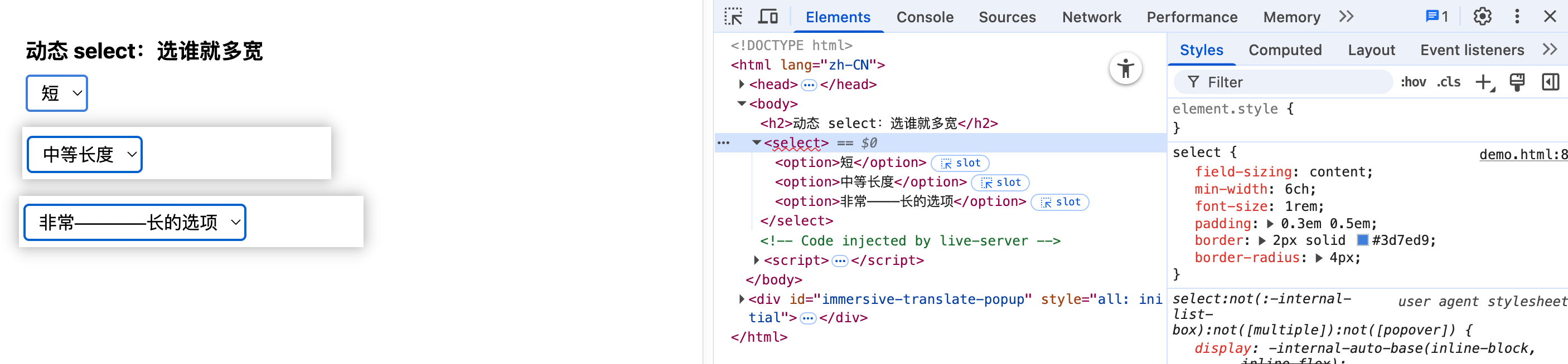
这个情况在 select 里面非常实用。
4. 渐进增强
- 检测失败 → 动态加载 2 KB 的 autosize.js 作为回退;
- 现代浏览器 → 省掉 300 行脚本, bundle 体积 -1.2 kB(gzip),First Input Delay -16%(内部 A/B)。
最后,一句话记住 field-sizing:
让表单元素像普通盒子一样"内容多长就多长",横竖都能伸缩,再也不用写 JS 量高度。