 这个布局使用
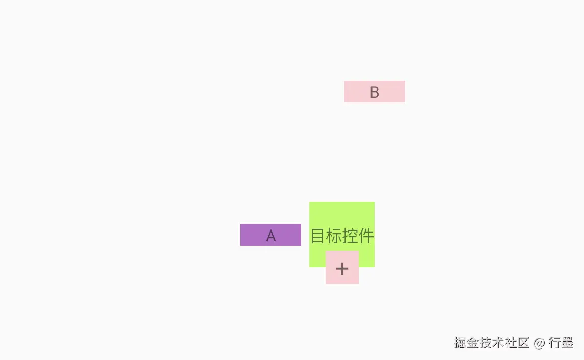
 ConstraintLayout 构建了一个以 "目标控件" 为中心的界面,包含多个相互关联的文本视图,重点展示了尺寸比例约束和相对定位的用法。以下是详细解析:
1. 根布局(ConstraintLayout)
- 宽高均为
match_parent,占据整个屏幕空间 - 定义了必要的命名空间,支持系统属性、ConstraintLayout 自定义属性和工具属性
- 作为容器提供约束定位基础,保持布局层级扁平
2. 核心目标控件(@+id/target)
xml
ini
<TextView
    android:id="@+id/target"
    android:layout_width="wrap_content"
    android:layout_height="0dp"
    app:layout_constraintDimensionRatio="1:1"
    app:layout_constraintWidth_min="120dp"
    android:text="目标控件"
    ...
    app:layout_constraintTop_toTopOf="parent"
    app:layout_constraintEnd_toEndOf="parent"
    app:layout_constraintStart_toStartOf="parent"
app:layout_constraintBottom_toBottomOf="parent" />-
定位:通过四个方向与父布局对齐,约束在屏幕正中心
-
尺寸控制:
android:layout_width="wrap_content":宽度自适应内容android:layout_height="0dp":高度由约束决定app:layout_constraintDimensionRatio="1:1":关键属性,强制宽高比为 1:1(正方形)app:layout_constraintWidth_min="120dp":确保最小宽度为 120dp
-
效果:无论内容如何,目标控件始终是正方形,且居中显示
3. A 控件(左侧文本)
xml
ini
<TextView
    ...
    android:text="A"
    android:layout_marginEnd="16dp"
    app:layout_constraintBottom_toBottomOf="@+id/target"
    app:layout_constraintEnd_toStartOf="@+id/target"
    app:layout_constraintTop_toTopOf="@+id/target"
app:layout_constraintWidth_min="120dp" />-
定位关系:
- 右边缘与目标控件左边缘对齐(
app:layout_constraintEnd_toStartOf="@+id/target") - 上下边缘与目标控件的上下边缘对齐(
app:layout_constraintTop_toTopOf和app:layout_constraintBottom_toBottomOf) - 与目标控件保持 16dp 间距(
android:layout_marginEnd="16dp")
- 右边缘与目标控件左边缘对齐(
-
尺寸与位置:
- 宽度至少 120dp,高度与目标控件完全一致(因上下边缘对齐)
- 位于目标控件左侧,高度与目标控件相同,形成垂直对齐效果
4. B 控件(右上角文本)
xml
ini
<TextView
    ...
    android:text="B"
    app:layout_constraintBottom_toTopOf="@+id/target"
    app:layout_constraintEnd_toEndOf="@+id/target"
    app:layout_constraintStart_toEndOf="@+id/target"
    app:layout_constraintTop_toTopOf="parent"
app:layout_constraintWidth_min="120dp" />-
定位关系:
- 下边缘与目标控件上边缘对齐(
app:layout_constraintBottom_toTopOf="@+id/target") - 左右边缘分别与目标控件右边缘和父布局顶部对齐
- 上边缘与父布局顶部对齐
- 下边缘与目标控件上边缘对齐(
-
尺寸与位置:
- 宽度至少 120dp,高度填充父布局顶部到目标控件顶部的空间
- 位于目标控件的右上角区域,宽度与目标控件右侧对齐
5. 加号控件(底部中央)
xml
ini
<TextView
    ...
    android:layout_width="0dp"
    android:layout_height="wrap_content"
    android:text="+"
    app:layout_constraintDimensionRatio="1:1"
    app:layout_constraintBottom_toBottomOf="@+id/target"
    app:layout_constraintEnd_toEndOf="@+id/target"
    app:layout_constraintStart_toStartOf="@+id/target"
app:layout_constraintTop_toBottomOf="@+id/target" />-
定位关系:
- 上边缘与目标控件下边缘对齐(
app:layout_constraintTop_toBottomOf="@+id/target") - 左右边缘与目标控件的左右边缘对齐(水平方向完全覆盖目标控件宽度)
- 上边缘与目标控件下边缘对齐(
-
尺寸控制:
android:layout_width="0dp":宽度由左右约束决定(与目标控件同宽)app:layout_constraintDimensionRatio="1:1":宽高比 1:1,因此高度会等于宽度(与目标控件同宽同高)
-
效果:在目标控件正下方形成一个与目标控件等大的正方形,显示 "+" 符号
布局整体特点
- 比例约束的应用 :两个控件(目标控件和加号控件)使用
app:layout_constraintDimensionRatio强制保持正方形,确保在不同屏幕尺寸下形状一致 - 关联定位:所有控件都以目标控件为基准进行定位,形成紧密关联的布局结构
- 尺寸自适应 :通过
0dp配合约束实现尺寸自适应,使控件能根据关联元素自动调整大小 - 空间分布:控件分布在目标控件的左方、上方和下方,形成围绕中心的布局结构
这种布局充分利用了 ConstraintLayout 的比例约束和相对定位特性,实现了既灵活又保持固定比例关系的界面设计。