经常做c端网页的朋友应该会经常遇到这种多段进度条的功能,类似
横向的进度条:


又或者,纵向的进度条:

等等类似的效果,这类进度条最难处理的便是:
- 每个ui效果可能都不太一样,不同的进度条可能需要重新封装一个全新的不同的组件
- 每一段进度展示的区间都不一样,不能简单的通过一个进度条计算出来,通常需要多个进度调进行复杂的计算;
- 复杂的表现形式,不同的进度条可能需要展示各种各样奇奇怪怪的位置显示不同的东西,导致很难写出一个统一的进度条组件去复用;
- 像这种横向的,纵向的其实功能是一致的,都是用于进度的表示,但仅仅是方向不同,但可能你需要重新写一个全新的组件去实现这种类似的功能
经过多个c端网页的捶打,博主也是对此类进度条进行的统一的封装处理,仅需一个组件,便能处理复杂的进度条需求,包括以下功能:
- 横向的进度条
- 纵向的进度条
- 上下左右内容插入
- 端点图标自定义
- 当前点悬浮内容插入
- 进度条过渡动画
- 动画结束监听
使用的时候仅需进行样式的编写就行, 像这种横向进度条, 关键html和css代码如下:
vue
<template>
    <MProgress class="progress" :data :cur="300" @progress-done="scrollToCenter">
        <template #cur>
            <div ref="curPointDom" class="cur">
              Hiện tại:111111111111
            </div>
        </template>

        <template #star="{ active }">
            <div class="star" :class="{ active }" />
        </template>

        <template #ctn2="{ data, active }">
            <div class="ctn2" :class="{ active }">
              {{ formatNumber(data.point) }}
            </div>
        </template>
    </MProgress>
</template>


<style lang='scss' scoped>
.progress {
    margin: 118px 0 104px;
    height: 16px;
    box-shadow: inset 0 0 0px 4px #9adfff;
    border-radius: 8px;

    .cur {
        position: relative;
        width: fit-content;
        height: 40px;
        line-height: 40px;
        padding: 0 18px;
        font-size: 20px;
        color: #53b5cc;
        background-color: #bdf2ff;
        border-radius: 10px;
        margin: 16px auto 0;

    &::after {
          content: '';
          position: absolute;
          bottom: 0;
          left: 0;
          right: 0;
          margin: auto;
          width: 10px;
          height: 10px;
          background-color: #bdf2ff;
          transform: rotate(45deg) translateY(50%);
        }
    }

    ::v-deep(.progressCur) {
        border-radius: 8px;
        background-color: #51d5ff;

        .progressCurAfter {
            bottom: 78px;
        }
    }

    // 自定义单段进度条的长度
    ::v-deep(.progressItem) {
        width: 166px;
        &:first-child {
          width: 0;
        }

        // 自定义内容插槽位置
        .progressSlot2 {
            top: 42px;
        }
    }

  // 自定义图标
    .star {
        width: 140px;
        height: 140px;
        filter: grayscale(1);
        background: url('../img/icon/icon-1.png') no-repeat center / contain;

        &.active {
            filter: grayscale(0);
        }
    }
    // 自定义插槽内容
    .ctn2 {
        width: fit-content;
        height: 40px;
        border-radius: 30px;
        background-color: #939393;
        line-height: 40px;
        color: #ffffff;
        font-size: 20px;
        padding: 0 24px;

        &.active {
          background-color: #20a5f2;
        }
    }
}
</style>
实现效果如下:

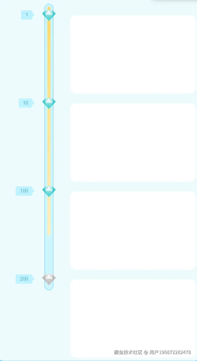
同样,长得完全不同的纵向进度条,代码量也仅仅只有样式代码不同,
vue
<template>
    <MProgress class="progress" :data :cur="150" show-last vertical>
        <template #star="{ active }">
            <div class="diamond" :class="{ active }" />
        </template>

        <template #ctn1="{ data }">
            <div class="ctn1">
                {{ data.point }}
            </div>
        </template>
        <template #ctn2="{ data }">
            // 插槽内容
            <div class="ctn2"></div>
        </template>
    </MProgress>
</template>


<style lang='scss' scoped>
.progress {
    margin: 40px 0 0 158px;
    width: 30px;
    border: 2px solid #9adfff;
    background-color: #cdf5ff;
    border-radius: 15px;
    padding: 8px;

    ::v-deep(.progressCur) {
        border-radius: 13px;
        background: linear-gradient(180deg, #ffd86b 0%, #fff0c1 100%);
    }
    ::v-deep(.progressItem) {
        height: 288px;
        flex-shrink: 0;

        &:first-child,
        &:last-child {
            height: 28px;
        }

        .progressSlot1 {
            right: 54px;
        }

        .progressSlot2 {
            width: 20px;
            height: 20px;
            left: 70px;
            top: 0;
            transform: translate(0, 0);
        }
    }

    .diamond {
        width: 46px;
        height: 38px;
        background: url('../img/icon/icon-diamond-gray.png') no-repeat center / contain;

        &.active {
            background-image: url('../img/icon/icon-diamond.png');
        }
    }

    .ctn1 {
        height: 32px;
        line-height: 32px;
        border-radius: 4px;
        background-color: #bdf2ff;
        padding: 0 14px;
        font-size: 16px;
        color: #53b5cc;

        &::after {
            content: '';
            position: absolute;
            right: 0;
            top: 0;
            bottom: 0;
            margin: auto;
            width: 12px;
            height: 12px;
            border-radius: 2px;
            background-color: #bdf2ff;
            transform: translate(50%) rotate(-45deg);
        }
    }

    .ctn2 {
        width: 412px;
        height: 258px;
        border-radius: 20px;
        background-color: #ffffff;
        padding-top: 10px;
    }
}
</style>
就能实现类似这样的效果:
源码如下
vue
<script setup lang='ts'>
interface ProgressItem {
  point: number
}

interface ProgressData {
  data: ProgressItem[]
  cur: number
  showLast?: boolean
  vertical?: boolean
}

const props = withDefaults(defineProps<ProgressData>(), {
  data: () => [],
  cur: 0,
  showLast: false,
  vertical: false,
})

const emits = defineEmits(['handlePoint', 'progressDone'])

const progressList = computed(() => props.data || [])

const progressItem = useTemplateRef<HTMLDivElement[]>('progressItem')

const lastItem = useTemplateRef<HTMLDivElement>('lastItem')

function handleTransitionEnd() {
  emits('progressDone')
}

// 计算进度条样式
function calculateProgressStyle() {
  // 如果当前值超过最大值点,直接返回100%
  if (props.cur > props.data[props.data.length - 1]?.point) {
    return props.vertical ? { height: '100%' } : { width: '100%' }
  }

  // 确定使用哪个尺寸属性
  const sizeProperty = props.vertical ? 'clientHeight' : 'clientWidth'

  // 计算总进度尺寸
  let totalSize = 0

  props.data.forEach((item, index) => {
    const prevPoint = props.data[index - 1]?.point || 0
    const segmentSize = progressItem.value?.[index]?.[sizeProperty] || 0

    if (props.cur >= item.point) {
      // 当前值已经超过这个节点,整个段都完成
      totalSize += segmentSize

      // 最后一段,需要判断是否显示空值段
      if (index === props.data.length - 1 && props.showLast) {
        const lastSize = lastItem.value?.[sizeProperty] || 0
        totalSize += lastSize
      }
    }
    else if (props.cur > prevPoint) {
      // 当前值在两个节点之间,计算部分进度
      const segmentRange = item.point - prevPoint
      const progressInSegment = props.cur - prevPoint
      totalSize += (progressInSegment / segmentRange) * segmentSize
    }
    // 其他情况(当前值还没到这个段)无需增加
  })

  // 返回对应方向的尺寸对象
  return props.vertical ? { height: `${totalSize}px` } : { width: `${totalSize}px` }
}

const progressStyle = ref<Record<string, any>>({})

watch(() => props.cur, async (val) => {
  await nextTick()

  if (val) {
    progressStyle.value = calculateProgressStyle()
  }
  else {
    handleTransitionEnd()
  }
}, { immediate: true })
</script>

<template>
  <div :class="`progress ${vertical ? 'progress-vertical' : 'progress-row'}`">
    <div class="progressCtn">
      <div class="progressCur" :style="progressStyle" @transitionend="handleTransitionEnd">
        <!-- 当前进度位置插槽 -->
        <div class="progressCurAfter">
          <slot name="cur" />
        </div>
      </div>
      <div class="progressList">
        <div
          v-for="(item, index) in progressList" :key="index"
          ref="progressItem"
          class="progressItem"
        >
          <!-- 进度点 -->
          <div class="progressStar" :class="{ highlight: cur >= item?.point }" @click="emits('handlePoint', index)">
            <!-- 星星 -->
            <div class="star">
              <slot name="star" :active="cur >= item.point" />
            </div>

            <!-- 进度点上方插槽 -->
            <div class="progressSlot1">
              <slot name="ctn1" :data="item" :active="cur >= item.point" />
            </div>

            <!-- 进度点下方插槽 -->
            <div class="progressSlot2">
              <slot name="ctn2" :data="item" :active="cur >= item.point" />
            </div>
          </div>
        </div>
        <div v-if="showLast" ref="lastItem" class="progressItem lastItem" />
      </div>
    </div>
  </div>
</template>

<style lang="scss" scoped>
.progress {
  text-align: center;
  white-space: nowrap;

  .progressCtn {
    position: relative;
    width: 100%;
    height: 100%;
  }

  .progressCur {
    position: absolute;
    left: 0;
    top: 0;
    background-color: yellow;
    transition: all 0.5s ease-in-out;
  }

  .progressList {
    width: 100%;
    height: 100%;
  }

  .progressStar {
    position: absolute;

    .star {
      position: absolute;
      left: 0;
      top: 0;
      transform: translate(-50%, -50%);
    }
  }

  .progressSlot1,
  .progressSlot2,
  .progressCurAfter {
    position: absolute;
  }

  &-row {
    width: fit-content;
    height: 18px;
    background: #baf6ff;

    .progressCur {
      width: 0;
      height: 100%;
    }

    .progressCurAfter {
      bottom: 46px;
      right: 0;
      transform: translate(50%, 0);
    }

    .progressList {
      width: 100%;
      display: flex;
      align-items: center;
    }

    .progressItem {
      position: relative;
      width: 188px;
      height: 100%;

      &:first-child,
      &.lastItem {
        width: 28px;
      }
    }

    .progressStar {
      right: 0;
      top: 50%;
      transform: translate(50%, -50%);
    }

    .progressSlot1 {
      bottom: 46px;
      left: 50%;
      transform: translate(-50%, 0);
    }

    .progressSlot2 {
      top: 46px;
      left: 50%;
      transform: translate(-50%, 0);
    }
  }

  &-vertical {
    position: relative;
    width: 18px;
    height: fit-content;
    background: #baf6ff;

    .progressCur {
      width: 100%;
      height: 0;
    }

    .progressList {
      height: 100%;
      display: flex;
      align-items: center;
      flex-direction: column;
    }

    .progressItem {
      position: relative;
      width: 100%;
      height: 188px;

      &:first-child,
      &:last-child {
        height: 28px;
      }
    }

    .progressStar {
      left: 50%;
      bottom: 0;
      transform: translate(-50%, 50%);
    }

    .progressSlot1 {
      right: 46px;
      top: 50%;
      transform: translate(0, -50%);
    }

    .progressSlot2 {
      left: 46px;
      top: 50%;
      transform: translate(0, -50%);
    }
  }
}
</style>
有什么不足的或者可扩展的点,欢迎留言~