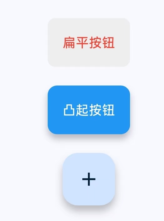
常见的三种按钮
TextButton扁平按钮
ElevatedButton凸起按钮
FloatingActionButton悬浮按钮
实现的效果图
常见的属性
Dart
children: [
SizedBox(height: 20), // 间距控制
// 1. 扁平按钮
TextButton(
onPressed: () => print('TextButton点击'),//点击回调
//按钮风格设置
style: TextButton.styleFrom(
foregroundColor: Colors.red,//文字/图标颜色
backgroundColor: Colors.grey[200],//背景色
padding: EdgeInsets.all(16),//内边距
shape: RoundedRectangleBorder( // 形状
borderRadius: BorderRadius.circular(8),
),
),
//按钮内容
child: Text('扁平按钮'),
),
SizedBox(height: 20), // 间距控制
// 2. 凸起按钮
ElevatedButton(
onPressed: () => print('ElevatedButton点击'),
style: ElevatedButton.styleFrom(
backgroundColor: Colors.blue, // 背景色
foregroundColor: Colors.white, // 文字颜色
elevation: 5, // 阴影高度
minimumSize: Size(20, 50), // 最小尺寸
padding: EdgeInsets.all(16), // 内边距
shape: RoundedRectangleBorder( // 形状
borderRadius: BorderRadius.circular(10),
),
),
child: Text('凸起按钮'),
),
SizedBox(height: 20),
// 3. 悬浮按钮
FloatingActionButton(
onPressed: () => print('FAB点击'),
child: Icon(Icons.add),
),
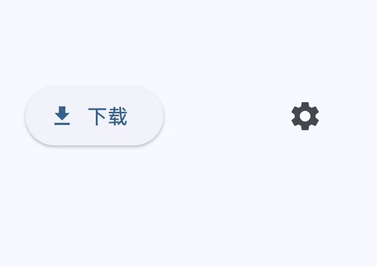
],带图标的按钮
效果图
详细代码
Dart
//带图标的按钮
child: Row(
            mainAxisAlignment: MainAxisAlignment.spaceEvenly,
            children: [
              // 图标+文字按钮
              ElevatedButton.icon(
                onPressed: () {},
                icon: Icon(Icons.download),
                label: Text('下载'),
              ),

              // 纯图标按钮
              IconButton(
                onPressed: () => print('图标按钮点击'),
                icon: Icon(Icons.settings),
                tooltip: '设置', // 长按提示
              ),
            ],
          ),
代码实例
main.dart
Dart
import 'dart:io';

import 'package:flutter/material.dart'; //导入Material设计组件库

void main() {
  runApp(const MyApp()); //应用入口
}

class MyApp extends StatelessWidget { //应用根目录 (StatelessWidget不可变UI)

  const MyApp({super.key});//默认构造函数

  @override
  Widget build(BuildContext context) {
    return MaterialApp(
      title: 'Flutter Demo', //应用标题(显示在任务管理器)
      theme: ThemeData(   //全局主题配置
        //colorScheme:自动生成的配色方案,textTheme:预定义的文字样式
        colorScheme: ColorScheme.fromSeed(seedColor: Colors.blue),
      ),
      //首页,应用的第一个页面
      home: const MyHomePage(title: 'Flutter Demo Home Page'),//构造MyHomePage传入标题

    );
  }
}

class MyHomePage extends StatefulWidget { //主页(有状态),(StatefulWidget可变UI)

  //构造函数
  const MyHomePage({super.key, required this.title});//接收title参数,required表示强制必须传递该参数

  final String title; //存储通过构造函数传入的标题

  @override
  State<MyHomePage> createState() => _MyHomePageState();
}

class _MyHomePageState extends State<MyHomePage> { //主页状态管理


  @override
  Widget build(BuildContext context) {
    return Scaffold( //页面骨架

      appBar: AppBar(//顶部应用栏组件
        //将AppBar的背景色设置为当前主题的反转主色
        backgroundColor: Theme.of(context).colorScheme.inversePrimary,

        title: Text(widget.title),//使用传入的标题
      ),

      body: Center(//居中布局
        child: Column( //垂直排列子组件
          //mainAxisAlignment: MainAxisAlignment.center,
          children: [

            SizedBox(height: 20), // 间距控制

            // 1. 扁平按钮
            TextButton(
              onPressed: () => print('TextButton点击'),//点击回调
              //按钮风格设置
              style: TextButton.styleFrom(
                foregroundColor: Colors.red,//文字/图标颜色
                backgroundColor: Colors.grey[200],//背景色
                padding: EdgeInsets.all(16),//内边距
                shape: RoundedRectangleBorder( // 形状
                  borderRadius: BorderRadius.circular(8),
                ),
              ),
              //按钮内容
              child: Text('扁平按钮'),
            ),

            SizedBox(height: 20), // 间距控制

            // 2. 凸起按钮
            ElevatedButton(
              onPressed: () => print('ElevatedButton点击'),

              style: ElevatedButton.styleFrom(
                backgroundColor: Colors.blue, // 背景色
                foregroundColor: Colors.white, // 文字颜色
                elevation: 5, // 阴影高度
                minimumSize: Size(20, 50),       // 最小尺寸
                padding: EdgeInsets.all(16),       // 内边距
                shape: RoundedRectangleBorder(     // 形状
                  borderRadius: BorderRadius.circular(10),
                ),
              ),

              child: Text('凸起按钮'),
            ),

            SizedBox(height: 20),

            // 3. 悬浮按钮
            FloatingActionButton(
              onPressed: () => print('FAB点击'),
              child: Icon(Icons.add),
            ),


          ],
        ),
      ),

    );
  }
}