Flutter常用布局
1. 引言:为什么布局系统如此重要?
比方说你要装修一间房子:你需要规划每个房间的位置、大小,考虑家具的摆放,确保空间利用合理且美观。Flutter的布局系统就是你在数字世界中的"室内设计师",它决定了每个UI元素的位置、大小和相互关系。
一个好的布局应该具备:
- 精确的元素定位
- 兼容自适应屏幕
- 渲染性能高效
- 视觉层次美观
今天就带你详细介绍Flutter的常用布局,让你熟练掌握布局系统~~~
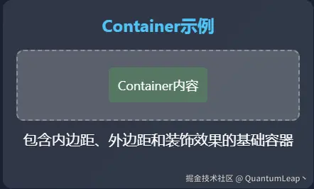
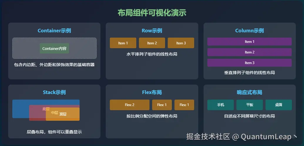
2. Container:万能的布局容器
它是最基础也是最强大的布局组件之一。
2.1 Container的基本用法
dart
Container(
  width: 200,                    // 设置宽度
  height: 100,                   // 设置高度
  color: Colors.blue,            // 背景颜色
  child: Text('Hello Flutter'),  // 子组件
)
这就像给文字套上了一个蓝色的相框,简单直接。
2.2 Container的装饰功能
但Container的真正威力在于它的装饰能力:
dart
Container(
  width: 200,
  height: 100,
  decoration: BoxDecoration(
    color: Colors.white,                     // 背景色
    borderRadius: BorderRadius.circular(16), // 圆角
    boxShadow: [                             // 阴影
      BoxShadow(
        color: Colors.black12,
        blurRadius: 10,
        offset: Offset(0, 4),
      ),
    ],
    border: Border.all(                    // 边框
      color: Colors.blue,
      width: 2,
    ),
    gradient: LinearGradient(              // 渐变背景
      colors: [Colors.blue, Colors.purple],
      begin: Alignment.topLeft,
      end: Alignment.bottomRight,
    ),
  ),
  child: Center(
    child: Text(
      '精美的容器',
      style: TextStyle(
        color: Colors.white,
        fontWeight: FontWeight.bold,
      ),
    ),
  ),
)
Container的核心属性:
width/height:控制尺寸margin:外边距,与其他组件的距离padding:内边距,内容与边框的距离decoration:装饰效果(颜色、边框、阴影等)constraints:尺寸约束
2.3 实际应用场景
下面以具体的实际开发场景为例,带大家深入了解Container组件
场景1:用户头像容器
dart
Container(
  width: 80,
  height: 80,
  decoration: BoxDecoration(
    color: Colors.grey[200],
    borderRadius: BorderRadius.circular(40), // 圆形
    border: Border.all(color: Colors.blue, width: 2),
    image: DecorationImage(
      image: NetworkImage('https://example.com/avatar.jpg'),
      fit: BoxFit.cover,
    ),
  ),
)
场景2:消息气泡
dart
Container(
  constraints: BoxConstraints(
    maxWidth: 250,  // 最大宽度限制
  ),
  padding: EdgeInsets.all(12),
  decoration: BoxDecoration(
    color: Colors.blue[50],
    borderRadius: BorderRadius.only(
      topLeft: Radius.circular(16),
      topRight: Radius.circular(16),
      bottomRight: Radius.circular(4),
    ),
  ),
  child: Text('这是一条消息内容'),
)
3. Padding和Margin
Padding和Margin就像人与人之间的安全距离,它们控制着组件之间的空间关系,但作用对象不同。
3.1 Padding:内部空间
Padding是组件内容与边框之间的距离,好比相框与照片之间的留白:
dart
Container(
  color: Colors.blue,
  child: Padding(
    padding: EdgeInsets.all(16),  // 四周都留16像素的空白
    child: Text(
      '有呼吸空间的文字',
      style: TextStyle(color: Colors.white),
    ),
  ),
)
EdgeInsets的四种用法:
dart
// 1. 统一间距
EdgeInsets.all(16)

// 2. 分别设置上下左右
EdgeInsets.fromLTRB(10, 20, 10, 20)

// 3. 设置水平和垂直
EdgeInsets.symmetric(horizontal: 10, vertical: 20)

// 4. 只设置一边
EdgeInsets.only(left: 10, top: 5)
3.2 Margin:外部安全距离
Margin是组件与其他组件之间的距离,就像两个人谈话时的舒适距离:
dart
Container(
  width: 100,
  height: 100,
  color: Colors.red,
  margin: EdgeInsets.all(20),  // 四周都保持20像素的距离
  child: Text('我有外边距'),
)
3.3 实际应用:卡片布局
dart
Container(
margin: EdgeInsets.all(16), // 卡片与其他组件的距离
padding: EdgeInsets.all(20), // 卡片内容与边框的距离
decoration: BoxDecoration(
color: Colors.white,
borderRadius: BorderRadius.circular(12),
boxShadow: [
BoxShadow(
color: Colors.black12,
blurRadius: 8,
),
],
),
child: Column(
crossAxisAlignment: CrossAxisAlignment.start,
children: [
Text(
'产品标题',
style: TextStyle(
fontSize: 18,
fontWeight: FontWeight.bold,
),
),
SizedBox(height: 8), // 文字之间的间距
Text('产品描述信息...'),
],
),
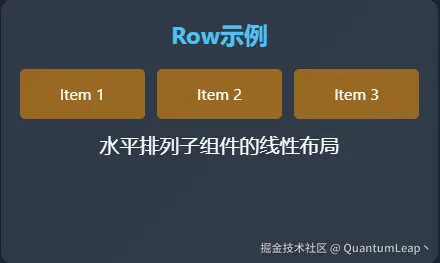
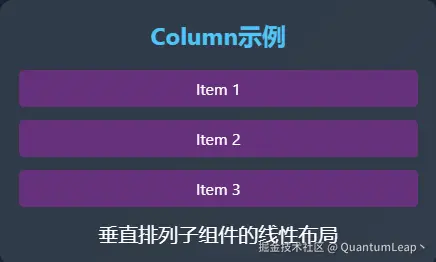
)4. Row和Column:线性布局
Row是横向布局,Column是竖向布局。它们让组件按照线性方式排列,是使用频率最高的布局组件。
4.1 Row:水平排列
Row让子组件水平排列,就像我们生活中排队买票的人群:
dart
Row(
  children: [
    Icon(Icons.star, color: Colors.orange),
    Icon(Icons.star, color: Colors.orange),
    Icon(Icons.star, color: Colors.orange),
    Icon(Icons.star_border, color: Colors.grey),
    Icon(Icons.star_border, color: Colors.grey),
  ],
)
Row的核心属性:
mainAxisAlignment:主轴对齐方式(水平方向)crossAxisAlignment:交叉轴对齐方式(垂直方向)mainAxisSize:主轴尺寸
4.2 主轴对齐方式
dart
Row(
  mainAxisAlignment: MainAxisAlignment.spaceBetween, // 两端对齐,均匀分布
  children: [
    Container(width: 50, height: 50, color: Colors.red),
    Container(width: 50, height: 50, color: Colors.green),
    Container(width: 50, height: 50, color: Colors.blue),
  ],
)
MainAxisAlignment的选项:
start:左对齐end:右对齐center:居中对齐spaceBetween:两端对齐,组件间隔相等spaceAround:每个组件两侧间隔相等spaceEvenly:组件间隔与边框间隔都相等
4.3 Column:垂直排列
Column让子组件垂直排列,就像叠放的一摞书籍:
dart
Column(
  crossAxisAlignment: CrossAxisAlignment.start, // 左对齐
  children: [
    Text('标题', style: TextStyle(fontSize: 24, fontWeight: FontWeight.bold)),
    SizedBox(height: 8),
    Text('副标题', style: TextStyle(fontSize: 16, color: Colors.grey)),
    SizedBox(height: 16),
    Text('内容描述...'),
  ],
)
4.4 实际应用:用户信息卡片
dart
Row(
children: [
// 头像
Container(
width: 60,
height: 60,
decoration: BoxDecoration(
color: Colors.grey[300],
borderRadius: BorderRadius.circular(30),
),
child: Icon(Icons.person, size: 30, color: Colors.grey[600]),
),
// 间距
SizedBox(width: 16),
// 用户信息
Expanded( // 占据剩余空间
child: Column(
crossAxisAlignment: CrossAxisAlignment.start,
children: [
Text('张小明', style: TextStyle(fontSize: 18, fontWeight: FontWeight.bold)),
SizedBox(height: 4),
Text('高级用户体验设计师', style: TextStyle(color: Colors.grey[600])),
SizedBox(height: 4),
Text('2小时前在线', style: TextStyle(color: Colors.green, fontSize: 12)),
],
),
),
// 右侧图标
Icon(Icons.chevron_right, color: Colors.grey[400]),
],
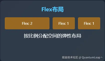
)5. Flex和Expanded:弹性布局
举个例子:Flex和Expanded就像弹簧和橡皮筋,它们让布局具有弹性,能够根据可用空间自动调整。
5.1 Flex布局基础
Flex是Row和Column的父类,提供了更灵活的布局方式:
dart
Flex(
  direction: Axis.horizontal,  // 水平排列,相当于Row
  children: [
    // 子组件
  ],
)
5.2 Expanded:占据剩余空间
Expanded让子组件占据剩余空间,就像弹簧可以拉伸:
dart
Row(
  children: [
    Container(
      width: 80,
      height: 50,
      color: Colors.red,
    ),
    Expanded(  // 占据剩余的所有水平空间
      child: Container(
        height: 50,
        color: Colors.blue,
        child: Center(child: Text('弹性区域')),
      ),
    ),
  ],
)
5.3 Flexible:尺寸控制
Flexible提供更精细的弹性控制:
dart
Row(
  children: [
    Flexible(
      flex: 1,  // 权重为1
      child: Container(height: 50, color: Colors.red),
    ),
    Flexible(
      flex: 2,  // 权重为2,占据两倍的空间
      child: Container(height: 50, color: Colors.green),
    ),
    Flexible(
      flex: 1,  // 权重为1
      child: Container(height: 50, color: Colors.blue),
    ),
  ],
)
Flexible vs Expanded:
- Expanded是Flexible(fit: FlexFit.tight)的简写
- Flexible默认是FlexFit.loose,子组件可以选择不填满空间
- Expanded强制子组件填满空间
5.4 实际应用:比例布局
dart
Column(
  children: [
    // 标题栏
    Container(
      height: 60,
      color: Colors.blue,
      child: Center(child: Text('仪表盘', style: TextStyle(color: Colors.white))),
    ),

    // 内容区域(占据剩余空间)
    Expanded(
      child: Row(
        children: [
          // 侧边栏(固定宽度)
          Container(
            width: 200,
            color: Colors.grey[100],
            child: ListView(
              children: [
                ListTile(title: Text('菜单项1')),
                ListTile(title: Text('菜单项2')),
                ListTile(title: Text('菜单项3')),
              ],
            ),
          ),

          // 主内容区(占据剩余空间)
          Expanded(
            child: Container(
              color: Colors.white,
              child: Center(child: Text('主内容区域')),
            ),
          ),
        ],
      ),
    ),

    // 底部栏
    Container(
      height: 50,
      color: Colors.grey[800],
      child: Center(child: Text('版权所有 © 2024', style: TextStyle(color: Colors.white))),
    ),
  ],
)
6. Stack:层叠布局
Stack好比透明的幻灯片 ,可以让多个组件重叠在一起,组合出丰富的页面视觉效果。
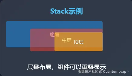
6.1 Stack基础用法
dart
Stack(
  children: [
    // 底层背景
    Container(
      width: 200,
      height: 200,
      color: Colors.blue,
    ),

    // 中间层
    Positioned(
      top: 20,
      left: 20,
      child: Container(
        width: 100,
        height: 100,
        color: Colors.red,
      ),
    ),

    // 顶层
    Positioned(
      bottom: 20,
      right: 20,
      child: Container(
        width: 80,
        height: 80,
        color: Colors.green,
      ),
    ),
  ],
)
6.2 Positioned:精确定位
Positioned用于在Stack中精确定位子组件:
dart
Positioned(
  top: 10,      // 距离顶部10像素
  left: 20,     // 距离左边20像素
  right: 30,    // 距离右边30像素
  bottom: 40,   // 距离底部40像素
  child: Container(color: Colors.orange),
)
6.3 Alignment:相对定位
除了Positioned,还可以使用Alignment进行相对定位:
dart
Stack(
  alignment: Alignment.center,  // 所有子组件默认居中对齐
  children: [
    Container(width: 200, height: 200, color: Colors.blue),
    Container(
      width: 100,
      height: 100,
      color: Colors.red,
    ),
    Align(  // 单独设置对齐方式
      alignment: Alignment.bottomRight,
      child: Container(
        width: 50,
        height: 50,
        color: Colors.green,
      ),
    ),
  ],
)
6.4 实际应用:用户头像徽章
dart
Stack(
  children: [
    // 用户头像
    Container(
      width: 80,
      height: 80,
      decoration: BoxDecoration(
        color: Colors.grey[300],
        borderRadius: BorderRadius.circular(40),
      ),
      child: Icon(Icons.person, size: 40, color: Colors.grey[600]),
    ),

    // 在线状态指示器
    Positioned(
      bottom: 0,
      right: 0,
      child: Container(
        width: 20,
        height: 20,
        decoration: BoxDecoration(
          color: Colors.green,
          borderRadius: BorderRadius.circular(10),
          border: Border.all(color: Colors.white, width: 2),
        ),
      ),
    ),

    // VIP徽章
    Positioned(
      top: 0,
      right: 0,
      child: Container(
        padding: EdgeInsets.all(4),
        decoration: BoxDecoration(
          color: Colors.orange,
          borderRadius: BorderRadius.circular(8),
        ),
        child: Text(
          'VIP',
          style: TextStyle(
            color: Colors.white,
            fontSize: 10,
            fontWeight: FontWeight.bold,
          ),
        ),
      ),
    ),
  ],
)
7. 响应式布局设计:适配各种屏幕
响应式布局能够根据不同的屏幕尺寸自动调整布局,提升用户体验。
7.1 MediaQuery:获取屏幕信息
MediaQuery可以获取屏幕尺寸、方向等信息:
dart
class ResponsiveLayout extends StatelessWidget {
  @override
  Widget build(BuildContext context) {
    // 获取屏幕尺寸
    final screenWidth = MediaQuery.of(context).size.width;
    final screenHeight = MediaQuery.of(context).size.height;

    // 判断屏幕方向
    final isPortrait = MediaQuery.of(context).orientation == Orientation.portrait;

    return Container(
      width: screenWidth,
      height: screenHeight,
      color: Colors.grey[200],
      child: Center(
        child: Text(
          '屏幕尺寸: ${screenWidth.toInt()} × ${screenHeight.toInt()}\n'
          '方向: ${isPortrait ? '竖屏' : '横屏'}',
          textAlign: TextAlign.center,
        ),
      ),
    );
  }
}
7.2 LayoutBuilder:根据约束调整布局
LayoutBuilder可以根据父组件的约束动态调整布局:
dart
LayoutBuilder(
  builder: (context, constraints) {
    // 根据可用宽度决定布局方式
    if (constraints.maxWidth > 600) {
      // 宽屏布局
      return Row(
        children: [
          Container(width: 200, color: Colors.blue, child: Text('侧边栏')),
          Expanded(child: Container(color: Colors.green, child: Text('主内容'))),
        ],
      );
    } else {
      // 窄屏布局
      return Column(
        children: [
          Container(height: 100, color: Colors.blue, child: Text('顶部导航')),
          Expanded(child: Container(color: Colors.green, child: Text('主内容'))),
        ],
      );
    }
  },
)
7.3 实际应用:响应式仪表盘
dart
class ResponsiveDashboard extends StatelessWidget {
  @override
  Widget build(BuildContext context) {
    return Scaffold(
      appBar: AppBar(title: Text('响应式仪表盘')),
      body: LayoutBuilder(
        builder: (context, constraints) {
          final isWideScreen = constraints.maxWidth > 768;

          return Row(
            children: [
              // 侧边栏(在宽屏显示,窄屏隐藏)
              if (isWideScreen)
                Container(
                  width: 250,
                  color: Colors.grey[100],
                  child: ListView(
                    children: [
                      ListTile(title: Text('仪表盘')),
                      ListTile(title: Text('用户管理')),
                      ListTile(title: Text('数据分析')),
                      ListTile(title: Text('系统设置')),
                    ],
                  ),
                ),

              // 主内容区域
              Expanded(
                child: Container(
                  padding: EdgeInsets.all(16),
                  child: GridView.count(
                    // 根据屏幕宽度调整列数
                    crossAxisCount: isWideScreen ? 3 : 2,
                    crossAxisSpacing: 16,
                    mainAxisSpacing: 16,
                    children: [
                      _buildStatCard('用户数', '1,234', Colors.blue),
                      _buildStatCard('订单数', '567', Colors.green),
                      _buildStatCard('收入', '\$8,901', Colors.orange),
                      _buildStatCard('增长率', '12.3%', Colors.purple),
                      _buildStatCard('满意度', '98%', Colors.red),
                      _buildStatCard('活跃度', '87%', Colors.teal),
                    ],
                  ),
                ),
              ),
            ],
          );
        },
      ),

      // 窄屏时显示底部导航
      bottomNavigationBar: constraints.maxWidth <= 768 ? BottomNavigationBar(
        items: [
          BottomNavigationBarItem(icon: Icon(Icons.dashboard), label: '首页'),
          BottomNavigationBarItem(icon: Icon(Icons.people), label: '用户'),
          BottomNavigationBarItem(icon: Icon(Icons.settings), label: '设置'),
        ],
      ) : null,
    );
  }

  Widget _buildStatCard(String title, String value, Color color) {
    return Container(
      decoration: BoxDecoration(
        color: Colors.white,
        borderRadius: BorderRadius.circular(12),
        boxShadow: [
          BoxShadow(
            color: Colors.black12,
            blurRadius: 6,
            offset: Offset(0, 2),
          ),
        ],
      ),
      child: Column(
        mainAxisAlignment: MainAxisAlignment.center,
        children: [
          Text(
            value,
            style: TextStyle(
              fontSize: 24,
              fontWeight: FontWeight.bold,
              color: color,
            ),
          ),
          SizedBox(height: 8),
          Text(
            title,
            style: TextStyle(
              color: Colors.grey[600],
            ),
          ),
        ],
      ),
    );
  }
}
8. 实战案例:用户资料卡片页面
让我们把所有知识融合起来,创建一个完整的用户资料卡片:
dart
class UserProfileCard extends StatelessWidget {
  @override
  Widget build(BuildContext context) {
    return Container(
      margin: EdgeInsets.all(16),
      padding: EdgeInsets.all(20),
      decoration: BoxDecoration(
        color: Colors.white,
        borderRadius: BorderRadius.circular(16),
        boxShadow: [
          BoxShadow(
            color: Colors.black12,
            blurRadius: 10,
            offset: Offset(0, 4),
          ),
        ],
      ),
      child: Column(
        children: [
          // 头部:头像和基本信息
          Row(
            children: [
              // 头像区域(带徽章)
              Stack(
                children: [
                  Container(
                    width: 80,
                    height: 80,
                    decoration: BoxDecoration(
                      color: Colors.blue[100],
                      borderRadius: BorderRadius.circular(40),
                      image: DecorationImage(
                        image: NetworkImage('https://example.com/avatar.jpg'),
                        fit: BoxFit.cover,
                      ),
                    ),
                  ),
                  // 在线状态
                  Positioned(
                    bottom: 0,
                    right: 0,
                    child: Container(
                      width: 20,
                      height: 20,
                      decoration: BoxDecoration(
                        color: Colors.green,
                        borderRadius: BorderRadius.circular(10),
                        border: Border.all(color: Colors.white, width: 2),
                      ),
                    ),
                  ),
                ],
              ),

              // 间距
              SizedBox(width: 16),

              // 用户信息
              Expanded(
                child: Column(
                  crossAxisAlignment: CrossAxisAlignment.start,
                  children: [
                    Text(
                      '张小明',
                      style: TextStyle(
                        fontSize: 20,
                        fontWeight: FontWeight.bold,
                      ),
                    ),
                    SizedBox(height: 4),
                    Text(
                      '高级用户体验设计师',
                      style: TextStyle(
                        color: Colors.grey[600],
                      ),
                    ),
                    SizedBox(height: 8),
                    Row(
                      children: [
                        Icon(Icons.location_on, size: 16, color: Colors.grey),
                        SizedBox(width: 4),
                        Text(
                          '北京市海淀区',
                          style: TextStyle(fontSize: 12, color: Colors.grey),
                        ),
                      ],
                    ),
                  ],
                ),
              ),

              // 更多操作按钮
              IconButton(
                icon: Icon(Icons.more_vert, color: Colors.grey),
                onPressed: () {},
              ),
            ],
          ),

          // 分隔线
          Padding(
            padding: EdgeInsets.symmetric(vertical: 16),
            child: Divider(height: 1, color: Colors.grey[300]),
          ),

          // 统计信息
          Row(
            mainAxisAlignment: MainAxisAlignment.spaceAround,
            children: [
              _buildStatItem('关注', '234'),
              _buildStatItem('粉丝', '1.2k'),
              _buildStatItem('作品', '56'),
              _buildStatItem('点赞', '3.4k'),
            ],
          ),

          // 分隔线
          Padding(
            padding: EdgeInsets.symmetric(vertical: 16),
            child: Divider(height: 1, color: Colors.grey[300]),
          ),

          // 操作按钮
          Row(
            children: [
              Expanded(
                child: ElevatedButton(
                  onPressed: () {},
                  style: ElevatedButton.styleFrom(
                    backgroundColor: Colors.blue,
                    foregroundColor: Colors.white,
                  ),
                  child: Text('关注'),
                ),
              ),
              SizedBox(width: 12),
              Expanded(
                child: OutlinedButton(
                  onPressed: () {},
                  child: Text('发消息'),
                ),
              ),
            ],
          ),
        ],
      ),
    );
  }

  Widget _buildStatItem(String label, String value) {
    return Column(
      children: [
        Text(
          value,
          style: TextStyle(
            fontSize: 16,
            fontWeight: FontWeight.bold,
          ),
        ),
        SizedBox(height: 4),
        Text(
          label,
          style: TextStyle(
            fontSize: 12,
            color: Colors.grey[600],
          ),
        ),
      ],
    );
  }
}
9. 性能优化与最佳实践
9.1 布局性能优化
-
避免过度嵌套:
dart// ❌ 不好的做法:过度嵌套 Container( child: Padding( padding: EdgeInsets.all(10), child: Container( child: Center( child: Text('Hello'), ), ), ), ) // ✅ 好的做法:使用Container的padding属性 Container( padding: EdgeInsets.all(10), child: Center( child: Text('Hello'), ), ) -
使用const构造函数:
dart// ✅ 好的做法:使用const const Text('静态文本') // ❌ 不好的做法:不使用const Text('静态文本')
9.2 代码优化
-
提取重复布局:
dart// 提取为独立组件 Widget _buildListItem(String title, String subtitle) { return ListTile( title: Text(title), subtitle: Text(subtitle), trailing: Icon(Icons.chevron_right), ); } -
使用扩展方法:
dartextension PaddingExtension on Widget { Widget withPadding(EdgeInsets padding) { return Padding(padding: padding, child: this); } } // 使用 Text('Hello').withPadding(EdgeInsets.all(16))
当然还有很多其他优化的点,这里就不一一介绍了,需要大家花时间去一步步摸索尝试~
10. 知识点总结
通过今天的学习,我们掌握了Flutter布局系统的核心概念:
1. 基础容器:
- Container:万能的布局容器,支持装饰效果
- Padding:控制内部间距
- Margin:控制外部间距
2. 线性布局:
- Row:水平排列组件
- Column:垂直排列组件
- Flex / Expanded:弹性布局,按比例分配空间
3. 层叠布局:
- Stack:组件重叠布局
- Positioned:在Stack中精确定位
- Align:相对对齐定位
4. 响应式设计:
- MediaQuery:获取屏幕信息
- LayoutBuilder:根据约束动态布局
- 断点设计和方向适配
重点:布局设计思维
- 从外到内:先确定整体结构,再细化内部组件
- 优先使用简单布局:能用Row/Column解决的问题不要用复杂布局
- 考虑扩展性:设计时要考虑不同屏幕尺寸和内容变化
- 性能意识:避免过度嵌套,合理使用const
写在最后的话
好的布局就像好的建筑,不仅要美观,更要实用和稳固。
布局设计是一个需要不断练习和实践的过程。多观察优秀的App界面,思考它们的布局方式,然后用自己的代码实现出来。很快你就会发现,面对任何UI设计稿,你都能轻松地用Flutter实现出来!
如果这篇教程对你有帮助,请给我点个赞 👍 支持一下! 有什么布局方面的疑问?欢迎在评论区留言讨论~Happy Coding! ✨