前言
最近接手一个react项目,项目中使用的 CSS in JS方案来实现CSS模块化,它使用的包是styled-components 我以前的项目Vue居多的,Vue是很简单的通过scoped就可以实现模块化CSS,当然也在项目中用过CSS Modules方案,但CSS in JS还是第一次接触到,正好趁这个时机学习一下,在做demo时候把平时开发用的比较高频的CSS特性都试了一下,最终完成了一个小按钮demo,突然发现它是一个不错的用来入门styled-components不错的小案例,特记录
styled-components介绍
主要作用是它可以编写实际的CSS代码来设计组件样式,也不需要组件和样式之间的映射,即创建后就是一个正常的React组件,在一个组件内会将结构、样式和逻辑写在一起,虽然这违背了关注点分离的原则,但是这有利于组件间的隔离 使用styled-components不需要再使用className属性来控制样式,而是将样式写成更具语义化的组件的形式,使用style-components会随机生成一个class名称,这样保证每个元素的样式名都是唯一的,当然因为随机生成,维护会增加难度,很难通过样式名定位到元素
入门styled-components的小按钮效果
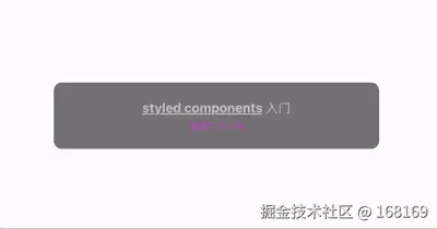
小按钮的关键代码
Javascript
import styled, { keyframes, createGlobalStyle, css } from 'styled-components'

const Wrap = styled.div`
  width: 100%;
  height: 100vh;
  display: flex;
  flex-direction: column;
  justify-content: center;
  align-items: center;
  gap: 20px;
`

// css帧动画
const aniTag = keyframes`
  0% {
    opacity: 0;
    transform: translateY(-100%);
  }
  100% {
    opacity: 1;
    transform: translateY(0);
  }
`

const MyButton = styled.div`
  width: 400px;
  height: 80px;
  border:1px solid gray;
  border-radius: 10px;
  overflow: hidden;
  display: flex;
  flex-direction: column;
  justify-content: center;
  align-items: center;
  position: relative;
  // 传参
  background-color: ${props => props.bgNormalColor ? props.bgNormalColor : 'blue'};
  transition: background-color 0.3s ease-in-out;
  // 伪元素
  &::after{
    content: 'after';
    height: 20px;
    font-size: 14px;
    line-height: 20px;
    padding:0 5px;
    border-radius: 0 0 6px 6px;
    position: absolute;
    top: 0;
    right: 10px;
    background-color: yellow;
    color: ${props => props.hightightColor ? props.hightightColor : 'white'};
    opacity: 0;
  }
  // 子孙选择器
  p {
    line-height: 24px;
    color: ${props => props.normalColor ? props.normalColor : 'black'};
    transition: color 0.3s ease-in-out;
  }
  // 当有全局样式的时候,使用&&提高局部样式优先级来覆盖全局样式
  && span{
    color: rgba(255,0,255,0.6);
  }
  // 类选择器
  .emphasize{
    text-decoration: underline;
  }
  // 伪类
  &:hover{
    background-color: ${props => props.bgHighlightColor ? props.bgHighlightColor : 'yellow'};
    p{
      color: ${props => props.hightightColor ? props.hightightColor : 'white'};
    }
    // css animation动画
    &::after{
      animation: ${aniTag} 0.4s ease-in-out forwards;
    }
  }
`

// 全局样式
const GlobalStyle = createGlobalStyle`
  *{
    padding: 0;
    margin: 0;
  }
  ${MyButton}{
    span{
      color: rgba(255,255,255,0.6);
      font-size: 12px;
      line-height: 20px;
    }
  }
`

export default function StyleComponentsTest() {
  return (
    <Wrap>
      <GlobalStyle />
      <MyButton
        bgNormalColor="gray"
        bgHighlightColor="white"
        normalColor='rgba(255,255,255,0.6)'
        hightightColor="red"
      >
          <p><strong className="emphasize">styled components</strong> 入门</p>
          <span>我是只小小鸟</span>
      </MyButton>
    </Wrap>
  )
}
这个小demo有用到styled-components的关键技术点:
- 其本语法,见Wrap
- 动态样式实现,通过${props => props.*}
- 怎么写全局样式,见createGlobalStyle
- 怎么实现子/孙元素样式控制,见p和strong元素样式控制
- 怎么实现伪类,见:hover
- 怎么实现伪元素,见::after
- 怎么实现动画,见transition/keyframes
- 当全局样式和自带样式冲突的,怎么提高样式优先级,见span 示例代码都做了详细的注释,可以浏览代码了解详情
补充
其实通过实现上面示例基本算已经入门styled-components了,但是开发经常要考虑代码复用,那styled-components怎么实现CSS复用,我来优化一下demo 最终实现的效果如下:
 关键代码如下:
JavaScript
import styled, { keyframes, createGlobalStyle, css } from 'styled-components'

// 样式复用
const flexColCenter = css`
  display: flex;
  flex-direction: column;
  justify-content: center;
  align-items: center;
`
const textHighlightColor = css`
  color: ${props => props.hightightColor ? props.hightightColor : 'white'};
`

const Wrap = styled.div`
  width: 100%;
  height: 100vh;
  ${flexColCenter}
  gap: 20px;
`

// css帧动画
const aniTag = keyframes`
  0% {
    opacity: 0;
    transform: translateY(-100%);
  }
  100% {
    opacity: 1;
    transform: translateY(0);
  }
`

const MyButton = styled.div`
  width: 400px;
  height: 80px;
  border:1px solid gray;
  border-radius: 10px;
  overflow: hidden;
  ${flexColCenter}
  position: relative;
  // 传参
  background-color: ${props => props.bgNormalColor ? props.bgNormalColor : 'blue'};
  transition: background-color 0.3s ease-in-out;
  // 伪元素
  &::after{
    content: 'after';
    height: 20px;
    font-size: 14px;
    line-height: 20px;
    padding:0 5px;
    border-radius: 0 0 6px 6px;
    position: absolute;
    top: 0;
    right: 10px;
    background-color: yellow;
    ${textHighlightColor}
    opacity: 0;
  }
  // 子孙选择器
  p {
    line-height: 24px;
    color: ${props => props.normalColor ? props.normalColor : 'black'};
    transition: color 0.3s ease-in-out;
  }
  // 当有全局样式的时候,使用&&提高局部样式优先级来覆盖全局样式
  && span{
    color: rgba(255,0,255,0.6);
  }
  // 类选择器
  .emphasize{
    text-decoration: underline;
  }
  // 伪类
  &:hover{
    background-color: ${props => props.bgHighlightColor ? props.bgHighlightColor : 'yellow'};
    p{
      ${textHighlightColor}
    }
    // css animation动画
    &::after{
      animation: ${aniTag} 0.4s ease-in-out forwards;
    }
  }
`

const MyButton1 = styled(MyButton)`
  border:4px solid gray;
  border-radius: 20px;
`

// 全局样式
const GlobalStyle = createGlobalStyle`
  *{
    padding: 0;
    margin: 0;
  }
  ${MyButton}{
    span{
      color: rgba(255,255,255,0.6);
      font-size: 12px;
      line-height: 20px;
    }
  }
`

export default function StyleComponentsTest() {
  return (
    <Wrap>
      <GlobalStyle />
      <MyButton
        bgNormalColor="gray"
        bgHighlightColor="white"
        normalColor='rgba(255,255,255,0.6)'
        hightightColor="red"
      >
          <p><strong className="emphasize">styled components</strong> 入门</p>
          <span>我是只小小鸟</span>
      </MyButton>
      <MyButton1
        bgNormalColor="gray"
        bgHighlightColor="white"
        normalColor='rgba(255,255,255,0.6)'
        hightightColor="red"
      >
          <p><strong className="emphasize">styled components</strong> 入门1</p>
          <span>我是只小小鸟1</span>
      </MyButton1>
    </Wrap>
  )
}
关键点:
- 样式复用,见flexColCenter/textHighlightColor
- 样式继承重写,见MyButton1
本来是想放一个在线测试案例的,找了很久都找到能用的React的playground,如果你想自己跑起示例来也是很简单的,初始化一个最简单的React示例项目并安装styled-components依赖,新建一个组件,把上面代码复制进去即可,推荐直接使用vite初始化项目
bash
// 1命令行执行如下命令,再选择react即可
npm create vite@latest或者直接clone我的测试仓库,你本地测试即可:demo仓库
小结
个人的知识和能力是有限的,本文只是个人练习styled-components的小demo,应该还有很多styled-components高级用法我没有了解到,如果有不对的地方或者你有更好的建议,希望不吝留言分享,一起学习一起进步
从一个按钮入门CSS in JS之styled-components
前言
最近接手一个react项目,项目中使用的 CSS in JS方案来实现CSS模块化,它使用的包是styled-components 我以前的项目Vue居多的,Vue是很简单的通过scoped就可以实现模块化CSS,当然也在项目中用过CSS Modules方案,但CSS in JS还是第一次接触到,正好趁这个时机学习一下,在做demo时候把平时开发用的比较高频的CSS特性都试了一下,最终完成了一个小按钮demo,突然发现它是一个不错的用来入门styled-components不错的小案例,特记录
styled-components介绍
主要作用是它可以编写实际的CSS代码来设计组件样式,也不需要组件和样式之间的映射,即创建后就是一个正常的React组件,在一个组件内会将结构、样式和逻辑写在一起,虽然这违背了关注点分离的原则,但是这有利于组件间的隔离 使用styled-components不需要再使用className属性来控制样式,而是将样式写成更具语义化的组件的形式,使用style-components会随机生成一个class名称,这样保证每个元素的样式名都是唯一的,当然因为随机生成,维护会增加难度,很难通过样式名定位到元素
入门styled-components的小按钮效果
小按钮的关键代码
Javascript
import styled, { keyframes, createGlobalStyle, css } from 'styled-components'

const Wrap = styled.div`
  width: 100%;
  height: 100vh;
  display: flex;
  flex-direction: column;
  justify-content: center;
  align-items: center;
  gap: 20px;
`

// css帧动画
const aniTag = keyframes`
  0% {
    opacity: 0;
    transform: translateY(-100%);
  }
  100% {
    opacity: 1;
    transform: translateY(0);
  }
`

const MyButton = styled.div`
  width: 400px;
  height: 80px;
  border:1px solid gray;
  border-radius: 10px;
  overflow: hidden;
  display: flex;
  flex-direction: column;
  justify-content: center;
  align-items: center;
  position: relative;
  // 传参
  background-color: ${props => props.bgNormalColor ? props.bgNormalColor : 'blue'};
  transition: background-color 0.3s ease-in-out;
  // 伪元素
  &::after{
    content: 'after';
    height: 20px;
    font-size: 14px;
    line-height: 20px;
    padding:0 5px;
    border-radius: 0 0 6px 6px;
    position: absolute;
    top: 0;
    right: 10px;
    background-color: yellow;
    color: ${props => props.hightightColor ? props.hightightColor : 'white'};
    opacity: 0;
  }
  // 子孙选择器
  p {
    line-height: 24px;
    color: ${props => props.normalColor ? props.normalColor : 'black'};
    transition: color 0.3s ease-in-out;
  }
  // 当有全局样式的时候,使用&&提高局部样式优先级来覆盖全局样式
  && span{
    color: rgba(255,0,255,0.6);
  }
  // 类选择器
  .emphasize{
    text-decoration: underline;
  }
  // 伪类
  &:hover{
    background-color: ${props => props.bgHighlightColor ? props.bgHighlightColor : 'yellow'};
    p{
      color: ${props => props.hightightColor ? props.hightightColor : 'white'};
    }
    // css animation动画
    &::after{
      animation: ${aniTag} 0.4s ease-in-out forwards;
    }
  }
`

// 全局样式
const GlobalStyle = createGlobalStyle`
  *{
    padding: 0;
    margin: 0;
  }
  ${MyButton}{
    span{
      color: rgba(255,255,255,0.6);
      font-size: 12px;
      line-height: 20px;
    }
  }
`

export default function StyleComponentsTest() {
  return (
    <Wrap>
      <GlobalStyle />
      <MyButton
        bgNormalColor="gray"
        bgHighlightColor="white"
        normalColor='rgba(255,255,255,0.6)'
        hightightColor="red"
      >
          <p><strong className="emphasize">styled components</strong> 入门</p>
          <span>我是只小小鸟</span>
      </MyButton>
    </Wrap>
  )
}
这个小demo有用到styled-components的关键技术点:
- 其本语法,见Wrap
- 动态样式实现,通过${props => props.*}
- 怎么写全局样式,见createGlobalStyle
- 怎么实现子/孙元素样式控制,见p和strong元素样式控制
- 怎么实现伪类,见:hover
- 怎么实现伪元素,见::after
- 怎么实现动画,见transition/keyframes
- 当全局样式和自带样式冲突的,怎么提高样式优先级,见span 示例代码都做了详细的注释,可以浏览代码了解详情
补充
其实通过实现上面示例基本算已经入门styled-components了,但是开发经常要考虑代码复用,那styled-components怎么实现CSS复用,我来优化一下demo 最终实现的效果如下:
关键代码如下:
JavaScript
import styled, { keyframes, createGlobalStyle, css } from 'styled-components'

// 样式复用
const flexColCenter = css`
  display: flex;
  flex-direction: column;
  justify-content: center;
  align-items: center;
`
const textHighlightColor = css`
  color: ${props => props.hightightColor ? props.hightightColor : 'white'};
`

const Wrap = styled.div`
  width: 100%;
  height: 100vh;
  ${flexColCenter}
  gap: 20px;
`

// css帧动画
const aniTag = keyframes`
  0% {
    opacity: 0;
    transform: translateY(-100%);
  }
  100% {
    opacity: 1;
    transform: translateY(0);
  }
`

const MyButton = styled.div`
  width: 400px;
  height: 80px;
  border:1px solid gray;
  border-radius: 10px;
  overflow: hidden;
  ${flexColCenter}
  position: relative;
  // 传参
  background-color: ${props => props.bgNormalColor ? props.bgNormalColor : 'blue'};
  transition: background-color 0.3s ease-in-out;
  // 伪元素
  &::after{
    content: 'after';
    height: 20px;
    font-size: 14px;
    line-height: 20px;
    padding:0 5px;
    border-radius: 0 0 6px 6px;
    position: absolute;
    top: 0;
    right: 10px;
    background-color: yellow;
    ${textHighlightColor}
    opacity: 0;
  }
  // 子孙选择器
  p {
    line-height: 24px;
    color: ${props => props.normalColor ? props.normalColor : 'black'};
    transition: color 0.3s ease-in-out;
  }
  // 当有全局样式的时候,使用&&提高局部样式优先级来覆盖全局样式
  && span{
    color: rgba(255,0,255,0.6);
  }
  // 类选择器
  .emphasize{
    text-decoration: underline;
  }
  // 伪类
  &:hover{
    background-color: ${props => props.bgHighlightColor ? props.bgHighlightColor : 'yellow'};
    p{
      ${textHighlightColor}
    }
    // css animation动画
    &::after{
      animation: ${aniTag} 0.4s ease-in-out forwards;
    }
  }
`

const MyButton1 = styled(MyButton)`
  border:4px solid gray;
  border-radius: 20px;
`

// 全局样式
const GlobalStyle = createGlobalStyle`
  *{
    padding: 0;
    margin: 0;
  }
  ${MyButton}{
    span{
      color: rgba(255,255,255,0.6);
      font-size: 12px;
      line-height: 20px;
    }
  }
`

export default function StyleComponentsTest() {
  return (
    <Wrap>
      <GlobalStyle />
      <MyButton
        bgNormalColor="gray"
        bgHighlightColor="white"
        normalColor='rgba(255,255,255,0.6)'
        hightightColor="red"
      >
          <p><strong className="emphasize">styled components</strong> 入门</p>
          <span>我是只小小鸟</span>
      </MyButton>
      <MyButton1
        bgNormalColor="gray"
        bgHighlightColor="white"
        normalColor='rgba(255,255,255,0.6)'
        hightightColor="red"
      >
          <p><strong className="emphasize">styled components</strong> 入门1</p>
          <span>我是只小小鸟1</span>
      </MyButton1>
    </Wrap>
  )
}
关键点:
- 样式复用,见flexColCenter/textHighlightColor
- 样式继承重写,见MyButton1
本来是想放一个在线测试案例的,找了很久都找到能用的React的playground,如果你想自己跑起示例来也是很简单的,初始化一个最简单的React示例项目并安装styled-components依赖,新建一个组件,把上面代码复制进去即可,推荐直接使用vite初始化项目
bash
// 1命令行执行如下命令,再选择react即可
npm create vite@latest或者直接clone我的测试仓库,你本地测试即可:demo仓库
小结
个人的知识和能力是有限的,本文只是个人练习styled-components的小demo,应该还有很多styled-components高级用法我没有了解到,如果有不对的地方或者你有更好的建议,希望不吝留言分享,一起学习一起进步