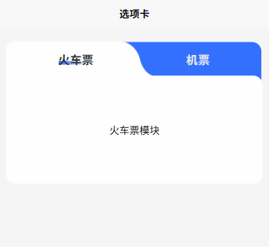
采用 uniapp 实现的一款简约美观的 tabs 标签页组件模板,纯 CSS、HTML 实现,具备丝滑的过渡切换效果,用户完全可根据自身需求进行更改、扩展
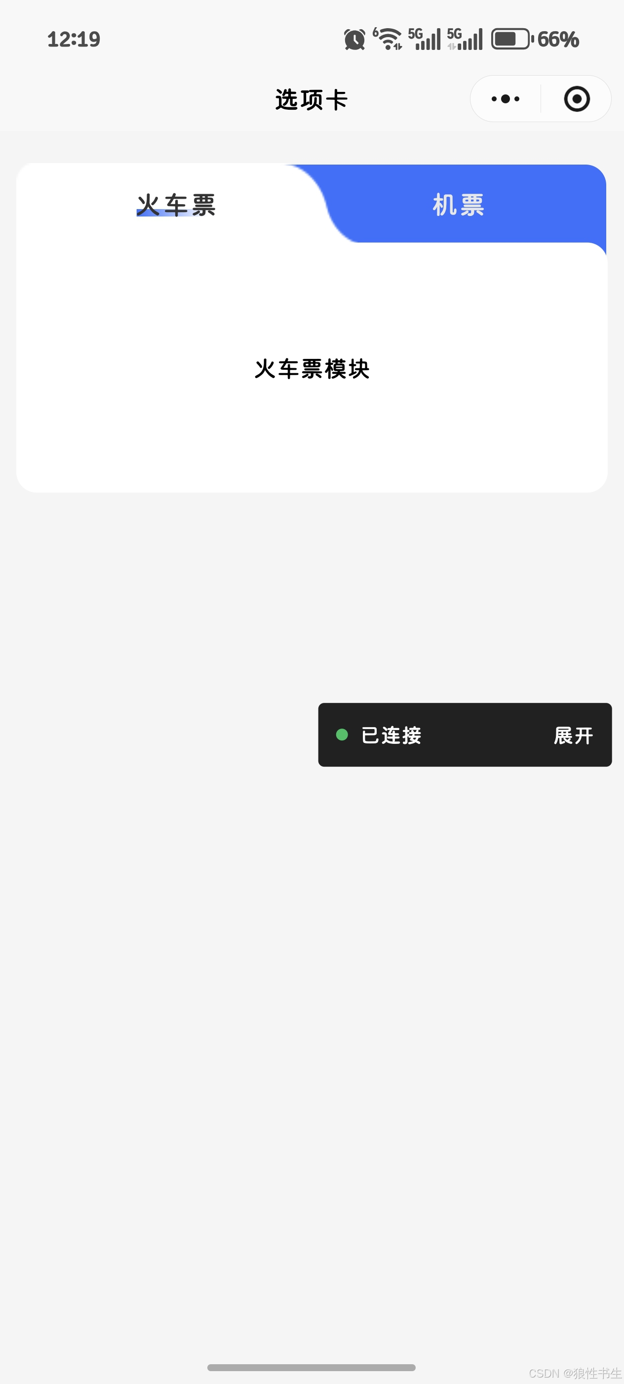
适配 web、H5、微信小程序(其他平台小程序未测试过,可自行尝试)
可到插件市场下载尝试:https://ext.dcloud.net.cn/plugin?id=25722
- 示例
props 属性
tabOptions
选项卡 tab 数组,必须具备 type、title 字段
js
tabOptions: {
  type: Array,
  default() {
    return [
      {
        type: "send",
        title: "火车票",
      },
      {
        type: "receive",
        title: "机票",
      },
    ];
  },
},
defaultTab
默认选中 tab
js
defaultTab: {
  type: String,
  default: "send",
},
事件
@onChange
切换 tab 时触发
使用示例
vue2 写法
js
<template>
  <view class="card">
    <tabsComp
      :tabOptions="tabOptions"
      :defaultTab="defaultTab"
      @onChange="onChangeTab"
    >
      <view>
        <view
          v-if="tabValue === 'send'"
          style="height: 300rpx"
          class="flex-center"
        >
          火车票模块
        </view>
        <view
          v-if="tabValue === 'receive'"
          style="height: 300rpx"
          class="flex-center"
        >
          机票模块
        </view>
      </view>
    </tabsComp>
  </view>
</template>
<script>
import tabsComp from "./components/tabs-comp.vue";
export default {
  components: {
    tabsComp,
  },
  data() {
    return {
      defaultTab: "send", // 默认选中的tab
      tabOptions: [
        {
          type: "send",
          title: "火车票",
        },
        {
          type: "receive",
          title: "机票",
        },
      ],
      tabValue: "send", // 当前选中的tab
    };
  },
  methods: {
    onChangeTab(type) {
      this.tabValue = type;
    },
  },
};
</script>

<style lang="scss" scoped>
.flex-center {
  display: flex;
  justify-content: center;
  align-items: center;
}
.card {
  padding: 40rpx 20rpx;
  background-color: #f5f5f5;
  height: 100%;
}
</style>
vue3 写法
js
<template>
  <view class="card">
    <tabsComp
      :tabOptions="tabOptions"
      :defaultTab="defaultTab"
      @onChange="onChangeTab"
    >
      <view>
        <view
          v-if="tabValue === 'send'"
          style="height: 300rpx"
          class="flex-center"
        >
          火车票模块
        </view>
        <view
          v-if="tabValue === 'receive'"
          style="height: 300rpx"
          class="flex-center"
        >
          机票模块
        </view>
      </view>
    </tabsComp>
  </view>
</template>
<script setup>
import { ref } from "vue";
import tabsComp from "./components/tabs-comp.vue";

const defaultTab = "send"; // 默认选中的tab
const tabOptions = [
  {
    type: "send",
    title: "火车票",
  },
  {
    type: "receive",
    title: "机票",
  },
];
const tabValue = ref(defaultTab);

function onChangeTab(type) {
  tabValue.value = type;
}
</script>

<style lang="scss" scoped>
.flex-center {
  display: flex;
  justify-content: center;
  align-items: center;
}
.card {
  padding: 40rpx 20rpx;
  background-color: #f5f5f5;
  height: 100%;
}
</style>