Vue3 组件库 Element Plus
- [1. 常见的 Vue 组件库](#1. 常见的 Vue 组件库)
- [2. Element Plus](#2. Element Plus)
-
- [2.1 安装](#2.1 安装)
- [2.2 引入方式](#2.2 引入方式)
-
- [2.2.1 完整引入(不推荐,打包后体积过大)](#2.2.1 完整引入(不推荐,打包后体积过大))
- [2.2.2 自动按需引入(推荐,优化包体积,性能更好)](#2.2.2 自动按需引入(推荐,优化包体积,性能更好))
- [2.3 快速上手(表单验证示例)](#2.3 快速上手(表单验证示例))
1. 常见的 Vue 组件库
(1)Element Plus - Element UI 的 Vue 3 升级版本,一个面向企业级产品的组件库,它提供了一系列可配置的组件和丰富的 API,也是当前 Vue3 中国内最受欢迎的组件库。
(2)Vuetify - Vuetify 是一个广受欢迎的 Vue UI 组件库,提供了广泛的材料设计组件。它非常适合快速开发,拥有丰富的组件和详细的文档。
(3)Ant Design Vue - 这是 Ant Design 的 Vue 实现,特别适合用于企业级应用。它提供了丰富的 Vue 组件,是构建后台应用界面的理想选择。
不过 Ant Design 最初是蚂蚁集团为 React 实现的组件库,Ant Design Vue 是 Vue 的改造版本,功能实现上并没有 Element Plus 来得更适合或强大。
(4)Naive UI - 一个相对较新的 Vue 3 组件库,采用 TypeScript 编写,提供了一套完整的组件,以灵活性和轻量级著称,还被尤雨溪推荐过。
(5)Vant - Vant 是一个轻量级、可靠的移动端 Vue 组件库,由有赞前端团队开发和维护。
(6)PrimeVue - PrimeVue 是 PrimeFaces Team 针对 Vue 开发的组件库,它提供了丰富的组件和主题,适合用于各种商业应用。
(7)BootstrapVue - 尽管 BootstrapVue 最初是为 Vue 2 开发的,但社区已经在为支持 Vue 3 而努力。它将 Bootstrap 的功能与 Vue 的反应性相结合。
(8)TinyVue - 是基于 OpenTiny Design 设计体系的 Vue UI 组件库,一套跨端、跨框架的企业级 UI 组件库,支持 Vue 2 和 Vue 3,支持 PC 端和移动端。
本章节主要讲解 Element Plus(国内 Vue3 的主流 UI 库)的安装和使用。
2. Element Plus
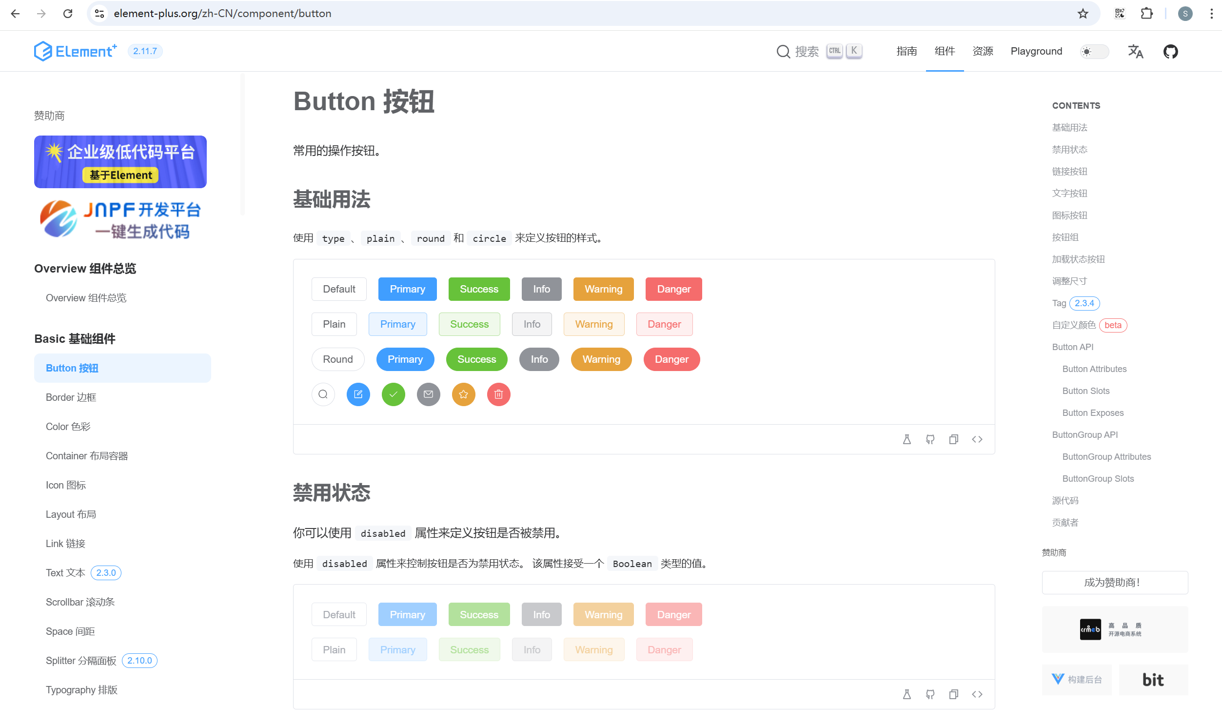
官网地址:https://element-plus.org/zh-CN/
其实官网文档已经非常完善了,本章针对主要知识点进行记录和讲解。
2.1 安装
在 Vue3 项目中进行下载:
javascript
npm install element-plus --save
2.2 引入方式
2.2.1 完整引入(不推荐,打包后体积过大)
如果你不在乎打包后项目的大小,那么使用完整引入会十分简单方便。
(1)在 main.js 中完整引入:
powershell
import { createApp} from 'vue'
import App from './App.vue'
import router from './router'
import ElementPlus from 'element-plus'
import 'element-plus/dist/index.css'

const app = createApp(App)

app.use(router)
app.use(ElementPlus)

app.mount('#app')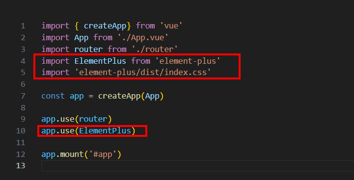
(2)在 .vue 文件中,即可直接使用所有的 Element Plus 组件。
App.vue:
powershell
<template>
  <div class="button-row">
    <el-button>Default</el-button>
    <el-button type="primary">Primary</el-button>
    <el-button type="success">Success</el-button>
    <el-button type="info">Info</el-button>
    <el-button type="warning">Warning</el-button>
    <el-button type="danger">Danger</el-button>
  </div>
</template>

<script setup>

</script>

<style lang="scss" scoped></style>
2.2.2 自动按需引入(推荐,优化包体积,性能更好)
不同于以前的 Vue2 项目使用 Element 的按需引入方式,Element Plus 的按需引入方式做了升级。
我们可以使用 unplugin-vue-components 和 unplugin-auto-import 这两款插件,做到自动的按需引入,而无需进行手动 import。
unplugin-vue-components:会自动扫描你的项目文件,找到使用的 Vue 组件,在打包的时候自动引入这些组件,无需手动的 import;unplugin-auto-import:按需引入工具函数的插件,它可以自动引入 Vue 相关的工具函数(ref、computed),这些工具函数也就不需要再 import 了。
(1)安装插件
powershell
npm install -D unplugin-vue-components unplugin-auto-import(2)在 vite.config.js 中进行配置
powershell
import { defineConfig } from 'vite'
import AutoImport from 'unplugin-auto-import/vite'
import Components from 'unplugin-vue-components/vite'
import { ElementPlusResolver } from 'unplugin-vue-components/resolvers'

export default defineConfig({
  // ...
  plugins: [
    // ...
    AutoImport({
      resolvers: [ElementPlusResolver()],
    }),
    Components({
      resolvers: [ElementPlusResolver()],
    }),
  ],
})
(3)在 .vue 文件中,即可直接使用所有的 Element Plus 组件。
App.vue:
powershell
<template>
  <div class="button-row">
    <el-button>Default</el-button>
    <el-button type="primary">Primary</el-button>
    <el-button type="success">Success</el-button>
    <el-button type="info">Info</el-button>
    <el-button type="warning">Warning</el-button>
    <el-button type="danger">Danger</el-button>
  </div>
</template>

<script setup>

</script>

<style lang="scss" scoped></style>
2.3 快速上手(表单验证示例)
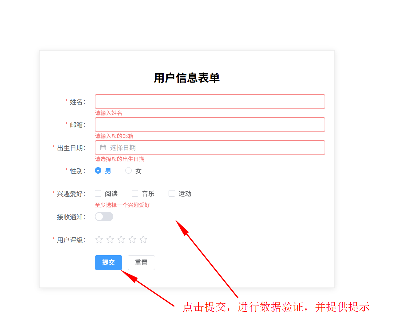
这是一个关于 Element Plus 表单验证的完整示例:
powershell
<template>
  <div class="form-container">
    <el-form :model="form" :rules="rules" ref="formRef" label-width="100px" class="user-form">
      <h2 class="form-title">用户信息表单</h2>
      <!-- 姓名 -->
      <el-form-item label="姓名:" prop="name">
        <el-input v-model="form.name" />
      </el-form-item>
      <!-- 邮箱 -->
      <el-form-item label="邮箱:" prop="email">
        <el-input v-model="form.email"></el-input>
      </el-form-item>
      <!-- 出生日期 -->
      <el-form-item label="出生日期:" prop="birthday">
        <el-date-picker
          v-model="form.birthday"
          type="date"
          placeholder="选择日期"
          :picker-options="{ firstDayOfWeek: 1 }"
          style="width: 100%"
        />
      </el-form-item>
      <!-- 性别 -->
      <el-form-item label="性别:" prop="gender">
        <el-radio-group v-model="form.gender">
          <el-radio value="male">男</el-radio>
          <el-radio value="female">女</el-radio>
        </el-radio-group>
      </el-form-item>
      <!-- 兴趣爱好 -->
      <el-form-item label="兴趣爱好:" prop="hobbies">
        <el-checkbox-group v-model="form.hobbies">
          <el-checkbox value="reading" name="hobby">阅读</el-checkbox>
          <el-checkbox value="music" name="hobby">音乐</el-checkbox>
          <el-checkbox value="sports" name="hobby">运动</el-checkbox>
        </el-checkbox-group>
      </el-form-item>
      <el-form-item label="接收通知:" prop="notifications">
        <el-switch v-model="form.notifications"></el-switch>
      </el-form-item>
      <el-form-item label="用户评级:" prop="rating">
        <el-rate v-model="form.rating"></el-rate>
      </el-form-item>
      <el-form-item>
        <el-button type="primary" @click="submitForm">提交</el-button>
        <el-button @click="resetForm">重置</el-button>
      </el-form-item>
    </el-form>
  </div>
</template>

<script setup>
import { ref } from 'vue'
const form = ref({
  name: '',
  email: '',
  birthday: '',
  gender: 'male',
  hobbies: [],
  notifications: false,
  rating: 0
})

const formRef = ref(null)

const rules = {
  // 验证规则是一个数组,因为可以设置多条验证规则
  // 每一条验证规则,是一个对象
  name: [
    {
      required: true,
      message: '请输入姓名',
      trigger: 'blur'
    }
  ],
  email: [
    { required: true, message: '请输入您的邮箱', trigger: 'blur' },
    { type: 'email', message: '请输入有效的邮箱地址', trigger: 'blur' }
  ],
  birthday: [{ required: true, message: '请选择您的出生日期', trigger: 'change' }],
  gender: [{ required: true, message: '请选择您的性别', trigger: 'change' }],
  hobbies: [{ required: true, message: '至少选择一个兴趣爱好', trigger: 'change' }],
  rating: [{ required: true, message: '请评价用户等级', trigger: 'change' }]
}
// 提交表单
function submitForm() {
  // 提交表单的时候,需要看一下表单是否验证通过
  formRef.value.validate((valid) => {
    // 自动传入一个参数,这个参数是一个布尔值,代表表单是否验证通过
    if (valid) {
      // 验证通过
      console.log('表单验证通过')
    } else {
      // 验证不通过
      console.log('表单验证不通过')
      return false
    }
  })
}
function resetForm() {
  formRef.value.resetFields()
}
</script>

<style scoped>
.form-container {
  display: flex;
  justify-content: center;
  align-items: center;
  min-height: 100vh;
}

.user-form {
  width: 600px;
  border: 1px solid #eee;
  padding: 20px;
  box-shadow: 0 2px 12px rgba(0, 0, 0, 0.1);
}

.form-title {
  text-align: center;
  margin-bottom: 20px;
}
</style>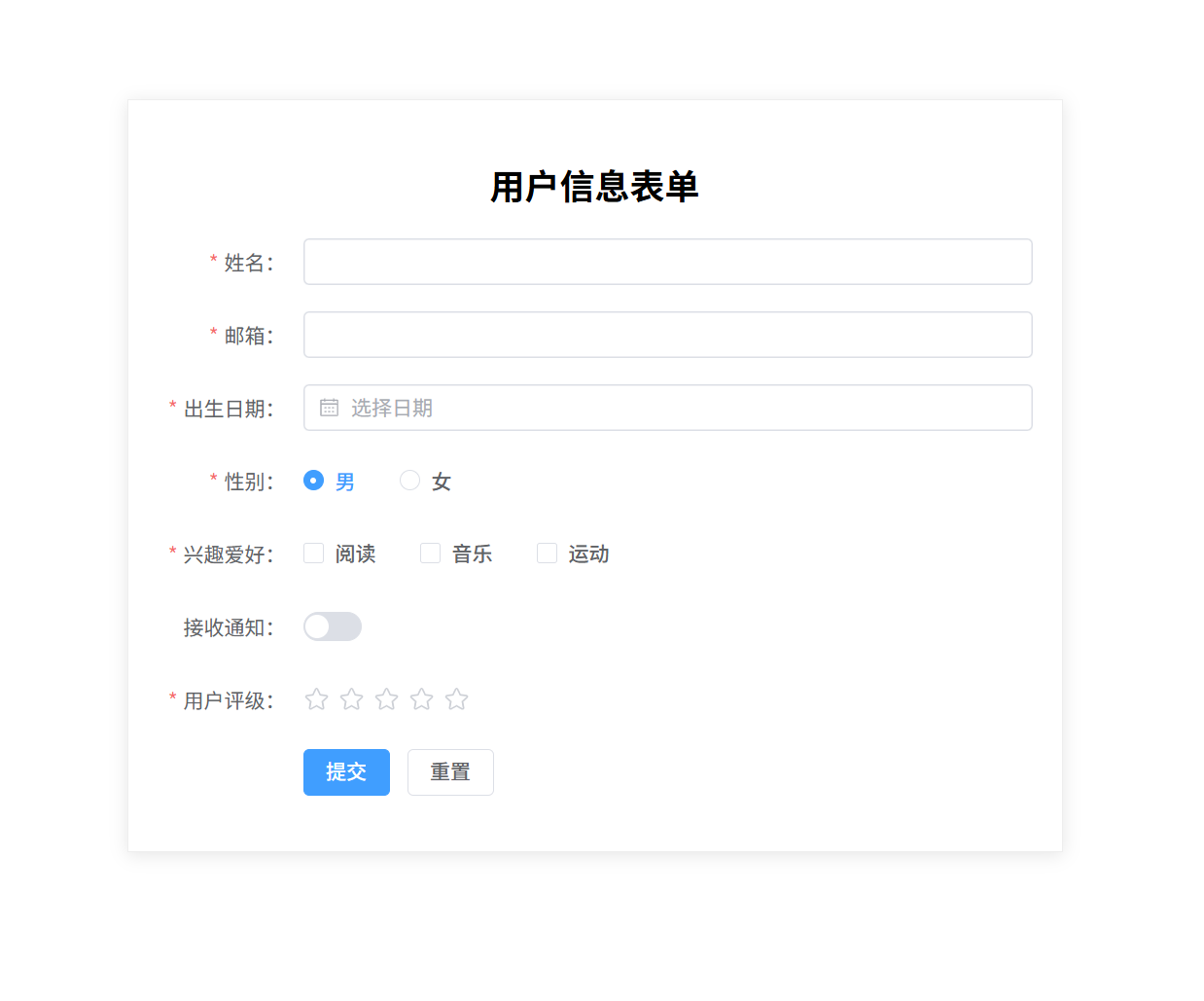
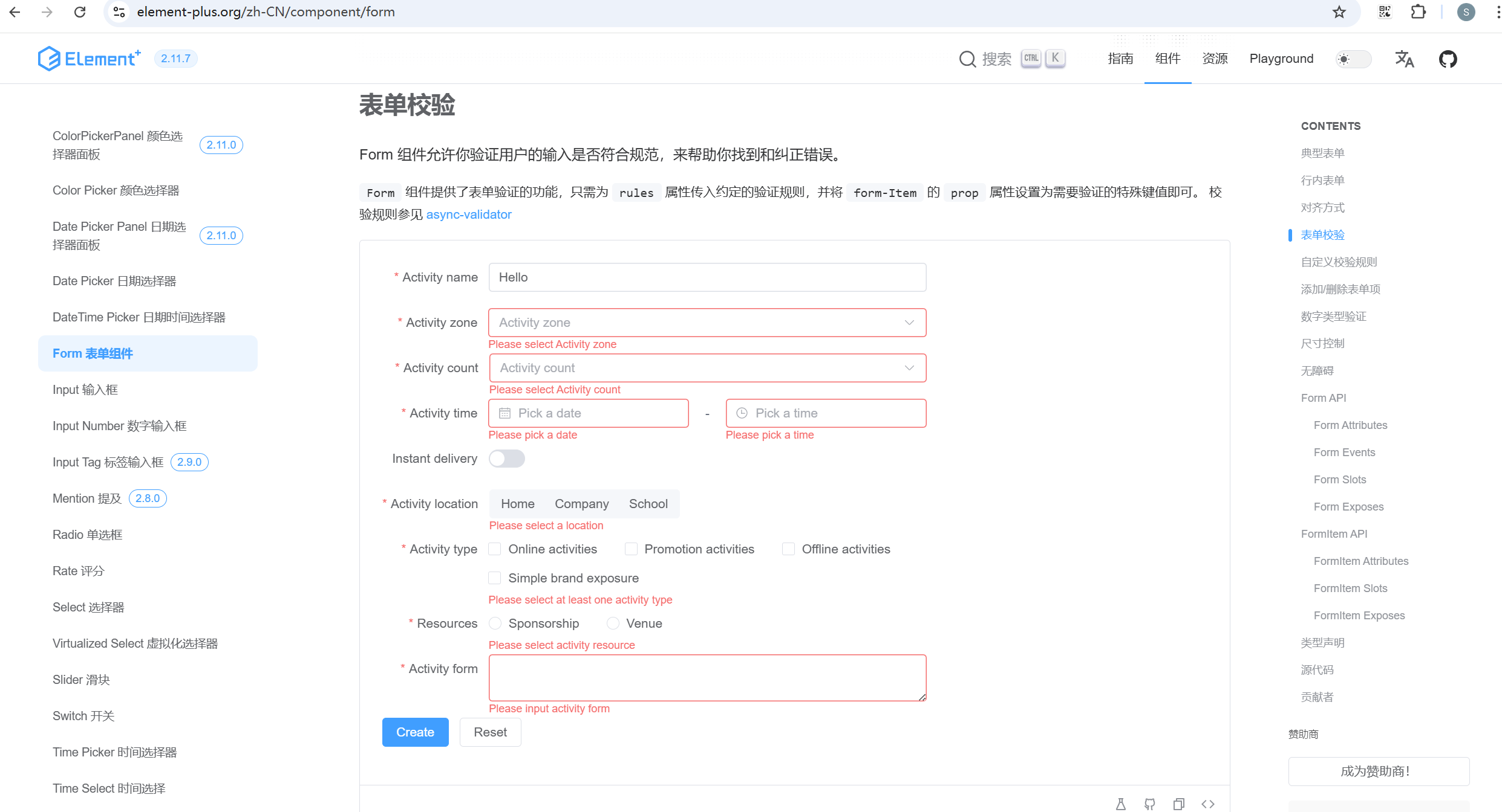
如果初学者对于表单验证没有接触过的话,可以查看官网的 form 表单部分。官网地址:https://element-plus.org/zh-CN/component/form
上一章 《Vue3 任务管理器(Pinia 练习)》