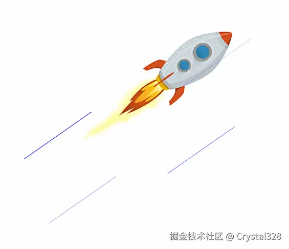
1. 飞行的火箭
 开发步骤:
开发步骤:
- 第一步:插入火箭图,然后利用自定义动画,实现火箭沿左上角和右下角方向来会移动
- 第二步:定义一个宽 1px 和高 160px,背景颜色为蓝色的盒子,然后定位到火箭旁边,再旋转一定的角度
- 第三步:自定义动画,实现线条(气流)从上往下移动(Y 轴移动),然后从透明到不透明再到透明的效果
html
<!DOCTYPE html>
<html lang="en">
<head>
<meta charset="UTF-8">
<meta name="viewport" content="width=device-width, initial-scale=1.0">
<title>Document</title>
<style>
.rocket {
width: 300px;
position: absolute;
left: 300px;
top: 200px;
animation: fly 0.5s linear infinite alternate;
}
/* 火箭飞行动画 */
@keyframes fly {
0% {
transform: translate(-30px, -30px);
}
100% {
transform: translate(30px, 30px);
}
}
.line {
width: 1px;
height: 160px;
position: absolute;
background-color: blue;
}
.pos1 {
top: 200px;
left: 400px;
}
.pos2 {
top: 240px;
left: 450px;
}
.pos3 {
top: 290px;
left: 500px;
}
.pos4 {
top: 320px;
left: 550px;
}
.animation-cloud {
animation: cloud 1s linear var(--delay) infinite backwards;
}
/* 流云动画 */
@keyframes cloud {
0% {
opacity: 0;
/* 先旋转后位移 */
transform: rotate(55deg) translateY(-200px);
}
70% {
opacity: 1;
}
100% {
opacity: 0;
transform: rotate(55deg) translateY(200px);
}
}
</style>
</head>
<body>
<img src="./images/rocket.png" class="rocket">
<div class="line pos1 animation-cloud" style="--delay:0s"></div>
<div class="line pos2 animation-cloud" style="--delay:0.4s"></div>
<div class="line pos3 animation-cloud" style="--delay:0.6s"></div>
<div class="line pos4 animation-cloud" style="--delay:0.8s"></div>
</body>
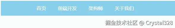
</html>2. 创建3D导航
 开发步骤
开发步骤
- 第一步:利用 ul 标签来制作简单的导航布局
- 第二步:在每个 li 中添加一个 div 用来实现旋转效果,后面旋转就是要旋转这个 div
- 第三步:利用 transform 来调整两个 a 标签的构成的盒子的位置
html
<!DOCTYPE html>
<html lang="en">
<head>
    <meta charset="UTF-8">
    <meta name="viewport" content="width=device-width, initial-scale=1.0">
    <title>3D导航</title>
    <style>
        body, ul ,li,a {
            list-style: none;
            padding: 0;
            margin: 0;
            text-decoration: none;
            color: white;
        }
        ul {
            display: block;
            height: 50px;
            background-color: #87ceeb;
            text-align: center;
            margin: 200px auto;
            padding-left: 200px;

        }
        li {
            float: left;
            height: 50px;
            line-height: 50px;
            perspective: 300px; /* 透视距离 */
        }
        li a {
            display: block;
            padding: 0 50px;
        }
        .box {
            height: 50px;
            /* border: 1px solid red; */
            /* 子元素在3D状态下呈现 */
            transform-style: preserve-3d;
            transform-origin: 50% 50% -25px;

        }
        .front {
            background-color: #87ceeb;
        }
        .bottom {
            background-color: khaki;
            /* 修改旋转中心点 */
            transform-origin: top center;
            transform: rotateX(-90deg);
        }
        ul li:hover .box {
            transform-origin: 50% 50% -25px;
            transform: rotateX(90deg);
            transition: transform 1s;
        }
    </style>
</head>
<body>
    <ul>
        <li>
            <div class="box">
            <a href="" class="front">前端</a>
            <a href="" class="bottom">前端</a>
            </div>
        </li>
        <li>
            <div class="box">
            <a href="" class="front">前端开发</a>
            <a href="" class="bottom">前端开发</a>
            </div>
        </li>
        <li>
            <div class="box">
            <a href="" class="front">架构师</a>
            <a href="" class="bottom">架构师</a>
            </div>
        </li>
       <li>
            <div class="box">
            <a href="" class="front">关于我们</a>
            <a href="" class="bottom">关于我们</a>
            </div>
        </li>
    </ul>
</body>
</html>
3. 翻书效果

- 构建.book 盒子,然后在.book 中构建.page,后面在旋转翻页效果时,旋转的就是.page 这个盒子
- .page 沿着 Y 轴的反方向旋转 180deg 来实现翻页效果,翻页时,把转换原点设置为左边中间位置(transform-origin:left;
- 在.page 盒子中,构建两个 div,.front 作为一页的正面,.back 作为一页的反面。用绝对定位控制位置
- 要实现翻转时,能看到一页的背面,则给.back 盒子添加 transform:translateZ(-1),使其与正面拉开一点距离
- 要使翻转后能看到书的反面是正面朝上的,则需要先把.back 旋转 180deg ,即 transform:rotateY(-180deg)
xml
<!DOCTYPE html>
<html lang="en">
<head>
<meta charset="UTF-8">
<meta name="viewport" content="width=device-width, initial-scale=1.0">
<title>翻书效果</title>
<style>
.book {
width: 300px;
height: 400px;
margin: 100px auto;
position: relative;
perspective: 1000px;
}
.page {
width: inherit;
height: inherit;
transform-style: preserve-3d;
transform-origin: left;
}
.first {
background-color: orange;
}
.second {
background-color: yellow;
position: absolute;
top:0;
left:0;
z-index: -1;
}
.page-item {
width: inherit;
height: inherit;
position: relative;
}
.front {
background-color: pink;
}
.back {
background-color: purple;
position: absolute;
top:0;
left:0;
/* z-index: -1; */
transform: translateZ(-1px) rotateY(-180deg);
}
.book:hover .page.first {
transform: rotateY(-180deg);
transition: transform 1s;
}
img {
width: 100%;
height: 100%;
display: block;
object-fit: cover;
}
</style>
</head>
<body>
<div class="book">
<!-- 第一页 -->
<div class="page first">
<!-- 正面 -->
<div class="page-item front">
<img src="./images/cover1.png">
</div>
<!-- 反面 -->
<div class="page-item back">
<img src="./images/cover2.png">
</div>
</div>
<!-- 第二页 -->
<div class="page second">
<img src="./images/cover3.png">
</div>
</div>
</body>
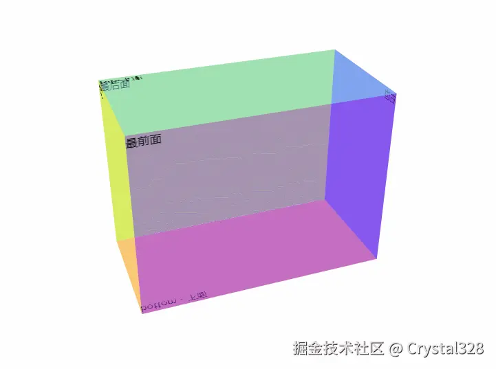
</html>4. 创建长方体
 开发步骤:
开发步骤:
- 第一步:首先创建一个名为
.container的容器,用来放立方体。我们站在离这个容器900px的地方,来观察里面的立方体。所以设置perspective: 900px; - 第二步:创建一个名为
.mybox的容器,用来构建立方体。所以需要设置transform-style: preserve-3d;,将子元素在 3D 空间展示 - 第三步:在容器中构建 6 个长方形,分别代表正方体的 6 个面
- 第四步:通过定位把元素叠在一起,然后通过位移,旋转来移动每个面的位置
- 第五步:给容器设置一个旋转角度,这样看正方体更立体一些
html
<!DOCTYPE html>
<html lang="en">
<head>
<meta charset="UTF-8">
<meta name="viewport" content="width=device-width, initial-scale=1.0">
<title>Document</title>
<style>
.container {
height: 700px;
border: 2px solid red;
perspective: 1000px;
}
.mybox {
width: 400px;
height: 300px;
border: 2px solid blue;
margin: 200px auto 0;
transform-style: preserve-3d;
/* 可不加 因为有上面的transform-style: preserve-3d; */
position: relative;
}
.mybox:hover {
/* 中心旋转 防止视觉放大 */
transform-origin: 50% 50% -100px;
transform: rotateY(180deg);
transition: all 6s ease ;
}
.face {
position: absolute;
left: 0;
top: 0;
}
.before,
.after {
width: 400px;
height: 300px;
}
.before {
background-color: rgba(240, 224, 79, 0.7);
}
.after {
background-color: rgba(79, 224, 240, 0.8);
}
.top,
.bottom {
width: 400px;
height: 200px;
}
.top {
background-color: rgba(255, 99, 71, 0.7);
}
.bottom {
background-color: rgba(138, 43, 226, 0.7);
}
.left,
.right {
width: 200px;
height: 300px;
}
.left {
background-color: rgba(60, 179, 113, 0.5);
}
.right {
background-color: rgba(210, 20, 147, 0.7);
}
/* 位置调整 */
.after {
/* 最后面z轴移动-200px */
transform: translateZ(-200px);
}
.top {
/* 上面先y轴反方向平移上去然后再向后折叠过去*/
transform-origin: bottom;
transform: translateY(-100%) rotateX(90deg);
}
.bottom {
/* 下面先y轴正方向平移下去然后再向前折叠过去*/
transform-origin: top;
transform: translateY(300px) rotateX(-90deg);
}
.left {
/* 左侧先x轴反方向平移过去然后再向右折叠过去*/
transform-origin: right;
transform: translateX(-200px) rotateY(-90deg);
}
.right {
/* 右侧先x轴正方向平移过去然后再向左折叠过去*/
transform-origin: left;
transform: translateX(400px) rotateY(90deg);
}
</style>
</head>
<body>
<div class="container">
<!-- 立体盒子 -->
<div class="mybox">
<div class="face before">11</div>
<div class="face after">12</div>
<div class="face top">21</div>
<div class="face bottom">22</div>
<div class="face left">31</div>
<div class="face right">32</div>
</div>
</div>
</body>
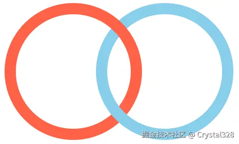
</html>5. 环环相扣
html
<!DOCTYPE html>
<html lang="en">
<head>
    <meta charset="UTF-8">
    <meta name="viewport" content="width=device-width, initial-scale=1.0">
    <title>环环相扣</title>
    <style>
        .wrap {
            width: 600px;
            height: 300px;
            border: 2px solid red;
            transform-style: preserve-3d;
        }
        .ring {
            width: 200px;
            height: 200px;
            border-radius: 50%;
            float: left;
        }
        .tomato {
            border: 10px solid tomato;
            margin-right: -60px;
        }
        .skyblue {
            border: 10px solid skyblue;
            /* 蓝色环向x轴旋转 */
            transform: rotateX(1deg);
        }
    </style>
</head>
<body>
    <div class="wrap">
        <div class="ring tomato"></div>
        <div class="ring skyblue"></div>
    </div>
</body>
</html>