原理:
CSS3 的变换(Transform) 属性配合 JavaScript 的鼠标事件。
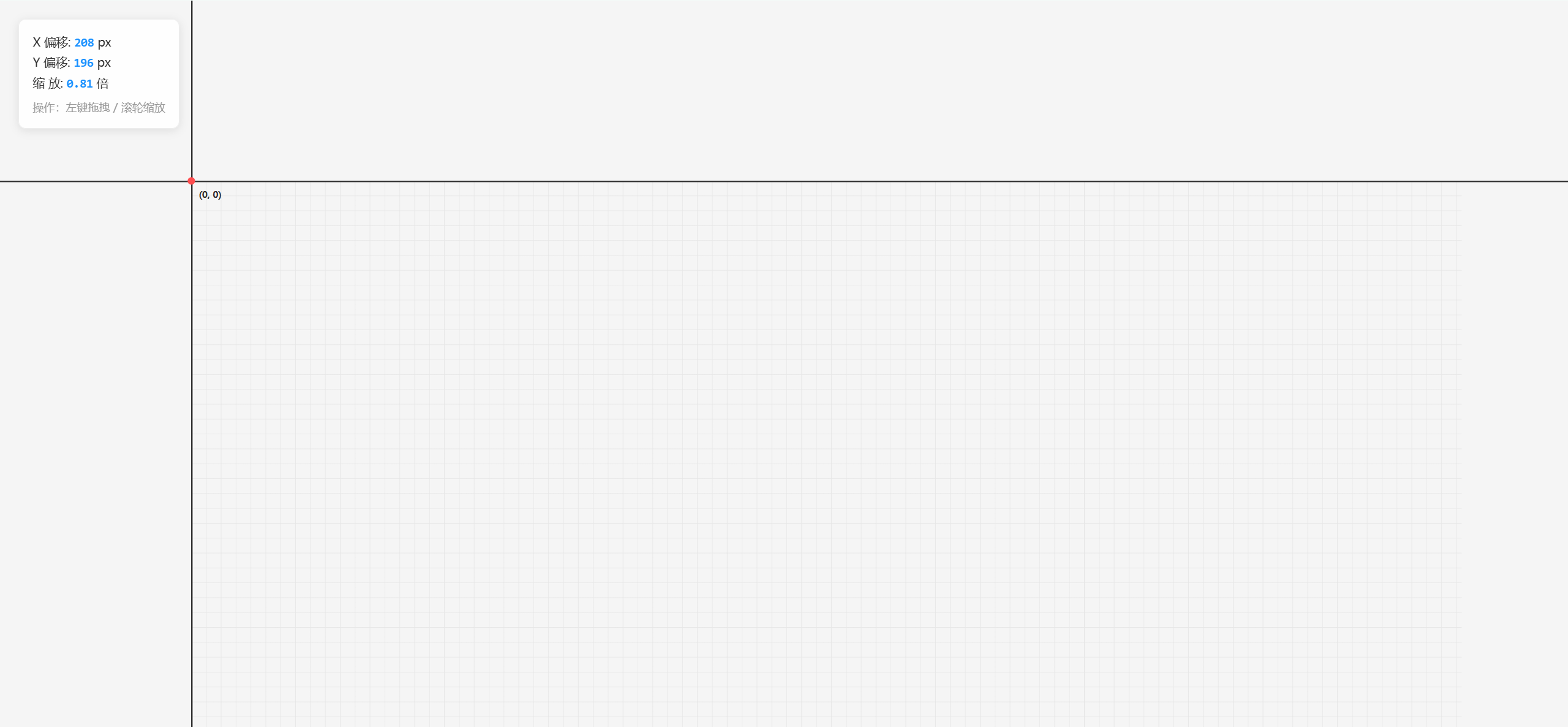
1. 核心模型:窗口与纸张
想象一下现实生活中的场景:
- 容器 (Container) :就像桌子上的一个相框(视口),大小是固定的,超出的部分看不见(CSS overflow: hidden)。
- 内容 (Content) :就像相框后面的一张巨大的纸 (SVG Group ),这张纸可以无限大。
我们做的操作,本质上不是动"相机",而是在动"纸"。
2.代码案例
<!DOCTYPE html>
<html lang="zh-CN">
<head>
    <meta charset="UTF-8">
    <meta name="viewport" content="width=device-width, initial-scale=1.0">
    <title>纯净画布原理 (坐标系版)</title>
    <style>
        /* =========================================
           1. 全局 & 布局
           ========================================= */
        body, html { margin: 0; padding: 0; width: 100%; height: 100%; overflow: hidden; font-family: "Microsoft YaHei", sans-serif; }

        /* =========================================
           2. 视口 (Viewport) - "相框"
           ========================================= */
        #viewport {
            width: 100vw;
            height: 100vh;
            background-color: #f5f5f5; /* 你的指定背景色 */
            overflow: hidden;          /* 隐藏超出的内容 */
            cursor: grab;              /* 鼠标样式:抓手 */
            position: relative;
        }

        #viewport:active {
            cursor: grabbing;          /* 按下时:紧抓 */
        }

        /* =========================================
           3. 世界 (World) - "大纸"
           ========================================= */
        #world {
            width: 100%;
            height: 100%;

            /* 关键:变换原点设为 (0,0),配合 JS 逻辑 */
            transform-origin: 0 0;

            /* 你的指定网格背景 */
            background-image:
                linear-gradient(#e8e8e8 1px, transparent 1px),
                linear-gradient(90deg, #e8e8e8 1px, transparent 1px);
            background-size: 20px 20px;

            /* 这行 transform 会被 JS 动态修改 */
            /* transform: translate(x, y) scale(s); */
        }

        /* =========================================
           4. 坐标系元素 (代替之前的参照物)
           ========================================= */
        /* 坐标轴通用样式 */
        .axis {
            position: absolute;
            background-color: #333; /* 深灰色轴线 */
            pointer-events: none;   /* 让鼠标穿透轴线,不影响拖拽 */
        }

        /* X轴 (水平) */
        .axis-x {
            height: 2px;        /* 线粗 */
            width: 10000px;     /* 足够长,模拟无限 */
            left: -5000px;      /* 向左延伸一半 */
            top: 0;             /* 位于 Y=0 */
        }

        /* Y轴 (垂直) */
        .axis-y {
            width: 2px;         /* 线粗 */
            height: 10000px;    /* 足够长 */
            top: -5000px;       /* 向上延伸一半 */
            left: 0;            /* 位于 X=0 */
        }

        /* 原点标记 (0,0) */
        .origin-point {
            position: absolute;
            width: 10px;
            height: 10px;
            background: #ff4d4f; /* 红色原点 */
            border-radius: 50%;
            left: -5px; /* 居中校正 */
            top: -5px;  /* 居中校正 */
            z-index: 10;
        }

        /* 原点文字 */
        .origin-text {
            position: absolute;
            left: 10px;
            top: 10px;
            font-weight: bold;
            color: #333;
            font-size: 12px;
        }

        /* =========================================
           5. 调试面板 (学习用)
           ========================================= */
        #debug-panel {
            position: fixed;
            top: 20px;
            left: 20px;
            background: rgba(255, 255, 255, 0.9);
            padding: 15px;
            border-radius: 8px;
            box-shadow: 0 2px 10px rgba(0,0,0,0.1);
            font-size: 13px;
            color: #333;
            border: 1px solid #eee;
            pointer-events: none;
        }
        .debug-item { margin-bottom: 5px; }
        .debug-val { font-family: Consolas, monospace; color: #1890ff; font-weight: bold; }

    </style>
</head>
<body>

    <!-- 视口 -->
    <div id="viewport">
        <!-- 世界 -->
        <div id="world">

            <!-- 绘制坐标系 -->
            <div class="axis axis-x"></div> <!-- X轴 -->
            <div class="axis axis-y"></div> <!-- Y轴 -->

            <div class="origin-point"></div> <!-- 原点红点 -->
            <div class="origin-text">(0, 0)</div> <!-- 文字 -->

        </div>
    </div>

    <!-- 实时数据面板 -->
    <div id="debug-panel">
        <div class="debug-item">X 偏移: <span id="val-x" class="debug-val">0</span> px</div>
        <div class="debug-item">Y 偏移: <span id="val-y" class="debug-val">0</span> px</div>
        <div class="debug-item">缩 放: <span id="val-scale" class="debug-val">1.00</span> 倍</div>
        <div style="margin-top:10px; color:#999; font-size:12px;">
            操作:左键拖拽 / 滚轮缩放
        </div>
    </div>

<script>
    // ==================================================
    // 核心交互逻辑
    // ==================================================

    // 1. 状态管理 (Model)
    const state = {
        x: 100,     // 初始让原点稍微往右下移一点,方便看到
        y: 100,
        scale: 1
    };

    // 2. 获取 DOM 元素
    const viewport = document.getElementById('viewport');
    const world = document.getElementById('world');

    // 调试面板元素
    const debugX = document.getElementById('val-x');
    const debugY = document.getElementById('val-y');
    const debugScale = document.getElementById('val-scale');

    // 3. 交互辅助变量
    let isDragging = false;
    let lastMouse = { x: 0, y: 0 };

    // --- 初始渲染 ---
    updateView();

    // ==================================================
    // 事件监听 (Controller)
    // ==================================================

    // A. 鼠标按下:开始拖拽
    viewport.addEventListener('mousedown', (e) => {
        isDragging = true;
        lastMouse.x = e.clientX;
        lastMouse.y = e.clientY;
        viewport.style.cursor = 'grabbing'; // 视觉反馈
    });

    // B. 鼠标移动:计算位移
    window.addEventListener('mousemove', (e) => {
        if (!isDragging) return;

        // 1. 计算当前帧的移动距离 (Delta)
        const dx = e.clientX - lastMouse.x;
        const dy = e.clientY - lastMouse.y;

        // 2. 更新状态
        state.x += dx;
        state.y += dy;

        // 3. 更新上一次鼠标位置
        lastMouse.x = e.clientX;
        lastMouse.y = e.clientY;

        // 4. 渲染视图
        updateView();
    });

    // C. 鼠标抬起:停止拖拽
    window.addEventListener('mouseup', () => {
        isDragging = false;
        viewport.style.cursor = 'grab'; // 恢复光标
    });

    // D. 滚轮滚动:缩放
    viewport.addEventListener('wheel', (e) => {
        e.preventDefault(); // 阻止网页默认滚动

        // 计算缩放系数 (向下滚 deltaY>0 -> 缩小)
        const zoomSpeed = 0.001;
        const zoomChange = -e.deltaY * zoomSpeed;

        const newScale = state.scale * (1 + zoomChange);

        // 限制缩放范围 (0.1倍 到 5倍)
        if (newScale > 0.1 && newScale < 5) {
            state.scale = newScale;
            updateView();
        }
    }, { passive: false });

    // ==================================================
    // 视图渲染 (View)
    // ==================================================
    function updateView() {
        // 核心原理:构造 CSS Transform 字符串
        // 浏览器会利用 GPU 进行高性能渲染
        world.style.transform = `translate(${state.x}px, ${state.y}px) scale(${state.scale})`;

        // 更新面板数据
        debugX.textContent = Math.round(state.x);
        debugY.textContent = Math.round(state.y);
        debugScale.textContent = state.scale.toFixed(2);
    }

</script>
</body>
</html>