Sass安装
npm install -g sass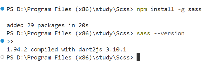
使用介绍
创建demo.scss
css
// Sass 变量定义
$primary-color: #007bff;
$secondary-color: #6c757d;
$bg-color: rgb(218, 245, 243);
$text-color: #333;
$border-radius: 8px;
// 基础样式
body {
background-color: $bg-color;
color: $text-color;
font-family: Arial, sans-serif;
margin: 0;
padding: 20px;
}
// 容器
.container {
max-width: 800px;
margin: 0 auto;
}
// 标题
h1 {
color: $primary-color;
text-align: center;
}
h2 {
color: $primary-color;
}
p {
line-height: 1.6;
}
// 按钮样式
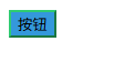
.btn {
padding: 10px 20px;
border: none;
border-radius: $border-radius;
margin: 5px;
cursor: pointer;
transition: all 0.3s ease;
background-color: $primary-color;
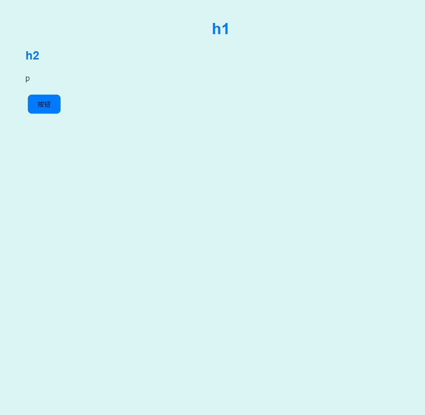
}创建demo.html
html
<!DOCTYPE html>
<html lang="zh-CN">
<head>
<meta charset="UTF-8">
<meta name="viewport"
content="width=device-width, initial-scale=1.0">
<title>Sass 简单案例</title>
<link rel="stylesheet"
href="demo.css">
</head>
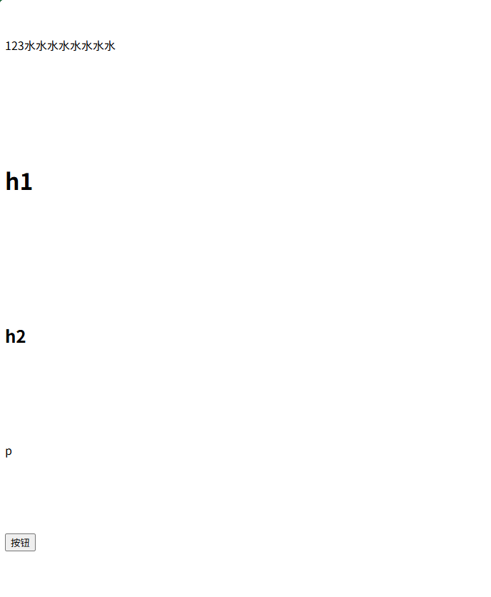
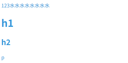
<body>
<div class="container">
<h1>h1</h1>
<h2>h2</h2>
<p>p</p>
<button class="btn ">按钮</button>
</div>
</body>
</html>将SCSS文件编译为CSS文件
bash
sass demo.scss demo.cssdemo.scss 是要转换的 SCSS 文件路径,demo.css 是生成的 CSS 文件路径。
生成
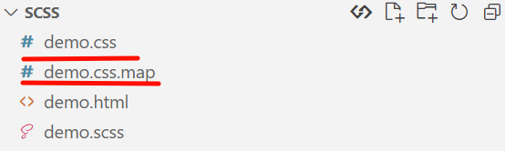
CSS.map 文件的作用
.css.map 文件是 Source Map(源映射) 文件,它建立了编译后的CSS代码与原始SCSS源代码之间的映射关系。
为什么需要Source Map?
- 调试便利:当你在浏览器开发者工具中检查元素时,可以直接看到原始的SCSS代码行号,而不是编译后的CSS代码
- 错误定位:如果CSS有问题,可以快速追溯到SCSS源文件中的具体位置
- 开发体验:让预处理器开发体验接近原生CSS开发
bash
# 默认会生成Source Map
sass demo.scss demo.css

# 禁用Source Map生成
sass --no-source-map demo.scss demo.css

# 明确启用Source Map(默认行为)
sass --source-map demo.scss demo.css
展示
Sass变量概述
Sass变量允许您存储信息,然后在整个样式表中重复使用。这使得CSS更加可维护、可重用和易于管理。
变量的语法
css
// 使用$符号声明变量
$bg-color: rgb(218, 245, 243);;

// 使用变量
body {
  background-color: $bg-color;
}
变量的命名规则
- 必须以美元符号(
$)开头 - 可以包含字母、数字、下划线(_)和连字符(-)
- 不能以数字开头
- 区分大小写
css
$primary-color: #3498db;      // 有效
$secondary_color: #2ecc71;    // 有效
$fontSize: 16px;              // 有效
$1st-color: red;              // 无效,不能以数字开头
变量的数据类型
Sass支持多种数据类型的变量:
1. 数字
css
$base-font-size: 16px;
$line-height: 7;
$border-radius: 4px;

body {
  font-size: $base-font-size;
  line-height: $line-height;
}
2. 字符串
css
$font-family: "Helvetica Neue", Arial, sans-serif;
$message: "Hello, Sass!";

h1 {
  font-family: $font-family;
}
3. 颜色
css
$primary-color: #3498db;
$secondary-color: #2ecc71;
$transparent-color: rgba(255, 255, 255, 0.8);

.button {
  background-color: $primary-color;
  border-color: $secondary-color;
}
4. 布尔值
css
$debug: true;
$rounded-corners: false;

@if $debug {
  border: 1px solid red;
}

@if $rounded-corners {
  border-radius: 5px;
}
5. 列表
css
$margin-list: 10px 15px 20px 25px;
$font-stack: "Helvetica", "Arial", sans-serif;
$sizes: small, medium, large;

// 使用nth()函数访问列表元素
.element {
  margin-top: nth($margin-list, 1); // 10px
  font-family: nth($font-stack, 2); // "Arial"
}
6. Maps(键值对)
css
$colors: (
  "primary": #3498db,
  "secondary": #2ecc71,
  "accent": #e74c3c
);

.button-primary {
  background-color: map-get($colors, "primary");
}

.button-secondary {
  background-color: map-get($colors, "secondary");
}
7. null
css
$variable: null;

// 当变量为null时,它不会被编译到CSS中
.element {
  content: $variable; // 这行不会出现在编译后的CSS中
}
变量的作用域
Sass变量有全局作用域和局部作用域:
css
$global-color: blue; // 全局变量

.container {
  $local-color: red; // 局部变量
  color: $global-color; // 可以访问全局变量

  .child {
    color: $local-color; // 可以访问父级的局部变量
  }
}

// 这里无法访问 $local-color,因为它在 .container 块内定义
css
<body>
    <text>123水水水水水水水水</text>
    <div class="container">
        <h1>h1</h1>
        <h2>h2</h2>
        <div class="child"
            <p>p</p>
        </div>
    </div>
</body>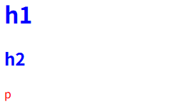
使用 !global 标志
css
.container {
  $local-color: red !global; // 将局部变量提升为全局变量
}

.footer {
  color: $local-color; // 现在可以访问
}
css
    <div class="container">
    </div>
    <div class="footer">
        <text>123</text>
    </div>
使用 !default 标志
!default 标志允许您设置默认值,只有在变量尚未定义时才赋值:
css
$primary-color: #3498db !default;

// 如果 $primary-color 已经定义,上面的赋值不会发生
$primary-color: #e74c3c; // 这会覆盖默认值

.button {
  background-color: $primary-color; // 使用 #e74c3c
}
变量的插值
您可以使用 #{} 插值语法在属性名、选择器等地方使用变量:
css
$prefix: "user";

.#{$prefix}-header {
  font-size: 20px;
}

.#{$prefix}-content {
  font-size: 16px;
}

// 属性名中使用变量
$property: margin;

.element {
  #{$property}-top: 10px;
  #{$property}-bottom: 20px;
}
变量中的特殊函数
Sass提供了一些内置函数来处理变量:
颜色函数
css
$primary-color: #3498db;

.button {
  background-color: $primary-color;

  // 颜色变暗
  &:hover {
    background-color: darken($primary-color, 10%);
  }

  // 颜色变亮
  &:active {
    background-color: lighten($primary-color, 10%);
  }

  // 调整色相
  &.alt {
    background-color: adjust-hue($primary-color, 180deg);
  }
}
数字函数
css
$base-size: 16px;

.element {
  // 单位转换
  width: unit($base-size); // 16
  height: unitless($base-size); // false

  // 绝对值
  padding: abs(-10px); // 10px

  // 四舍五入
  margin: round(15.7px); // 16px

  // 最大值/最小值
  font-size: max(14px, $base-size); // 16px
}
字符串函数
css
$message: "Hello, Sass!";

.element {
  // 字符串长度
  width: str-length($message); // 12

  // 字符串插入
  content: str-insert($message, "World", 7); // "Hello, World!"

  // 转换为大写
  content: to-upper-case($message); // "HELLO, SASS!"
}
变量覆盖
变量可以被重新赋值,后面的值会覆盖前面的值:
css
$color: blue;
$color: red; // 这会覆盖前面的值

.text {
  color: $color; // 红色
}
实际应用示例
1. 主题系统
css
// 定义主题变量
$themes: (
  "light": (
    "bg-color": #ffffff,
    "text-color": #333333,
    "primary": #3498db
  ),
  "dark": (
    "bg-color": #222222,
    "text-color": #eeeeee,
    "primary": #3498db
  )
);

// 创建主题混合
@mixin theme($theme-name) {
  $theme: map-get($themes, $theme-name);

  background-color: map-get($theme, "bg-color");
  color: map-get($theme, "text-color");

  .btn-primary {
    background-color: map-get($theme, "primary");
  }
}

// 应用主题
.light-theme {
  @include theme("light");
}

.dark-theme {
  @include theme("dark");
}
2. 响应式断点系统
css
// 断点变量
$breakpoints: (
  "sm": 576px,
  "md": 768px,
  "lg": 992px,
  "xl": 1200px
);

// 响应式混合
@mixin respond-to($breakpoint) {
  @media (min-width: map-get($breakpoints, $breakpoint)) {
    @content;
  }
}

// 使用
.container {
  width: 100%;

  @include respond-to("sm") {
    width: 540px;
  }

  @include respond-to("md") {
    width: 720px;
  }

  @include respond-to("lg") {
    width: 960px;
  }
}
3. 间距系统
css
// 间距变量
$spacers: (
  0: 0,
  1: 0.25rem,
  2: 0.5rem,
  3: 1rem,
  4: 1.5rem,
  5: 3rem
);

// 生成间距类
@each $key, $value in $spacers {
  .m-#{$key} { margin: $value !important; }
  .p-#{$key} { padding: $value !important; }

  .mt-#{$key} { margin-top: $value !important; }
  .mb-#{$key} { margin-bottom: $value !important; }

  .pt-#{$key} { padding-top: $value !important; }
  .pb-#{$key} { padding-bottom: $value !important; }
}
最佳实践
- 有意义的命名 :使用描述性的变量名,如
$primary-color而不是$c1 - 组织变量 :将相关变量组织在一起,通常放在单独的文件中(如
_variables.scss) - 使用默认值 :使用
!default标志创建可覆盖的变量系统 - 合理使用作用域:避免全局污染,适当使用局部变量
- 文档化变量:为复杂变量添加注释说明
CSS自定义变量 vs Sass变量
Sass变量和CSS自定义变量(CSS变量)有一些区别:
| 特性 | Sass变量 | CSS自定义变量 |
|---|---|---|
| 语法 | $variable |
--variable |
| 使用 | property: $variable |
property: var(--variable) |
| 编译时处理 | 是 | 否 |
| 运行时修改 | 否 | 是 |
| 作用域 | Sass作用域规则 | DOM作用域 |
| 浏览器支持 | 编译后支持 | 现代浏览器支持 |
总结
Sass变量是CSS预处理器的核心功能之一,它们提供了一种强大而灵活的方式来管理样式表中的值。通过合理使用变量,您可以:
- 提高代码的可维护性
- 减少重复
- 创建一致的设计系统
- 轻松实现主题切换
- 建立响应式断点系统
变量是掌握Sass的第一步,也是最重要的一步。
Sass 嵌套规则与属性
Sass允许您按照HTML文档的结构嵌套CSS选择器,这使代码更加清晰、有组织性,并且更易于维护。它模仿了HTML的层级结构,让您能够直观地看到元素之间的关系。
传统CSS vs Sass嵌套
传统CSS写法:
css
nav ul {
  margin: 0;
  padding: 0;
  list-style: none;
}

nav li {
  display: inline-block;
}

nav a {
  display: block;
  padding: 6px 12px;
  text-decoration: none;
}
Sass嵌套写法:
css
nav {
  ul {
    margin: 0;
    padding: 0;
    list-style: none;
  }

  li {
    display: inline-block;
  }

  a {
    display: block;
    padding: 6px 12px;
    text-decoration: none;
  }
}
嵌套选择器
1. 后代选择器嵌套
这是最常见的嵌套类型,嵌套的选择器会被编译为后代选择器:
css
.container {
  background-color: #f8f9fa;

  .header {
    font-size: 24px;
    color: #333;

    .title {
      font-weight: bold;
    }
  }
}

// 编译为:
.container {
  background-color: #f8f9fa;
}
.container .header {
  font-size: 24px;
  color: #333;
}
.container .header .title {
  font-weight: bold;
}
2. 子选择器嵌套
使用 > 选择器表示直接子元素:
css
nav > ul {
  margin: 0;

  > li {
    list-style: none;
  }
}

// 编译为:
nav > ul {
  margin: 0;
}
nav > ul > li {
  list-style: none;
}
3. 相邻兄弟选择器嵌套
使用 + 选择器表示相邻兄弟元素:
css
h1 + p {
  font-style: italic;
}

// 编译为:
h1 + p {
  font-style: italic;
}
4. 通用兄弟选择器嵌套
使用 ~ 选择器表示通用兄弟元素:
css
h2 ~ p {
  margin-top: 10px;
}

// 编译为:
h2 ~ p {
  margin-top: 10px;
}
父选择器引用(&符号)
& 符号是Sass中最强大的嵌套功能之一,它引用父选择器。
1. 基本用法
css
.button {
  display: inline-block;
  padding: 10px 20px;

  &:hover {
    background-color: darken(#3498db, 10%);
  }

  &:active {
    transform: scale(0.98);
  }
}

// 编译为:
.button {
  display: inline-block;
  padding: 10px 20px;
}
.button:hover {
  background-color: #2980b9;
}
.button:active {
  transform: scale(0.98);
}
2. 伪类和伪元素
css
.input {
  border: 1px solid #ccc;

  &:focus {
    border-color: #3498db;
    outline: none;
  }

  &::placeholder {
    color: #999;
  }
}

// 编译为:
.input {
  border: 1px solid #ccc;
}
.input:focus {
  border-color: #3498db;
  outline: none;
}
.input::placeholder {
  color: #999;
}
3. BEM命名约定
- 中划线 :仅作为连字符使用,表示某个块或者某个子元素的多单词之间的连接记号。
__ 双下划线:双下划线用来连接块和块的子元素
-- 双连字符:双连字符用来描述一个块或者块的子元素的一种状态
css
.card {
  padding: 20px;

  &__header {
    font-size: 18px;
  }

  &__content {
    margin-top: 10px;
  }

  &--highlighted {
    border: 2px solid #3498db;
  }
}

// 编译为:
.card {
  padding: 20px;
}
.card__header {
  font-size: 18px;
}
.card__content {
  margin-top: 10px;
}
.card--highlighted {
  border: 2px solid #3498db;
}
4. 复杂选择器组合
css
.container {
  .item {
    // 引用两个父选择器
    .sidebar & {
      width: 100%;
    }

    // 使用父选择器作为前缀
    &-title {
      font-weight: bold;
    }
  }
}

// 编译为:
.container .item {
}
.sidebar .container .item {
  width: 100%;
}
.container .item-title {
  font-weight: bold;
}
嵌套属性
Sass允许您将相关的CSS属性嵌套在一个命名空间下,特别适用于带有相同前缀的属性,如 font- 、 margin- 、 padding- 等。
1. 基本属性嵌套
css
.button {
  font: {
    family: Arial, sans-serif;
    size: 16px;
    weight: bold;
  }

  margin: {
    top: 10px;
    right: 20px;
    bottom: 10px;
    left: 20px;
  }
}

// 编译为:
.button {
  font-family: Arial, sans-serif;
  font-size: 16px;
  font-weight: bold;
  margin-top: 10px;
  margin-right: 20px;
  margin-bottom: 10px;
  margin-left: 20px;
}
2. 带有值的命名空间
css
.text {
  border: {
    color: #333;
    style: solid;
    width: 1px;
  }
}

// 编译为:
.text {
  border-color: #333;
  border-style: solid;
  border-width: 1px;
}
3. 混合使用
css
.box {
  padding: {
    top: 15px;
    bottom: 15px;
  }

  margin-left: 20px;
  margin-right: 20px;
}

// 编译为:
.box {
  padding-top: 15px;
  padding-bottom: 15px;
  margin-left: 20px;
  margin-right: 20px;
}
嵌套的最佳实践
1. 避免过度嵌套
过度嵌套会导致CSS选择器过于复杂,难以维护:
css
// 不推荐:嵌套过深
.container {
  .sidebar {
    .widget {
      .title {
        .icon {
          // 太深了!
        }
      }
    }
  }
}

// 推荐:限制嵌套深度(通常不超过3层)
.container {
  .sidebar {
    .widget {
      .title {
        // 最多3层
      }
    }

    .widget-icon {
      // 单独处理深层元素
    }
  }
}
2. 使用BEM减少嵌套
BEM(Block Element Modifier)命名约定可以帮助减少嵌套深度:
css
// 不推荐:深度嵌套
.card {
  .header {
    .title {
      .icon {
        // 太深
      }
    }
  }
}

// 推荐:使用BEM
.card {
  // 块级样式
}

.card__header {
  // 元素样式
}

.card__title {
  // 元素样式
}

.card__title-icon {
  // 元素样式
}
3. 仅在必要时嵌套
css
// 不推荐:不必要地嵌套
.page {
  .header {
    // 如果没有共享样式,不必嵌套
  }

  .content {
    // 如果没有共享样式,不必嵌套
  }
}

// 推荐:扁平化结构
.page-header {
  // 直接定义
}

.page-content {
  // 直接定义
}
实际应用示例
1. 导航菜单
css
.nav {
  background-color: #fff;
  box-shadow: 0 2px 4px rgba(0, 0, 0, 0.1);

  &__list {
    display: flex;
    list-style: none;
    margin: 0;
    padding: 0;
  }

  &__item {
    position: relative;

    &:hover {
      .nav__dropdown {
        display: block;
      }
    }
  }

  &__link {
    display: block;
    padding: 1rem;
    color: #333;
    text-decoration: none;
    transition: color 0.3s;

    &:hover {
      color: #007bff;
    }
  }

  &__dropdown {
    display: none;
    position: absolute;
    top: 100%;
    left: 0;
    min-width: 200px;
    background-color: #fff;
    box-shadow: 0 4px 8px rgba(0, 0, 0, 0.1);

    .nav__link {
      padding: 0.75rem 1rem;
    }
  }
}
2. 表单组件
css
.form {
  &__group {
    margin-bottom: 1.5rem;

    &--error {
      .form__label {
        color: #dc3545;
      }

      .form__input {
        border-color: #dc3545;

        &:focus {
          border-color: #dc3545;
          box-shadow: 0 0 0 0.2rem rgba(220, 53, 69, 0.25);
        }
      }

      .form__error-message {
        display: block;
        color: #dc3545;
        font-size: 0.875rem;
        margin-top: 0.25rem;
      }
    }
  }

  &__label {
    display: block;
    margin-bottom: 0.5rem;
    font-weight: 500;
  }

  &__input {
    display: block;
    width: 100%;
    padding: 0.75rem 1rem;
    font-size: 1rem;
    line-height: 1.5;
    color: #495057;
    background-color: #fff;
    border: 1px solid #ced4da;
    border-radius: 0.25rem;
    transition: border-color 0.15s ease-in-out, box-shadow 0.15s ease-in-out;

    &:focus {
      outline: 0;
      border-color: #80bdff;
      box-shadow: 0 0 0 0.2rem rgba(0, 123, 255, 0.25);
    }
  }

  &__error-message {
    display: none; // 默认隐藏错误消息
  }
}
3. 响应式设计中的嵌套
css
.card {
  padding: 1.5rem;
  border-radius: 0.25rem;
  box-shadow: 0 2px 4px rgba(0, 0, 0, 0.1);

  @media (min-width: 768px) {
    padding: 2rem;
  }

  &__header {
    display: flex;
    align-items: center;
    justify-content: space-between;
    margin-bottom: 1rem;

    @media (min-width: 768px) {
      margin-bottom: 1.5rem;
    }
  }

  &__title {
    margin: 0;
    font-size: 1.25rem;

    @media (min-width: 768px) {
      font-size: 1.5rem;
    }
  }

  &__content {
    color: #6c757d;

    p {
      margin-bottom: 1rem;

      &:last-child {
        margin-bottom: 0;
      }
    }
  }
}
嵌套规则与编译性能
虽然嵌套使代码更易读,但过度嵌套可能会影响编译性能和生成的CSS大小。以下是一些性能考虑:
- 嵌套深度与CSS特异性:嵌套越深,生成的CSS选择器特异性越高,可能导致样式难以覆盖
- 文件大小:过度嵌套会增加生成的CSS文件大小
- 编译时间:复杂的嵌套结构可能增加Sass编译时间
总结
Sass的嵌套规则和属性功能为CSS开发带来了巨大的便利:
- 代码组织性:按照HTML结构组织CSS,直观易懂
- 可维护性:相关样式集中管理,修改更容易
- 减少重复:避免重复编写父选择器
- 属性简洁性:相关属性可以组织在一起
但是,也需要注意避免过度嵌套,保持合理的嵌套深度,并选择适当的命名约定(如BEM)来平衡代码的清晰性和性能。
Sass @import 与 Partials
Sass的 @import 功能允许您将多个Sass文件合并为一个CSS文件。这有助于将样式分割为更小、更易于管理的部分,提高代码的可维护性和重用性。
与原生CSS @import的区别
-
性能差异:
- CSS的
@import会在页面加载时发送额外的HTTP请求,影响性能 - Sass的
@import在编译时将文件内容合并,生成单个CSS文件
- CSS的
-
文件扩展名:
- Sass可以省略文件扩展名,自动查找
.scss、.sass或.css文件 - CSS必须指定完整文件名
- Sass可以省略文件扩展名,自动查找
-
处理方式:
- Sass在编译时处理导入
- CSS在浏览器运行时处理导入
Partials(部分文件)
什么是Partials
Partials是以下划线( _ )开头的Sass文件,它们不会被直接编译为CSS文件,而是专门用于被其他文件导入。
css
// _variables.scss
$primary-color: #3498db;
$secondary-color: #2ecc71;
$font-size: 16px;
Partials的优势
- 防止编译冲突:不会生成单独的CSS文件
- 明确用途:下划线表示这是一个部分文件
- 文件组织:便于将相关样式分组
css
// main.scss
@import 'variables'; // 导入_variables.scss,但不必写下划线或扩展名

body {
  color: $primary-color;
  font-size: $font-size;
}
@import 语法与用法
基本语法
css
@import "filename"; // 使用引号
@import 'filename'; // 使用单引号也可以
@import filename;    // 不使用引号也可以(不推荐)
文件搜索顺序
当您导入一个文件时,Sass会按以下顺序查找:
_filename.scss_filename.sassfilename.scssfilename.sassfilename.css
导入多个文件
css
@import "variables", "mixins", "reset";
// 等同于:
@import "variables";
@import "mixins";
@import "reset";
文件组织结构
典型的Sass项目结构
css
scss/
├── main.scss              // 主文件,导入所有部分文件
├── _variables.scss        // 变量定义
├── _mixins.scss           // 混合宏
├── _functions.scss        // 自定义函数
├── _placeholders.scss     // 占位符选择器
├── base/
│   ├── _reset.scss        // 重置样式
│   ├── _typography.scss   // 排版样式
│   └── _base.scss         // 基础样式
├── components/
│   ├── _buttons.scss      // 按钮样式
│   ├── _cards.scss        // 卡片样式
│   └── _forms.scss        // 表单样式
├── layout/
│   ├── _header.scss       // 头部布局
│   ├── _footer.scss       // 底部布局
│   └── _grid.scss         // 网格系统
└── pages/
    ├── _home.scss         // 首页样式
    └── _about.scss        // 关于页面样式
main.scss 示例
css
// 清理CSS
@charset "utf-8";

// 导入变量和函数
@import "variables";
@import "functions";
@import "mixins";
@import "placeholders";

// 导入基础样式
@import "base/reset";
@import "base/typography";
@import "base/base";

// 导入布局
@import "layout/header";
@import "layout/footer";
@import "layout/grid";

// 导入组件
@import "components/buttons";
@import "components/cards";
@import "components/forms";

// 导入页面特定样式
@import "pages/home";
@import "pages/about";
导入不同类型的文件
1. 导入Sass/SCSS文件
css
@import "variables"; // 导入_variables.scss
@import "mixins/utils"; // 导入_mixins/utils.scss
2. 导入CSS文件
css
// 直接导入CSS文件,内容会被原样包含在输出中
@import "normalize.css";
3. 导入URL
css
// 导入外部CSS文件
@import url("https://fonts.googleapis.com/css?family=Open+Sans");
导入的作用域
变量作用域
css
// _variables.scss
$primary-color: #3498db;

// _buttons.scss
@import "variables"; // 导入变量

.button {
  background-color: $primary-color; // 可以使用导入的变量
}

// main.scss
@import "variables";
@import "buttons";

.header {
  background-color: $primary-color; // 也可以使用
}
变量覆盖
导入顺序很重要,后导入的文件会覆盖先导入文件中的变量:
css
// _variables.scss
$primary-color: #3498db;

// _theme.scss
$primary-color: #e74c3c; // 覆盖前面的变量

// main.scss
@import "variables";
@import "theme";

.button {
  background-color: $primary-color; // 使用#e74c3c
}
使用!default防止覆盖
使用 !default 标志可以防止变量被意外覆盖:
css
// _variables.scss
$primary-color: #3498db !default;
$font-size: 16px !default;

// main.scss
$primary-color: #e74c3c; // 这会覆盖默认值

@import "variables"; // 由于$primary-color已定义,不会使用默认值

// 但如果没有在前面定义,$font-size会使用默认值16px
条件导入
使用@if控制导入
css
// 根据变量决定导入哪个主题文件
@if $theme == "light" {
  @import "themes/light";
} @else if $theme == "dark" {
  @import "themes/dark";
} @else {
  @import "themes/default";
}
使用@import的optional标志
css
// 尝试导入文件,如果不存在不会报错
@import "optional-file" as *;
高级用法
1. 嵌套导入
css
// _theme.scss
.theme-light {
  background-color: #fff;
  color: #333;
}

// main.scss
.container {
  @import "theme"; // 在.container内导入

  .content {
    padding: 20px;
  }
}

// 编译为:
.container .theme-light {
  background-color: #fff;
  color: #333;
}

.container .content {
  padding: 20px;
}
2. 添加命名空间
css
// 导入文件并添加命名空间
@import "variables" as vars;

.button {
  background-color: vars.$primary-color; // 使用命名空间访问变量
}
最佳实践
1. 文件命名
- 使用下划线前缀(
_)表示部分文件 - 使用小写字母和连字符命名文件
- 保持文件名描述性强
css
_variables.scss      // 好的命名
_buttons.scss        // 好的命名
form-styles.scss    // 好的命名
VARs.scss           // 不好的命名(大写字母)
btn.scss            // 不好的命名(缩写不清晰)
2. 导入顺序
- 首先导入变量、函数和混合宏
- 然后导入基础样式和重置
- 接着导入布局和组件
- 最后导入页面特定样式和覆盖
css
// 标准导入顺序
@import "variables";
@import "functions";
@import "mixins";

@import "base/reset";
@import "base/typography";

@import "layout/grid";
@import "layout/header";

@import "components/buttons";
@import "components/cards";

@import "pages/home";
3. 避免循环依赖
确保文件之间没有循环导入,这会导致编译错误:
css
// _file1.scss
@import "file2"; // 导入file2

// _file2.scss
@import "file1"; // 错误:循环导入
4. 使用索引文件简化导入
创建 _index.scss 文件来简化目录导入:
css
components/
├── _index.scss    // 索引文件,导入目录下所有部分文件
├── _buttons.scss
├── _cards.scss
└── _forms.scss
css
// components/_index.scss
@import "buttons";
@import "cards";
@import "forms";

// main.scss
@import "components"; // 导入整个components目录
实际应用示例
1. 创建一个变量库
css
// _variables.scss
// 颜色
$primary-color: #3498db !default;
$secondary-color: #2ecc71 !default;
$success-color: #27ae60 !default;
$warning-color: #f39c12 !default;
$error-color: #e74c3c !default;

// 字体
$font-family-base: "Helvetica Neue", Arial, sans-serif !default;
$font-size-base: 16px !default;
$line-height-base: 1.5 !default;

// 间距
$spacer: 1rem !default;
$spacer-1: $spacer !default;    // 1rem
$spacer-2: ($spacer * 1.5) !default;  // 1.5rem
$spacer-3: ($spacer * 2) !default;    // 2rem

// 断点
$breakpoint-sm: 576px !default;
$breakpoint-md: 768px !default;
$breakpoint-lg: 992px !default;
$breakpoint-xl: 1200px !default;
2. 创建一个混合宏库
css
// _mixins.scss
// 导入变量
@import "variables";

// 响应式断点混合宏
@mixin respond-to($breakpoint) {
  @if $breakpoint == sm {
    @media (min-width: $breakpoint-sm) {
      @content;
    }
  } @else if $breakpoint == md {
    @media (min-width: $breakpoint-md) {
      @content;
    }
  } @else if $breakpoint == lg {
    @media (min-width: $breakpoint-lg) {
      @content;
    }
  } @else if $breakpoint == xl {
    @media (min-width: $breakpoint-xl) {
      @content;
    }
  }
}

// 按钮样式混合宏
@mixin button-variant($bg-color, $color: white) {
  background-color: $bg-color;
  color: $color;
  border: 1px solid $bg-color;

  &:hover,
  &:focus {
    background-color: darken($bg-color, 10%);
    border-color: darken($bg-color, 10%);
  }

  &:active {
    background-color: darken($bg-color, 15%);
    border-color: darken($bg-color, 15%);
  }
}
3. 使用模块化组织样式
css
// main.scss
@import "variables";
@import "mixins";

@import "base/reset";
@import "base/typography";

@import "layout/grid";
@import "layout/header";
@import "layout/footer";

@import "components/buttons";
@import "components/cards";
@import "components/navigation";

// 自定义样式
.hero {
  background-color: $primary-color;
  padding: $spacer-3 0;

  .title {
    color: white;
    font-size: ($font-size-base * 2);

    @include respond-to(md) {
      font-size: ($font-size-base * 3);
    }
  }

  .button {
    @include button-variant($secondary-color);

    &-alt {
      @include button-variant(white, $primary-color);
    }
  }
}
现代CSS @import vs Sass @import
随着CSS模块化的需求增加,现代CSS也引入了 @import 语法,但与Sass的 @import 有所不同:
| 特性 | Sass @import | CSS @import |
|---|---|---|
| 处理时间 | 编译时 | 运行时 |
| 性能影响 | 无额外请求 | 产生额外HTTP请求 |
| 文件合并 | 是 | 否 |
| 文件扩展名 | 可省略 | 必须指定 |
| 支持功能 | 变量、混合等 | 仅CSS |
总结
Sass的 @import 与Partials功能提供了一种强大的方式来组织和模块化CSS代码:
- 代码组织:将大型样式表分解为更小、更易于管理的部分
- 重用性:创建可重用的变量、混合和函数库
- 维护性:相关样式分组,便于查找和修改
- 团队协作:团队成员可以并行开发不同的部分文件
通过合理使用 @import 和Partials,可以构建出结构清晰、易于维护的Sass项目,提高开发效率和代码质量。
Sass @mixin 与 @include
Sass Mixin(混合)概述
Mixin是Sass中用于定义可重用CSS规则块的功能,类似于编程语言中的函数。它允许您创建包含CSS声明的模板,然后在需要的地方将其包含进来。
Mixin与普通CSS类的区别
-
Mixin:
- 在编译时展开,生成具体的CSS规则
- 可以接受参数
- 不会直接出现在最终的CSS中
-
CSS类:
- 直接存在于CSS中
- 通过HTML的class属性应用
- 不能接受参数
定义和使用Mixin
1. 基本Mixin定义与使用
css
// 定义一个简单的Mixin
@mixin center-block {
  display: block;
  margin-left: auto;
  margin-right: auto;
}

// 使用Mixin
.container {
  @include center-block;
}

// 编译为:
.container {
  display: block;
  margin-left: auto;
  margin-right: auto;
}
2. 带参数的Mixin
css
// 定义带参数的Mixin
@mixin border-radius($radius) {
  border-radius: $radius;
  -webkit-border-radius: $radius;
  -moz-border-radius: $radius;
}

// 使用带参数的Mixin
.button {
  @include border-radius(5px);
}

.box {
  @include border-radius(10px);
}

// 编译为:
.button {
  border-radius: 5px;
  -webkit-border-radius: 5px;
  -moz-border-radius: 5px;
}
.box {
  border-radius: 10px;
  -webkit-border-radius: 10px;
  -moz-border-radius: 10px;
}
3. 带默认参数的Mixin
css
// 定义带默认参数的Mixin
@mixin transition($property: all, $duration: 0.3s, $timing: ease) {
  transition: $property $duration $timing;
  -webkit-transition: $property $duration $timing;
  -moz-transition: $property $duration $timing;
}

// 使用不同参数的Mixin
.button {
  @include transition; // 使用所有默认参数
}

.card {
  @include transition(opacity, 0.5s); // 覆盖前两个参数
}

.modal {
  @include transition(transform, 0.4s, ease-out); // 覆盖所有参数
}
4. 可变参数的Mixin
css
// 使用...定义可变参数
@mixin box-shadow($shadows...) {
  box-shadow: $shadows;
  -webkit-box-shadow: $shadows;
  -moz-box-shadow: $shadows;
}

// 使用可变参数
.card {
  @include box-shadow(0 4px 8px rgba(0, 0, 0, 0.1));
}

.button {
  @include box-shadow(0 2px 4px rgba(0, 0, 0, 0.1), inset 0 1px 0 rgba(255, 255, 255, 0.5));
}
Mixin高级用法
1. 条件语句
css
// 定义带条件判断的Mixin
@mixin text-overflow($lines: 1) {
  @if $lines == 1 {
    overflow: hidden;
    text-overflow: ellipsis;
    white-space: nowrap;
  } @else {
    display: -webkit-box;
    -webkit-line-clamp: $lines;
    -webkit-box-orient: vertical;
    overflow: hidden;
  }
}

// 使用条件Mixin
.title-single {
  @include text-overflow(1); // 单行省略
}

.title-multi {
  @include text-overflow(3); // 三行省略
}
2. 循环语句
css
// 定义带循环的Mixin
@mixin generate-sizes($prefix, $sizes...) {
  @each $size in $sizes {
    .#{$prefix}-#{$size} {
      font-size: #{$size}px;
    }
  }
}

// 使用循环Mixin
@include generate-sizes(text, 12, 14, 16, 18, 20);

// 编译为:
.text-12 { font-size: 12px; }
.text-14 { font-size: 14px; }
.text-16 { font-size: 16px; }
.text-18 { font-size: 18px; }
.text-20 { font-size: 20px; }
3. Mixin内容块
css
// 定义接受内容块的Mixin
@mixin screen($size) {
  @media (min-width: $size) {
    @content; // 插入传入的内容块
  }
}

// 使用内容块
.container {
  width: 100%;

  @include screen(768px) {
    width: 750px;
  }

  @include screen(992px) {
    width: 970px;
  }
}

// 编译为:
.container {
  width: 100%;
}
@media (min-width: 768px) {
  .container {
    width: 750px;
  }
}
@media (min-width: 992px) {
  .container {
    width: 970px;
  }
}
4. 变量作用域
css
// 全局变量
$default-color: #333;

@mixin theme-style($theme-color) {
  // Mixin内部变量
  $local-color: $theme-color;

  color: $local-color;

  .child {
    // 可以访问Mixin内部的变量
    background-color: lighten($local-color, 40%);
  }
}

.button {
  @include theme-style($default-color);
}
实用Mixin示例
1. 响应式设计Mixin
css
// 定义断点变量
$breakpoints: (
  xs: 0,
  sm: 576px,
  md: 768px,
  lg: 992px,
  xl: 1200px
);

// 响应式Mixin
@mixin respond-to($breakpoint) {
  @if map-has-key($breakpoints, $breakpoint) {
    @media (min-width: map-get($breakpoints, $breakpoint)) {
      @content;
    }
  } @else {
    @warn "未知的断点: #{$breakpoint}. 可用断点: #{map-keys($breakpoints)}";
  }
}

// 使用响应式Mixin
.container {
  padding: 15px;

  @include respond-to(sm) {
    padding: 20px;
  }

  @include respond-to(md) {
    padding: 30px;
  }

  @include respond-to(lg) {
    padding: 40px;
  }
}
2. 按钮样式Mixin
css
// 按钮基础样式Mixin
@mixin button-base {
  display: inline-block;
  padding: 10px 20px;
  font-size: 16px;
  font-weight: 500;
  text-align: center;
  text-decoration: none;
  cursor: pointer;
  border: 1px solid transparent;
  border-radius: 4px;
  transition: all 0.2s ease-in-out;

  &:focus {
    outline: 0;
    box-shadow: 0 0 0 2px rgba(0, 123, 255, 0.25);
  }

  &:disabled {
    opacity: 0.65;
    cursor: not-allowed;
  }
}

// 按钮变体Mixin
@mixin button-variant($bg-color, $color: white) {
  background-color: $bg-color;
  color: $color;
  border-color: $bg-color;

  &:hover:not(:disabled) {
    background-color: darken($bg-color, 7.5%);
    border-color: darken($bg-color, 10%);
  }

  &:active:not(:disabled) {
    background-color: darken($bg-color, 10%);
    border-color: darken($bg-color, 12.5%);
  }
}

// 使用按钮Mixin
.btn {
  @include button-base;
}

.btn-primary {
  @include button-variant(#007bff);
}

.btn-success {
  @include button-variant(#28a745);
}

.btn-outline {
  background-color: transparent;
  color: #007bff;
  border-color: #007bff;

  @include button-variant(transparent, #007bff);
}
3. 网格系统Mixin
css
// 网格容器Mixin
@mixin make-container {
  width: 100%;
  padding-right: 15px;
  padding-left: 15px;
  margin-right: auto;
  margin-left: auto;
}

// 网格行Mixin
@mixin make-row {
  display: flex;
  flex-wrap: wrap;
  margin-right: -15px;
  margin-left: -15px;
}

// 网格列Mixin
@mixin make-col($size, $columns: 12) {
  flex: 0 0 percentage($size / $columns);
  max-width: percentage($size / $columns);
  padding-right: 15px;
  padding-left: 15px;
}

// 响应式网格列Mixin
@mixin make-col-responsive($size, $breakpoint: null) {
  @if $breakpoint {
    @include respond-to($breakpoint) {
      @include make-col($size);
    }
  } @else {
    @include make-col($size);
  }
}

// 使用网格Mixin
.container {
  @include make-container;
}

.row {
  @include make-row;
}

.col {
  @include make-col(12);

  @include respond-to(sm) {
    @include make-col(6);
  }

  @include respond-to(md) {
    @include make-col(4);
  }
}

.col-8 {
  @include make-col(8);
}

.col-md-6 {
  @include make-col-responsive(6, md);
}
Mixin的最佳实践
1. 合理命名
css
// 好的命名:描述性强,清晰易懂
@mixin button-variant($bg-color, $color: white) { ... }
@mixin respond-to($breakpoint) { ... }
@mixin flex-center { ... }

// 不好的命名:缩写不清晰,用途不明
@mixin btn-var($c, $t: w) { ... }
@mixin resp($bp) { ... }
2. 参数验证
css
// 带参数验证的Mixin
@mixin font-size($size) {
  @if type-of($size) != number {
    @error "字体大小必须是数字,但传递的是 #{type-of($size)}";
  }

  @if not unitless($size) and unit($size) != px and unit($size) != rem {
    @error "字体大小单位必须是px或rem";
  }

  font-size: $size;
}
3. 避免过度复杂
css
// 不推荐:过于复杂的Mixin
@mixin complex-button($size, $color, $hover-color, $text-color, $border-radius, $padding, $shadow) {
  // 大量复杂的代码...
}

// 推荐:分解为多个简单的Mixin
@mixin button-base { ... }
@mixin button-size($size, $padding) { ... }
@mixin button-variant($color, $hover-color, $text-color) { ... }
@mixin button-shape($border-radius) { ... }
@mixin button-shadow($shadow) { ... }

// 组合使用简单的Mixin
.btn {
  @include button-base;
  @include button-size(medium, 10px 20px);
  @include button-variant(blue, darkblue, white);
  @include button-shape(4px);
  @include button-shadow(0 2px 5px rgba(0,0,0,0.1));
}
4. 与变量结合使用
css
// 定义变量
$button-sizes: (
  small: 8px 16px,
  medium: 10px 20px,
  large: 12px 24px
);

// 使用变量
@mixin button-size($size) {
  @if map-has-key($button-sizes, $size) {
    padding: map-get($button-sizes, $size);
  } @else {
    @warn "未知的按钮大小: #{$size}";
  }
}
Mixin与@extend的比较
| 特性 | Mixin | @extend |
|---|---|---|
| 代码重复 | 每次使用都会复制代码 | 合并选择器,减少重复 |
| 参数支持 | 支持参数传递 | 不支持参数 |
| 内容块 | 支持@content | 不支持 |
| 选择器关系 | 独立规则 | 继承关系 |
| 使用场景 | 动态样式、需要参数 | 静态样式、共享属性 |
Mixin的局限性
- 代码重复:每次使用Mixin都会复制完整的代码,可能导致CSS变大
- 特异性问题:可能导致选择器特异性增加
- 调试困难:生成的CSS可能不直观,增加调试难度
总结
Sass的 @mixin 与 @include 为CSS开发提供了强大的代码重用和封装能力:
- 代码复用:避免重复编写相似的CSS代码
- 参数化:通过参数实现样式定制
- 功能封装:将复杂逻辑封装在Mixin中
- 条件逻辑:支持条件判断和循环
- 响应式设计:简化媒体查询编写
合理使用Mixin可以大大提高CSS的可维护性和开发效率,但也要注意避免过度复杂化和代码膨胀。
Sass @extend 与 继承
Sass @extend 概述
@extend 是Sass中用于继承已有选择器样式的功能。它允许一个选择器继承另一个选择器的所有样式,从而创建样式的继承关系,减少代码重复。
@extend 与 Mixin 的区别
| 特性 | @extend | Mixin |
|---|---|---|
| 代码生成 | 合并选择器 | 复制代码 |
| 参数支持 | 不支持 | 支持 |
| 样式关系 | 继承关系 | 独立规则 |
| 生成的CSS | 优化选择器 | 可能产生重复 |
基本用法
1. 简单继承
css
// 基础样式
.message {
  padding: 10px 15px;
  border: 1px solid #ddd;
  border-radius: 4px;
  margin-bottom: 10px;
}

// 继承基础样式
.success {
  @extend .message;
  background-color: #dff0d8;
  border-color: #d6e9c6;
  color: #3c763d;
}

.error {
  @extend .message;
  background-color: #f2dede;
  border-color: #ebccd1;
  color: #a94442;
}

// 编译为:
.message, .success, .error {
  padding: 10px 15px;
  border: 1px solid #ddd;
  border-radius: 4px;
  margin-bottom: 10px;
}

.success {
  background-color: #dff0d8;
  border-color: #d6e9c6;
  color: #3c763d;
}

.error {
  background-color: #f2dede;
  border-color: #ebccd1;
  color: #a94442;
}
2. 多重继承
css
// 基础样式
.btn-base {
  display: inline-block;
  padding: 6px 12px;
  font-size: 14px;
  font-weight: normal;
  line-height: 1.42857143;
  text-align: center;
  white-space: nowrap;
  vertical-align: middle;
  cursor: pointer;
  user-select: none;
  border: 1px solid transparent;
  border-radius: 4px;
}

.btn-large {
  padding: 10px 16px;
  font-size: 18px;
  line-height: 1.3333333;
  border-radius: 6px;
}

// 继承多个选择器
.btn-primary {
  @extend .btn-base;
  @extend .btn-large;
  color: #fff;
  background-color: #337ab7;
  border-color: #2e6da4;
}

// 编译为:
.btn-base, .btn-primary {
  display: inline-block;
  padding: 6px 12px;
  font-size: 14px;
  font-weight: normal;
  line-height: 1.42857143;
  text-align: center;
  white-space: nowrap;
  vertical-align: middle;
  cursor: pointer;
  user-select: none;
  border: 1px solid transparent;
  border-radius: 4px;
}

.btn-large, .btn-primary {
  padding: 10px 16px;
  font-size: 18px;
  line-height: 1.3333333;
  border-radius: 6px;
}

.btn-primary {
  color: #fff;
  background-color: #337ab7;
  border-color: #2e6da4;
}
占位符选择器
占位符选择器是 @extend 的最佳实践,它定义不会被编译到CSS中的样式模板,只用于被其他选择器继承。
占位符语法
占位符选择器以 % 开头,类似于ID选择器使用 # 和类选择器使用 . 。
css
// 定义占位符
%btn-base {
  display: inline-block;
  padding: 6px 12px;
  font-size: 14px;
  text-align: center;
  cursor: pointer;
  border: 1px solid transparent;
  border-radius: 4px;
}

// 继承占位符
.btn-primary {
  @extend %btn-base;
  background-color: #337ab7;
  color: white;
}

.btn-secondary {
  @extend %btn-base;
  background-color: #6c757d;
  color: white;
}

// 编译为(注意:没有生成.btn-base选择器):
.btn-primary, .btn-secondary {
  display: inline-block;
  padding: 6px 12px;
  font-size: 14px;
  text-align: center;
  cursor: pointer;
  border: 1px solid transparent;
  border-radius: 4px;
}

.btn-primary {
  background-color: #337ab7;
  color: white;
}

.btn-secondary {
  background-color: #6c757d;
  color: white;
}
占位符 vs 普通选择器
css
// 不推荐:使用普通选择器作为基础
.panel {
  padding: 15px;
  margin-bottom: 20px;
  background-color: #fff;
  border: 1px solid transparent;
  border-radius: 4px;
}

.panel-default {
  @extend .panel;
  border-color: #ddd;
}

// 问题:.panel选择器出现在最终CSS中,即使可能不需要它

// 推荐:使用占位符选择器
%panel {
  padding: 15px;
  margin-bottom: 20px;
  background-color: #fff;
  border: 1px solid transparent;
  border-radius: 4px;
}

.panel-default {
  @extend %panel;
  border-color: #ddd;
}

// 优点:%panel不会出现在最终CSS中,减少不必要的样式
高级用法
1. 链式继承
css
// 基础样式
%base-button {
  display: inline-block;
  padding: 10px 15px;
  font-size: 14px;
  text-align: center;
  cursor: pointer;
  border-radius: 4px;
  border: 1px solid transparent;
}

// 中间样式
%primary-button {
  @extend %base-button;
  background-color: #007bff;
  color: white;
}

// 具体样式
.button {
  @extend %primary-button;

  &:hover {
    background-color: #0069d9;
  }
}

.button-large {
  @extend %button;
  padding: 12px 20px;
  font-size: 16px;
}

// 编译为:
%base-button, .button, .button-large {
  display: inline-block;
  padding: 10px 15px;
  font-size: 14px;
  text-align: center;
  cursor: pointer;
  border-radius: 4px;
  border: 1px solid transparent;
}

%primary-button, .button, .button-large {
  background-color: #007bff;
  color: white;
}

.button, .button-large {
  // 注意:这部分实际上是合并了所有继承链
}

.button {
  // button特有的样式
}

.button-large {
  padding: 12px 20px;
  font-size: 16px;
}
2. 继承与嵌套
css
// 基础样式
%block {
  margin-bottom: 20px;

  %title {
    font-size: 18px;
    font-weight: bold;
    margin-bottom: 10px;
  }

  %content {
    font-size: 14px;
    line-height: 1.5;
  }
}

// 继承嵌套样式
.card {
  @extend %block;

  .title {
    @extend %title;
  }

  .content {
    @extend %content;
  }
}

.alert {
  @extend %block;
  padding: 15px;
  border: 1px solid transparent;
  border-radius: 4px;

  .message {
    @extend %content;
  }
}

// 编译为(注意生成的选择器组合):
%block, .card, .alert {
  margin-bottom: 20px;
}

%block %title, .card .title {
  font-size: 18px;
  font-weight: bold;
  margin-bottom: 10px;
}

%block %content, .card .content, .alert .message {
  font-size: 14px;
  line-height: 1.5;
}

.alert {
  padding: 15px;
  border: 1px solid transparent;
  border-radius: 4px;
}
3. 可选继承
css
// 基础样式
%button-base {
  display: inline-block;
  padding: 6px 12px;
  font-size: 14px;
  text-align: center;
  cursor: pointer;
}

// 使用可选继承(当选择器可能不存在时)
.custom-button {
  @extend %button-base !optional;
  background-color: #f8f9fa;
}
4. 占位符与混合结合
css
// 定义占位符和混合
%flex-center {
  display: flex;
  align-items: center;
  justify-content: center;
}

@mixin button-style($bg-color, $text-color: white) {
  background-color: $bg-color;
  color: $text-color;

  &:hover {
    background-color: darken($bg-color, 10%);
  }
}

// 组合使用
.button {
  @extend %flex-center;
  @include button-style(#007bff);
}
实际应用示例
1. 表单控件样式
css
// 基础表单控件样式
%form-control {
  display: block;
  width: 100%;
  padding: 8px 12px;
  font-size: 14px;
  line-height: 1.42857143;
  color: #555;
  background-color: #fff;
  border: 1px solid #ccc;
  border-radius: 4px;
  transition: border-color ease-in-out .15s, box-shadow ease-in-out .15s;

  &:focus {
    border-color: #66afe9;
    outline: 0;
    box-shadow: inset 0 1px 1px rgba(0,0,0,.075), 0 0 8px rgba(102,175,233,.6);
  }
}

// 具体表单控件
.input {
  @extend %form-control;
}

.textarea {
  @extend %form-control;
  height: auto;
  resize: vertical;
}

.select {
  @extend %form-control;
  background-image: url("data:image/svg+xml;charset=utf8,%3Csvg xmlns='http://www.w3.org/2000/svg' viewBox='0 0 4 5'%3E%3Cpath fill='%23333' d='M2 0L0 2h4zm0 5L0 3h4z'/%3E%3C/svg%3E");
  background-repeat: no-repeat;
  background-position: right .5rem center;
  background-size: 8px 10px;
  padding-right: 25px;
}
2. 布局组件
css
// 基础布局样式
%flex-container {
  display: flex;
}

%flex-column {
  flex-direction: column;
}

%flex-wrap {
  flex-wrap: wrap;
}

%flex-center {
  align-items: center;
  justify-content: center;
}

%flex-space-between {
  justify-content: space-between;
}

// 具体布局组件
.flex-container {
  @extend %flex-container;
}

.flex-center {
  @extend %flex-container;
  @extend %flex-center;
}

.flex-column {
  @extend %flex-container;
  @extend %flex-column;
}

.flex-wrap {
  @extend %flex-container;
  @extend %flex-wrap;
}

.nav {
  @extend %flex-container;
  @extend %flex-space-between;

  &.vertical {
    @extend %flex-column;
  }
}
3. 状态样式
css
// 基础状态样式
%disabled {
  opacity: .65;
  cursor: not-allowed;
  pointer-events: none;
}

%active {
  background-image: none;
  outline: 0;
  box-shadow: inset 0 3px 5px rgba(0, 0, 0, .125);
}

// 应用于不同组件
.button {
  // 正常状态样式...

  &:disabled {
    @extend %disabled;
  }

  &:active {
    @extend %active;
  }
}

.input {
  // 正常状态样式...

  &:disabled {
    @extend %disabled;
    background-color: #eee;
  }
}
@extend的最佳实践
1. 使用占位符选择器
css
// 不推荐:使用普通选择器作为基础
.base-button {
  // 样式...
}

// 推荐:使用占位符选择器
%base-button {
  // 样式...
}
2. 避免复杂的选择器链
css
// 不推荐:复杂的选择器链
.nav .item .link {
  // 样式...
}

.special-nav .item .link {
  @extend .nav .item .link; // 复杂的继承链
}

// 推荐:使用占位符和简单的结构
%nav-link {
  // 样式...
}

.nav .item .link {
  @extend %nav-link;
}

.special-nav .item .link {
  @extend %nav-link;
}
3. 避免跨文件继承
css
// file1.scss
%base-style {
  // 样式...
}

// file2.scss
.component {
  @extend %base-style; // 不推荐:跨文件继承
}

// 推荐:确保导入顺序正确
// main.scss
@import "base-style";
@import "components";
4. 结合BEM命名约定
css
// 使用占位符定义基础样式
%block {
  box-sizing: border-box;
}

%element {
  // 元素基础样式...
}

%modifier {
  // 修饰符基础样式...
}

// 应用BEM
.card {
  @extend %block;
  padding: 20px;
  border-radius: 4px;
}

.card__header {
  @extend %element;
  margin-bottom: 15px;
}

.card__title {
  @extend %element;
  font-size: 18px;
  font-weight: bold;
}

.card--highlighted {
  @extend %modifier;
  border: 1px solid #007bff;
}
@extend的局限性
- 选择器特异性:继承可能导致选择器特异性增加,难以覆盖
- 复杂选择器:复杂的选择器继承可能导致意外的CSS规则
- 文件顺序依赖:跨文件继承需要正确的导入顺序
- 调试困难:生成的CSS选择器可能不直观,增加调试难度
总结
Sass的 @extend 与继承功能提供了一种优雅的方式来重用样式和维护选择器关系:
- 代码复用:通过继承减少重复代码
- 维护性:修改基础样式,所有继承的选择器都会更新
- 语义关系:保持选择器之间的语义关系
- CSS优化:生成更紧凑的CSS,合并相似选择器
合理使用 @extend (特别是占位符选择器)可以创建出结构清晰、易于维护的样式表。但也要注意避免过度复杂化和潜在的特异性问题。结合 @mixin 、变量和函数,Sass提供了强大的工具集来构建高效、可维护的CSS代码。
Sass 函数
Sass 函数概述
Sass函数类似于编程语言中的函数,它接受参数,执行操作,并返回一个值。Sass提供了丰富的内置函数,同时也允许您创建自定义函数。
函数与Mixins的区别
| 特性 | 函数 | Mixin |
|---|---|---|
| 返回值 | 返回单个值 | 生成CSS代码块 |
| 使用方式 | 表达式/属性值 | @include指令 |
| 主要用途 | 计算、转换、操作 | 样式复用、代码生成 |
内置函数
Sass提供了丰富的内置函数,分为多个类别:
1. 字符串函数
css
// 字符串长度
$str-length: str-length("Hello, Sass!"); // 12

// 字符串插入
$insert: str-insert("Hello World", "Beautiful ", 6); // "Hello Beautiful World"

// 字符串索引
$index: str-index("Hello", "e"); // 2

// 字符串切片
$slice: str-slice("Hello, World!", 1, 5); // "Hello"

// 转换大小写
$upper: to-upper-case("hello"); // "HELLO"
$lower: to_lower_case("WORLD"); // "world"

// 引用与去引
$quote: quote("Hello"); // "Hello"
$unquote: unquote("Hello"); // Hello

// 使用示例
.element {
  content: quote("这是一段引用文本");
  &::before {
    content: str-insert("开始", "和结束", 2);
  }
}
2. 数字函数
css
// 绝对值
$abs: abs(-15px); // 15px

// 四舍五入
$round: round(15.7px); // 16px
$ceil: ceil(15.2px); // 16px
$floor: floor(15.9px); // 15px

// 百分比转换
$percentage: percentage(0.5); // 50%

// 最小值和最大值
$min: min(10px, 20px, 5px); // 5px
$max: max(10px, 20px, 5px); // 20px

// 单位处理
$unit: unit(15px); // "px"
$unitless: unitless(15); // true
$compatible: is-compatible(10px, 1em); // true

// 使用示例
.container {
  width: max(300px, 50%);
  margin: round(15.7px);
}
3. 列表函数
css
// 创建列表
$list: 10px 20px 30px;
$comma-list: ("Arial", "Helvetica", sans-serif);

// 列表长度
$length: length(10px 20px 30px); // 3

// 获取列表元素
$nth: nth(10px 20px 30px, 2); // 20px

// 设置列表元素
$set-nth: set-nth(10px 20px 30px, 2, 25px); // 10px 25px 30px

// 追加元素
$append: append(10px 20px, 30px); // 10px 20px 30px

// 连接列表
$join: join(10px 20px, 30px 40px); // 10px 20px 30px 40px

// 列表索引
$index: index(a b c d, b); // 2

// 使用示例
$margin-values: 10px 15px 20px 25px;
.box {
  margin-top: nth($margin-values, 1); // 10px
  margin-right: nth($margin-values, 2); // 15px
  margin-bottom: nth($margin-values, 3); // 20px
  margin-left: nth($margin-values, 4); // 25px
}
4. Map函数
css
// 创建Map
$colors: (
  "primary": #3498db,
  "secondary": #2ecc71,
  "success": #27ae60
);

// 获取Map值
$primary: map-get($colors, "primary"); // #3498db

// 检查键是否存在
$has-key: map-has-key($colors, "primary"); // true
$no-key: map-has-key($colors, "warning"); // false

// 获取所有键
$keys: map-keys($colors); // "primary", "secondary", "success"

// 获取所有值
$values: map-values($colors); // #3498db, #2ecc71, #27ae60

// 合并Map
$merged: map-merge($colors, ("warning": #f39c12)); // 合并后的Map

// 移除键值对
$removed: map-remove($colors, "secondary"); // 移除secondary后的Map

// 使用示例
.button {
  background-color: map-get($colors, "primary");
  color: white;
}

.alert-success {
  background-color: map-get($colors, "success");
  color: white;
}

// 使用循环遍历Map
@each $name, $color in $colors {
  .text-#{$name} {
    color: $color;
  }
}
5. 颜色函数
css
// 获取颜色通道
$red: red(#ff6347); // 255
$green: green(#ff6347); // 99
$blue: blue(#ff6347); // 71
$hue: hue(#ff6347); // 9deg
$saturation: saturation(#ff6347); // 100%
$lightness: lightness(#ff6347); // 63%

// 调整颜色
$lighten: lighten(#ff6347, 20%); // 变亮
$darken: darken(#ff6347, 20%); // 变暗
$saturate: saturate(#ff6347, 20%); // 增加饱和度
$desaturate: desaturate(#ff6347, 20%); // 降低饱和度
$grayscale: grayscale(#ff6347); // 转为灰度
$invert: invert(#ff6347); // 反转颜色

// 调整色相
$adjust-hue: adjust-hue(#ff6347, 60deg); // 调整色相

// 混合颜色
$mix: mix(#ff6347, #0000ff, 50%); // 混合两种颜色

// 透明度处理
$rgba: rgba(#ff6347, 0.5); // 添加透明度
$alpha: alpha(rgba(255, 99, 71, 0.5)); // 0.5
$opacify: opacify(rgba(255, 99, 71, 0.5), 0.3); // 增加不透明度
$transparentize: transparentize(rgba(255, 99, 71, 0.5), 0.3); // 增加透明度

// 使用示例
$primary-color: #3498db;

.button {
  background-color: $primary-color;

  &:hover {
    background-color: darken($primary-color, 10%);
  }

  &:active {
    background-color: darken($primary-color, 15%);
  }

  &.outline {
    background-color: transparent;
    border: 1px solid $primary-color;
    color: $primary-color;

    &:hover {
      background-color: $primary-color;
      color: white;
    }
  }
}
自定义函数
1. 基本自定义函数
css
// 定义自定义函数
@function px-to-em($px, $base-font-size: 16px) {
  @return ($px / $base-font-size) * 1em;
}

// 使用自定义函数
.heading {
  font-size: px-to-em(24px); // 1.5em
  margin-bottom: px-to-em(16px, 24px); // 0.6666666667em
}

// 带计算的函数
@function calculate-spacing($multiplier) {
  @return $multiplier * 8px;
}

.element {
  padding: calculate-spacing(2); // 16px
  margin: calculate-spacing(3); // 24px
}
2. 带条件判断的函数
css
// 带条件判断的函数
@function text-color($bg-color) {
  @if lightness($bg-color) > 50% {
    @return #333; // 浅色背景用深色文字
  } @else {
    @return #fff; // 深色背景用浅色文字
  }
}

.button {
  background-color: #3498db;
  color: text-color(#3498db); // #fff
}

.button-light {
  background-color: #ecf0f1;
  color: text-color(#ecf0f1); // #333
}
3. 处理Map的函数
css
// 定义主题Map
$themes: (
  "light": (
    "bg": #ffffff,
    "text": #333333,
    "primary": #3498db
  ),
  "dark": (
    "bg": #222222,
    "text": #ffffff,
    "primary": #3498db
  )
);

// 获取主题属性的函数
@function theme($theme-name, $property) {
  @if map-has-key($themes, $theme-name) {
    $theme: map-get($themes, $theme-name);

    @if map-has-key($theme, $property) {
      @return map-get($theme, $property);
    }
  }

  @return null; // 或者返回默认值
}

// 使用函数
.light-theme {
  background-color: theme("light", "bg");
  color: theme("light", "text");
}

.dark-theme {
  background-color: theme("dark", "bg");
  color: theme("dark", "text");
}
4. 生成网格系统的函数
css
// 定义网格变量
$grid-columns: 12;
$grid-gutter: 30px;

// 计算列宽的函数
@function grid-width($columns) {
  @return percentage($columns / $grid-columns);
}

// 计算列偏移的函数
@function grid-offset($columns) {
  @return grid-width($columns);
}

// 使用函数生成网格
.col-1 { width: grid-width(1); }
.col-2 { width: grid-width(2); }
.col-3 { width: grid-width(3); }
// ... 一直到 col-12

.offset-1 { margin-left: grid-offset(1); }
.offset-2 { margin-left: grid-offset(2); }
.offset-3 { margin-left: grid-offset(3); }
// ... 一直到 offset-11
函数与Mixin的结合使用
css
// 定义计算函数
@function strip-unit($num) {
  @if type-of($num) == "number" and not unitless($num) {
    @return $num / ($num * 0 + 1);
  }
  @return $num;
}

// 使用函数的Mixin
@mixin fluid-type($min-vw, $max-vw, $min-font-size, $max-font-size) {
  $u1: unit($min-vw);
  $u2: unit($max-vw);
  $u3: unit($min-font-size);
  $u4: unit($max-font-size);

  @if $u1 == $u2 and $u3 == $u4 and $u1 == $u3 {
    & {
      font-size: $min-font-size;

      @media screen and (min-width: $min-vw) {
        font-size: calc(
          #{$min-font-size} + #{strip-unit($max-font-size - $min-font-size)} *
            ((100vw - #{$min-vw}) / #{strip-unit($max-vw - $min-vw)})
        );
      }

      @media screen and (min-width: $max-vw) {
        font-size: $max-font-size;
      }
    }
  }
}

// 使用Mixin和函数组合
html {
  @include fluid-type(320px, 1200px, 14px, 18px);
}

h1 {
  @include fluid-type(320px, 1200px, 24px, 36px);
}
函数的高级应用
1. 颜色调和函数
css
// 生成单色调色板
@function color-palette($base-color, $steps: 5) {
  $palette: ();

  @for $i from 1 through $steps {
    $lightness: lightness($base-color);
    $new-lightness: $lightness + ($i - 3) * 15%; // 中心点周围调整

    @if $new-lightness > 95% {
      $new-lightness: 95%;
    } @else if $new-lightness < 5% {
      $new-lightness: 5%;
    }

    $palette: map-merge($palette, (
      "step-#{$i}": change-color($base-color, $lightness: $new-lightness)
    ));
  }

  @return $palette;
}

// 使用调色板函数
$primary-palette: color-palette(#3498db, 5);

.button {
  background-color: map-get($primary-palette, "step-3"); // 基础色

  &:hover {
    background-color: map-get($primary-palette, "step-2"); // 稍暗
  }

  &:active {
    background-color: map-get($primary-palette, "step-1"); // 更暗
  }

  &.light {
    background-color: map-get($primary-palette, "step-4"); // 更亮

    &:hover {
      background-color: map-get($primary-palette, "step-3");
    }
  }
}
2. 响应式断点函数
css
// 断点Map
$breakpoints: (
  "xs": 0,
  "sm": 576px,
  "md": 768px,
  "lg": 992px,
  "xl": 1200px
);

// 获取断点值的函数
@function breakpoint($name) {
  @if map-has-key($breakpoints, $name) {
    @return map-get($breakpoints, $name);
  }

  @warn "未知的断点: #{$name}";
  @return null;
}

// 生成媒体查询的函数
@function min-width($name) {
  @if breakpoint($name) {
    @return "min-width: #{breakpoint($name)}";
  }
}

// 使用函数的Mixin
@mixin respond-above($breakpoint) {
  @if breakpoint($breakpoint) {
    @media screen and (min-width: breakpoint($breakpoint)) {
      @content;
    }
  }
}

// 使用
.container {
  width: 100%;
  padding: 0 15px;

  @include respond-above("sm") {
    max-width: 540px;
    margin: 0 auto;
  }

  @include respond-above("md") {
    max-width: 720px;
  }

  @include respond-above("lg") {
    max-width: 960px;
  }
}
函数的最佳实践
1. 命名规范
css
// 好的命名:描述性强,清晰易懂
@function px-to-rem($px, $base: 16px) { ... }
@function get-theme-color($theme, $shade: "base") { ... }
@function calculate-spacing($multiplier) { ... }

// 不好的命名:缩写不清晰,用途不明
@function p2r($px, $b: 16px) { ... }
@function gtc($t, $s: "b") { ... }
@function cs($m) { ... }
2. 参数验证
css
// 带参数验证的函数
@function safe-add($a, $b) {
  @if type-of($a) != number or type-of($b) != number {
    @error "两个参数都必须是数字";
    @return null;
  }

  @if not unitless($a) and not unitless($b) and unit($a) != unit($b) {
    @error "两个数字必须有相同的单位";
    @return null;
  }

  @return $a + $b;
}

// 使用验证函数
.element {
  width: safe-add(100px, 50px); // 150px
  // width: safe-add(100px, "50px"); // 会报错
}
3. 默认值与可选参数
css
// 带默认值的函数
@function create-shadow($color, $blur: 5px, $spread: 0, $opacity: 0.3) {
  $rgba-color: rgba($color, $opacity);
  @return 0 0 $blur $spread $rgba-color;
}

// 使用不同参数
.box-1 {
  box-shadow: create-shadow(#000); // 使用所有默认值
}

.box-2 {
  box-shadow: create-shadow(#000, 10px); // 覆盖blur
}

.box-3 {
  box-shadow: create-shadow(#000, 10px, 2px); // 覆盖blur和spread
}

.box-4 {
  box-shadow: create-shadow(#000, 10px, 2px, 0.5); // 覆盖所有参数
}
总结
Sass函数为CSS开发提供了强大的计算和逻辑处理能力:
- 计算能力:执行数学运算、颜色处理、单位转换等
- 代码复用:创建可重用的计算逻辑
- 逻辑处理:通过条件判断实现复杂逻辑
- 数据处理:操作列表、Map等数据结构
- 样式生成:与Mixin结合生成动态样式
通过合理使用Sass函数,您可以创建出更加灵活、可维护的样式系统。函数特别适合处理计算、转换和条件逻辑等场景,使CSS开发更加接近编程体验。