Vue3 + TS + TailwindCSS 操作引导组件开发逐行解析
1.设计稿&效果图
设计稿:
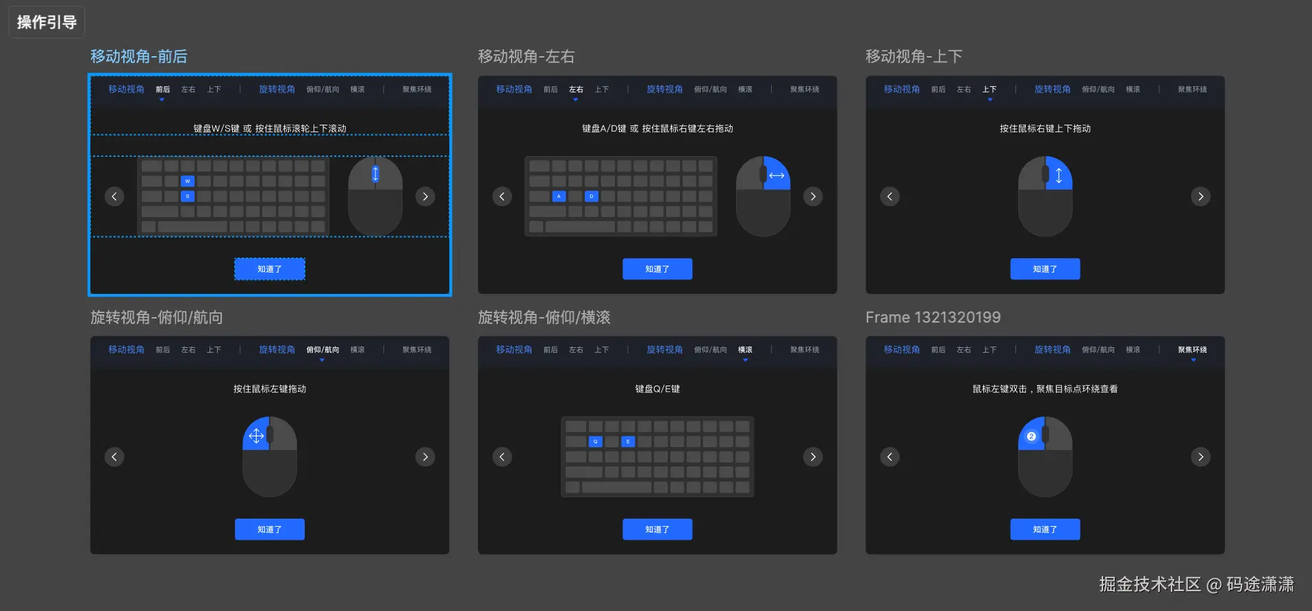
效果图:
2.业务背景&业务需求
业务背景:
产品中使用了 3D 高斯游览(3D Gaussian Splatting)技术,用户可以在三维场景中进行自由浏览、旋转视角、缩放等交互操作。然而,对于首次使用的用户来说,这类 3D 交互存在一定的学习成本。
业务需求:
为降低用户上手难度,需要在 3D 游览开始时在右下角提供一段 操作引导。
该引导用于:
- 清晰说明 "移动视角 / 旋转视角 / 缩放" 的操作方式
- 通过图示和说明文案提升理解速度
- 提高用户在 3D 场景中的交互效率与体验
- 避免用户因不会操作而误以为产品不够友好
功能概述:
系统在进入 3D 游览界面时弹出一个指南组件,引导用户理解基础操作。用户可通过左右切换示意图,阅读提示信息,并在了解后点击"知道了"关闭提示
3.代码设计
文件结构:
bash
GSview/
├─ components/
│  └─ Guide.vue         # 操作引导组件
├─ index.vue            # 页面入口
└─ settings.ts          # 操作引导配置
本次的目标就是实现 Guide.vue,一些相关的配置写在 settings.ts 中
3.1 html骨架
Guide.vue 中:
html
<template>
<div class="guide-container" v-if="isShow">
<div class="guide-container-header">
<div class="guide-container-tabs">
<div class="guide-container-tabs-header">移动视角</div>
<div class="guide-container-tabs-content">
<div
:class="[
'guide-container-tabs-content-item',
activeTab === item.value ? 'tab-active' : '',
]"
v-for="item in GuideMoveTabConfig"
:key="item.value"
@click="handleTabClick(item.value)"
>
<span>{{ item.label }}</span>
</div>
</div>
</div>
<div class="guide-container-tabs-line"></div>
<div class="guide-container-tabs">
<div class="guide-container-tabs-header">旋转视角</div>
<div class="guide-container-tabs-content">
<div
:class="[
'guide-container-tabs-content-item',
activeTab === item.value ? 'tab-active' : '',
]"
v-for="item in GuideRotateTabConfig"
:key="item.value"
@click="handleTabClick(item.value)"
>
<span>{{ item.label }}</span>
</div>
</div>
</div>
<div class="guide-container-tabs-line"></div>
<div class="guide-container-tabs guide-container-tabs-last">
<div class="guide-container-tabs-header"></div>
<div class="guide-container-tabs-content">
<div
:class="[
'guide-container-tabs-content-item',
activeTab === item.value ? 'tab-active' : '',
]"
v-for="item in GuideScaleTabConfig"
:key="item.value"
@click="handleTabClick(item.value)"
>
<span>{{ item.label }}</span>
</div>
</div>
</div>
</div>
<div class="guide-container-content">
<div class="guide-tips">{{ guideTips }}</div>
<div class="guide-img-wrapper">
<div class="guide-arrow-icon" @click="handlePrev">
<ArrowLeftIcon :width="24" :height="24" color="#FFFFFF"/>
</div>
<img :src="guideImg" class="guide-img" />
<div class="guide-arrow-icon" @click="handleNext">
<GuideArrowRight :width="24" :height="24" color="#FFFFFF" />
</div>
</div>
<div class="confim-btn" @click="handleConfirm">知道了</div>
</div>
</div>
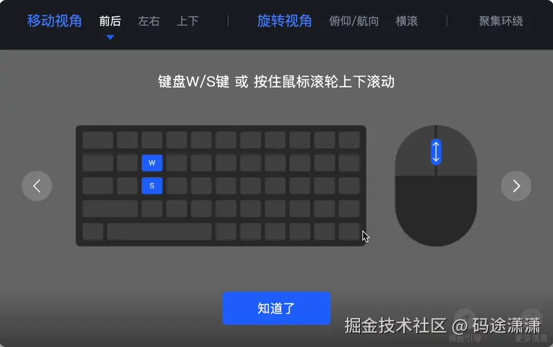
</template>组件结构概要:
bash
guide-container (整个遮罩层)
 ├ guide-container-header (顶部三组 tab)
 │   ├ guide-container-tabs(移动视角)
 │   │   ├ header
 │   │   └ content -> item
 │   ├ line
 │   ├ guide-container-tabs(旋转视角)
 │   ├ line
 │   ├ guide-container-tabs-last(缩放视角)
 │
 ├ guide-container-content(下半部分)
 │   ├ guide-tips(提示文字)
 │   ├ guide-img-wrapper(左右箭头 + 图片)
 │   ├ confirm-btn(底部按钮)
部分代码分析:
css
:class="[
  'guide-container-tabs-content-item',
  activeTab === item.value ? 'tab-active' : '',
]"
这是Vue 的动态 class 数组写法
上述代码的含义是
- 无论如何都加上 "guide-container-tabs-content-item"
- 如果当前项是选中项 → 加上 "tab-active"
- 如果不是选中项 → 加上空字符串(不会渲染)
Index.vue中:
html
<Guide v-model:is-show="isShowGuide" />3.2 css样式
Guide.vue 中:
css
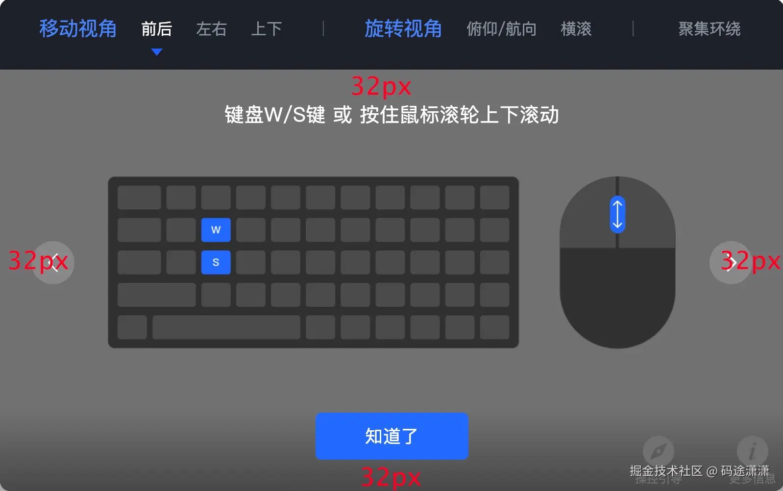
.guide-container {
@apply flex flex-col absolute bottom-[26px] right-[32px] z-50 bg-[#00000099] rounded-[10px] overflow-hidden;
width: 800px;
}
.guide-container-header {
@apply flex gap-[32px] bg-[#1E2128] px-[40px] pt-[16px] pb-[8px] box-border text-[#88909B] h-[72px];
}
.guide-container-tabs {
@apply flex gap-[24px] items-center h-[28px];
}
.guide-container-tabs-last {
flex: 1;
position: relative;
}
.guide-container-tabs-last .guide-container-tabs-header {
display: none;
}
.guide-container-tabs-last .guide-container-tabs-content {
position: absolute;
left: 50%;
transform: translateX(-50%);
}
.guide-container-tabs-line {
@apply w-[1px] h-[16px] mx-[9.5px] my-[6px] bg-[#505968];
}
.guide-container-tabs-header {
@apply text-[20px];
color: #4884FD;
}
.guide-container-tabs-content {
@apply text-[16px] flex gap-[24px] h-[28px] items-center;
}
.guide-container-tabs-content-item {
@apply cursor-pointer hover:text-[#FFFFFF];
white-space: nowrap;
}
.tab-active {
@apply text-[#FFFFFF] relative;
}
.tab-active::before {
content: '';
position: absolute;
bottom: -16.75px;
left: 50%;
transform: translateX(-50%);
width: 0;
height: 0;
border-left: 6.25px solid transparent;
border-right: 6.25px solid transparent;
border-top: 7.5px solid #2061fd;
}
.guide-container-content {
@apply p-[32px] box-border;
}
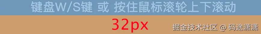
.guide-tips {
@apply text-[#FFFFFF] text-[20px] mb-[32px] text-center;
letter-spacing: 0.02em;
}
.guide-img-wrapper {
@apply relative flex items-center justify-center mb-[48px] px-[56px];
}
.guide-arrow-icon {
@apply absolute top-1/2 -translate-y-1/2 flex items-center justify-center cursor-pointer;
width: 44px;
height: 44px;
background: #FFFFFF26;
border-radius: 37px;
}
.guide-arrow-icon:first-child {
left: 0;
}
.guide-arrow-icon:last-child {
right: 0;
}
.guide-img {
height: 210px;
max-width: 580px;
width: auto;
object-fit: contain;
}
.confim-btn {
@apply w-[156px] h-[48px] bg-[#216BFF] text-[#FFFFFF] text-[18px] rounded-[6px] text-center cursor-pointer flex items-center justify-center mx-auto;
letter-spacing: 0.02em;
}css分析:
css
.guide-container {
  @apply flex flex-col absolute bottom-[26px] right-[32px] z-50 bg-[#00000099] rounded-[10px] overflow-hidden;
  width: 800px;
}
flex flex-col相当于display: flex; flex-direction: column;
flex布局,文字方向是纵向,也就是垂直排列
absolute:让这个容器变成 绝对定位。
相对于最近的 position: relative 的祖先元素
如果没有,则相对于 浏览器视口(viewport)
bottom-26px right-32px
让这个容器固定在右下角,离底部 26px,离右侧 32px。
z-index: 50;
让它 叠在几乎所有元素之上
防止被页面其他内容遮住。
bg-#00000099
#00000099 #000000 = 黑色 99 = 透明度 (~60%)
这是一个半透明黑色的背景 -> 类似"深色面板"
rounded-10px
rounded-10px
overflow-hidden
让内部内容裁剪,不会溢出容器外。
width: 800px;
固定宽度为 800px。
这让弹窗有固定的大宽度,适合显示图片 + 文案。
css
.guide-container-header {
  @apply flex gap-[32px] bg-[#1E2128] px-[40px] pt-[16px] pb-[8px] box-border text-[#88909B] h-[72px];
}
flex gap-32px bg-#1E2128
flex布局默认横向排列 设置深灰背景色
gap 只会在兄弟元素之间产生空间32px
移动视角 tabs\] \[竖线\] \[旋转视角 tabs\] \[竖线\] \[缩放视角 tabs
px-40px pt-16px pb-8px
px是左右 的padding-left: 40px;padding-right: 40px;
pt是padding-top: 16px; pb是padding-bottom: 8px;
| ← padding-left 40px → | A | gap 32 | B | gap 32 | C | ← padding-right 40px → |
box-border
box-sizing: border-box; padding 和 border 会包含在 height 内部
设定 h-72px 时不会撑大元素
h-72px
高度固定为 72px。
为什么视觉上,文字下部的空隙要大?
因为头部固定了高度,上下padding定死了,文字会贴着上padding,所以显得下面大
css
.guide-container-tabs {
  @apply flex gap-[24px] items-center h-[28px];
}
元素间距24px,items-center 表示垂直方向上居中
css
.guide-container-tabs-line {
  @apply w-[1px] h-[16px] mx-[9.5px] my-[6px] bg-[#505968];
}
定好的分割线
css
.guide-container-tabs-last {
  flex: 1;
  position: relative;
}

.guide-container-tabs-last .guide-container-tabs-header {
  display: none;
}

.guide-container-tabs-last .guide-container-tabs-content {
  position: absolute;
  left: 50%;
  transform: translateX(-50%);
}
最后一个tab样式和之前的不太同
所以flex: 1,让他占据剩下的所有空间, position: relative;,为他的子元素绝对定位用
display: none;消除guide-container-tabs-header本身的影响
position: absolute; left: 50%;transform: translateX(-50%); 水平方向居中三件套
css
.guide-container-tabs-content {
  @apply text-[16px] flex gap-[24px] h-[28px] items-center;
}
css
.tab-active::before {
  content: '';
  position: absolute;
  bottom: -16.75px;
  left: 50%;
  transform: translateX(-50%);
  width: 0;
  height: 0;
  border-left: 6.25px solid transparent;
  border-right: 6.25px solid transparent;
  border-top: 7.5px solid #2061fd;
}
纯css三角形技巧,tab项下面的三角形
css
.guide-container-content {
  @apply p-[32px] box-border;
}
css
.guide-tips {
  @apply text-[#FFFFFF] text-[20px] mb-[32px] text-center;
  letter-spacing: 0.02em;
}
在视觉上,看着可能要大一些,因为本身的图片就有一段空白高度
css
.guide-img-wrapper {
  @apply relative flex items-center justify-center mb-[48px] px-[56px];
}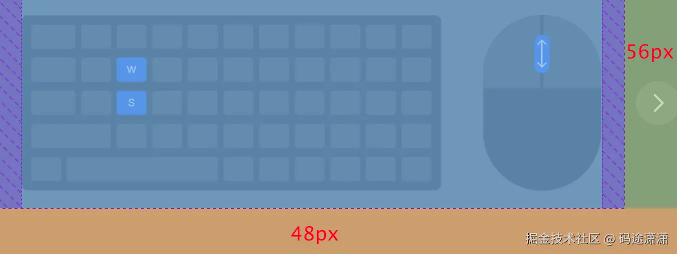
其中紫色部分是图片并没有被拉满 wrapper,object-fit: contain 自动填的空白
css
.guide-img {
  height: 210px;
  max-width: 580px;
  width: auto;
  object-fit: contain;
}
width: auto 宽度跟着图片本身比例自适应
object-fit: contain; ------ 图片保持原比例,不能被裁剪,保持原始比例,宁愿留白,也不能拉伸和裁剪
css
.guide-arrow-icon {
  @apply absolute top-1/2 -translate-y-1/2 flex items-center justify-center cursor-pointer;
  width: 44px;
  height: 44px;
  background: #FFFFFF26;
  border-radius: 37px;
}

.guide-arrow-icon:first-child {
  left: 0;
}

.guide-arrow-icon:last-child {
  right: 0;
}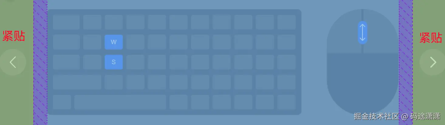
内部垂直水平居中
外部左右间距设置为0,紧贴
3.2 JS交互
settings.ts配置
javascript
export const GuideMoveTabConfig = [
  {
    label: '前后',
    value: 'move-forward-backward',
    img: MoveForwardBackwardImg,
    info: '键盘W/S键 或 按住鼠标滚轮上下滚动',
  },
  {
    label: '左右',
    value: 'move-left-right',
    img: MoveLeftRightImg,
    info: '键盘A/D键 或 按住鼠标右键左右拖动',
  },
  {
    label: '上下',
    value: 'move-up-down',
    img: MoveUpDownImg,
    info: '按住鼠标右键上下拖动',
  },
]

export const GuideRotateTabConfig = [
  {
    label: '俯仰/航向',
    value: 'rotate-pitch',
    img: RotatePitchImg,
    info: '按住鼠标左键拖动',
  },
  {
    label: '横滚',
    value: 'rotate-roll',
    img: RotateRollImg,
    info: '键盘Q/E键',
  },
]

export const GuideScaleTabConfig = [
  {
    label: '聚集环绕',
    value: 'scale',
    img: ScaleImg,
    info: '鼠标左键双击,聚集目标点环绕查看',
  },
]
Guide.vue 中的 JS 交互
javascript
<script setup lang="ts">
import { ref, computed } from 'vue'
import { GuideMoveTabConfig, GuideRotateTabConfig, GuideScaleTabConfig } from '../settings'
import ArrowLeftIcon from '@/assets/svgs/ArrowLeftIcon.vue'
import GuideArrowRight from '@/assets/svgs/GuideArrowRight.vue'

const AllConfig = [...GuideMoveTabConfig, ...GuideRotateTabConfig, ...GuideScaleTabConfig]

const isShow = defineModel<boolean>('isShow', {
  type: Boolean,
  default: false,
})

const activeTab = ref('move-forward-backward')
const currentConfig = computed(() => {
  return AllConfig.find((item) => item.value === activeTab.value)
})
const guideTips = computed(() => {
  return currentConfig.value?.info
})
const guideImg = computed(() => {
  return currentConfig.value?.img
})

const handleTabClick = (tab: string) => {
  activeTab.value = tab
}

const handlePrev = () => {
  const currentIndex = AllConfig.findIndex((item) => item.value === activeTab.value)
  if (currentIndex === -1) return
  const prevIndex = (currentIndex - 1 + AllConfig.length) % AllConfig.length
  const prevConfig = AllConfig[prevIndex]
  if (prevConfig) {
    activeTab.value = prevConfig.value
  }
}

const handleNext = () => {
  const currentIndex = AllConfig.findIndex((item) => item.value === activeTab.value)
  if (currentIndex === -1) return
  const nextIndex = (currentIndex + 1) % AllConfig.length
  const nextConfig = AllConfig[nextIndex]
  if (nextConfig) {
    activeTab.value = nextConfig.value
  }
}

const handleConfirm = () => {
  isShow.value = false
}
</script>
1.从 settings 里面拿到三个 tab 的配置
javascript
const AllConfig = [...GuideMoveTabConfig, ...GuideRotateTabConfig, ...GuideScaleTabConfig]2.解构拼接成一个大数组
javascript
const isShow = defineModel<boolean>('isShow', {
  type: Boolean,
  default: false,
})
defineModel的用途
- 声明一个"模型字段"(用于 v-model 绑定)
- 自动生成 props + emits
- 返回一个 ref(可直接修改,自动触发父组件更新)
boolean(泛型)
defineModel<boolean>,这个 model 的类型是 boolean
isShow.value 必须是 boolean,父组件传进来的数据也必须是 boolean
javascriptdefineModel<boolean>('isShow', ...)表示这个 model 的名字叫 isShow
vbnettype: Boolean, default: false,声明这个 prop 的类型是 Boolean(Vue 的运行时类型检查用)
父组件不传值时,默认值是 false
在子组件里可以直接使用,父组件也会同时更新(双向绑定效果)
javascriptisShow.value = true
3.默认绑定一个 tab
javascript
const activeTab = ref('move-forward-backward')4.维护当前的配置项
javascript
const currentConfig = computed(() => {
  return AllConfig.find((item) => item.value === activeTab.value)
})
使用计算属性,每次AllConfig 或者activeTab 发生变化的时候触发,保证currentConfig 拿到了当前选中的这项
javascript
const guideTips = computed(() => {
  return currentConfig.value?.info
})
const guideImg = computed(() => {
  return currentConfig.value?.img
})
currentConfig.value?: 因为currentConfig是一个计算属性,所以需要用.value来访问它的结果。?是可选链操作符,它防止在currentConfig.value为null或undefined时程序崩溃。
...?.info: 它尝试获取当前配置对象中的info属性。作用:
guideTips响应式地保存着当前激活标签对应的提示信息。图片也同理,看 setting 中的配置就行
5.更新当前的点击项
javascript
const handleTabClick = (tab: string) => {
  activeTab.value = tab
}
更新当前点击的 tab
6.切换上一项切换下一项的核心函数
javascript
const handlePrev = () => {
  const currentIndex = AllConfig.findIndex((item) => item.value === activeTab.value)
  if (currentIndex === -1) return
  const prevIndex = (currentIndex - 1 + AllConfig.length) % AllConfig.length
  const prevConfig = AllConfig[prevIndex]
  if (prevConfig) {
    activeTab.value = prevConfig.value
  }
}

const handleNext = () => {
  const currentIndex = AllConfig.findIndex((item) => item.value === activeTab.value)
  if (currentIndex === -1) return
  const nextIndex = (currentIndex + 1) % AllConfig.length
  const nextConfig = AllConfig[nextIndex]
  if (nextConfig) {
    activeTab.value = nextConfig.value
  }
}
核心函数:切换上一项和切换下一项
以切换上一项为例(切换下一项同理):
- 首先拿到当前下标
- 如果没拿到就返回(防御式编程)
- 利用当前下标,计算出上一项下标(实现循环)
- 更新当前的 active.tab