组件 my-back-to-top.vue
html
<template>
<view v-show="isShown" class="back-top" :style="rootStyle" @touchstart.stop="onTouchStart"
@touchmove.stop.prevent="onTouchMove" @touchend.stop="onTouchEnd" @click.stop="onClick">
<up-icon name="arrow-up" :size="iconSize" :color="iconColor"></up-icon>
</view>
</template>
<script setup>
/**
通用组件:回到顶部(可拖拽悬浮按钮)
实现要点(uni-app + Vue3 + uview-plus):
1. 显隐控制:
- 通过 onPageScroll 监听页面滚动,超过 visibleOffset 才显示(onlyShowWhenScroll=true)。
- 如果 onlyShowWhenScroll=false,则初始就显示。
2. 初始定位:
- 组件记录中心点坐标 leftPx/topPx(单位:px),mounted 时读取系统窗口宽高,
根据 initialRight/initialBottom 计算默认靠近右下的位置。
3. 拖拽移动:
- touchstart 记录起点与当前中心点;touchmove 计算位移增量,更新 leftPx/topPx。
- clamp 辅助:约束在安全边界内(避免超出屏幕和状态栏)。
4. 样式计算:
- 使用 computed 拼出内联样式,将中心点还原为 left/top(左上角)并设置 size、圆角、阴影、zIndex 等。
5. 回到顶部:
- click 时调用 uni.pageScrollTo({ scrollTop: 0, duration }) 平滑回到顶部;
- 若刚发生拖拽且位移较大,短时间内点击将被忽略,避免误触。
6. UI:
- 图标用 uview-plus 的 u-icon(arrow-up)。支持自定义尺寸与渐变背景。
*/
import { ref, onMounted, computed } from 'vue'
import { onPageScroll } from '@dcloudio/uni-app'
const props = defineProps({
// 显示滚动距离阈值,超过才显示
visibleOffset: { type: Number, default: 300 },
// 初始距右侧 px
initialRight: { type: Number, default: 24 },
// 初始距底部 px
initialBottom: { type: Number, default: 120 },
// 直径 px
size: { type: Number, default: 48 },
// 图标大小 px
iconSize: { type: Number, default: 22 },
// 图标颜色
iconColor: { type: String, default: '#ffffff' },
// 背景色
backgroundColor: { type: String, default: 'linear-gradient(90deg, #FF0D01 0%, #FE634B 100%)' },
// 阴影
boxShadow: { type: String, default: '0 6px 16px rgba(0,0,0,0.15)' },
// 层级
zIndex: { type: Number, default: 999 },
// 是否仅滚动后显示
onlyShowWhenScroll: { type: Boolean, default: true },
// 是否禁用拖拽
disableDrag: { type: Boolean, default: false }
})
// 运行环境窗口信息(用于定位与边界计算)
const windowWidth = ref(375)
const windowHeight = ref(667)
const statusBarHeight = ref(0)
// 显隐与中心点坐标(单位:px)
const isShown = ref(!props.onlyShowWhenScroll)
const leftPx = ref(0)
const topPx = ref(0)
// 拖拽状态缓存
const touching = ref(false)
const startTouch = ref({ x: 0, y: 0, t: 0, left: 0, top: 0 })
onMounted(() => {
const info = uni.getSystemInfoSync()
windowWidth.value = info.windowWidth
windowHeight.value = info.windowHeight
statusBarHeight.value = info.statusBarHeight || 0
// 计算初始位置(默认靠右下:距右 initialRight、距底 initialBottom)
const sizeHalf = props.size / 2
leftPx.value = Math.max(
sizeHalf,
Math.min(windowWidth.value - sizeHalf, windowWidth.value - props.initialRight - sizeHalf)
)
topPx.value = Math.max(
statusBarHeight.value + sizeHalf,
Math.min(windowHeight.value - sizeHalf, windowHeight.value - props.initialBottom - sizeHalf)
)
})
onPageScroll((e) => {
if (!props.onlyShowWhenScroll) return
isShown.value = e.scrollTop >= props.visibleOffset
})
// 由中心点生成用于视图的定位与样式
const rootStyle = computed(() => {
return `
left:${leftPx.value - props.size / 2}px;
top:${topPx.value - props.size / 2}px;
width:${props.size}px;
height:${props.size}px;
background:${props.backgroundColor};
box-shadow:${props.boxShadow};
z-index:${props.zIndex};
`
})
// 将值限制在[min, max] 区间
function clamp(val, min, max) {
return Math.max(min, Math.min(max, val))
}
// 开始拖拽:记录触点与初始位置
function onTouchStart(ev) {
if (props.disableDrag) return
touching.value = true
const t = (ev.touches && ev.touches[0]) || ev
startTouch.value = {
x: t.clientX,
y: t.clientY,
t: Date.now(),
left: leftPx.value,
top: topPx.value
}
}
// 拖拽移动:根据位移增量更新中心点,并做边界约束
function onTouchMove(ev) {
if (!touching.value || props.disableDrag) return
const t = (ev.touches && ev.touches[0]) || ev
const dx = t.clientX - startTouch.value.x
const dy = t.clientY - startTouch.value.y
const sizeHalf = props.size / 2
leftPx.value = clamp(
startTouch.value.left + dx,
sizeHalf,
windowWidth.value - sizeHalf
)
topPx.value = clamp(
startTouch.value.top + dy,
statusBarHeight.value + sizeHalf,
windowHeight.value - sizeHalf
)
}
// 结束拖拽:如需吸附/惯性,可在此扩展
function onTouchEnd() {
if (props.disableDrag) return
touching.value = false
}
// 点击回到顶部,防抖:刚拖拽且位移大时忽略点击
function onClick() {
// 如果刚拖拽结束且位移较大,忽略点击
if (startTouch.value) {
const moved = Math.abs(leftPx.value - startTouch.value.left) + Math.abs(topPx.value - startTouch.value.top)
if (moved > 6 && Date.now() - startTouch.value.t < 300) return
}
uni.pageScrollTo({ scrollTop: 0, duration: 300 })
}
</script>
<style scoped>
.back-top {
position: fixed;
display: flex;
align-items: center;
justify-content: center;
border-radius: 9999px;
user-select: none;
-webkit-user-drag: none;
transition: opacity 0.2s ease;
}
.gradient-icon {
background: linear-gradient(90deg, #FF0D01 0%, #FE634B 100%);
-webkit-background-clip: text;
background-clip: text;
color: transparent;
}
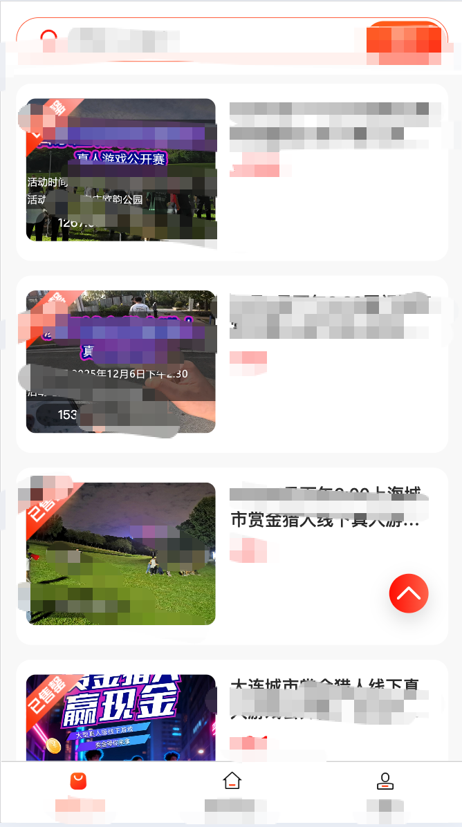
</style>通用组件:回到顶部 components/my-back-to-top.vue
可拖拽、圆形悬浮按钮,默认位于右下方,滚动超阈值显示,点击回到顶部。
使用示例:
html
<template>
  <view>
    <!-- 页面内容 ... -->
    <my-back-to-top />
  </view>
</template>

<script setup>
import MyBackToTop from "@/components/my-back-to-top.vue";
</script>
可选属性:
visibleOffset滚动多少像素后显示(默认 300)initialRight初始距右侧 px(默认 24)initialBottom初始距底部 px(默认 120)size直径 px(默认 48)iconSize图标大小 px(默认 22)iconColor图标颜色(默认#ffffff)backgroundColor背景色(默认#2979ff)boxShadow阴影(默认0 6px 16px rgba(0,0,0,0.15))zIndex层级(默认 999)onlyShowWhenScroll仅滚动后显示(默认 true)disableDrag禁用拖拽(默认 false)
示例(自定义样式):
html
<my-back-to-top
  :visibleOffset="400"
  :size="56"
  :iconSize="24"
  backgroundColor="#ff6a00"
/>
这里显示的图标是uview-plus里的图标,想要好看一点的可以下载更换成其他字体图标调整样式就行,功能已经完成