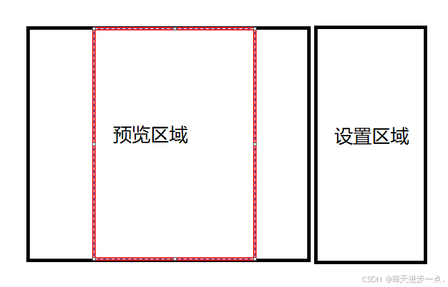
页面预览

分为左右结构,左侧为预览区域,右侧为功能区,可分别设置封面图片,封面标题,目录背景,背景颜色,页眉,页脚,水印等功能
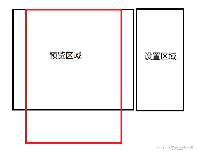
核心要点1:左侧区域宽度和高度处理
方案1:高度固定为一屏高度,宽度按照A4比例渲染
JavaScript
const pageSize = reactive({
  width: 0,
  height: 0,
})

const getA4PageSize = () => {
  // 外层父容器 ref
  if (previewContentRef.value) {
    const height = previewContentRef.value.clientHeight
    pageSize.width = (210 / 297) * height
    pageSize.height = height
  }
}
但是实际会导致页面很小(低分辨率下,内容无法看清),测试阶段被pass
方案2:宽度固定为80%父元素宽,高度根据A4判断
JavaScript
const getA4PageSize = () => {
  if (previewContentRef.value) {
    const width = previewContentRef.value.clientWidth
    pageSize.width = width * 0.8
    pageSize.height = pageSize.width / (210 / 297)
  }
}
未来需求迭代点,会增加放大缩小功能,对0.8做动态设置
JavaScript
// 此处注意改为 * 100 之后的数字,防止出现 0.8 + 0.05 = 0.8500000000000001 精度异常的问题
const widthPercentage = ref(80)
const handleScale = (zoomIn: boolean) => {
  if (zoomIn) {
    widthPercentage.value += 5
    if (widthPercentage.value >= 100) widthPercentage.value = 100
  } else {
    widthPercentage.value -= 5
    if (widthPercentage.value <= 50) widthPercentage.value = 50
  }

  getA4PageSize()
}
核心要点2:内容区域组件设计
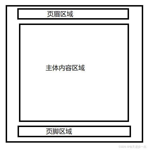
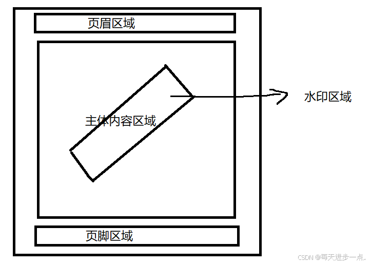
2.1 page-wrapper 组件
- 先实现页面容器功能,包括页眉,页脚,水印,背景等
- 支持配置显示或不显示某些东西,比如首页不显示页眉页脚,水印等
TypeScript
// 页面容器配置
export interface PageConfig {
  // 是否显示背景图片
  showBackgroundImg: boolean
  // 是否显示背景颜色
  showBackgroundColor: boolean
  // 是否显示水印
  showWatermark: boolean
  // 是否显示分页
  showPage: boolean
  // 是否显示页眉
  showHeader: boolean
  // 是否显示页脚
  showFooter: boolean
}

// 页面容器数据
export interface PageConfigData {
  backgroundColor?: string
  backgroundImg?: string
  watermarkText?: string
  page?: number
  showPage?: number
  header?: {
    img: string
    text: string
  }
  footer?: {
    img: string
    text: string
  }
}

const props = withDefaults(
  defineProps<{
    // 页面宽高相关
    size: any
    // 页面数据相关
    config: { config: PageConfig; data: PageConfigData }
    // 是否隐藏头尾
    hideHeaderFooter?: boolean
  }>(),
  {
    hideHeaderFooter: false,
  }
)
此处抽离分开 config 和 data,是因为 背景图 不一致,封面显示封面背景图,目录显示目录背景图,以及页脚区域的页码也不一样
每页有自己不同的配置数据
JavaScript
<page-wrapper :size="pageSize" :config="coverConfig" hide-header-footer>
  <cover :cover-title="coverTitle" :template-type="templateType"></cover>
</page-wrapper>
<page-wrapper :size="pageSize" :config="cataLogConfig">
  <cata-log :catalog="cataLogList" />
</page-wrapper>
<page-wrapper :size="pageSize" :config="bodyConfig(1)">
  <riskOverview />
</page-wrapper>
<page-wrapper :size="pageSize" :config="bodyConfig(2)">
  <riskOverview2 />
</page-wrapper>
<page-wrapper :size="pageSize" :config="bodyConfig(3)">
  <riskDetails />
</page-wrapper>
核心功能点3:内容区域px值自适应
由于我们的宽度和高度是非固定值,其随着分辨率的变化而变化,所以我们写宽、高、fontSize 等值时,就不能直接写死,否则就会出现,小分辨率下字很大的情况
方案1:基于自定义函数adapt
- 在 page-wrapper.vue 跟节点上,打上 ---width 和 ---height,供 css 使用变量
JavaScript
<div
    class="template-page-wrapper"
    :style="{
      'width': `${size.expectWidth}px`,
      'height': `${size.expectHeight}px`,
      '--width': size.width,
      '--height': size.height,
    }"
  >
</div>- 实现 scss 函数 adapt
Sass
// 基于:1192px宽度,根据传入的 'xxpx' 返回计算后的 ?px
@function adapt($value) {
  @return calc(var(--width) * #{$value / 1192});
}- page-wrapper 组件及其子孙组件使用
Sass
// 模板页的 scss 部分
.template-page-wrapper {
  overflow: hidden;
  margin: 0 auto;
  .template-page {
    padding: 0 adapt(80px);
    position: relative;
    display: flex;
    flex-direction: column;
    border: adapt(1px) solid #e5e6eb;
    margin: 0 auto;
    .template-page-header,
    ...
}- template 或者 js 部分如果需要 adapt,利用 provide 的 pageSize 实现类似函数即可
TypeScript
const pageSize = inject('pageSize', { width: 0, height: 0 })

const adapt = (value: number) => {
  return (pageSize.width * value) / 1192
}
是不是很合理,剩下的就是码内容了,但是等提测的时候,天塌了
有一位测试同学的电脑chrome 上字很大,很丑
等打开控制台才看到,程序计算的fontSize 的像素值是 9.3 px,但是浏览器拦截了,显示了最小值 12px。。。,而宽度和高度由于没有阀值限制,显示了正常计算的值...
查了资料才发现,chrome浏览器由于为了兼容手机端的一些效果,在后续迭代中将 12px 值的限制放开了 ,大概就是100多版本(2020~2021年左右更新的),具体无需考证,新版本的都是能支持9.x 像素值的,所以我本地和大部分人的电脑都是好的
怎么办?需要兼容吗?当然需要,线上用户的chrome版本可不太确定
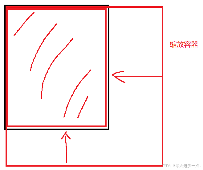
方案2:整体缩放
缩放的话,肯定考虑整体缩放,而缩放默认是中心点缩放,我们可以调整为基于左上角缩放
'transform-origin': 'top left'
- 我们先定义一个标准尺寸
- 这个尺寸应当是设计稿的尺寸,这样的话,我们的宽高像素值和fontSize就无需 adapt 计算了,可以直接写对应的值
- 或者依旧采用 adapt 函数,那这样的 width 和 height 就可以随便是一组 A4 等比例宽高了
- 我们希望的尺寸是可视区的80%宽,那么希望尺寸和可视区尺寸就会得到一个 scale 值
JavaScript
# 得到 expectWidth 和 expectHeight 和 scale 值
const pageSize = reactive({
  // 标准A4 尺寸
  width: 1040,
  height: 1474,
  scale: 1,
  expectWidth: 0,
  expectHeight: 0,
})

const getA4PageSize = () => {
  if (previewContentRef.value) {
    const width = previewContentRef.value.clientWidth
    // 期望的宽度是当前可视区域的80%,并计算出对应的高度
    pageSize.expectWidth = width * 0.8
    pageSize.expectHeight = pageSize.expectWidth / (210 / 297)
    // 计算出对应的缩放比例
    pageSize.scale = pageSize.expectHeight / pageSize.height
  }
}- 此时通过 transform 就可以缩放了,这样最后显示的宽和高就是 expectWidth 和 expectHeight 了
JavaScript
:style="{
  'width': `${size.width}px`,
  'height': `${size.height}px`,
  'transform': `scale(${size.scale})`,
  'transform-origin': 'top left',
}"