DevUI Carousel 走马灯组件使用指南
Carousel(走马灯/轮播图)是网页开发中常见的视觉组件,用于在有限空间内循环展示多张图片或内容区块。DevUI 基于 Angular 框架提供了功能清晰、配置灵活的 Carousel 组件,本文将基于其官方 API 文档,详细说明其使用方法并附上代码示例。
1. 组件概述与核心概念
DevUI 的 Carousel 组件由两个核心部分构成:
<d-carousel>: 轮播容器,负责控制整体的轮播逻辑、时序和交互。<d-carousel-item>: 轮播项,定义每个轮播页的具体内容。你需要将多个此标签放置在<d-carousel>内部。
2. 快速开始:基础用法
2.1 安装与引入
首先,确保你的项目使用的是 Angular 18.0.0 或更高版本。在需要使用轮播的模块中导入 CarouselModule。
typescript
// 在你的功能模块或根模块中 (例如:app.module.ts)
import { NgModule } from '@angular/core';
import { CarouselModule } from 'ng-devui/carousel';

@NgModule({
  imports: [
    // ... 其他模块
    CarouselModule,
  ],
})
export class AppModule { }
2.2 基本代码示例
以下是一个最简单的轮播图实现,包含三张轮播图片。
HTML
html
<!-- your-component.component.html -->
<d-carousel [height]="height" [(activeIndex)]="activeIndex" (activeIndexChange)="getIndex($event)">
  <d-carousel-item *ngFor="let i of array">{{ 'page ' + i }}</d-carousel-item>
</d-carousel>
TS
javascript
import { Component } from '@angular/core';

@Component({
  selector: 'd-carousel-demo-basic',
  templateUrl: './carousel-demo-basic.component.html',
  styleUrls: ['../demo-common.scss']
})
export class CarouselDemoBasicComponent {
  array = [1, 2, 3, 4];
  height = '200px';
  activeIndex = 0;

  getIndex(index) {
    console.log(this.activeIndex);
    console.log(index);
  }
}
CSS
css
@import '~ng-devui/styles-var/devui-var.scss';
d-carousel-item {
  text-align: center;
  line-height: 200px;
  background: $devui-global-bg;
}
3. 核心参数、方法与事件详解
<d-carousel> 组件提供了丰富的参数来控制其行为。
3.1 常用参数配置表
| 参数 | 类型 | 默认值 | 说明 |
|---|---|---|---|
activeIndex |
number |
0 |
重要 :当前激活项的索引(从0开始)。支持 [(activeIndex)] 双向绑定。 |
autoplay |
boolean |
false |
是否开启自动轮播。 |
autoplaySpeed |
number |
3000 |
自动轮播的速度,单位是毫秒(ms),需配合 autoplay=true 使用。 |
height |
string |
'100%' |
轮播容器的高度,建议使用固定值(如 '300px')以确保正常显示。 |
showDots |
boolean |
true |
是否显示底部的面板指示器(小圆点)。 |
dotPosition |
'top'/'bottom' |
'bottom' |
指示器的位置,可选顶部或底部。 |
arrowTrigger |
'hover'/'never'/'always' |
'hover' |
切换箭头的显示逻辑。'hover'(悬停显示),'never'(永不显示),'always'(总是显示)。 |
transitionSpeed |
number |
500 |
卡片切换时的动画速度,单位是毫秒(ms)。 |
3.2 事件
activeIndexChange: 当轮播项切换时触发,事件参数为当前激活项的索引。可以用于同步外部状态。
3.3 方法
你可以通过模板变量调用以下方法来手动控制轮播:
prev(): 切换到上一张。next(): 切换到下一张。goTo(index): 切换到指定索引的卡片。
4. 进阶功能与代码示例
4.1 自动轮播与双向绑定
此示例展示了如何创建一个具有自动轮播、可外部控制的轮播图。
TS代码:
typescript
// your-component.component.ts
import { Component } from '@angular/core';
import { ArrowTrigger } from 'ng-devui/carousel';
@Component({
selector: 'd-carousel-demo-custom',
templateUrl: './carousel-demo-custom.component.html',
styleUrls: ['../demo-common.scss']
})
export class CarouselDemoCustomComponent {
array = [1, 2, 3, 4];
height = '200px';
showDots = true;
arrowTrigger: ArrowTrigger = 'never';
autoplay = true;
autoplaySpeed = 3000;
transitionSpeed = 1000;
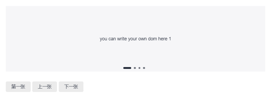
}html代码:
html
<!-- your-component.component.html -->
<d-carousel #carousel="dCarousel" [height]="height" [showDots]="showDots" [arrowTrigger]="arrowTrigger">
  <d-carousel-item *ngFor="let i of array">
    <div class="custom-area">you can write your own dom here {{ i }}</div>
  </d-carousel-item>
</d-carousel>
<div style="margin-top: 30px">
  <d-button bsStyle="common" style="margin-right: 5px" (btnClick)="carousel.goTo(0)"> 第一张 </d-button>
  <d-button bsStyle="common" style="margin-right: 5px" (btnClick)="carousel.prev()"> 上一张 </d-button>
  <d-button bsStyle="common" (btnClick)="carousel.next()"> 下一张 </d-button>
</div>
css代码:
css
@import '~ng-devui/styles-var/devui-var.scss';
d-carousel-item {
  text-align: center;
  line-height: 200px;
  background: $devui-global-bg;
}
5. 使用建议与注意事项
- 容器高度 :务必设置明确的
height属性值。使用百分比(100%)时,请确保其父容器有确定的高度,否则可能无法正常显示。 - 性能优化 :每个
<d-carousel-item>内部的内容应尽量轻量。避免在轮播项内放置过于复杂或耗能的组件。 - 双向绑定的妙用 :
[(activeIndex)]双向绑定非常适合需要从外部(如一个缩略图列表)控制轮播主图,或者需要将当前轮播状态同步到其他部分的场景。 - 自动轮播与交互 :开启
autoplay后,当用户将鼠标悬停(hover)在轮播区域时,组件会自动暂停轮播,移出后恢复,以此提升用户体验。 - 内容灵活性 :
<d-carousel-item>内可以包裹任何 HTML 内容或 Angular 组件,如图片、视频、文字介绍等,为你提供了极大的设计空间。
通过以上介绍,你可以掌握 DevUI Carousel 组件的主要功能并将其应用到项目中。对于更复杂的自定义需求(如自定义指示点样式、复杂的动画效果),你可能需要参考其演示(Demo)示例或查阅源码进行扩展。
参考文档
参考资料:
MateChat:https://gitcode.com/DevCloudFE/MateChat
MateChat官网:https://matechat.gitcode.com
DevUI官网:https://devui.design/home