前言
- 本文参加了由 公众号@若川视野 发起的每周源码共读活动, 点击了解详情一起参与。
- 这是源码共读的第42期,链接:juejin.cn/post/720672...
loading组件介绍
1. 下载源码
shell
## 克隆官方仓库
git clone git@github.com:vant-ui/vant.git
## 进入文件夹根目录
cd vant
## 安装依赖
pnpm i
## 运行package.json中的命令
pnpm dev
2. 找到页面的loading组件,如下图
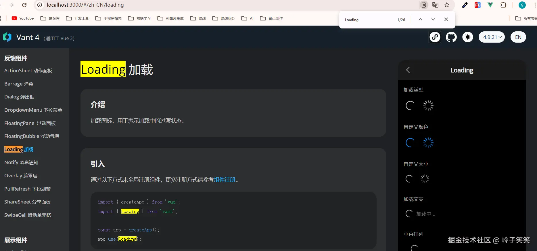
3. 如何使用van-loading组件
3.1 注入到vue全局组件,整个项目直接使用
js
import { createApp } from 'vue';
import { Loading } from 'vant';

const app = createApp();
app.use(Loading);
html
<van-loading />
<van-loading type="spinner" />

### Color
<van-loading color="#1989fa" />
<van-loading type="spinner" color="#1989fa" />

### Size
<van-loading size="24" />
<van-loading type="spinner" size="24px" />

### Text Color
<!-- the color of text and icon will be changed -->
<van-loading color="#0094ff" />

<!-- only change text color -->
<van-loading text-color="#0094ff" />

### Custom Icon
<van-loading vertical>
  <template #icon>
    <van-icon name="star-o" size="30" />
  </template>
  Loading...
</van-loading>
loading源码分析
让我们找到loading文件夹/index.ts开启源码之旅把 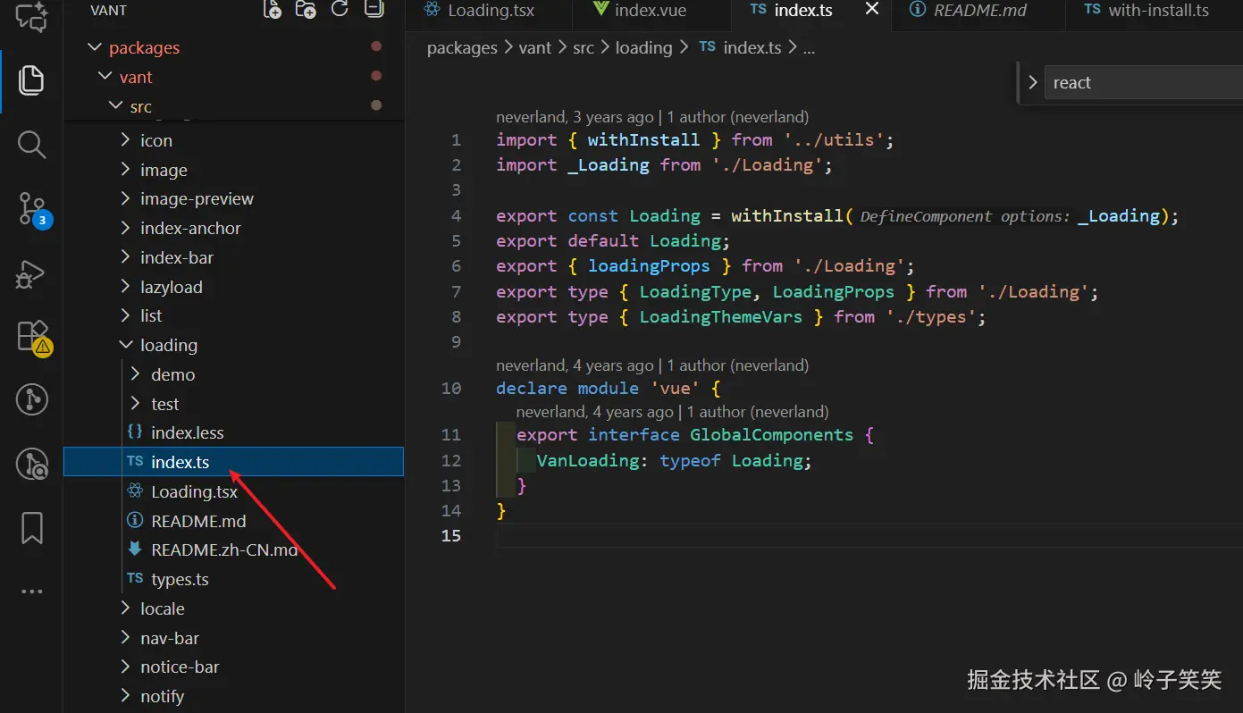
1. index.ts解析
- 为什么需要Loading = withInstall(_Loading)?
typescript
import { withInstall } from '../utils';
import _Loading from './Loading';

// 为什么Loading组件导出要先执行withInstall(_Loading)
export const Loading = withInstall(_Loading);
// 默认导出Loading
export default Loading;

// 导出LoadingProps的一些属性,用于TS开发导入类型
export { loadingProps } from './Loading';
export type { LoadingType, LoadingProps } from './Loading';
export type { LoadingThemeVars } from './types';

// 给已有的 `vue` 模块增加 VanLoading 类型,便于TS提示
declare module 'vue' {
  export interface GlobalComponents {
    VanLoading: typeof Loading;
  }
}- withInstall是什么函数?
为组件添加 install 方法,使其能够通过 app.use() 进行全局注册,同时提供 TypeScript 类型增强
typescript
// 1. 优先学习下withInstall中引用的函数camelize
// camelize函数实现my-button 转换成myButton, 将匹配到的-b字符替换成了B字符
// 为什么需要 camelize(`-${name}`)?
// 这是为了同时注册 kebab-case (van-loading) 和 PascalCase (VanLoading) 两种形式的组件
// 例如:
// app.use(Loading) 后
// 以下两种写法都有效:
// <van-loading> 和 <VanLoading>

const camelizeRE = /-(\w)/g;
export const camelize = (str: string): string =>
  str.replace(camelizeRE, (_, c) => c.toUpperCase());

// with-install.ts 文件 code
import { camelize } from './format';
import type { App, Component } from 'vue';

type EventShim = {
  new (...args: any[]): {
    $props: {
      onClick?: (...args: any[]) => void;
    };
  };
};
// 使用 `&` 把T类型属性、install属性和EventShim属性融合在一起成一个新的类型
export type WithInstall<T> = T & {
  install(app: App): void;
} & EventShim;

export function withInstall<T extends Component>(options: T) {
// 给传入的options添加一个install方法
  (options as Record<string, unknown>).install = (app: App) => {
    const { name } = options;
    if (name) {
      app.component(name, options); // PascalCase形式
      app.component(camelize(`-${name}`), options); // kebab-case形式
    }
  };

  // 通过 `withInstall()` 在组件上动态添加了一个 `install()` 方法,因此需要在类型上声明它,所以必须要as WithInstall<T>类型,都在后面使用该loading组件TS会报错
  return options as WithInstall<T>;
}
2. Loading.tsx源码阅读
- 前置函数getSizeStyle
该函数返回一个对象,包含width 和 height属性
javascript
// 判断val值不为空
const isDef = <T>(val: T): val is NonNullable<T> =>
  val !== undefined && val !== null;

// 添加px单位函数
function addUnit(value?: Numeric): string | undefined {
  if (isDef(value)) {
    return isNumeric(value) ? `${value}px` : String(value);
  }
  return undefined;
}
// 获取{width: size, height: size}的css样式
export function getSizeStyle(
  originSize?: Numeric | Numeric[],
): CSSProperties | undefined {
  if (isDef(originSize)) { // 判断originSize不为空
    if (Array.isArray(originSize)) { // 判断传参是数组
      return {
        width: addUnit(originSize[0]),
        height: addUnit(originSize[1]),
      };
    }
    const size = addUnit(originSize);
    return {
      width: size,
      height: size,
    };
  }
}- makeStringProp 获取一个对象类型{ type: String, default: defaultVal }, 返回Vue 组件 prop 定义类型模板
vbnet
export const makeStringProp = <T>(defaultVal: T) => ({
  type: String as unknown as PropType<T>,
  default: defaultVal,
});
/**
 * 为什么需要 String as unknown as PropType<T> 这种双重断言?
 *
 * 1. 运行时需求:Vue 需要知道这是一个 String 类型的 prop
 * 2. 编译时需求:TypeScript 需要推断出更精确的类型(如 'circular' | 'spinner')
 *
 * 例如:
 * type: makeStringProp<LoadingType>('circular')
 *
 * 在运行时,Vue 看到的是 { type: String, default: 'circular' }
 * 在编译时,TypeScript 看到的是 PropType<LoadingType>,即 'circular' | 'spinner'
 *
 * 这是 Vue + TypeScript 项目中处理枚举类型 props 的常用技巧
*/-
createNamespace工具函数
这里插播一下,什么是BEM命名?
BEM (Block Element Modifier) 是一种CSS类名命名方法 BEM由三个核心部分组成,每个部分都有明确的语义和命名规则:- Block (块)
-
定义:独立的、可复用的组件或功能单元
-
命名规则 :
block-name -
示例 :
.button,.menu,.header,.loading
- Element (元素)
-
定义:Block的组成部分,没有独立意义
-
特点:
- 必须属于某个Block
- 不能单独使用
- 通常不能被其他Block共享
-
命名规则 :
block-name__element-name -
示例 :
.menu__item,.button__icon,.loading__spinner
- Modifier (修饰符)
- 定义:表示Block或Element的不同状态或变体
- 特点 :
- 描述外观、状态或行为的变化
- 不单独使用,必须与Block或Element一起使用
- 类似于"形容词"修饰"名词"
- 命名规则 :
block-name--modifier-name或block-name__element-name--modifier-name - 示例 :
.button--primary,.menu__item--active,.loading--vertical
typescript
// createBEM和createTranslate函数执行之后都是返回一个函数,这里是对闭包的一个优秀运用案例!
export function createNamespace(name: string) {
  const prefixedName = `van-${name}`; // 添加统一前缀,避免样式冲突

  return [
    prefixedName, // 基础类名,例如'vant-loading'
    createBEM(prefixedName), // BEM命名工具函数
    createTranslate(prefixedName), // 国际化翻译工具
  ] as const;
}
/**
 * 哈哈,我们看官方注释,createBEM返回BEM命名格式
 * bem helper
 * b() // 'button'
 * b('text') // 'button__text'
 * b({ disabled }) // 'button button--disabled'
 * b('text', { disabled }) // 'button__text button__text--disabled'
 * b(['disabled', 'primary']) // 'button button--disabled button--primary'
 */
export function createBEM(name: string) {
  return (el?: Mods, mods?: Mods): Mods => {
    if (el && typeof el !== 'string') {
      mods = el;
      el = '';
    }

    el = el ? `${name}__${el}` : name;

    return `${el}${genBem(el, mods)}`;
  };
}
function genBem(name: string, mods?: Mods): string {
  if (!mods) {
    return '';
  }

  if (typeof mods === 'string') {
    return ` ${name}--${mods}`;
  }

  if (Array.isArray(mods)) {
    return (mods as Mod[]).reduce<string>(
      (ret, item) => ret + genBem(name, item),
      '',
    );
  }

  return Object.keys(mods).reduce(
    (ret, key) => ret + (mods[key] ? genBem(name, key) : ''),
    '',
  );
}
// 获取国际化的message
export function createTranslate(name: string) {
  const prefix = camelize(name) + '.';

  return (path: string, ...args: unknown[]) => {
    const messages = locale.messages();
    const message = get(messages, prefix + path) || get(messages, path);

    return isFunction(message) ? message(...args) : message;
  };
}- Loading.tsx源码
typescript
// 导入vue的一些内部函数
import { computed, defineComponent, type ExtractPropTypes } from 'vue';
// 从utils中导入一些内部封装的函数,详情看前文具体介绍
import {
  extend,  // const extend = Object.assign
  addUnit, // 将数字格式为带px的字符串,例如传参是10, 格式化为10px
  numericProp, // const numericProp = [Number, String]
  getSizeStyle,
  makeStringProp,
  createNamespace,
} from '../utils';
// bem创建BEM规范的css类名
const [name, bem] = createNamespace('loading');

const SpinIcon: JSX.Element[] = Array(12)
  .fill(null)
  .map((_, index) => <i class={bem('line', String(index + 1))} />);
/**
 * 为什么是12个元素?
 *
 * 这是实现 spinner 加载动画的关键:12个线条通过CSS动画依次显示/隐藏
 * 形成旋转效果。每个线条有不同的动画延迟,创建出流畅的旋转效果。
 *
 */

const CircularIcon = (
  <svg class={bem('circular')} viewBox="25 25 50 50">
    <circle cx="50" cy="50" r="20" fill="none" />
  </svg>
);

export type LoadingType = 'circular' | 'spinner';

/** makeStringProp 返回了一个对象类型, type是String类型,default是'circular'默认值
*{
*   type: String,
*   default: 'circular'
* }
**/
export const loadingProps = {
  size: numericProp, // [Number, String]类型
  type: makeStringProp<LoadingType>('circular'),
  color: String,
  vertical: Boolean,
  textSize: numericProp, // [Number, String]类型
  textColor: String,
};

// ExtractPropTypes 是 Vue 3 专门为 TypeScript 提供的类型工具
// 它的作用是:从组件的 props 选项中提取运行时的 TypeScript 类型
export type LoadingProps = ExtractPropTypes<typeof loadingProps>;

export default defineComponent({
  name,

  props: loadingProps,

  setup(props, { slots }) {
    // 使用computed 优化性能,只有当prop变化时才重新计算
    const spinnerStyle = computed(() =>
      extend({ color: props.color }, getSizeStyle(props.size)),
    );

    // 内置2种类型的icon, 优先使用用户插槽自定义的图标
    const renderIcon = () => {
    // 根据type选择内置图标
      const DefaultIcon = props.type === 'spinner' ? SpinIcon : CircularIcon;
      return (
        <span class={bem('spinner', props.type)} style={spinnerStyle.value}>
          {slots.icon ? slots.icon() : DefaultIcon}
        </span>
      );
    };
    // 渲染文本
    const renderText = () => {
      if (slots.default) {
        return (
          <span
            class={bem('text')}
            style={{
              fontSize: addUnit(props.textSize),
              color: props.textColor ?? props.color,
            }}
          >
            {slots.default()}
          </span>
        );
      }
    };

    // 返回组件的div结构
    return () => {
      const { type, vertical } = props;
      return (
        <div
          class={bem([type, { vertical }])}
          aria-live="polite"
          aria-busy={true}
        >
          {renderIcon()}
          {renderText()}
        </div>
      );
    };
  },
});
Loading Icon的CSS动画
让我们来看看这2个loading icon动画是怎么实现的!

1. 圆圈loading是通过svg绘制的
ini
<span class="van-loading__spinner van-loading__spinner--circular">
    <svg class="van-loading__circular" viewBox="25 25 50 50">
        <circle cx="50" cy="50" r="20" fill="none"></circle>
    </svg>
</span>
css
//注入到root中的一些变量
:root {
    --van-loading-spinner-size: 30px;
    --van-loading-spinner-duration: .8s;
    ...
}
.van-loading__spinner--circular {
   animation-duration: 2s; // 动画的一个运行过程时间,该属性覆盖了animation中的0.8s
}
.van-loading__spinner {
    width: var(--van-loading-spinner-size);  // --van-loading-spinner-size是挂载在root上的变量
    max-width: 100%;
    height: var(--van-loading-spinner-size);
    vertical-align: middle;
    max-height: 100%;
    animation: van-rotate var(--van-loading-spinner-duration) linear infinite; // 定义动画效果和时间
    display: inline-block;
    position: relative;
}
// van-rotate的动画效果就是旋转360deg
@keyframes van-rotate {
  from {
    transform: rotate(0deg); // 等同于0%, 定义动画的起始状态
  }
  to {
    transform: rotate(360deg); // 等同于100%, 定义动画的结束状态
  }
}
animation 是一个复合属性,包含了 8 个子属性。在代码中的简写形式:
css
animation: van-rotate var(--van-loading-spinner-duration) linear infinite;等价于以下完整形式:
css
animation-name: van-rotate;           /* 动画名称 */
animation-duration: 0.8s;             /* 动画持续时间 - 来自CSS变量 */
animation-timing-function: linear;    /* 动画速度曲线 */
animation-iteration-count: infinite;  /* 无限循环 */
animation-direction: normal;          /* 默认正向播放 */
animation-delay: 0s;                  /* 无延迟 */
animation-fill-mode: none;            /* 动画结束后不保留状态 */
animation-play-state: running;        /* 默认运行状态 */
2.花瓣loading
js代码中SpinIcon的定义, 用了12个i标签
javascript
const SpinIcon: JSX.Element[] = Array(12) .fill(null) .map((_, index) => <i class={bem('line', String(index + 1))} />);页面渲染如下代码
html
<div class="van-loading van-loading--spinner" aria-live="polite" aria-busy="true">
  <span class="van-loading__spinner van-loading__spinner--spinner" style="color: rgb(25, 137, 250);">
    <i class="van-loading__line van-loading__line--1"></i>
    <i class="van-loading__line van-loading__line--2"></i>
    <i class="van-loading__line van-loading__line--3"></i>
    <i class="van-loading__line van-loading__line--4"></i>
    <i class="van-loading__line van-loading__line--5"></i>
    <i class="van-loading__line van-loading__line--6"></i>
    <i class="van-loading__line van-loading__line--7"></i>
    <i class="van-loading__line van-loading__line--8"></i>
    <i class="van-loading__line van-loading__line--9"></i>
    <i class="van-loading__line van-loading__line--10"></i>
    <i class="van-loading__line van-loading__line--11"></i>
    <i class="van-loading__line van-loading__line--12"></i>
  </span>
  </div>

.van-loading__spinner--spinner {
    animation-timing-function: steps(12, end); // 将整个动画分成 **12 个离散步骤**,-   `steps(12, end)` 将动画周期分成 12 个相等时间段
}
每个 .van-loading__line 的通用样式
css
css
编辑
.van-loading__line {
  width: 100%;
  height: 100%;
  position: absolute;
  top: 0;
  left: 0;
}- 所有 line 元素都 完全覆盖父容器(spinner 容器) 。
- 通过
position: absolute叠在一起。 每个 line 有独立的旋转角度和透明度
css
.van-loading__line--1 { opacity: 1;     transform: rotate(30deg);  }
.van-loading__line--2 { opacity: 0.9375; transform: rotate(60deg); }
...
.van-loading__line--10 { ... }- 每个 line 被 单独旋转到特定角度(30°、60°、90°......),说明它们呈放射状分布。
- 同时,opacity 逐渐递减 (1 → 0.9375 → ...),形成"由亮到暗"的渐变拖尾效果,模拟旋转时的运动模糊或惯性。 关键点来了:如果每个 line 的角度和透明度都是静态写死的,那"旋转"效果从何而来?
动画如何工作?
答案是:整个 .van-loading__spinner 容器在旋转!
css
   @keyframes van-spinner-rotate {
     0%   { transform: rotate(0deg); }
     100% { transform: rotate(360deg); }
   }

   .van-loading__spinner--spinner {
     animation: van-spinner-rotate 1s infinite steps(12, end);
   }
那么发生了什么?
12 个 line 已经以 30° 间隔放射状排好(像钟表的刻度)。
- 整个容器 以
steps(12, end)的方式 每 1/12 周期跳转 30°。 - 由于容器旋转,原本朝 30° 的 line--1 会依次出现在 0°、330°、300°......的位置。
- 同时,因为每个 line 的 opacity 不同 (越靠后的越透明),当容器旋转时,你会看到:
- 一个 高亮的"头" (opacity=1)
- 后面跟着 逐渐变淡的"尾巴" (opacity 递减)
- 整体形成 顺时针旋转的光弧效果
总结
- 整个loading组件功能较少,代码很简洁
- 了解了组件库的BEM格式的css命名创建
- TS类型学习,我的TS类型学习的很少
- css动画学习
如有问题,欢迎指正,下篇源码见~