🚀 手把手教你封装一个高性能、多功能的 React 锚点导航组件 (Anchor)
在开发长页面(如新闻资讯、产品详情、帮助文档)时,锚点导航是一个非常常见的需求。它能让用户快速定位到感兴趣的内容区域,提升阅读体验。
市面上虽然有很多 UI 库提供了 Anchor 组件(如 Ant Design),但在移动端或特定复杂场景下(如吸顶、滚动容器自适应、高度不一),往往还是需要我们自己封装一个更灵活、更轻量的组件。
今天,我就带大家详细解析一下,我们是如何封装一个 开箱即用、功能强大 的 Anchor 组件的。
✨ 核心亮点
这个组件不仅仅是一个简单的"点击跳转",它解决了许多实际开发中的痛点:
- 开箱即用:组件内置滚动容器,无需外部再包一层复杂的布局,把内容传进去就能跑。
- 智能吸顶 (Sticky):当页面向上滚动时,导航栏会自动吸附在顶部,不用担心用户找不到导航。
- 双向联动 :
- 点击导航 -> 平滑滚动到对应内容。
- 滚动内容 -> 自动高亮对应的导航 Tab。
- 高度自适应:无论内容模块是高是矮,都能精准定位,且支持"触底自动选中最后一项"的兜底逻辑。
- 丝滑无抖动:完美解决了 Tab 切换时的字体粗细变化导致的布局抖动问题。
- 极简 API :直接传递组件数组,自动提取标题,告别手动维护
id和key的烦恼。 - 高度可定制:从导航栏到每一个 Tab,样式全开放配置。
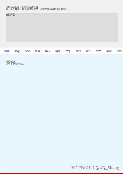
🛠️ 使用体验
在使用这个组件之前,你可能需要手动写很多 ID、监听 Scroll 事件、计算高度......
而现在,你只需要这样:
- 准备你的内容数组,在每个组件上标记 title
tsx
const items = [
  <div title="推荐">这里是推荐板块的内容...</div>,
  <div title="热点">这里是热点板块的内容...</div>,
  <div title="视频">这里是视频板块的内容...</div>,
];- 渲染组件
tsx
<Anchor
  items={items}
  header={<div>这里可以放顶部的 Banner</div>}
  style={{ height: '100vh' }} // 设置容器高度
/>就这么简单!组件会自动生成导航栏,并处理好所有的滚动逻辑。
💡 核心技术实现
1. 极简的 Props 设计
为了让开发者用得爽,我们放弃了传统的 data + content 分离的写法,采用了"组件即数据"的思路:
tsx
// 组件内部自动提取 title
const anchorData = useMemo(() => {
  return items.map((child, index) => ({
    key: `anchor-item-${index}`,
    title: child.props.title || `Tab ${index + 1}`, // 自动提取
    content: child
  }));
}, [items]);
2. 精准的滚动定位 (getBoundingClientRect)
很多组件使用 offsetTop 来计算位置,但在多层嵌套或有 sticky 元素的情况下容易出错。我们统一使用 getBoundingClientRect() 来计算相对可视区的距离,确保万无一失。
tsx
// 计算目标元素距离容器顶部的真实视觉距离
const relativeTop = targetEl.getBoundingClientRect().top - containerEl.getBoundingClientRect().top;

// 目标位置 = 当前滚动 + 相对距离 - 吸顶高度 - 导航栏高度
const scrollTop = containerEl.scrollTop + relativeTop - offsetTop - navHeight;
3. 解决"Tab 切换抖动"
当选中的 Tab 字体变粗(font-weight: bold)时,宽度会增加,导致整个导航栏"跳"一下。我们使用了一个巧妙的 CSS 技巧:text-shadow 模拟加粗。
scss
.navItem.active {
  color: #0084ff;
  /* 看起来像粗体,但完全不占额外空间 */
  text-shadow: 0 0 .25px currentcolor;
}
4. 智能的 ScrollSpy (滚动监听)
如何判断当前应该高亮哪个 Tab?我们不仅判断了元素位置,还加了一个触底兜底逻辑:
tsx
// 如果滚到底了,强制选中最后一个,防止最后一个模块太矮永远无法被激活
const isBottom = container.scrollTop + container.clientHeight >= container.scrollHeight - 5;
if (isBottom) {
  setActiveKey(lastItem.key);
  return;
}
5. 防抖处理
在用户快速连续点击 Tab 时,如果仍然触发滚动监听,会导致左侧 Tab 乱跳。我们引入了一个简单的"锁"机制:
tsx
// 点击时上锁
isManualScrolling.current = true;

// 滚动结束后解锁 (使用 setTimeout 防抖)
clearTimeout(timer);
timer = setTimeout(() => {
  isManualScrolling.current = false;
}, 600);---
🎨 样式完全定制
组件提供了丰富的样式接口,你可以把它变成任何你想要的样子:
tsx
<Anchor
  // 定制 Tab 栏背景和边框
  tabBarStyle={{ background: '#f9f9f9', borderBottom: '1px solid #eee' }}
  // 定制 Tab 项间距和字体
  tabItemStyle={{ padding: '10px 20px', fontSize: 16 }}
  // 定制激活状态 (比如变成胶囊按钮)
  activeTabStyle={{ background: '#e6f7ff', color: '#0084ff', borderRadius: 20 }}
  // 隐藏默认下划线
  lineStyle={{ display: 'none' }}
  // ...
/>---
5. 完整代码结构+样式
tsx
import React, { useEffect, useRef, useState, useMemo } from 'react';
import styles from './index.module.scss';
import classNames from 'classnames';

/**
 * 通用 Anchor 锚点导航组件
 *
 * 功能特点:
 * 1. 自带滚动容器,无需外部包裹,开箱即用。
 * 2. 支持吸顶导航(Sticky),可配置吸顶偏移量。
 * 3. 自动根据滚动位置高亮对应的 Tab。
 * 4. 点击 Tab 平滑滚动到对应内容区域,自动修正吸顶高度遮挡。
 * 5. 解决 Tab 切换抖动问题(使用 text-shadow 模拟加粗)。
 * 6. 支持连续快速点击的防抖处理。
 * 7. 支持高度不一致的内容模块,支持触底自动选中最后一项。
 *
 * 使用方式:
 * 直接传递 React Element 数组作为 items,组件会自动提取元素上的 title 属性作为 Tab 标题。
 *
 * 示例:
 * ```tsx
 * <Anchor
 *   items={[
 *     <div title="推荐">推荐内容...</div>,
 *     <div title="热点">热点内容...</div>
 *   ]}
 *   header={<div>顶部 Banner</div>}
 *   style={{ height: '100vh' }}
 *   tabItemStyle={{ fontSize: 16 }}
 *   activeTabStyle={{ color: 'red' }}
 * />
 * ```
 */

// 内部使用的 Item 结构
interface AnchorItem {
  key: string;
  title: React.ReactNode;
  content: React.ReactNode;
}

interface Props {
  // 接收 React Element 数组,要求每个 Element 有 title 属性
  items: React.ReactElement<{ title?: React.ReactNode }>[];
  header?: React.ReactNode; // 顶部不需要吸顶的内容

  className?: string; // 最外层容器类名
  style?: React.CSSProperties; // 最外层容器样式,通常需要设置 height

  offsetTop?: number; // 吸顶距离,默认 0

  // 自定义样式配置
  tabBarClassName?: string;   // 导航条容器类名
  tabItemClassName?: string;  // Tab 项类名
  activeTabClassName?: string;// 激活状态 Tab 项类名
  lineClassName?: string;     // 下划线类名

  tabBarStyle?: React.CSSProperties;   // 导航条容器样式
  tabItemStyle?: React.CSSProperties;  // Tab 项样式
  activeTabStyle?: React.CSSProperties;// 激活状态 Tab 项样式
  lineStyle?: React.CSSProperties;     // 下划线样式
}

const Anchor: React.FC<Props> = ({
  items,
  header,
  className,
  style,
  offsetTop = 0,

  tabBarClassName,
  tabItemClassName,
  activeTabClassName,
  lineClassName,

  tabBarStyle,
  tabItemStyle,
  activeTabStyle,
  lineStyle
}) => {
  const scrollContainerRef = useRef<HTMLDivElement>(null); // 整个组件的滚动容器
  const navRef = useRef<HTMLDivElement>(null); // 导航条容器(吸顶部分)
  const navScrollRef = useRef<HTMLDivElement>(null); // 导航条内部的水平滚动区域

  // 处理 items,生成内部使用的数据结构
  const anchorData = useMemo(() => {
    return items.map((child, index) => ({
      key: `anchor-item-${index}`,
      title: child.props.title || `Tab ${index + 1}`,
      content: child
    }));
  }, [items]);

  const [activeKey, setActiveKey] = useState<string>(anchorData[0]?.key);
  const isManualScrolling = useRef(false);
  const scrollTimerRef = useRef<NodeJS.Timeout | null>(null); // 用于保存定时器

  // Tab 自动居中逻辑
  useEffect(() => {
    if (activeKey && navScrollRef.current) {
      const index = anchorData.findIndex(item => item.key === activeKey);
      if (index >= 0) {
        const itemNodes = navScrollRef.current.children;
        const targetNode = itemNodes[index] as HTMLElement;
        if (targetNode) {
          const navContainer = navScrollRef.current;
          const scrollLeft = targetNode.offsetLeft + targetNode.offsetWidth / 2 - navContainer.offsetWidth / 2;
          navContainer.scrollTo({ left: scrollLeft, behavior: 'smooth' });
        }
      }
    }
  }, [activeKey, anchorData]);

  // 点击 Tab 处理
  const handleClick = (item: AnchorItem, e: React.MouseEvent) => {
    e.preventDefault();

    // 清除之前的定时器,防止过早释放锁
    if (scrollTimerRef.current) {
      clearTimeout(scrollTimerRef.current);
    }

    setActiveKey(item.key);
    isManualScrolling.current = true;

    const targetEl = document.getElementById(item.key);
    const containerEl = scrollContainerRef.current;

    if (targetEl && containerEl) {
         const navHeight = navRef.current?.offsetHeight || 0;

         // 目标位置 = 当前scrollTop + (目标相对于视口的top - 容器相对于视口的top) - (吸顶距离 + 导航高度)
         const relativeTop = targetEl.getBoundingClientRect().top - containerEl.getBoundingClientRect().top;
         let scrollTop = containerEl.scrollTop + relativeTop - offsetTop - navHeight;

         // 边界检查
         scrollTop = Math.max(0, scrollTop);

         containerEl.scrollTo({ top: scrollTop, behavior: 'smooth' });

         // 重新设置定时器,确保锁住直到本次滚动大致结束
         scrollTimerRef.current = setTimeout(() => {
           isManualScrolling.current = false;
           scrollTimerRef.current = null;
         }, 600);
    }
  };

  // 监听页面滚动
  useEffect(() => {
    const container = scrollContainerRef.current;
    if (!container) return;

    const handleScroll = () => {
      if (isManualScrolling.current) return;

      const navHeight = navRef.current?.offsetHeight || 0;

      // 触底判断
      const isBottom = container.scrollTop + container.clientHeight >= container.scrollHeight - 5;
      if (isBottom) {
        setActiveKey(anchorData[anchorData.length - 1]?.key);
        return;
      }

      // 判定线:容器可视区顶部 + 吸顶距离 + 导航高度 + 缓冲
      // 我们希望当元素的顶部 滚入 到 Anchor 下方时激活
      const checkPoint = container.getBoundingClientRect().top + offsetTop + navHeight + 10;

      let currentKey = anchorData[0]?.key;

      for (const item of anchorData) {
        const targetEl = document.getElementById(item.key);
        if (targetEl) {
           const targetTop = targetEl.getBoundingClientRect().top;
           if (targetTop <= checkPoint) {
             currentKey = item.key;
           } else {
             break;
           }
        }
      }
      setActiveKey(currentKey);
    };

    container.addEventListener('scroll', handleScroll);
    return () => container.removeEventListener('scroll', handleScroll);
  }, [anchorData, offsetTop]);

  return (
    <div
      className={classNames(styles.anchorContainer, className)}
      style={style}
      ref={scrollContainerRef}
    >
      {/* 顶部内容区域 */}
      {header && <div className={styles.header}>{header}</div>}

      {/* 吸顶导航条 */}
      <div
        className={classNames(styles.navWrapper, tabBarClassName)}
        style={{ top: offsetTop, ...tabBarStyle }}
        ref={navRef}
      >
         <div className={styles.navScrollContainer} ref={navScrollRef}>
            {anchorData.map((item) => {
              const isActive = activeKey === item.key;
              return (
                <div
                  key={item.key}
                  className={classNames(styles.navItem, tabItemClassName, {
                    [styles.active]: isActive,
                    [activeTabClassName || '']: isActive
                  })}
                  style={{
                    ...tabItemStyle,
                    ...(isActive ? activeTabStyle : {})
                  }}
                  onClick={(e) => handleClick(item, e)}
                >
                  {item.title}
                  {isActive && (
                    <div
                      className={classNames(styles.line, lineClassName)}
                      style={lineStyle}
                    />
                  )}
                </div>
              );
            })}
         </div>
      </div>

      {/* 内容区域 */}
      <div className={styles.contentWrapper}>
        {anchorData.map((item) => (
          // 这里我们必须给内容包裹一层,用于定位
          <div key={item.key} id={item.key}>
             {item.content}
          </div>
        ))}
      </div>
    </div>
  );
};

export default Anchor;
scss
.anchorContainer {
  width: 100%;
  position: relative;
  overflow-y: auto; // 纵向滚动容器
  -webkit-overflow-scrolling: touch;
}

.header {
  // 顶部区域样式,如果需要
}

.navWrapper {
  width: 100%;
  background: #fff;
  border-bottom: 1px solid #eee;
  position: sticky; // 吸顶
  z-index: 100;
}

.navScrollContainer {
  display: flex;
  overflow-x: auto; // 横向滚动
  white-space: nowrap;
  -webkit-overflow-scrolling: touch;

  &::-webkit-scrollbar {
    display: none;
  }

  padding: 0 10px;
}

.navItem {
  flex-shrink: 0;
  padding: 12px 16px;
  font-size: 15px;
  color: #666;
  position: relative;
  transition: all 0.3s;
  display: flex;
  flex-direction: column;
  align-items: center;
  cursor: pointer;

  &.active {
    color: #0084ff;
    // 使用 text-shadow 模拟加粗,防止抖动
    text-shadow: 0 0 .25px currentcolor;
  }

  .line {
    position: absolute;
    bottom: 6px;
    width: 20px;
    height: 3px;
    background: #0084ff;
    border-radius: 2px;
  }
}

.contentWrapper {
  // 内容区域样式
}
📝 总结
通过封装这个 Anchor 组件,我们将复杂的滚动计算、事件监听、样式处理全部收敛到了内部。对于外部使用者来说,它就是一个简单的、可配置的容器组件。
这不仅提高了开发效率,保证了各处交互的一致性,也让代码变得更加整洁、易维护。
如果你也在做移动端长页面的开发,强烈建议尝试一下这种封装思路!