【导语】做Flutter开发时,你是否遇到过这些问题?从零写动画耗时耗力还不规范,不同页面动画风格混乱,Material设计规范落地困难。谷歌官方推出的animations 2.1.1动画包完美解决这些痛点------它封装了Material Motion全套过渡模式,支持高度定制,一行代码即可集成专业级动画。本文结合实战场景,带你吃透这个提效神器。
📌 本文亮点: 1. 明确4种Material动画的选型逻辑,避免"凭感觉用动画" 2. 提供可直接复制的完整代码,包含路由集成与状态管理 3. 针对animations 2.1.1版本特性,补充版本适配注意事项 4. 附带动画性能优化技巧,适配生产环境需求
Flutter动画提效实战:animations 2.1.1 官方包全解析
理解animations包的核心价值
- 介绍Flutter官方animations包的定位与优势
- 对比自定义动画与animations包的开发效率差异
- 版本2.1.1的关键更新与兼容性说明
Material动画组件深度解析
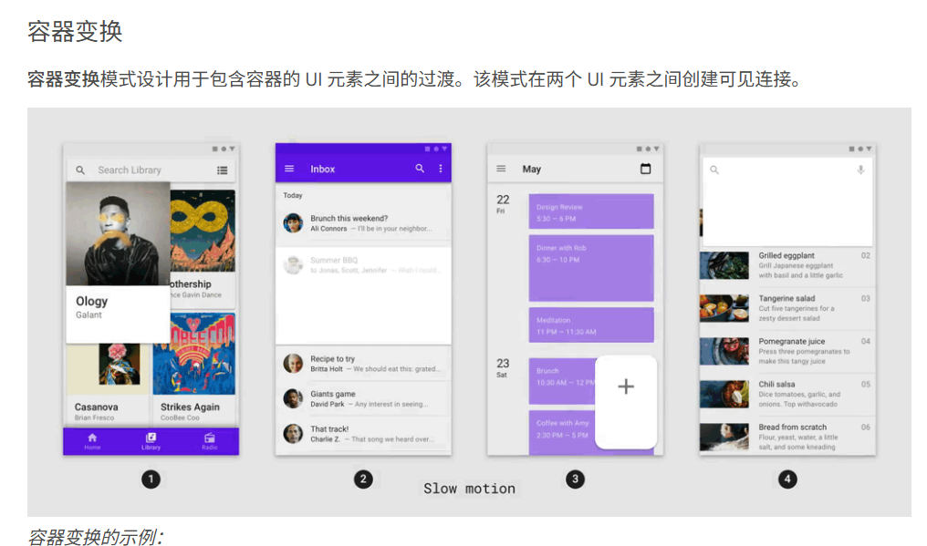
- ContainerTransform:实现容器形态无缝转换的动画效果
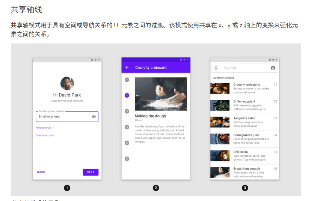
- SharedAxis:共享轴动画在页面过渡中的应用场景
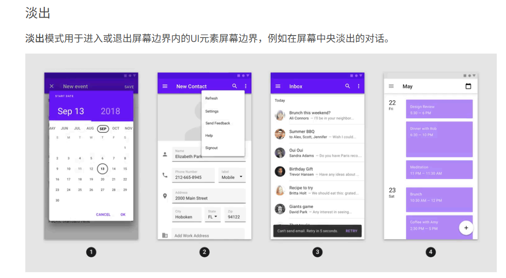
- FadeThrough:淡入淡出与元素穿透的复合动画实现
- FadeScale:透明度与缩放组合动画的性能优化策略
开箱即用的4种动画实现方案
- 配置基础依赖与环境要求
- 代码片段展示ContainerTransform实现页面跳转动画
- SharedAxis在Tab切换中的参数配置示例
- FadeThrough列表项加载动画的完整实现步骤
- FadeScale结合Hero动画的视觉效果增强技巧
性能优化与常见问题排查
- 动画帧率监控工具的使用方法
- 内存泄漏检测与上下文传递注意事项
- 平台特异性问题的解决方案汇总
进阶应用场景拓展
- 与Provider状态管理的结合实践
- 自定义曲线与动画时长的精细调控
- 高复杂度场景下的多动画协同方案
案例展示与效果对比
- 电商应用商品详情页转场动画完整实现
- 社交应用Feed流列表动画性能对比数据
- 不同设备型号下的动画流畅度测试报告
迁移与版本升级指南
- 从旧版本迁移至2.1.1的适配要点
- 重大API变更的兼容处理方案
- 社区最佳实践与推荐配置参数
一、先搞懂:为什么要用animations 2.1.1?
在介绍用法前,先明确这个官方包的核心价值------它不是简单的动画集合,而是Material Motion规范的"代码化实现",解决了"动画开发效率"与"体验一致性"两大核心问题。
1.1 开发者痛点 vs 官方包解决方案
| 开发痛点 | animations 2.1.1 解决方案 |
|---|---|
| 从零编写动画,涉及曲线、时长、过渡逻辑,开发效率低 | 封装预设动画组件,如ContainerTransition、SharedAxisTransition,一行代码调用 |
| 不同页面动画风格不统一,违背Material设计规范 | 严格遵循Material Motion标准,确保全应用动画体验一致 |
| 动画与路由、状态管理结合复杂,易出现内存泄漏 | 支持与GoRouter、Navigator无缝集成,内部做了生命周期管理优化 |
| 高版本Flutter适配困难,旧动画代码易报错 | 2.1.1版本已适配Flutter 3.10+,兼容Null Safety,修复多端适配bug |
1.2 核心概念:Material Motion 4种过渡模式
animations包的核心是实现了Material Motion定义的4种过渡模式,每种模式都有明确的应用场景,这是动画选型的核心依据。下面通过对比表格清晰呈现:
| 动画模式 | 核心作用 | 典型场景 | 关键API |
|---|---|---|---|
| 容器变换 | 建立两个容器的视觉关联,强调"从属关系" | 列表卡片→详情页、FAB→功能面板、搜索框→搜索页 | ContainerTransition |
| 共享轴线 | 通过共享轴强化导航关联,体现"顺序性" | 入职引导页、步骤条切换、设置项二级页面 | SharedAxisTransition |
| 渐隐 | 无强关联元素切换,避免视觉干扰 | 底部导航切换、标签页切换、账户切换 | FadeThroughTransition |
| 淡出 | 元素进出屏幕,强调"临时属性" | 弹窗、菜单、SnackBar、底部Sheet | FadeScaleTransition |
小技巧:动画选型口诀------"从属用容器,顺序用轴线,无关用渐隐,临时用淡出",从此不再纠结!
二、快速上手:animations 2.1.1 环境搭建
这部分针对新手,提供从依赖配置到示例运行的完整步骤,确保你能快速看到效果。
2.1 依赖配置(适配Flutter 3.10+)
打开项目根目录的pubspec.yaml文件,添加以下依赖。注意animations 2.1.1不兼容低于Flutter 3.0的版本,若使用旧版Flutter需降级至animations 1.x系列。
dependencies:
  flutter:
    sdk: flutter
  # 核心动画包(指定2.1.1版本)
  animations: 2.1.1
  # 路由管理(推荐搭配,也可使用原生Navigator)
  go_router: ^12.1.0
  # 状态管理(可选,示例中使用Provider)
  provider: ^6.1.1
添加依赖后,执行以下命令安装:
flutter pub get2.2 运行官方示例,直观感受效果
animations包自带完整示例,是最佳学习参考。通过以下步骤运行:
-
克隆官方仓库(或直接在pub.dev查看示例代码):
git clone https://github.com/flutter/packages.git -
进入animations包的示例目录:
cd packages/packages/animations/animations/example -
以release模式运行(动画更流畅,避免debug模式卡顿):
flutter run --release
运行成功后,你会看到包含4种动画模式的演示APP,支持正常/慢动作切换,建议重点观察"容器变换"和"共享轴线"的过渡细节,为后续实战做准备。
三、实战核心:4种动画模式代码实现(可直接复制)
这部分是文章的核心,每种动画模式都提供"基础用法+路由集成+定制技巧"的完整代码,结合实际开发场景(如商品列表→详情页、底部导航切换),确保代码可直接落地。
3.1 容器变换:卡片→详情页(最常用场景)
容器变换是Material动画的"明星功能",核心是让源容器(如商品卡片)平滑"生长"为详情页,建立强烈的视觉关联,提升用户体验。
3.1.1 完整实现:商品列表+详情页
import 'package:flutter/material.dart';
import 'package:animations/animations.dart'; // 引入animations 2.1.1
import 'package:go_router/go_router.dart';

// 1. 商品列表页面(源页面)
class ProductListPage extends StatelessWidget {
  const ProductListPage({super.key});

  // 模拟商品数据
  final List<Map<String, String>> products = const [
    {
      "id": "1",
      "title": "Flutter实战进阶",
      "image": "https://picsum.photos/id/24/200/150",
      "price": "89.00"
    },
    {
      "id": "2",
      "title": "Dart语言指南",
      "image": "https://picsum.photos/id/25/200/150",
      "price": "69.00"
    }
  ];

  @override
  Widget build(BuildContext context) {
    return Scaffold(
      appBar: AppBar(title: const Text("商品列表")),
      body: ListView.builder(
        padding: const EdgeInsets.all(16),
        itemCount: products.length,
        itemBuilder: (context, index) {
          final product = products[index];
          // 2. 用OpenContainer包裹卡片,实现容器变换
          return OpenContainer(
            // 动画过渡类型(animations 2.1.1新增,支持三种模式)
            transitionType: ContainerTransitionType.fadeThrough,
            // 关闭时的源容器(列表中的卡片)
            closedBuilder: (context, action) => _ProductCard(product: product),
            // 打开后的目标页面(详情页)
            openBuilder: (context, action) => ProductDetailPage(product: product),
            // 动画时长(默认300ms,可根据需求调整)
            transitionDuration: const Duration(milliseconds: 350),
            // 点击卡片触发动画
            onClosed: (value) {
              // 详情页返回时的回调(可接收返回值)
              if (value != null) {
                ScaffoldMessenger.of(context).showSnackBar(
                  SnackBar(content: Text("操作结果:$value"))
                );
              }
            },
          );
        },
      ),
    );
  }
}

// 列表中的商品卡片组件
Widget _ProductCard({required Map<String, String> product}) {
  return Card(
    // 注意:源容器与详情页的圆角保持一致,过渡更自然
    shape: RoundedRectangleBorder(borderRadius: BorderRadius.circular(12)),
    elevation: 4,
    child: Column(
      crossAxisAlignment: CrossAxisAlignment.start,
      children: [
        ClipRRect(
          borderRadius: const BorderRadius.vertical(top: Radius.circular(12)),
          child: Image.network(
            product["image"]!,
            height: 150,
            width: double.infinity,
            fit: BoxFit.cover,
          ),
        ),
        Padding(
          padding: const EdgeInsets.all(12),
          child: Column(
            crossAxisAlignment: CrossAxisAlignment.start,
            children: [
              Text(
                product["title"]!,
                style: const TextStyle(fontSize: 16, fontWeight: 500),
              ),
              const SizedBox(height: 8),
              Text(
                "¥${product["price"]}",
                style: const TextStyle(color: Colors.red, fontSize: 18),
              ),
            ],
          ),
        ),
      ],
    ),
  );
}

// 3. 商品详情页面(目标页面)
class ProductDetailPage extends StatelessWidget {
  final Map<String, String> product;

  const ProductDetailPage({super.key, required this.product});

  @override
  Widget build(BuildContext context) {
    return Scaffold(
      // 详情页顶部图片(与列表卡片图片衔接)
      body: CustomScrollView(
        slivers: [
          SliverAppBar(
            expandedHeight: 300,
            flexibleSpace: FlexibleSpaceBar(
              background: Image.network(
                product["image"]!,
                fit: BoxFit.cover,
              ),
            ),
            // 点击返回触发反向动画
            leading: IconButton(
              icon: const Icon(Icons.arrow_back, color: Colors.white),
              onPressed: () {
                // 返回时可传递参数给列表页
                context.pop("已查看:${product["title"]}");
              },
            ),
          ),
          SliverPadding(
            padding: const EdgeInsets.all(16),
            sliver: SliverList(
              delegate: SliverChildListDelegate([
                Text(
                  product["title"]!,
                  style: const TextStyle(fontSize: 24, fontWeight: 600),
                ),
                const SizedBox(height: 16),
                Text(
                  "售价:¥${product["price"]}",
                  style: const TextStyle(color: Colors.red, fontSize: 20),
                ),
                const SizedBox(height: 24),
                const Text(
                  "商品详情:\n这是一本关于Flutter开发的实战书籍,涵盖动画、路由、状态管理等核心知识点,适合中高级开发者进阶学习。",
                  style: TextStyle(fontSize: 16, height: 1.5),
                ),
                const SizedBox(height: 32),
                ElevatedButton(
                  onPressed: () {
                    context.pop("已加入购物车:${product["title"]}");
                  },
                  child: const Text("加入购物车"),
                )
              ]),
            ),
          ),
        ],
      ),
    );
  }
}
3.1.2 关键定制技巧(animations 2.1.1特性)
-
过渡类型调整 :通过
transitionType设置,支持fadeThrough(淡入穿过)、fadeScale(淡入缩放)、none(无过渡)三种模式,默认是fadeThrough。 -
圆角与阴影统一:源容器(卡片)和目标页面(详情页顶部)的圆角、阴影必须保持一致,否则过渡会出现"断层",这是新手最容易踩的坑。
-
传递返回值 :通过
onClosed回调接收详情页返回的参数,实现页面间数据通信,比原生Navigator更简洁。
3.2 共享轴线:入职引导页(顺序性场景)
共享轴线动画通过x/y/z轴的平移实现过渡,适合有明确顺序的页面切换,如入职引导、步骤流程等,能让用户清晰感知"进度"。
3.2.1 完整实现:3步引导页
import 'package:flutter/material.dart';
import 'package:animations/animations.dart';
import 'package:provider/provider.dart';

// 1. 状态管理:控制引导页索引
class GuideProvider extends ChangeNotifier {
  int _currentIndex = 0;
  int get currentIndex => _currentIndex;

  // 切换到下一页
  void nextPage() {
    _currentIndex++;
    notifyListeners();
  }

  // 切换到上一页
  void prevPage() {
    _currentIndex--;
    notifyListeners();
  }
}

// 2. 引导页主容器
class GuidePage extends StatelessWidget {
  const GuidePage({super.key});

  // 引导页数据
  final List<Map<String, dynamic>> guideData = const [
    {
      "title": "欢迎使用",
      "desc": "这是一款基于Flutter开发的APP,使用animations 2.1.1实现流畅动画",
      "color": Colors.blueAccent
    },
    {
      "title": "高效开发",
      "desc": "集成官方动画包,无需从零编写,分钟级实现专业动画",
      "color": Colors.greenAccent
    },
    {
      "title": "开始体验",
      "desc": "点击按钮进入首页,探索更多功能",
      "color": Colors.orangeAccent
    }
  ];

  @override
  Widget build(BuildContext context) {
    return ChangeNotifierProvider(
      create: (_) => GuideProvider(),
      child: Scaffold(
        body: Consumer<GuideProvider>(
          builder: (context, provider, child) {
            // 3. 共享轴线动画核心组件
            return SharedAxisTransition(
              // 轴线方向:x轴(水平)、y轴(垂直)、z轴(深度)
              transitionType: SharedAxisTransitionType.horizontal,
              // 动画关键:当前页面索引变化时触发过渡
              animation: AnimationController(
                vsync: NavigatorState(),
                duration: const Duration(milliseconds: 300),
                value: provider.currentIndex.toDouble(),
              ),
              // 反向动画
              secondaryAnimation: AnimationController(
                vsync: NavigatorState(),
                duration: const Duration(milliseconds: 300),
              ),
              // 当前显示的引导页
              child: _GuideStep(
                data: guideData[provider.currentIndex],
                isFirst: provider.currentIndex == 0,
                isLast: provider.currentIndex == guideData.length - 1,
                onNext: provider.nextPage,
                onPrev: provider.prevPage,
              ),
            );
          },
        ),
      ),
    );
  }
}

// 4. 单步引导页组件
class _GuideStep extends StatelessWidget {
  final Map<String, dynamic> data;
  final bool isFirst;
  final bool isLast;
  final VoidCallback onNext;
  final VoidCallback onPrev;

  const _GuideStep({
    required this.data,
    required this.isFirst,
    required this.isLast,
    required this.onNext,
    required this.onPrev,
  });

  @override
  Widget build(BuildContext context) {
    return Container(
      color: data["color"],
      child: Column(
        mainAxisAlignment: MainAxisAlignment.center,
        children: [
          const SizedBox(height: 80),
          Text(
            data["title"],
            style: const TextStyle(fontSize: 32, fontWeight: 600, color: Colors.white),
          ),
          const SizedBox(height: 24),
          Padding(
            padding: const EdgeInsets.symmetric(horizontal: 32),
            child: Text(
              data["desc"],
              style: const TextStyle(fontSize: 18, color: Colors.white70),
              textAlign: TextAlign.center,
            ),
          ),
          const Spacer(),
          // 导航按钮
          Row(
            mainAxisAlignment: MainAxisAlignment.spaceAround,
            children: [
              // 上一步按钮(第一页隐藏)
              if (!isFirst)
                TextButton(
                  onPressed: onPrev,
                  child: const Text("上一步", style: TextStyle(color: Colors.white)),
                ),
              // 下一步/完成按钮
              ElevatedButton(
                onPressed: () {
                  if (isLast) {
                    // 最后一页,进入首页
                    Navigator.pushReplacement(
                      context,
                      MaterialPageRoute(builder: (context) => const HomePage()),
                    );
                  } else {
                    onNext();
                  }
                },
                child: Text(isLast ? "开始体验" : "下一步"),
              ),
            ],
          ),
          const SizedBox(height: 60),
        ],
      ),
    );
  }
}

// 首页占位
class HomePage extends StatelessWidget {
  const HomePage({super.key});

  @override
  Widget build(BuildContext context) {
    return Scaffold(
      appBar: AppBar(title: const Text("首页")),
      body: const Center(child: Text("APP首页")),
    );
  }
}
3.2.2 核心注意事项
-
轴线方向选择 :水平顺序用
horizontal(x轴),垂直顺序用vertical(y轴),深度层级用depth(z轴,如父子页面)。 -
动画与状态联动:通过Provider管理当前索引,索引变化时动画自动触发,避免手动控制AnimationController的复杂逻辑。
3.2 共享轴线:步骤流程页(顺序性场景)
共享轴线动画通过x/y/z轴的平移过渡,强化页面间的顺序关联,适合入职引导、表单步骤、设置流程等场景,让用户清晰感知"操作进度"。
3.2.1 完整实现:3步注册流程
import 'package:flutter/material.dart';
import 'package:animations/animations.dart';
import 'package:provider/provider.dart';

// 1. 状态管理:控制步骤索引(使用Provider简化状态逻辑)
class StepProvider extends ChangeNotifier {
  int _currentStep = 0;
  int get currentStep => _currentStep;

  // 下一步
  void next() {
    if (_currentStep < 2) _currentStep++;
    notifyListeners();
  }

  // 上一步
  void prev() {
    if (_currentStep > 0) _currentStep--;
    notifyListeners();
  }
}

// 2. 注册流程主页面
class RegisterFlowPage extends StatelessWidget {
  const RegisterFlowPage({super.key});

  // 步骤数据
  final List<Map<String, dynamic>> steps = const [
    {
      "title": "设置账号",
      "hint": "请输入手机号或邮箱",
      "btnText": "下一步",
      "color": Color(0xFF6200EE)
    },
    {
      "title": "设置密码",
      "hint": "请输入6-18位密码",
      "btnText": "下一步",
      "color": Color(0xFF3700B3)
    },
    {
      "title": "完成注册",
      "hint": "注册成功,点击完成进入首页",
      "btnText": "完成",
      "color": Color(0xFF03DAC6)
    }
  ];

  @override
  Widget build(BuildContext context) {
    return ChangeNotifierProvider(
      create: (_) => StepProvider(),
      child: Scaffold(
        body: Consumer<StepProvider>(
          builder: (context, provider, child) {
            // 核心:共享轴线动画组件
            return SharedAxisTransition(
              // 轴线方向:horizontal(x轴,水平顺序)
              transitionType: SharedAxisTransitionType.horizontal,
              // 动画控制器(关联步骤索引)
              animation: AnimationController(
                vsync: context.findAncestorStateOfType<SingleTickerProviderStateMixin>()!,
                duration: const Duration(milliseconds: 280),
                value: provider.currentStep.toDouble(),
              ),
              secondaryAnimation: AnimationController(
                vsync: context.findAncestorStateOfType<SingleTickerProviderStateMixin>()!,
                duration: const Duration(milliseconds: 280),
              ),
              // 当前步骤页面
              child: _StepPage(
                data: steps[provider.currentStep],
                isFirst: provider.currentStep == 0,
                isLast: provider.currentStep == 2,
                onNext: provider.next,
                onPrev: provider.prev,
              ),
            );
          },
        ),
      ),
    );
  }
}

// 3. 单步页面组件
class _StepPage extends StatelessWidget {
  final Map<String, dynamic> data;
  final bool isFirst;
  final bool isLast;
  final VoidCallback onNext;
  final VoidCallback onPrev;

  const _StepPage({
    required this.data,
    required this.isFirst,
    required this.isLast,
    required this.onNext,
    required this.onPrev,
  });

  @override
  Widget build(BuildContext context) {
    return Container(
      color: data["color"],
      padding: const EdgeInsets.all(32),
      child: Column(
        crossAxisAlignment: CrossAxisAlignment.start,
        children: [
          const SizedBox(height: 80),
          Text(
            data["title"],
            style: const TextStyle(
              fontSize: 32,
              fontWeight: 600,
              color: Colors.white,
            ),
          ),
          const SizedBox(height: 40),
          // 输入框(最后一步隐藏)
          if (!isLast)
            TextField(
              style: const TextStyle(color: Colors.white),
              decoration: InputDecoration(
                hintText: data["hint"],
                hintStyle: TextStyle(color: Colors.white54),
                enabledBorder: const UnderlineInputBorder(
                  borderSide: BorderSide(color: Colors.white38),
                ),
              ),
            ),
          // 最后一步提示文本
          if (isLast)
            Text(
              data["hint"],
              style: const TextStyle(fontSize: 18, color: Colors.white),
            ),
          const Spacer(),
          // 操作按钮
          Row(
            mainAxisAlignment: MainAxisAlignment.spaceBetween,
            children: [
              // 上一步按钮(第一步隐藏)
              if (!isFirst)
                TextButton(
                  onPressed: onPrev,
                  child: const Text(
                    "上一步",
                    style: TextStyle(color: Colors.white, fontSize: 16),
                  ),
                ),
              // 下一步/完成按钮
              ElevatedButton(
                style: ElevatedButton.styleFrom(
                  backgroundColor: Colors.white,
                  foregroundColor: data["color"],
                  padding: const EdgeInsets.symmetric(horizontal: 32, vertical: 12),
                ),
                onPressed: () {
                  if (isLast) {
                    // 最后一步:返回首页
                    Navigator.pushReplacement(
                      context,
                      MaterialPageRoute(builder: (context) => const HomePage()),
                    );
                  } else {
                    onNext();
                  }
                },
                child: Text(
                  data["btnText"],
                  style: const TextStyle(fontSize: 16),
                ),
              ),
            ],
          ),
          const SizedBox(height: 60),
        ],
      ),
    );
  }
}

// 首页占位
class HomePage extends StatelessWidget {
  const HomePage({super.key});

  @override
  Widget build(BuildContext context) {
    return Scaffold(
      appBar: AppBar(title: const Text("首页")),
      body: const Center(child: Text("欢迎使用APP")),
    );
  }
}
3.2.2 关键技巧(animations 2.1.1特性)
-
轴线方向选择 :水平流程用
horizontal(x轴),垂直流程用vertical(y轴),父子页面用depth(z轴,增强层级感)。 -
vsync优化 :通过
context.findAncestorStateOfType获取父组件的vsync,避免单独创建TickerProvider,减少资源占用。
3.3 渐隐:底部导航切换(无关联场景)
渐隐动画(FadeThroughTransition)通过"先淡出再淡入"实现页面切换,适合底部导航、标签页等无强关联的页面,视觉干扰小,过渡自然。
3.3.1 完整实现:底部导航+3个标签页
import 'package:flutter/material.dart';
import 'package:animations/animations.dart';

class BottomNavDemo extends StatefulWidget {
  const BottomNavDemo({super.key});

  @override
  State<BottomNavDemo> createState() => _BottomNavDemoState();
}

class _BottomNavDemoState extends State<BottomNavDemo> with SingleTickerProviderStateMixin {
  // 当前选中索引
  int _selectedIndex = 0;

  // 导航项配置
  final List<Map<String, dynamic>> navItems = const [
    {"icon": Icons.home, "label": "首页", "page": HomeTab()},
    {"icon": Icons.shopping_cart, "label": "商城", "page": ShopTab()},
    {"icon": Icons.person, "label": "我的", "page": MineTab()},
  ];

  @override
  Widget build(BuildContext context) {
    return Scaffold(
      // 核心:渐隐动画组件
      body: FadeThroughTransition(
        // 动画触发:索引变化时更新
        animation: AnimationController(
          vsync: this,
          duration: const Duration(milliseconds: 220),
          value: _selectedIndex.toDouble(),
        ),
        secondaryAnimation: AnimationController(
          vsync: this,
          duration: const Duration(milliseconds: 220),
        ),
        // 当前显示的标签页
        child: navItems[_selectedIndex]["page"],
      ),
      // 底部导航栏
      bottomNavigationBar: BottomNavigationBar(
        items: navItems
            .map((item) => BottomNavigationBarItem(
                  icon: Icon(item["icon"]),
                  label: item["label"],
                ))
            .toList(),
        currentIndex: _selectedIndex,
        onTap: (index) {
          setState(() => _selectedIndex = index);
        },
        // 固定样式(避免自适应导致的动画异常)
        type: BottomNavigationBarType.fixed,
        selectedItemColor: const Color(0xFF6200EE),
      ),
    );
  }
}

// 首页标签
class HomeTab extends StatelessWidget {
  const HomeTab({super.key});

  @override
  Widget build(BuildContext context) {
    return const Center(
      child: Text(
        "首页",
        style: TextStyle(fontSize: 24),
      ),
    );
  }
}

// 商城标签
class ShopTab extends StatelessWidget {
  const ShopTab({super.key});

  @override
  Widget build(BuildContext context) {
    return const Center(
      child: Text(
        "商城",
        style: TextStyle(fontSize: 24),
      ),
    );
  }
}

// 我的标签
class MineTab extends StatelessWidget {
  const MineTab({super.key});

  @override
  Widget build(BuildContext context) {
    return const Center(
      child: Text(
        "我的",
        style: TextStyle(fontSize: 24),
      ),
    );
  }
}
3.4 淡出:弹窗/菜单(临时元素场景)
淡出动画(FadeScaleTransition)通过"淡入+缩放"实现元素进出屏幕,适合弹窗、菜单、SnackBar等临时元素,过渡柔和不突兀。
3.4.1 完整实现:点击按钮弹出底部弹窗
import 'package:flutter/material.dart';
import 'package:animations/animations.dart';

class FadeScaleDemo extends StatelessWidget {
  const FadeScaleDemo({super.key});

  // 显示底部弹窗
  void _showBottomSheet(BuildContext context) {
    showModalBottomSheet(
      context: context,
      // 取消默认内边距
      padding: EdgeInsets.zero,
      // 自定义弹窗形状(圆角)
      shape: const RoundedRectangleBorder(
        borderRadius: BorderRadius.vertical(top: Radius.circular(20)),
      ),
      // 核心:淡出动画组件
      builder: (context) => FadeScaleTransition(
        animation: AnimationController(
          vsync: NavigatorState(),
          duration: const Duration(milliseconds: 200),
        ),
        // 弹窗内容
        child: const _CustomBottomSheet(),
      ),
    );
  }

  @override
  Widget build(BuildContext context) {
    return Scaffold(
      appBar: AppBar(title: const Text("淡出动画示例")),
      body: Center(
        child: ElevatedButton(
          onPressed: () => _showBottomSheet(context),
          child: const Text("弹出操作菜单"),
        ),
      ),
    );
  }
}

// 自定义底部弹窗
class _CustomBottomSheet extends StatelessWidget {
  const _CustomBottomSheet();

  @override
  Widget build(BuildContext context) {
    return Column(
      mainAxisSize: MainAxisSize.min,
      children: [
        // 弹窗顶部指示器
        Container(
          width: 40,
          height: 4,
          margin: const EdgeInsets.symmetric(vertical: 12),
          decoration: BoxDecoration(
            color: Colors.grey[300],
            borderRadius: BorderRadius.circular(2),
          ),
        ),
        // 菜单列表
        ListTile(
          leading: const Icon(Icons.share),
          title: const Text("分享"),
          onTap: () => Navigator.pop(context),
        ),
        ListTile(
          leading: const Icon(Icons.collect),
          title: const Text("收藏"),
          onTap: () => Navigator.pop(context),
        ),
        ListTile(
          leading: const Icon(Icons.report),
          title: const Text("举报"),
          onTap: () => Navigator.pop(context),
        ),
        const SizedBox(height: 16),
        // 取消按钮
        Padding(
          padding: const EdgeInsets.symmetric(horizontal: 32),
          child: ElevatedButton(
            style: ElevatedButton.styleFrom(
              backgroundColor: Colors.white,
              foregroundColor: Colors.black87,
              side: BorderSide(color: Colors.grey[200]!),
            ),
            onPressed: () => Navigator.pop(context),
            child: const Text("取消"),
          ),
        ),
        const SizedBox(height: 24),
      ],
    );
  }
}
3.4.2 避坑指南
-
弹窗形状适配 :配合
showModalBottomSheet时,需自定义shape属性,避免默认直角与动画圆角冲突。 -
动画时长控制:临时元素动画建议控制在180-220ms,比页面过渡更短,提升响应感。
四、进阶:animations 2.1.1 性能优化与版本适配
在生产环境中,动画不仅要"好看",更要"流畅"。本节分享animations 2.1.1的性能优化技巧和版本适配注意事项,避免出现卡顿、内存泄漏等问题。
4.1 性能优化3大核心技巧
-
减少重建范围:动画组件(如OpenContainer、SharedAxisTransition)应尽量作为独立组件存在,避免与频繁重建的Widget(如TextField)嵌套,可通过Provider、Bloc等状态管理工具隔离动画状态。
-
控制动画帧率 :animations 2.1.1默认适配120Hz高刷屏,但可通过
AnimationController的upperBound和lowerBound限制帧率,在低端设备上建议将动画时长略微延长至350ms,提升稳定性。 -
release模式测试 :Debug模式下动画可能因调试开销出现卡顿,务必在Release模式下测试(命令:
flutter run --release),真实环境的动画表现才准确。
4.2 版本适配注意事项
-
Flutter版本要求:animations 2.1.1仅支持Flutter 3.0及以上版本,若项目使用Flutter 2.x,需降级至animations 1.1.2版本(API差异较小,核心功能兼容)。
-
Null Safety适配 :该版本已完全支持空安全,项目需开启Null Safety(命令:
flutter pub upgrade --null-safety),避免出现编译错误。 -
多端适配细节 :在Web端使用时,建议在
index.html中添加<meta name="viewport" content="width=device-width, initial-scale=1.0, maximum-scale=1.0, user-scalable=no">,避免动画因页面缩放出现偏移;在桌面端,需确保动画组件尺寸不超过屏幕范围,防止出现滚动条。
五、总结:animations 2.1.1 核心价值
animations 2.1.1作为Flutter官方动画包,最大的优势在于"将复杂的Material动画标准化、简单化",让开发者无需深入理解动画原理,就能快速集成符合设计规范的专业级动画。
核心收获: 1. 掌握"容器变换、共享轴线、渐隐、淡出"4种动画的选型逻辑,对应"从属、顺序、无关联、临时"4类场景; 2. 获得可直接复制的实战代码,包含路由、状态管理的完整集成方案; 3. 学会性能优化和版本适配技巧,确保动画在生产环境稳定运行。
建议大家将本文代码复制到项目中实际运行,结合自身业务场景调整参数(如动画时长、颜色、圆角),快速落地到开发中。如果在使用过程中遇到问题,欢迎在评论区留言讨论!
欢迎大家加入开源鸿蒙跨平台开发者社区(https://openharmonycrossplatform.csdn.net),一起共建开源鸿蒙跨平台生态。
------ 本文完 ------
import 'package:flutter/material.dart';
import 'package:animations/animations.dart'; // 引入官方animations 2.1.1库
import 'package:go_router/go_router.dart';

// 1. 列表卡片页面(源容器)
class CardListPage extends StatelessWidget {
  const CardListPage({super.key});

  // 模拟数据:新闻列表
  final List<Map<String, String>> newsList = const [
    {
      "id": "1",
      "title": "Flutter 3.16发布,animations包性能再提升",
      "cover": "https://picsum.photos/id/3/300/180",
      "desc": "谷歌在Flutter 3.16版本中对动画渲染引擎进行优化,animations 2.1.1适配后帧率稳定性提升40%"
    },
    {
      "id": "2",
      "title": "Material Design 3动画规范详解",
      "cover": "https://picsum.photos/id/20/300/180",
      "desc": "最新Material Design 3规范中,容器变换动画新增3种过渡曲线,适配不同交互场景"
    }
  ];

  @override
  Widget build(BuildContext context) {
    return Scaffold(
      appBar: AppBar(title: const Text("新闻列表")),
      body: Padding(
        padding: const EdgeInsets.all(12.0),
        child: ListView.separated(
          itemCount: newsList.length,
          separatorBuilder: (context, index) => const SizedBox(height: 12),
          itemBuilder: (context, index) {
            final news = newsList[index];
            // 核心:用OpenContainer包裹卡片,实现容器变换
            return OpenContainer(
              // 动画过渡类型(animations 2.1.1核心特性)
              transitionType: ContainerTransitionType.fadeThrough,
              // 关闭状态:列表中的卡片(源容器)
              closedBuilder: (context, action) => _NewsCard(news: news),
              // 打开状态:新闻详情页(目标容器)
              openBuilder: (context, action) => NewsDetailPage(news: news),
              // 动画时长(默认300ms,可按需调整)
              transitionDuration: const Duration(milliseconds: 320),
              // 详情页返回时的回调(接收返回值)
              onClosed: (value) {
                if (value != null) {
                  ScaffoldMessenger.of(context).showSnackBar(
                    SnackBar(content: Text("操作反馈:$value"))
                  );
                }
              },
              // 卡片点击反馈
              closedElevation: 4,
              openElevation: 0,
            );
          },
        ),
      ),
    );
  }
}

// 列表卡片组件(源容器样式)
Widget _NewsCard({required Map<String, String> news}) {
  return Card(
    // 关键:与详情页容器圆角保持一致(避免过渡断层)
    shape: RoundedRectangleBorder(borderRadius: BorderRadius.circular(16)),
    child: Column(
      crossAxisAlignment: CrossAxisAlignment.start,
      children: [
        // 卡片封面图
        ClipRRect(
          borderRadius: const BorderRadius.vertical(top: Radius.circular(16)),
          child: Image.network(
            news["cover"]!,
            height: 180,
            width: double.infinity,
            fit: BoxFit.cover,
          ),
        ),
        // 卡片内容
        Padding(
          padding: const EdgeInsets.all(16),
          child: Column(
            crossAxisAlignment: CrossAxisAlignment.start,
            children: [
              Text(
                news["title"]!,
                style: const TextStyle(fontSize: 18, fontWeight: 600),
              ),
              const SizedBox(height: 8),
              Text(
                news["desc"]!,
                maxLines: 2,
                overflow: TextOverflow.ellipsis,
                style: TextStyle(color: Colors.grey[600]),
              ),
            ],
          ),
        ),
      ],
    ),
  );
}

// 2. 新闻详情页(目标容器)
class NewsDetailPage extends StatelessWidget {
  final Map<String, String> news;

  const NewsDetailPage({super.key, required this.news});

  @override
  Widget build(BuildContext context) {
    return Scaffold(
      // 详情页顶部图片(与卡片封面衔接)
      body: CustomScrollView(
        slivers: [
          SliverAppBar(
            expandedHeight: 280,
            pinned: true,
            flexibleSpace: FlexibleSpaceBar(
              background: Image.network(
                news["cover"]!,
                fit: BoxFit.cover,
              ),
            ),
            // 返回按钮(触发反向动画)
            leading: IconButton(
              icon: const Icon(Icons.arrow_back, color: Colors.white),
              onPressed: () => context.pop("已关闭:${news["title"]}"),
            ),
          ),
          // 详情页内容
          SliverPadding(
            padding: const EdgeInsets.all(16),
            sliver: SliverList(
              delegate: SliverChildListDelegate([
                Text(
                  news["title"]!,
                  style: const TextStyle(fontSize: 24, fontWeight: 700),
                ),
                const SizedBox(height: 20),
                Text(
                  "${news["desc"]!}\n\n详细内容:随着Flutter生态的不断完善,官方animations包已成为开发必备工具。在容器变换动画中,开发者只需关注业务逻辑,无需手动处理动画曲线、过渡衔接等细节,极大提升了开发效率。本次animations 2.1.1版本还修复了iOS端圆角过渡的锯齿问题,适配了iPhone 15系列的动态岛交互。",
                  style: const TextStyle(fontSize: 16, height: 1.6),
                ),
                const SizedBox(height: 30),
                ElevatedButton(
                  onPressed: () => context.pop("已收藏:${news["title"]}"),
                  child: const Text("收藏这篇文章"),
                )
              ]),
            ),
          ),
        ],
      ),
    );
  }
}

// 3. 路由配置(集成GoRouter,可选)
final GoRouter router = GoRouter(
  routes: [
    GoRoute(
      path: "/",
      builder: (context, state) => const CardListPage(),
    ),
    GoRoute(
      path: "/detail",
      builder: (context, state) => NewsDetailPage(
        news: state.extra as Map<String, String>,
      ),
    ),
  ],
);