Flutter 实现一个容器内部元素可平移、缩放和旋转等功能(八)
Flutter: 3.35.7
前面我们实现了元素的变换操作,单纯的变换操作只是为了后续功能的实现,接下来我们就开始扩展容器的属性。
我们要新增容器功能的扩展,那么就要划分新的区域来实现这部分功能,所以我们得重新规划和计算。
有许多方式实现扩展功能区域,第一种就是划分区域,划分下面为属性扩展区域,元素变换区域则会相应的压缩,所以涉及到变换的计算有使用到容器宽高属性的都要变化;第二种就是将功能区域设计成一个底部弹框覆盖在元素变换区域,在元素变换过程中隐藏,未变换就展示,这样就不用更改,不过得制定弹出时机。这里我们使用第一种,感兴趣的可以自行研究第二种。
常量新增配置:
dart
/// 底部功能区域的高度
static const double bottomHeight = 100;
/// 变换区域的左右margin
static const double transformMargin = 20;
重新计算宽高、重新设计布局和更改变换过程中应用到容器宽高的计算(将变换计算中的_containerWidth换成_transformWidth,_containerHeight换成_transformHeight):
dart
/// 变换区域的宽
double get _transformWidth {
  return _width - ConstantsConfig.transformMargin * 2;
}

/// 变换区域的高
double get _transformHeight {
  return _height - ConstantsConfig.bottomHeight;
}

/// 最终容器的宽
double get _width {
  return _containerWidth == 0 ? (widget.containerWidth ?? double.infinity) : _containerWidth;
}

/// 最终容器的高
double get _height {
  return _containerHeight == 0 ? (widget.containerHeight ?? double.infinity) : _containerHeight;
}

SizedBox(
  key: _multipleTransformContainerGlobalKey,
  width: _width,
  height: _height,
  child: _containerWidth == 0 || _containerHeight == 0 ? null : Column(
    children: [
      // 变换区域
      GestureDetector(
        // 其他省略...
        child: Container(
          width: _transformWidth,
          height: _transformHeight,
          margin: EdgeInsets.symmetric(
            horizontal: ConstantsConfig.transformMargin,
          ),
          color: Colors.white,
          child: _containerWidth == 0 || _containerHeight == 0 ? null : Stack(
            // 其他省略...
          ),
        ),
      ),
      // 底部功能区域
      Container(
        height: ConstantsConfig.bottomHeight,
        color: Colors.white60,
      ),
    ],
  ),
);
运行效果:
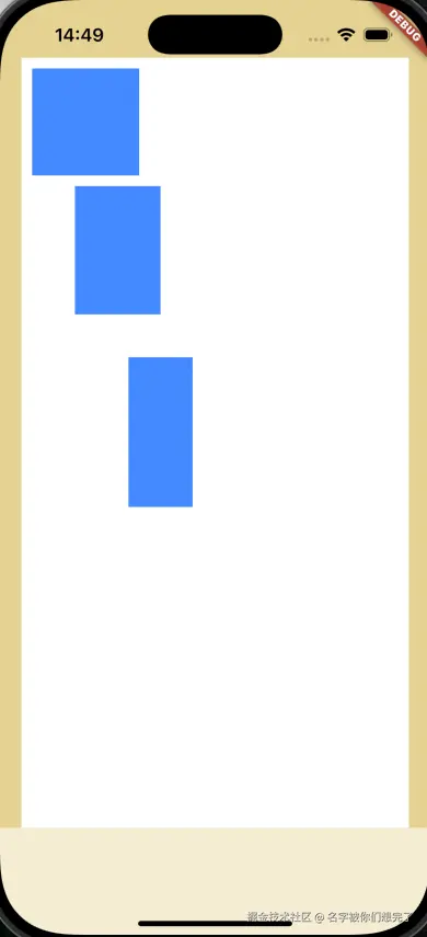
顺便将使用外层的容器设置了顶部边距。
后续的功能扩展就在这个小小的区域上面实现。规划完区域,我们就要对变换元素做出修改,总不可能一直操作一个矩形吧;按照部分经验,这种功能操作的大多数是图片+文本,所以我们以这两种来划分元素的类型为例,后续如果有新的类型再增加即可。
新增元素类型:
dart
enum ElementType {
  /// 图片
  imageType(type: 'image'),
  /// 文本
  textType(type: 'text'),;

  final String type;
  const ElementType({required this.type});
}

class ElementModel {
  // 其他省略...

  /// 元素的类型
  final String type;
  /// 如果是元素是图片类型,图片的path
  final String? imagePath;
  /// 如果元素是文本类型,文本属性
  final ElementTextOptions? textOptions;

  // 其他省略...
}

// 其他省略...

enum TextAlignType {
  left(type: 'left', textAlign: TextAlign.left),
  right(type: 'right', textAlign: TextAlign.right),
  center(type: 'center', textAlign: TextAlign.center),
  justify(type: 'justify', textAlign: TextAlign.justify),
  ;

  final String? type;
  final TextAlign textAlign;
  const TextAlignType({
    required this.type,
    required this.textAlign,
  });
}

class ElementTextOptions {
  const ElementTextOptions({
    required this.text,
    this.textHeight = ConstantsConfig.initFontHeight,
    this.fontSize = ConstantsConfig.initFontSize,
    this.fontColor = Colors.black,
    this.fontWeight,
    this.fontFamily,
    this.textAlign = ConstantsConfig.initFontAlign,
    this.letterSpacing,
  });

  /// 文本内容
  final String text;
  /// 文本行高
  final double textHeight;
  /// 文本大小
  final double fontSize;
  /// 文本颜色
  final Color fontColor;
  /// 文本字重(100-1000,1000就是bold)
  final int? fontWeight;
  /// 文本字体
  final String? fontFamily;
  /// 文本对齐方式
  final String? textAlign;
  /// 文本字间距
  final double? letterSpacing;

  ElementTextOptions copyWith({
    String? text,
    double? textHeight,
    double? fontSize,
    Color? fontColor,
    int? fontWeight,
    String? fontFamily,
    String? textAlign,
    double? letterSpacing,
  }) {
    return ElementTextOptions(
      text: text ?? this.text,
      textHeight: textHeight ?? this.textHeight,
      fontSize: fontSize ?? this.fontSize,
      fontColor: fontColor ?? this.fontColor,
      fontWeight: fontWeight ?? this.fontWeight,
      fontFamily: fontFamily ?? this.fontFamily,
      textAlign: textAlign ?? this.textAlign,
      letterSpacing: letterSpacing ?? this.letterSpacing,
    );
  }
}
定义完属性,我们就开始新增图片元素,在功能区新增图片选择按钮,从本地文件中选择图片,所以我们得增加图片选择插件(image_picker),在获取到图片的时候再将部分必要信息填充,然后将选择的图片添加到元素列表中即可:
dart
// 其他省略...
class ImageElementAdd extends StatefulWidget {
const ImageElementAdd({
super.key,
required this.transformWidth,
required this.transformHeight,
required this.addElement,
});
/// 变换区域的宽,用于计算选择图片的初始宽度
final double transformWidth;
/// 变换区域的高,用于计算选择图片的初始高度
final double transformHeight;
/// 新增元素方法,用于将选择的图片添加到元素列表中
final Function(ElementModel) addElement;
@override
State<ImageElementAdd> createState() => _ImageElementAddState();
}
class _ImageElementAddState extends State<ImageElementAdd> {
/// 选择图片
Future<void> _imagePicker() async {
final ImagePicker picker = ImagePicker();
final XFile? imageFile = await picker.pickImage(source: ImageSource.gallery);
if (imageFile != null) {
final imageInfo = await _loadImageFromFile(imageFile.path);
widget.addElement(ElementModel(
id: DateTime.now().millisecondsSinceEpoch,
elementWidth: imageInfo.$1,
elementHeight: imageInfo.$2,
type: ElementType.imageType.type,
imagePath: imageFile.path,
));
}
}
/// 从本地文件加载图片并获取宽高
///
/// 通过[filePath]获取这张图片的宽高
Future<(double, double)> _loadImageFromFile(String filePath) async {
final file = File(filePath);
final bytes = await file.readAsBytes();
final codec = await ui.instantiateImageCodec(bytes);
final frame = await codec.getNextFrame();
final imageInfo = frame.image;
final double imageWidth = imageInfo.width.toDouble();
final double imageHeight = imageInfo.height.toDouble();
final double tempContainerWidth = widget.transformWidth / 2;
final double tempContainerHeight = widget.transformHeight / 2;
double tempWidth = imageWidth;
double tempHeight = imageHeight;
// 以长边来设置图片的最终初始宽高
if (imageWidth >= imageHeight) {
tempWidth = imageWidth > tempContainerWidth ? tempContainerWidth : imageWidth;
tempHeight = (tempWidth / imageWidth) * imageHeight;
} else {
tempHeight = imageHeight > tempContainerHeight ? tempContainerHeight : imageHeight;
tempWidth = (tempHeight / imageHeight) * imageWidth;
}
return (tempWidth, tempHeight);
}
@override
Widget build(BuildContext context) {
return ElevatedButton(
onPressed: _imagePicker,
child: Text('图片选择'),
);
}
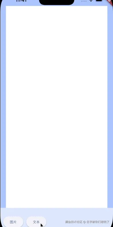
}运行效果:

这样我们就简单实现了图片元素的新增。接下来我们简单实现文本元素的新增。文本元素就需要考虑多些了,因为涉及到文本属性的修改,新增的时候将对应的属性修改放开,后续也涉及到编辑,所以封装成一个部件,为了后续能更好的展示,我们封装成一个Positioned,通过控制状态来展示:
dart
// 其他省略...

class TextOptions extends StatefulWidget {
  const TextOptions({
    super.key,
    required this.transformWidth,
    required this.isShow,
    required this.addElement,
  });

  /// 变换区域的宽,用于计算选择文本元素的最大宽度
  final double transformWidth;
  /// 文本元素属性部件是否展示
  final bool isShow;
  /// 新增元素方法,用于新增文本部件
  final Function(ElementModel) addElement;

  @override
  State<TextOptions> createState() => _TextOptionsState();
}

class _TextOptionsState extends State<TextOptions> {
  /// 新增文本元素
  void _onAddTextElement(String text) {}

  @override
  Widget build(BuildContext context) {
    return AnimatedPositioned(
      duration: Duration(milliseconds: 100),
      left: 0,
      right: 0,
      bottom: widget.isShow ? 0 : -ConstantsConfig.fontOptionsWidgetHeight,
      child: Container(
        padding: EdgeInsets.all(20),
        color: Colors.white,
        height: ConstantsConfig.fontOptionsWidgetHeight,
        child: TextField(
          style: TextStyle(
            fontSize: 15,
            fontWeight: FontWeight.w600,
            height: 1.333,
          ),
          decoration: InputDecoration(
            isCollapsed: true,
            contentPadding: EdgeInsets.zero,
            border: InputBorder.none,
            counter: const Offstage(),
            hintText: '请输入',
            hintStyle: TextStyle(
              fontSize: 15,
              fontWeight: FontWeight.w600,
              height: 1.333,
            ),
          ),
          onSubmitted: _onAddTextElement,
        ),
      ),
    );
  }
}
dart
// 其他省略...
class TextElementAdd extends StatefulWidget {
const TextElementAdd({
super.key,
required this.onShowTextOptions,
});
/// 展示文本属性部件
final Function(bool) onShowTextOptions;
@override
State<TextElementAdd> createState() => _TextElementAddState();
}
class _TextElementAddState extends State<TextElementAdd> {
void _onShowText() {
widget.onShowTextOptions(true);
}
@override
Widget build(BuildContext context) {
return ElevatedButton(
onPressed: _onShowText,
child: Text(
'文本',
style: TextStyle(
fontSize: 12,
),
),
);
}
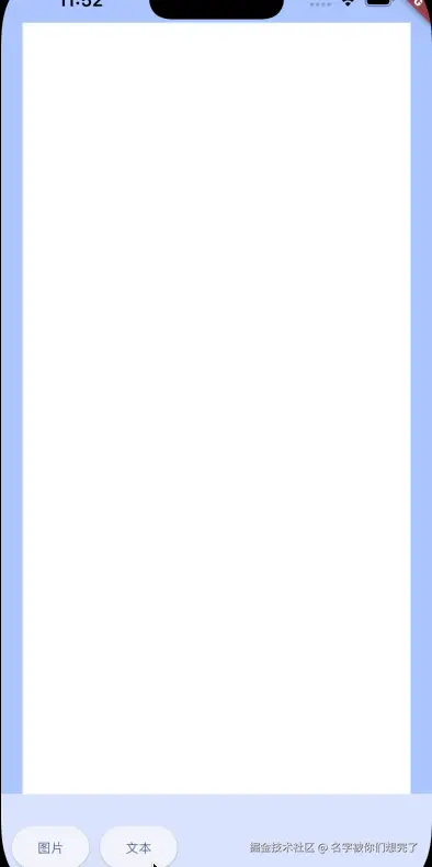
}运行效果:
接下来就在这个基础上实现新增文本的逻辑。首先,新增文本的时候我也也要得到这个字符串应该拥有的宽高。通过 flutter 提供的 TextPainter 来获取:
dart
/// 计算文本的宽高
///
/// 传入文本字符串[text]、文本的样式[style]和最大的宽度[maxWidth]来计算文本的宽高
static (double, double) calculateTextSize({
  required String text,
  required TextStyle style,
  required double maxWidth
}) {
  if (text.isEmpty) {
    return (0, 0);
  }

  final TextPainter textPainter = TextPainter(
    text: TextSpan(text: text, style: style),
    textDirection: TextDirection.ltr,
  )..layout(maxWidth: maxWidth);
  final tempWidth = textPainter.width;
  final tempHeight = textPainter.height;
  // 不能小于最小值
  final minSize = ConstantsConfig.minSize;

  return (
    tempWidth <= minSize ? minSize : tempWidth,
    tempHeight <= minSize ? minSize : tempHeight
  );
}
获取到文本元素的宽高后,就可以实现新增的逻辑了:
dart
/// 新增文本元素
void _onAddTextElement(String text) {
// 一些初始化的文本属性
TextStyle style = TextStyle(
fontSize: ConstantsConfig.initFontSize,
height: ConstantsConfig.initFontHeight,
);
final (tempWidth, tempHeight) = TransformUtils.calculateTextSize(
text: text,
style: style,
maxWidth: widget.transformWidth,
);
widget.addElement(ElementModel(
id: DateTime.now().millisecondsSinceEpoch,
elementHeight: tempHeight,
elementWidth: tempWidth,
type: ElementType.textType.type,
textOptions: ElementTextOptions(text: text),
));
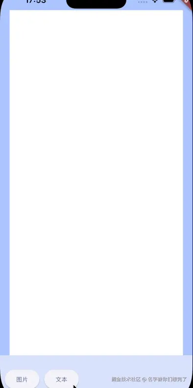
}运行效果:
这样我们就简单实现了新增文本元素,下面就来设计文本元素属性的修改。因为属性比较多,我们可以使用tab来分开(前面简单封装过一个tab,感兴趣的朋友可以看看),也可以使用滑动组件,这里为了方便,所以使用滑动组件(我们以行高属性为例,其他的实现类似,只是结构稍微调整即可):
dart
/// 设置文本的属性
void _setTextOptions(ElementTextOptions textOptions) {
  if (_currentElement?.type == ElementType.textType.type) {
    TextStyle style = TextStyle(
      fontSize: textOptions.fontSize,
      height: textOptions.textHeight,
      letterSpacing: textOptions.letterSpacing,
      fontWeight: TransformUtils.getFontWeight(
        textOptions.fontWeight,
      ),
    );

    final (tempWidth, tempHeight) = TransformUtils.calculateTextSize(
      text: textOptions.text,
      style: style,
      maxWidth: _currentElement!.elementWidth,
    );

    _currentElement = _currentElement?.copyWith(
      // elementWidth: tempWidth,
      elementHeight: tempHeight,
      textOptions: _currentElement?.textOptions?.copyWith(
        text: textOptions.text,
        textHeight: textOptions.textHeight,
        fontSize: textOptions.fontSize,
        fontColor: textOptions.fontColor,
        fontWeight: textOptions.fontWeight,
        fontFamily: textOptions.fontFamily,
        textAlign: textOptions.textAlign,
        letterSpacing: textOptions.letterSpacing,
      ),
    );
    _onChange();
  }
}
dart
void _onReduceFontHeight() {
  if (widget.textOptions != null && widget.textOptions!.textHeight > 0) {
    widget.setTextOptions(
      widget.textOptions!.copyWith(
        textHeight: (
          Decimal.parse('${widget.textOptions!.textHeight}') - Decimal.parse('0.1')
        ).toDouble(),
      ),
    );
  }
}

void _onAddFontHeight() {
  if (widget.textOptions != null) {
    widget.setTextOptions(
      widget.textOptions!.copyWith(
        textHeight: (
          Decimal.parse('${widget.textOptions!.textHeight}') + Decimal.parse('0.1')
        ).toDouble(),
      ),
    );
  }
}
这样我们就简单实现了属性的修改,样式什么的后面有时间再慢慢调整,现在只是功能为主,毕竟真实的开发总会有UI的。
下面快速预览一下文本属性修改的完整效果:
字体因为难得找相关的所以就暂未实现。
感兴趣的也可以关注我的微信公众号【前端学习小营地】,不定时会分享一些小功能~
好了,今天的分享到此结束了,感谢阅读~拜拜~