常用元素属性
CSS 属性有很多,可参考文档:http://www.w3school.com/cssref/index.asp不需要全部都背下来,而是在使用中学习。
字体属性
设置字体
html
body {
    font-family: "微软雅黑";
    font-family: "Microsoft yahei";
}- 字体名称可以用中文,但不建议。
- 多个字体之间使用逗号分隔(从左到右查找字体,如果都找不到,会使用默认字体)。
- 如果字体名称有空格,使用引号包裹。
- 建议使用完字体,否则兼容性不好。
示例代码:
html
<style>
    .font-family_one {
        font-family: "Microsoft yahei";
    }
    .font-family_two {
        font-family: "宋体";
    }
</style>
<div class="font-family">
    <div class="one">
        <div>这是微软雅黑</div>
    </div>
    <div class="two">
        <div>这是宋体</div>
    </div>
</div>
大小
p {
    font-size: 20px;
}- 不同的浏览器默认字号不一样,最好给一个明确值(chrome 默认是 16px)。
- 可以给 body 标签统一用 font-size。
- 要注意单位是 px 不要忘记。
- 标题标签需要单独指定大小。
注意:实际上它设置的是字体中字符框的高度;实际的字符字形可能比这些框高或矮。
示例代码:
html
<style>
    .font-size_one {
        font-size: 40px;
    }
    .font-size_two {
        font-size: 20px;
    }
</style>
<div class="font-size">
    <div class="one">
        <div>大</div>
    </div>
    <div class="two">
        <div>小</div>
    </div>
粗细
p {
    font-weight: bold;
    font-weight: 700;
}- 可以使用数字表示粗细。
700 == bold,400 == normal。- 取值范围是
100 ~ 900。
示例代码:
html
<style>
    .font-weight_one {
        font-weight: 900;
    }
    .font-weight_two {
        font-weight: 100;
    }
</style>
<div class="font-weight">
    <div class="one">
        <div>粗粗粗</div>
    </div>
    <div class="two">
        <div>细细细</div>
    </div>
</div>
文字样式
html
/* 设置倾斜 */
font-style: italic;
/* 取消倾斜 */
font-style: normal;- 很少把整个文字变倾斜,但经常需要把
em/i改成不倾斜。
示例代码:
html
<style>
    .font-style em {
        font-style: normal;
    }
    .font-style div {
        font-style: italic;
    }
</style>
<div class="font-style">
    <em>
        这是一段
        <div>这段是倾斜</div>
    </em>
</div>
文本属性
文本颜色(RGB 认知)
我们的显示器是由很多 "像素" 构成的,每个像素对应一个具体颜色。通过 R(red)、G(green)、B(blue)(光的三原色)按不同比例搭配,混合出各种颜色。计算机中对 R、G、B 分量,用一个字节(8 位)表示,范围是 0-255(十六进制为 00-FF)。
- 数值越大,对应颜色越浓。
255,255,255是白色,0,0,0是黑色。
设置文本颜色
html
color: red;
color: #ff0000;
color: rgb(255, 0, 0);- 鼠标停在 vscode 的颜色上,会出现颜色选择器,可手动调整。
color书写方式:- 预定义颜色值(直接单词)。
- 十六进制形式(常用)。
- RGB 方式。
- 十六进制可简写(两两相同则用一个字符):
#ff00ff→#f0f。
示例代码:
html
<style>
.color {
color: red;
/* color: rgb(255, 0, 0); */
/* color: #ff0000; */
}
</style>
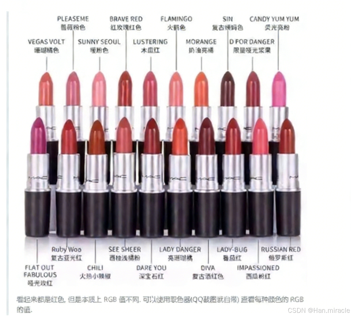
<div class="color">这是一段</div>注意:请说一下不同红色的区别。
文本对齐
控制文字水平方向的对齐,不仅能控制文本对齐,也能控制图片等元素居中或靠右。
text-align: [值];常用取值:
center:居中对齐left:左对齐right:右对齐
示例代码:
html
<style>
    .text-align_one {
        text-align: left;
    }
    .text-align_two {
        text-align: right;
    }
    .text-align_three {
        text-align: center;
    }
</style>
<div class="text-align">
    <div class="one">左对齐</div>
    <div class="two">右对齐</div>
    <div class="three">居中对齐</div>
</div>
文本装饰
text-decoration: [值];常用取值:
underline:下划线(常用)none:移除装饰(可以给 a 标签去掉下划线)overline:上划线(不常用)line-through:删除线(不常用)
示例代码:
html
<style>
    .text-decorate .one {
        text-decoration: none;
    }
    .text-decorate .two {
        text-decoration: underline;
    }
    .text-decorate .three {
        text-decoration: overline;
    }
    .text-decorate .four {
        text-decoration: line-through;
    }
</style>
<div class="text-decorate">
    <div class="one">移除装饰</div>
    <div class="two">下划线</div>
    <div class="three">上划线</div>
    <div class="four">删除线</div>
</div>
例如 B 站这里的导航链接, 就是使用这个属性去的掉的下划线. 可以 F12 观察

文本缩进
控制段落的首行缩进(其他行不影响)。
text-indent: [值];- 单位可以使用
px或者em。 - 使用
em作为单位更好:1 个em就是当前元素的文字大小。 - 缩进可以是负的,表示往左缩进(会导致文字溢出)。
示例代码:
html
<style>
    .text-indent .one {
        text-indent: 2em;
    }
    .text-indent .two {
        text-indent: -2em;
    }
</style>
<div class="text-indent">
    <div class="one">正常缩进</div>
    <div class="two">反向缩进</div>
</div>
行高
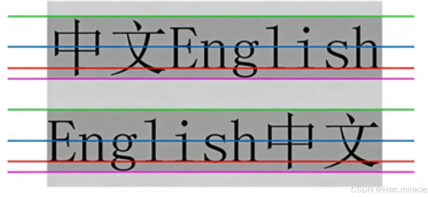
行高指的是上下文本行之间的基线距离。
HTML 中展示文字涉及的基准线:
- 顶线
- 中线
- 基线(相当于英语四线格的倒数第二条线)
- 底线
内容区:底线和顶线包裹的区域,即下图深灰色背景区域。
行高
line-height: [值];注意 1:行高的计算
行高 = 上边距 + 下边距 + 字体大小上下边距是相等的,例如:字体大小 16px、行高 40px 时,上下边距分别为 12px。
示例代码:
html
<style>
    .line-height .one {
        line-height: 40px;
        font-size: 16px;
    }
</style>
<div class="line-height">
    <div>上一行</div>
    <div class="one">中间行</div>
    <div>下一行</div>
</div>
注意 2:行高的取值
行高也可以取 normal 等值,具体取决于浏览器实现(如 Chrome 中 normal 对应 21px)。
注意 3:行高实现垂直居中
行高等于元素高度时,可以实现文字垂直居中。
示例代码:
<style>
    .line-height .two {
        height: 100px;
        line-height: 100px;
    }
</style>
<div class="line-height">
    <div class="two">
        文本垂直居中
    </div>
</div>
背景属性
1. 背景颜色
background-color: [指定颜色];-
默认值为
transparent(透明),可通过颜色值修改。 -
示例代码:
红色背景绿色背景透明背景
2. 背景图片
background-image: url(...)- 比
<img>更便于控制图片在容器中的位置。 - 注意:
url不可遗漏;- 路径可以是绝对 / 相对路径;
url可加 / 不加引号。
- 示例代码:
html
<style>
  .bgi .one {
    background-image: url(rose.jpg);
    height: 300px;
  }
</style>
<div class="bgi">
  <div class="one">背景图片</div>
</div>
3. 背景平铺
background-repeat: [平铺方式];- 常用取值:
repeat:默认,全屏平铺;no-repeat:不平铺;repeat-x:水平平铺;repeat-y:垂直平铺。
- 背景图与背景色可共存,背景图在背景色上方。
- 示例代码:
html
<style>
  .bgr .one {
    background-image: url(rose.jpg);
    height: 300px;
    background-repeat: no-repeat;
  }
  .bgr .two {
    background-image: url(rose.jpg);
    height: 300px;
    background-repeat: repeat-x;
  }
  .bgr .three {
    background-image: url(rose.jpg);
    height: 300px;
    background-repeat: repeat-y;
  }
</style>
<div class="bgr">
  <div class="one">不平铺</div>
  <div class="two">水平平铺</div>
  <div class="three">垂直平铺</div>
</div>
4. 背景位置
background-position: x y;- 用于调整背景图的位置,参数格式:
- 方位名词(
top/left/right/bottom); - 精确单位(坐标 / 百分比,左上角为原点);
- 混合单位(方位名词 + 精确单位)。
- 方位名词(
- 注意:计算机坐标系为左手系(y 轴向下)。
- 示例代码:
html
<style>
  .bgp .one {
    background-image: url(rose.jpg);
    height: 500px;
    background-repeat: no-repeat;
    background-color: purple;
    background-position: center;
  }
</style>
<div class="bgp">
  <div class="one">背景居中</div>
</div>
5. 背景尺寸
css
background-size: length|percentage|cover|contain;- 取值说明:
- 具体数值(如
40px 60px):指定宽高; - 百分比:相对于元素尺寸缩放;
cover:拉伸背景图以完全覆盖容器(可能裁剪);contain:拉伸背景图以完全适配容器(可能留白)。
- 具体数值(如
- 示例代码:
html
<style>
  .bgs .one {
    width: 500px;
    height: 300px;
    background-image: url(rose.jpg);
    background-repeat: no-repeat;
    background-position: center;
    background-size: contain;
  }
</style>
<div class="bgs">
  <div class="one">背景尺寸</div>
</div>
圆角矩形(border-radius)
通过 border-radius 实现边框圆角效果。
基本用法
border-radius: length;length是内切圆半径,数值越大,圆角越明显。
生成图形
-
圆形 :将
border-radius设置为正方形宽度的一半(或50%)。htmldiv { width: 200px; height: 200px; border: 2px solid green; border-radius: 100px; /* 或 50% */ } -
圆角矩形 :将
border-radius设置为矩形高度的一半。htmldiv { width: 200px; height: 100px; border: 2px solid green; border-radius: 50px; }
补充说明
- 背景属性常用于页面布局的视觉美化,可组合使用(如
background: #fff url(xxx.jpg) no-repeat center/contain;简写)。 border-radius是现代 UI 设计中常用的样式属性,可单独设置四个角的圆角(如border-radius: 10px 20px 30px 40px;)。
展开写法
border-radius 是复合写法,可针对四个角分别设置圆角:
-
统一设置四个角
border-radius: 2em;
等价于:
border-top-left-radius: 2em;
border-top-right-radius: 2em;
border-bottom-right-radius: 2em;
border-bottom-left-radius: 2em;-
按顺时针单独设置四个角
border-radius: 10px 20px 30px 40px;
等价于(顺序:左上 → 右上 → 右下 → 左下):
border-top-left-radius: 10px;
border-top-right-radius: 20px;
border-bottom-right-radius: 30px;
border-bottom-left-radius: 40px;