前言
商品分类导航是商城应用中帮助用户快速定位商品类别的重要组件。一个设计良好的分类导航能够让用户在海量商品中快速找到目标品类,提升购物效率和用户体验。本文将详细介绍如何在Flutter和OpenHarmony平台上开发商品分类导航组件,包括图标式分类入口、侧边栏分类菜单等常见形式。
在电商应用的信息架构中,商品分类是组织商品的基础维度。合理的分类体系能够帮助用户建立对商城商品结构的认知,降低用户的决策成本。分类导航的设计需要考虑分类层级的深度、每级分类的数量、图标和文字的搭配等因素,在信息展示的完整性和界面的简洁性之间取得平衡。
Flutter分类数据模型
首先定义分类数据的模型结构:
dart
class Category {
  final String id;
  final String name;
  final String iconUrl;
  final List<Category>? children;

  const Category({
    required this.id,
    required this.name,
    required this.iconUrl,
    this.children,
  });
}
Category类采用树形结构设计,支持多级分类的表示。id是分类的唯一标识符,用于数据查询和路由跳转。name是分类名称,显示在界面上供用户识别。iconUrl是分类图标的网络地址,图标能够帮助用户快速识别分类内容。children是子分类列表,使用可空类型表示叶子节点没有子分类。这种递归的数据结构可以表示任意深度的分类层级,具有很强的扩展性。
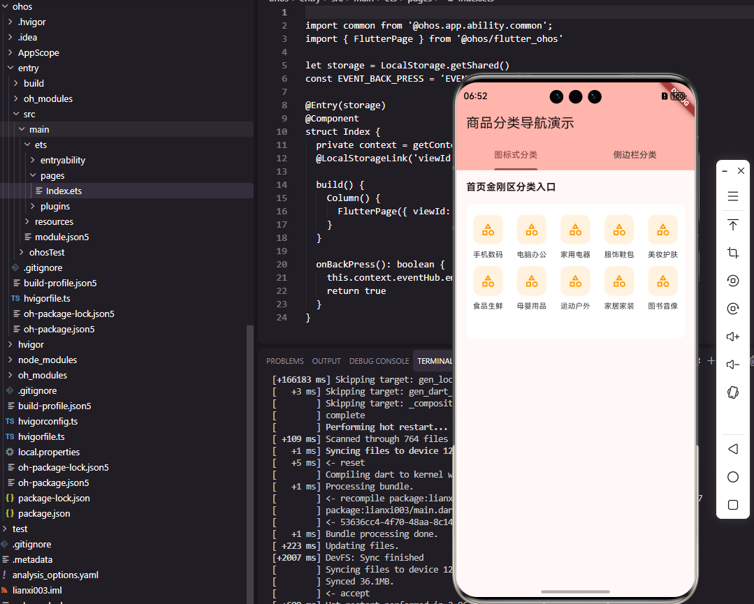
图标式分类入口组件
dart
class CategoryGrid extends StatelessWidget {
  final List<Category> categories;
  final ValueChanged<Category>? onTap;
  final int crossAxisCount;

  const CategoryGrid({
    Key? key,
    required this.categories,
    this.onTap,
    this.crossAxisCount = 5,
  }) : super(key: key);

  @override
  Widget build(BuildContext context) {
    return GridView.builder(
      shrinkWrap: true,
      physics: const NeverScrollableScrollPhysics(),
      gridDelegate: SliverGridDelegateWithFixedCrossAxisCount(
        crossAxisCount: crossAxisCount,
        childAspectRatio: 0.85,
      ),
      itemCount: categories.length,
      itemBuilder: (context, index) {
        return _buildCategoryItem(categories[index]);
      },
    );
  }
}
CategoryGrid组件实现了图标式的分类入口展示,常见于商城首页的金刚区。GridView.builder采用懒加载方式构建网格项,shrinkWrap设为true使网格高度自适应内容,physics设为NeverScrollableScrollPhysics禁用网格自身的滚动,让它跟随父级滚动视图一起滚动。crossAxisCount设置每行显示的分类数量,默认为5个,这是移动端常见的布局方式。childAspectRatio设置子项的宽高比为0.85,使图标和文字有足够的垂直空间展示。
分类项组件的实现:
dart
Widget _buildCategoryItem(Category category) {
  return GestureDetector(
    onTap: () => onTap?.call(category),
    child: Column(
      mainAxisAlignment: MainAxisAlignment.center,
      children: [
        Container(
          width: 48,
          height: 48,
          decoration: BoxDecoration(
            color: const Color(0xFFFFF3E0),
            borderRadius: BorderRadius.circular(12),
          ),
          child: ClipRRect(
            borderRadius: BorderRadius.circular(12),
            child: Image.network(
              category.iconUrl,
              fit: BoxFit.cover,
            ),
          ),
        ),
        const SizedBox(height: 8),
        Text(
          category.name,
          style: const TextStyle(
            fontSize: 12,
            color: Color(0xFF333333),
          ),
          maxLines: 1,
          overflow: TextOverflow.ellipsis,
        ),
      ],
    ),
  );
}
每个分类项由图标和文字组成,使用Column垂直排列。图标容器设置了48像素的固定尺寸和浅橙色背景,圆角设计使图标更加柔和。ClipRRect对图片进行圆角裁剪,与容器的圆角保持一致。文字使用12像素字号,maxLines限制为单行显示,overflow设为ellipsis在文字过长时显示省略号。GestureDetector包装整个分类项,点击时触发onTap回调,将分类数据传递给父组件处理跳转逻辑。
侧边栏分类菜单
dart
class CategorySidebar extends StatefulWidget {
  final List<Category> categories;
  final ValueChanged<Category>? onSelect;

  const CategorySidebar({
    Key? key,
    required this.categories,
    this.onSelect,
  }) : super(key: key);

  @override
  State<CategorySidebar> createState() => _CategorySidebarState();
}

class _CategorySidebarState extends State<CategorySidebar> {
  int _selectedIndex = 0;

  @override
  Widget build(BuildContext context) {
    return Row(
      children: [
        _buildSideMenu(),
        Expanded(child: _buildSubCategories()),
      ],
    );
  }
}
CategorySidebar组件实现了左侧一级分类、右侧二级分类的经典布局,这种设计在商城分类页面中非常常见。组件使用StatefulWidget管理当前选中的一级分类索引。Row组件水平排列侧边菜单和子分类内容区,Expanded使子分类区域占据剩余空间。这种布局充分利用了屏幕宽度,左侧菜单固定宽度便于用户快速浏览一级分类,右侧区域展示详细的子分类内容。
侧边菜单的实现:
dart
Widget _buildSideMenu() {
  return Container(
    width: 90,
    color: const Color(0xFFF5F5F5),
    child: ListView.builder(
      itemCount: widget.categories.length,
      itemBuilder: (context, index) {
        final isSelected = index == _selectedIndex;
        return GestureDetector(
          onTap: () {
            setState(() {
              _selectedIndex = index;
            });
            widget.onSelect?.call(widget.categories[index]);
          },
          child: Container(
            height: 50,
            alignment: Alignment.center,
            decoration: BoxDecoration(
              color: isSelected ? Colors.white : Colors.transparent,
              border: Border(
                left: BorderSide(
                  color: isSelected
                    ? const Color(0xFFE53935)
                    : Colors.transparent,
                  width: 3,
                ),
              ),
            ),
            child: Text(
              widget.categories[index].name,
              style: TextStyle(
                fontSize: 14,
                color: isSelected
                  ? const Color(0xFFE53935)
                  : const Color(0xFF666666),
                fontWeight: isSelected
                  ? FontWeight.w600
                  : FontWeight.normal,
              ),
            ),
          ),
        );
      },
    ),
  );
}
侧边菜单使用固定90像素宽度的Container,灰色背景与右侧白色内容区形成视觉区分。ListView.builder构建可滚动的菜单列表,每个菜单项高度为50像素。选中状态通过多种视觉元素强调:白色背景突出当前项,左侧3像素的红色边框作为选中指示器,文字颜色变为红色并加粗。这种多重视觉反馈确保用户能够清晰地识别当前选中的分类。点击菜单项时更新选中索引并触发回调,通知父组件加载对应的子分类数据。
OpenHarmony分类导航实现
typescript
@Component
struct CategoryGrid {
  @Prop categories: CategoryInfo[] = []
  private onCategoryClick: (category: CategoryInfo) => void = () => {}
  private columns: number = 5

  build() {
    Grid() {
      ForEach(this.categories, (item: CategoryInfo) => {
        GridItem() {
          this.CategoryItem(item)
        }
      })
    }
    .columnsTemplate('1fr '.repeat(this.columns).trim())
    .rowsGap(12)
    .columnsGap(0)
    .width('100%')
  }
}
OpenHarmony的Grid组件提供了强大的网格布局能力。columnsTemplate使用fr单位定义列宽,'1fr '.repeat(this.columns)生成等宽的列模板。rowsGap设置行间距,columnsGap设置列间距。ForEach遍历分类数据,为每个分类创建GridItem。这种声明式的网格布局比手动计算位置更加简洁,也更容易维护。Grid组件会自动处理子项的排列和换行,开发者只需关注单个分类项的UI实现。
分类数据接口定义:
typescript
interface CategoryInfo {
  id: string
  name: string
  iconUrl: string
  children?: CategoryInfo[]
}
TypeScript接口定义了与Flutter相同的分类数据结构。children属性使用可选标记,表示叶子分类没有子分类。接口的递归定义支持任意深度的分类层级,与后端API的数据结构保持一致,便于数据的序列化和反序列化处理。
分类项ArkUI实现
typescript
@Builder
CategoryItem(category: CategoryInfo) {
  Column() {
    Image(category.iconUrl)
      .width(48)
      .height(48)
      .borderRadius(12)
      .backgroundColor('#FFF3E0')
      .objectFit(ImageFit.Cover)

    Text(category.name)
      .fontSize(12)
      .fontColor('#333333')
      .margin({ top: 8 })
      .maxLines(1)
      .textOverflow({ overflow: TextOverflow.Ellipsis })
  }
  .width('100%')
  .alignItems(HorizontalAlign.Center)
  .onClick(() => {
    this.onCategoryClick(category)
  })
}
@Builder装饰器定义了分类项的构建方法。Column垂直排列图标和文字,alignItems设为HorizontalAlign.Center使内容水平居中。Image组件设置固定尺寸、圆角和背景色,objectFit确保图片正确填充。Text组件设置字号、颜色和上边距,maxLines和textOverflow处理文字溢出情况。onClick事件处理器在用户点击时调用回调函数。ArkUI的链式调用语法使样式设置清晰直观。
侧边栏ArkUI实现
typescript
@Component
struct CategorySidebar {
  @State selectedIndex: number = 0
  @Prop categories: CategoryInfo[] = []
  private onSelect: (category: CategoryInfo) => void = () => {}

  build() {
    Row() {
      this.SideMenu()
      this.SubCategories()
    }
    .width('100%')
    .height('100%')
  }
}
侧边栏组件使用Row水平排列菜单和内容区。@State装饰的selectedIndex管理选中状态,状态变化时UI自动更新。@Prop装饰的categories从父组件接收分类数据。组件结构与Flutter版本保持一致,确保两个平台的用户体验统一。
侧边菜单ArkUI实现:
typescript
@Builder
SideMenu() {
  List() {
    ForEach(this.categories, (item: CategoryInfo, index: number) => {
      ListItem() {
        Text(item.name)
          .width('100%')
          .height(50)
          .fontSize(14)
          .fontColor(this.selectedIndex === index ? '#E53935' : '#666666')
          .fontWeight(this.selectedIndex === index
            ? FontWeight.Medium
            : FontWeight.Normal)
          .textAlign(TextAlign.Center)
          .backgroundColor(this.selectedIndex === index
            ? Color.White
            : Color.Transparent)
          .border({
            width: { left: this.selectedIndex === index ? 3 : 0 },
            color: '#E53935'
          })
      }
      .onClick(() => {
        this.selectedIndex = index
        this.onSelect(item)
      })
    })
  }
  .width(90)
  .height('100%')
  .backgroundColor('#F5F5F5')
}
List组件创建可滚动的菜单列表,ForEach遍历分类数据生成列表项。Text组件通过条件表达式设置选中和未选中状态的不同样式,包括字体颜色、字重、背景色和左边框。border属性支持分别设置四个方向的边框,这里只设置左边框作为选中指示器。onClick事件更新选中索引并触发回调。这种实现方式与Flutter版本的视觉效果完全一致。
子分类内容区
dart
Widget _buildSubCategories() {
  final selectedCategory = widget.categories[_selectedIndex];
  final children = selectedCategory.children ?? [];

  return Container(
    color: Colors.white,
    padding: const EdgeInsets.all(16),
    child: GridView.builder(
      gridDelegate: const SliverGridDelegateWithFixedCrossAxisCount(
        crossAxisCount: 3,
        mainAxisSpacing: 16,
        crossAxisSpacing: 16,
        childAspectRatio: 0.9,
      ),
      itemCount: children.length,
      itemBuilder: (context, index) {
        return _buildSubCategoryItem(children[index]);
      },
    ),
  );
}
子分类内容区展示当前选中一级分类下的所有二级分类。通过selectedIndex获取当前选中的一级分类,然后读取其children属性获得子分类列表。GridView以3列网格形式展示子分类,mainAxisSpacing和crossAxisSpacing设置网格间距。白色背景和16像素内边距使内容区与侧边菜单形成清晰的视觉分隔。当用户切换一级分类时,selectedIndex变化触发重建,自动显示新的子分类内容。
总结
本文详细介绍了Flutter和OpenHarmony平台上商品分类导航组件的开发过程。分类导航作为商城应用的核心导航组件,其设计质量直接影响用户的商品发现效率。通过图标式分类入口和侧边栏分类菜单两种形式,我们满足了不同场景下的分类导航需求。在实际项目中,还可以进一步添加分类搜索、热门分类推荐、分类收藏等功能,为用户提供更加便捷的分类浏览体验。
欢迎加入开源鸿蒙跨平台社区:https://openharmonycrossplatform.csdn.net