大家好,我的开源项目PakePlus可以将网页/Vue/React项目打包为桌面/手机应用并且小于5M只需几分钟,官网地址:pakeplus.com
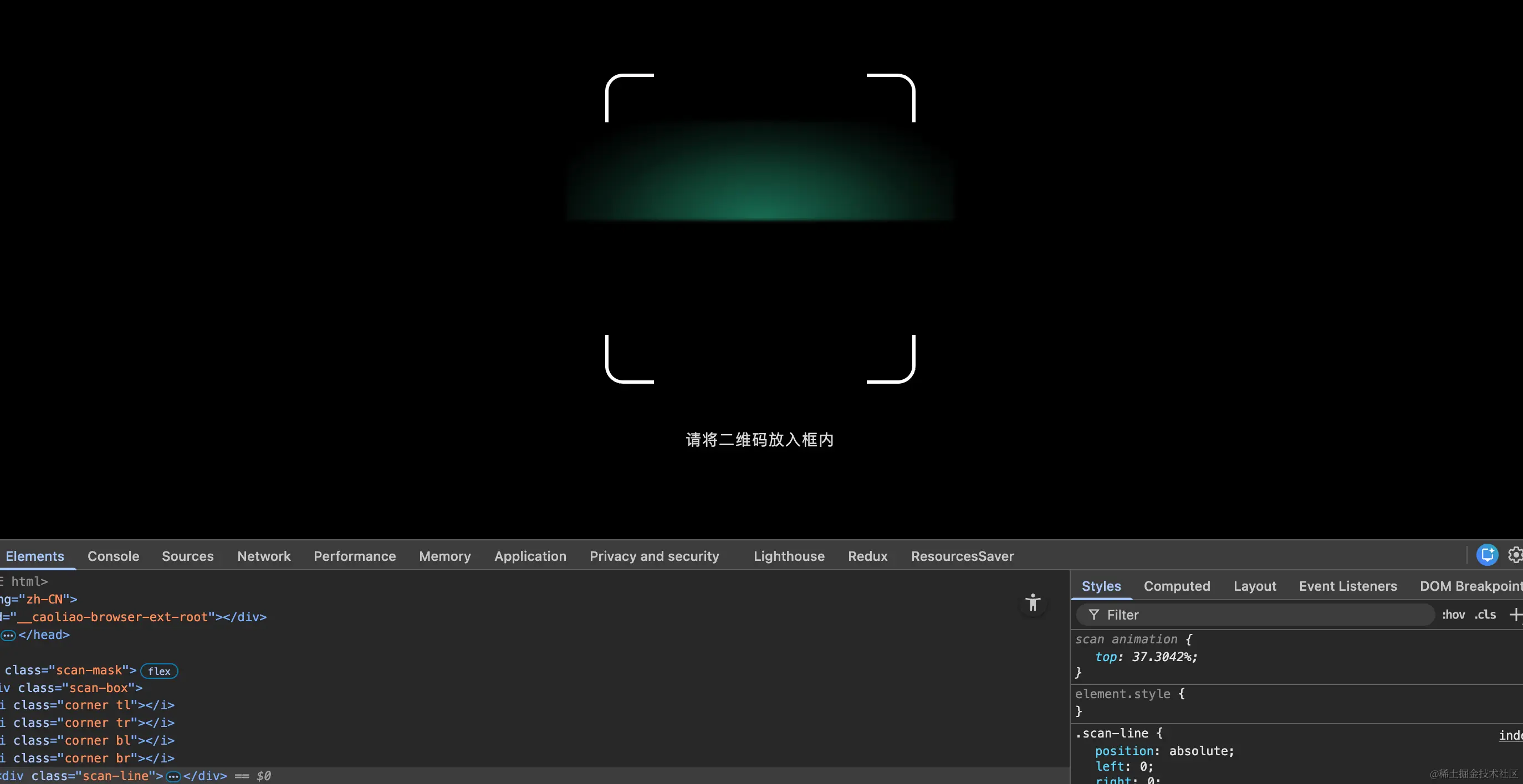
纯html和css实现的效果,中间的绿色会向下移动,放在微信小程序中也可以生效,全部html代码如下:
html
<!DOCTYPE html>
<html lang="zh-CN">
    <head>
        <meta charset="UTF-8" />
        <title>扫码扫描线效果</title>
        <meta name="viewport" content="width=device-width, initial-scale=1.0" />

        <style>
            * {
                margin: 0;
                padding: 0;
                box-sizing: border-box;
            }

            body {
                width: 100vw;
                height: 100vh;
                background: #000;
                overflow: hidden;
            }

            /* 遮罩层 */
            .scan-mask {
                position: fixed;
                inset: 0;
                background: rgba(0, 0, 0, 0.75);
                display: flex;
                justify-content: center;
                align-items: center;
            }

            /* 扫码框 */
            .scan-box {
                position: relative;
                width: 280px;
                height: 280px;
                box-shadow: 0 0 0 9999px rgba(0, 0, 0, 0.65);
            }

            /* 四个圆角 */
            .corner {
                position: absolute;
                width: 44px;
                height: 44px;
                border: 3px solid #fff;
            }

            .tl {
                top: 0;
                left: 0;
                border-right: none;
                border-bottom: none;
                border-radius: 16px 0 0 0;
            }

            .tr {
                top: 0;
                right: 0;
                border-left: none;
                border-bottom: none;
                border-radius: 0 16px 0 0;
            }

            .bl {
                bottom: 0;
                left: 0;
                border-right: none;
                border-top: none;
                border-radius: 0 0 0 16px;
            }

            .br {
                bottom: 0;
                right: 0;
                border-left: none;
                border-top: none;
                border-radius: 0 0 16px 0;
            }

            /* 扫描线主体 */
            .scan-line {
                position: absolute;
                left: 0;
                right: 0;
                height: 2px; /* 下边平直 */
                animation: scan 2.4s linear infinite;
            }

            /* 上方拱形发散光(核心) */
            .scan-line::before {
                content: '';
                position: absolute;
                left: -35px;
                right: -35px;
                bottom: 100%;
                height: 90px;

                background: radial-gradient(
                    ellipse at center bottom,
                    rgba(39, 243, 184, 0.45) 0%,
                    rgba(39, 243, 184, 0.25) 35%,
                    rgba(39, 243, 184, 0.12) 55%,
                    rgba(39, 243, 184, 0.05) 70%,
                    rgba(39, 243, 184, 0) 85%
                );

                filter: blur(1.5px);
                pointer-events: none;
            }

            /* 横向亮度集中 */
            .scan-line::after {
                content: '';
                position: absolute;
                inset: 0;
                opacity: 0.9;
            }

            @keyframes scan {
                0% {
                    top: 0;
                }
                100% {
                    top: 100%;
                }
            }

            /* 底部提示 */
            .tip {
                position: fixed;
                bottom: 80px;
                width: 100%;
                text-align: center;
                color: rgba(255, 255, 255, 0.85);
                font-size: 14px;
                letter-spacing: 1px;
            }
        </style>
    </head>

    <body>
        <div class="scan-mask">
            <div class="scan-box">
                <i class="corner tl"></i>
                <i class="corner tr"></i>
                <i class="corner bl"></i>
                <i class="corner br"></i>

                <div class="scan-line"></div>
            </div>
        </div>

        <div class="tip">请将二维码放入框内</div>
    </body>
</html>