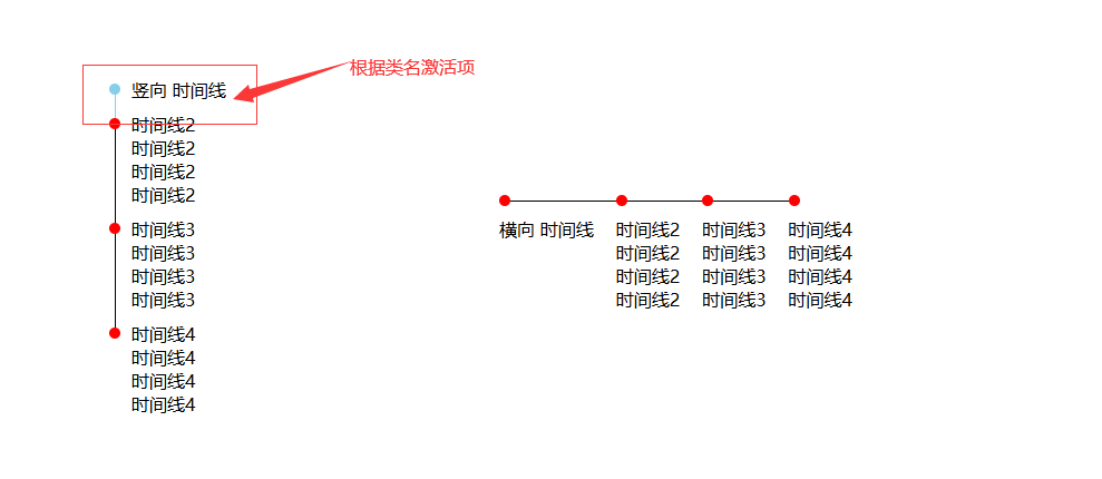
效果如图
javascript
<!DOCTYPE html>
<html>
	<head>
		<meta charset="utf-8">
		<title></title>
		<style>
			* {
				margin: 0;
				padding: 0;
			}

			body {
				width: 100vw;
				height: 100vh;
				overflow: hidden;
				display: flex;
				align-items: center;
				justify-content: center;
				gap: 50px;
			}

			.time-box {
				width: 300px;
			}

			.time {
				position: relative;
				box-sizing: border-box;
				padding: 0 0 10px 20px;
			}

			.time:before {
				position: absolute;
				left: 0;
				top: 5px;
				content: '';
				display: block;
				background-color: red;
				width: 10px;
				height: 10px;
				border-radius: 10px;
				z-index: 2;
			}

			.time.active:before {
				background: skyblue;
			}

			.time:not(:last-child)::after {
				position: absolute;
				left: 5px;
				top: 5px;
				content: '';
				display: block;
				background-color: #000;
				width: 1px;
				height: 100%;
			}
			.time.active:after {
				background: skyblue;
			}

			.time-box2 {
				display: flex;
				width: 500px;
			}

			.time2 {
				position: relative;
				padding: 20px 20px 0 0px;
			}

			.time2:before {
				position: absolute;
				left: 0;
				top: 0;
				content: '';
				display: block;
				background-color: red;
				width: 10px;
				height: 10px;
				border-radius: 10px;
				z-index: 2;
			}

			.time2:not(:last-child)::after {
				position: absolute;
				left: 0;
				top: 5px;
				content: '';
				display: block;
				background-color: #000;
				width: 100%;
				height: 1px;
			}
		</style>
	</head>
	<body>
		<div class="time-box">
			<div class="time active">
				<div class="text">
					竖向 时间线
				</div>
			</div>
			<div class="time">
				<div class="text">
					时间线2
				</div>
				<div class="text">
					时间线2
				</div>
				<div class="text">
					时间线2
				</div>
				<div class="text">
					时间线2
				</div>
			</div>
			<div class="time">
				<div class="text">
					时间线3
				</div>
				<div class="text">
					时间线3
				</div>
				<div class="text">
					时间线3
				</div>
				<div class="text">
					时间线3
				</div>
			</div>
			<div class="time">
				<div class="text">
					时间线4
				</div>
				<div class="text">
					时间线4
				</div>
				<div class="text">
					时间线4
				</div>
				<div class="text">
					时间线4
				</div>
			</div>
		</div>
		<div class="time-box2">
			<div class="time2">
				<div class="text">
					横向 时间线
				</div>

			</div>
			<div class="time2">
				<div class="text">
					时间线2
				</div>
				<div class="text">
					时间线2
				</div>
				<div class="text">
					时间线2
				</div>
				<div class="text">
					时间线2
				</div>
			</div>
			<div class="time2">
				<div class="text">
					时间线3
				</div>
				<div class="text">
					时间线3
				</div>
				<div class="text">
					时间线3
				</div>
				<div class="text">
					时间线3
				</div>
			</div>
			<div class="time2">
				<div class="text">
					时间线4
				</div>
				<div class="text">
					时间线4
				</div>
				<div class="text">
					时间线4
				</div>
				<div class="text">
					时间线4
				</div>
			</div>
		</div>
	</body>
</html>
你的这个时间线 Demo 非常适合用于教学博客!它通过纯 CSS 实现了竖向 和横向 两种时间线布局,并巧妙地利用 :before 和 ::after 伪元素绘制连接线与节点,同时通过 .active 类实现了"激活状态"的视觉反馈------这正是步骤条(Step Progress)组件的核心思想。
下面我为你整理一份结构清晰、适合写进博客的教学解释文案,你可以直接使用或稍作修改:
🕒 纯 CSS 实现竖向 & 横向时间线(可拓展为步骤条)
在前端开发中,时间线(Timeline) 和 步骤条(Step Progress) 是常见的 UI 组件,常用于展示流程、历史事件或操作引导。今天,我们就用 纯 HTML + CSS 来实现一个简洁、可复用的时间线组件,并支持"激活项"高亮,轻松拓展为交互式步骤条!
🧱 核心思路
- 利用 伪元素
::before绘制圆形节点(时间点) - 利用 伪元素
::after绘制连接线(时间轴) - 通过
.active类控制当前步骤的样式(如颜色变化) - 分别实现 竖向排列 和 横向排列 两种布局
🔽 竖向时间线实现
HTML 结构
html
<div class="time-box">
  <div class="time active">...</div>
  <div class="time">...</div>
  <!-- 更多步骤 -->
</div>
关键 CSS 技巧
css
.time {
  position: relative;
  padding: 20px 0 10px 20px; /* 左侧留出空间给时间轴 */
}

/* 圆形节点 */
.time::before {
  content: '';
  position: absolute;
  left: 0;
  top: 5px;
  width: 10px;
  height: 10px;
  border-radius: 50%;
  background-color: red;
  z-index: 2;
}

/* 垂直线(时间轴) */
.time::after {
  content: '';
  position: absolute;
  left: 5px;
  top: 5px;
  width: 1px;
  height: 100%;
  background-color: #000;
}
💡 注意 :
.time::after的height: 100%会延伸到每个.time元素的底部,从而形成连续的竖线。
激活状态(.active)
css
.time.active::before {
  background: skyblue;
}
.time.active::after {
  background: skyblue;
}这样,当前步骤的节点 和连接线都会高亮,视觉上更突出!
➡️ 横向时间线实现
HTML 结构
html
<div class="time-box2"> <!-- 使用 flex 横向排列 -->
  <div class="time2">...</div>
  <div class="time2">...</div>
</div>
关键差异
- 容器
.time-box2使用display: flex实现横向布局 - 连接线从 垂直 变为 水平
css
.time2::before {
  /* 节点位置:左上角 */
  left: 5px;
  top: 0;
}

.time2::after {
  /* 水平线:从节点向右延伸 */
  left: 5px;
  top: 5px;
  width: 100%;   /* 横向拉满 */
  height: 1px;   /* 变成细线 */
  background-color: #000;
}
⚠️ 注意:横向时间线的连接线是每个
.time2自己画的"右边部分",所以最后一个元素的线可能会超出容器。实际项目中可通过:not(:last-child)::after优化。
🚀 拓展为交互式步骤条
你只需:
- 用 JavaScript 动态切换
.active类(例如点击下一步) - 添加过渡动画(如
transition: background 0.3s) - 配合内容区域切换,即可实现完整的分步引导流程
示例逻辑(伪代码):
js
steps.forEach((step, index) => {
  step.addEventListener('click', () => {
    steps.forEach(s => s.classList.remove('active'));
    step.classList.add('active');
    showContent(index);
  });
});
✅ 总结
| 特性 | 实现方式 |
|---|---|
| 时间节点 | ::before + border-radius: 50% |
| 时间轴线 | ::after + 宽/高控制方向 |
| 激活高亮 | .active 类覆盖颜色 |
| 布局切换 | 父容器用 flex 控制子项排列方向 |