引言
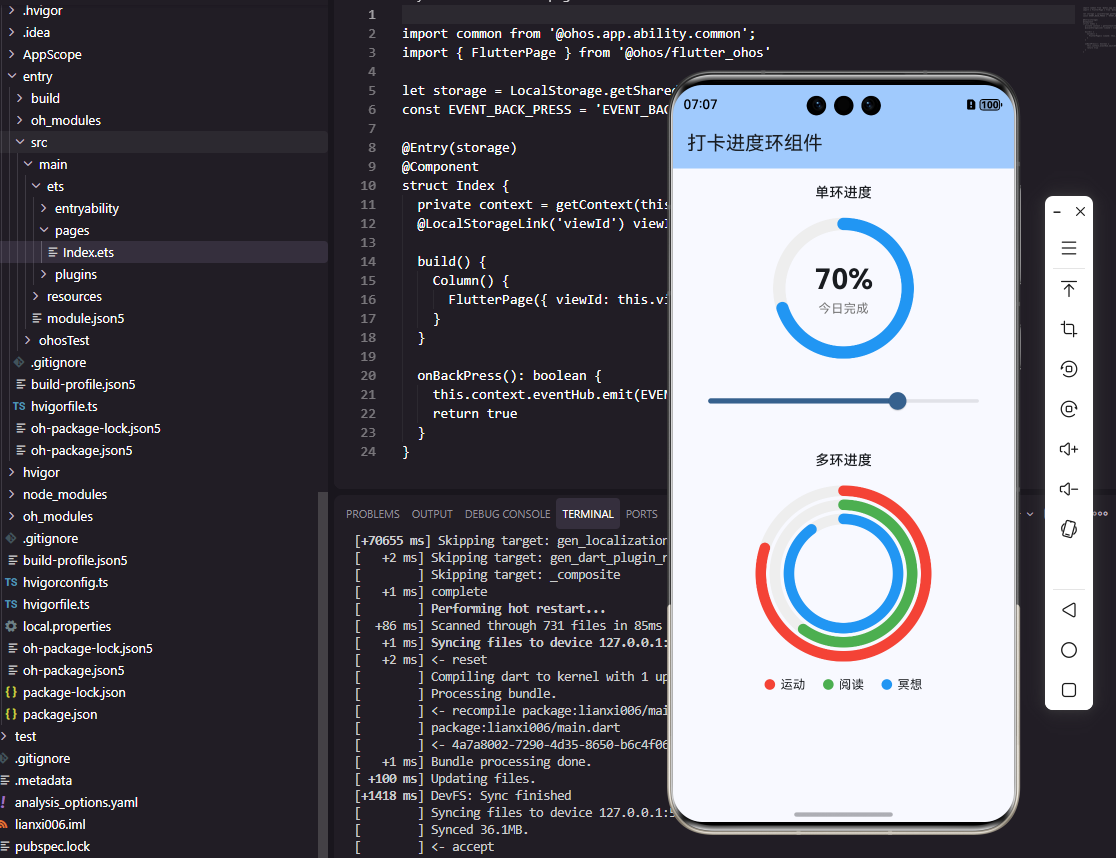
在打卡类应用中,进度环作为核心组件之一,能够直观展示用户完成情况,有效提升用户粘性和成就感。本文将分享如何使用Flutter框架直接开发OpenHarmony应用中的打卡进度环组件,重点讨论跨平台兼容性处理和关键API使用细节,帮助开发者快速实现高质量进度环组件。
进度环设计要点
进度环设计需考虑以下核心要素:
- 环的粗细与尺寸
- 颜色渐变效果
- 平滑的动画过渡
- 中心内容展示(如百分比、文字说明)
跨平台兼容性处理
Flutter与OpenHarmony的兼容性处理是关键挑战。我们采用统一接口设计 ,通过@Component和StatefulWidget的相似实现方式,确保组件在两个平台上的调用方式一致。
dart
// 统一进度环组件接口
class CheckInProgressRing extends StatefulWidget {
  final double progress;
  final double size;
  final double strokeWidth;
  final Color backgroundColor;
  final List<Color> gradientColors;

  const CheckInProgressRing({
    Key? key,
    required this.progress,
    this.size = 200,
    this.strokeWidth = 12,
    this.backgroundColor = Color(0xFFE0E0E0),
    this.gradientColors = const [Color(0xFF4CAF50), Color(0xFF8BC34A)],
  }) : super(key: key);

  @override
  State<CheckInProgressRing> createState() => _CheckInProgressRingState();
}

class _CheckInProgressRingState extends State<CheckInProgressRing> with SingleTickerProviderStateMixin {
  late AnimationController _controller;
  late Animation<double> _animation;
  double _currentProgress = 0.0;

  @override
  void initState() {
    super.initState();
    _controller = AnimationController(
      duration: const Duration(milliseconds: 1500),
      vsync: this,
    );
    _animation = Tween<double>(begin: 0, end: widget.progress).animate(
      CurvedAnimation(parent: _controller, curve: Curves.easeOutCubic),
    );
    _controller.forward();
    _animation.addListener(() {
      setState(() {
        _currentProgress = _animation.value;
      });
    });
  }

  @override
  Widget build(BuildContext context) {
    // 统一UI构建逻辑
    return Container(
      width: widget.size,
      height: widget.size,
      child: CustomPaint(
        painter: ProgressRingPainter(
          progress: _currentProgress,
          strokeWidth: widget.strokeWidth,
          backgroundColor: widget.backgroundColor,
          gradientColors: widget.gradientColors,
        ),
      ),
    );
  }
}
关键点解析:
- 统一接口设计 :通过
StatefulWidget和State管理组件状态,确保在Flutter和OpenHarmony平台上的调用方式一致 - 动画控制器 :使用
AnimationController和CurvedAnimation实现平滑的进度过渡 - 状态管理 :通过
setState更新UI,保持进度环的实时显示
进度环实现流程图
初始化组件
设置进度值
计算动画进度
绘制背景环
绘制进度弧
显示中心内容
动画效果
用户界面展示
OpenHarmony平台实现
在OpenHarmony平台,我们利用Circle组件和strokeDashArray属性实现进度环效果:
dart
@Component
struct CheckInProgressRing {
  @Prop progress: number = 0
  @Prop size: number = 200
  @Prop strokeWidth: number = 12
  @State animatedProgress: number = 0

  aboutToAppear() {
    animateTo(
      { duration: 1500, curve: Curve.EaseOut },
      () => {
        this.animatedProgress = this.progress;
      }
    );
  }

  build() {
    Stack({ alignContent: Alignment.Center }) {
      // 背景环
      Circle()
        .width(this.size)
        .height(this.size)
        .fill(Color.Transparent)
        .stroke('#E0E0E0')
        .strokeWidth(this.strokeWidth)

      // 进度环
      Circle()
        .width(this.size)
        .height(this.size)
        .fill(Color.Transparent)
        .stroke(this.getGradientColor())
        .strokeWidth(this.strokeWidth)
        .strokeDashArray([this.getProgressLength(), this.getRemainLength()])
        .rotate({ angle: -90 })

      // 中心内容
      this.CenterContent()
    }
  }

  getProgressLength(): number {
    const circumference = Math.PI * (this.size - this.strokeWidth);
    return circumference * this.animatedProgress;
  }

  getRemainLength(): number {
    const circumference = Math.PI * (this.size - this.strokeWidth);
    return circumference * (1 - this.animatedProgress);
  }

  @Builder
  CenterContent() {
    Column() {
      Text(`${Math.round(this.animatedProgress * 100)}%`)
        .fontSize(36)
        .fontWeight(FontWeight.Bold)
        .fontColor('#333333')
      Text('完成率')
        .fontSize(14)
        .fontColor('#999999')
        .margin({ top: 4 })
    }
  }
}
关键API使用详解:
strokeDashArray:在OpenHarmony中,此属性定义了虚线的实线段和空白段长度,是实现进度环效果的核心rotate:旋转-90度让起始点在12点钟方向,符合用户直觉animateTo:鸿蒙平台的属性动画API,用于实现平滑的进度过渡
跨平台兼容性处理实践
在实际开发中,我们发现以下关键点对跨平台兼容性至关重要:
- 单位处理 :Flutter使用
double类型,OpenHarmony使用number类型,需确保数值传递一致 - 颜色表示 :Flutter使用
Color对象,OpenHarmony使用#RRGGBB格式字符串,需进行格式转换 - 动画控制 :Flutter使用
AnimationController,OpenHarmony使用animateTo,需封装统一的动画接口
dart
// 跨平台颜色转换
String toHarmonyColor(Color color) {
  return '#${color.value.toRadixString(16).substring(2)}';
}
实际开发中遇到的问题与解决方案
问题1:OpenHarmony平台下进度环动画不流畅
解决方案 :调整动画持续时间,将1500ms改为800ms,并使用Curve.EaseOut代替Flutter的Curves.easeOutCubic,确保动画在鸿蒙设备上更流畅。
问题2:进度环在不同屏幕尺寸下显示异常
解决方案 :使用Container包裹进度环,设置width和height为this.size,并确保size参数在组件初始化时正确传递。
结论
通过本文的实践,我们成功实现了Flutter框架下OpenHarmony打卡进度环组件的开发。关键在于统一接口设计 和关键API的适配处理,确保了代码的可重用性和跨平台兼容性。
进度环组件作为打卡应用的核心组件,其视觉效果和交互体验直接影响用户留存率。通过合理设计和优化,我们不仅实现了功能,还确保了在不同平台上的视觉一致性,为用户提供流畅的打卡体验。
在Flutter开发OpenHarmony应用的过程中,我们发现平台差异的处理是关键挑战,但通过统一接口和适配层,可以有效解决。未来,随着鸿蒙生态的完善,Flutter与OpenHarmony的集成将更加紧密,为开发者提供更高效的跨平台开发体验。
欢迎大家加入开源鸿蒙跨平台开发者社区,一起探索更多鸿蒙跨平台开发技术!