一、Button组件概述
Flutter提供了多种按钮组件,满足不同场景的需求。
Button类型
Button组件
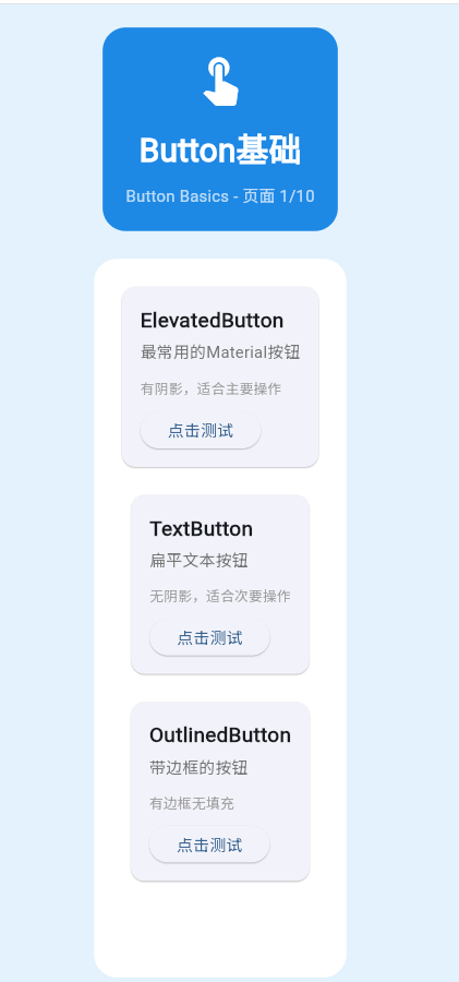
ElevatedButton
TextButton
OutlinedButton
IconButton
FloatingActionButton
二、ElevatedButton
基础用法
dart
ElevatedButton(
  onPressed: () {},
  child: Text('点击'),
)
带图标的按钮
dart
ElevatedButton.icon(
  icon: Icon(Icons.add),
  label: Text('添加'),
  onPressed: () {},
)
三、TextButton
基础用法
dart
TextButton(
  onPressed: () {},
  child: Text('文本按钮'),
)
四、OutlinedButton
基础用法
dart
OutlinedButton(
  onPressed: () {},
  child: Text('轮廓按钮'),
)
五、完整示例
dart
class ButtonBasicsExample extends StatelessWidget {
  const ButtonBasicsExample({super.key});

  @override
  Widget build(BuildContext context) {
    return Scaffold(
      appBar: AppBar(title: Text('Button基础')),
      body: ListView(
        padding: EdgeInsets.all(16),
        children: [
          Card(
            child: Padding(
              padding: EdgeInsets.all(16),
              child: Column(
                crossAxisAlignment: CrossAxisAlignment.start,
                children: [
                  Text('ElevatedButton'),
                  SizedBox(height: 16),
                  Row(
                    children: [
                      ElevatedButton(
                        onPressed: () {},
                        child: Text('普通'),
                      ),
                      SizedBox(width: 16),
                      ElevatedButton.icon(
                        icon: Icon(Icons.add),
                        label: Text('带图标'),
                        onPressed: () {},
                      ),
                    ],
                  ),
                ],
              ),
            ),
          ),
          SizedBox(height: 16),
          Card(
            child: Padding(
              padding: EdgeInsets.all(16),
              child: Column(
                crossAxisAlignment: CrossAxisAlignment.start,
                children: [
                  Text('TextButton'),
                  SizedBox(height: 16),
                  TextButton(
                    onPressed: () {},
                    child: Text('文本按钮'),
                  ),
                ],
              ),
            ),
          ),
          SizedBox(height: 16),
          Card(
            child: Padding(
              padding: EdgeInsets.all(16),
              child: Column(
                crossAxisAlignment: CrossAxisAlignment.start,
                children: [
                  Text('OutlinedButton'),
                  SizedBox(height: 16),
                  OutlinedButton(
                    onPressed: () {},
                    child: Text('轮廓按钮'),
                  ),
                ],
              ),
            ),
          ),
        ],
      ),
    );
  }
}欢迎加入开源鸿蒙跨平台社区:https://openharmonycrossplatform.csdn.net