GridView交互功能
GridView交互功能
知识点概述
GridView交互功能是提升用户体验的关键所在。一个优秀的GridView不仅要能够展示数据,更要让用户能够流畅地与数据进行各种交互操作。本章将详细介绍GridView的各种交互功能实现方式,包括点击事件处理、长按操作、拖拽排序、滚动监听、下拉刷新、手势识别等核心交互技术。通过这些交互功能的应用,可以让GridView变得生动、灵活且易于使用,满足不同场景下的用户需求,提供接近原生应用的流畅体验。
1. 点击事件处理
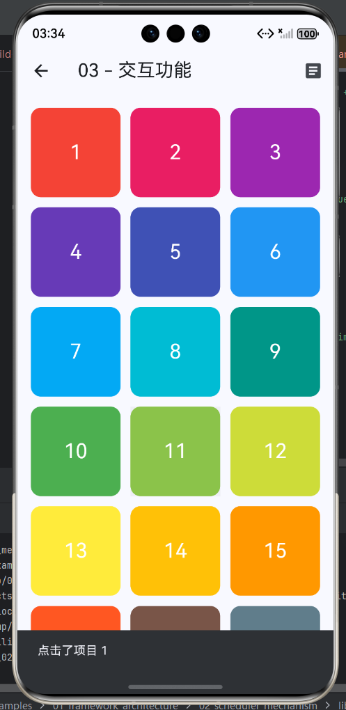
点击事件是GridView中最基础也是最常用的交互方式。用户通过点击可以触发各种操作,如导航到详情页、弹出对话框、显示提示信息、切换选中状态等。在Flutter中,实现点击事件主要使用GestureDetector或InkWell组件来包裹grid item。
1.1 GestureDetector基础点击实现
GestureDetector是Flutter提供的一个功能强大的手势识别组件,它可以检测多种手势事件,包括点击、双击、长按、滑动等。使用GestureDetector包裹GridView的子组件,可以方便地实现点击响应。
dart
class BasicClickGrid extends StatelessWidget {
  final List<String> _items = List.generate(20, (index) => '项目 ${index + 1}');

  @override
  Widget build(BuildContext context) {
    return Scaffold(
      appBar: AppBar(title: Text('基础点击网格')),
      body: GridView.builder(
        gridDelegate: SliverGridDelegateWithFixedCrossAxisCount(
          crossAxisCount: 3,
          mainAxisSpacing: 10,
          crossAxisSpacing: 10,
        ),
        itemCount: _items.length,
        itemBuilder: (context, index) {
          return GestureDetector(
            onTap: () {
              ScaffoldMessenger.of(context).showSnackBar(
                SnackBar(content: Text('点击了 ${_items[index]}')),
              );
            },
            child: Card(
              color: Colors.primaries[index % Colors.primaries.length],
              child: Center(
                child: Text(
                  '${index + 1}',
                  style: TextStyle(color: Colors.white, fontSize: 24),
                ),
              ),
            ),
          );
        },
      ),
    );
  }
}
1.2 InkWell水波纹效果实现
InkWell是Material Design风格的手势检测组件,它在GestureDetector的基础上增加了Material Design风格的水波纹动画效果。当用户点击时,会在点击位置产生一个扩散的涟漪效果,为用户提供明确的视觉反馈。InkWell特别适合用于Material Design风格的应用中。
dart
class InkWellGrid extends StatelessWidget {
  @override
  Widget build(BuildContext context) {
    return Scaffold(
      appBar: AppBar(title: Text('水波纹效果')),
      body: GridView.count(
        crossAxisCount: 2,
        padding: EdgeInsets.all(12),
        mainAxisSpacing: 12,
        crossAxisSpacing: 12,
        children: List.generate(10, (index) {
          return InkWell(
            onTap: () {
              print('点击了项目 $index');
            },
            onLongPress: () {
              print('长按了项目 $index');
            },
            splashColor: Colors.blue.withOpacity(0.5),
            borderRadius: BorderRadius.circular(8),
            child: Container(
              decoration: BoxDecoration(
                color: Colors.primaries[index % Colors.primaries.length],
                borderRadius: BorderRadius.circular(8),
              ),
              child: Center(
                child: Text(
                  '项目 ${index + 1}',
                  style: TextStyle(color: Colors.white, fontSize: 18),
                ),
              ),
            ),
          );
        }),
      ),
    );
  }
}
1.3 点击事件处理流程
点击事件的处理流程涉及多个环节,从用户点击开始,到最终执行操作并更新UI,整个过程需要快速响应,给用户流畅的体验。
onTap
onDoubleTap
onLongPress
onTapCancel
是
否
用户点击item
GestureDetector检测手势
手势类型判断
触发单击回调
触发双击回调
触发长按回调
触发取消回调
执行业务逻辑
恢复原始状态
需要更新UI?
调用setState
完成
重建Widget
1.4 GestureDetector常用手势回调对比
| 回调函数 | 触发时机 | 典型应用场景 | 注意事项 |
|---|---|---|---|
| onTap | 单击完成后 | 导航、选择、确认 | 最常用的点击回调 |
| onDoubleTap | 双击完成后 | 快速点赞、快速操作 | 需要在短时间内连续点击 |
| onLongPress | 长按完成后 | 上下文菜单、拖拽开始 | 通常与onTap配合使用 |
| onTapDown | 手指按下时 | 按下动画效果 | 用于实现自定义反馈 |
| onTapUp | 手指抬起时 | 抬起动画效果 | 与onTapDown配合使用 |
| onTapCancel | 点击被取消时 | 取消按下状态 | 用户移出点击区域时触发 |
1.5 点击导航到详情页示例
在实际应用中,点击GridView的item通常会导航到详情页面。这需要使用Flutter的路由系统,可以通过Navigator.pushNamed或Navigator.push来实现。
dart
class NavigationGrid extends StatelessWidget {
  final List<Map<String, dynamic>> _items = [
    {'id': 1, 'title': '首页', 'icon': Icons.home, 'route': '/home'},
    {'id': 2, 'title': '搜索', 'icon': Icons.search, 'route': '/search'},
    {'id': 3, 'title': '通知', 'icon': Icons.notifications, 'route': '/notifications'},
    {'id': 4, 'title': '设置', 'icon': Icons.settings, 'route': '/settings'},
    {'id': 5, 'title': '个人', 'icon': Icons.person, 'route': '/profile'},
    {'id': 6, 'title': '收藏', 'icon': Icons.favorite, 'route': '/favorites'},
  ];

  @override
  Widget build(BuildContext context) {
    return Scaffold(
      appBar: AppBar(title: Text('导航网格')),
      body: GridView.count(
        crossAxisCount: 3,
        padding: EdgeInsets.all(16),
        mainAxisSpacing: 16,
        crossAxisSpacing: 16,
        children: _items.map((item) {
          return InkWell(
            onTap: () {
              Navigator.pushNamed(context, item['route']);
            },
            child: Card(
              child: Column(
                mainAxisAlignment: MainAxisAlignment.center,
                children: [
                  Icon(item['icon'], size: 48, color: Colors.blue),
                  SizedBox(height: 12),
                  Text(item['title']),
                ],
              ),
            ),
          );
        }).toList(),
      ),
    );
  }
}
2. 长按事件处理
长按事件是移动应用中非常重要的交互方式。与点击相比,长按操作通常用于触发次级操作或上下文菜单,如编辑、删除、分享等功能。长按的响应时间比点击长,能够区分用户的明确意图。
2.1 长按上下文菜单实现
长按显示上下文菜单是移动应用的常见交互模式。当用户长按某个item时,弹出一个包含相关操作选项的菜单,用户可以选择需要执行的操作。这种设计可以保持界面简洁,同时在需要时提供丰富的功能选项。
dart
class LongPressGrid extends StatefulWidget {
  @override
  _LongPressGridState createState() => _LongPressGridState();
}

class _LongPressGridState extends State<LongPressGrid> {
  int? _longPressedIndex;

  @override
  Widget build(BuildContext context) {
    return Scaffold(
      appBar: AppBar(title: Text('长按网格')),
      body: GridView.builder(
        gridDelegate: SliverGridDelegateWithFixedCrossAxisCount(
          crossAxisCount: 3,
          mainAxisSpacing: 10,
          crossAxisSpacing: 10,
        ),
        itemCount: 15,
        itemBuilder: (context, index) {
          final isLongPressed = _longPressedIndex == index;
          return GestureDetector(
            onLongPress: () {
              setState(() {
                _longPressedIndex = index;
              });
              _showContextMenu(context, index);
            },
            child: Container(
              decoration: BoxDecoration(
                color: isLongPressed
                    ? Colors.primaries[index % Colors.primaries.length].shade700
                    : Colors.primaries[index % Colors.primaries.length],
                borderRadius: BorderRadius.circular(8),
                border: isLongPressed
                    ? Border.all(color: Colors.white, width: 2)
                    : null,
              ),
              child: Center(
                child: Text(
                  '${index + 1}',
                  style: TextStyle(
                    color: Colors.white,
                    fontSize: 24,
                    fontWeight: isLongPressed ? FontWeight.bold : FontWeight.normal,
                  ),
                ),
              ),
            ),
          );
        },
      ),
    );
  }

  void _showContextMenu(BuildContext context, int index) {
    showModalBottomSheet(
      context: context,
      builder: (BuildContext context) {
        return Container(
          height: 200,
          child: Column(
            children: [
              ListTile(
                leading: Icon(Icons.edit),
                title: Text('编辑项目 $index'),
                onTap: () {
                  Navigator.pop(context);
                  // 执行编辑操作
                },
              ),
              ListTile(
                leading: Icon(Icons.share),
                title: Text('分享项目 $index'),
                onTap: () {
                  Navigator.pop(context);
                  // 执行分享操作
                },
              ),
              ListTile(
                leading: Icon(Icons.delete, color: Colors.red),
                title: Text('删除项目 $index', style: TextStyle(color: Colors.red)),
                onTap: () {
                  Navigator.pop(context);
                  // 执行删除操作
                },
              ),
            ],
          ),
        );
      },
    );
  }
}
2.2 长按选择模式实现
选择模式允许用户通过长按进入多选状态,然后可以点击选择多个item。这种交互模式常见于邮件应用、相册应用、文件管理器等场景,用户需要批量操作多个项目时非常方便。实现时需要维护一个选中索引的Set集合,并通过状态管理控制选择模式的开启和关闭。
dart
class SelectionModeGrid extends StatefulWidget {
  @override
  _SelectionModeGridState createState() => _SelectionModeGridState();
}

class _SelectionModeGridState extends State<SelectionModeGrid> {
  final Set<int> _selectedIndices = {};
  bool _isSelectionMode = false;

  void _toggleSelection(int index) {
    setState(() {
      if (_selectedIndices.contains(index)) {
        _selectedIndices.remove(index);
        if (_selectedIndices.isEmpty) {
          _isSelectionMode = false;
        }
      } else {
        _selectedIndices.add(index);
      }
    });
  }

  void _clearSelection() {
    setState(() {
      _selectedIndices.clear();
      _isSelectionMode = false;
    });
  }

  @override
  Widget build(BuildContext context) {
    return Scaffold(
      appBar: AppBar(
        title: Text(_isSelectionMode ? '已选 ${_selectedIndices.length} 项' : '选择模式网格'),
        actions: _isSelectionMode
            ? [
                IconButton(
                  icon: Icon(Icons.delete),
                  onPressed: _selectedIndices.isEmpty
                      ? null
                      : () {
                          // 删除选中项
                          _clearSelection();
                        },
                ),
                IconButton(
                  icon: Icon(Icons.close),
                  onPressed: _clearSelection,
                ),
              ]
            : [],
      ),
      body: GridView.builder(
        gridDelegate: SliverGridDelegateWithFixedCrossAxisCount(
          crossAxisCount: 3,
          mainAxisSpacing: 10,
          crossAxisSpacing: 10,
        ),
        itemCount: 20,
        itemBuilder: (context, index) {
          final isSelected = _selectedIndices.contains(index);
          return GestureDetector(
            onTap: () {
              if (_isSelectionMode) {
                _toggleSelection(index);
              }
            },
            onLongPress: () {
              setState(() {
                _isSelectionMode = true;
                _selectedIndices.add(index);
              });
            },
            child: Container(
              decoration: BoxDecoration(
                color: isSelected
                    ? Colors.blue
                    : Colors.primaries[index % Colors.primaries.length],
                borderRadius: BorderRadius.circular(8),
                border: isSelected
                    ? Border.all(color: Colors.white, width: 3)
                    : null,
              ),
              child: Stack(
                children: [
                  Center(
                    child: Text(
                      '${index + 1}',
                      style: TextStyle(
                        color: Colors.white,
                        fontSize: 24,
                      ),
                    ),
                  ),
                  if (isSelected)
                    Positioned(
                      top: 4,
                      right: 4,
                      child: Icon(
                        Icons.check_circle,
                        color: Colors.white,
                        size: 24,
                      ),
                    ),
                ],
              ),
            ),
          );
        },
      ),
    );
  }
}
2.3 长按交互模式对比
| 模式类型 | 进入方式 | 选择方式 | 退出方式 | 适用场景 | 用户体验 |
|---|---|---|---|---|---|
| 上下文菜单 | 长按item | 菜单项选择 | 点击菜单项/外部 | 需要展示操作选项 | 简洁直观 |
| 选择模式 | 长按进入 | 点击多选 | 完成操作/取消 | 批量操作场景 | 高效灵活 |
| 拖拽模式 | 长按开始 | 拖拽移动 | 松开手指 | 重新排列顺序 | 直观流畅 |
2.4 长按选择模式状态机
初始状态
长按item
点击item切换选择
清空选择
执行批量操作
操作完成
正常模式
单击=查看详情
选择模式
单击=切换选择
长按=不响应
批量操作
删除/移动/分享
选中的item用特殊样式显示
AppBar显示选中数量
提供批量操作按钮
3. 拖拽功能实现
拖拽功能是提升GridView交互体验的重要特性,允许用户通过直观的拖拽操作来重新排序items或将items拖拽到其他区域。Flutter提供了Draggable和DragTarget组件来实现拖拽功能,同时ReorderableGridView提供了更方便的拖拽排序解决方案。
3.1 Draggable基础拖拽实现
Draggable组件用于创建可拖拽的子组件,它可以与DragTarget配合使用,实现拖拽到特定位置的交互逻辑。Draggable需要指定data属性作为拖拽数据,并可以自定义feedback拖拽时的显示效果和childWhenDragging拖拽时的原位置显示。
dart
class DraggableGrid extends StatefulWidget {
  @override
  _DraggableGridState createState() => _DraggableGridState();
}

class _DraggableGridState extends State<DraggableGrid> {
  final List<String> _items = List.generate(16, (index) => 'Item ${index + 1}');
  String? _draggedItem;

  @override
  Widget build(BuildContext context) {
    return Scaffold(
      appBar: AppBar(title: Text('可拖拽网格')),
      body: GridView.builder(
        gridDelegate: SliverGridDelegateWithFixedCrossAxisCount(
          crossAxisCount: 4,
          mainAxisSpacing: 10,
          crossAxisSpacing: 10,
        ),
        itemCount: _items.length,
        itemBuilder: (context, index) {
          final item = _items[index];
          final isDragged = _draggedItem == item;

          return Draggable<String>(
            data: item,
            childWhenDragging: Container(
              color: Colors.grey[300],
              child: Center(
                child: Text(
                  '$index',
                  style: TextStyle(color: Colors.grey),
                ),
              ),
            ),
            feedback: Container(
              width: 80,
              height: 80,
              decoration: BoxDecoration(
                color: Colors.blue,
                borderRadius: BorderRadius.circular(8),
              ),
              child: Center(
                child: Text(
                  item,
                  style: TextStyle(color: Colors.white),
                ),
              ),
            ),
            onDragStarted: () {
              setState(() => _draggedItem = item);
            },
            onDragEnd: (details) {
              setState(() => _draggedItem = null);
            },
            child: DragTarget<String>(
              onAcceptWithDetails: (details) {
                setState(() {
                  final draggedIndex = _items.indexOf(details.data);
                  final targetIndex = index;

                  if (draggedIndex != targetIndex) {
                    _items.removeAt(draggedIndex);
                    _items.insert(targetIndex, details.data);
                  }
                });
              },
              builder: (context, candidateData, rejectedData) {
                return Container(
                  decoration: BoxDecoration(
                    color: isDragged
                        ? Colors.blue.withOpacity(0.3)
                        : candidateData.isNotEmpty
                            ? Colors.green.withOpacity(0.3)
                            : Colors.primaries[index % Colors.primaries.length],
                    borderRadius: BorderRadius.circular(8),
                  ),
                  child: Center(
                    child: Text(
                      '${index + 1}',
                      style: TextStyle(color: Colors.white, fontSize: 20),
                    ),
                  ),
                );
              },
            ),
          );
        },
      ),
    );
  }
}
3.2 ReorderableGridView拖拽排序
ReorderableGridView是Flutter提供的一个专门的拖拽排序网格组件,它简化了拖拽排序的实现。每个item需要用ReorderableDragStartListener包裹,并在onReorder回调中处理排序逻辑。ReorderableDragStartListener会自动处理拖拽开始、拖拽反馈等细节,开发者只需要关注排序逻辑即可。
dart
class ReorderableGrid extends StatefulWidget {
  @override
  _ReorderableGridState createState() => _ReorderableGridState();
}

class _ReorderableGridState extends State<ReorderableGrid> {
  late List<GridItem> _items;

  @override
  void initState() {
    super.initState();
    _items = List.generate(12, (index) {
      return GridItem(
        id: 'item_$index',
        title: '项目 ${index + 1}',
        color: Colors.primaries[index % Colors.primaries.length],
      );
    });
  }

  @override
  Widget build(BuildContext context) {
    return Scaffold(
      appBar: AppBar(title: Text('可排序网格')),
      body: ReorderableGridView(
        gridDelegate: SliverGridDelegateWithFixedCrossAxisCount(
          crossAxisCount: 3,
          mainAxisSpacing: 10,
          crossAxisSpacing: 10,
        ),
        onReorder: (oldIndex, newIndex) {
          setState(() {
            if (oldIndex < newIndex) {
              newIndex -= 1;
            }
            final item = _items.removeAt(oldIndex);
            _items.insert(newIndex, item);
          });
        },
        children: _items.map((item) {
          return ReorderableDragStartListener(
            key: ValueKey(item.id),
            index: _items.indexOf(item),
            child: Container(
              decoration: BoxDecoration(
                color: item.color,
                borderRadius: BorderRadius.circular(8),
              ),
              child: Column(
                mainAxisAlignment: MainAxisAlignment.center,
                children: [
                  Text(
                    item.title,
                    style: TextStyle(
                      color: Colors.white,
                      fontSize: 16,
                      fontWeight: FontWeight.bold,
                    ),
                  ),
                  Icon(Icons.drag_handle, color: Colors.white70),
                ],
              ),
            ),
          );
        }).toList(),
      ),
    );
  }
}

class GridItem {
  final String id;
  final String title;
  final Color color;

  GridItem({required this.id, required this.title, required this.color});
}
3.3 跨区域拖拽实现
除了在GridView内部拖拽排序外,还可以实现跨区域的拖拽功能,例如从一个GridView拖拽到另一个区域。这需要使用Draggable和DragTarget的组合,Draggable包裹源区域的item,DragTarget作为目标区域接收拖拽数据。
dart
class DragDropGrid extends StatefulWidget {
  @override
  _DragDropGridState createState() => _DragDropGridState();
}

class _DragDropGridState extends State<DragDropGrid> {
  final List<DraggableItem> _sourceItems = List.generate(8, (index) {
    return DraggableItem(
      id: 's_$index',
      name: '项目 ${index + 1}',
      color: Colors.primaries[index % Colors.primaries.length],
    );
  });

  final List<DraggableItem> _targetItems = [];

  @override
  Widget build(BuildContext context) {
    return Scaffold(
      appBar: AppBar(title: Text('拖拽投放')),
      body: Column(
        children: [
          // 源区域
          Expanded(
            flex: 1,
            child: Container(
              color: Colors.grey[200],
              padding: EdgeInsets.all(8),
              child: Column(
                children: [
                  Text('源区域', style: TextStyle(fontSize: 16, fontWeight: FontWeight.bold)),
                  SizedBox(height: 8),
                  Expanded(
                    child: GridView.builder(
                      gridDelegate: SliverGridDelegateWithFixedCrossAxisCount(
                        crossAxisCount: 4,
                        mainAxisSpacing: 8,
                        crossAxisSpacing: 8,
                      ),
                      itemCount: _sourceItems.length,
                      itemBuilder: (context, index) {
                        final item = _sourceItems[index];
                        return Draggable<DraggableItem>(
                          data: item,
                          feedback: Container(
                            width: 60,
                            height: 60,
                            decoration: BoxDecoration(
                              color: item.color,
                              borderRadius: BorderRadius.circular(8),
                            ),
                          ),
                          child: Container(
                            decoration: BoxDecoration(
                              color: item.color,
                              borderRadius: BorderRadius.circular(8),
                            ),
                            child: Center(
                              child: Text(
                                '${index + 1}',
                                style: TextStyle(color: Colors.white),
                              ),
                            ),
                          ),
                        );
                      },
                    ),
                  ),
                ],
              ),
            ),
          ),
          // 目标区域
          Expanded(
            flex: 1,
            child: DragTarget<DraggableItem>(
              onAcceptWithDetails: (details) {
                setState(() {
                  _sourceItems.remove(details.data);
                  _targetItems.add(details.data);
                });
              },
              builder: (context, candidateData, rejectedData) {
                return Container(
                  color: candidateData.isNotEmpty
                      ? Colors.blue.withOpacity(0.1)
                      : Colors.white,
                  padding: EdgeInsets.all(8),
                  child: Column(
                    children: [
                      Text(
                        '目标区域 (${_targetItems.length})',
                        style: TextStyle(fontSize: 16, fontWeight: FontWeight.bold),
                      ),
                      SizedBox(height: 8),
                      Expanded(
                        child: _targetItems.isEmpty
                            ? Center(child: Text('拖拽项目到这里'))
                            : GridView.builder(
                                gridDelegate: SliverGridDelegateWithFixedCrossAxisCount(
                                  crossAxisCount: 4,
                                  mainAxisSpacing: 8,
                                  crossAxisSpacing: 8,
                                ),
                                itemCount: _targetItems.length,
                                itemBuilder: (context, index) {
                                  final item = _targetItems[index];
                                  return Container(
                                    decoration: BoxDecoration(
                                      color: item.color,
                                      borderRadius: BorderRadius.circular(8),
                                    ),
                                    child: Center(
                                      child: Text(
                                        '${index + 1}',
                                        style: TextStyle(color: Colors.white),
                                      ),
                                    ),
                                  );
                                },
                              ),
                      ),
                    ],
                  ),
                );
              },
            ),
          ),
        ],
      ),
    );
  }
}

class DraggableItem {
  final String id;
  final String name;
  final Color color;

  DraggableItem({required this.id, required this.name, required this.color});
}
3.4 拖拽功能对比表
| 实现方式 | 组件 | 复杂度 | 灵活性 | 性能 | 适用场景 |
|---|---|---|---|---|---|
| Draggable+DragTarget | Draggable | 高 | 高 | 中等 | 自定义拖拽效果、跨区域拖拽 |
| ReorderableGridView | ReorderableDragStartListener | 中 | 中 | 较好 | 快速实现排序功能 |
| 第三方库 | flutter_reorderable_grid | 低 | 中 | 优秀 | 复杂拖拽场景 |
3.5 拖拽流程图
DragTarget Draggable GridView 用户 DragTarget Draggable GridView 用户 长按item开始拖拽 onDragStarted触发 显示原位置占位 显示拖拽反馈 拖拽到目标位置 检测目标区域 更新candidateData 显示接受状态 松开手指 onAcceptWithDetails 更新数据源 调用setState 显示新布局 onDragEnd触发 隐藏拖拽反馈
4. 滚动事件监听
滚动事件监听是GridView交互功能的重要组成部分,通过监听滚动位置可以实现无限滚动加载、滚动到顶部/底部触发操作、滚动位置指示器等功能。ScrollController是控制滚动和监听滚动事件的核心工具。
4.1 基础滚动监听实现
ScrollController提供了一个addListener方法,可以添加滚动监听器。在监听器中可以通过scrollController.position.pixels获取当前滚动位置,通过scrollController.position.maxScrollExtent获取最大可滚动距离。当滚动位置等于最大滚动距离时,表示已经滚动到底部。
dart
class ScrollListenerGrid extends StatefulWidget {
  @override
  _ScrollListenerGridState createState() => _ScrollListenerGridState();
}

class _ScrollListenerGridState extends State<ScrollListenerGrid> {
  final ScrollController _scrollController = ScrollController();
  final List<int> _items = List.generate(50, (index) => index + 1);

  @override
  void initState() {
    super.initState();
    _scrollController.addListener(_scrollListener);
  }

  void _scrollListener() {
    if (_scrollController.position.pixels ==
        _scrollController.position.maxScrollExtent) {
      print('滚动到底部');
      _loadMore();
    }
  }

  void _loadMore() {
    setState(() {
      final currentLength = _items.length;
      _items.addAll(
        List.generate(20, (index) => currentLength + index + 1),
      );
    });
  }

  @override
  void dispose() {
    _scrollController.dispose();
    super.dispose();
  }

  @override
  Widget build(BuildContext context) {
    return Scaffold(
      appBar: AppBar(title: Text('滚动监听')),
      body: Column(
        children: [
          // 滚动位置指示器
          Container(
            padding: EdgeInsets.all(8),
            color: Colors.grey[200],
            child: Builder(
              builder: (context) {
                final scrollPosition = _scrollController.hasClients
                    ? _scrollController.position.pixels.toInt()
                    : 0;
                return Text('滚动位置: $scrollPosition');
              },
            ),
          ),
          Expanded(
            child: GridView.builder(
              controller: _scrollController,
              gridDelegate: SliverGridDelegateWithFixedCrossAxisCount(
                crossAxisCount: 3,
                mainAxisSpacing: 10,
                crossAxisSpacing: 10,
              ),
              itemCount: _items.length,
              itemBuilder: (context, index) {
                return Card(
                  color: Colors.primaries[index % Colors.primaries.length],
                  child: Center(
                    child: Text(
                      '${_items[index]}',
                      style: TextStyle(color: Colors.white, fontSize: 20),
                    ),
                  ),
                );
              },
            ),
          ),
        ],
      ),
    );
  }
}
4.2 无限滚动加载实现
无限滚动是现代应用的常见交互模式,当用户滚动到接近底部时自动加载更多数据,无需手动点击"加载更多"按钮。实现时需要判断滚动位置距离底部的距离,当小于一定阈值时触发加载操作。同时需要防止重复加载,可以使用isLoading标志来控制。
dart
class InfiniteScrollGrid extends StatefulWidget {
  @override
  _InfiniteScrollGridState createState() => _InfiniteScrollGridState();
}

class _InfiniteScrollGridState extends State<InfiniteScrollGrid> {
  final ScrollController _scrollController = ScrollController();
  final List<int> _items = List.generate(30, (index) => index + 1);
  bool _isLoading = false;
  bool _hasMore = true;

  @override
  void initState() {
    super.initState();
    _scrollController.addListener(_scrollListener);
  }

  void _scrollListener() {
    if (_scrollController.position.pixels >=
        _scrollController.position.maxScrollExtent - 200) {
      _loadMore();
    }
  }

  Future<void> _loadMore() async {
    if (_isLoading || !_hasMore) return;

    setState(() => _isLoading = true);

    // 模拟网络请求
    await Future.delayed(Duration(milliseconds: 500));

    setState(() {
      final currentLength = _items.length;
      if (currentLength >= 200) {
        _hasMore = false;
      } else {
        _items.addAll(
          List.generate(20, (index) => currentLength + index + 1),
        );
      }
      _isLoading = false;
    });
  }

  @override
  void dispose() {
    _scrollController.dispose();
    super.dispose();
  }

  @override
  Widget build(BuildContext context) {
    return Scaffold(
      appBar: AppBar(
        title: Text('无限滚动'),
        actions: [
          Text('共 ${_items.length} 项'),
          SizedBox(width: 16),
        ],
      ),
      body: GridView.builder(
        controller: _scrollController,
        gridDelegate: SliverGridDelegateWithFixedCrossAxisCount(
          crossAxisCount: 3,
          mainAxisSpacing: 10,
          crossAxisSpacing: 10,
        ),
        itemCount: _hasMore ? _items.length + 1 : _items.length,
        itemBuilder: (context, index) {
          if (index >= _items.length) {
            return Center(child: CircularProgressIndicator());
          }

          return Card(
            color: Colors.primaries[index % Colors.primaries.length],
            child: Center(
              child: Text(
                '${_items[index]}',
                style: TextStyle(color: Colors.white, fontSize: 20),
              ),
            ),
          );
        },
      ),
    );
  }
}
4.3 滚动事件处理最佳实践
| 最佳实践 | 说明 | 实现方式 | 注意事项 |
|---|---|---|---|
| 防止重复加载 | 避免同一时间多次触发加载 | 使用isLoading标志 | 加载开始设为true,结束设为false |
| 合理设置预加载距离 | 提前加载避免卡顿 | 距离底部200-300px | 根据item大小和加载速度调整 |
| 显示加载状态 | 给用户明确反馈 | 在列表末尾显示指示器 | 避免无感知的加载 |
| 处理无更多数据 | 避免无效请求 | 使用hasMore标志 | 根据实际业务逻辑判断 |
| 及时释放Controller | 防止内存泄漏 | dispose中调用dispose | 必须在dispose中释放 |
| 检查hasClients | 避免Controller未附加时访问 | 使用hasClients检查 | Controller可能还未附加到视图树 |
5. 下拉刷新功能
下拉刷新是移动应用的经典交互模式,用户通过向下滑动列表顶部来刷新数据。Flutter提供了RefreshIndicator组件,可以轻松实现下拉刷新功能。RefreshIndicator包裹在GridView外层,当用户下拉时会触发onRefresh回调,执行刷新逻辑。
5.1 基础下拉刷新实现
dart
class RefreshableGrid extends StatefulWidget {
  @override
  _RefreshableGridState createState() => _RefreshableGridState();
}

class _RefreshableGridState extends State<RefreshableGrid> {
  final List<Map<String, dynamic>> _items = [];

  @override
  void initState() {
    super.initState();
    _loadData();
  }

  Future<void> _loadData({bool refresh = false}) async {
    if (refresh) {
      await Future.delayed(Duration(milliseconds: 800));
      setState(() {
        _items.clear();
      });
    }

    await Future.delayed(Duration(milliseconds: 500));

    setState(() {
      _items.addAll(
        List.generate(20, (index) {
          final itemIndex = _items.length + index;
          return {
            'id': 'item_$itemIndex',
            'title': '项目 $itemIndex',
            'color': Colors.primaries[itemIndex % Colors.primaries.length],
          };
        }),
      );
    });
  }

  Future<void> _handleRefresh() async {
    await _loadData(refresh: true);
  }

  @override
  Widget build(BuildContext context) {
    return Scaffold(
      appBar: AppBar(
        title: Text('下拉刷新'),
        actions: [
          IconButton(
            icon: Icon(Icons.refresh),
            onPressed: () => _handleRefresh(),
          ),
        ],
      ),
      body: RefreshIndicator(
        onRefresh: _handleRefresh,
        child: GridView.builder(
          gridDelegate: SliverGridDelegateWithFixedCrossAxisCount(
            crossAxisCount: 3,
            mainAxisSpacing: 10,
            crossAxisSpacing: 10,
          ),
          itemCount: _items.length,
          itemBuilder: (context, index) {
            final item = _items[index];
            return Card(
              color: item['color'],
              child: Center(
                child: Text(
                  item['title'],
                  style: TextStyle(color: Colors.white),
                ),
              ),
            );
          },
        ),
      ),
    );
  }
}
5.2 下拉刷新与滚动加载组合
在实际应用中,下拉刷新通常与无限滚动加载配合使用,形成完整的数据加载体验。用户可以通过下拉刷新获取最新数据,通过滚动加载获取历史数据。
否
是
是
否
否
是
用户下拉
RefreshIndicator触发
清空当前数据
加载第一页数据
显示新数据
用户滚动
接近底部?
正在加载?
还有更多数据?
显示加载指示器
加载下一页数据
追加到列表
6. 手势识别组件对比
6.1 GestureDetector vs InkWell对比
| 特性 | GestureDetector | InkWell | 推荐 |
|---|---|---|---|
| 手势检测 | 全面,支持多种手势 | 仅点击和长按 | 复杂手势用GestureDetector |
| 视觉反馈 | 无 | 水波纹动画 | Material Design用InkWell |
| 自定义能力 | 高 | 中 | 需要自定义用GestureDetector |
| 性能 | 较好 | 中等 | 性能敏感用GestureDetector |
| 使用复杂度 | 简单 | 简单 | 两者都很简单 |
6.2 手势事件处理时序
HitTest GestureRecognizer Widget 用户 HitTest GestureRecognizer Widget 用户 手指按下 执行命中测试 返回命中结果 创建手势识别器 开始竞争手势 onTapDown事件 手指移动 评估手势类型 可能触发onTapCancel 手指抬起 判断手势类型 onTap事件 清理手势状态 手势处理完成 执行回调操作
7. 综合交互示例
7.1 组合多种交互功能
在实际开发中,通常需要将多种交互功能组合使用,以提供更好的用户体验。例如,可以同时支持点击导航、长按多选、下拉刷新、无限滚动等功能。实现时需要仔细处理各种交互之间的冲突和协调关系。
dart
class InteractiveGridExample extends StatefulWidget {
  @override
  _InteractiveGridExampleState createState() => _InteractiveGridExampleState();
}

class _InteractiveGridExampleState extends State<InteractiveGridExample> {
  final ScrollController _scrollController = ScrollController();
  final List<Map<String, dynamic>> _items = [];
  final Set<int> _selectedIndices = {};
  bool _isSelectionMode = false;

  @override
  void initState() {
    super.initState();
    _loadData();
    _scrollController.addListener(_scrollListener);
  }

  void _loadData() {
    setState(() {
      _items.addAll(
        List.generate(20, (index) {
          return {
            'id': 'item_$index',
            'title': '项目 ${index + 1}',
            'color': Colors.primaries[index % Colors.primaries.length],
          };
        }),
      );
    });
  }

  void _scrollListener() {
    if (_scrollController.position.pixels >=
        _scrollController.position.maxScrollExtent - 200) {
      _loadMore();
    }
  }

  Future<void> _loadMore() async {
    await Future.delayed(Duration(milliseconds: 300));

    if (!mounted) return;

    setState(() {
      final currentLength = _items.length;
      _items.addAll(
        List.generate(20, (index) {
          final itemIndex = currentLength + index;
          return {
            'id': 'item_$itemIndex',
            'title': '项目 $itemIndex',
            'color': Colors.primaries[itemIndex % Colors.primaries.length],
          };
        }),
      );
    });
  }

  void _handleTap(int index) {
    if (_isSelectionMode) {
      _toggleSelection(index);
    } else {
      ScaffoldMessenger.of(context).showSnackBar(
        SnackBar(content: Text('点击了 ${_items[index]['title']}')),
      );
    }
  }

  void _handleLongPress(int index) {
    setState(() {
      _isSelectionMode = true;
      _selectedIndices.add(index);
    });
  }

  void _toggleSelection(int index) {
    setState(() {
      if (_selectedIndices.contains(index)) {
        _selectedIndices.remove(index);
        if (_selectedIndices.isEmpty) {
          _isSelectionMode = false;
        }
      } else {
        _selectedIndices.add(index);
      }
    });
  }

  void _clearSelection() {
    setState(() {
      _selectedIndices.clear();
      _isSelectionMode = false;
    });
  }

  @override
  void dispose() {
    _scrollController.dispose();
    super.dispose();
  }

  @override
  Widget build(BuildContext context) {
    return Scaffold(
      appBar: AppBar(
        title: Text(_isSelectionMode
            ? '已选 ${_selectedIndices.length} 项'
            : '综合交互网格 (${_items.length})'),
        actions: _isSelectionMode
            ? [
                IconButton(
                  icon: Icon(Icons.delete),
                  onPressed: _selectedIndices.isEmpty
                      ? null
                      : () {
                          // 删除选中项
                          _clearSelection();
                        },
                ),
                IconButton(
                  icon: Icon(Icons.close),
                  onPressed: _clearSelection,
                ),
              ]
            : [
                IconButton(
                  icon: Icon(Icons.checklist),
                  onPressed: () => setState(() => _isSelectionMode = true),
                ),
              ],
      ),
      body: GridView.builder(
        controller: _scrollController,
        gridDelegate: SliverGridDelegateWithFixedCrossAxisCount(
          crossAxisCount: 3,
          mainAxisSpacing: 10,
          crossAxisSpacing: 10,
        ),
        itemCount: _items.length,
        itemBuilder: (context, index) {
          final item = _items[index];
          final isSelected = _selectedIndices.contains(index);

          return InkWell(
            onTap: () => _handleTap(index),
            onLongPress: () => _handleLongPress(index),
            child: Container(
              decoration: BoxDecoration(
                color: isSelected
                    ? Colors.blue
                    : item['color'],
                borderRadius: BorderRadius.circular(8),
                border: isSelected
                    ? Border.all(color: Colors.white, width: 3)
                    : null,
              ),
              child: Stack(
                children: [
                  Center(
                    child: Text(
                      '${index + 1}',
                      style: TextStyle(
                        color: Colors.white,
                        fontSize: 24,
                      ),
                    ),
                  ),
                  if (isSelected)
                    Positioned(
                      top: 4,
                      right: 4,
                      child: Icon(
                        Icons.check_circle,
                        color: Colors.white,
                        size: 24,
                      ),
                    ),
                ],
              ),
            ),
          );
        },
      ),
    );
  }
}
7.2 综合交互架构图
UI更新层
业务逻辑层
状态管理层
事件处理层
用户交互层
点击事件
长按事件
拖拽事件
滚动事件
GestureDetector
InkWell
Draggable
DragTarget
ScrollController
选择模式
加载状态
刷新状态
页面导航
上下文菜单
加载更多
数据刷新
数据重排
GridView渲染
加载指示器
菜单显示
8. 交互功能最佳实践
8.1 性能优化原则
- 避免过度渲染: 使用const构造函数创建不变widget,减少不必要的重建
- 合理使用setState: 只在必要时更新状态,避免频繁重建整个GridView
- 使用ValueKey: 在列表中使用稳定的key帮助Flutter识别item
- 避免在itemBuilder中创建新对象: 将可复用的对象提取到外部
8.2 用户体验设计原则
| 原则 | 说明 | 实现方式 | 示例 |
|---|---|---|---|
| 即时反馈 | 用户操作后立即给予视觉反馈 | InkWell水波纹、动画 | 点击item显示水波纹 |
| 一致性 | 相同的操作在不同场景下效果一致 | 统一的手势处理 | 长按都显示菜单 |
| 可预测性 | 交互结果符合用户预期 | 遵循平台设计规范 | 长按500ms触发 |
| 可撤销性 | 重要操作提供撤销或二次确认 | 对话框确认 | 删除前显示确认 |
8.3 交互功能实现检查清单
否
是
否
是
否
是
否
是
实现交互功能
提供视觉反馈?
添加反馈
处理边缘情况?
添加边界处理
优化性能?
进行优化
测试多场景?
补充测试
完成
8.4 常见问题解决方案
| 问题 | 可能原因 | 解决方案 | 预防措施 |
|---|---|---|---|
| 点击无响应 | GestureDetector被其他组件拦截 | 检查widget层级结构 | 使用hitTestBehavior |
| 长按不触发 | 拖拽手势优先级更高 | 调整手势识别策略 | 设置明确的触发条件 |
| 拖拽卡顿 | 数据量过大或布局复杂 | 优化item布局 | 使用缓存、简化布局 |
| 滚动不流畅 | 频繁调用setState | 减少setState调用 | 使用性能分析工具 |
| 下拉刷新无效 | RefreshIndicator包裹位置不对 | 确保包裹在可滚动组件外 | 检查widget树结构 |
总结
本章全面介绍了GridView的交互功能实现:
- ✅ 点击事件处理 - GestureDetector和InkWell的使用
- ✅ 长按事件处理 - 上下文菜单和选择模式
- ✅ 拖拽功能实现 - Draggable、DragTarget和ReorderableGridView
- ✅ 滚动事件监听 - ScrollController的使用
- ✅ 无限滚动加载 - 自动加载更多数据
- ✅ 下拉刷新功能 - RefreshIndicator的实现
- ✅ 手势识别组件对比 - 选择合适的组件
- ✅ 综合交互示例 - 组合多种交互功能
- ✅ 最佳实践和常见问题 - 性能优化和问题解决
通过学习本章内容,您已经掌握了GridView交互功能的核心技术。交互功能是提升用户体验的关键,良好的交互设计可以让应用更加生动、流畅和易用。在实际开发中,应该根据具体场景选择合适的交互方式,并注意性能优化和用户体验的平衡。
关键要点回顾:
- 点击是最基础的交互,用GestureDetector或InkWell实现
- 长按用于触发次级操作,如上下文菜单和选择模式
- 拖拽功能可以提供直观的排序体验
- 滚动监听是实现无限加载和下拉刷新的基础
- 组合多种交互功能时要注意避免冲突
- 始终为用户提供明确的视觉反馈
- 性能优化和用户体验同样重要
下一步建议:
- 在实际项目中应用这些交互技术
- 根据用户反馈调整交互细节
- 学习更复杂的手势识别技术
- 探索第三方库提供的增强功能
掌握这些交互技术后,您的GridView将不再只是简单的数据展示,而是一个充满活力的交互式界面!
欢迎加入开源鸿蒙跨平台社区:https://openharmonycrossplatform.csdn.net