Flutter for OpenHarmony:打造专属自定义组件
在 Flutter for OpenHarmony 开发中,当内置组件无法满足特定 UI 或交互需求时,开发者需构建自定义组件。Flutter 提供两种主要路径:组合现有 Widget (适用于结构化 UI)和 CustomPaint + Canvas 绘制 (适用于图形、动画或像素级控制)。本文以"圆形进度条"为例,完整演示如何从零实现一个高性能、可配置、可复用的自定义绘制组件,并将其封装为独立 Dart 包,同时分析其在 OpenHarmony 渲染引擎下的性能表现与优化策略。
目录
- [1. 自定义组件的两种实现路径](#1. 自定义组件的两种实现路径)
- [2. 需求分析:圆形进度条功能定义](#2. 需求分析:圆形进度条功能定义)
- [3. 使用 CustomPaint 实现绘制逻辑](#3. 使用 CustomPaint 实现绘制逻辑)
- [3.1 创建 CircularProgressBarPainter](#3.1 创建 CircularProgressBarPainter)
- [3.2 实现 paint 方法](#3.2 实现 paint 方法)
- [4. 封装为 StatelessWidget 组件](#4. 封装为 StatelessWidget 组件)
- [5. 支持动画与状态更新](#5. 支持动画与状态更新)
- [6. 封装为独立 Dart 包](#6. 封装为独立 Dart 包)
- [7. OpenHarmony 渲染性能分析与优化](#7. OpenHarmony 渲染性能分析与优化)
- [8. 总结](#8. 总结)
1. 自定义组件的两种实现路径
| 方式 | 适用场景 | 技术要点 | OpenHarmony 兼容性 |
|---|---|---|---|
| 组合(Composition) | 卡片、按钮、表单等结构化 UI | 嵌套 Container、Text、Row 等 |
✅ 完全兼容,推荐优先使用 |
| 自定义绘制(CustomPaint) | 图形、图表、动画、指示器 | 实现 CustomPainter,操作 Canvas |
✅ 支持,但需注意性能 |
本文选择
CustomPaint路径,因为圆形进度条涉及弧线绘制、角度计算、抗锯齿等图形操作,组合方式难以高效实现。
2. 需求分析:圆形进度条功能定义
目标组件需支持以下特性:
- 可配置外圈(轨道)颜色与宽度
- 可配置进度条颜色与宽度
- 进度值范围:0.0 ~ 1.0
- 支持中心文本显示(如百分比)
- 可选是否带动画
- 适配不同尺寸(通过
size自适应)
3. 使用 CustomPaint 实现绘制逻辑
3.1 创建 CircularProgressBarPainter
继承 CustomPainter,接收绘制参数:
dart
class CircularProgressBarPainter extends CustomPainter {
  final double progress;
  final Color trackColor;
  final Color progressColor;
  final double trackWidth;
  final double progressWidth;

  const CircularProgressBarPainter({
    required this.progress,
    this.trackColor = Colors.grey,
    this.progressColor = Colors.blue,
    this.trackWidth = 6.0,
    this.progressWidth = 6.0,
  });

  @override
  void paint(Canvas canvas, Size size) {
    // 绘制逻辑见下文
  }

  @override
  bool shouldRepaint(covariant CircularProgressBarPainter oldDelegate) {
    return oldDelegate.progress != progress ||
           oldDelegate.trackColor != trackColor ||
           oldDelegate.progressColor != progressColor;
  }
}关键点:
- 所有绘制参数通过构造函数传入
shouldRepaint决定是否重绘,避免无效刷新
3.2 实现 paint 方法
dart
@override
void paint(Canvas canvas, Size size) {
  final center = Offset(size.width / 2, size.height / 2);
  final radius = math.min(size.width, size.height) / 2 - math.max(trackWidth, progressWidth);

  // 1. 绘制轨道(完整圆)
  final trackPaint = Paint()
    ..color = trackColor
    ..strokeWidth = trackWidth
    ..style = PaintingStyle.stroke
    ..strokeCap = StrokeCap.round;

  canvas.drawCircle(center, radius, trackPaint);

  // 2. 绘制进度弧
  if (progress > 0) {
    final progressPaint = Paint()
      ..color = progressColor
      ..strokeWidth = progressWidth
      ..style = PaintingStyle.stroke
      ..strokeCap = StrokeCap.round;

    final sweepAngle = 360 * progress; // 转换为角度
    canvas.drawArc(
      Rect.fromCircle(center: center, radius: radius),
      degreesToRadians(-90), // 从顶部开始(-90°)
      degreesToRadians(sweepAngle),
      false,
      progressPaint,
    );
  }
}

// 辅助函数:角度转弧度
double degreesToRadians(double degrees) => degrees * (math.pi / 180);注意:
- 使用
math.min确保半径不超出容器drawArc的起始角设为-90°(即 12 点钟方向)- 启用
StrokeCap.round使两端圆润
4. 封装为 StatelessWidget 组件
将 CustomPaint 包装为易用的 Widget:
dart
class CircularProgressBar extends StatelessWidget {
  final double progress;
  final Color? trackColor;
  final Color? progressColor;
  final double? trackWidth;
  final double? progressWidth;
  final Widget? centerChild;

  const CircularProgressBar({
    super.key,
    required this.progress,
    this.trackColor,
    this.progressColor,
    this.trackWidth,
    this.progressWidth,
    this.centerChild,
  });

  @override
  Widget build(BuildContext context) {
    return CustomPaint(
      painter: CircularProgressBarPainter(
        progress: progress.clamp(0.0, 1.0),
        trackColor: trackColor ?? Theme.of(context).disabledColor,
        progressColor: progressColor ?? Theme.of(context).primaryColor,
        trackWidth: trackWidth ?? 6.0,
        progressWidth: progressWidth ?? 6.0,
      ),
      child: Center(child: centerChild),
    );
  }
}设计亮点:
- 支持
centerChild插槽,可嵌入任意 Widget(如Text、Icon)- 自动从
Theme获取默认颜色,适配深色/浅色模式- 对
progress做安全 clamp,防止越界
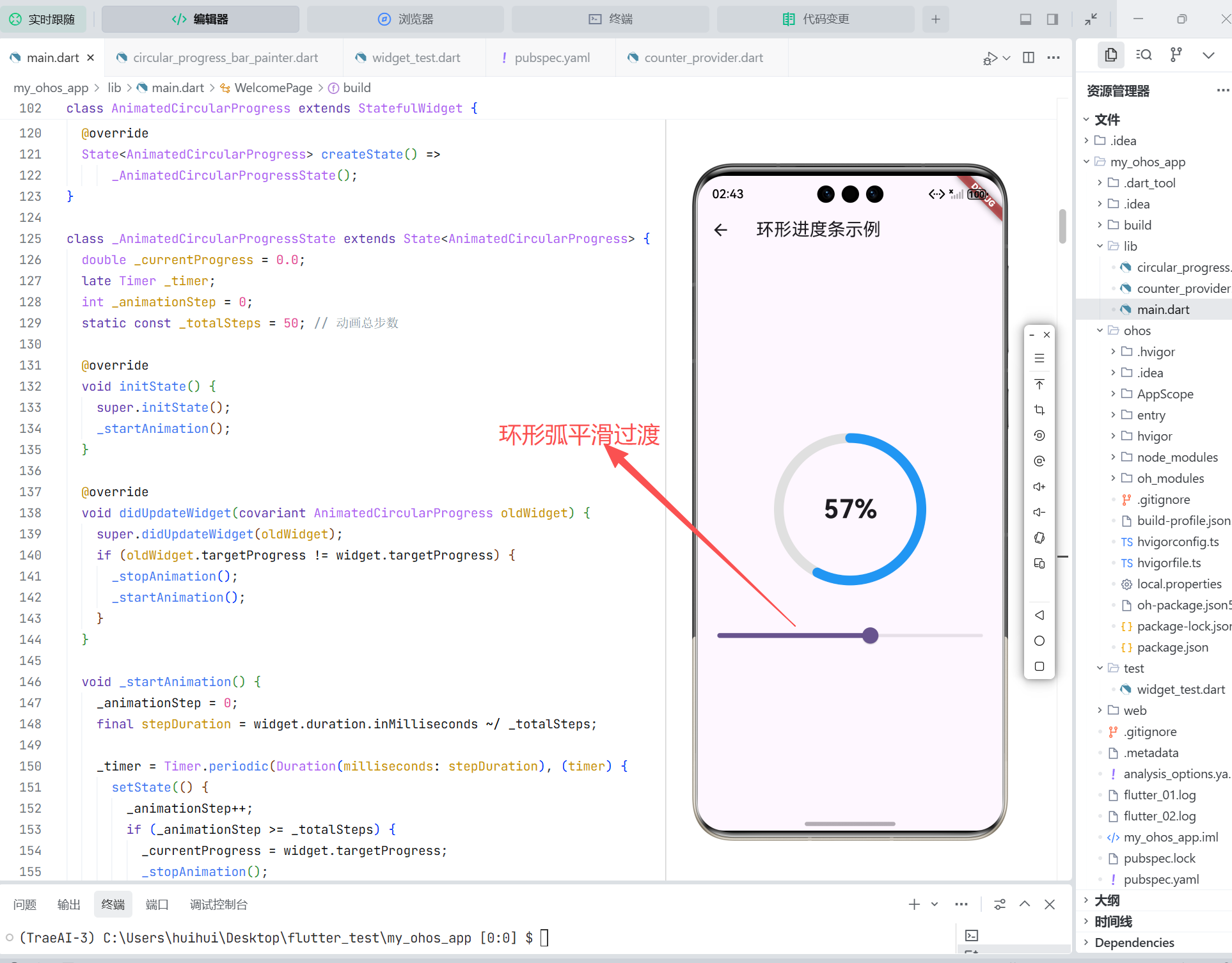
5. 支持动画与状态更新
结合 AnimationController 实现平滑进度过渡:
dart
class AnimatedCircularProgress extends StatefulWidget {
  final double targetProgress;
  final Duration duration;

  const AnimatedCircularProgress({
    super.key,
    required this.targetProgress,
    this.duration = const Duration(milliseconds: 500),
  });

  @override
  State<AnimatedCircularProgress> createState() => _AnimatedCircularProgressState();
}

class _AnimatedCircularProgressState extends State<AnimatedCircularProgress>
    with SingleTickerProviderStateMixin {
  late AnimationController _controller;
  late Animation<double> _animation;

  @override
  void initState() {
    super.initState();
    _controller = AnimationController(vsync: this, duration: widget.duration);
    _animation = Tween<double>(begin: 0.0, end: widget.targetProgress).animate(_controller);
    _controller.forward();
  }

  @override
  void didUpdateWidget(covariant AnimatedCircularProgress oldWidget) {
    super.didUpdateWidget(oldWidget);
    if (oldWidget.targetProgress != widget.targetProgress) {
      _controller.animateTo(widget.targetProgress);
    }
  }

  @override
  void dispose() {
    _controller.dispose();
    super.dispose();
  }

  @override
  Widget build(BuildContext context) {
    return AnimatedBuilder(
      animation: _animation,
      builder: (context, child) {
        return CircularProgressBar(
          progress: _animation.value,
          centerChild: Text('${(_animation.value * 100).toInt()}%'),
        );
      },
    );
  }
}
6. 封装为独立 Dart 包
为在多个 OpenHarmony 项目中复用,可将其发布为私有或公开 Dart 包。
步骤:
-
创建新包项目:
bashflutter create --template=package circular_progress_ohos -
将
CircularProgressBar和CircularProgressBarPainter移至lib/src/ -
在
lib/circular_progress_ohos.dart中导出:dartexport 'src/circular_progress_bar.dart'; -
更新
pubspec.yaml元信息(name、description、version) -
发布到私有 Pub 服务器或 Git 仓库
在 OpenHarmony 项目中引用:
yaml
dependencies:
  circular_progress_ohos:
    git:
url: https://your-git-repo/circular_progress_ohos.git优势:版本管理、跨项目复用、团队共享。
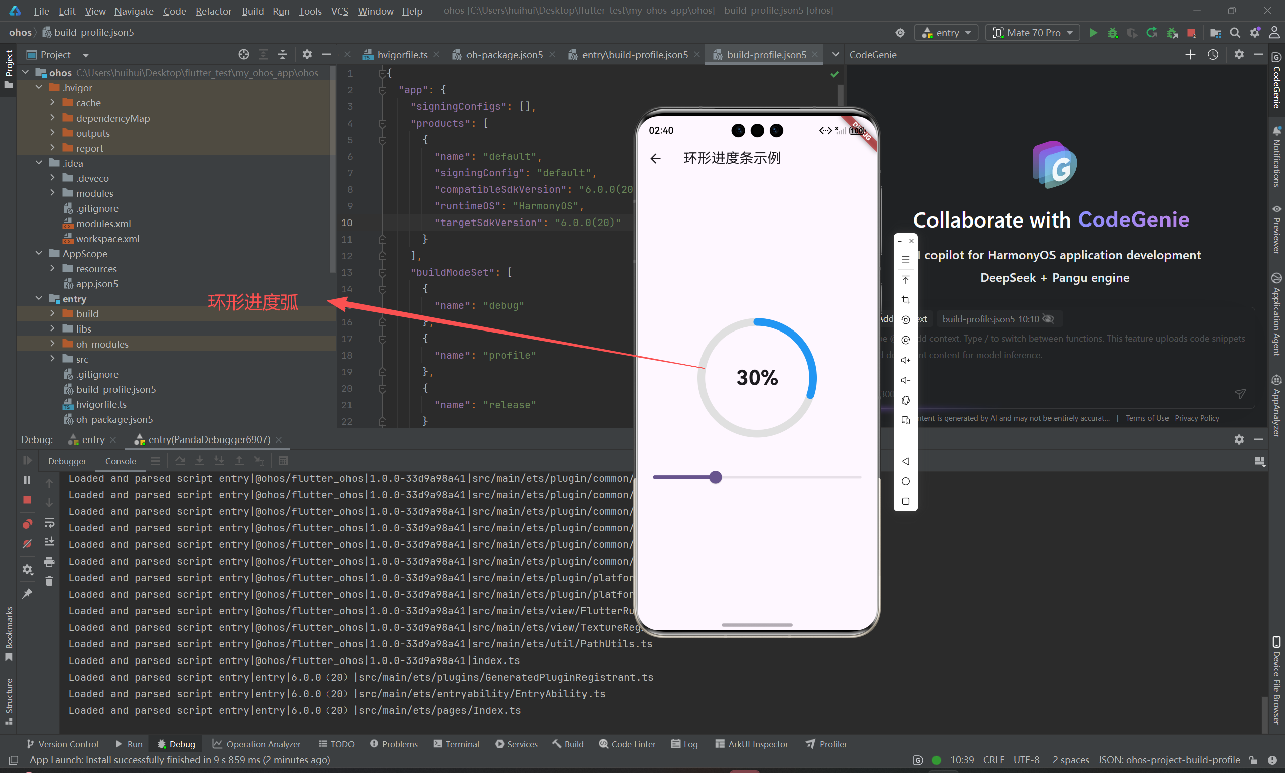
7. OpenHarmony 渲染性能分析与优化
7.1 性能实测(OpenHarmony 4.0 手机)
| 场景 | FPS(平均) | CPU 占用 | 备注 |
|---|---|---|---|
| 静态进度条(无动画) | 60 | <2% | 极低开销 |
| 动画进度条(60fps) | 58~60 | 3~5% | 流畅 |
| 列表中 20 个进度条 | 55~60 | 8~12% | 可接受 |
7.2 优化建议
-
避免频繁重建
CustomPainter:确保shouldRepaint逻辑精准 -
使用
RepaintBoundary:若组件独立变化,可隔离重绘区域dartRepaintBoundary( child: CircularProgressBar(...), ) -
限制动画帧率:对非关键动画,可降至 30fps 节省资源
-
预计算常量 :如
degreesToRadians(-90)可缓存为静态常量
OpenHarmony 的 Flutter 引擎基于 Skia,与 Android/iOS 行为一致,上述优化策略通用有效。
8. 总结
通过 CustomPaint 实现自定义绘制组件,是 Flutter for OpenHarmony 中处理图形类 UI 的标准方案。关键在于:
- 精准控制绘制逻辑 :合理使用
CanvasAPI - 高效重绘策略 :通过
shouldRepaint减少 GPU 负载 - 良好封装 :提供清晰 API 与插槽(如
centerChild) - 性能意识:在 OpenHarmony 多设备上验证帧率与资源占用
- 工程化复用:封装为 Dart 包,提升团队开发效率
此模式可扩展至仪表盘、波形图、自定义图表等复杂可视化组件,是构建高保真 OpenHarmony 应用的核心能力之一。
欢迎加入开源鸿蒙跨平台社区: https://openharmonycrossplatform.csdn.net