HarmonyOS实战:React Native实现Popover弹出位置控制

🌸你好呀!我是 lbb小魔仙
🌟 感谢陪伴~ 小白博主在线求友
🌿 跟着小白学Linux/Java/Python
📖 专栏汇总:
《Linux》专栏 | 《Java》专栏 | 《Python》专栏

- [HarmonyOS实战:React Native实现Popover弹出位置控制](#HarmonyOS实战:React Native实现Popover弹出位置控制)
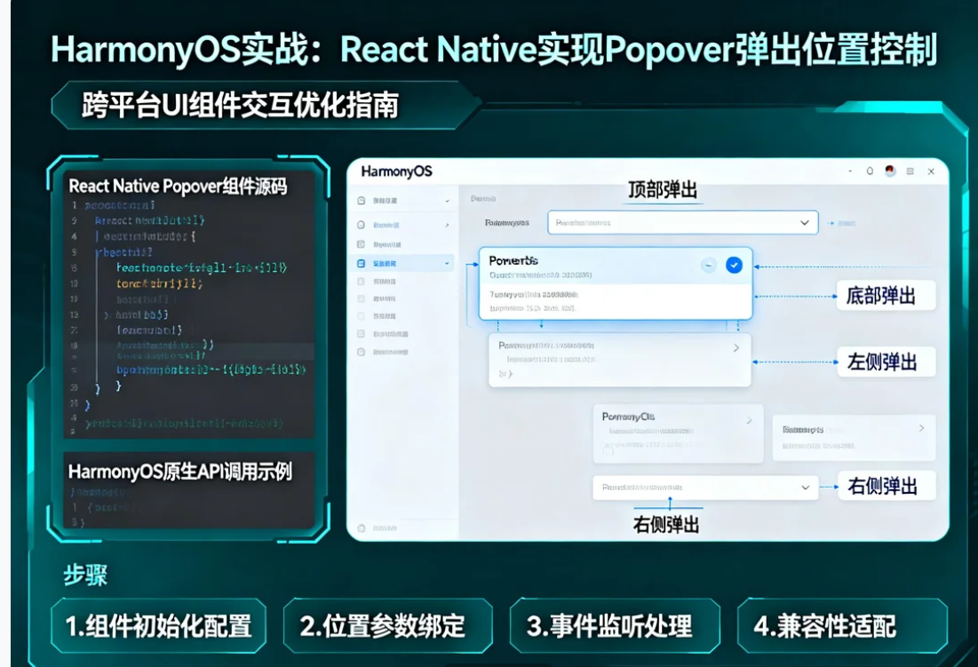
概述
Popover弹出框的位置控制是实现优秀用户体验的关键因素。准确的定位能够确保弹出内容与触发元素保持视觉关联,同时避免被屏幕边缘截断或遮挡重要内容。
在OpenHarmony 6.0.0平台上,由于坐标系统和布局计算的差异,Popover的位置控制需要特别适配。本文将深入讲解如何实现精确的Popover弹出位置控制。
位置计算原理
坐标系统
屏幕坐标系统示意:

┌────────────────────────────────────┐
│ (0,0)                              │
│   ┌────────┐                       │
│   │ Anchor │ ← 触发元素            │
│   └────────┘                       │
│          ↓                         │
│      ┌──────┐                      │
│      │Popover│ ← 弹出框            │
│      └──────┘                      │
│                                    │
└────────────────────────────────────┘
                    (screenWidth, screenHeight)

计算公式:
popoverX = anchorX + anchorWidth/2 - popoverWidth/2
popoverY = anchorY + anchorHeight + offset
定位策略
| 策略 | 计算方式 | 适用场景 |
|---|---|---|
| center | 居中对齐触发元素 | 通用场景 |
| start | 左对齐触发元素 | 右侧空间充足 |
| end | 右对齐触发元素 | 左侧空间充足 |
| auto | 自动选择最佳位置 | 空间不确定 |
OpenHarmony适配要点
测量API
| API | 用途 | OpenHarmony注意事项 |
|---|---|---|
| measure | 相对于父容器 | 需要遍历父链 |
| measureInWindow | 相对于屏幕 | 推荐使用,结果准确 |
| getBoundingClientRect | 不支持 | 使用measureInWindow替代 |
边界处理
typescript
// 边界检测函数
const ensureInBounds = (
  x: number,
  y: number,
  width: number,
  height: number,
  screenWidth: number,
  screenHeight: number
) => {
  const safeAreaTop = 44;  // 状态栏区域
  const safeAreaBottom = 34; // 底部安全区域

  return {
    x: Math.max(16, Math.min(x, screenWidth - width - 16)),
    y: Math.max(safeAreaTop + 16, Math.min(y, screenHeight - height - safeAreaBottom - 16)),
  };
};
完整实现代码
typescript
/**
 * HarmonyOS实战:Popover弹出位置控制
 *
 * @platform OpenHarmony 6.0.0 (API 20)
 * @react-native 0.72.5
 * @typescript 4.8.4
 */

import React, { useState, useRef, useEffect } from 'react';
import {
  View,
  Text,
  StyleSheet,
  TouchableOpacity,
  Modal,
  Dimensions,
} from 'react-native';

interface PositionControlledPopoverProps {
  visible: boolean;
  anchor: JSX.Element;
  children: React.ReactNode;
  placement?: 'top' | 'bottom' | 'left' | 'right';
  align?: 'start' | 'center' | 'end';
  onClose: () => void;
}

interface PositionControlDemoProps {
  onBack: () => void;
}

// 位置可控的Popover组件
const PositionControlledPopover: React.FC<PositionControlledPopoverProps> = ({
  visible,
  anchor,
  children,
  placement = 'bottom',
  align = 'center',
  onClose,
}) => {
  const [position, setPosition] = useState({ x: 0, y: 0 });
  const anchorRef = useRef<View>(null);

  useEffect(() => {
    if (visible && anchorRef.current) {
      anchorRef.current.measureInWindow((x, y, anchorWidth, anchorHeight) => {
        const { width: screenWidth, height: screenHeight } = Dimensions.get('window');
        const popoverWidth = 200;
        const popoverHeight = 150;
        const offset = 8;

        let posX = x;
        let posY = y;

        // 根据placement计算位置
        switch (placement) {
          case 'bottom':
            posY = y + anchorHeight + offset;
            switch (align) {
              case 'start':
                posX = x;
                break;
              case 'center':
                posX = x + anchorWidth / 2 - popoverWidth / 2;
                break;
              case 'end':
                posX = x + anchorWidth - popoverWidth;
                break;
            }
            break;
          case 'top':
            posY = y - popoverHeight - offset;
            switch (align) {
              case 'start':
                posX = x;
                break;
              case 'center':
                posX = x + anchorWidth / 2 - popoverWidth / 2;
                break;
              case 'end':
                posX = x + anchorWidth - popoverWidth;
                break;
            }
            break;
          case 'left':
            posX = x - popoverWidth - offset;
            switch (align) {
              case 'start':
                posY = y;
                break;
              case 'center':
                posY = y + anchorHeight / 2 - popoverHeight / 2;
                break;
              case 'end':
                posY = y + anchorHeight - popoverHeight;
                break;
            }
            break;
          case 'right':
            posX = x + anchorWidth + offset;
            switch (align) {
              case 'start':
                posY = y;
                break;
              case 'center':
                posY = y + anchorHeight / 2 - popoverHeight / 2;
                break;
              case 'end':
                posY = y + anchorHeight - popoverHeight;
                break;
            }
            break;
        }

        // 边界检测
        const safeAreaTop = 50;
        const safeAreaBottom = 34;

        posX = Math.max(16, Math.min(posX, screenWidth - popoverWidth - 16));
        posY = Math.max(safeAreaTop + 16, Math.min(posY, screenHeight - popoverHeight - safeAreaBottom - 16));

        setPosition({ x: posX, y: posY });
      });
    }
  }, [visible, placement, align]);

  return (
    <View style={styles.anchorWrapper}>
      <View ref={anchorRef}>{anchor}</View>
      <Modal
        visible={visible}
        transparent
        animationType="fade"
        onRequestClose={onClose}
      >
        <TouchableOpacity style={styles.modalOverlay} onPress={onClose} activeOpacity={1}>
          <TouchableOpacity
            style={[styles.popoverBox, { left: position.x, top: position.y }]}
            activeOpacity={1}
          >
            {children}
          </TouchableOpacity>
        </TouchableOpacity>
      </Modal>
    </View>
  );
};

// 演示页面
const PositionControlDemoScreen: React.FC<PositionControlDemoProps> = ({ onBack }) => {
  const [visible, setVisible] = useState(false);
  const [placement, setPlacement] = useState<'top' | 'bottom' | 'left' | 'right'>('bottom');
  const [align, setAlign] = useState<'start' | 'center' | 'end'>('center');

  return (
    <View style={styles.container}>
      {/* 顶部导航栏 */}
      <View style={styles.navigationBar}>
        <TouchableOpacity onPress={onBack} style={styles.backBtn}>
          <Text style={styles.backText}>← 返回</Text>
        </TouchableOpacity>
        <View style={styles.titleWrapper}>
          <Text style={styles.mainTitle}>Popover位置控制</Text>
          <Text style={styles.subTitle}>精确控制弹出位置</Text>
        </View>
      </View>

      {/* 平台信息 */}
      <View style={styles.versionBanner}>
        <Text style={styles.versionText}>OpenHarmony 6.0.0 | API 20</Text>
      </View>

      {/* 功能介绍 */}
      <View style={styles.introCard}>
        <Text style={styles.introTitle}>弹出位置精确控制</Text>
        <Text style={styles.introDesc}>
          通过placement和align参数精确控制Popover的弹出位置
        </Text>
      </View>

      {/* 配置区域 */}
      <View style={styles.configCard}>
        <Text style={styles.configTitle}>位置配置</Text>

        <View style={styles.configSection}>
          <Text style={styles.configLabel}>弹出方向:</Text>
          <View style={styles.optionRow}>
            {(['top', 'bottom', 'left', 'right'] as const).map((dir) => (
              <TouchableOpacity
                key={dir}
                style={[
                  styles.optionBtn,
                  placement === dir && styles.optionBtnActive,
                ]}
                onPress={() => setPlacement(dir)}
              >
                <Text
                  style={[
                    styles.optionText,
                    placement === dir && styles.optionTextActive,
                  ]}
                >
                  {dir.toUpperCase()}
                </Text>
              </TouchableOpacity>
            ))}
          </View>
        </View>

        <View style={styles.configSection}>
          <Text style={styles.configLabel}>对齐方式:</Text>
          <View style={styles.optionRow}>
            {(['start', 'center', 'end'] as const).map((aln) => (
              <TouchableOpacity
                key={aln}
                style={[
                  styles.optionBtn,
                  align === aln && styles.optionBtnActive,
                ]}
                onPress={() => setAlign(aln)}
              >
                <Text
                  style={[
                    styles.optionText,
                    align === aln && styles.optionTextActive,
                  ]}
                >
                  {aln.toUpperCase()}
                </Text>
              </TouchableOpacity>
            ))}
          </View>
        </View>

        <Text style={styles.currentConfig}>
          当前配置: {placement.toUpperCase()} - {align.toUpperCase()}
        </Text>
      </View>

      {/* 演示区域 */}
      <View style={styles.demoArea}>
        <PositionControlledPopover
          visible={visible}
          placement={placement}
          align={align}
          anchor={
            <TouchableOpacity
              style={styles.anchorButton}
              onPress={() => setVisible(true)}
            >
              <Text style={styles.anchorButtonText}>点击弹出</Text>
            </TouchableOpacity>
          }
          onClose={() => setVisible(false)}
        >
          <View style={styles.popoverContent}>
            <Text style={styles.popoverTitle}>Popover内容</Text>
            <Text style={styles.popoverDesc}>
              方向: {placement}\n对齐: {align}
            </Text>
            <TouchableOpacity style={styles.popoverAction}>
              <Text style={styles.popoverActionText}>操作选项</Text>
            </TouchableOpacity>
          </View>
        </PositionControlledPopover>
      </View>

      {/* 技术要点 */}
      <View style={styles.techCard}>
        <Text style={styles.cardTitle}>核心技术</Text>
        <View style={styles.techList}>
          <View style={styles.techItem}>
            <Text style={styles.techIcon}>📍</Text>
            <View style={styles.techContent}>
              <Text style={styles.techTitle}>measureInWindow</Text>
              <Text style={styles.techDesc}>获取触发元素在屏幕中的位置</Text>
            </View>
          </View>
          <View style={styles.techItem}>
            <Text style={styles.techIcon}>📐</Text>
            <View style={styles.techContent}>
              <Text style={styles.techTitle}>位置计算公式</Text>
              <Text style={styles.techDesc}>根据placement和align计算坐标</Text>
            </View>
          </View>
          <View style={styles.techItem}>
            <Text style={styles.techIcon}>🛡️</Text>
            <View style={styles.techContent}>
              <Text style={styles.techTitle}>边界约束</Text>
              <Text style={styles.techDesc}>确保Popover完全在可视区域内</Text>
            </View>
          </View>
        </View>
      </View>

      {/* 适配要点 */}
      <View style={styles.adaptCard}>
        <Text style={styles.adaptTitle}>OpenHarmony适配要点</Text>
        <View style={styles.adaptList}>
          <Text style={styles.adaptItem}>• 优先使用measureInWindow获取位置</Text>
          <Text style={styles.adaptItem}>• 考虑状态栏等安全区域偏移</Text>
          <Text style={styles.adaptItem}>• 添加边界检测防止溢出</Text>
          <Text style={styles.adaptItem}>• 测试不同屏幕尺寸的表现</Text>
        </View>
      </View>
    </View>
  );
};

const styles = StyleSheet.create({
  container: {
    flex: 1,
    backgroundColor: '#f8f9fa',
  },
  navigationBar: {
    flexDirection: 'row',
    alignItems: 'center',
    paddingHorizontal: 16,
    paddingVertical: 12,
    backgroundColor: '#6366f1',
    paddingTop: 50,
  },
  backBtn: {
    padding: 8,
  },
  backText: {
    fontSize: 16,
    color: '#fff',
    fontWeight: '600',
  },
  titleWrapper: {
    flex: 1,
    marginLeft: 8,
  },
  mainTitle: {
    fontSize: 20,
    fontWeight: 'bold',
    color: '#fff',
  },
  subTitle: {
    fontSize: 12,
    color: 'rgba(255, 255, 255, 0.85)',
    marginTop: 2,
  },
  versionBanner: {
    backgroundColor: '#e0e7ff',
    paddingHorizontal: 16,
    paddingVertical: 8,
  },
  versionText: {
    fontSize: 12,
    color: '#4338ca',
    textAlign: 'center',
  },
  introCard: {
    margin: 16,
    padding: 16,
    backgroundColor: '#fff',
    borderRadius: 12,
  },
  introTitle: {
    fontSize: 18,
    fontWeight: 'bold',
    color: '#334155',
    marginBottom: 8,
  },
  introDesc: {
    fontSize: 14,
    color: '#64748b',
  },
  configCard: {
    backgroundColor: '#fff',
    margin: 16,
    padding: 16,
    borderRadius: 12,
  },
  configTitle: {
    fontSize: 16,
    fontWeight: 'bold',
    color: '#334155',
    marginBottom: 16,
  },
  configSection: {
    marginBottom: 16,
  },
  configLabel: {
    fontSize: 14,
    color: '#64748b',
    marginBottom: 10,
  },
  optionRow: {
    flexDirection: 'row',
    gap: 8,
  },
  optionBtn: {
    flex: 1,
    paddingVertical: 10,
    paddingHorizontal: 12,
    backgroundColor: '#f1f5f9',
    borderRadius: 8,
    alignItems: 'center',
  },
  optionBtnActive: {
    backgroundColor: '#6366f1',
  },
  optionText: {
    fontSize: 13,
    color: '#64748b',
    fontWeight: '500',
  },
  optionTextActive: {
    color: '#fff',
  },
  currentConfig: {
    fontSize: 13,
    color: '#6366f1',
    textAlign: 'center',
    padding: 12,
    backgroundColor: '#eef2ff',
    borderRadius: 8,
  },
  demoArea: {
    alignItems: 'center',
    paddingVertical: 40,
  },
  anchorButton: {
    backgroundColor: '#6366f1',
    paddingHorizontal: 32,
    paddingVertical: 14,
    borderRadius: 10,
    shadowColor: '#000',
    shadowOffset: { width: 0, height: 2 },
    shadowOpacity: 0.15,
    shadowRadius: 4,
    elevation: 3,
  },
  anchorButtonText: {
    color: '#fff',
    fontSize: 16,
    fontWeight: '600',
  },
  anchorWrapper: {
    position: 'relative',
  },
  modalOverlay: {
    flex: 1,
    backgroundColor: 'rgba(0, 0, 0, 0.3)',
  },
  popoverBox: {
    position: 'absolute',
    backgroundColor: '#fff',
    borderRadius: 12,
    width: 200,
    shadowColor: '#000',
    shadowOffset: { width: 0, height: 4 },
    shadowOpacity: 0.2,
    shadowRadius: 8,
    elevation: 8,
  },
  popoverContent: {
    padding: 16,
  },
  popoverTitle: {
    fontSize: 15,
    fontWeight: 'bold',
    color: '#334155',
    marginBottom: 8,
  },
  popoverDesc: {
    fontSize: 13,
    color: '#64748b',
    lineHeight: 18,
    marginBottom: 12,
  },
  popoverAction: {
    paddingVertical: 10,
    backgroundColor: '#f1f5f9',
    borderRadius: 8,
    alignItems: 'center',
  },
  popoverActionText: {
    fontSize: 14,
    color: '#475569',
    fontWeight: '500',
  },
  techCard: {
    backgroundColor: '#fff',
    margin: 16,
    padding: 16,
    borderRadius: 12,
  },
  cardTitle: {
    fontSize: 16,
    fontWeight: 'bold',
    color: '#334155',
    marginBottom: 12,
  },
  techList: {
    gap: 12,
  },
  techItem: {
    flexDirection: 'row',
    alignItems: 'flex-start',
  },
  techIcon: {
    fontSize: 24,
    marginRight: 12,
  },
  techContent: {
    flex: 1,
  },
  techTitle: {
    fontSize: 14,
    fontWeight: '600',
    color: '#334155',
    marginBottom: 4,
  },
  techDesc: {
    fontSize: 12,
    color: '#64748b',
    lineHeight: 18,
  },
  adaptCard: {
    backgroundColor: '#eef2ff',
    margin: 16,
    marginBottom: 32,
    padding: 16,
    borderRadius: 12,
  },
  adaptTitle: {
    fontSize: 16,
    fontWeight: 'bold',
    color: '#4338ca',
    marginBottom: 12,
  },
  adaptList: {
    gap: 6,
  },
  adaptItem: {
    fontSize: 13,
    color: '#475569',
    lineHeight: 20,
  },
});

export default PositionControlDemoScreen;
核心实现要点
1. 位置计算公式
typescript
// bottom方向,center对齐示例
posY = y + anchorHeight + offset;
posX = x + anchorWidth / 2 - popoverWidth / 2;
2. 对齐方式处理
| align | 水平定位 | 垂直定位 |
|---|---|---|
| start | left | top |
| center | center | center |
| end | right | bottom |
3. OpenHarmony适配
| 问题 | 解决方案 |
|---|---|
| 坐标获取 | measureInWindow |
| 安全区域 | 添加top/bottom偏移 |
| 边界检测 | Math.max/min约束 |
| 测试验证 | 多设备验证 |
项目源码
完整项目代码:https://atomgit.com/lbbxmx111/AtomGitNewsDemo
开源鸿蒙社区:https://openharmonycrossplatform.csdn.net
欢迎加入开源鸿蒙跨平台社区: https://openharmonycrossplatform.csdn.net
📕个人领域 :Linux/C++/java/AI
🚀 个人主页 :有点流鼻涕 · CSDN
💬 座右铭 : "向光而行,沐光而生。"