🎯欢迎加入开源鸿蒙跨平台社区:https://openharmonycrossplatform.csdn.net
💳 本文将带你深入了解 Flutter 中常用的展示组件------Card,掌握卡片布局的设计与实现技巧。
一、Card 组件概述
在现代移动应用设计中,卡片已经成为最流行的信息展示方式之一。无论是商品列表、文章卡片、用户信息还是设置选项,卡片都能以清晰、美观的方式展示内容。Flutter 的 Card 组件提供了 Material Design 风格的卡片样式,自带阴影和圆角效果,非常适合用于组织相关内容。
🎯 为什么 Card 如此重要?
Card 的重要性体现在以下几个方面:
- Material Design 规范:完全符合 Material Design 的卡片设计规范
- 内置阴影效果:自动添加投影,增强立体感和层次感
- 圆角设计:自带圆角效果,视觉更加柔和
- 灵活的内容:可以包含任意类型的子组件
- 主题适配:自动适配深色和浅色主题
- 易于使用:简单的 API,快速创建美观的卡片
💡 核心思想:Card 就像是一张卡片纸,可以将相关的内容组织在一起。通过阴影和圆角的设计,Card 能够在页面中创造出明确的视觉边界,帮助用户快速识别和组织信息。合理使用 Card 可以让界面更加整洁、层次分明。
二、Card 的基础用法
2.1 最简单的 Card
最简单的 Card 不需要任何参数,会使用默认的阴影和圆角效果。
dart
const Card(
  child: Padding(
    padding: EdgeInsets.all(16),
    child: Text('这是一个卡片'),
  ),
)
2.2 添加内容
Card 可以包含任意类型的子组件,最常用的是结合 Padding、Column、Row 等布局组件来组织内容。
dart
Card(
  child: Padding(
    padding: const EdgeInsets.all(16),
    child: Column(
      crossAxisAlignment: CrossAxisAlignment.start,
      children: [
        Text(
          '卡片标题',
          style: TextStyle(fontSize: 18, fontWeight: FontWeight.bold),
        ),
        SizedBox(height: 8),
        Text('这是卡片的详细内容描述'),
      ],
    ),
  ),
)
2.3 自定义颜色和圆角
dart
Card(
  color: Colors.blue[50],
  shape: RoundedRectangleBorder(
    borderRadius: BorderRadius.circular(16),
  ),
  child: const Padding(
    padding: EdgeInsets.all(16),
    child: Text('自定义样式的卡片'),
  ),
)
三、Card 的常用属性
3.1 color 颜色
color 属性设置卡片的背景颜色。
dart
Card(
  color: Colors.green[100],
  child: const Padding(
    padding: EdgeInsets.all(16),
    child: Text('绿色背景卡片'),
  ),
)
💡 小贴士 :在深色主题中,Card 会自动适配为深色背景。如果要保持特定颜色,建议使用
Theme.of(context).cardColor作为基础颜色。
3.2 shadowOn 禁用阴影
shadowOn 属性控制是否显示阴影效果。
dart
Card(
  shadowOn: false, // 禁用阴影
  child: const Padding(
    padding: EdgeInsets.all(16),
    child: Text('无阴影卡片'),
  ),
)
3.3 elevation 阴影高度
elevation 属性控制阴影的高度,值越大阴影越明显。
dart
Card(
  elevation: 8,
  child: const Padding(
    padding: EdgeInsets.all(16),
    child: Text('高阴影卡片'),
  ),
)
常用的 elevation 值:
| 值 | 效果 | 使用场景 |
|---|---|---|
| 0 | 无阴影 | 平面设计风格 |
| 1-4 | 轻微阴影 | 静态卡片 |
| 5-8 | 中等阴影 | 悬浮效果 |
| 9-12 | 明显阴影 | 强调卡片 |
| 13+ | 强烈阴影 | 特殊效果 |
3.4 shape 形状
shape 属性控制卡片的形状,主要是圆角。
dart
// 圆角矩形
Card(
  shape: RoundedRectangleBorder(
    borderRadius: BorderRadius.circular(12),
  ),
  child: const Padding(
    padding: EdgeInsets.all(16),
    child: Text('圆角卡片'),
  ),
)

// 完全圆形
Card(
  shape: RoundedRectangleBorder(
    borderRadius: BorderRadius.circular(100),
  ),
  child: const Padding(
    padding: EdgeInsets.all(24),
    child: Icon(Icons.person, size: 48),
  ),
)
3.5 margin 外边距
margin 属性控制卡片与其他组件的间距。
dart
Card(
  margin: const EdgeInsets.all(16),
  child: const Padding(
    padding: EdgeInsets.all(16),
    child: Text('带外边距的卡片'),
  ),
)
四、Card 的形状类型
4.1 RoundedRectangleBorder
最常用的形状类型,可以设置圆角半径。
dart
Card(
  shape: RoundedRectangleBorder(
    borderRadius: BorderRadius.circular(16),
    side: BorderSide(color: Colors.blue, width: 2),
  ),
  child: const Padding(
    padding: EdgeInsets.all(16),
    child: Text('带边框的圆角卡片'),
  ),
)
4.2 BeveledRectangleBorder
斜角矩形边框,可以创建特殊效果。
dart
Card(
  shape: BeveledRectangleBorder(
    borderRadius: BorderRadius.circular(16),
  ),
  child: const Padding(
    padding: EdgeInsets.all(16),
    child: Text('斜角卡片'),
  ),
)
4.3 CircleBorder
圆形边框,适合头像等场景。
dart
Card(
  shape: const CircleBorder(
    side: BorderSide(color: Colors.blue, width: 2),
  ),
  child: const Padding(
    padding: EdgeInsets.all(24),
    child: Icon(Icons.person, size: 48),
  ),
)
五、实际应用场景
5.1 商品卡片
dart
Card(
  margin: const EdgeInsets.all(16),
  child: Column(
    crossAxisAlignment: CrossAxisAlignment.start,
    children: [
      AspectRatio(
        aspectRatio: 16 / 9,
        child: Image.network(
          'https://picsum.photos/400/225',
          fit: BoxFit.cover,
        ),
      ),
      Padding(
        padding: const EdgeInsets.all(16),
        child: Column(
          crossAxisAlignment: CrossAxisAlignment.start,
          children: [
            Text(
              '商品名称',
              style: TextStyle(
                fontSize: 18,
                fontWeight: FontWeight.bold,
              ),
            ),
            SizedBox(height: 8),
            Text(
              '¥299.00',
              style: TextStyle(
                fontSize: 24,
                color: Colors.red,
                fontWeight: FontWeight.bold,
              ),
            ),
          ],
        ),
      ),
    ],
  ),
)
5.2 用户卡片
dart
Card(
  margin: const EdgeInsets.symmetric(horizontal: 16, vertical: 8),
  child: ListTile(
    leading: CircleAvatar(
      backgroundImage: NetworkImage('https://picsum.photos/100/100'),
    ),
    title: const Text('用户名称'),
    subtitle: const Text('用户简介信息'),
    trailing: const Icon(Icons.chevron_right),
    onTap: () {
      // 点击事件
    },
  ),
)
5.3 统计卡片
dart
Card(
  elevation: 4,
  child: Padding(
    padding: const EdgeInsets.all(24),
    child: Column(
      children: [
        Icon(
          Icons.trending_up,
          size: 48,
          color: Colors.green,
        ),
        const SizedBox(height: 16),
        Text(
          '1,234',
          style: TextStyle(
            fontSize: 32,
            fontWeight: FontWeight.bold,
          ),
        ),
        const SizedBox(height: 8),
        Text(
          '总访问量',
          style: TextStyle(
            fontSize: 16,
            color: Colors.grey[600],
          ),
        ),
      ],
    ),
  ),
)
5.4 信息卡片
dart
Card(
  color: Colors.blue[50],
  shape: RoundedRectangleBorder(
    borderRadius: BorderRadius.circular(12),
    side: BorderSide(color: Colors.blue[200]!),
  ),
  child: Padding(
    padding: const EdgeInsets.all(16),
    child: Row(
      children: [
        Icon(
          Icons.info,
          color: Colors.blue,
          size: 24,
        ),
        const SizedBox(width: 12),
        Expanded(
          child: Column(
            crossAxisAlignment: CrossAxisAlignment.start,
            children: [
              Text(
                '提示信息',
                style: TextStyle(
                  fontWeight: FontWeight.bold,
                  color: Colors.blue[900],
                ),
              ),
              const SizedBox(height: 4),
              Text(
                '这是详细的提示内容描述',
                style: TextStyle(color: Colors.blue[700]),
              ),
            ],
          ),
        ),
      ],
    ),
  ),
)
5.5 功能卡片
dart
Card(
  elevation: 2,
  child: InkWell(
    onTap: () {
      // 点击事件
    },
    child: Padding(
      padding: const EdgeInsets.all(16),
      child: Row(
        children: [
          Container(
            padding: const EdgeInsets.all(12),
            decoration: BoxDecoration(
              color: Colors.purple[100],
              borderRadius: BorderRadius.circular(12),
            ),
            child: Icon(
              Icons.settings,
              color: Colors.purple,
            ),
          ),
          const SizedBox(width: 16),
          Expanded(
            child: Column(
              crossAxisAlignment: CrossAxisAlignment.start,
              children: [
                Text(
                  '设置',
                  style: TextStyle(
                    fontSize: 16,
                    fontWeight: FontWeight.bold,
                  ),
                ),
                const SizedBox(height: 4),
                Text(
                  '管理应用设置',
                  style: TextStyle(
                    fontSize: 14,
                    color: Colors.grey[600],
                  ),
                ),
              ],
            ),
          ),
          const Icon(Icons.chevron_right),
        ],
      ),
    ),
  ),
)
六、Card 与其他组件的组合
6.1 Card + ListView
在列表中使用 Card 是最常见的组合方式。
dart
ListView.builder(
  padding: const EdgeInsets.all(16),
  itemCount: items.length,
  itemBuilder: (context, index) {
    return Card(
      margin: const EdgeInsets.only(bottom: 16),
      child: ListTile(
        title: Text(items[index].title),
        subtitle: Text(items[index].description),
      ),
    );
  },
)
6.2 Card + GridView
在网格布局中使用 Card。
dart
GridView.count(
  crossAxisCount: 2,
  padding: const EdgeInsets.all(16),
  mainAxisSpacing: 16,
  crossAxisSpacing: 16,
  children: List.generate(
    6,
    (index) => Card(
      child: Center(
        child: Text('卡片 $index'),
      ),
    ),
  ),
)
6.3 Card + Stack
使用 Stack 创建复杂的卡片效果。
dart
Card(
  clipBehavior: Clip.antiAlias,
  child: Stack(
    children: [
      Image.network(
        'https://picsum.photos/400/300',
        fit: BoxFit.cover,
      ),
      Positioned(
        bottom: 0,
        left: 0,
        right: 0,
        child: Container(
          padding: const EdgeInsets.all(16),
          decoration: BoxDecoration(
            gradient: LinearGradient(
              begin: Alignment.topCenter,
              end: Alignment.bottomCenter,
              colors: [
                Colors.transparent,
                Colors.black.withOpacity(0.7),
              ],
            ),
          ),
          child: const Text(
            '卡片标题',
            style: TextStyle(
              color: Colors.white,
              fontSize: 18,
              fontWeight: FontWeight.bold,
            ),
          ),
        ),
      ),
    ],
  ),
)
七、主题适配
7.1 使用主题颜色
dart
Card(
  color: Theme.of(context).cardColor,
  elevation: Theme.of(context).cardTheme.elevation ?? 1,
  shape: Theme.of(context).cardTheme.shape,
  child: const Padding(
    padding: EdgeInsets.all(16),
    child: Text('主题适配卡片'),
  ),
)
7.2 自定义主题
dart
MaterialApp(
  theme: ThemeData(
    cardTheme: CardTheme(
      elevation: 4,
      shape: RoundedRectangleBorder(
        borderRadius: BorderRadius.circular(12),
      ),
      clipBehavior: Clip.antiAlias,
    ),
  ),
  home: const MyApp(),
)
八、性能优化
8.1 使用 const 构造函数
对于不变的 Card,使用 const 修饰符。
dart
const Card(
  child: Padding(
    padding: EdgeInsets.all(16),
    child: Text('静态卡片'),
  ),
)
8.2 避免过深的嵌套
过深的嵌套会影响性能,尽量简化结构。
dart
// ❌ 过度嵌套
Card(
  child: Padding(
    padding: EdgeInsets.all(16),
    child: Container(
      padding: EdgeInsets.all(16),
      child: Text('内容'),
    ),
  ),
)

// ✅ 简化结构
Card(
  child: Padding(
    padding: EdgeInsets.all(32),
    child: Text('内容'),
  ),
)
九、完整示例代码
下面是一个完整的 Flutter 应用示例,展示 Card 组件的各种用法。
dart
import 'package:flutter/material.dart';
void main() {
runApp(const CardDemo());
}
class CardDemo extends StatelessWidget {
const CardDemo({super.key});
@override
Widget build(BuildContext context) {
return MaterialApp(
title: 'Card 组件演示',
debugShowCheckedModeBanner: false,
theme: ThemeData(
colorScheme: ColorScheme.dark(
primary: const Color(0xFF6366F1),
secondary: const Color(0xFF8B5CF6),
surface: const Color(0xFF1E293B),
background: const Color(0xFF0F172A),
brightness: Brightness.dark,
),
useMaterial3: true,
),
home: const CardPage(),
);
}
}
class CardPage extends StatelessWidget {
const CardPage({super.key});
@override
Widget build(BuildContext context) {
return Scaffold(
backgroundColor: const Color(0xFF0F172A),
body: SafeArea(
child: SingleChildScrollView(
padding: const EdgeInsets.all(20),
child: Column(
crossAxisAlignment: CrossAxisAlignment.start,
children: [
// 标题区域
Container(
padding: const EdgeInsets.all(24),
decoration: BoxDecoration(
gradient: LinearGradient(
begin: Alignment.topLeft,
end: Alignment.bottomRight,
colors: [
const Color(0xFF6366F1).withOpacity(0.2),
const Color(0xFF8B5CF6).withOpacity(0.2),
],
),
borderRadius: BorderRadius.circular(20),
border: Border.all(
color: Colors.white.withOpacity(0.1),
),
),
child: Column(
crossAxisAlignment: CrossAxisAlignment.start,
children: [
const Text(
'💳 Card',
style: TextStyle(
fontSize: 28,
fontWeight: FontWeight.bold,
color: Colors.white,
letterSpacing: 0.5,
),
),
const SizedBox(height: 8),
Text(
'探索 Flutter 中卡片组件的各种用法',
style: TextStyle(
fontSize: 14,
color: Colors.white.withOpacity(0.7),
height: 1.5,
),
),
],
),
),
const SizedBox(height: 32),
// 基础卡片
_buildSection(
title: '基础卡片',
icon: Icons.style,
color: Colors.blue,
child: _buildCardPreview([
_buildBasicCard(),
]),
),
const SizedBox(height: 24),
// 阴影效果
_buildSection(
title: '阴影效果',
icon: Icons.layers,
color: Colors.green,
child: _buildCardPreview([
_buildShadowCards(),
]),
),
const SizedBox(height: 24),
// 圆角样式
_buildSection(
title: '圆角样式',
icon: Icons.rounded_corner,
color: Colors.purple,
child: _buildCardPreview([
_buildRadiusCards(),
]),
),
const SizedBox(height: 24),
// 实际应用
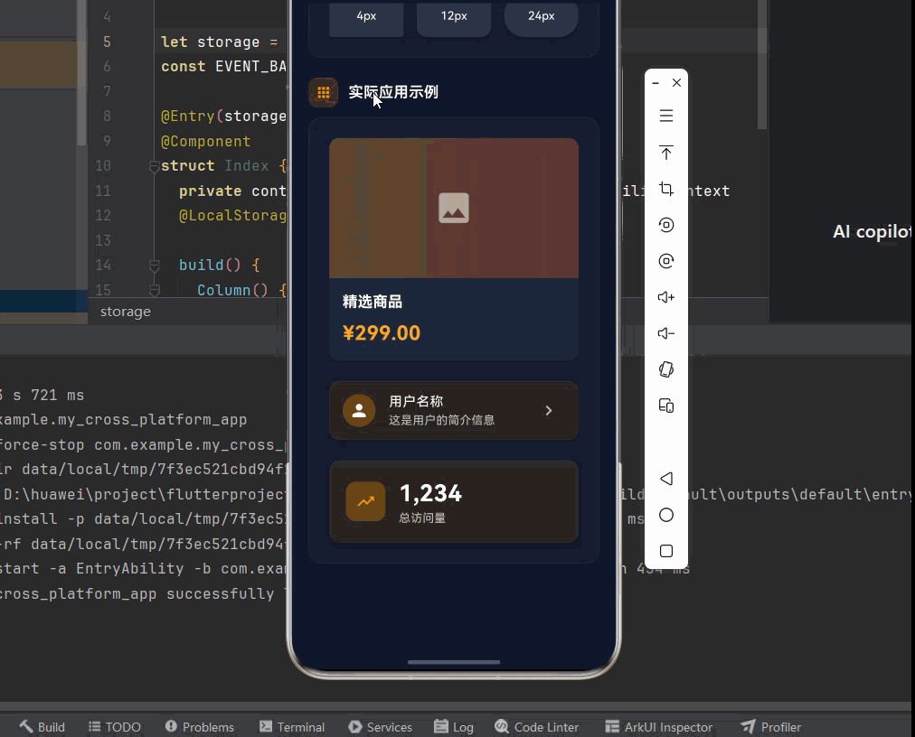
_buildSection(
title: '实际应用示例',
icon: Icons.apps,
color: Colors.orange,
child: _buildCardPreview([
_buildProductCard(),
const SizedBox(height: 16),
_buildUserCard(),
const SizedBox(height: 16),
_buildStatCard(),
]),
),
const SizedBox(height: 80),
],
),
),
),
);
}
Widget _buildSection({
required String title,
required IconData icon,
required Color color,
required Widget child,
}) {
return Column(
crossAxisAlignment: CrossAxisAlignment.start,
children: [
Row(
children: [
Container(
padding: const EdgeInsets.all(8),
decoration: BoxDecoration(
color: color.withOpacity(0.2),
borderRadius: BorderRadius.circular(10),
),
child: Icon(icon, color: color, size: 20),
),
const SizedBox(width: 12),
Text(
title,
style: const TextStyle(
fontSize: 18,
fontWeight: FontWeight.w600,
color: Colors.white,
),
),
],
),
const SizedBox(height: 12),
child,
],
);
}
Widget _buildCardPreview(List<Widget> children) {
return Container(
width: double.infinity,
padding: const EdgeInsets.all(20),
decoration: BoxDecoration(
color: Colors.white.withOpacity(0.03),
borderRadius: BorderRadius.circular(16),
border: Border.all(
color: Colors.white.withOpacity(0.05),
),
),
child: Column(
children: children,
),
);
}
Widget _buildBasicCard() {
return Card(
elevation: 2,
color: const Color(0xFF2D3748),
child: const Padding(
padding: EdgeInsets.all(16),
child: Text(
'这是一个基础的卡片',
style: TextStyle(color: Colors.white),
),
),
);
}
Widget _buildShadowCards() {
return Column(
children: [
Card(
elevation: 0,
color: const Color(0xFF2D3748),
child: const Padding(
padding: EdgeInsets.all(12),
child: Text('无阴影 (elevation: 0)'),
),
),
const SizedBox(height: 8),
Card(
elevation: 4,
color: const Color(0xFF2D3748),
child: const Padding(
padding: EdgeInsets.all(12),
child: Text('中等阴影 (elevation: 4)'),
),
),
const SizedBox(height: 8),
Card(
elevation: 8,
color: const Color(0xFF2D3748),
child: const Padding(
padding: EdgeInsets.all(12),
child: Text('强阴影 (elevation: 8)'),
),
),
],
);
}
Widget _buildRadiusCards() {
return Row(
children: [
Expanded(
child: Card(
elevation: 2,
shape: RoundedRectangleBorder(
borderRadius: BorderRadius.circular(4),
),
color: const Color(0xFF2D3748),
child: const Padding(
padding: EdgeInsets.all(16),
child: Center(
child: Text('4px', style: TextStyle(color: Colors.white)),
),
),
),
),
const SizedBox(width: 8),
Expanded(
child: Card(
elevation: 2,
shape: RoundedRectangleBorder(
borderRadius: BorderRadius.circular(12),
),
color: const Color(0xFF2D3748),
child: const Padding(
padding: EdgeInsets.all(16),
child: Center(
child: Text('12px', style: TextStyle(color: Colors.white)),
),
),
),
),
const SizedBox(width: 8),
Expanded(
child: Card(
elevation: 2,
shape: RoundedRectangleBorder(
borderRadius: BorderRadius.circular(24),
),
color: const Color(0xFF2D3748),
child: const Padding(
padding: EdgeInsets.all(16),
child: Center(
child: Text('24px', style: TextStyle(color: Colors.white)),
),
),
),
),
],
);
}
Widget _buildProductCard() {
return Card(
clipBehavior: Clip.antiAlias,
child: Column(
crossAxisAlignment: CrossAxisAlignment.start,
children: [
AspectRatio(
aspectRatio: 16 / 9,
child: Container(
decoration: BoxDecoration(
gradient: LinearGradient(
colors: [
Colors.orange.withOpacity(0.3),
Colors.red.withOpacity(0.3),
],
),
),
child: const Center(
child: Icon(
Icons.image,
size: 48,
color: Colors.white54,
),
),
),
),
Padding(
padding: const EdgeInsets.all(16),
child: Column(
crossAxisAlignment: CrossAxisAlignment.start,
children: [
Text(
'精选商品',
style: const TextStyle(
fontSize: 18,
fontWeight: FontWeight.bold,
color: Colors.white,
),
),
const SizedBox(height: 8),
Text(
'¥299.00',
style: TextStyle(
fontSize: 24,
color: Colors.orange[400],
fontWeight: FontWeight.bold,
),
),
],
),
),
],
),
);
}
Widget _buildUserCard() {
return Card(
color: Colors.orange.withOpacity(0.1),
child: ListTile(
leading: CircleAvatar(
backgroundColor: Colors.orange.withOpacity(0.3),
child: const Icon(Icons.person, color: Colors.white),
),
title: const Text(
'用户名称',
style: TextStyle(color: Colors.white),
),
subtitle: Text(
'这是用户的简介信息',
style: TextStyle(color: Colors.white70),
),
trailing: const Icon(Icons.chevron_right, color: Colors.white70),
),
);
}
Widget _buildStatCard() {
return Card(
elevation: 4,
color: Colors.orange.withOpacity(0.1),
child: Padding(
padding: const EdgeInsets.all(20),
child: Row(
children: [
Container(
padding: const EdgeInsets.all(12),
decoration: BoxDecoration(
color: Colors.orange.withOpacity(0.3),
borderRadius: BorderRadius.circular(12),
),
child: const Icon(
Icons.trending_up,
color: Colors.orange,
size: 24,
),
),
const SizedBox(width: 16),
Expanded(
child: Column(
crossAxisAlignment: CrossAxisAlignment.start,
children: [
Text(
'1,234',
style: const TextStyle(
fontSize: 28,
fontWeight: FontWeight.bold,
color: Colors.white,
),
),
Text(
'总访问量',
style: TextStyle(
fontSize: 14,
color: Colors.white70,
),
),
],
),
),
],
),
),
);
}
}十、总结
Card 是 Flutter 中最常用的展示组件之一,掌握它的各种用法对于创建美观的界面至关重要。
🎯 核心要点
- 阴影效果:通过 elevation 控制阴影高度
- 圆角设计:通过 shape 属性设置圆角半径
- 颜色自定义:通过 color 属性设置背景颜色
- 内容灵活:可以包含任意类型的子组件
- 主题适配:自动适配深色和浅色主题
- 组合使用:与 ListView、GridView、Stack 等组件配合使用
📚 使用建议
| 场景 | 推荐配置 |
|---|---|
| 商品列表 | elevation: 2 + RoundedRectangleBorder |
| 信息展示 | elevation: 1 + 主题颜色 |
| 统计数据 | elevation: 4 + 圆角 + 图标 |
| 功能入口 | elevation: 2 + InkWell + ListTile |
| 用户信息 | elevation: 0 + 圆形头像 |
💡 最佳实践:Card 是 Material Design 的核心组件之一,合理使用它可以让界面更加整洁、层次分明。根据使用场景选择合适的阴影高度和圆角大小,保持视觉风格的一致性。对于列表中的卡片,建议使用统一的间距和样式,创造出协调的视觉效果。