🎯欢迎加入开源鸿蒙跨平台社区:https://openharmonycrossplatform.csdn.net
🏗️ 本文将带你深入掌握 Flutter 中最重要的页面框架组件------Scaffold,了解如何构建 Material Design 风格的完整页面结构。
一、Scaffold 组件概述
在 Flutter 开发中,Scaffold 是构建 Material Design 风格页面的核心组件。它提供了页面结构的框架,包括顶部导航栏(AppBar)、底部导航栏、抽屉菜单、悬浮按钮等常用页面元素。Scaffold 的设计理念是将页面的各个部分组合在一起,形成一个完整的页面布局。
🎯 为什么 Scaffold 如此重要?
Scaffold 的重要性体现在以下几个方面:
- 完整页面结构:提供完整的 Material Design 页面框架
- 自动适配:自动处理安全区域,避免刘海屏遮挡内容
- 丰富配置:支持导航栏、底部栏、抽屉等多种页面元素
- 灵活组合:可以根据需求选择需要的页面元素
- 标准规范:遵循 Material Design 设计规范,提供一致的用户体验
💡 核心思想:Scaffold 就像是页面的骨架,它提供了页面的基本结构和常用元素。开发者只需要在骨架上填充具体内容,就可以快速构建出符合 Material Design 规范的页面。这种设计大大简化了页面开发的工作量。
二、Scaffold 的基础结构
2.1 最简单的 Scaffold
最简单的 Scaffold 只需要一个 body 属性,用于放置页面的主要内容。
dart
Scaffold(
  appBar: AppBar(
    title: const Text('简单页面'),
  ),
  body: const Center(
    child: Text('页面内容'),
  ),
)
2.2 Scaffold 的主要属性
Scaffold 提供了丰富的属性来配置页面的各个部分:
| 属性 | 类型 | 说明 | 常用场景 |
|---|---|---|---|
appBar |
PreferredSizeWidget? | 顶部导航栏 | 页面标题、返回按钮 |
body |
Widget? | 页面主要内容 | 展示页面的主要内容 |
floatingActionButton |
Widget? | 悬浮操作按钮 | 主要操作按钮 |
drawer |
Widget? | 左侧抽屉菜单 | 侧边导航菜单 |
endDrawer |
Widget? | 右侧抽屉菜单 | 辅助侧边菜单 |
bottomNavigationBar |
Widget? | 底部导航栏 | 主导航切换 |
persistentFooterButtons |
List? | 固定底部按钮 | 常用操作按钮 |
backgroundColor |
Color? | 背景颜色 | 页面背景设置 |
resizeToAvoidBottomInset |
bool | 避免键盘遮挡 | 表单输入页面 |
三、AppBar 顶部导航栏
3.1 基础用法
AppBar 是 Material Design 的顶部导航栏,包含标题、操作按钮等元素。
dart
Scaffold(
  appBar: AppBar(
    title: const Text('页面标题'),
    leading: const Icon(Icons.menu),
    actions: const [
      Icon(Icons.search),
      Icon(Icons.more_vert),
    ],
  ),
  body: const Center(
    child: Text('页面内容'),
  ),
)
3.2 AppBar 的常用属性
| 属性 | 类型 | 说明 |
|---|---|---|
title |
Widget? | 导航栏标题 |
leading |
Widget? | 左侧图标(如返回按钮) |
actions |
List? | 右侧操作按钮列表 |
backgroundColor |
Color? | 背景颜色 |
elevation |
double? | 阴影高度 |
centerTitle |
bool? | 标题是否居中 |
flexibleSpace |
Widget? | 自定义顶部空间 |
3.3 自定义 AppBar
dart
Scaffold(
  appBar: AppBar(
    title: const Text('自定义导航栏'),
    backgroundColor: Colors.blue,
    elevation: 0,
    centerTitle: true,
    flexibleSpace: Container(
      decoration: const BoxDecoration(
        gradient: LinearGradient(
          colors: [Colors.blue, Colors.purple],
        ),
      ),
    ),
    actions: [
      IconButton(
        icon: const Icon(Icons.search),
        onPressed: () {},
      ),
      IconButton(
        icon: const Icon(Icons.settings),
        onPressed: () {},
      ),
    ],
  ),
  body: const Center(
    child: Text('页面内容'),
  ),
)
💡 小贴士 :使用
flexibleSpace可以创建自定义的导航栏背景,如渐变色、图片等。
四、Drawer 抽屉菜单
4.1 左侧抽屉菜单
Drawer 用于创建侧边抽屉菜单,通常用于放置导航选项。
dart
Scaffold(
  appBar: AppBar(
    title: const Text('抽屉菜单示例'),
  ),
  drawer: Drawer(
    child: ListView(
      padding: EdgeInsets.zero,
      children: [
        DrawerHeader(
          decoration: BoxDecoration(
            color: Colors.blue,
          ),
          child: const Column(
            children: [
              CircleAvatar(
                radius: 40,
                child: Icon(Icons.person, size: 40),
              ),
              SizedBox(height: 16),
              Text(
                '用户名称',
                style: TextStyle(
                  color: Colors.white,
                  fontSize: 18,
                ),
              ),
            ],
          ),
        ),
        ListTile(
          leading: const Icon(Icons.home),
          title: const Text('首页'),
          onTap: () {
            Navigator.pop(context);
          },
        ),
        ListTile(
          leading: const Icon(Icons.settings),
          title: const Text('设置'),
          onTap: () {
            Navigator.pop(context);
          },
        ),
        ListTile(
          leading: const Icon(Icons.info),
          title: const Text('关于'),
          onTap: () {
            Navigator.pop(context);
          },
        ),
      ],
    ),
  ),
  body: const Center(
    child: Text('点击左上角图标打开抽屉'),
  ),
)
4.2 右侧抽屉菜单
使用 endDrawer 可以创建右侧抽屉菜单。
dart
Scaffold(
  appBar: AppBar(
    title: const Text('右侧抽屉'),
  ),
  endDrawer: Drawer(
    child: ListView(
      children: [
        const DrawerHeader(
          decoration: BoxDecoration(
            color: Colors.green,
          ),
          child: Center(
            child: Text(
              '右侧菜单',
              style: TextStyle(color: Colors.white, fontSize: 20),
            ),
          ),
        ),
        ListTile(
          title: const Text('选项 1'),
          onTap: () {},
        ),
        ListTile(
          title: const Text('选项 2'),
          onTap: () {},
        ),
      ],
    ),
  ),
  body: const Center(
    child: Text('页面内容'),
  ),
)
五、FloatingActionButton 悬浮按钮
5.1 基础用法
FloatingActionButton 是 Material Design 的悬浮操作按钮,通常用于页面的主要操作。
dart
Scaffold(
  appBar: AppBar(
    title: const Text('悬浮按钮示例'),
  ),
  floatingActionButton: FloatingActionButton(
    onPressed: () {
      // 点击事件
    },
    child: const Icon(Icons.add),
  ),
  body: const Center(
    child: Text('点击右下角按钮'),
  ),
)
5.2 悬浮按钮的位置
通过 floatingActionButtonLocation 可以控制悬浮按钮的位置。
dart
Scaffold(
  appBar: AppBar(
    title: const Text('悬浮按钮位置'),
  ),
  floatingActionButton: const FloatingActionButton(
    onPressed: null,
    child: Icon(Icons.add),
  ),
  floatingActionButtonLocation: FloatingActionButtonLocation.centerFloat,
  body: const Center(
    child: Text('页面内容'),
  ),
)
常用位置:
| 位置 | 值 |
|---|---|
| 右下角(默认) | FloatingActionButtonLocation.endFloat |
| 居中底部 | FloatingActionButtonLocation.centerFloat |
| 居中顶部 | FloatingActionButtonLocation.centerTop |
| 左下角 | FloatingActionButtonLocation.startFloat |
5.3 不同大小的悬浮按钮
dart
Column(
  children: [
    FloatingActionButton.small(
      onPressed: () {},
      child: const Icon(Icons.add),
    ),
    const SizedBox(height: 16),
    FloatingActionButton(
      onPressed: () {},
      child: const Icon(Icons.add),
    ),
    const SizedBox(height: 16),
    FloatingActionButton.large(
      onPressed: () {},
      child: const Icon(Icons.add),
    ),
  ],
)
六、BottomNavigationBar 底部导航栏
6.1 基础用法
BottomNavigationBar 用于创建底部导航栏,通常用于切换主页面。
dart
class BottomNavExample extends StatefulWidget {
  const BottomNavExample({super.key});

  @override
  State<BottomNavExample> createState() => _BottomNavExampleState();
}

class _BottomNavExampleState extends State<BottomNavExample> {
  int _currentIndex = 0;

  final List<Widget> _pages = [
    const Center(child: Text('首页')),
    const Center(child: Text('发现')),
    const Center(child: Text('消息')),
    const Center(child: Text('我的')),
  ];

  @override
  Widget build(BuildContext context) {
    return Scaffold(
      appBar: AppBar(
        title: const Text('底部导航栏'),
      ),
      body: _pages[_currentIndex],
      bottomNavigationBar: BottomNavigationBar(
        currentIndex: _currentIndex,
        onTap: (index) {
          setState(() {
            _currentIndex = index;
          });
        },
        items: const [
          BottomNavigationBarItem(
            icon: Icon(Icons.home),
            label: '首页',
          ),
          BottomNavigationBarItem(
            icon: Icon(Icons.explore),
            label: '发现',
          ),
          BottomNavigationBarItem(
            icon: Icon(Icons.message),
            label: '消息',
          ),
          BottomNavigationBarItem(
            icon: Icon(Icons.person),
            label: '我的',
          ),
        ],
      ),
    );
  }
}
6.2 自定义样式
dart
BottomNavigationBar(
  currentIndex: _currentIndex,
  onTap: (index) {
    setState(() {
      _currentIndex = index;
    });
  },
  backgroundColor: Colors.white,
  selectedItemColor: Colors.blue,
  unselectedItemColor: Colors.grey,
  selectedFontSize: 14,
  unselectedFontSize: 12,
  type: BottomNavigationBarType.fixed,
  items: const [
    BottomNavigationBarItem(
      icon: Icon(Icons.home),
      label: '首页',
    ),
    BottomNavigationBarItem(
      icon: Icon(Icons.settings),
      label: '设置',
    ),
  ],
)
七、SnackBars 消息提示
7.1 显示 SnackBar
SnackBar 用于显示轻量级的消息提示,会自动消失。
dart
Scaffold(
  appBar: AppBar(
    title: const Text('SnackBar 示例'),
  ),
  body: Center(
    child: ElevatedButton(
      onPressed: () {
        ScaffoldMessenger.of(context).showSnackBar(
          const SnackBar(
            content: Text('这是一个消息提示'),
            duration: Duration(seconds: 2),
          ),
        );
      },
      child: const Text('显示 SnackBar'),
    ),
  ),
)
7.2 自定义 SnackBar
dart
ScaffoldMessenger.of(context).showSnackBar(
  SnackBar(
    content: const Text('操作成功'),
    backgroundColor: Colors.green,
    action: SnackBarAction(
      label: '撤销',
      textColor: Colors.white,
      onPressed: () {
        // 撤销操作
      },
    ),
    behavior: SnackBarBehavior.floating,
    shape: RoundedRectangleBorder(
      borderRadius: BorderRadius.circular(8),
    ),
  ),
)
八、SafeArea 安全区域
8.1 处理刘海屏
现代手机通常有刘海屏或圆角设计,Scaffold 会自动处理安全区域,确保内容不被遮挡。
dart
Scaffold(
  appBar: AppBar(
    title: const Text('安全区域'),
  ),
  body: const SafeArea(
    child: Text(
      '这段文字不会被刘海屏遮挡',
      style: TextStyle(fontSize: 20),
    ),
  ),
)
8.2 手动处理安全区域
dart
Padding(
  padding: EdgeInsets.only(
    top: MediaQuery.of(context).padding.top,
  ),
  child: const Text('内容'),
)
⚠️ 注意:Scaffold 的 body 已经自动处理了安全区域,不需要额外的 SafeArea。只有在自定义布局时才需要手动处理。
九、实际应用场景
9.1 主页面结构
dart
Scaffold(
  appBar: AppBar(
    title: const Text('应用首页'),
    actions: [
      IconButton(
        icon: const Icon(Icons.search),
        onPressed: () {},
      ),
      IconButton(
        icon: const Icon(Icons.notifications),
        onPressed: () {},
      ),
    ],
  ),
  drawer: Drawer(
    child: ListView(
      children: [
        const DrawerHeader(
          decoration: BoxDecoration(color: Colors.blue),
          child: Text('菜单'),
        ),
        ListTile(
          leading: const Icon(Icons.home),
          title: const Text('首页'),
          onTap: () {},
        ),
        ListTile(
          leading: const Icon(Icons.person),
          title: const Text('个人中心'),
          onTap: () {},
        ),
      ],
    ),
  ),
  body: ListView(
    children: const [
      ListTile(title: Text('内容 1')),
      ListTile(title: Text('内容 2')),
      ListTile(title: Text('内容 3')),
    ],
  ),
  floatingActionButton: FloatingActionButton(
    onPressed: () {},
    child: const Icon(Icons.add),
  ),
  bottomNavigationBar: BottomNavigationBar(
    items: const [
      BottomNavigationBarItem(icon: Icon(Icons.home), label: '首页'),
      BottomNavigationBarItem(icon: Icon(Icons.explore), label: '发现'),
    ],
  ),
)
9.2 详情页结构
dart
Scaffold(
  appBar: AppBar(
    title: const Text('详情页'),
    actions: [
      IconButton(
        icon: const Icon(Icons.share),
        onPressed: () {},
      ),
      IconButton(
        icon: const Icon(Icons.favorite_border),
        onPressed: () {},
      ),
    ],
  ),
  body: SingleChildScrollView(
    child: Column(
      children: [
        Image.network('https://picsum.photos/400/300'),
        Padding(
          padding: const EdgeInsets.all(16),
          child: Column(
            crossAxisAlignment: CrossAxisAlignment.start,
            children: const [
              Text(
                '文章标题',
                style: TextStyle(
                  fontSize: 24,
                  fontWeight: FontWeight.bold,
                ),
              ),
              SizedBox(height: 16),
              Text('文章内容...'),
            ],
          ),
        ),
      ],
    ),
  ),
)
9.3 表单页结构
dart
Scaffold(
  appBar: AppBar(
    title: const Text('表单页'),
  ),
  body: Padding(
    padding: const EdgeInsets.all(16),
    child: Column(
      children: [
        const TextField(
          decoration: InputDecoration(
            labelText: '用户名',
            border: OutlineInputBorder(),
          ),
        ),
        const SizedBox(height: 16),
        const TextField(
          decoration: InputDecoration(
            labelText: '密码',
            border: OutlineInputBorder(),
          ),
          obscureText: true,
        ),
        const SizedBox(height: 24),
        SizedBox(
          width: double.infinity,
          child: ElevatedButton(
            onPressed: () {},
            child: const Text('提交'),
          ),
        ),
      ],
    ),
  ),
  resizeToAvoidBottomInset: true, // 避免键盘遮挡
)
十、完整示例代码
下面是一个完整的 Flutter 应用示例,展示 Scaffold 组件的各种用法。
dart
import 'package:flutter/material.dart';
void main() {
runApp(const ScaffoldDemo());
}
class ScaffoldDemo extends StatelessWidget {
const ScaffoldDemo({super.key});
@override
Widget build(BuildContext context) {
return MaterialApp(
title: 'Scaffold 组件演示',
debugShowCheckedModeBanner: false,
theme: ThemeData(
colorScheme: ColorScheme.dark(
primary: const Color(0xFF6366F1),
secondary: const Color(0xFF8B5CF6),
surface: const Color(0xFF1E293B),
background: const Color(0xFF0F172A),
brightness: Brightness.dark,
),
useMaterial3: true,
),
home: const ScaffoldPage(),
);
}
}
class ScaffoldPage extends StatelessWidget {
const ScaffoldPage({super.key});
@override
Widget build(BuildContext context) {
return Scaffold(
backgroundColor: const Color(0xFF0F172A),
body: SafeArea(
child: SingleChildScrollView(
padding: const EdgeInsets.all(20),
child: Column(
crossAxisAlignment: CrossAxisAlignment.start,
children: [
// 标题区域
Container(
padding: const EdgeInsets.all(24),
decoration: BoxDecoration(
gradient: LinearGradient(
begin: Alignment.topLeft,
end: Alignment.bottomRight,
colors: [
const Color(0xFF6366F1).withOpacity(0.2),
const Color(0xFF8B5CF6).withOpacity(0.2),
],
),
borderRadius: BorderRadius.circular(20),
border: Border.all(
color: Colors.white.withOpacity(0.1),
),
),
child: Column(
crossAxisAlignment: CrossAxisAlignment.start,
children: [
const Text(
'🏗️ Scaffold',
style: TextStyle(
fontSize: 28,
fontWeight: FontWeight.bold,
color: Colors.white,
letterSpacing: 0.5,
),
),
const SizedBox(height: 8),
Text(
'探索 Flutter 中页面框架组件的各种用法',
style: TextStyle(
fontSize: 14,
color: Colors.white.withOpacity(0.7),
height: 1.5,
),
),
],
),
),
const SizedBox(height: 32),
// AppBar 示例
_buildSection(
title: 'AppBar 导航栏',
icon: Icons.navigation,
color: Colors.blue,
child: _buildDemoCard([
_buildAppBarPreview(),
]),
),
const SizedBox(height: 24),
// Drawer 示例
_buildSection(
title: 'Drawer 抽屉菜单',
icon: Icons.menu_open,
color: Colors.green,
child: _buildDemoCard([
_buildDrawerPreview(),
]),
),
const SizedBox(height: 24),
// FloatingActionButton 示例
_buildSection(
title: 'FloatingActionButton 悬浮按钮',
icon: Icons.radio_button_checked,
color: Colors.purple,
child: _buildDemoCard([
_buildFABPreview(),
]),
),
const SizedBox(height: 24),
// BottomNavigationBar 示例
_buildSection(
title: 'BottomNavigationBar 底部导航',
icon: Icons.view_module,
color: Colors.orange,
child: _buildDemoCard([
_buildBottomNavPreview(),
]),
),
const SizedBox(height: 24),
// SnackBar 示例
_buildSection(
title: 'SnackBar 消息提示',
icon: Icons.message,
color: Colors.pink,
child: _buildDemoCard([
_buildSnackBarPreview(),
]),
),
const SizedBox(height: 24),
// 实际应用
_buildSection(
title: '实际应用示例',
icon: Icons.apps,
color: Colors.cyan,
child: _buildDemoCard([
_buildMainPagePreview(),
]),
),
const SizedBox(height: 80),
],
),
),
),
);
}
Widget _buildSection({
required String title,
required IconData icon,
required Color color,
required Widget child,
}) {
return Column(
crossAxisAlignment: CrossAxisAlignment.start,
children: [
Row(
children: [
Container(
padding: const EdgeInsets.all(8),
decoration: BoxDecoration(
color: color.withOpacity(0.2),
borderRadius: BorderRadius.circular(10),
),
child: Icon(icon, color: color, size: 20),
),
const SizedBox(width: 12),
Text(
title,
style: const TextStyle(
fontSize: 18,
fontWeight: FontWeight.w600,
color: Colors.white,
),
),
],
),
const SizedBox(height: 12),
child,
],
);
}
Widget _buildDemoCard(List<Widget> children) {
return Container(
width: double.infinity,
padding: const EdgeInsets.all(20),
decoration: BoxDecoration(
color: Colors.white.withOpacity(0.03),
borderRadius: BorderRadius.circular(16),
border: Border.all(
color: Colors.white.withOpacity(0.05),
),
),
child: Column(
children: children,
),
);
}
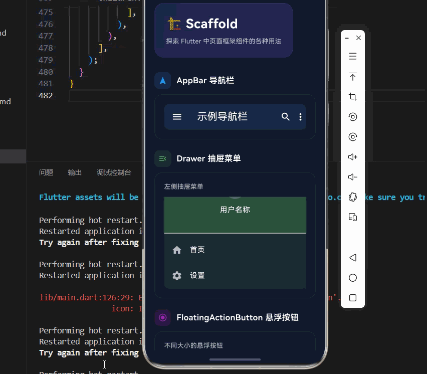
Widget _buildAppBarPreview() {
return Container(
decoration: BoxDecoration(
color: Colors.blue.withOpacity(0.1),
borderRadius: BorderRadius.circular(12),
),
child: AppBar(
backgroundColor: Colors.transparent,
elevation: 0,
leading: const Icon(Icons.menu, color: Colors.white),
title: const Text('示例导航栏'),
actions: const [
Icon(Icons.search, color: Colors.white),
SizedBox(width: 8),
Icon(Icons.more_vert, color: Colors.white),
],
),
);
}
Widget _buildDrawerPreview() {
return Column(
crossAxisAlignment: CrossAxisAlignment.start,
children: [
Text(
'左侧抽屉菜单',
style: TextStyle(
fontSize: 14,
color: Colors.white.withOpacity(0.7),
),
),
const SizedBox(height: 12),
Container(
height: 200,
decoration: BoxDecoration(
color: Colors.green.withOpacity(0.1),
borderRadius: BorderRadius.circular(12),
),
child: ListView(
padding: EdgeInsets.zero,
children: [
DrawerHeader(
decoration: BoxDecoration(
color: Colors.green.withOpacity(0.3),
),
child: Column(
mainAxisAlignment: MainAxisAlignment.center,
children: [
CircleAvatar(
backgroundColor: Colors.white.withOpacity(0.2),
child: const Icon(Icons.person, color: Colors.white),
),
const SizedBox(height: 12),
const Text(
'用户名称',
style: TextStyle(color: Colors.white),
),
],
),
),
ListTile(
leading: const Icon(Icons.home, color: Colors.white70),
title: const Text('首页', style: TextStyle(color: Colors.white)),
),
ListTile(
leading: const Icon(Icons.settings, color: Colors.white70),
title: const Text('设置', style: TextStyle(color: Colors.white)),
),
],
),
),
],
);
}
Widget _buildFABPreview() {
return Column(
crossAxisAlignment: CrossAxisAlignment.start,
children: [
Text(
'不同大小的悬浮按钮',
style: TextStyle(
fontSize: 14,
color: Colors.white.withOpacity(0.7),
),
),
const SizedBox(height: 16),
Row(
mainAxisAlignment: MainAxisAlignment.spaceEvenly,
children: [
FloatingActionButton.small(
heroTag: 'small',
onPressed: () {},
backgroundColor: Colors.purple.withOpacity(0.3),
child: const Icon(Icons.add, size: 20),
),
FloatingActionButton(
heroTag: 'normal',
onPressed: () {},
backgroundColor: Colors.purple.withOpacity(0.3),
child: const Icon(Icons.add),
),
FloatingActionButton.large(
heroTag: 'large',
onPressed: () {},
backgroundColor: Colors.purple.withOpacity(0.3),
child: const Icon(Icons.add),
),
],
),
],
);
}
Widget _buildBottomNavPreview() {
return Column(
crossAxisAlignment: CrossAxisAlignment.start,
children: [
Text(
'底部导航栏',
style: TextStyle(
fontSize: 14,
color: Colors.white.withOpacity(0.7),
),
),
const SizedBox(height: 16),
Container(
decoration: BoxDecoration(
color: Colors.orange.withOpacity(0.1),
borderRadius: BorderRadius.circular(12),
),
child: BottomNavigationBar(
backgroundColor: Colors.transparent,
selectedItemColor: Colors.orange,
unselectedItemColor: Colors.white70,
items: const [
BottomNavigationBarItem(
icon: Icon(Icons.home),
label: '首页',
),
BottomNavigationBarItem(
icon: Icon(Icons.explore),
label: '发现',
),
BottomNavigationBarItem(
icon: Icon(Icons.person),
label: '我的',
),
],
),
),
],
);
}
Widget _buildSnackBarPreview() {
return Center(
child: ElevatedButton.icon(
onPressed: () {},
icon: const Icon(Icons.message),
label: const Text('显示 SnackBar'),
style: ElevatedButton.styleFrom(
backgroundColor: Colors.pink.withOpacity(0.3),
),
),
);
}
Widget _buildMainPagePreview() {
return Column(
crossAxisAlignment: CrossAxisAlignment.start,
children: [
Text(
'完整页面结构示例',
style: TextStyle(
fontSize: 14,
color: Colors.white.withOpacity(0.7),
),
),
const SizedBox(height: 12),
Container(
decoration: BoxDecoration(
gradient: const LinearGradient(
colors: [Color(0xFF6366F1), Color(0xFF8B5CF6)],
),
borderRadius: BorderRadius.circular(16),
),
child: Column(
children: [
// 模拟 AppBar
Container(
padding: const EdgeInsets.all(16),
child: Row(
children: const [
Icon(Icons.menu, color: Colors.white),
SizedBox(width: 16),
Text(
'应用首页',
style: TextStyle(
color: Colors.white,
fontSize: 18,
fontWeight: FontWeight.bold,
),
),
],
),
),
// 模拟内容
Padding(
padding: const EdgeInsets.all(16),
child: Column(
children: [
Container(
height: 80,
decoration: BoxDecoration(
color: Colors.white.withOpacity(0.1),
borderRadius: BorderRadius.circular(12),
),
child: const Center(
child: Text(
'内容区域',
style: TextStyle(color: Colors.white),
),
),
),
const SizedBox(height: 12),
Container(
height: 80,
decoration: BoxDecoration(
color: Colors.white.withOpacity(0.1),
borderRadius: BorderRadius.circular(12),
),
child: const Center(
child: Text(
'内容区域',
style: TextStyle(color: Colors.white),
),
),
),
],
),
),
// 模拟底部导航
Container(
padding: const EdgeInsets.symmetric(vertical: 8),
decoration: BoxDecoration(
color: Colors.black.withOpacity(0.2),
),
child: Row(
mainAxisAlignment: MainAxisAlignment.spaceEvenly,
children: const [
Icon(Icons.home, color: Colors.white70),
Icon(Icons.explore, color: Colors.white70),
Icon(Icons.person, color: Colors.white70),
],
),
),
],
),
),
],
);
}
}十一、总结
Scaffold 是 Flutter 中构建 Material Design 页面的核心组件,掌握它的各种用法对于开发完整的移动应用至关重要。
🎯 核心要点
- 完整页面框架:提供 AppBar、Drawer、BottomNavigationBar 等页面元素
- 自动安全区域:自动处理刘海屏等安全区域问题
- 悬浮按钮:支持不同大小和位置的 FloatingActionButton
- 消息提示:使用 SnackBar 显示轻量级消息
- 灵活组合:可以根据需求选择需要的页面元素
- Material Design:遵循设计规范,提供一致的用户体验
📚 使用建议
| 页面类型 | 推荐配置 |
|---|---|
| 主页面 | AppBar + Drawer + BottomNavigationBar + FAB |
| 详情页 | AppBar(带返回按钮)+ Body |
| 表单页 | AppBar + Body + resizeToAvoidBottomInset |
| 列表页 | AppBar + ListView + FAB |
| 设置页 | AppBar + ListView(separated) |
| 对话框 | 无 AppBar + 自定义布局 |
💡 最佳实践:Scaffold 是每个页面的基础框架,合理使用它提供的各种元素可以快速构建出符合 Material Design 规范的页面。根据页面类型选择合适的配置,避免不必要的元素,保持页面的简洁和一致性。通过 Scaffold 的组合使用,可以轻松构建出各种复杂的页面结构。