欢迎加入开源鸿蒙跨平台社区:https://openharmonycrossplatform.csdn.net
🎯 欢迎来到 Flutter for OpenHarmony 社区!本文将深入讲解 Flutter 中 Slider 滑块组件的使用方法,带你从基础到精通,掌握这一常用的数值选择控件。
一、Slider 组件概述
在 Flutter for OpenHarmony 应用开发中,Slider(滑块)是一种用于选择连续数值的控件。用户可以通过拖动滑块在指定范围内选择一个数值,适用于音量调节、亮度调整、进度选择等场景。
📋 Slider 组件特点
| 特点 | 说明 |
|---|---|
| 连续数值 | 选择一个范围内的连续数值 |
| 视觉反馈 | 实时显示当前选择的数值 |
| 可定制 | 支持自定义颜色、大小、分段等样式 |
| 触摸友好 | 提供较大的触摸区域,易于操作 |
| Material Design | 遵循 Material Design 规范 |
💡 使用场景:滑块组件常用于音量调节、亮度控制、进度选择、评分系统、数值范围选择等场景。
二、Slider 基础用法
Slider 组件的使用非常直观,但要想用得好,需要理解其核心参数和交互逻辑。让我们从最简单的用法开始,逐步深入。
2.1 最简单的 Slider
最基础的 Slider 只需要两个参数:value(当前值)和 onChanged(值改变时的回调)。
dart
Slider(
  value: _currentValue,
  onChanged: (double value) {
    setState(() {
      _currentValue = value;
    });
  },
)
代码解析:
value:这是一个double类型的值,表示滑块的当前位置。默认情况下,值的范围是 0.0 到 1.0。onChanged:当用户拖动滑块时会触发的回调函数,接收新的值作为参数。setState:更新状态后调用setState来刷新界面,让滑块移动到新位置。
⚠️ 注意 :如果不调用
setState,滑块虽然会跟随手指移动,但松开后会立即弹回原位,因为状态没有真正更新。
2.2 完整示例
下面是一个完整的可运行示例,展示如何在实际应用中使用 Slider 组件:
dart
class SliderExample extends StatefulWidget {
  const SliderExample({super.key});

  @override
  State<SliderExample> createState() => _SliderExampleState();
}

class _SliderExampleState extends State<SliderExample> {
  double _currentValue = 0.5;

  @override
  Widget build(BuildContext context) {
    return Scaffold(
      appBar: AppBar(title: const Text('Slider 示例')),
      body: Center(
        child: Column(
          mainAxisAlignment: MainAxisAlignment.center,
          children: [
            Text(
              '当前值: ${_currentValue.toStringAsFixed(2)}',
              style: const TextStyle(fontSize: 24),
            ),
            const SizedBox(height: 32),
            Slider(
              value: _currentValue,
              onChanged: (double value) {
                setState(() {
                  _currentValue = value;
                });
              },
            ),
          ],
        ),
      ),
    );
  }
}
示例说明:
- 使用
Text组件实时显示滑块的当前值,让用户清楚看到选择的数值 toStringAsFixed(2)方法将数值格式化为保留两位小数的字符串- 滑块的默认范围是 0.0 到 1.0,可以通过
min和max属性调整
💡 用户体验建议:在实际应用中,最好在滑块附近显示当前值,这样用户可以精确了解自己的选择。
三、Slider 常用属性
Slider 组件提供了丰富的属性,让我们可以根据实际需求定制滑块的外观和行为。掌握这些属性,你就能创建出符合应用设计风格的滑块控件。
3.1 value - 当前值
控制滑块的当前位置,取值范围在 min 和 max 之间。
dart
Slider(
  value: 0.5,  // 中间位置
  onChanged: (value) {},
)
使用技巧:
value的值应该在min和max范围内,否则会抛出异常- 在实际应用中,
value通常来自状态变量或模型数据 - 如果需要初始化滑块到特定位置,可以在状态初始化时设置
value
3.2 min 和 max - 范围设置
设置滑块的取值范围,默认 min 为 0.0,max 为 1.0。
dart
Slider(
  value: _currentValue,
  min: 0,
  max: 100,
  onChanged: (value) {},
)
应用场景:
| 场景 | min | max | 说明 |
|---|---|---|---|
| 音量调节 | 0 | 100 | 0 表示静音,100 表示最大音量 |
| 亮度调整 | 0 | 100 | 0 表示最暗,100 表示最亮 |
| 温度控制 | 16 | 30 | 空调温度范围 |
| 评分系统 | 1 | 5 | 1 星到 5 星评分 |
3.3 onChanged - 值改变回调
当用户拖动滑块时触发,接收新值作为参数。设为 null 时滑块禁用。
dart
Slider(
  value: _currentValue,
  onChanged: (double value) {
    print('滑块值变为: $value');
    setState(() {
      _currentValue = value;
    });
  },
)
深入理解:
onChanged回调在拖动过程中会持续触发,实现实时反馈- 除了更新状态,你还可以在这里执行其他逻辑,如播放音效、发送网络请求等
- 如果需要区分"拖动开始"、"拖动中"、"拖动结束",可以使用
SliderTheme或自定义实现
3.4 activeColor - 激活部分颜色
设置滑块激活部分(已选择部分)的颜色。
dart
Slider(
  value: _currentValue,
  activeColor: Colors.blue,
  onChanged: (value) {},
)
设计建议:
- 使用应用的主题色作为激活颜色,保持界面风格统一
- 可以根据滑块的功能选择不同的颜色(例如:音量用蓝色,温度用橙色)
- 确保颜色与背景有足够的对比度,保证可读性
3.5 inactiveColor - 未激活部分颜色
设置滑块未激活部分(未选择部分)的颜色。
dart
Slider(
  value: _currentValue,
  inactiveColor: Colors.grey.withOpacity(0.3),
  onChanged: (value) {},
)
视觉效果技巧:
- 通常使用中性色或激活色的浅色版本
- 透明度设置在 0.2-0.4 之间,既不干扰视觉又能清晰区分
- 避免使用过于鲜艳的颜色,以免分散用户注意力
3.6 label - 浮动标签
显示在滑块上方的浮动标签,通常用于显示当前值。
dart
Slider(
  value: _currentValue,
  label: _currentValue.round().toString(),
  onChanged: (value) {},
)
使用场景:
- 当用户拖动滑块时,浮动标签会自动显示,帮助用户精确控制
- 标签内容可以是数值、百分比、或其他描述性文字
- 注意不要在标签中显示过长的文字,以免影响视觉效果
3.7 divisions - 分段数量
将滑块分成离散的段数,使滑块只能停在指定的位置上。这非常适合需要精确控制整数值的场景。
dart
Slider(
  value: _currentValue,
  min: 0,
  max: 100,
  divisions: 10,  // 分成10段,每段10
  label: _currentValue.round().toString(),
  onChanged: (value) {},
)
计算方式:
divisions= 最大值 - 最小值,每段跨度 = (max - min) / divisions- 例如:min=0, max=100, divisions=10,则滑块只能停在 0, 10, 20...100 这些位置
- 配合
label使用,可以清晰地显示每个分段的值
📊 Slider 属性速查表
| 属性 | 类型 | 默认值 | 说明 |
|---|---|---|---|
value |
double | - | 当前滑块值(必填) |
min |
double | 0.0 | 最小值 |
max |
double | 1.0 | 最大值 |
onChanged |
ValueChanged? | - | 值改变回调 |
activeColor |
Color? | - | 激活部分颜色 |
inactiveColor |
Color? | - | 未激活部分颜色 |
label |
String? | - | 浮动标签文本 |
divisions |
int? | - | 分段数量 |
thumbColor |
Color? | - | 滑块按钮颜色 |
四、Slider 禁用状态
将 onChanged 设为 null 即可禁用滑块,禁用后用户无法拖动。
dart
Column(
  children: [
    Slider(
      value: 0.5,
      onChanged: (value) {},  // 可用状态
    ),
    const SizedBox(height: 32),
    Slider(
      value: 0.7,
      onChanged: null,  // 禁用状态
    ),
  ],
)
💡 小贴士:禁用状态的滑块通常显示为灰色,视觉上明确告知用户该控件当前不可用。
五、Slider 配合数值显示
5.1 基础数值显示
dart
Column(
  children: [
    Text(
      '音量: ${(_volume * 100).toInt()}%',
      style: const TextStyle(fontSize: 20),
    ),
    Slider(
      value: _volume,
      onChanged: (value) {
        setState(() {
          _volume = value;
        });
      },
    ),
  ],
)
5.2 分段滑块
dart
Column(
  children: [
    Text(
      '亮度: ${_brightness.round()}%',
      style: const TextStyle(fontSize: 20),
    ),
    Slider(
      value: _brightness,
      min: 0,
      max: 100,
      divisions: 20,  // 分成20段
      label: '${_brightness.round()}%',
      onChanged: (value) {
        setState(() {
          _brightness = value;
        });
      },
    ),
  ],
)
六、自定义 Slider 样式
6.1 主题色 Slider
dart
Slider(
  value: _currentValue,
  activeColor: Colors.blue,
  inactiveColor: Colors.grey.withOpacity(0.3),
  thumbColor: Colors.blue,
  onChanged: (value) {},
)
6.2 渐变色效果
dart
SliderTheme(
  data: SliderThemeData(
    trackHeight: 4,
    thumbShape: const RoundSliderThumbShape(enabledThumbRadius: 12),
    overlayShape: const RoundSliderOverlayShape(overlayRadius: 24),
    activeTrackColor: Colors.blue,
    inactiveTrackColor: Colors.grey.withOpacity(0.3),
    thumbColor: Colors.blue,
    overlayColor: Colors.blue.withOpacity(0.2),
  ),
  child: Slider(
    value: _currentValue,
    onChanged: (value) {},
  ),
)
6.3 不同风格的滑块
dart
Column(
  children: [
    // 精细滑块
    SliderTheme(
      data: SliderThemeData(
        trackHeight: 2,
        thumbShape: const RoundSliderThumbShape(enabledThumbRadius: 8),
        overlayShape: const RoundSliderOverlayShape(overlayRadius: 16),
      ),
      child: Slider(
        value: _currentValue,
        onChanged: (value) {},
      ),
    ),
    const SizedBox(height: 32),
    // 粗壮滑块
    SliderTheme(
      data: SliderThemeData(
        trackHeight: 8,
        thumbShape: const RoundSliderThumbShape(enabledThumbRadius: 16),
        overlayShape: const RoundSliderOverlayShape(overlayRadius: 32),
      ),
      child: Slider(
        value: _currentValue,
        onChanged: (value) {},
      ),
    ),
  ],
)
七、RangeSlider 范围滑块
Flutter 还提供了 RangeSlider 组件,用于选择一个数值范围。
7.1 基础用法
dart
RangeValues _rangeValues = const RangeValues(0.3, 0.7);

RangeSlider(
  values: _rangeValues,
  min: 0,
  max: 1,
  onChanged: (RangeValues values) {
    setState(() {
      _rangeValues = values;
    });
  },
)
7.2 完整示例
dart
class RangeSliderExample extends StatefulWidget {
  const RangeSliderExample({super.key});

  @override
  State<RangeSliderExample> createState() => _RangeSliderExampleState();
}

class _RangeSliderExampleState extends State<RangeSliderExample> {
  RangeValues _rangeValues = const RangeValues(20, 80);

  @override
  Widget build(BuildContext context) {
    return Scaffold(
      appBar: AppBar(title: const Text('RangeSlider 示例')),
      body: Center(
        child: Column(
          mainAxisAlignment: MainAxisAlignment.center,
          children: [
            Text(
              '范围: ${_rangeValues.start.round()} - ${_rangeValues.end.round()}',
              style: const TextStyle(fontSize: 24),
            ),
            const SizedBox(height: 32),
            RangeSlider(
              values: _rangeValues,
              min: 0,
              max: 100,
              divisions: 20,
              labels: RangeLabels(
                _rangeValues.start.round().toString(),
                _rangeValues.end.round().toString(),
              ),
              onChanged: (RangeValues values) {
                setState(() {
                  _rangeValues = values;
                });
              },
            ),
          ],
        ),
      ),
    );
  }
}
八、实际应用场景
8.1 音量控制
dart
Card(
  margin: const EdgeInsets.all(16),
  child: Padding(
    padding: const EdgeInsets.all(20),
    child: Column(
      crossAxisAlignment: CrossAxisAlignment.start,
      children: [
        Row(
          children: [
            const Icon(Icons.volume_down, color: Colors.blue),
            const SizedBox(width: 12),
            const Text(
              '音量',
              style: TextStyle(
                fontSize: 18,
                fontWeight: FontWeight.bold,
              ),
            ),
            const Spacer(),
            Text(
              '${(_volume * 100).toInt()}%',
              style: const TextStyle(
                fontSize: 18,
                color: Colors.blue,
                fontWeight: FontWeight.bold,
              ),
            ),
          ],
        ),
        const SizedBox(height: 16),
        Slider(
          value: _volume,
          activeColor: Colors.blue,
          onChanged: (value) {
            setState(() {
              _volume = value;
            });
          },
        ),
      ],
    ),
  ),
)
8.2 亮度调节
dart
Card(
  margin: const EdgeInsets.all(16),
  child: Padding(
    padding: const EdgeInsets.all(20),
    child: Column(
      crossAxisAlignment: CrossAxisAlignment.start,
      children: [
        Row(
          children: [
            const Icon(Icons.brightness_5, color: Colors.amber),
            const SizedBox(width: 12),
            const Text(
              '亮度',
              style: TextStyle(
                fontSize: 18,
                fontWeight: FontWeight.bold,
              ),
            ),
            const Spacer(),
            Text(
              '${_brightness.round()}%',
              style: const TextStyle(
                fontSize: 18,
                color: Colors.amber,
                fontWeight: FontWeight.bold,
              ),
            ),
          ],
        ),
        const SizedBox(height: 16),
        Slider(
          value: _brightness,
          min: 0,
          max: 100,
          divisions: 20,
          label: '${_brightness.round()}%',
          activeColor: Colors.amber,
          onChanged: (value) {
            setState(() {
              _brightness = value;
            });
          },
        ),
      ],
    ),
  ),
)
8.3 价格范围选择
dart
Card(
  margin: const EdgeInsets.all(16),
  child: Padding(
    padding: const EdgeInsets.all(20),
    child: Column(
      crossAxisAlignment: CrossAxisAlignment.start,
      children: [
        Row(
          children: [
            const Icon(Icons.attach_money, color: Colors.green),
            const SizedBox(width: 12),
            const Text(
              '价格范围',
              style: TextStyle(
                fontSize: 18,
                fontWeight: FontWeight.bold,
              ),
            ),
            const Spacer(),
            Text(
              '¥${_priceRange.start.round()} - ¥${_priceRange.end.round()}',
              style: const TextStyle(
                fontSize: 16,
                color: Colors.green,
                fontWeight: FontWeight.bold,
              ),
            ),
          ],
        ),
        const SizedBox(height: 16),
        RangeSlider(
          values: _priceRange,
          min: 0,
          max: 1000,
          divisions: 20,
          labels: RangeLabels(
            '¥${_priceRange.start.round()}',
            '¥${_priceRange.end.round()}',
          ),
          activeColor: Colors.green,
          onChanged: (values) {
            setState(() {
              _priceRange = values;
            });
          },
        ),
      ],
    ),
  ),
)
8.4 评分系统
dart
Card(
margin: const EdgeInsets.all(16),
child: Padding(
padding: const EdgeInsets.all(20),
child: Column(
crossAxisAlignment: CrossAxisAlignment.start,
children: [
Row(
children: [
const Icon(Icons.star, color: Colors.orange),
const SizedBox(width: 12),
const Text(
'评分',
style: TextStyle(
fontSize: 18,
fontWeight: FontWeight.bold,
),
),
const Spacer(),
Text(
'${_rating.round()} / 10',
style: const TextStyle(
fontSize: 18,
color: Colors.orange,
fontWeight: FontWeight.bold,
),
),
],
),
const SizedBox(height: 16),
Slider(
value: _rating,
min: 0,
max: 10,
divisions: 10,
label: '${_rating.round()}',
activeColor: Colors.orange,
onChanged: (value) {
setState(() {
_rating = value;
});
},
),
const SizedBox(height: 8),
Text(
_getRatingText(_rating),
style: TextStyle(
fontSize: 14,
color: Colors.white.withOpacity(0.7),
),
),
],
),
),
)
String _getRatingText(double rating) {
if (rating < 3) return '需要改进';
if (rating < 5) return '一般';
if (rating < 7) return '良好';
if (rating < 9) return '优秀';
return '完美';
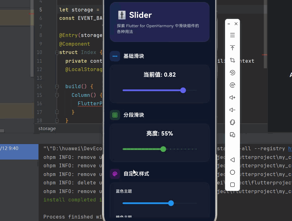
}九、完整示例代码
下面是一个完整的 Flutter 应用示例,展示 Slider 组件的各种用法。
dart
import 'package:flutter/material.dart';
void main() {
runApp(const SliderDemo());
}
class SliderDemo extends StatelessWidget {
const SliderDemo({super.key});
@override
Widget build(BuildContext context) {
return MaterialApp(
title: 'Slider 组件演示',
debugShowCheckedModeBanner: false,
theme: ThemeData(
colorScheme: ColorScheme.dark(
primary: const Color(0xFF6366F1),
secondary: const Color(0xFF8B5CF6),
surface: const Color(0xFF1E293B),
background: const Color(0xFF0F172A),
brightness: Brightness.dark,
),
useMaterial3: true,
),
home: const SliderPage(),
);
}
}
class SliderPage extends StatefulWidget {
const SliderPage({super.key});
@override
State<SliderPage> createState() => _SliderPageState();
}
class _SliderPageState extends State<SliderPage> {
double _currentValue = 0.5;
double _volume = 0.5;
double _brightness = 50;
RangeValues _priceRange = const RangeValues(200, 800);
double _rating = 7.0;
double _blueSlider = 0.5;
double _orangeSlider = 0.5;
double _pinkSlider = 0.5;
@override
Widget build(BuildContext context) {
return Scaffold(
backgroundColor: const Color(0xFF0F172A),
body: SafeArea(
child: SingleChildScrollView(
padding: const EdgeInsets.all(20),
child: Column(
crossAxisAlignment: CrossAxisAlignment.start,
children: [
// 标题区域
Container(
padding: const EdgeInsets.all(24),
decoration: BoxDecoration(
gradient: LinearGradient(
begin: Alignment.topLeft,
end: Alignment.bottomRight,
colors: [
const Color(0xFF6366F1).withOpacity(0.2),
const Color(0xFF8B5CF6).withOpacity(0.2),
],
),
borderRadius: BorderRadius.circular(20),
border: Border.all(
color: Colors.white.withOpacity(0.1),
),
),
child: Column(
crossAxisAlignment: CrossAxisAlignment.start,
children: [
const Text(
'🎚️ Slider',
style: TextStyle(
fontSize: 28,
fontWeight: FontWeight.bold,
color: Colors.white,
letterSpacing: 0.5,
),
),
const SizedBox(height: 8),
Text(
'探索 Flutter for OpenHarmony 中滑块组件的各种用法',
style: TextStyle(
fontSize: 14,
color: Colors.white.withOpacity(0.7),
height: 1.5,
),
),
],
),
),
const SizedBox(height: 32),
// 基础滑块
_buildSection(
title: '基础滑块',
icon: Icons.linear_scale,
color: Colors.blue,
child: _buildCard([
Text(
'当前值: ${_currentValue.toStringAsFixed(2)}',
style: const TextStyle(
fontSize: 20,
color: Colors.white,
fontWeight: FontWeight.bold,
),
),
const SizedBox(height: 16),
Slider(
value: _currentValue,
onChanged: (value) {
setState(() {
_currentValue = value;
});
},
),
]),
),
const SizedBox(height: 24),
// 分段滑块
_buildSection(
title: '分段滑块',
icon: Icons.grid_on,
color: Colors.green,
child: _buildCard([
Text(
'亮度: ${_brightness.round()}%',
style: const TextStyle(
fontSize: 20,
color: Colors.white,
fontWeight: FontWeight.bold,
),
),
const SizedBox(height: 16),
Slider(
value: _brightness,
min: 0,
max: 100,
divisions: 20,
label: '${_brightness.round()}%',
activeColor: Colors.green,
onChanged: (value) {
setState(() {
_brightness = value;
});
},
),
]),
),
const SizedBox(height: 24),
// 自定义样式
_buildSection(
title: '自定义样式',
icon: Icons.palette,
color: Colors.purple,
child: _buildCard([
_buildStyledSlider('蓝色主题', Colors.blue, _blueSlider),
const SizedBox(height: 16),
_buildStyledSlider('橙色主题', Colors.orange, _orangeSlider),
const SizedBox(height: 16),
_buildStyledSlider('粉色主题', Colors.pink, _pinkSlider),
]),
),
const SizedBox(height: 24),
// 音量控制
_buildSection(
title: '音量控制',
icon: Icons.volume_up,
color: Colors.cyan,
child: _buildCard([
Row(
children: [
const Icon(Icons.volume_down, color: Colors.cyan),
const SizedBox(width: 12),
const Text(
'音量',
style: TextStyle(
fontSize: 16,
color: Colors.white,
),
),
const Spacer(),
Text(
'${(_volume * 100).toInt()}%',
style: const TextStyle(
fontSize: 16,
color: Colors.cyan,
fontWeight: FontWeight.bold,
),
),
],
),
const SizedBox(height: 12),
Slider(
value: _volume,
activeColor: Colors.cyan,
onChanged: (value) {
setState(() {
_volume = value;
});
},
),
]),
),
const SizedBox(height: 24),
// 范围选择
_buildSection(
title: '价格范围',
icon: Icons.attach_money,
color: Colors.green,
child: _buildCard([
Row(
children: [
const Icon(Icons.attach_money, color: Colors.green),
const SizedBox(width: 12),
const Text(
'价格范围',
style: TextStyle(
fontSize: 16,
color: Colors.white,
),
),
const Spacer(),
Text(
'¥${_priceRange.start.round()} - ¥${_priceRange.end.round()}',
style: const TextStyle(
fontSize: 14,
color: Colors.green,
fontWeight: FontWeight.bold,
),
),
],
),
const SizedBox(height: 12),
RangeSlider(
values: _priceRange,
min: 0,
max: 1000,
divisions: 20,
activeColor: Colors.green,
onChanged: (values) {
setState(() {
_priceRange = values;
});
},
),
]),
),
const SizedBox(height: 24),
// 评分系统
_buildSection(
title: '评分系统',
icon: Icons.star,
color: Colors.amber,
child: _buildCard([
Row(
children: [
const Icon(Icons.star, color: Colors.amber),
const SizedBox(width: 12),
const Text(
'评分',
style: TextStyle(
fontSize: 16,
color: Colors.white,
),
),
const Spacer(),
Text(
'${_rating.round()} / 10',
style: const TextStyle(
fontSize: 16,
color: Colors.amber,
fontWeight: FontWeight.bold,
),
),
],
),
const SizedBox(height: 12),
Slider(
value: _rating,
min: 0,
max: 10,
divisions: 10,
label: '${_rating.round()}',
activeColor: Colors.amber,
onChanged: (value) {
setState(() {
_rating = value;
});
},
),
const SizedBox(height: 8),
Text(
_getRatingText(_rating),
style: TextStyle(
fontSize: 14,
color: Colors.white.withOpacity(0.7),
),
),
]),
),
const SizedBox(height: 80),
],
),
),
),
);
}
Widget _buildSection({
required String title,
required IconData icon,
required Color color,
required Widget child,
}) {
return Column(
crossAxisAlignment: CrossAxisAlignment.start,
children: [
Row(
children: [
Container(
padding: const EdgeInsets.all(8),
decoration: BoxDecoration(
color: color.withOpacity(0.2),
borderRadius: BorderRadius.circular(10),
),
child: Icon(icon, color: color, size: 20),
),
const SizedBox(width: 12),
Text(
title,
style: const TextStyle(
fontSize: 18,
fontWeight: FontWeight.w600,
color: Colors.white,
),
),
],
),
const SizedBox(height: 12),
child,
],
);
}
Widget _buildCard(List<Widget> children) {
return Container(
width: double.infinity,
padding: const EdgeInsets.all(20),
decoration: BoxDecoration(
color: Colors.white.withOpacity(0.03),
borderRadius: BorderRadius.circular(16),
border: Border.all(
color: Colors.white.withOpacity(0.05),
),
),
child: Column(
children: children,
),
);
}
Widget _buildStyledSlider(String label, Color color, double value) {
return Column(
crossAxisAlignment: CrossAxisAlignment.start,
children: [
Text(
label,
style: const TextStyle(
fontSize: 14,
color: Colors.white,
),
),
const SizedBox(height: 8),
Slider(
value: value,
activeColor: color,
onChanged: (val) {
setState(() {
if (label == '蓝色主题') {
_blueSlider = val;
} else if (label == '橙色主题') {
_orangeSlider = val;
} else if (label == '粉色主题') {
_pinkSlider = val;
}
});
},
),
],
);
}
String _getRatingText(double rating) {
if (rating < 3) return '需要改进';
if (rating < 5) return '一般';
if (rating < 7) return '良好';
if (rating < 9) return '优秀';
return '完美';
}
}十、总结
Slider 是 Flutter for OpenHarmony 中表示连续数值选择的强大组件,通过合理使用可以创建直观易用的数值输入界面。
🎯 核心要点
- 基础用法 :
value控制位置,onChanged响应变化 - 范围设置 :通过
min和max设置取值范围 - 分段控制 :使用
divisions创建离散的分段滑块 - 样式定制:通过颜色属性和 SliderTheme 自定义外观
- 范围选择:使用 RangeSlider 选择数值范围
- 最佳实践:为滑块添加清晰的数值显示和标签
📚 使用建议
| 场景 | 推荐方案 |
|---|---|
| 音量控制 | 配合图标和百分比显示 |
| 亮度调节 | 使用分段滑块,显示百分比 |
| 价格范围 | 使用 RangeSlider 选择范围 |
| 评分系统 | 分段滑块配合文字描述 |
掌握 Slider 组件后,你可以轻松创建专业的数值选择界面,为用户提供流畅直观的数值输入体验。