欢迎加入开源鸿蒙跨平台社区:https://openharmonycrossplatform.csdn.net
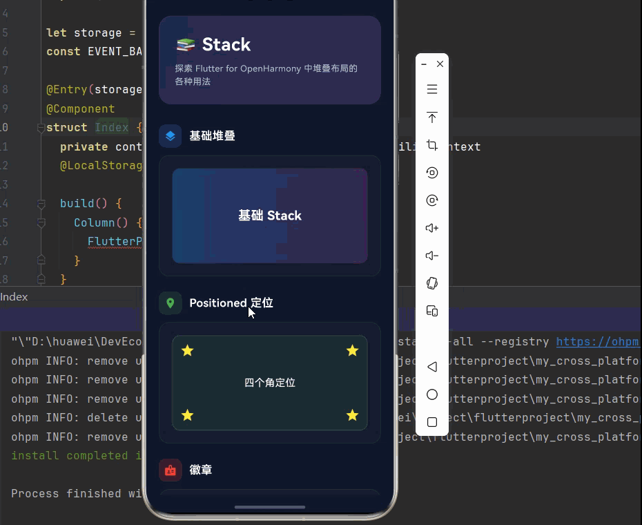
🎯 欢迎来到 Flutter for OpenHarmony 社区!本文将深入讲解 Flutter 中 Stack 堆叠布局的使用方法,带你从基础到精通,掌握这一强大的层叠布局组件。
一、Stack 组件概述
在 Flutter for OpenHarmony 应用开发中,Stack(堆叠布局)是一种允许子组件相互重叠的布局方式。与 Row 和 Column 不同,Stack 中的子组件按照从后到前的顺序堆叠,后面的子组件会覆盖在前面的子组件之上。
📋 Stack 组件特点
| 特点 | 说明 |
|---|---|
| 层叠布局 | 子组件可以相互重叠 |
| 位置控制 | 通过 Positioned 控制子组件位置 |
| 灵活布局 | 适用于复杂界面布局 |
| 性能优良 | 高效的布局计算 |
| 适应性强 | 支持多种对齐方式 |
💡 使用场景:Stack 常用于创建覆盖层、徽章、背景装饰、悬浮按钮、复杂卡片、图片叠加等场景。
二、Stack 基础用法
Stack 布局的核心思想是"层叠",这与 Row 和 Column 的"排列"截然不同。理解层叠的概念,是掌握 Stack 的关键。
2.1 最简单的 Stack
最基础的 Stack 只需要传入子组件列表,所有子组件默认在左上角对齐并层叠。
dart
Stack(
  children: const [
    // 底层
    Container(
      width: 200,
      height: 200,
      color: Colors.blue,
    ),
    // 顶层
    Container(
      width: 100,
      height: 100,
      color: Colors.red,
    ),
  ],
)
层叠原理:
- 子组件按照
children列表的顺序从后向前堆叠 - 第一个子组件在最底层,最后一个子组件在最顶层
- 如果子组件没有指定位置,默认都堆叠在左上角
- 后面的子组件会覆盖前面的子组件
⚠️ 注意:Stack 默认会尽可能大,如果 Stack 本身没有约束,子组件可能无法正确显示。建议将 Stack 放在有约束的容器中(如 Container、SizedBox)。
2.2 完整示例
下面是一个完整的可运行示例,展示如何在实际应用中使用 Stack 组件:
dart
class StackExample extends StatelessWidget {
  const StackExample({super.key});

  @override
  Widget build(BuildContext context) {
    return Scaffold(
      appBar: AppBar(title: const Text('Stack 示例')),
      body: Center(
        child: Container(
          width: 300,
          height: 300,
          color: Colors.grey[200],
          child: Stack(
            children: [
              // 底层 - 背景图片
              Container(
                decoration: BoxDecoration(
                  gradient: LinearGradient(
                    colors: [Colors.blue, Colors.purple],
                  ),
                ),
              ),
              // 中层 - 文本
              const Center(
                child: Text(
                  'Stack',
                  style: TextStyle(
                    fontSize: 32,
                    color: Colors.white,
                    fontWeight: FontWeight.bold,
                  ),
                ),
              ),
              // 顶层 - 按钮
              Positioned(
                bottom: 20,
                right: 20,
                child: ElevatedButton(
                  onPressed: () {},
                  child: const Text('点击'),
                ),
              ),
            ],
          ),
        ),
      ),
    );
  }
}
三、Stack 常用属性
3.1 alignment - 对齐方式
控制未使用 Positioned 定位的子组件的对齐方式。
dart
Stack(
  alignment: Alignment.center,  // 居中对齐
  children: [
    Container(
      width: 200,
      height: 200,
      color: Colors.blue,
    ),
    Container(
      width: 100,
      height: 100,
      color: Colors.red,
    ),
  ],
)
常用的 Alignment 值:
| 值 | 说明 |
|---|---|
Alignment.topLeft |
左上角 |
Alignment.topCenter |
顶部居中 |
Alignment.topRight |
右上角 |
Alignment.centerLeft |
左侧居中 |
Alignment.center |
居中(默认) |
Alignment.centerRight |
右侧居中 |
Alignment.bottomLeft |
左下角 |
Alignment.bottomCenter |
底部居中 |
Alignment.bottomRight |
右下角 |
3.2 textDirection - 文本方向
控制子组件的排列方向,影响 Positioned 的定位基准。
dart
Stack(
  textDirection: TextDirection.ltr,
  children: const [
    // 子组件
  ],
)
3.3 fit - 适应方式
控制未使用 Positioned 定位的子组件如何适应 Stack 的大小。
dart
Stack(
  fit: StackFit.expand,  // 子组件扩展到 Stack 的大小
  children: [
    Container(
      color: Colors.blue,
    ),
  ],
)| 值 | 说明 |
|---|---|
StackFit.loose |
子组件保持自身大小(默认) |
StackFit.expand |
子组件扩展到 Stack 的大小 |
StackFit.passthrough |
子组件不受 Stack 约束 |
📊 Stack 属性速查表
| 属性 | 类型 | 默认值 | 说明 |
|---|---|---|---|
children |
List<Widget> |
\[\] | 子组件列表 |
alignment |
AlignmentGeometry | AlignmentDirectional.center | 对齐方式 |
textDirection |
TextDirection? | - | 文本方向 |
fit |
StackFit | StackFit.loose | 适应方式 |
clipBehavior |
Clip | Clip.none | 裁剪行为 |
四、Positioned 定位
Positioned 是 Stack 中最重要的组件,用于精确控制子组件的位置。
4.1 基础用法
dart
Stack(
  children: [
    const Positioned(
      left: 10,
      top: 10,
      child: Text('左上角'),
    ),
    const Positioned(
      right: 10,
      bottom: 10,
      child: Text('右下角'),
    ),
  ],
)
4.2 相对定位
dart
Stack(
  children: [
    Positioned.fill(
      child: Container(
        color: Colors.blue.withOpacity(0.3),
      ),
    ),
    const Positioned(
      left: 20,
      top: 20,
      right: 20,
      bottom: 20,
      child: Text('内边距 20'),
    ),
  ],
)
4.3 绝对定位
dart
Stack(
  children: [
    const Positioned(
      left: 0,
      top: 0,
      child: Icon(Icons.star, color: Colors.yellow),
    ),
    const Positioned(
      right: 0,
      top: 0,
      child: Icon(Icons.star, color: Colors.yellow),
    ),
  ],
)
📊 Positioned 属性速查表
| 属性 | 类型 | 说明 |
|---|---|---|
left |
double? | 距离左侧的距离 |
right |
double? | 距离右侧的距离 |
top |
double? | 距离顶部的距离 |
bottom |
double? | 距离底部的距离 |
width |
double? | 组件宽度 |
height |
double? | 组件高度 |
⚠️ 注意 :不能同时设置
left和right(或top和bottom)且不设置width(或height),否则会导致布局错误。
五、IndexedStack 索引堆叠
IndexedStack 是 Stack 的变体,只显示指定索引的子组件,其他子组件保持构建但不显示。
5.1 基础用法
dart
int _currentIndex = 0;

IndexedStack(
  index: _currentIndex,
  children: [
    Container(color: Colors.red, child: const Center(child: Text('页面1'))),
    Container(color: Colors.green, child: const Center(child: Text('页面2'))),
    Container(color: Colors.blue, child: const Center(child: Text('页面3'))),
  ],
)
5.2 完整示例
dart
class IndexedStackExample extends StatefulWidget {
  const IndexedStackExample({super.key});

  @override
  State<IndexedStackExample> createState() => _IndexedStackExampleState();
}

class _IndexedStackExampleState extends State<IndexedStackExample> {
  int _currentIndex = 0;

  @override
  Widget build(BuildContext context) {
    return Scaffold(
      appBar: AppBar(title: const Text('IndexedStack 示例')),
      body: IndexedStack(
        index: _currentIndex,
        children: [
          Container(
            color: Colors.red,
            child: const Center(child: Text('页面1', style: TextStyle(fontSize: 24))),
          ),
          Container(
            color: Colors.green,
            child: const Center(child: Text('页面2', style: TextStyle(fontSize: 24))),
          ),
          Container(
            color: Colors.blue,
            child: const Center(child: Text('页面3', style: TextStyle(fontSize: 24))),
          ),
        ],
      ),
      bottomNavigationBar: BottomNavigationBar(
        currentIndex: _currentIndex,
        onTap: (index) {
          setState(() {
            _currentIndex = index;
          });
        },
        items: const [
          BottomNavigationBarItem(icon: Icon(Icons.home), label: '页面1'),
          BottomNavigationBarItem(icon: Icon(Icons.search), label: '页面2'),
          BottomNavigationBarItem(icon: Icon(Icons.person), label: '页面3'),
        ],
      ),
    );
  }
}
六、实际应用场景
6.1 徽章(Badge)
dart
Stack(
  children: [
    IconButton(
      icon: const Icon(Icons.notifications),
      onPressed: () {},
    ),
    Positioned(
      right: 0,
      top: 0,
      child: Container(
        padding: const EdgeInsets.all(4),
        decoration: const BoxDecoration(
          color: Colors.red,
          shape: BoxShape.circle,
        ),
        child: const Text(
          '3',
          style: TextStyle(
            color: Colors.white,
            fontSize: 12,
          ),
        ),
      ),
    ),
  ],
)
6.2 卡片装饰
dart
Card(
  child: Stack(
    children: [
      // 内容
      Padding(
        padding: const EdgeInsets.all(16),
        child: Column(
          crossAxisAlignment: CrossAxisAlignment.start,
          children: [
            Container(
              width: double.infinity,
              height: 150,
              decoration: BoxDecoration(
                color: Colors.grey[300],
                borderRadius: BorderRadius.circular(8),
              ),
            ),
            const SizedBox(height: 12),
            const Text(
              '卡片标题',
              style: TextStyle(
                fontSize: 18,
                fontWeight: FontWeight.bold,
              ),
            ),
            const SizedBox(height: 8),
            Text(
              '卡片描述内容',
              style: TextStyle(
                color: Colors.grey[600],
              ),
            ),
          ],
        ),
      ),
      // 角标
      Positioned(
        top: 12,
        right: 12,
        child: Container(
          padding: const EdgeInsets.symmetric(horizontal: 8, vertical: 4),
          decoration: BoxDecoration(
            color: Colors.blue,
            borderRadius: BorderRadius.circular(12),
          ),
          child: const Text(
            '推荐',
            style: TextStyle(
              color: Colors.white,
              fontSize: 12,
            ),
          ),
        ),
      ),
    ],
  ),
)
6.3 图片叠加
dart
Stack(
  children: [
    // 背景图片
    Container(
      width: 300,
      height: 200,
      decoration: BoxDecoration(
        gradient: LinearGradient(
          begin: Alignment.topCenter,
          end: Alignment.bottomCenter,
          colors: [
            Colors.blue.withOpacity(0.8),
            Colors.purple.withOpacity(0.8),
          ],
        ),
        borderRadius: BorderRadius.circular(12),
      ),
    ),
    // 渐变遮罩
    Positioned.fill(
      child: Container(
        decoration: BoxDecoration(
          gradient: LinearGradient(
            begin: Alignment.topCenter,
            end: Alignment.bottomCenter,
            colors: [
              Colors.transparent,
              Colors.black.withOpacity(0.7),
            ],
          ),
          borderRadius: BorderRadius.circular(12),
        ),
      ),
    ),
    // 文本内容
    Positioned(
      left: 16,
      right: 16,
      bottom: 16,
      child: Column(
        crossAxisAlignment: CrossAxisAlignment.start,
        children: const [
          Text(
            '图片标题',
            style: TextStyle(
              color: Colors.white,
              fontSize: 18,
              fontWeight: FontWeight.bold,
            ),
          ),
          SizedBox(height: 4),
          Text(
            '图片描述文字',
            style: TextStyle(
              color: Colors.white70,
              fontSize: 14,
            ),
          ),
        ],
      ),
    ),
  ],
)
6.4 悬浮按钮
dart
Stack(
  children: [
    // 主要内容
    Container(
      color: Colors.grey[200],
      child: const Center(child: Text('内容区域')),
    ),
    // 悬浮按钮
    Positioned(
      right: 16,
      bottom: 16,
      child: FloatingActionButton(
        onPressed: () {},
        child: const Icon(Icons.add),
      ),
    ),
  ],
)
七、完整示例代码
下面是一个完整的 Flutter 应用示例,展示 Stack 组件的各种用法。
dart
import 'package:flutter/material.dart';
void main() {
runApp(const StackDemo());
}
class StackDemo extends StatelessWidget {
const StackDemo({super.key});
@override
Widget build(BuildContext context) {
return MaterialApp(
title: 'Stack 组件演示',
debugShowCheckedModeBanner: false,
theme: ThemeData(
colorScheme: ColorScheme.dark(
primary: const Color(0xFF6366F1),
secondary: const Color(0xFF8B5CF6),
surface: const Color(0xFF1E293B),
background: const Color(0xFF0F172A),
brightness: Brightness.dark,
),
useMaterial3: true,
),
home: const StackPage(),
);
}
}
class StackPage extends StatelessWidget {
const StackPage({super.key});
@override
Widget build(BuildContext context) {
return Scaffold(
backgroundColor: const Color(0xFF0F172A),
body: SafeArea(
child: SingleChildScrollView(
padding: const EdgeInsets.all(20),
child: Column(
crossAxisAlignment: CrossAxisAlignment.start,
children: [
// 标题区域
Container(
padding: const EdgeInsets.all(24),
decoration: BoxDecoration(
gradient: LinearGradient(
begin: Alignment.topLeft,
end: Alignment.bottomRight,
colors: [
const Color(0xFF6366F1).withOpacity(0.2),
const Color(0xFF8B5CF6).withOpacity(0.2),
],
),
borderRadius: BorderRadius.circular(20),
border: Border.all(
color: Colors.white.withOpacity(0.1),
),
),
child: Column(
crossAxisAlignment: CrossAxisAlignment.start,
children: [
const Text(
'📚 Stack',
style: TextStyle(
fontSize: 28,
fontWeight: FontWeight.bold,
color: Colors.white,
letterSpacing: 0.5,
),
),
const SizedBox(height: 8),
Text(
'探索 Flutter for OpenHarmony 中堆叠布局的各种用法',
style: TextStyle(
fontSize: 14,
color: Colors.white.withOpacity(0.7),
height: 1.5,
),
),
],
),
),
const SizedBox(height: 32),
// 基础堆叠
_buildSection(
title: '基础堆叠',
icon: Icons.layers,
color: Colors.blue,
child: _buildCard([
SizedBox(
height: 150,
child: Stack(
children: [
Container(
decoration: BoxDecoration(
gradient: LinearGradient(
colors: [
Colors.blue.withOpacity(0.3),
Colors.purple.withOpacity(0.3),
],
),
borderRadius: BorderRadius.circular(12),
),
),
const Center(
child: Text(
'基础 Stack',
style: TextStyle(
fontSize: 20,
fontWeight: FontWeight.bold,
color: Colors.white,
),
),
),
],
),
),
]),
),
const SizedBox(height: 24),
// Positioned 定位
_buildSection(
title: 'Positioned 定位',
icon: Icons.place,
color: Colors.green,
child: _buildCard([
SizedBox(
height: 150,
child: Stack(
children: [
Container(
decoration: BoxDecoration(
color: Colors.green.withOpacity(0.1),
borderRadius: BorderRadius.circular(12),
border: Border.all(color: Colors.green.withOpacity(0.3)),
),
),
const Positioned(
left: 12,
top: 12,
child: Icon(Icons.star, color: Colors.yellow, size: 24),
),
const Positioned(
right: 12,
top: 12,
child: Icon(Icons.star, color: Colors.yellow, size: 24),
),
const Positioned(
left: 12,
bottom: 12,
child: Icon(Icons.star, color: Colors.yellow, size: 24),
),
const Positioned(
right: 12,
bottom: 12,
child: Icon(Icons.star, color: Colors.yellow, size: 24),
),
const Center(
child: Text(
'四个角定位',
style: TextStyle(
fontSize: 16,
color: Colors.white,
),
),
),
],
),
),
]),
),
const SizedBox(height: 24),
// 徽章
_buildSection(
title: '徽章',
icon: Icons.badge,
color: Colors.red,
child: _buildCard([
Row(
mainAxisAlignment: MainAxisAlignment.spaceEvenly,
children: [
_buildBadge(Icons.notifications, 3),
_buildBadge(Icons.mail, 99),
_buildBadge(Icons.shopping_cart, 5),
],
),
]),
),
const SizedBox(height: 24),
// 卡片装饰
_buildSection(
title: '卡片装饰',
icon: Icons.style,
color: Colors.purple,
child: _buildCard([
Stack(
children: [
Container(
height: 180,
decoration: BoxDecoration(
gradient: LinearGradient(
colors: [
Colors.purple.withOpacity(0.3),
Colors.pink.withOpacity(0.3),
],
),
borderRadius: BorderRadius.circular(12),
),
child: const Center(
child: Icon(Icons.image, size: 48, color: Colors.white54),
),
),
Positioned(
top: 12,
right: 12,
child: Container(
padding: const EdgeInsets.symmetric(horizontal: 10, vertical: 4),
decoration: BoxDecoration(
color: Colors.purple,
borderRadius: BorderRadius.circular(12),
),
child: const Text(
'推荐',
style: TextStyle(
color: Colors.white,
fontSize: 12,
fontWeight: FontWeight.bold,
),
),
),
),
Positioned(
left: 12,
right: 12,
bottom: 12,
child: Column(
crossAxisAlignment: CrossAxisAlignment.start,
children: [
const Text(
'精美图片',
style: TextStyle(
color: Colors.white,
fontSize: 18,
fontWeight: FontWeight.bold,
),
),
const SizedBox(height: 4),
Text(
'这是一张非常漂亮的图片',
style: TextStyle(
color: Colors.white.withOpacity(0.8),
fontSize: 14,
),
),
],
),
),
],
),
]),
),
const SizedBox(height: 24),
// 悬浮按钮
_buildSection(
title: '悬浮按钮',
icon: Icons.radio_button_checked,
color: Colors.cyan,
child: _buildCard([
SizedBox(
height: 150,
child: Stack(
children: [
Container(
decoration: BoxDecoration(
color: Colors.cyan.withOpacity(0.1),
borderRadius: BorderRadius.circular(12),
),
child: const Center(
child: Text(
'内容区域',
style: TextStyle(
fontSize: 16,
color: Colors.white,
),
),
),
),
Positioned(
right: 12,
bottom: 12,
child: Container(
width: 48,
height: 48,
decoration: BoxDecoration(
color: Colors.cyan,
borderRadius: BorderRadius.circular(24),
),
child: const Icon(Icons.add, color: Colors.white),
),
),
],
),
),
]),
),
const SizedBox(height: 24),
// 不同对齐方式
_buildSection(
title: '不同对齐方式',
icon: Icons.align_horizontal_left,
color: Colors.amber,
child: _buildCard([
Row(
mainAxisAlignment: MainAxisAlignment.spaceEvenly,
children: [
_buildAlignmentDemo('左上', Alignment.topLeft),
_buildAlignmentDemo('居中', Alignment.center),
_buildAlignmentDemo('右下', Alignment.bottomRight),
],
),
]),
),
const SizedBox(height: 80),
],
),
),
),
);
}
Widget _buildSection({
required String title,
required IconData icon,
required Color color,
required Widget child,
}) {
return Column(
crossAxisAlignment: CrossAxisAlignment.start,
children: [
Row(
children: [
Container(
padding: const EdgeInsets.all(8),
decoration: BoxDecoration(
color: color.withOpacity(0.2),
borderRadius: BorderRadius.circular(10),
),
child: Icon(icon, color: color, size: 20),
),
const SizedBox(width: 12),
Text(
title,
style: const TextStyle(
fontSize: 18,
fontWeight: FontWeight.w600,
color: Colors.white,
),
),
],
),
const SizedBox(height: 12),
child,
],
);
}
Widget _buildCard(List<Widget> children) {
return Container(
width: double.infinity,
padding: const EdgeInsets.all(20),
decoration: BoxDecoration(
color: Colors.white.withOpacity(0.03),
borderRadius: BorderRadius.circular(16),
border: Border.all(
color: Colors.white.withOpacity(0.05),
),
),
child: Column(
children: children,
),
);
}
Widget _buildBadge(IconData icon, int count) {
return Stack(
children: [
IconButton(
icon: Icon(icon),
onPressed: () {},
),
Positioned(
right: 0,
top: 0,
child: Container(
padding: const EdgeInsets.all(4),
decoration: const BoxDecoration(
color: Colors.red,
shape: BoxShape.circle,
),
child: Text(
count > 99 ? '99+' : count.toString(),
style: const TextStyle(
color: Colors.white,
fontSize: 10,
fontWeight: FontWeight.bold,
),
),
),
),
],
);
}
Widget _buildAlignmentDemo(String label, Alignment alignment) {
return Column(
children: [
Container(
width: 80,
height: 80,
decoration: BoxDecoration(
color: Colors.amber.withOpacity(0.1),
borderRadius: BorderRadius.circular(8),
border: Border.all(color: Colors.amber.withOpacity(0.3)),
),
child: Stack(
alignment: alignment,
children: [
Container(
width: 16,
height: 16,
decoration: BoxDecoration(
color: Colors.amber,
shape: BoxShape.circle,
),
),
],
),
),
const SizedBox(height: 8),
Text(
label,
style: TextStyle(
fontSize: 12,
color: Colors.white.withOpacity(0.7),
),
),
],
);
}
}八、总结
Stack 是 Flutter for OpenHarmony 中实现层叠布局的核心组件,通过合理使用可以创建丰富多样的界面效果。
🎯 核心要点
- 层叠布局:子组件可以相互重叠,从后到前堆叠
- Positioned 定位:精确控制子组件的位置
- alignment 对齐:控制未定位子组件的对齐方式
- IndexedStack:只显示指定索引的子组件
- 灵活应用:适用于徽章、装饰、悬浮等多种场景
📚 使用建议
| 场景 | 推荐方案 |
|---|---|
| 徽章提示 | Stack + Positioned |
| 卡片装饰 | Stack + Positioned.fill |
| 页面切换 | IndexedStack |
| 背景叠加 | Stack + Container |
| 悬浮元素 | Stack + Positioned |
掌握 Stack 组件后,你可以轻松创建复杂的层叠布局效果,为用户打造更加丰富的视觉体验。