欢迎加入开源鸿蒙跨平台社区:https://openharmonycrossplatform.csdn.net
🎯 欢迎来到 Flutter for OpenHarmony 社区!本文将深入讲解 Flutter 中 Chip 标签组件的使用方法,带你从基础到精通,掌握这一灵活的标签展示组件。
一、Chip 组件概述
在 Flutter for OpenHarmony 应用开发中,Chip(标签)是一种用于展示简短信息的组件,常用于表示类别、标签、选择状态等。Chip 组件设计遵循 Material Design 规范,提供多种变体以满足不同的使用场景。
📋 Chip 组件类型
| 类型 | 说明 | 适用场景 |
|---|---|---|
Chip |
基础标签 | 一般信息展示 |
InputChip |
输入标签 | 可删除、可选择的标签 |
ChoiceChip |
选择标签 | 单选场景 |
FilterChip |
过滤标签 | 多选过滤场景 |
ActionChip |
动作标签 | 触发操作 |
💡 使用场景:标签组件常用于分类展示、标签选择、过滤筛选、用户标签、状态标识等场景。
二、Chip 基础用法
Chip 组件的使用非常灵活,从简单的文本标签到复杂的交互式标签,都能轻松实现。让我们逐步学习各种用法。
2.1 最简单的 Chip
最基础的 Chip 只需要 label 参数。
dart
Chip(
  label: const Text('Flutter'),
)
使用建议:
- 最简单的 Chip 适合用于展示不需要交互的静态信息
- 文本内容尽量简短,保持标签的简洁性
- 在实际应用中,通常会配合其他属性来美化标签
2.2 带图标的 Chip
为标签添加图标或头像,可以增强视觉识别度,让标签更加醒目。
dart
Chip(
  avatar: const CircleAvatar(
    backgroundColor: Colors.blue,
    child: Icon(Icons.code, color: Colors.white),
  ),
  label: const Text('编程'),
)
设计技巧:
avatar可以是任何 Widget,通常使用CircleAvatar创建圆形图标- 图标的颜色应该与标签主题色保持一致,营造协调的视觉效果
- 图标大小建议在 16-24px 之间,避免过大或过小
2.3 可删除的 Chip
在标签管理、选择标签等场景中,用户可能需要删除标签。使用 onDeleted 回调可以轻松实现这个功能。
dart
Chip(
  label: const Text('可删除标签'),
  onDeleted: () {
    print('标签被删除');
  },
  deleteIcon: const Icon(Icons.close),
)
交互设计要点:
onDeleted回调中应该包含删除标签的逻辑,如更新状态、发送网络请求等- 可以通过
deleteIcon属性自定义删除图标 - 删除图标默认显示在标签右侧,点击即触发删除操作
💡 最佳实践:对于可删除的标签,建议添加确认机制(如弹窗),防止用户误删重要标签。
三、Chip 常用属性
Chip 组件提供了丰富的属性,让我们可以根据实际需求定制标签的外观和行为。
3.1 label - 标签内容
设置标签显示的主要文本内容。
dart
Chip(
  label: const Text('标签文本'),
)
使用技巧:
label接受任何 Widget,但通常使用Text组件- 文本内容应该简洁明了,避免过长的文字
- 可以使用
RichText创建包含多种样式的复杂文本
3.2 avatar - 前置图标
设置标签左侧显示的图标或头像。
dart
Chip(
  avatar: const CircleAvatar(
    child: Icon(Icons.favorite),
  ),
  label: const Text('收藏'),
)
应用场景:
| 场景 | avatar 类型 | 说明 |
|---|---|---|
| 用户标签 | CircleAvatar + 用户头像 | 展示用户信息 |
| 分类标签 | 图标 | 增强分类识别度 |
| 状态标签 | 状态图标 | 表示标签状态 |
3.3 labelStyle - 文本样式
自定义标签文本的样式。
dart
Chip(
  label: const Text('自定义样式'),
  labelStyle: const TextStyle(
    fontSize: 14,
    fontWeight: FontWeight.bold,
    color: Colors.white,
  ),
  backgroundColor: Colors.blue,
)
3.4 backgroundColor - 背景颜色
设置标签的背景颜色。
dart
Chip(
  label: const Text('蓝色标签'),
  backgroundColor: Colors.blue,
  labelStyle: const TextStyle(color: Colors.white),
)
3.5 padding - 内边距
设置标签内容的内边距。
dart
Chip(
  label: const Text('内边距'),
  padding: const EdgeInsets.symmetric(horizontal: 12, vertical: 8),
)
3.6 deleteIcon - 删除图标
设置删除按钮的图标。
dart
Chip(
  label: const Text('删除标签'),
  onDeleted: () {},
  deleteIcon: const Icon(Icons.cancel),
  deleteIconColor: Colors.red,
)
3.7 onDeleted - 删除回调
当用户点击删除按钮时触发。
dart
Chip(
  label: const Text('可删除'),
  onDeleted: () {
    print('标签被删除');
  },
)
📊 Chip 属性速查表
| 属性 | 类型 | 默认值 | 说明 |
|---|---|---|---|
label |
Widget | - | 标签内容(必填) |
avatar |
Widget? | - | 前置图标 |
labelStyle |
TextStyle? | - | 文本样式 |
backgroundColor |
Color? | - | 背景颜色 |
padding |
EdgeInsetsGeometry? | - | 内边距 |
deleteIcon |
Widget? | - | 删除图标 |
onDeleted |
VoidCallback? | - | 删除回调 |
shape |
ShapeBorder? | - | 形状 |
elevation |
double? | - | 阴影高度 |
四、InputChip 输入标签
InputChip 是一种可以表示输入内容的标签,支持删除和选择操作。
4.1 基础用法
dart
InputChip(
  label: const Text('Flutter'),
  onDeleted: () {
    print('删除 Flutter');
  },
  onSelected: (bool selected) {
    print('选择状态: $selected');
  },
  selected: _isSelected,
)
4.2 完整示例
dart
class InputChipExample extends StatefulWidget {
  const InputChipExample({super.key});

  @override
  State<InputChipExample> createState() => _InputChipExampleState();
}

class _InputChipExampleState extends State<InputChipExample> {
  final List<String> _chips = ['Flutter', 'Dart', 'Android', 'iOS'];
  final Set<String> _selectedChips = {};

  @override
  Widget build(BuildContext context) {
    return Scaffold(
      appBar: AppBar(title: const Text('InputChip 示例')),
      body: Padding(
        padding: const EdgeInsets.all(16),
        child: Wrap(
          spacing: 8,
          runSpacing: 8,
          children: _chips.map((chip) {
            return InputChip(
              label: Text(chip),
              selected: _selectedChips.contains(chip),
              onSelected: (selected) {
                setState(() {
                  if (selected) {
                    _selectedChips.add(chip);
                  } else {
                    _selectedChips.remove(chip);
                  }
                });
              },
              onDeleted: () {
                setState(() {
                  _chips.remove(chip);
                  _selectedChips.remove(chip);
                });
              },
              deleteIcon: const Icon(Icons.close),
            );
          }).toList(),
        ),
      ),
    );
  }
}
五、ChoiceChip 选择标签
ChoiceChip 用于表示单选场景,一次只能选择一个标签。
5.1 基础用法
dart
int _selectedIndex = 0;

final List<String> _choices = ['选项1', '选项2', '选项3'];

Wrap(
  spacing: 8,
  children: List.generate(_choices.length, (index) {
    return ChoiceChip(
      label: Text(_choices[index]),
      selected: _selectedIndex == index,
      onSelected: (selected) {
        if (selected) {
          setState(() {
            _selectedIndex = index;
          });
        }
      },
    );
  }),
)
5.2 完整示例
dart
class ChoiceChipExample extends StatefulWidget {
  const ChoiceChipExample({super.key});

  @override
  State<ChoiceChipExample> createState() => _ChoiceChipExampleState();
}

class _ChoiceChipExampleState extends State<ChoiceChipExample> {
  int _selectedSize = 1;
  final List<String> _sizes = ['S', 'M', 'L', 'XL'];

  @override
  Widget build(BuildContext context) {
    return Scaffold(
      appBar: AppBar(title: const Text('ChoiceChip 示例')),
      body: Center(
        child: Column(
          mainAxisAlignment: MainAxisAlignment.center,
          children: [
            const Text(
              '选择尺码',
              style: TextStyle(fontSize: 20),
            ),
            const SizedBox(height: 24),
            Wrap(
              spacing: 12,
              children: List.generate(_sizes.length, (index) {
                return ChoiceChip(
                  label: Text(_sizes[index]),
                  selected: _selectedSize == index,
                  selectedColor: Colors.purple.withOpacity(0.3),
                  onSelected: (selected) {
                    if (selected) {
                      setState(() {
                        _selectedSize = index;
                      });
                    }
                  },
                );
              }),
            ),
            const SizedBox(height: 24),
            Text(
              '已选择: ${_sizes[_selectedSize]}',
              style: const TextStyle(fontSize: 18),
            ),
          ],
        ),
      ),
    );
  }
}
六、FilterChip 过滤标签
FilterChip 用于表示多选过滤场景,可以同时选择多个标签。
6.1 基础用法
dart
final Set<String> _selectedFilters = {};

final List<String> _filters = ['科技', '体育', '娱乐', '财经'];

Wrap(
  spacing: 8,
  children: _filters.map((filter) {
    return FilterChip(
      label: Text(filter),
      selected: _selectedFilters.contains(filter),
      onSelected: (selected) {
        setState(() {
          if (selected) {
            _selectedFilters.add(filter);
          } else {
            _selectedFilters.remove(filter);
          }
        });
      },
    );
  }).toList(),
)
6.2 完整示例
dart
class FilterChipExample extends StatefulWidget {
  const FilterChipExample({super.key});

  @override
  State<FilterChipExample> createState() => _FilterChipExampleState();
}

class _FilterChipExampleState extends State<FilterChipExample> {
  final Set<String> _selectedCategories = {};
  final List<String> _categories = [
    'Flutter',
    'React',
    'Vue',
    'Angular',
    'Python',
    'Java',
  ];

  @override
  Widget build(BuildContext context) {
    return Scaffold(
      appBar: AppBar(title: const Text('FilterChip 示例')),
      body: Padding(
        padding: const EdgeInsets.all(16),
        child: Column(
          crossAxisAlignment: CrossAxisAlignment.start,
          children: [
            const Text(
              '选择技术栈',
              style: TextStyle(fontSize: 20, fontWeight: FontWeight.bold),
            ),
            const SizedBox(height: 16),
            Wrap(
              spacing: 8,
              runSpacing: 8,
              children: _categories.map((category) {
                return FilterChip(
                  label: Text(category),
                  selected: _selectedCategories.contains(category),
                  selectedColor: Colors.blue.withOpacity(0.3),
                  checkmarkColor: Colors.blue,
                  onSelected: (selected) {
                    setState(() {
                      if (selected) {
                        _selectedCategories.add(category);
                      } else {
                        _selectedCategories.remove(category);
                      }
                    });
                  },
                );
              }).toList(),
            ),
            const SizedBox(height: 24),
            if (_selectedCategories.isNotEmpty)
              Text(
                '已选择: ${_selectedCategories.join(', ')}',
                style: TextStyle(
                  fontSize: 16,
                  color: Colors.white.withOpacity(0.7),
                ),
              ),
          ],
        ),
      ),
    );
  }
}
七、ActionChip 动作标签
ActionChip 用于触发操作,点击后会执行相应的动作。
7.1 基础用法
dart
ActionChip(
  avatar: const Icon(Icons.play_arrow),
  label: const Text('播放'),
  onPressed: () {
    print('播放视频');
  },
)
7.2 完整示例
dart
class ActionChipExample extends StatelessWidget {
  const ActionChipExample({super.key});

  @override
  Widget build(BuildContext context) {
    return Scaffold(
      appBar: AppBar(title: const Text('ActionChip 示例')),
      body: Center(
        child: Column(
          mainAxisAlignment: MainAxisAlignment.center,
          children: [
            ActionChip(
              avatar: const Icon(Icons.share),
              label: const Text('分享'),
              onPressed: () {
                ScaffoldMessenger.of(context).showSnackBar(
                  const SnackBar(content: Text('分享成功')),
                );
              },
            ),
            const SizedBox(height: 16),
            ActionChip(
              avatar: const Icon(Icons.bookmark),
              label: const Text('收藏'),
              onPressed: () {
                ScaffoldMessenger.of(context).showSnackBar(
                  const SnackBar(content: Text('收藏成功')),
                );
              },
            ),
            const SizedBox(height: 16),
            ActionChip(
              avatar: const Icon(Icons.download),
              label: const Text('下载'),
              onPressed: () {
                ScaffoldMessenger.of(context).showSnackBar(
                  const SnackBar(content: Text('下载开始')),
                );
              },
            ),
          ],
        ),
      ),
    );
  }
}
八、自定义 Chip 样式
8.1 圆角标签
dart
Chip(
  label: const Text('圆角标签'),
  shape: RoundedRectangleBorder(
    borderRadius: BorderRadius.circular(20),
  ),
  backgroundColor: Colors.blue,
  labelStyle: const TextStyle(color: Colors.white),
)
8.2 边框标签
dart
Chip(
  label: const Text('边框标签'),
  shape: RoundedRectangleBorder(
    borderRadius: BorderRadius.circular(20),
    side: const BorderSide(color: Colors.blue, width: 2),
  ),
  backgroundColor: Colors.transparent,
  labelStyle: const TextStyle(color: Colors.blue),
)
8.3 渐变标签
dart
Container(
  decoration: BoxDecoration(
    gradient: const LinearGradient(
      colors: [Colors.blue, Colors.purple],
    ),
    borderRadius: BorderRadius.circular(20),
  ),
  child: Chip(
    label: const Text('渐变标签'),
    backgroundColor: Colors.transparent,
    labelStyle: const TextStyle(color: Colors.white),
    shape: RoundedRectangleBorder(
      borderRadius: BorderRadius.circular(20),
    ),
  ),
)
九、实际应用场景
9.1 标签云
dart
Card(
  margin: const EdgeInsets.all(16),
  child: Padding(
    padding: const EdgeInsets.all(16),
    child: Column(
      crossAxisAlignment: CrossAxisAlignment.start,
      children: [
        const Text(
          '热门标签',
          style: TextStyle(
            fontSize: 18,
            fontWeight: FontWeight.bold,
          ),
        ),
        const SizedBox(height: 16),
        Wrap(
          spacing: 8,
          runSpacing: 8,
          children: const [
            Chip(label: Text('Flutter')),
            Chip(label: Text('Dart')),
            Chip(label: Text('Android')),
            Chip(label: Text('iOS')),
            Chip(label: Text('Web')),
            Chip(label: Text('HarmonyOS')),
            Chip(label: Text('OpenHarmony')),
            Chip(label: Text('跨平台')),
          ],
        ),
      ],
    ),
  ),
)
9.2 分类筛选
dart
Card(
  margin: const EdgeInsets.all(16),
  child: Padding(
    padding: const EdgeInsets.all(16),
    child: Column(
      crossAxisAlignment: CrossAxisAlignment.start,
      children: [
        const Text(
          '分类筛选',
          style: TextStyle(
            fontSize: 18,
            fontWeight: FontWeight.bold,
          ),
        ),
        const SizedBox(height: 16),
        Wrap(
          spacing: 8,
          runSpacing: 8,
          children: _categories.map((category) {
            return FilterChip(
              label: Text(category),
              selected: _selectedCategories.contains(category),
              selectedColor: Colors.green.withOpacity(0.3),
              onSelected: (selected) {
                setState(() {
                  if (selected) {
                    _selectedCategories.add(category);
                  } else {
                    _selectedCategories.remove(category);
                  }
                });
              },
            );
          }).toList(),
        ),
      ],
    ),
  ),
)
9.3 用户标签
dart
Card(
  margin: const EdgeInsets.all(16),
  child: Padding(
    padding: const EdgeInsets.all(16),
    child: Column(
      crossAxisAlignment: CrossAxisAlignment.start,
      children: [
        Row(
          children: [
            const CircleAvatar(
              radius: 24,
              backgroundImage: NetworkImage('https://picsum.photos/100/100'),
            ),
            const SizedBox(width: 12),
            const Column(
              crossAxisAlignment: CrossAxisAlignment.start,
              children: [
                Text(
                  '张三',
                  style: TextStyle(
                    fontSize: 18,
                    fontWeight: FontWeight.bold,
                  ),
                ),
                Text(
                  '开发者',
                  style: TextStyle(
                    fontSize: 14,
                    color: Colors.grey,
                  ),
                ),
              ],
            ),
          ],
        ),
        const SizedBox(height: 16),
        Wrap(
          spacing: 8,
          runSpacing: 8,
          children: [
            Chip(
              avatar: const Icon(Icons.code, size: 16),
              label: const Text('Flutter'),
            ),
            Chip(
              avatar: const Icon(Icons.star, size: 16),
              label: const Text('MVP'),
            ),
            Chip(
              avatar: const Icon(Icons.location_on, size: 16),
              label: const Text('北京'),
            ),
          ],
        ),
      ],
    ),
  ),
)
十、完整示例代码
下面是一个完整的 Flutter 应用示例,展示 Chip 组件的各种用法。
dart
import 'package:flutter/material.dart';
void main() {
runApp(const ChipDemo());
}
class ChipDemo extends StatelessWidget {
const ChipDemo({super.key});
@override
Widget build(BuildContext context) {
return MaterialApp(
title: 'Chip 组件演示',
debugShowCheckedModeBanner: false,
theme: ThemeData(
colorScheme: ColorScheme.dark(
primary: const Color(0xFF6366F1),
secondary: const Color(0xFF8B5CF6),
surface: const Color(0xFF1E293B),
background: const Color(0xFF0F172A),
brightness: Brightness.dark,
),
useMaterial3: true,
),
home: const ChipPage(),
);
}
}
class ChipPage extends StatefulWidget {
const ChipPage({super.key});
@override
State<ChipPage> createState() => _ChipPageState();
}
class _ChipPageState extends State<ChipPage> {
final Set<String> _selectedCategories = {};
final List<String> _categories = [
'Flutter',
'Dart',
'Android',
'iOS',
'Web',
'HarmonyOS',
];
int _selectedSize = 1;
final List<String> _sizes = ['S', 'M', 'L', 'XL'];
final List<String> _deletableChips = ['标签1', '标签2', '标签3', '标签4', '标签5'];
@override
Widget build(BuildContext context) {
return Scaffold(
body: Container(
decoration: const BoxDecoration(
gradient: LinearGradient(
begin: Alignment.topCenter,
end: Alignment.bottomCenter,
colors: [
Color(0xFFE8F4FF),
Color(0xFFF8F9FF),
Color(0xFFE8F4FF),
],
),
),
child: SafeArea(
child: SingleChildScrollView(
padding: const EdgeInsets.all(20),
child: Column(
crossAxisAlignment: CrossAxisAlignment.start,
children: [
// 标题区域
Container(
padding: const EdgeInsets.all(24),
decoration: BoxDecoration(
gradient: const LinearGradient(
begin: Alignment.topLeft,
end: Alignment.bottomRight,
colors: [
Color(0xFF6366F1),
Color(0xFF8B5CF6),
Color(0xFFEC4899),
],
),
borderRadius: BorderRadius.circular(24),
boxShadow: [
BoxShadow(
color: const Color(0xFF6366F1).withOpacity(0.3),
blurRadius: 20,
offset: const Offset(0, 8),
),
],
),
child: Column(
crossAxisAlignment: CrossAxisAlignment.start,
children: [
Row(
children: [
Container(
padding: const EdgeInsets.all(12),
decoration: BoxDecoration(
color: Colors.white.withOpacity(0.2),
borderRadius: BorderRadius.circular(12),
),
child: const Icon(
Icons.label,
color: Colors.white,
size: 28,
),
),
const SizedBox(width: 16),
const Text(
'Chip',
style: TextStyle(
fontSize: 32,
fontWeight: FontWeight.bold,
color: Colors.white,
letterSpacing: 0.5,
),
),
],
),
const SizedBox(height: 12),
Text(
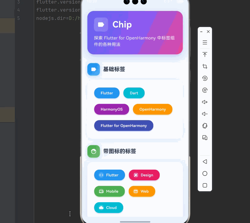
'探索 Flutter for OpenHarmony 中标签组件的各种用法',
style: TextStyle(
fontSize: 16,
color: Colors.white.withOpacity(0.9),
height: 1.5,
),
),
],
),
),
const SizedBox(height: 32),
// 基础标签
_buildSection(
title: '基础标签',
icon: Icons.label,
color: Colors.blue,
child: _buildCard([
Wrap(
spacing: 12,
runSpacing: 12,
children: [
_buildChipWithColor('Flutter', Colors.blue),
_buildChipWithColor('Dart', Colors.cyan),
_buildChipWithColor('HarmonyOS', Colors.purple),
_buildChipWithColor('OpenHarmony', Colors.orange),
_buildChipWithColor('Flutter for OpenHarmony', Colors.indigo),
],
),
]),
),
const SizedBox(height: 24),
// 带图标的标签
_buildSection(
title: '带图标的标签',
icon: Icons.face,
color: Colors.green,
child: _buildCard([
Wrap(
spacing: 12,
runSpacing: 12,
children: [
_buildChipWithIcon(Icons.code, 'Flutter', Colors.blue),
_buildChipWithIcon(Icons.design_services, 'Design', Colors.pink),
_buildChipWithIcon(Icons.devices, 'Mobile', Colors.green),
_buildChipWithIcon(Icons.web, 'Web', Colors.orange),
_buildChipWithIcon(Icons.cloud, 'Cloud', Colors.cyan),
],
),
]),
),
const SizedBox(height: 24),
// 可删除的标签
_buildSection(
title: '可删除的标签',
icon: Icons.delete,
color: Colors.red,
child: _buildCard([
_deletableChips.isEmpty
? const Text(
'所有标签已删除',
style: TextStyle(
fontSize: 14,
color: Color(0xFF64748B),
fontStyle: FontStyle.italic,
),
)
: Wrap(
spacing: 12,
runSpacing: 12,
children: _deletableChips
.map((label) => _buildDeletableChip(label))
.toList(),
),
]),
),
const SizedBox(height: 24),
// 选择标签
_buildSection(
title: '选择标签',
icon: Icons.check_circle,
color: Colors.purple,
child: _buildCard([
Column(
crossAxisAlignment: CrossAxisAlignment.start,
children: [
const Text(
'选择尺寸',
style: TextStyle(
fontSize: 16,
fontWeight: FontWeight.w600,
color: Color(0xFF1E293B),
),
),
const SizedBox(height: 12),
Wrap(
spacing: 12,
runSpacing: 12,
children: List.generate(_sizes.length, (index) {
return ChoiceChip(
label: Text(
_sizes[index],
style: TextStyle(
fontWeight: FontWeight.w600,
fontSize: 14,
color: _selectedSize == index
? Colors.white
: const Color(0xFF64748B),
),
),
selected: _selectedSize == index,
selectedColor: const Color(0xFF8B5CF6),
backgroundColor: const Color(0xFFF1F5F9),
side: BorderSide(
color: _selectedSize == index
? Colors.transparent
: const Color(0xFFE2E8F0),
width: 2,
),
padding: const EdgeInsets.symmetric(horizontal: 16, vertical: 10),
elevation: _selectedSize == index ? 2 : 0,
shadowColor: _selectedSize == index ? const Color(0xFF8B5CF6).withOpacity(0.4) : Colors.transparent,
shape: RoundedRectangleBorder(
borderRadius: BorderRadius.circular(20),
),
onSelected: (selected) {
if (selected) {
setState(() {
_selectedSize = index;
});
}
},
);
}),
),
const SizedBox(height: 12),
Text(
'已选择: ${_sizes[_selectedSize]}',
style: const TextStyle(
fontSize: 14,
color: Color(0xFF64748B),
),
),
],
),
]),
),
const SizedBox(height: 24),
// 过滤标签
_buildSection(
title: '过滤标签',
icon: Icons.filter_list,
color: Colors.amber,
child: _buildCard([
Column(
crossAxisAlignment: CrossAxisAlignment.start,
children: [
const Text(
'选择技术栈',
style: TextStyle(
fontSize: 16,
fontWeight: FontWeight.w600,
color: Color(0xFF1E293B),
),
),
const SizedBox(height: 12),
Wrap(
spacing: 12,
runSpacing: 12,
children: _categories.map((category) {
return FilterChip(
label: Text(
category,
style: TextStyle(
fontWeight: FontWeight.w600,
fontSize: 14,
color: _selectedCategories.contains(category)
? Colors.white
: const Color(0xFF64748B),
),
),
selected: _selectedCategories.contains(category),
selectedColor: const Color(0xFFF59E0B),
backgroundColor: const Color(0xFFF1F5F9),
side: BorderSide(
color: _selectedCategories.contains(category)
? Colors.transparent
: const Color(0xFFE2E8F0),
width: 2,
),
padding: const EdgeInsets.symmetric(horizontal: 16, vertical: 10),
elevation: _selectedCategories.contains(category) ? 2 : 0,
shadowColor: _selectedCategories.contains(category) ? const Color(0xFFF59E0B).withOpacity(0.4) : Colors.transparent,
shape: RoundedRectangleBorder(
borderRadius: BorderRadius.circular(20),
),
onSelected: (selected) {
setState(() {
if (selected) {
_selectedCategories.add(category);
} else {
_selectedCategories.remove(category);
}
});
},
);
}).toList(),
),
if (_selectedCategories.isNotEmpty) ...[
const SizedBox(height: 12),
Text(
'已选择: ${_selectedCategories.join(', ')}',
style: const TextStyle(
fontSize: 14,
color: Color(0xFF64748B),
),
),
],
],
),
]),
),
const SizedBox(height: 24),
// 动作标签
_buildSection(
title: '动作标签',
icon: Icons.touch_app,
color: Colors.cyan,
child: _buildCard([
Wrap(
spacing: 12,
runSpacing: 12,
children: [
ActionChip(
avatar: const Icon(Icons.share, size: 18, color: Colors.white),
label: const Text(
'分享',
style: TextStyle(
fontWeight: FontWeight.w600,
color: Colors.white,
fontSize: 14,
),
),
backgroundColor: const Color(0xFF06B6D4),
padding: const EdgeInsets.symmetric(horizontal: 16, vertical: 10),
elevation: 2,
shadowColor: const Color(0xFF06B6D4).withOpacity(0.4),
shape: RoundedRectangleBorder(
borderRadius: BorderRadius.circular(20),
),
onPressed: () {
ScaffoldMessenger.of(context).showSnackBar(
const SnackBar(
content: Text('分享成功'),
behavior: SnackBarBehavior.floating,
),
);
},
),
ActionChip(
avatar: const Icon(Icons.bookmark, size: 18, color: Colors.white),
label: const Text(
'收藏',
style: TextStyle(
fontWeight: FontWeight.w600,
color: Colors.white,
fontSize: 14,
),
),
backgroundColor: const Color(0xFFEC4899),
padding: const EdgeInsets.symmetric(horizontal: 16, vertical: 10),
elevation: 2,
shadowColor: const Color(0xFFEC4899).withOpacity(0.4),
shape: RoundedRectangleBorder(
borderRadius: BorderRadius.circular(20),
),
onPressed: () {
ScaffoldMessenger.of(context).showSnackBar(
const SnackBar(
content: Text('收藏成功'),
behavior: SnackBarBehavior.floating,
),
);
},
),
ActionChip(
avatar: const Icon(Icons.download, size: 18, color: Colors.white),
label: const Text(
'下载',
style: TextStyle(
fontWeight: FontWeight.w600,
color: Colors.white,
fontSize: 14,
),
),
backgroundColor: const Color(0xFF10B981),
padding: const EdgeInsets.symmetric(horizontal: 16, vertical: 10),
elevation: 2,
shadowColor: const Color(0xFF10B981).withOpacity(0.4),
shape: RoundedRectangleBorder(
borderRadius: BorderRadius.circular(20),
),
onPressed: () {
ScaffoldMessenger.of(context).showSnackBar(
const SnackBar(
content: Text('下载开始'),
behavior: SnackBarBehavior.floating,
),
);
},
), ],
),
]),
),
const SizedBox(height: 80),
],
),
),
),
),
);
}
Widget _buildSection({
required String title,
required IconData icon,
required Color color,
required Widget child,
}) {
return Column(
crossAxisAlignment: CrossAxisAlignment.start,
children: [
Row(
children: [
Container(
padding: const EdgeInsets.all(12),
decoration: BoxDecoration(
gradient: LinearGradient(
begin: Alignment.topLeft,
end: Alignment.bottomRight,
colors: [
color,
color.withOpacity(0.7),
],
),
borderRadius: BorderRadius.circular(14),
boxShadow: [
BoxShadow(
color: color.withOpacity(0.3),
blurRadius: 8,
offset: const Offset(0, 2),
),
],
),
child: Icon(icon, color: Colors.white, size: 22),
),
const SizedBox(width: 12),
Text(
title,
style: const TextStyle(
fontSize: 20,
fontWeight: FontWeight.w700,
color: Color(0xFF1E293B),
),
),
],
),
const SizedBox(height: 16),
child,
],
);
}
Widget _buildCard(List<Widget> children) {
return Container(
width: double.infinity,
padding: const EdgeInsets.all(24),
decoration: BoxDecoration(
color: Colors.white,
borderRadius: BorderRadius.circular(20),
boxShadow: [
BoxShadow(
color: Colors.black.withOpacity(0.05),
blurRadius: 20,
offset: const Offset(0, 4),
),
],
),
child: Column(
crossAxisAlignment: CrossAxisAlignment.start,
children: children,
),
);
}
Widget _buildChipWithColor(String label, Color color) {
return Chip(
label: Text(
label,
style: const TextStyle(
fontWeight: FontWeight.w600,
color: Colors.white,
fontSize: 14,
),
),
backgroundColor: color,
padding: const EdgeInsets.symmetric(horizontal: 16, vertical: 10),
elevation: 2,
shadowColor: color.withOpacity(0.4),
shape: RoundedRectangleBorder(
borderRadius: BorderRadius.circular(20),
),
);
}
Widget _buildChipWithIcon(IconData icon, String label, Color color) {
return Chip(
avatar: CircleAvatar(
backgroundColor: Colors.white.withOpacity(0.2),
child: Icon(icon, size: 16, color: Colors.white),
),
label: Text(
label,
style: const TextStyle(
fontWeight: FontWeight.w600,
color: Colors.white,
fontSize: 14,
),
),
backgroundColor: color,
padding: const EdgeInsets.symmetric(horizontal: 16, vertical: 10),
elevation: 2,
shadowColor: color.withOpacity(0.4),
shape: RoundedRectangleBorder(
borderRadius: BorderRadius.circular(20),
),
);
}
Widget _buildDeletableChip(String label) {
return Chip(
label: Text(
label,
style: const TextStyle(
fontWeight: FontWeight.w600,
color: Color(0xFFEF4444),
fontSize: 14,
),
),
onDeleted: () {
setState(() {
_deletableChips.remove(label);
});
ScaffoldMessenger.of(context).showSnackBar(
SnackBar(
content: Text('已删除: $label'),
behavior: SnackBarBehavior.floating,
backgroundColor: const Color(0xFFEF4444),
),
);
},
deleteIcon: const Icon(Icons.close, size: 20),
deleteIconColor: const Color(0xFFEF4444),
backgroundColor: const Color(0xFFFEE2E2),
side: const BorderSide(color: Color(0xFFFECACA), width: 2),
padding: const EdgeInsets.symmetric(horizontal: 16, vertical: 10),
elevation: 2,
shadowColor: const Color(0xFFEF4444).withOpacity(0.3),
shape: RoundedRectangleBorder(
borderRadius: BorderRadius.circular(20),
),
);
}
}十一、总结
Chip 是 Flutter for OpenHarmony 中展示简短信息的灵活组件,通过合理使用可以创建美观实用的标签展示界面。
🎯 核心要点
- 基础 Chip:简单的信息展示标签
- InputChip:可删除、可选择的输入标签
- ChoiceChip:单选场景的选择标签
- FilterChip:多选过滤场景的过滤标签
- ActionChip:触发操作的动作标签
- 样式定制:通过颜色、形状、图标等自定义外观
📚 使用建议
| 场景 | 推荐方案 |
|---|---|
| 信息展示 | 基础 Chip |
| 用户输入 | InputChip |
| 单选场景 | ChoiceChip |
| 多选过滤 | FilterChip |
| 操作触发 | ActionChip |
掌握 Chip 组件后,你可以轻松创建专业的标签展示界面,为用户提供清晰直观的信息分类和选择体验。