前言
饼状图是数据可视化信息传递的一种方式,凭借直观的占比呈现能力,在很多的场景下都会使用到,比如说统计分析、财务报告、业务监控等等;虽然说鸿蒙系统中没有原生的组件能够实现,但是也为我们提供了便捷的实现方式,那就是使用Canvas来自定义绘制。
本文会带着大家简单的实现绘制,并在最后为大家提供一个便捷的实现组件,我们先看一下,最终要实现的效果:
静态效果如下:
动态效果如下:
实现方式
既然自定义绘制,肯定会使用到Canvas,它是系统的画布组件,主要用于自定义绘制图形,除此之外,还需要用到CanvasRenderingContext2D对象,它相当于画笔,可以在Canvas画布组件上进行绘制,比如,绘制图形、文本、线段、图片等。
饼状图由两条直线和一条弧线构成,当两条直线完全重合时,若弧线覆盖整个圆周,则饼状图呈现为一个完整的圆形,大概可分为四步骤,首先是根据指定数组进行填装数据,并且计算出总量;接着根据当前分类的数据和总数据占比,计算出扇形的起始角度和终点角度;第三步则是根据扇形的起始角度和终点角度,以及对应的数据信息绘制扇形;最后就是根据扇形的起始角度和终点角度,以及对应的数据信息绘制折线和文字。
完整的简单饼状图绘制如下:
TypeScript
class SectorInfo {
  name: string = ''; // 名称
  data: number = 0; // 数据
  color: string = ''; // 颜色
  fontSize: number = 14; // 字体大小
  radius: number = 40; // 半径
}

@Entry
@Component
struct drawPieChart {
  @State sectorInfoArr: Array<SectorInfo> = [];
  @State @Watch('drawChart') isTypeChange: boolean = false;
  // 用来配置CanvasRenderingContext2D对象的参数,包括是否开启抗锯齿,true表明开启抗锯齿。
  private settings: RenderingContextSettings = new RenderingContextSettings(true);
  // 用来创建CanvasRenderingContext2D对象,通过在canvas中调用CanvasRenderingContext2D对象来绘制。
  private context: CanvasRenderingContext2D = new CanvasRenderingContext2D(this.settings);
  private centerX: number = 0;
  private centerY: number = 0;
  private radius: number = 40;
  private allData: number = 0; // 总数
  private maxData: number = 40; // 最大值
  private minData: number = 20; // 最小值

  // 绘制扇形
  drawSector(startAngle: number, endAngle: number, sectorInfo: SectorInfo) {
    this.context.beginPath();
    this.context.arc(this.centerX, this.centerY, sectorInfo.radius, startAngle, endAngle);
    this.context.lineWidth = sectorInfo.radius * 2;
    this.context.strokeStyle = sectorInfo.color;
    this.context.stroke();
    this.context.restore();
  }

  // 绘制折线和文字
  drawBrokenLineAndText(startAngle: number, endAngle: number, sectorInfo: SectorInfo) {
    let angle = endAngle - startAngle;
    let brokenLineLength: number = 20;
    let brokenLineLengthTemp: number = 15;
    // 计算扇形中心角度
    let centerAngle = startAngle + angle / 2;
    let r = sectorInfo.radius * 2 + brokenLineLength / 2;
    // 计算折线起始点
    let startX = this.centerX + (r - brokenLineLength) * Math.cos(centerAngle);
    let startY = this.centerY + (r - brokenLineLength) * Math.sin(centerAngle);
    // 计算折线转折点
    let brokenX = this.centerX + r * Math.cos(centerAngle);
    let brokenY = this.centerY + r * Math.sin(centerAngle);
    let endX = brokenX;
    let endY = brokenY;
    // 添加文字属性
    this.context.textBaseline = 'middle';
    this.context.fillStyle = sectorInfo.color;
    this.context.font = this.getUIContext().fp2px(sectorInfo.fontSize) + 'px sans-serif';
    // 获取文本
    let textWidth = this.context.measureText(sectorInfo.name).width;
    let textHeight = this.context.measureText(sectorInfo.name).height;
    let textX = endX;
    let textY = endY - textHeight + 5;
    let lastX = 0;
    // 根据文字计算折线终点,根据角度单位判断折线左右方向,以及文字的起点
    if (centerAngle < Math.PI / 2) {
      this.context.textAlign = 'right';
      endX = brokenX + brokenLineLengthTemp + textWidth;
      textX = brokenX + brokenLineLengthTemp + textWidth;
      lastX = endX - 27;
    } else {
      this.context.textAlign = 'left';
      endX = brokenX - brokenLineLengthTemp - textWidth;
      textX = endX;
      lastX = endX + 27;
    }
    // 绘制折线
    this.context.beginPath();
    this.context.lineWidth = 2;
    this.context.strokeStyle = sectorInfo.color;
    this.context.moveTo(startX, startY);
    this.context.lineTo(brokenX, brokenY);
    this.context.lineTo(lastX, endY);
    // 填充文字
    this.context.fillText(sectorInfo.name, textX, textY);
    this.context.stroke();
  }

  aboutToAppear(): void {
    // 装载模拟数据
    const categories = ['视频广告', '搜索引擎', '直接访问', '邮件营销', '联盟广告'];
    const dataCount = [1, 2, 1, 3, 1];
    const colorArr =
      ['#4f81bd', '#c0504d', '#9bbb59', '#8064a2', '#4bacc6 '];
    for (let index = 0; index < categories.length; index++) {
      let sectorInfo = new SectorInfo();
      sectorInfo.name = categories[index];
      sectorInfo.data = dataCount[index];
      sectorInfo.color = colorArr[index];
      this.allData += dataCount[index];
      this.sectorInfoArr.push(sectorInfo);
      if (this.maxData < dataCount[index]) {
        this.maxData = dataCount[index];
      }
      if (this.minData > dataCount[index]) {
        this.minData = dataCount[index];
      }
    }
  }

  drawChart() {
    this.context.clearRect(0, 0, this.centerX * 2, this.centerY * 2);
    // 上一个扇形的结束角度
    let lastEndAngle: number = -Math.PI / 2;
    for (let index = 0; index < this.sectorInfoArr.length; index++) {
      const element = this.sectorInfoArr[index];
      // 计算当前扇形的起始角度和终点角度
      let startAngle: number = lastEndAngle;
      let endAngle: number = lastEndAngle + element.data / this.allData * 2 * Math.PI;
      if (this.isTypeChange) {
        element.radius = this.radius * (0.5 + (element.data - this.minData) / this.maxData / 2);
      } else {
        element.radius = this.radius;
      }
      this.drawSector(startAngle, endAngle, element);
      this.drawBrokenLineAndText(startAngle, endAngle, element);
      lastEndAngle = endAngle;
    }
  }

  build() {
    Column() {
      Canvas(this.context)
        .width('90%')
        .height('40%')
        .backgroundColor('#fff5f5f1')
        .onAreaChange((oldArea: Area, newArea: Area) => {
          // 计算饼图的中心点
          this.centerX = Number(newArea.width) / 2;
          this.centerY = Number(newArea.height) / 2;
          this.drawChart();
        })
        .onReady(() => {
          console.info('onReady');
        })
      Button('切换状态')
        .onClick(() => {
          this.isTypeChange = !this.isTypeChange;
        })
    }
    .height('100%')
    .width('100%')
  }
}
饼状图组件使用
如果大家不想进行逐步绘制呢,目前完整的饼状图组件,已经上传到了中心仓库,大家可以进行选择使用,中心仓库地址为:
https://ohpm.openharmony.cn/#/cn/detail/@abner%2Fpie
目前功能支持功能如下:
1、支持普通的饼状图表展示。
2、支持饼状图点击。
3、支持饼状图圆环形式。
4、支持外部折线标注。
5、支持动画形式进入。
快速使用
方式一:在Terminal窗口中,执行如下命令安装三方包,DevEco Studio会自动在工程的oh-package.json5中自动添加三方包依赖。
建议:在使用的模块路径下进行执行命令。
Groovy
ohpm install @abner/pie方式二:在需要的模块中的oh-package.json5中设置三方包依赖,配置示例如下:
Groovy
"dependencies": { "@abner/pie": "^1.0.0"}代码使用
准备好数据
Groovy
private chartData: PieChartData[] = [
  { label: "类别A", value: 30, color: "#3498db" },
  { label: "类别B", value: 20, color: "#e74c3c" },
  { label: "类别C", value: 25, color: "#2ecc71" },
  { label: "类别D", value: 15, color: "#f39c12" },
  { label: "类别E", value: 10, color: "#9b59b6" }
];
简单使用
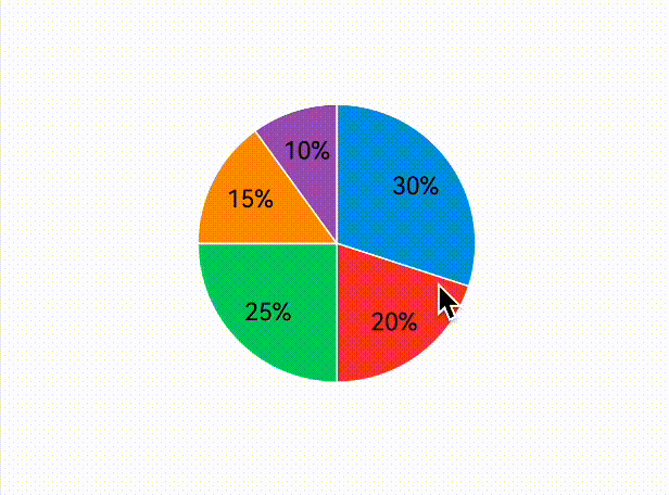
Groovy
PieChartView({
chartData: this.chartData,
textColor: Color.White
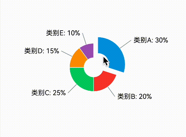
}).height(200)外部标注
Groovy
PieChartView({
chartData: this.chartData,
radius: 80, //饼状图半径
chartType: PieChartType.external//外部标注
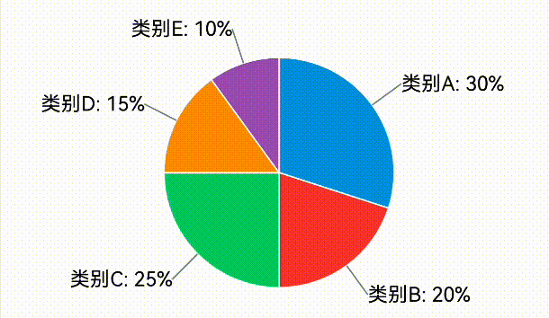
}).height(220)外部折线标注
Groovy
PieChartView({
  chartData: this.chartData,
  radius: 80, //饼状图半径
  chartType: PieChartType.polyline//外部折线标注
}).height(220)
点击交互
Groovy
PieChartView({
  chartData: this.chartData,
  radius: 80, //饼状图半径
  chartType: PieChartType.clickInteraction//可点击交互
}).height(220)
圆环设置
Groovy
PieChartView({
  chartData: this.chartData,
  radius: 80, //饼状图半径
  chartType: PieChartType.ring//圆环
}).height(220)
圆环点击交互
Groovy
PieChartView({
  chartData: this.chartData,
  radius: 50, //饼状图半径
  chartType: PieChartType.ringClick//圆环点击交互
}).height(220)
左侧标注
Groovy
Row() {
  Column() {
    ForEach(this.chartData, (item: PieChartData) => {
      Row() {
        Circle()
          .width(10)
          .height(10)
          .fill("" + item.color)
          .borderRadius(10)
        Text(item.label)
          .margin({ left: 5 })
          .fontColor($r("app.color.title_color"))
      }.margin({ bottom: 5 })
            })
  }.margin({ right: 10 })

  PieChartView({
    chartData: this.chartData,
    textColor: Color.White
  }).height(200)
    .width(200)
}
顶部标注
Groovy
Column() {
  Row() {
    ForEach(this.chartData, (item: PieChartData) => {
      Row() {
        Circle()
          .width(10)
          .height(10)
          .fill("" + item.color)
          .borderRadius(10)
        Text(item.label)
          .margin({ left: 5 })
          .fontColor($r("app.color.title_color"))
      }.margin({ right: 5 })
            })
  }.margin({ bottom: 10 })

  PieChartView({
    chartData: this.chartData,
    textColor: Color.White
  }).height(200)
    .width(200)
}
点击提示
Groovy
Column() {
  Row() {
    ForEach(this.chartData, (item: PieChartData) => {
      Row() {
        Circle()
          .width(10)
          .height(10)
          .fill("" + item.color)
          .borderRadius(10)
        Text(item.label)
          .margin({ left: 5 })
          .fontColor($r("app.color.title_color"))
      }.margin({ right: 5 })
            })
  }.margin({ bottom: 10 })

  Stack() {
    PieChartView({
      chartData: this.chartData,
      textColor: Color.White,
      isAllowClick: true,
      onItemClick: (position) => {
        this.tempPieChartData = this.chartData[position]
        clearTimeout(this.tempPieChartTimeout)
        this.tempPieChartTimeout = setTimeout(() => {
          this.tempPieChartData = undefined
        }, 2000)
      }
    }).height(200)
      .width(200)

    Row() {
      Circle()
        .width(10)
        .height(10)
        .fill("" + this.tempPieChartData?.color)
        .borderRadius(10)
      Text(this.tempPieChartData?.label)
        .margin({ left: 5 })
        .fontColor(Color.White)
    }.backgroundColor("#80000000")
      .padding(10)
      .borderRadius(3)
      .visibility(this.tempPieChartData != undefined ? Visibility.Visible : Visibility.None)
  }
}
动画进入
Groovy
PieChartView({
  chartData: this.chartData,
  radius: 80, //饼状图半径
  chartType: PieChartType.animation, //动画进入
  pieChartControl: this.pieChartControl,
  animateTime: 50
}).height(220)
  .margin({ top: 10 })
属性介绍
常见属性配置如下:
|----------------------------|--------------------------------------------|-------------------|
| 属性 | 类型 | 概述 |
| chartData | PieChartData | 饼状图数据源 |
| strokeStyle | string/number/CanvasGradient/CanvasPattern | 扇形边框颜色,默认白色 |
| strokeWidth | number | 扇形边框大小 |
| textColor | string/number/CanvasGradient/CanvasPattern | 文本颜色,默认黑色 |
| textAlign | CanvasTextAlign | 文本横向对齐方式,默认center |
| textBaseline | CanvasTextBaseline | 文本纵向对齐方式,默认middle |
| textSize | number | 文本大小 |
| radius | number | 饼状图半径 |
| chartType | PieChartType | 饼状图展示类型 |
| externalLineColor | string/number/CanvasGradient/CanvasPattern | 外部折线颜色 |
| externalLineWidth | number | 外部折线大小 |
| externalLineRadius | number | 外部折线半径大小 |
| externalLineLeftTextAlign | CanvasTextAlign | 外部折线文本左半边对齐方式 |
| externalLineRightTextAlign | CanvasTextAlign | 外部折线文本右半边对齐方式 |
| polylineColor | string/number/CanvasGradient/CanvasPattern | 外部双折线折线颜色 |
| polylineWidth | number | 外部双折线大小 |
| polylineRadius | number | 外部双折线半径大小 |
| polylineDoubleRadius | number | 外部第二条线半径大小 |
| maxAnimationProgress | number | 最大放大,默认为1 |
| ringLineColor | string/number/CanvasGradient/CanvasPattern | 圆环线颜色 |
| ringLineWidth | number | 圆环线大小 |
| ringWidth | number | 圆环宽度 |
| ringLineRadius | number | 圆环线半径大小 |
| ringLineLeftTextAlign | CanvasTextAlign | 外部折线文本左半边对齐方式 |
| ringLineRightTextAlign | CanvasTextAlign | 外部折线文本右半边对齐方式 |
| animateTime | number | 展开动画时间,默认10毫秒 |
| pieChartControl | PieChartControl | 饼状图控制器,可以控制动画重新展开 |
| onItemClick | (position: number) => void | 块状点击回调 |
| isAllowClick | boolean | 是否允许点击 |
PieChartData
|--------|--------------------------------------------|--------|
| 属性 | 类型 | 概述 |
| label | string | 饼状图数据源 |
| value | number | 饼状百分比 |
| color | string/number/CanvasGradient/CanvasPattern | 饼状图颜色 |
相关总结
目前的饼状图组件,可以实现多种的场景,对应着前言中的效果,如果有其他的效果还未实现,或者有问题,都可以进行反馈,希望这个组件,可以帮助到您。