欢迎加入开源鸿蒙跨平台社区:https://openharmonycrossplatform.csdn.net
🎯 欢迎来到 Flutter for OpenHarmony 社区!本文将深入讲解 Flutter 中 Divider 分割线组件的使用方法,带你从基础到精通,掌握这一常用的布局分隔组件。
一、Divider 组件概述
在用户界面设计中,分割线(Divider)是一种简单却非常重要的视觉元素。它用于在界面中创建视觉分隔,帮助用户理解内容的层次结构,提升信息的可读性。Flutter 提供了 Divider 组件,让开发者能够轻松地在应用中添加各种风格的分割线。
📋 Divider 组件特点
| 特点 | 说明 |
|---|---|
| 轻量级 | 组件简单,性能开销小 |
| 高度可定制 | 支持颜色、粗细、缩进等属性 |
| Material Design | 遵循 Material Design 规范 |
| 水平分割 | 默认创建水平分割线 |
| 自适应宽度 | 可以填充父容器或设置固定宽度 |
分割线的作用
分割线在 UI 设计中扮演着重要的角色,它能够:
- 划分区域:将不同的内容区域清晰地区分开来
- 组织信息:帮助用户理解信息的层次结构
- 引导视觉:引导用户的视线流动
- 提升美观:增加界面的层次感和精致度
- 减少混乱:避免内容过于拥挤,提升可读性
💡 使用场景:分割线广泛应用于列表项之间、卡片内容分隔、设置页面分组、表单字段分隔等场景。
二、Divider 基础用法
学习 Divider 组件非常简单,它是一个轻量级的组件,只需要很少的代码就能实现分割效果。让我们从最基础的用法开始。
2.1 最简单的 Divider
最基础的 Divider 不需要任何参数,它会创建一条默认样式的水平分割线。
dart
Column(
  children: [
    const Text('上面的内容'),
    const Divider(),
    const Text('下面的内容'),
  ],
)
代码解析:
Divider()创建一条默认的水平分割线- 默认情况下,分割线会填充父容器的宽度
- 默认颜色是灰色,默认高度是 16 逻辑像素
2.2 Divider 的默认值
了解 Divider 的默认属性值,可以帮助我们更好地理解它的行为:
| 属性 | 默认值 | 说明 |
|---|---|---|
| height | 16.0 | 分割线占用的高度(包含上下边距) |
| thickness | 0.0 | 分割线的粗细 |
| indent | 0.0 | 左侧缩进距离 |
| endIndent | 0.0 | 右侧缩进距离 |
| color | null | 分割线颜色(默认使用主题的 dividerColor) |
2.3 完整示例
下面是一个完整的可运行示例,展示了 Divider 组件的基本使用:
dart
class DividerExample extends StatelessWidget {
  const DividerExample({super.key});

  @override
  Widget build(BuildContext context) {
    return Scaffold(
      appBar: AppBar(title: const Text('Divider 示例')),
      body: const Padding(
        padding: EdgeInsets.all(16),
        child: Column(
          children: [
            Text(
              '第一部分内容',
              style: TextStyle(fontSize: 18, fontWeight: FontWeight.bold),
            ),
            SizedBox(height: 8),
            Text('这是第一部分的详细描述内容。'),
            Divider(),
            Text(
              '第二部分内容',
              style: TextStyle(fontSize: 18, fontWeight: FontWeight.bold),
            ),
            SizedBox(height: 8),
            Text('这是第二部分的详细描述内容。'),
            Divider(),
            Text(
              '第三部分内容',
              style: TextStyle(fontSize: 18, fontWeight: FontWeight.bold),
            ),
            SizedBox(height: 8),
            Text('这是第三部分的详细描述内容。'),
          ],
        ),
      ),
    );
  }
}
三、Divider 常用属性详解
掌握了基础用法后,我们来深入了解 Divider 的各种属性。通过这些属性,我们可以创建出各种风格的分割线。
3.1 height - 分割线高度
height 属性控制分割线占用的垂直空间,注意这不是分割线本身的粗细,而是整个分割线组件的高度(包含上下边距)。
dart
Column(
  children: [
    const Text('高度为 10'),
    const Divider(height: 10),
    const Text('高度为 20'),
    const Divider(height: 20),
    const Text('高度为 40'),
    const Divider(height: 40),
  ],
)
深入理解 height:
height是分割线组件占用的总高度,不是线条的粗细- 如果
height大于thickness,多余的空间会作为上下边距 - 合适的
height可以让分割线与周围内容保持舒适的间距
height 与 thickness 的区别:
┌─────────────────────────────────────┐
│           height (总高度)            │
│  ┌───────────────────────────────┐  │
│  │      thickness (线条粗细)      │  │
│  └───────────────────────────────┘  │
│                                     │
└─────────────────────────────────────┘
3.2 thickness - 分割线粗细
thickness 属性控制分割线本身的粗细,这才是真正可见的线条宽度。
dart
Column(
  children: [
    const Text('细线 (1dp)'),
    const Divider(thickness: 1),
    const Text('中等 (2dp)'),
    const Divider(thickness: 2),
    const Text('粗线 (4dp)'),
    const Divider(thickness: 4),
  ],
)
粗细选择建议:
| 粗细 | 适用场景 |
|---|---|
| 0.5 - 1dp | 细微分隔,内容紧凑的列表 |
| 1 - 2dp | 标准分割,通用场景 |
| 2 - 4dp | 强调分隔,重要区域划分 |
| 4dp+ | 特殊设计风格,装饰性分割线 |
⚠️ 注意 :
thickness不能大于height,否则线条会被裁剪。
3.3 color - 分割线颜色
color 属性设置分割线的颜色,可以根据设计需求自定义颜色。
dart
Column(
  children: [
    const Text('灰色分割线'),
    const Divider(color: Colors.grey),
    const Text('蓝色分割线'),
    const Divider(color: Colors.blue),
    const Text('红色分割线'),
    const Divider(color: Colors.red),
    const Text('透明度分割线'),
    Divider(color: Colors.black.withOpacity(0.1)),
  ],
)
颜色选择原则:
- 低调原则:分割线应该"安静"地存在,不应过于抢眼
- 对比度适中:颜色应与背景有一定对比,但不要过于强烈
- 主题一致:分割线颜色应与应用主题协调
- 语义化:不同区域可以使用不同颜色区分功能
3.4 indent - 左侧缩进
indent 属性控制分割线左侧的缩进距离,常用于创建层级效果。
dart
Column(
  children: [
    const Text('无缩进'),
    const Divider(),
    const Text('左侧缩进 20'),
    const Divider(indent: 20),
    const Text('左侧缩进 40'),
    const Divider(indent: 40),
    const Text('左侧缩进 60'),
    const Divider(indent: 60),
  ],
)
缩进的应用场景:
- 带图标的列表项,分割线从文字开始
- 层级结构展示,不同层级使用不同缩进
- 卡片内容,分割线与内容对齐
3.5 endIndent - 右侧缩进
endIndent 属性控制分割线右侧的缩进距离,与 indent 配合使用可以创建居中或偏移的分割线。
dart
Column(
  children: [
    const Text('两侧对称缩进'),
    const Divider(indent: 20, endIndent: 20),
    const Text('左侧缩进更多'),
    const Divider(indent: 40, endIndent: 10),
    const Text('右侧缩进更多'),
    const Divider(indent: 10, endIndent: 40),
  ],
)
📊 Divider 属性速查表
| 属性 | 类型 | 默认值 | 说明 |
|---|---|---|---|
| height | double | 16.0 | 分割线占用高度 |
| thickness | double | 0.0 | 分割线粗细 |
| indent | double | 0.0 | 左侧缩进 |
| endIndent | double | 0.0 | 右侧缩进 |
| color | Color? | null | 分割线颜色 |
四、VerticalDivider 垂直分割线
除了水平分割线,Flutter 还提供了 VerticalDivider 组件用于创建垂直分割线。它在水平布局中非常有用。
4.1 基础用法
dart
Row(
  children: [
    const Expanded(child: Center(child: Text('左侧'))),
    const VerticalDivider(),
    const Expanded(child: Center(child: Text('右侧'))),
  ],
)
4.2 VerticalDivider 属性
VerticalDivider 的属性与 Divider 类似,但方向不同:
| 属性 | 类型 | 默认值 | 说明 |
|---|---|---|---|
| width | double | 16.0 | 分割线占用宽度 |
| thickness | double | 0.0 | 分割线粗细 |
| indent | double | 0.0 | 顶部缩进 |
| endIndent | double | 0.0 | 底部缩进 |
| color | Color? | null | 分割线颜色 |
4.3 完整示例
dart
class VerticalDividerExample extends StatelessWidget {
  const VerticalDividerExample({super.key});

  @override
  Widget build(BuildContext context) {
    return Scaffold(
      appBar: AppBar(title: const Text('VerticalDivider 示例')),
      body: Center(
        child: SizedBox(
          height: 200,
          child: Row(
            mainAxisAlignment: MainAxisAlignment.center,
            children: [
              _buildSection('功能一', Icons.home),
              const VerticalDivider(
                thickness: 1,
                indent: 20,
                endIndent: 20,
              ),
              _buildSection('功能二', Icons.search),
              const VerticalDivider(
                thickness: 1,
                indent: 20,
                endIndent: 20,
              ),
              _buildSection('功能三', Icons.person),
            ],
          ),
        ),
      ),
    );
  }

  Widget _buildSection(String title, IconData icon) {
    return SizedBox(
      width: 80,
      child: Column(
        mainAxisAlignment: MainAxisAlignment.center,
        children: [
          Icon(icon, size: 32),
          const SizedBox(height: 8),
          Text(title),
        ],
      ),
    );
  }
}
五、Divider 在列表中的应用
Divider 最常见的应用场景是在列表中分隔各个列表项。Flutter 的 ListView 提供了 divider 属性,可以方便地为列表添加分割线。
5.1 ListView.builder 中的分割线
dart
class ListDividerExample extends StatelessWidget {
  const ListDividerExample({super.key});

  final List<String> items = const [
    '列表项一',
    '列表项二',
    '列表项三',
    '列表项四',
    '列表项五',
  ];

  @override
  Widget build(BuildContext context) {
    return Scaffold(
      appBar: AppBar(title: const Text('列表分割线示例')),
      body: ListView.separated(
        itemCount: items.length,
        separatorBuilder: (context, index) => const Divider(
          height: 1,
          thickness: 1,
          indent: 16,
          endIndent: 16,
        ),
        itemBuilder: (context, index) {
          return ListTile(
            title: Text(items[index]),
            trailing: const Icon(Icons.arrow_forward_ios, size: 16),
          );
        },
      ),
    );
  }
}
5.2 ListTile 的分割线
ListTile 组件本身不包含分割线,但我们可以通过多种方式添加:
方式一:使用 ListView.separated
dart
ListView.separated(
  itemCount: items.length,
  separatorBuilder: (context, index) => const Divider(),
  itemBuilder: (context, index) => ListTile(title: Text(items[index])),
)
方式二:在 Column 中手动添加
dart
Column(
  children: [
    const ListTile(title: Text('项目一')),
    const Divider(),
    const ListTile(title: Text('项目二')),
    const Divider(),
    const ListTile(title: Text('项目三')),
  ],
)
5.3 带图标的列表分割线
dart
class IconListDividerExample extends StatelessWidget {
  const IconListDividerExample({super.key});

  @override
  Widget build(BuildContext context) {
    return Scaffold(
      appBar: AppBar(title: const Text('带图标的列表')),
      body: ListView(
        children: [
          ListTile(
            leading: const Icon(Icons.phone, color: Colors.green),
            title: const Text('电话'),
            subtitle: const Text('10086'),
          ),
          const Divider(indent: 72),  // 与文字对齐
          ListTile(
            leading: const Icon(Icons.email, color: Colors.blue),
            title: const Text('邮件'),
            subtitle: const Text('example@email.com'),
          ),
          const Divider(indent: 72),
          ListTile(
            leading: const Icon(Icons.location_on, color: Colors.red),
            title: const Text('地址'),
            subtitle: const Text('北京市海淀区'),
          ),
        ],
      ),
    );
  }
}
六、自定义分割线样式
除了使用默认的 Divider,我们还可以创建各种自定义风格的分割线,让界面更加独特和美观。
6.1 渐变分割线
dart
class GradientDivider extends StatelessWidget {
  const GradientDivider({super.key});

  @override
  Widget build(BuildContext context) {
    return Container(
      height: 2,
      decoration: BoxDecoration(
        gradient: LinearGradient(
          colors: [
            Colors.transparent,
            Colors.blue.withOpacity(0.5),
            Colors.blue,
            Colors.blue.withOpacity(0.5),
            Colors.transparent,
          ],
        ),
      ),
    );
  }
}
6.2 虚线分割线
dart
class DashedDivider extends StatelessWidget {
  const DashedDivider({
    super.key,
    this.height = 1,
    this.color = Colors.grey,
    this.dashWidth = 5,
    this.dashSpace = 3,
  });

  final double height;
  final Color color;
  final double dashWidth;
  final double dashSpace;

  @override
  Widget build(BuildContext context) {
    return LayoutBuilder(
      builder: (context, constraints) {
        final boxWidth = constraints.constrainWidth();
        final dashCount = (boxWidth / (dashWidth + dashSpace)).floor();
        return Row(
          mainAxisAlignment: MainAxisAlignment.spaceBetween,
          children: List.generate(dashCount, (_) {
            return SizedBox(
              width: dashWidth,
              height: height,
              child: DecoratedBox(
                decoration: BoxDecoration(color: color),
              ),
            );
          }),
        );
      },
    );
  }
}
6.3 带文字的分割线
dart
class TextDivider extends StatelessWidget {
  const TextDivider({
    super.key,
    required this.text,
    this.color = Colors.grey,
  });

  final String text;
  final Color color;

  @override
  Widget build(BuildContext context) {
    return Row(
      children: [
        Expanded(
          child: Divider(
            color: color,
            thickness: 1,
          ),
        ),
        Padding(
          padding: const EdgeInsets.symmetric(horizontal: 16),
          child: Text(
            text,
            style: TextStyle(color: color),
          ),
        ),
        Expanded(
          child: Divider(
            color: color,
            thickness: 1,
          ),
        ),
      ],
    );
  }
}
6.4 使用示例
dart
class CustomDividerExample extends StatelessWidget {
  const CustomDividerExample({super.key});

  @override
  Widget build(BuildContext context) {
    return Scaffold(
      appBar: AppBar(title: const Text('自定义分割线')),
      body: Padding(
        padding: const EdgeInsets.all(16),
        child: Column(
          children: [
            const Text('普通分割线'),
            const Divider(),
            const SizedBox(height: 20),
            const Text('渐变分割线'),
            const SizedBox(height: 8),
            const GradientDivider(),
            const SizedBox(height: 20),
            const Text('虚线分割线'),
            const SizedBox(height: 8),
            const DashedDivider(color: Colors.blue),
            const SizedBox(height: 20),
            const TextDivider(text: '或'),
            const SizedBox(height: 20),
            const Text('粗分割线'),
            const Divider(thickness: 2, color: Colors.black12),
          ],
        ),
      ),
    );
  }
}
七、Divider 与其他分隔组件的对比
Flutter 中有多种创建视觉分隔的方式,了解它们的区别可以帮助我们选择最合适的组件。
7.1 Divider vs SizedBox
| 特性 | Divider | SizedBox |
|---|---|---|
| 可见性 | 可见线条 | 不可见空间 |
| 用途 | 视觉分隔 | 间距控制 |
| 视觉效果 | 明显的分隔 | 隐形的间隔 |
| 适用场景 | 内容分组 | 布局间距 |
dart
Column(
  children: [
    const Text('使用 Divider'),
    const Divider(),
    const Text('有明显的分隔线'),
    const SizedBox(height: 20),
    const Text('使用 SizedBox'),
    const SizedBox(height: 16),
    const Text('只有间距,无分隔线'),
  ],
)
7.2 Divider vs Container 边框
dart
Column(
  children: [
    const Text('使用 Divider'),
    const Divider(thickness: 1),
    const SizedBox(height: 20),
    const Text('使用 Container 边框'),
    Container(
      height: 1,
      color: Colors.grey,
    ),
  ],
)
7.3 Divider vs Card 边框
Card 组件自带边框和阴影,可以自然地分隔内容:
dart
Column(
  children: [
    Card(
      child: Padding(
        padding: const EdgeInsets.all(16),
        child: const Text('卡片一'),
      ),
    ),
    Card(
      child: Padding(
        padding: const EdgeInsets.all(16),
        child: const Text('卡片二'),
      ),
    ),
  ],
)
八、实际应用场景
8.1 设置页面分组
dart
class SettingsDividerExample extends StatelessWidget {
  const SettingsDividerExample({super.key});

  @override
  Widget build(BuildContext context) {
    return Scaffold(
      appBar: AppBar(title: const Text('设置')),
      body: ListView(
        children: [
          const Padding(
            padding: EdgeInsets.fromLTRB(16, 16, 16, 8),
            child: Text(
              '通用设置',
              style: TextStyle(
                color: Colors.grey,
                fontWeight: FontWeight.bold,
              ),
            ),
          ),
          const ListTile(
            leading: Icon(Icons.wifi),
            title: Text('Wi-Fi'),
            trailing: Icon(Icons.arrow_forward_ios, size: 16),
          ),
          const Divider(indent: 56),
          const ListTile(
            leading: Icon(Icons.bluetooth),
            title: Text('蓝牙'),
            trailing: Icon(Icons.arrow_forward_ios, size: 16),
          ),
          const Divider(indent: 56),
          const ListTile(
            leading: Icon(Icons.flight),
            title: Text('飞行模式'),
            trailing: Icon(Icons.arrow_forward_ios, size: 16),
          ),
          const SizedBox(height: 16),
          const Padding(
            padding: EdgeInsets.fromLTRB(16, 16, 16, 8),
            child: Text(
              '隐私与安全',
              style: TextStyle(
                color: Colors.grey,
                fontWeight: FontWeight.bold,
              ),
            ),
          ),
          const ListTile(
            leading: Icon(Icons.lock),
            title: Text('密码'),
            trailing: Icon(Icons.arrow_forward_ios, size: 16),
          ),
          const Divider(indent: 56),
          const ListTile(
            leading: Icon(Icons.fingerprint),
            title: Text('指纹'),
            trailing: Icon(Icons.arrow_forward_ios, size: 16),
          ),
        ],
      ),
    );
  }
}
8.2 表单分隔
dart
class FormDividerExample extends StatelessWidget {
  const FormDividerExample({super.key});

  @override
  Widget build(BuildContext context) {
    return Scaffold(
      appBar: AppBar(title: const Text('表单')),
      body: Padding(
        padding: const EdgeInsets.all(16),
        child: Column(
          children: [
            const TextField(
              decoration: InputDecoration(
                labelText: '姓名',
                border: OutlineInputBorder(),
              ),
            ),
            const SizedBox(height: 16),
            const Divider(),
            const SizedBox(height: 16),
            const TextField(
              decoration: InputDecoration(
                labelText: '邮箱',
                border: OutlineInputBorder(),
              ),
            ),
            const SizedBox(height: 16),
            const Divider(),
            const SizedBox(height: 16),
            const TextField(
              decoration: InputDecoration(
                labelText: '电话',
                border: OutlineInputBorder(),
              ),
            ),
          ],
        ),
      ),
    );
  }
}
九、最佳实践与注意事项
9.1 设计原则
- 适度使用:不要过度使用分割线,过多的分割线会让界面显得杂乱
- 保持一致:同一应用中的分割线样式应保持一致
- 颜色低调:分割线颜色应低调,不应抢夺内容的注意力
- 间距合理:分割线的上下间距应与周围内容协调
9.2 性能考虑
- Divider 是轻量级组件,性能开销很小
- 在长列表中使用
ListView.separated比手动添加 Divider 更高效 - 避免在分割线上使用复杂的装饰效果
9.3 常见问题
问题 1:分割线不显示
原因:height 或 thickness 设置为 0
解决:确保 thickness 大于 0,或检查颜色是否与背景相同
问题 2:分割线位置不对
原因:父容器的约束问题
解决:检查父容器的宽度约束,确保 Divider 有足够空间
问题 3:分割线颜色太浅
原因:默认颜色透明度较高
解决:显式设置 color 属性
十、完整代码示例
下面是一个完整的、可以直接运行的 main.dart 文件,展示了 Divider 组件的各种用法:
dart
import 'package:flutter/material.dart';
void main() {
runApp(const MyApp());
}
class MyApp extends StatelessWidget {
const MyApp({super.key});
@override
Widget build(BuildContext context) {
return MaterialApp(
title: 'Divider 组件示例',
theme: ThemeData(
primarySwatch: Colors.blue,
useMaterial3: true,
),
home: const DividerDemoPage(),
);
}
}
class DividerDemoPage extends StatelessWidget {
const DividerDemoPage({super.key});
@override
Widget build(BuildContext context) {
return Scaffold(
appBar: AppBar(
title: const Text('Divider 分割线组件详解'),
),
body: SingleChildScrollView(
padding: const EdgeInsets.all(16),
child: Column(
crossAxisAlignment: CrossAxisAlignment.start,
children: [
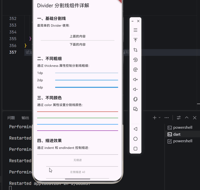
_buildSection('一、基础分割线', [
const Text('最简单的 Divider 使用:'),
const SizedBox(height: 12),
Container(
padding: const EdgeInsets.all(16),
decoration: BoxDecoration(
color: Colors.grey[100],
borderRadius: BorderRadius.circular(8),
),
child: const Column(
children: [
Text('上面的内容'),
Divider(),
Text('下面的内容'),
],
),
),
]),
const SizedBox(height: 24),
_buildSection('二、不同粗细', [
const Text('通过 thickness 属性控制分割线粗细:'),
const SizedBox(height: 12),
const Column(
children: [
Row(
children: [
SizedBox(width: 80, child: Text('1dp')),
Expanded(child: Divider(thickness: 1, color: Colors.blue)),
],
),
SizedBox(height: 12),
Row(
children: [
SizedBox(width: 80, child: Text('2dp')),
Expanded(child: Divider(thickness: 2, color: Colors.blue)),
],
),
SizedBox(height: 12),
Row(
children: [
SizedBox(width: 80, child: Text('4dp')),
Expanded(child: Divider(thickness: 4, color: Colors.blue)),
],
),
],
),
]),
const SizedBox(height: 24),
_buildSection('三、不同颜色', [
const Text('通过 color 属性设置分割线颜色:'),
const SizedBox(height: 12),
const Column(
children: [
Divider(thickness: 2, color: Colors.red),
SizedBox(height: 12),
Divider(thickness: 2, color: Colors.green),
SizedBox(height: 12),
Divider(thickness: 2, color: Colors.blue),
SizedBox(height: 12),
Divider(thickness: 2, color: Colors.purple),
],
),
]),
const SizedBox(height: 24),
_buildSection('四、缩进效果', [
const Text('通过 indent 和 endIndent 控制缩进:'),
const SizedBox(height: 12),
const Column(
children: [
Divider(thickness: 1, color: Colors.grey, indent: 0),
SizedBox(height: 8),
Text('无缩进', style: TextStyle(fontSize: 12, color: Colors.grey)),
SizedBox(height: 12),
Divider(thickness: 1, color: Colors.grey, indent: 40),
SizedBox(height: 8),
Text('左侧缩进 40', style: TextStyle(fontSize: 12, color: Colors.grey)),
SizedBox(height: 12),
Divider(thickness: 1, color: Colors.grey, indent: 40, endIndent: 40),
SizedBox(height: 8),
Text('两侧缩进 40', style: TextStyle(fontSize: 12, color: Colors.grey)),
],
),
]),
const SizedBox(height: 24),
_buildSection('五、VerticalDivider 垂直分割线', [
const Text('在 Row 中使用垂直分割线:'),
const SizedBox(height: 12),
Container(
height: 100,
decoration: BoxDecoration(
border: Border.all(color: Colors.grey[300]!),
borderRadius: BorderRadius.circular(8),
),
child: const Row(
mainAxisAlignment: MainAxisAlignment.center,
children: [
Expanded(
child: Center(
child: Column(
mainAxisSize: MainAxisSize.min,
children: [
Icon(Icons.home, color: Colors.blue),
SizedBox(height: 8),
Text('首页'),
],
),
),
),
VerticalDivider(thickness: 1, indent: 20, endIndent: 20),
Expanded(
child: Center(
child: Column(
mainAxisSize: MainAxisSize.min,
children: [
Icon(Icons.search, color: Colors.green),
SizedBox(height: 8),
Text('搜索'),
],
),
),
),
VerticalDivider(thickness: 1, indent: 20, endIndent: 20),
Expanded(
child: Center(
child: Column(
mainAxisSize: MainAxisSize.min,
children: [
Icon(Icons.person, color: Colors.orange),
SizedBox(height: 8),
Text('我的'),
],
),
),
),
],
),
),
]),
const SizedBox(height: 24),
_buildSection('六、列表中的分割线', [
const Text('使用 ListView.separated 添加分割线:'),
const SizedBox(height: 12),
SizedBox(
height: 250,
child: Card(
child: ListView.separated(
shrinkWrap: true,
itemCount: 5,
separatorBuilder: (context, index) => const Divider(
height: 1,
indent: 16,
endIndent: 16,
),
itemBuilder: (context, index) {
return ListTile(
leading: CircleAvatar(
child: Text('${index + 1}'),
),
title: Text('列表项 ${index + 1}'),
subtitle: const Text('这是列表项的描述内容'),
trailing: const Icon(Icons.arrow_forward_ios, size: 16),
);
},
),
),
),
]),
const SizedBox(height: 24),
_buildSection('七、自定义分割线', [
const Text('渐变分割线:'),
const SizedBox(height: 8),
Container(
height: 2,
decoration: BoxDecoration(
gradient: LinearGradient(
colors: [
Colors.transparent,
Colors.blue.withOpacity(0.5),
Colors.blue,
Colors.blue.withOpacity(0.5),
Colors.transparent,
],
),
),
),
const SizedBox(height: 16),
const Text('带文字的分割线:'),
const SizedBox(height: 8),
Row(
children: [
Expanded(child: Divider(color: Colors.grey[400])),
Padding(
padding: const EdgeInsets.symmetric(horizontal: 16),
child: Text('或', style: TextStyle(color: Colors.grey[600])),
),
Expanded(child: Divider(color: Colors.grey[400])),
],
),
const SizedBox(height: 16),
const Text('虚线分割线:'),
const SizedBox(height: 8),
_buildDashedDivider(),
]),
const SizedBox(height: 24),
_buildSection('八、设置页面示例', [
const Text('分组设置页面:'),
const SizedBox(height: 12),
Card(
child: Column(
children: [
const Padding(
padding: EdgeInsets.fromLTRB(16, 12, 16, 4),
child: Align(
alignment: Alignment.centerLeft,
child: Text(
'通用设置',
style: TextStyle(
color: Colors.grey,
fontWeight: FontWeight.bold,
fontSize: 12,
),
),
),
),
const ListTile(
dense: true,
leading: Icon(Icons.wifi, color: Colors.blue),
title: Text('Wi-Fi'),
trailing: Icon(Icons.arrow_forward_ios, size: 16),
),
const Divider(indent: 56, height: 1),
const ListTile(
dense: true,
leading: Icon(Icons.bluetooth, color: Colors.blue),
title: Text('蓝牙'),
trailing: Icon(Icons.arrow_forward_ios, size: 16),
),
const Divider(indent: 56, height: 1),
const ListTile(
dense: true,
leading: Icon(Icons.flight, color: Colors.blue),
title: Text('飞行模式'),
trailing: Icon(Icons.arrow_forward_ios, size: 16),
),
const Padding(
padding: EdgeInsets.fromLTRB(16, 12, 16, 4),
child: Align(
alignment: Alignment.centerLeft,
child: Text(
'隐私与安全',
style: TextStyle(
color: Colors.grey,
fontWeight: FontWeight.bold,
fontSize: 12,
),
),
),
),
const ListTile(
dense: true,
leading: Icon(Icons.lock, color: Colors.green),
title: Text('密码'),
trailing: Icon(Icons.arrow_forward_ios, size: 16),
),
const Divider(indent: 56, height: 1),
const ListTile(
dense: true,
leading: Icon(Icons.fingerprint, color: Colors.green),
title: Text('指纹'),
trailing: Icon(Icons.arrow_forward_ios, size: 16),
),
],
),
),
]),
const SizedBox(height: 32),
],
),
),
);
}
Widget _buildSection(String title, List<Widget> children) {
return Column(
crossAxisAlignment: CrossAxisAlignment.start,
children: [
Text(
title,
style: const TextStyle(
fontSize: 18,
fontWeight: FontWeight.bold,
),
),
const SizedBox(height: 8),
...children,
],
);
}
Widget _buildDashedDivider() {
return LayoutBuilder(
builder: (context, constraints) {
final boxWidth = constraints.constrainWidth();
const dashWidth = 5.0;
const dashSpace = 3.0;
final dashCount = (boxWidth / (dashWidth + dashSpace)).floor();
return Row(
mainAxisAlignment: MainAxisAlignment.spaceBetween,
children: List.generate(dashCount, (_) {
return Container(
width: dashWidth,
height: 1,
color: Colors.blue,
);
}),
);
},
);
}
}代码说明:
- 基础分割线:展示了最简单的 Divider 使用方式
- 不同粗细 :通过
thickness属性控制分割线粗细(1dp - 4dp) - 不同颜色 :通过
color属性设置分割线颜色 - 缩进效果 :通过
indent和endIndent控制左右缩进 - VerticalDivider:在 Row 中使用垂直分割线
- 列表分割线 :使用
ListView.separated添加列表项分割线 - 自定义分割线:渐变分割线、带文字分割线、虚线分割线
- 设置页面示例:完整的分组设置页面布局
十一、总结
Divider 组件虽然简单,但在 UI 设计中扮演着重要的角色。通过本文的学习,我们掌握了:
- Divider 组件的基本概念:了解了分割线在 UI 设计中的重要性
- Divider 的基本用法:学会了创建基本的水平分割线
- Divider 的各种属性:掌握了 height、thickness、color、indent、endIndent 等属性
- VerticalDivider 垂直分割线:学会了创建垂直分割线
- 列表中的分割线应用:学会了在 ListView 中使用分割线
- 自定义分割线样式:学会了创建渐变、虚线、带文字等自定义分割线
- 实际应用场景:学会了在设置页面、表单等场景中使用分割线
💡 学习建议:分割线是 UI 设计的基础元素,关键在于"适度"使用。过多的分割线会让界面显得杂乱,过少则会让内容缺乏层次。建议多观察优秀应用的设计,学习它们如何使用分割线来组织内容。
📚 延伸阅读: