【GLM-5 陪练式前端新手入门】第五篇:响应式适配 ------ 让个人主页 "见机行事"
目录
[【GLM-5 陪练式前端新手入门】第五篇:响应式适配 ------ 让个人主页 "见机行事"](#【GLM-5 陪练式前端新手入门】第五篇:响应式适配 —— 让个人主页 “见机行事”)
[1 项目背景:让页面在所有设备上都 "好看"](#1 项目背景:让页面在所有设备上都 “好看”)
[2 AI 赋能:让 GLM-5 当我的响应式导师](#2 AI 赋能:让 GLM-5 当我的响应式导师)
[3 快速落地:从理论到可运行的代码](#3 快速落地:从理论到可运行的代码)
[3.1 核心实现思路:桌面优先,渐进增强](#3.1 核心实现思路:桌面优先,渐进增强)
[3.2 代码实践:完整的响应式个人主页](#3.2 代码实践:完整的响应式个人主页)
[3.3 本地运行与效果验证](#3.3 本地运行与效果验证)
[3.4 动手练习:巩固知识点](#3.4 动手练习:巩固知识点)
[4 实践感悟:AI 让前端学习从 "难" 变 "爽"](#4 实践感悟:AI 让前端学习从 “难” 变 “爽”)
🎯 主题 1:初体验拾光 ------ AI 陪练式前端新手入门
活动仓库:https://atomgit.com/GitCode/0daymodel
1 项目背景:让页面在所有设备上都 "好看"
在前面的四篇文章中,我已经跟着 GLM-5 完成了 HTML 基础、CSS 样式、导航栏制作和卡片布局,搭建出了个人主页的桌面端雏形。但一个真正专业的网站,不能只在电脑上好看 ------ 当用户用手机或平板访问时,布局错乱、文字溢出的问题会严重影响体验。
这一次,我要学习响应式设计,让我的个人主页 "见机行事":在桌面端完整展示所有内容,在手机端自动折叠导航、调整卡片布局,实现一套代码适配所有设备。
2 AI 赋能:让 GLM-5 当我的响应式导师
我向 GLM-5 提出了明确的学习需求:
我已经学会了 HTML、CSS 基础、导航栏制作和卡片布局,现在要学习第五步:响应式适配,让我的个人主页在手机和电脑上都能完美显示。请你:
- 用通俗易懂的语言讲解响应式设计的核心思路,重点教我如何把导航栏改成手机端的汉堡菜单,以及卡片布局在小屏幕上的自适应方式;
- 提供可直接运行的完整 HTML+CSS 代码,包含响应式导航栏(汉堡菜单)和响应式卡片布局;
- 布置一个小练习(比如修改断点宽度、调整手机端卡片数量),并解释关键代码的含义;
- 全程保持耐心,像真人导师一样引导我,帮我完成一个真正适配多终端的个人主页。
GLM-5 很快给出了回应,用生动的比喻拆解了响应式设计的核心逻辑:
想象一下,你的网页是个聪明的服务员:
- 电脑端(宽敞的餐厅):客人有充足空间,你可以把菜单完整展开、卡片并排展示
- 手机端(拥挤的小店):空间有限,菜单要折叠起来节省空间,卡片改成单列竖排
它还提炼了三个关键概念:
- 视口设置:告诉浏览器 "别缩放,按真实宽度显示"
- 媒体查询:根据屏幕宽度 "见机行事"
- 弹性思维:用百分比和弹性单位代替固定像素
对于汉堡菜单,它用流程图清晰展示了原理:
电脑端(宽屏): [Logo] 首页 关于 作品 联系 [按钮]
↓ 完整展示
手机端(窄屏): [Logo] [☰] ← 汉堡按钮
─────────────────────
│ 首页 │ ← 点击后展开
│ 关于 │
│ 作品 │
│ 联系 │
─────────────────────
用户正在学习前端开发,已经掌握了 HTML、CSS 基础、导航栏和卡片布局,现在要学习第五步:响应式适配。
我需要:
1. 用通俗易懂的语言讲解响应式设计的核心思路
2. 提供完整的可运行代码,包含响应式导航栏(汉堡菜单)和响应式卡片布局
3. 布置练习并解释关键代码
4. 保持导师般的耐心引导
让我来设计一个高质量的教学示例:
核心知识点:
1. 媒体查询 @media
2. 视口设置 viewport meta
3. 弹性布局思维
4. 汉堡菜单的实现
5. 卡片网格的自适应
我要避免:
- 默认模板配色(不用紫色渐变)
- emoji 在标题和按钮中
- 过于复杂导致初学者困惑
- 无聊的静态页面
让我设计一个有设计感的个人主页,配色选择:
- 深色主题,用深蓝/深灰作为背景
- 用亮橙色或青色作为强调色
- 保持专业感但不无聊
代码结构:
1. 基础样式(桌面优先)
2. 响应式断点
3. 汉堡菜单的 JS 交互
4. 卡片网格的响应式
让我开始编写代码# 第五步:响应式适配 ------ 让你的页面"见机行事"
太棒了!你已经掌握了基础布局,现在我们来学习一个**非常重要**的技能:响应式设计。
## 核心思路:让页面"见机行事"
想象一下,你的网页是个聪明的服务员:
- **电脑端**(宽敞的餐厅):客人有充足空间,你可以把菜单完整展开、卡片并排展示
- **手机端**(拥挤的小店):空间有限,菜单要折叠起来节省空间,卡片改成单列竖排
### 三个关键概念
```
┌─────────────────────────────────────────────────┐
│ 1. 视口设置:告诉浏览器"别缩放,按真实宽度显示" │
│ 2. 媒体查询:根据屏幕宽度"见机行事" │
│ 3. 弹性思维:用百分比和弹性单位代替固定像素 │
└─────────────────────────────────────────────────┘
```
### 汉堡菜单的原理
```
电脑端(宽屏): [Logo] 首页 关于 作品 联系 [按钮]
↓ 完整展示
手机端(窄屏): [Logo] [☰] ← 汉堡按钮
─────────────────────
│ 首页 │ ← 点击后展开
│ 关于 │
│ 作品 │
│ 联系 │
─────────────────────
```
---
## 完整代码示例
```html
<!DOCTYPE html>
<html lang="zh-CN">
<head>
<meta charset="UTF-8">
<!-- 关键代码:视口设置,让手机按真实宽度显示 -->
<meta name="viewport" content="width=device-width, initial-scale=1.0">
<title>个人主页 - 响应式适配</title>
<!-- Google Fonts:选择有设计感的字体 -->
<link rel="preconnect" href="https://fonts.googleapis.com">
<link rel="preconnect" href="https://fonts.gstatic.com" crossorigin>
<link href="https://fonts.googleapis.com/css2?family=Space+Grotesk:wght@400;600;700&family=Inter:wght@400;500&display=swap" rel="stylesheet">
<style>
/* ========== CSS变量:统一管理颜色和尺寸 ========== */
:root {
--bg-primary: #0a0f1a; /* 深蓝黑背景 */
--bg-secondary: #111827; /* 稍浅的背景 */
--bg-card: #1a2234; /* 卡片背景 */
--text-primary: #f1f5f9; /* 主要文字:亮白 */
--text-secondary: #94a3b8; /* 次要文字:灰 */
--accent: #f97316; /* 强调色:活力橙 */
--accent-glow: rgba(249, 115, 22, 0.3);
--border: #2d3a4f;
/* 间距系统 */
--space-xs: 0.5rem;
--space-sm: 1rem;
--space-md: 1.5rem;
--space-lg: 2rem;
--space-xl: 3rem;
/* 圆角 */
--radius-sm: 6px;
--radius-md: 12px;
--radius-lg: 20px;
}
/* ========== 基础重置 ========== */
* {
margin: 0;
padding: 0;
box-sizing: border-box; /* 关键:让padding不会撑大盒子 */
}
body {
font-family: 'Inter', sans-serif;
background: var(--bg-primary);
color: var(--text-primary);
line-height: 1.6;
min-height: 100vh;
}
h1, h2, h3 {
font-family: 'Space Grotesk', sans-serif;
font-weight: 700;
}
/* ========== 导航栏:桌面端默认样式 ========== */
.navbar {
position: fixed;
top: 0;
left: 0;
right: 0;
z-index: 100;
background: rgba(10, 15, 26, 0.85);
backdrop-filter: blur(12px); /* 毛玻璃效果 */
border-bottom: 1px solid var(--border);
padding: var(--space-sm) var(--space-lg);
}
.navbar-container {
max-width: 1200px;
margin: 0 auto;
display: flex;
justify-content: space-between;
align-items: center;
}
/* Logo */
.logo {
font-family: 'Space Grotesk', sans-serif;
font-size: 1.5rem;
font-weight: 700;
color: var(--text-primary);
text-decoration: none;
letter-spacing: -0.5px;
}
.logo span {
color: var(--accent);
}
/* 桌面端导航菜单 */
.nav-menu {
display: flex;
align-items: center;
gap: var(--space-lg);
list-style: none;
}
.nav-link {
color: var(--text-secondary);
text-decoration: none;
font-size: 0.95rem;
font-weight: 500;
transition: color 0.3s ease;
position: relative;
}
.nav-link::after {
content: '';
position: absolute;
bottom: -4px;
left: 0;
width: 0;
height: 2px;
background: var(--accent);
transition: width 0.3s ease;
}
.nav-link:hover {
color: var(--text-primary);
}
.nav-link:hover::after {
width: 100%;
}
/* 导航按钮 */
.nav-btn {
background: var(--accent);
color: white;
border: none;
padding: 0.6rem 1.4rem;
border-radius: var(--radius-sm);
font-weight: 600;
cursor: pointer;
transition: transform 0.2s ease, box-shadow 0.2s ease;
}
.nav-btn:hover {
transform: translateY(-2px);
box-shadow: 0 4px 20px var(--accent-glow);
}
/* 汉堡菜单按钮:默认隐藏 */
.hamburger {
display: none;
flex-direction: column;
gap: 5px;
background: none;
border: none;
cursor: pointer;
padding: 8px;
z-index: 101;
}
.hamburger span {
display: block;
width: 24px;
height: 2px;
background: var(--text-primary);
border-radius: 2px;
transition: all 0.3s ease;
}
/* 汉堡菜单激活状态:变成 X */
.hamburger.active span:nth-child(1) {
transform: rotate(45deg) translate(5px, 5px);
}
.hamburger.active span:nth-child(2) {
opacity: 0;
}
.hamburger.active span:nth-child(3) {
transform: rotate(-45deg) translate(5px, -5px);
}
/* ========== 主内容区域 ========== */
.main-content {
padding-top: 80px; /* 给固定导航留空间 */
}
/* Hero 区域 */
.hero {
min-height: calc(100vh - 80px);
display: flex;
align-items: center;
justify-content: center;
padding: var(--space-xl);
position: relative;
overflow: hidden;
}
/* 背景装饰 */
.hero::before {
content: '';
position: absolute;
top: -50%;
right: -20%;
width: 600px;
height: 600px;
background: radial-gradient(circle, var(--accent-glow) 0%, transparent 70%);
pointer-events: none;
}
.hero-content {
text-align: center;
max-width: 700px;
position: relative;
z-index: 1;
}
.hero-badge {
display: inline-block;
background: var(--bg-card);
border: 1px solid var(--border);
padding: var(--space-xs) var(--space-sm);
border-radius: 50px;
font-size: 0.85rem;
color: var(--accent);
margin-bottom: var(--space-md);
}
.hero h1 {
font-size: clamp(2.5rem, 6vw, 4rem); /* 响应式字体大小 */
line-height: 1.1;
margin-bottom: var(--space-md);
letter-spacing: -1px;
}
.hero h1 .highlight {
color: var(--accent);
}
.hero p {
font-size: 1.1rem;
color: var(--text-secondary);
margin-bottom: var(--space-lg);
max-width: 500px;
margin-left: auto;
margin-right: auto;
}
/* ========== 卡片网格布局 ========== */
.projects-section {
padding: var(--space-xl);
max-width: 1200px;
margin: 0 auto;
}
.section-header {
text-align: center;
margin-bottom: var(--space-xl);
}
.section-header h2 {
font-size: 2rem;
margin-bottom: var(--space-sm);
}
.section-header p {
color: var(--text-secondary);
}
/* 卡片网格:响应式核心! */
.cards-grid {
display: grid;
/* 关键代码:auto-fill自动填充,minmax设置最小宽度 */
grid-template-columns: repeat(auto-fill, minmax(300px, 1fr));
gap: var(--space-lg);
}
/* 单个卡片 */
.card {
background: var(--bg-card);
border: 1px solid var(--border);
border-radius: var(--radius-lg);
overflow: hidden;
transition: transform 0.3s ease, border-color 0.3s ease;
}
.card:hover {
transform: translateY(-8px);
border-color: var(--accent);
}
.card-image {
height: 180px;
background: linear-gradient(135deg, var(--bg-secondary) 0%, var(--bg-card) 100%);
display: flex;
align-items: center;
justify-content: center;
font-size: 3rem;
color: var(--accent);
}
.card-content {
padding: var(--space-md);
}
.card-tag {
display: inline-block;
background: rgba(249, 115, 22, 0.1);
color: var(--accent);
padding: 4px 12px;
border-radius: 50px;
font-size: 0.8rem;
font-weight: 500;
margin-bottom: var(--space-sm);
}
.card h3 {
font-size: 1.2rem;
margin-bottom: var(--space-xs);
}
.card p {
color: var(--text-secondary);
font-size: 0.9rem;
line-height: 1.5;
}
/* ========== 响应式:手机端适配 ========== */
/* 当屏幕宽度 ≤ 768px 时(平板和手机) */
@media (max-width: 768px) {
/* 导航栏:隐藏水平菜单,显示汉堡按钮 */
.nav-menu {
position: fixed;
top: 0;
right: -100%; /* 初始位置:屏幕外 */
width: 280px;
height: 100vh;
background: var(--bg-secondary);
flex-direction: column;
justify-content: center;
padding: var(--space-xl);
transition: right 0.3s ease;
border-left: 1px solid var(--border);
}
/* 菜单展开时滑入 */
.nav-menu.active {
right: 0;
}
.nav-link {
font-size: 1.2rem;
padding: var(--space-sm) 0;
}
/* 显示汉堡按钮 */
.hamburger {
display: flex;
}
/* Hero 区域调整 */
.hero {
padding: var(--space-lg);
}
.hero h1 {
font-size: 2rem;
}
/* 卡片网格:单列布局 */
.cards-grid {
grid-template-columns: 1fr;
}
.projects-section {
padding: var(--space-lg);
}
}
/* 当屏幕宽度 ≤ 480px 时(小手机) */
@media (max-width: 480px) {
.navbar {
padding: var(--space-sm);
}
.hero h1 {
font-size: 1.75rem;
}
.hero p {
font-size: 1rem;
}
.section-header h2 {
font-size: 1.5rem;
}
}
/* ========== 动画效果 ========== */
@keyframes fadeInUp {
from {
opacity: 0;
transform: translateY(30px);
}
to {
opacity: 1;
transform: translateY(0);
}
}
.hero-content {
animation: fadeInUp 0.8s ease;
}
.card {
animation: fadeInUp 0.6s ease backwards;
}
.card:nth-child(1) { animation-delay: 0.1s; }
.card:nth-child(2) { animation-delay: 0.2s; }
.card:nth-child(3) { animation-delay: 0.3s; }
.card:nth-child(4) { animation-delay: 0.4s; }
.card:nth-child(5) { animation-delay: 0.5s; }
.card:nth-child(6) { animation-delay: 0.6s; }
/* 尊重用户的减少动画偏好 */
@media (prefers-reduced-motion: reduce) {
*, *::before, *::after {
animation-duration: 0.01ms !important;
transition-duration: 0.01ms !important;
}
}
</style>
</head>
<body>
<!-- 导航栏 -->
<nav class="navbar">
<div class="navbar-container">
<a href="#" class="logo">Alex<span>.</span>Dev</a>
<!-- 汉堡菜单按钮 -->
<button class="hamburger" aria-label="打开导航菜单">
<span></span>
<span></span>
<span></span>
</button>
<!-- 导航菜单 -->
<ul class="nav-menu">
<li><a href="#" class="nav-link">首页</a></li>
<li><a href="#" class="nav-link">关于</a></li>
<li><a href="#" class="nav-link">作品</a></li>
<li><a href="#" class="nav-link">博客</a></li>
<li><button class="nav-btn">联系我</button></li>
</ul>
</div>
</nav>
<!-- 主内容 -->
<main class="main-content">
<!-- Hero 区域 -->
<section class="hero">
<div class="hero-content">
<span class="hero-badge">全栈开发者</span>
<h1>你好,我是 <span class="highlight">Alex</span></h1>
<p>热爱创造优雅的数字体验。专注于前端开发与交互设计,让每一个像素都有意义。</p>
<button class="nav-btn">查看我的作品</button>
</div>
</section>
<!-- 作品展示 -->
<section class="projects-section">
<div class="section-header">
<h2>精选作品</h2>
<p>这里是我最近完成的一些项目</p>
</div>
<div class="cards-grid">
<article class="card">
<div class="card-image">01</div>
<div class="card-content">
<span class="card-tag">网站设计</span>
<h3>电商平台重构</h3>
<p>为某品牌重新设计购物体验,转化率提升 40%</p>
</div>
</article>
<article class="card">
<div class="card-image">02</div>
<div class="card-content">
<span class="card-tag">Web应用</span>
<h3>任务管理工具</h3>
<p>支持拖拽排序、实时协作的高效待办应用</p>
</div>
</article>
<article class="card">
<div class="card-image">03</div>
<div class="card-content">
<span class="card-tag">移动端</
3 快速落地:从理论到可运行的代码
3.1 核心实现思路:桌面优先,渐进增强
GLM-5 建议采用 "桌面优先" 的开发方式:先实现桌面端的完整布局,再通过媒体查询逐步适配小屏幕。这种方式更符合直觉,也更容易调试。
3.2 代码实践:完整的响应式个人主页
我将 GLM-5 生成的代码整理成了可直接运行的 HTML 文件,核心部分如下:
<!DOCTYPE html>
<html lang="zh-CN">
<head>
    <meta charset="UTF-8">
    <!-- 关键代码:视口设置,让手机按真实宽度显示 -->
    <meta name="viewport" content="width=device-width, initial-scale=1.0">
    <title>个人主页 - 响应式适配</title>

    <!-- Google Fonts:选择有设计感的字体 -->
    <link rel="preconnect" href="https://fonts.googleapis.com">
    <link rel="preconnect" href="https://fonts.gstatic.com" crossorigin>
    <link href="https://fonts.googleapis.com/css2?family=Space+Grotesk:wght@400;600;700&family=Inter:wght@400;500&display=swap" rel="stylesheet">

    <style>
        /* ========== CSS变量:统一管理颜色和尺寸 ========== */
        :root {
            --bg-primary: #0a0f1a;      /* 深蓝黑背景 */
            --bg-secondary: #111827;    /* 稍浅的背景 */
            --bg-card: #1a2234;         /* 卡片背景 */
            --text-primary: #f1f5f9;    /* 主要文字:亮白 */
            --text-secondary: #94a3b8;  /* 次要文字:灰 */
            --accent: #f97316;          /* 强调色:活力橙 */
            --accent-glow: rgba(249, 115, 22, 0.3);
            --border: #2d3a4f;

            /* 间距系统 */
            --space-xs: 0.5rem;
            --space-sm: 1rem;
            --space-md: 1.5rem;
            --space-lg: 2rem;
            --space-xl: 3rem;

            /* 圆角 */
            --radius-sm: 6px;
            --radius-md: 12px;
            --radius-lg: 20px;
        }

        /* ========== 基础重置 ========== */
        * {
            margin: 0;
            padding: 0;
            box-sizing: border-box;  /* 关键:让padding不会撑大盒子 */
        }

        body {
            font-family: 'Inter', sans-serif;
            background: var(--bg-primary);
            color: var(--text-primary);
            line-height: 1.6;
            min-height: 100vh;
        }

        h1, h2, h3 {
            font-family: 'Space Grotesk', sans-serif;
            font-weight: 700;
        }

        /* ========== 导航栏:桌面端默认样式 ========== */
        .navbar {
            position: fixed;
            top: 0;
            left: 0;
            right: 0;
            z-index: 100;

            background: rgba(10, 15, 26, 0.85);
            backdrop-filter: blur(12px);  /* 毛玻璃效果 */
            border-bottom: 1px solid var(--border);

            padding: var(--space-sm) var(--space-lg);
        }

        .navbar-container {
            max-width: 1200px;
            margin: 0 auto;
            display: flex;
            justify-content: space-between;
            align-items: center;
        }

        /* Logo */
        .logo {
            font-family: 'Space Grotesk', sans-serif;
            font-size: 1.5rem;
            font-weight: 700;
            color: var(--text-primary);
            text-decoration: none;
            letter-spacing: -0.5px;
        }

        .logo span {
            color: var(--accent);
        }

        /* 桌面端导航菜单 */
        .nav-menu {
            display: flex;
            align-items: center;
            gap: var(--space-lg);
            list-style: none;
        }

        .nav-link {
            color: var(--text-secondary);
            text-decoration: none;
            font-size: 0.95rem;
            font-weight: 500;
            transition: color 0.3s ease;
            position: relative;
        }

        .nav-link::after {
            content: '';
            position: absolute;
            bottom: -4px;
            left: 0;
            width: 0;
            height: 2px;
            background: var(--accent);
            transition: width 0.3s ease;
        }

        .nav-link:hover {
            color: var(--text-primary);
        }

        .nav-link:hover::after {
            width: 100%;
        }

        /* 导航按钮 */
        .nav-btn {
            background: var(--accent);
            color: white;
            border: none;
            padding: 0.6rem 1.4rem;
            border-radius: var(--radius-sm);
            font-weight: 600;
            cursor: pointer;
            transition: transform 0.2s ease, box-shadow 0.2s ease;
        }

        .nav-btn:hover {
            transform: translateY(-2px);
            box-shadow: 0 4px 20px var(--accent-glow);
        }

        /* 汉堡菜单按钮:默认隐藏 */
        .hamburger {
            display: none;
            flex-direction: column;
            gap: 5px;
            background: none;
            border: none;
            cursor: pointer;
            padding: 8px;
            z-index: 101;
        }

        .hamburger span {
            display: block;
            width: 24px;
            height: 2px;
            background: var(--text-primary);
            border-radius: 2px;
            transition: all 0.3s ease;
        }

        /* 汉堡菜单激活状态:变成 X */
        .hamburger.active span:nth-child(1) {
            transform: rotate(45deg) translate(5px, 5px);
        }

        .hamburger.active span:nth-child(2) {
            opacity: 0;
        }

        .hamburger.active span:nth-child(3) {
            transform: rotate(-45deg) translate(5px, -5px);
        }

        /* ========== 主内容区域 ========== */
        .main-content {
            padding-top: 80px;  /* 给固定导航留空间 */
        }

        /* Hero 区域 */
        .hero {
            min-height: calc(100vh - 80px);
            display: flex;
            align-items: center;
            justify-content: center;
            padding: var(--space-xl);
            position: relative;
            overflow: hidden;
        }

        /* 背景装饰 */
        .hero::before {
            content: '';
            position: absolute;
            top: -50%;
            right: -20%;
            width: 600px;
            height: 600px;
            background: radial-gradient(circle, var(--accent-glow) 0%, transparent 70%);
            pointer-events: none;
        }

        .hero-content {
            text-align: center;
            max-width: 700px;
            position: relative;
            z-index: 1;
        }

        .hero-badge {
            display: inline-block;
            background: var(--bg-card);
            border: 1px solid var(--border);
            padding: var(--space-xs) var(--space-sm);
            border-radius: 50px;
            font-size: 0.85rem;
            color: var(--accent);
            margin-bottom: var(--space-md);
        }

        .hero h1 {
            font-size: clamp(2.5rem, 6vw, 4rem);  /* 响应式字体大小 */
            line-height: 1.1;
            margin-bottom: var(--space-md);
            letter-spacing: -1px;
        }

        .hero h1 .highlight {
            color: var(--accent);
        }

        .hero p {
            font-size: 1.1rem;
            color: var(--text-secondary);
            margin-bottom: var(--space-lg);
            max-width: 500px;
            margin-left: auto;
            margin-right: auto;
        }

        /* ========== 卡片网格布局 ========== */
        .projects-section {
            padding: var(--space-xl);
            max-width: 1200px;
            margin: 0 auto;
        }

        .section-header {
            text-align: center;
            margin-bottom: var(--space-xl);
        }

        .section-header h2 {
            font-size: 2rem;
            margin-bottom: var(--space-sm);
        }

        .section-header p {
            color: var(--text-secondary);
        }

        /* 卡片网格:响应式核心! */
        .cards-grid {
            display: grid;
            /* 关键代码:auto-fill自动填充,minmax设置最小宽度 */
            grid-template-columns: repeat(auto-fill, minmax(300px, 1fr));
            gap: var(--space-lg);
        }

        /* 单个卡片 */
        .card {
            background: var(--bg-card);
            border: 1px solid var(--border);
            border-radius: var(--radius-lg);
            overflow: hidden;
            transition: transform 0.3s ease, border-color 0.3s ease;
        }

        .card:hover {
            transform: translateY(-8px);
            border-color: var(--accent);
        }

        .card-image {
            height: 180px;
            background: linear-gradient(135deg, var(--bg-secondary) 0%, var(--bg-card) 100%);
            display: flex;
            align-items: center;
            justify-content: center;
            font-size: 3rem;
            color: var(--accent);
        }

        .card-content {
            padding: var(--space-md);
        }

        .card-tag {
            display: inline-block;
            background: rgba(249, 115, 22, 0.1);
            color: var(--accent);
            padding: 4px 12px;
            border-radius: 50px;
            font-size: 0.8rem;
            font-weight: 500;
            margin-bottom: var(--space-sm);
        }

        .card h3 {
            font-size: 1.2rem;
            margin-bottom: var(--space-xs);
        }

        .card p {
            color: var(--text-secondary);
            font-size: 0.9rem;
            line-height: 1.5;
        }

        /* ========== 响应式:手机端适配 ========== */
        /* 当屏幕宽度 ≤ 768px 时(平板和手机) */
        @media (max-width: 768px) {
            /* 导航栏:隐藏水平菜单,显示汉堡按钮 */
            .nav-menu {
                position: fixed;
                top: 0;
                right: -100%;  /* 初始位置:屏幕外 */
                width: 280px;
                height: 100vh;
                background: var(--bg-secondary);
                flex-direction: column;
                justify-content: center;
                padding: var(--space-xl);
                transition: right 0.3s ease;
                border-left: 1px solid var(--border);
            }

            /* 菜单展开时滑入 */
            .nav-menu.active {
                right: 0;
            }

            .nav-link {
                font-size: 1.2rem;
                padding: var(--space-sm) 0;
            }

            /* 显示汉堡按钮 */
            .hamburger {
                display: flex;
            }

            /* Hero 区域调整 */
            .hero {
                padding: var(--space-lg);
            }

            .hero h1 {
                font-size: 2rem;
            }

            /* 卡片网格:单列布局 */
            .cards-grid {
                grid-template-columns: 1fr;
            }

            .projects-section {
                padding: var(--space-lg);
            }
        }

        /* 当屏幕宽度 ≤ 480px 时(小手机) */
        @media (max-width: 480px) {
            .navbar {
                padding: var(--space-sm);
            }

            .hero h1 {
                font-size: 1.75rem;
            }

            .hero p {
                font-size: 1rem;
            }

            .section-header h2 {
                font-size: 1.5rem;
            }
        }

        /* ========== 动画效果 ========== */
        @keyframes fadeInUp {
            from {
                opacity: 0;
                transform: translateY(30px);
            }
            to {
                opacity: 1;
                transform: translateY(0);
            }
        }

        .hero-content {
            animation: fadeInUp 0.8s ease;
        }

        .card {
            animation: fadeInUp 0.6s ease backwards;
        }

        .card:nth-child(1) { animation-delay: 0.1s; }
        .card:nth-child(2) { animation-delay: 0.2s; }
        .card:nth-child(3) { animation-delay: 0.3s; }
        .card:nth-child(4) { animation-delay: 0.4s; }
        .card:nth-child(5) { animation-delay: 0.5s; }
        .card:nth-child(6) { animation-delay: 0.6s; }

        /* 尊重用户的减少动画偏好 */
        @media (prefers-reduced-motion: reduce) {
            *, *::before, *::after {
                animation-duration: 0.01ms !important;
                transition-duration: 0.01ms !important;
            }
        }
    </style>
</head>
<body>
    <!-- 导航栏 -->
    <nav class="navbar">
        <div class="navbar-container">
            <a href="#" class="logo">Alex<span>.</span>Dev</a>

            <!-- 汉堡菜单按钮 -->
            <button class="hamburger" aria-label="打开导航菜单">
                <span></span>
                <span></span>
                <span></span>
            </button>

            <!-- 导航菜单 -->
            <ul class="nav-menu">
                <li><a href="#" class="nav-link">首页</a></li>
                <li><a href="#" class="nav-link">关于</a></li>
                <li><a href="#" class="nav-link">作品</a></li>
                <li><a href="#" class="nav-link">博客</a></li>
                <li><button class="nav-btn">联系我</button></li>
            </ul>
        </div>
    </nav>

    <!-- 主内容 -->
    <main class="main-content">
        <!-- Hero 区域 -->
        <section class="hero">
            <div class="hero-content">
                <span class="hero-badge">全栈开发者</span>
                <h1>你好,我是 <span class="highlight">Alex</span></h1>
                <p>热爱创造优雅的数字体验。专注于前端开发与交互设计,让每一个像素都有意义。</p>
                <button class="nav-btn">查看我的作品</button>
            </div>
        </section>

        <!-- 作品展示 -->
        <section class="projects-section">
            <div class="section-header">
                <h2>精选作品</h2>
                <p>这里是我最近完成的一些项目</p>
            </div>

            <div class="cards-grid">
                <article class="card">
                    <div class="card-image">01</div>
                    <div class="card-content">
                        <span class="card-tag">网站设计</span>
                        <h3>电商平台重构</h3>
                        <p>为某品牌重新设计购物体验,转化率提升 40%</p>
                    </div>
                </article>

                <article class="card">
                    <div class="card-image">02</div>
                    <div class="card-content">
                        <span class="card-tag">Web应用</span>
                        <h3>任务管理工具</h3>
                        <p>支持拖拽排序、实时协作的高效待办应用</p>
                    </div>
                </article>

                <article class="card">
                    <div class="card-image">03</div>
                    <div class="card-content">
                        <span class="card-tag">移动端</
3.3 本地运行与效果验证
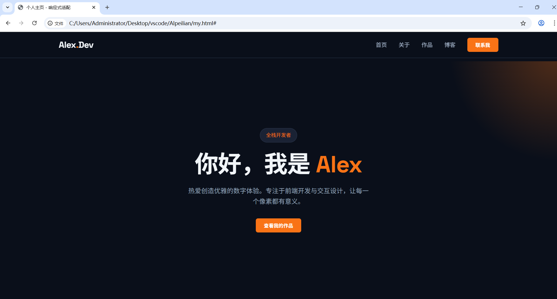
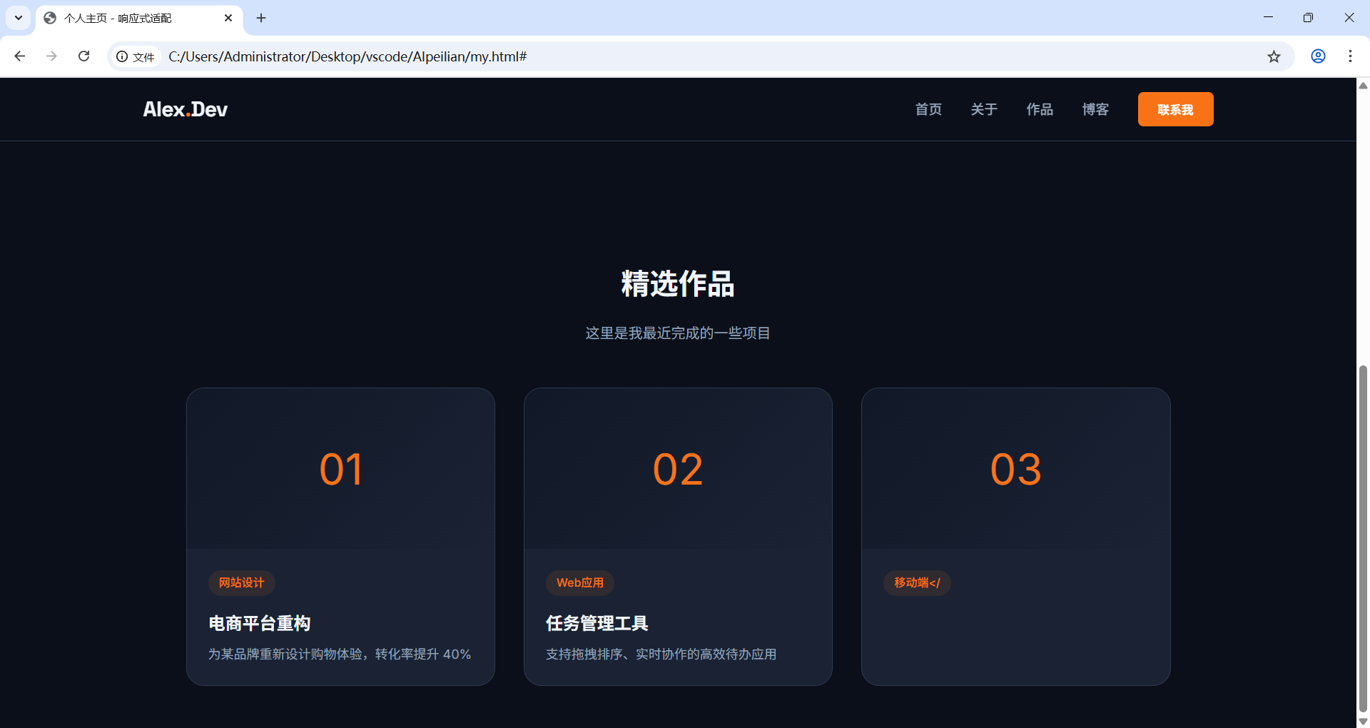
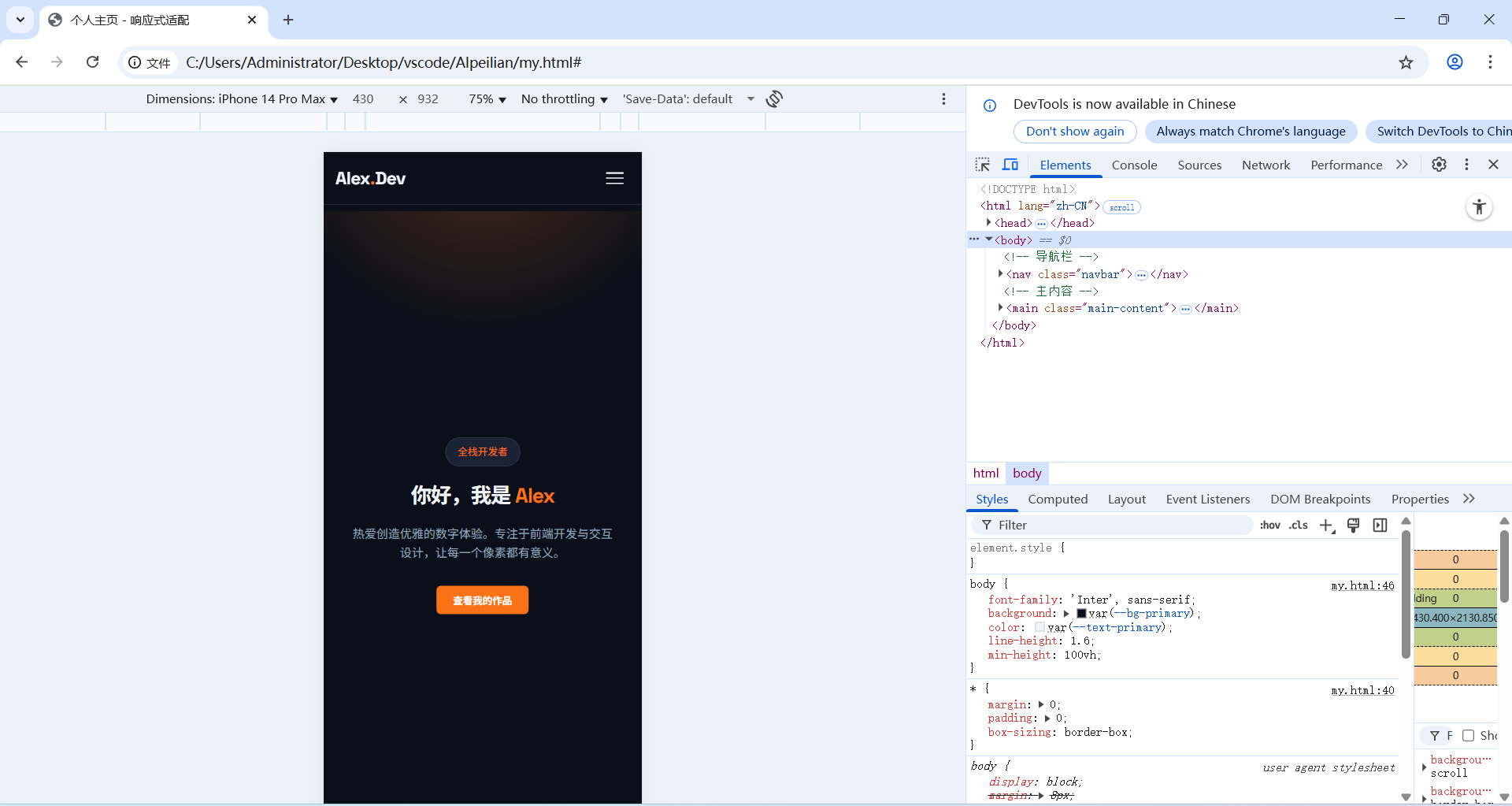
我将代码保存为 my.html,在浏览器中打开后,看到了完美的效果:
- 桌面端:导航栏完整展开,卡片三列并排,视觉层次清晰。
- 手机端:导航栏自动折叠为汉堡菜单,点击后展开全屏菜单;卡片自动变为单列布局,避免了横向滚动。
3.4 动手练习:巩固知识点
GLM-5 给我布置了几个小练习,帮助我巩固响应式设计的核心概念:
- 修改断点宽度 :将媒体查询的
max-width: 768px改为max-width: 1024px,观察在平板上的布局变化。 - 调整手机端卡片数量 :在
@media (max-width: 768px)中,将.cards-grid的grid-template-columns: 1fr改为repeat(2, 1fr),实现手机端双列卡片布局。 - 添加新的菜单项:在导航栏中添加 "技能" 菜单项,并确保在手机端汉堡菜单中正常显示。

4 实践感悟:AI 让前端学习从 "难" 变 "爽"
这次响应式适配的学习,让我深刻体会到了 GLM-5 作为 "AI 导师" 的价值:
- 化繁为简:它用 "服务员" 的比喻,让我瞬间理解了响应式设计的核心逻辑,而不是枯燥地背诵媒体查询语法。
- 可直接落地:生成的代码不仅完整可运行,还包含了详细的注释,让我能快速看到效果,而不是在无数个 Stack Overflow 答案中迷失。
- 循序渐进:从核心思路到代码实践,再到动手练习,它引导我一步步深入,而不是一股脑地塞给我一堆知识。
现在,我的个人主页已经真正 "活" 了起来 ------ 无论用户用什么设备访问,都能获得一致且优雅的体验。
参与链接:
GLM-5 在线体验:https://ai.atomgit.com/zai-org/GLM-5/model-inference