一.使用场景
1.主要用于C端业务,或者对样式有要求的B端项目
2.公司内部组件库
不适用的场景:
对样式要求不高的管理后台项目,这种项目使用成熟的组件库会让你的开发更加的迅速,样式部分进行样式覆盖即可。
二.为什么要使用tailwind-variants?
之前讲了tailwind和taiwind-merge的使用,但是这两个东西主要是为了写样式,现在要写组件,我们还需要一个利器,那就是tailwind-variants。为什么需要它呢?试想一下,我们需要写一个Button组件,但是这个Button组件有不同的样式,比如空心和实心的。
1.不使用taiwind-variant来封装button组件
jsx
import { cn } from "@/utils/cn";
function Button({
  variant = "primary",
  className,
  size = "small",
  children = "button",
  onClick,
}: {
  variant: "primary" | "danger" | "outline" | "disabled";
  className?: string;
  size?: "small" | "medium" | "large";
  children?: React.ReactNode;
  onClick?: () => void;
}) {
  return (
    <button
      onClick={onClick}
      className={cn(
        // 基础样式(所有按钮共享)
        "rounded-md cursor-pointer",
        // 变体样式(根据不同 variant 应用不同样式)
        {
          "bg-blue-500 text-white": variant === "primary",
          "bg-red-500 text-white": variant === "danger",
          "bg-transparent text-blue-500 border border-blue-500":
            variant === "outline",
          "bg-gray-300 text-gray-500 cursor-not-allowed":
            variant === "disabled",
        },
        {
          "p-2 text-sm": size === "small",
          "p-4 text-base": size === "medium",
          "p-6 text-lg": size === "large",
        },
        {
          // 特殊样式:danger 和 large 组合时,添加特殊样式
          'font-bold uppercase border-4': variant === "danger" && size === "large",
        },
        // 外部传入的样式(优先级最高,可以覆盖上面的样式)
        className
      )}
      disabled={variant === "disabled"}
      >
      {children}
    </button>
  );
}
2.使用taiwind-variant来封装组件
jsx
import { tv, type VariantProps } from "tailwind-variants";

const buttonTvStyles = tv({
  base: "rounded-md cursor-pointer",
  variants: {
    color: {
      primary: "bg-blue-500 text-white",
      danger: "bg-red-500 text-white",
      outline: "bg-transparent text-blue-500 border border-blue-500",
      disabled: "bg-gray-300 text-gray-500 cursor-not-allowed",
    },
    size: {
      small: "p-2 text-sm",
      medium: "p-4 text-base",
      large: "p-6 text-lg",
    },
  },
  // ✅ 正确示例:特定组合时添加特殊样式
  compoundVariants: [
    {
      color: "danger",
      size: "large",
      class: "font-bold uppercase border-4", // 特殊样式
    },
  ],
  // 定义默认的样式
  defaultVariants: {
    size: "small",
    color: "primary",
  },
});

// ✅ 完整的组件实现
type ButtonProps = VariantProps<typeof buttonTvStyles> & {
  children?: React.ReactNode;
className?: string; // ✅ 支持外部样式
onClick?: () => void;
  disabled?: boolean; // ✅ 支持禁用
};

function Button2({
  size,
  color,
  children = "button",
  className,
  onClick,
  disabled,
}: ButtonProps) {
  return (
    <button
      onClick={onClick}
      className={buttonTvStyles({ size, color, className })}
      disabled={disabled || color === "disabled"}
      >
      {children}
    </button>
  );
}
使用都是一样的:
jsx
export default function TailwindVariants() {
  return (
    <div>
      不同的button样式,如果不用tailwind-variants,这样子写代码:
      <div>
        基础的:
        <Button variant="primary" size="small" className="bg-amber-300" />
        主要的:
        <Button variant="danger" size="medium" />
        空心的:
        <Button variant="outline" size="large" />
        禁用的:
        <Button variant="disabled" />
      </div>
      <div className="mt-5">
        基础的:
        <Button2 color="primary" size="small" />
        主要的:
        <Button2 color="danger" size="medium" />
        空心的:
        <Button2 color="outline" size="large" />
        禁用的:
        <Button2 color="disabled"/>
      </div>
    </div>
  );
}
总结:可以看到,通过使用tailwind-variants可以让我们的代码结构显得非常的清晰,不会杂糅js和css。能通过js判断需要应用的css,使用tailwind-variants都有相对应的方法处理。 其实tailwind-variants最主要的作用就是让我们的代码变得更容易维护,虽然学习成本稍微高一点,但是这些都是值得的
举更多的例子说明-为什么要使用tailwind-variants
1.主要原因还是因为在组件复用样式时,能更好的帮我们处理样式的情况,能让我们的代码结构更加的清晰,而不是css中杂糅着js。
2.能够让我们创建一致性的组件样式。公司组件的风格会相对比较统一
以下为对比使用和没有使用tailwind-variants情况的对比,大家可以看下,就能直观的感受到了
markdown
# 📊 为什么需要 tailwind-variants?实际对比

## 🎯 核心问题:当组件变复杂时,`cn` 方案会遇到的三大难题

---

  ## 问题一:复合变体(Compound Variants)难以实现

### 需求场景
当**特定的变体组合**需要特殊样式时,例如:
  - `danger` + `large` 时:按钮要加粗、大写、加粗边框
  - `primary` + `small` 时:添加阴影效果

### ❌ 使用 cn 的方案(不优雅)

  ```tsx
function Button({ variant, size }) {
  // 需要手动判断组合
  const isDangerLarge = variant === "danger" && size === "large";
  const isPrimarySmall = variant === "primary" && size === "small";

  return (
    <button
      className={cn(
        "rounded-md",
        { "bg-red-500": variant === "danger" },
        { "px-6 py-3": size === "large" },
        // ❌ 问题:复合样式散落在条件判断中
        isDangerLarge && "font-bold uppercase border-4",
        isPrimarySmall && "shadow-lg",
      )}
    >
      Button
    </button>
  );
}
问题:
- ❌ 需要手动定义布尔变量(
isDangerLarge) - ❌ 复合样式混在 cn 函数里,不够清晰
- ❌ 组合越多,代码越乱
- ❌ 容易遗漏某些组合
✅ 使用 tailwind-variants 的方案(优雅)
tsx
import { tv } from "tailwind-variants";

const button = tv({
base: "rounded-md transition-colors",
variants: {
  variant: {
    primary: "bg-blue-500 text-white",
    danger: "bg-red-500 text-white",
  },
  size: {
    small: "px-2 py-1 text-sm",
    large: "px-6 py-3 text-lg",
  },
},
// ✅ 关键:复合变体集中管理,清晰明了
compoundVariants: [
  {
    variant: "danger",
    size: "large",
    class: "font-bold uppercase border-4 border-red-700",
  },
  {
    variant: "primary",
    size: "small",
    class: "shadow-lg",
  },
],
});

function Button({ variant, size }) {
return <button className={button({ variant, size })}>Button</button>;
}
优势:
- ✅ 复合变体集中在
compoundVariants配置中 - ✅ 代码结构清晰,易于维护
- ✅ 不会遗漏任何组合
- ✅ TypeScript 类型安全
问题二:多元素组件(Slots)管理混乱
需求场景
像 Card、Modal、Alert 这种多元素组件,每个子元素都需要根据父组件的变体调整样式。
❌ 使用 cn 的方案(重复且混乱)
tsx
function Card({ variant, size }) {
return (
  <div
    className={cn(
      "rounded-lg border",
      // 每个元素都要重复判断 variant 和 size
      { "bg-white": variant === "default" },
      { "bg-blue-50": variant === "highlighted" },
      { "p-4": size === "small" },
      { "p-6": size === "large" }
    )}
  >
    <h3
      className={cn(
        "font-bold",
        // ❌ 问题:又要写一遍 variant 判断
        { "text-gray-900": variant === "default" },
        { "text-blue-900": variant === "highlighted" },
        // ❌ 问题:又要写一遍 size 判断
        { "text-lg": size === "small" },
        { "text-2xl": size === "large" }
      )}
    >
      Title
    </h3>
    <p
      className={cn(
        // ❌ 问题:第三次重复写 variant 和 size 判断...
        { "text-gray-600": variant === "default" },
        { "text-blue-600": variant === "highlighted" },
        { "text-sm": size === "small" },
        { "text-base": size === "large" }
      )}
    >
      Content
    </p>
  </div>
);
}
问题:
- ❌ 每个子元素都要重复写条件判断
- ❌ 代码重复严重,难以维护
- ❌ 修改变体时需要改多处
- ❌ 容易出错(忘记更新某个元素)
✅ 使用 tailwind-variants 的方案(Slots)
tsx
import { tv } from "tailwind-variants";

const card = tv({
// ✅ 关键:使用 slots 管理多个元素
slots: {
  base: "rounded-lg border",
  title: "font-bold",
  content: "mt-2",
},
variants: {
  variant: {
    default: {
      base: "bg-white border-gray-200",
      title: "text-gray-900",
      content: "text-gray-600",
    },
    highlighted: {
      base: "bg-blue-50 border-blue-300",
      title: "text-blue-900",
      content: "text-blue-600",
    },
  },
  size: {
    small: {
      base: "p-4",
      title: "text-lg",
      content: "text-sm",
    },
    large: {
      base: "p-6",
      title: "text-2xl",
      content: "text-base",
    },
  },
},
});

function Card({ variant, size }) {
// ✅ 一次性获取所有元素的样式
const { base, title, content } = card({ variant, size });

return (
  <div className={base()}>
    <h3 className={title()}>Title</h3>
    <p className={content()}>Content</p>
  </div>
);
}
优势:
- ✅ 所有元素的变体样式集中管理
- ✅ 代码清晰,结构化
- ✅ 修改变体只需改一处
- ✅ 不会遗漏任何元素
问题三:响应式变体
需求场景
按钮在不同屏幕尺寸下需要不同的样式。
❌ 使用 cn 的方案(需要手动写响应式类)
tsx
function Button({ variant }) {
  return (
    <button
      className={cn(
        "p-2",
        // ❌ 需要手动写响应式前缀
        "md:p-4 lg:p-6",
        {
          "bg-blue-500 md:bg-red-500 lg:bg-green-500": variant === "primary",
        }
      )}
    >
      Button
    </button>
  );
}
✅ 使用 tailwind-variants 的方案(原生支持)
tsx
const button = tv({
  variants: {
    variant: {
      primary: "bg-blue-500",
      danger: "bg-red-500",
    },
  },
});

// ✅ 可以这样传入响应式变体
<button className={button({
  variant: {
    initial: "primary",  // 默认
    md: "danger",        // 中等屏幕
    lg: "primary"        // 大屏幕
  }
})}>
  Button
</button>
问题四:代码可维护性
场景对比:一个真实的按钮组件
假设需要支持:
- 3 个颜色(primary、danger、success)
- 3 个尺寸(sm、md、lg)
- 2 个圆角(normal、full)
- 是否有阴影
- 复合变体:danger + lg 时要加粗
❌ 使用 cn 的代码量
tsx
function Button({ variant, size, rounded, shadow }) {
  const isDangerLarge = variant === "danger" && size === "lg";

  return (
    <button
      className={cn(
        "transition-colors font-medium",
        // variant (3 个)
        {
          "bg-blue-500 text-white": variant === "primary",
          "bg-red-500 text-white": variant === "danger",
          "bg-green-500 text-white": variant === "success",
        },
        // size (3 个)
        {
          "px-2 py-1 text-sm": size === "sm",
          "px-4 py-2 text-base": size === "md",
          "px-6 py-3 text-lg": size === "lg",
        },
        // rounded (2 个)
        {
          "rounded-md": rounded === "normal",
          "rounded-full": rounded === "full",
        },
        // shadow
        shadow && "shadow-lg",
        // 复合变体
        isDangerLarge && "font-bold border-4"
      )}
    >
      Button
    </button>
  );
}
总计:约 30 行,且结构混乱
✅ 使用 tailwind-variants 的代码量
tsx
const button = tv({
  base: "transition-colors font-medium",
  variants: {
    variant: {
      primary: "bg-blue-500 text-white",
      danger: "bg-red-500 text-white",
      success: "bg-green-500 text-white",
    },
    size: {
      sm: "px-2 py-1 text-sm",
      md: "px-4 py-2 text-base",
      lg: "px-6 py-3 text-lg",
    },
    rounded: {
      normal: "rounded-md",
      full: "rounded-full",
    },
    shadow: {
      true: "shadow-lg",
    },
  },
  compoundVariants: [
    {
      variant: "danger",
      size: "lg",
      class: "font-bold border-4",
    },
  ],
  defaultVariants: {
    variant: "primary",
    size: "md",
    rounded: "normal",
  },
});

function Button(props) {
  return <button className={button(props)}>Button</button>;
}
总计:约 35 行,但结构清晰、可维护性强
📊 总结对比
| 特性 | cn 方案 | tailwind-variants |
|---|---|---|
| 简单变体 | ✅ 够用 | ✅ 优雅 |
| 复合变体 | ❌ 需要手动判断 | ✅ compoundVariants |
| 多元素组件 | ❌ 代码重复 | ✅ slots 统一管理 |
| 响应式变体 | ⚠️ 手动写前缀 | ✅ 原生支持 |
| 代码可读性 | ⚠️ 变体多时混乱 | ✅ 结构化配置 |
| 维护成本 | ⚠️ 修改需要改多处 | ✅ 集中管理 |
| TypeScript | ⚠️ 手动定义 | ✅ 自动推断 |
| 学习曲线 | ✅ 简单 | ⚠️ 需要学习 API |
🎯 结论
适合继续用 cn 的场景:
- ✅ 简单组件(1-2 个变体维度)
- ✅ 不需要复合变体
- ✅ 不需要多元素协同管理
- ✅ 原型开发、快速迭代
建议使用 tailwind-variants 的场景:
- ✅ 构建设计系统或组件库
- ✅ 组件有复杂的变体组合需求
- ✅ 多元素组件(Card、Modal、Alert 等)
- ✅ 需要响应式变体
- ✅ 团队协作,需要统一规范
- ✅ 长期维护的项目
核心差异: cn 是战术工具(解决单个组件),tailwind-variants 是战略工具(解决整个设计系统)。
markdown
## 三.学习文档
直接到[官网](https://www.tailwind-variants.org/docs/getting-started)去学习就好了,它的官网的例子写的真的很详细。跟着官网的例子走一遍,基本上就知道怎么用了
官网:[https://www.tailwind-variants.org/docs/getting-started](https://www.tailwind-variants.org/docs/getting-started)

## 四.怎么使用-基础组件?
### 1.安装
```markdown
npm install tailwind-variants
2.组件中使用tailwind-variants
jsx
import { tv } from "tailwind-variants";

export default function Button({
  size,
  color,
  children,
}: {
  size?: "sm" | "md" | "lg";
  color?: "primary" | "secondary";
  children?: React.ReactNode;
}) {
  const buttonTvStyles = tv({
    base: "font-medium bg-blue-500 text-white rounded-full active:opacity-80",
    variants: {
      color: {
        primary: "bg-blue-500 text-white",
        secondary: "bg-purple-500 text-white",
      },
      size: {
        sm: "text-sm",
        md: "text-base",
        lg: "px-4 py-3 text-lg",
      },
    },
    compoundVariants: [
      {
        size: ["sm", "md"],
        class: "px-3 py-1",
      },
    ],
    defaultVariants: {
      size: "md",
      color: "primary",
    },
  });

  return (
    <button className={buttonTvStyles({ size, color })}>{children}</button>
  );
}
3.使用组件
jsx
import Button from "./components/Button";
export default function UseTailwindVariants() {
  return (
    <div>
      <Button size="sm" color="secondary">组件按钮</Button>
    </div>
  );
}
4.解释tv中定义的各属性的作用:
就以上面封装的button组件的代码为例:
a. base:
作用:定义基础样式,该样式会和变体中的样式一起应用到组件上,这里的样式定义一般就放最基础的,需要改动的样式放到变体variants中去
b.variants(变体):
作用:定义变体,可以定义不同样式,不同大小的按钮(也可以定义其他的,比如圆角,阴影等等)
文档:www.tailwind-variants.org/docs/varian...
解释下,比如
jsx
variants: {
  color: {
    primary: "bg-blue-500 text-white",
    secondary: "bg-purple-500 text-white",
  },
  size: {
    sm: "text-sm",
    md: "text-base",
    lg: "px-4 py-3 text-lg",
  },
},
意思是这里我们定义了两个变体,一个是color风格,一个是size的大小。color分为primary和secondary两种风格,size主要分为三个大小。 这个color和size主要是可以通过外面传进来的变量来让我们的组件确认是渲染哪一种,如:
jsx
<Button size="sm" color="secondary">组件按钮</Button>
<Button size="sm" color="primary">组件按钮</Button>
<Button size="md" color="primary">组件按钮</Button>
我还可以这样子定义:
jsx
variants: {
  radius: {
    none: "rounded-none",
      sm: "rounded-sm",
      md: "rounded-md",
      lg: "rounded-lg",
      full: "rounded-full",
      },
  shadow: {
    none: "shadow-none",
      sm: "shadow-sm",
      md: "shadow-md",
      lg: "shadow-lg",
      },
},
这样子就又加了两种变体,radius和shadow,radius圆角有五种风格的圆角,shadow阴影有四种风格的阴影。使用的时候就可以传进来使用了:
jsx
<Button size="md" color="primary" radius="full">组件按钮</Button>
<Button size="md" color="primary" shadow="md" >组件按钮</Button>
注意:定义变体时是三层结构的object,先是variants变体对象,其次是变体名称对应的对象,最后是变体名称对应有哪些值,并且这些值对应的样式是什么
c.compoundVariants(复合变体):
作用:定义复合样式,即满足该条件的会应用该样式
比如
jsx
compoundVariants: [
  {
    size: ["sm", "md"],
    class: "px-3 py-1",
  },
],
这个的意思是:size为sm或者md的组件会应用下面的class(即'px-3 py-1')
我还可以这样子定义:
jsx
compoundVariants: [
  {
    color: 'primary',
    size: 'sm',
    class: 'bg-red-500 text-white',
  }
],
这个的意思是:当color为primary且size为sm的组件会应用'bg-red-500 text-white'的样式
注意别理解错了:
数组 "sm", "md" = 或关系 (满足其中之一)
多个属性 = 且关系 (必须同时满足)
d.defaultVariants(默认变体)
作用:定义默认变体(即不传的时候会默认渲染的)
比如
jsx
defaultVariants: {
  size: "md",
  color: "primary",
},
如果这个button不传size和color,那么它的默认样式就是size为md,color为primary
五.核心:variants(变体)
文档:www.tailwind-variants.org/docs/varian...
a.基础variants: 例如:
jsx
variants: {
    color: {
      primary: 'bg-blue-500 hover:bg-blue-700',
      secondary: 'bg-purple-500 hover:bg-purple-700',
      success: 'bg-green-500 hover:bg-green-700'
    }
  }
这里只定义了一种color的变体,这种变体有三种选择,分别是primary,secondary,success,对应了不同的样式
使用变体:
jsx
  <Button color="secondary">组件按钮</Button>
  <Button color="primary">组件按钮</Button>
b.多个变体
jsx
variants: {
  color: {
    primary: 'bg-blue-500 hover:bg-blue-700',
    secondary: 'bg-purple-500 hover:bg-purple-700',
    success: 'bg-green-500 hover:bg-green-700'
  },
  size: {
    sm: 'py-1 px-3 text-xs',
    md: 'py-1.5 px-4 text-sm',
    lg: 'py-2 px-6 text-md'
  }
}
这里定义了两种变体,color可以选择primary,secondary,success, size可以选择sm,md, lg
使用变体
jsx
  <Button size="sm" color="secondary">组件按钮</Button>
  <Button size="sm" color="primary">组件按钮</Button>
c.boolean变体
jsx
variants: {
  color: {
    primary: 'bg-blue-500 hover:bg-blue-700',
    secondary: 'bg-purple-500 hover:bg-purple-700',
    success: 'bg-green-500 hover:bg-green-700'
  },
  disabled: {
    true: 'opacity-50 bg-gray-500 pointer-events-none'
  }
}
这里定义了disabled的boolean变体,当disabled为true时会应用opacity-50 bg-gray-500 pointer-events-none这些样式
封装的时候是这么写的:
jsx
import { tv } from "tailwind-variants";

export default function Button({
  size,
  color,
  radius,
  shadow,
  children,
  disabled
}: {
  size?: "sm" | "md" | "lg";
  color?: "primary" | "secondary";
  radius?: "none" | "sm" | "md" | "lg" | "full";
  shadow?: "none" | "sm" | "md" | "lg";
  children?: React.ReactNode;
  disabled?: boolean
}) {
  const buttonTvStyles = tv({
    base: "font-medium bg-blue-500 text-white active:opacity-80 cursor-pointer",
    variants: {
      color: {
        primary: "bg-blue-500 text-white",
        secondary: "bg-purple-500 text-white",
      },
      size: {
        sm: "text-sm",
        md: "text-base",
        lg: "px-4 py-3 text-lg",
      },
      radius: {
        none: "rounded-none",
        sm: "rounded-sm",
        md: "rounded-md",
        lg: "rounded-lg",
        full: "rounded-full",
      },
      shadow: {
        none: "shadow-none",
        sm: "shadow-sm",
        md: "shadow-md",
        lg: "shadow-lg",
      },
      disabled: {
        true: 'opacity-50 bg-gray-500 pointer-events-none'
      }
    },
    compoundVariants: [
      {
        size: ["sm", "md"],
        class: "px-3 py-1",
      },
      {
        color: 'primary',
        size: 'sm',
        class: 'bg-red-500 text-white',
      }
    ],
    defaultVariants: {
      size: "md",
      color: "primary",
      radius: "md",
      shadow: "none",
    },
  });

  return (
    <button className={buttonTvStyles({ size, color, radius, shadow, disabled })}>
      {children}
    </button>
  );
}
使用boolean变体
jsx
<Button size="md" color="primary" disabled>组件按钮</Button>
d.Compound variants(复合变体)
这个在上面说过了,就不举例子了
e.Default variants(默认变体)
这个也在上面说过了,就不举例子了
六.核心:slots(插槽)
文档:www.tailwind-variants.org/docs/slots
上面的例子是拿了一个按钮作为例子的,但是我们实际业务的组件绝对不只是这么简单,可能很复杂有一堆的元素,那么就要引入tailwind-variants的另一个重要的属性了-----slots,这个属性能让我们对不同的盒子进行自定义样式,以下拿例子来说明:
a.基础使用:
jsx
import { tv } from "tailwind-variants";
import avatar2 from "./intro-avatar.webp";

export default function Card() {
  const card = tv({
    slots: {
      base: "bg-slate-100 rounded-xl p-8 md:p-0",
      avatar:
        "w-24 h-24 md:h-auto md:rounded-none rounded-full mx-auto drop-shadow-lg",
      wrapper: "flex-1 pt-6 md:p-8 text-center md:text-left space-y-4",
      description: "text-md font-medium",
      infoWrapper: "font-medium",
      name: "text-sm text-sky-500",
      role: "text-sm text-slate-700",
    },
  });

  const { base, avatar, wrapper, description, infoWrapper, name, role } =
    card();

  return (
    <figure className={base()}>
      <img
        className={avatar()}
        src={avatar2}
        alt=""
        width="384"
        height="512"
      />
      <div className={wrapper()}>
        <blockquote>
          <p className={description()}>
            "Tailwind variants allows you to reduce repeated code in your
            project and make it more readable. They fixed the headache of
            building a design system with TailwindCSS."
          </p>
        </blockquote>
        <figcaption className={infoWrapper()}>
          <div className={name()}>Zoey Lang</div>
          <div className={role()}>Full-stack developer, HeroUI</div>
        </figcaption>
      </div>
    </figure>
  );
}
这里通过slots插槽定义了组件的多个部分的样式,分为了base, avatar, wrapper, description, infoWrapper, name, role,其实就是相当于起了个类名,然后各个类名的样式对应什么。
b.和变体variants一起使用
就是既要有插槽,又有变体的时候要怎么使用?
这里我给出来了格式,但是没有写具体的样式
jsx
variants: {
  color: {
    primary: {
      base: "xxx bbb",
      avatar:'ccc ddd'
    },
  },
},
注意:这里变成了四层结构的object,第一层依然是variants变体对象,第二层还是定义的变体名称对象,第三层不再是值和值对应的样式了,而是值和值对应的object,这个object包括的是各个slot名称和要加上去的样式。
这个意思就是说,当这个Card组件的color为primary时, 会将'xxx bbb'的样式应用到base盒子上去,'ccc ddd'的样式会被应用到avatar盒子上去
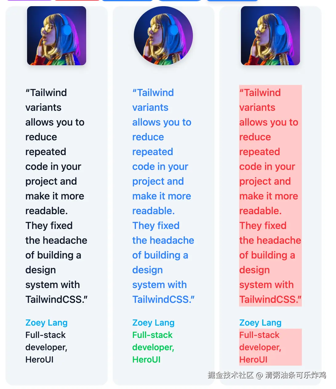
比如,我现在定义了三种color的样式,在不同的color下,description和role的字体颜色不同
jsx
variants: {
  color: {
    default: {
      description: "text-gray-900",
      role: "text-gray-900",
    },
    primary: {
      description: "text-green-500",
      role: "text-green-500",
    },
    danger: {
      description: "text-red-500",
      role: "text-red-500",
    },
  },
},
当我使用时,就可以传入这个color以实现不同的效果:
jsx
<Card color="default"/>
<Card color="primary"/>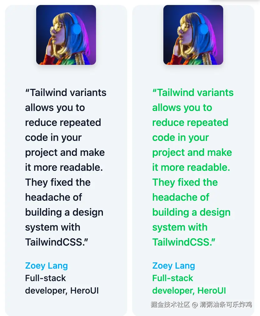
c.和compoundVariants(复合变体)一起使用
这里我直接给出我的代码
jsx
compoundVariants:[
  {
    color:'primary',
    class:{
      description:'text-blue-500',
      avatar:'rounded-full md:rounded-full'
    }
  }
],
解释下,这里的color的值,可以选择你上面变体定义的三个值default,primary,danger
我这里的复合变体的意思是:如果你的color为primary,那么description的盒子再应用text-blue-500的样式(之前的),avatar的盒子再应用rounded-full md:rounded-full的样式
d.Compoundslots(复合slot)
这个属性和compoundVariants的用法是基本一致的,比如
jsx
compoundSlots:[
  {
    slots:['role','description'],
    color:'danger',
    class: 'bg-red-200'
  }
],
这个的代码的意思是: slots为role和description的盒子,并且该组件的color变体为danger时, 会应用bg-red-200的class,如图,现在只有danger的组件有红色背景
e.Slot variant overrides(这个相对难以理解,但是用的也比较少)
官网例子:www.tailwind-variants.org/docs/slots#...
这里我用组件的方式改写了一下
jsx
import { tv } from "tailwind-variants";

// ✅ 定义 Item 类型
type TabItem = {
  id: string;
  label: string;
  color?: "primary" | "secondary";
  isSelected?: boolean;
};

// ✅ 正确的 props 类型定义
export default function Tab({ items }: { items: TabItem[] }) {
  const card = tv({
    slots: {
      base: "flex gap-2",
      tab: "rounded px-4 py-2 cursor-pointer transition-all",
    },
    variants: {
      color: {
        primary: {
          tab: "text-blue-500 dark:text-blue-400",
        },
        secondary: {
          tab: "text-purple-500 dark:text-purple-400",
        },
      },
      isSelected: {
        true: {
          tab: "font-bold bg-blue-100",
        },
        false: {
          tab: "font-normal bg-gray-50",
        },
      },
    },
  });

  const { base, tab } = card({ color: "primary" });

  return (
    <div className={base()}>
      {items.map((item) => (
        <div
          key={item.id}
          className={tab({ isSelected: item.isSelected, color: item.color })}
          id={item.id}
        >
          {item.label}
        </div>
      ))}
    </div>
  );
}
传入使用:
jsx
const tabItems = [
  { id: "1", label: "Tab 1", isSelected: true },
  { id: "2", label: "Tab 2", isSelected: false },
  { id: "3", label: "Tab 3", isSelected: false, color: "secondary" as const },
];
<Tab items={tabItems} />
效果:

解释一下: 这个tab这里本来默认是渲染rounded px-4 py-2 cursor-pointer transition-all的样式的,但是我们可以通过把变体传进来,进而去覆盖默认的tab的样式。
比如{ id: "1", label: "Tab 1", isSelected: true } 就会把font-bold bg-blue-100的样式加到tab的样式里面去。
比如{ id: "3", label: "Tab 3", isSelected: false, color: "secondary" as const }会把secondary: {
arduino
tab: "text-purple-500 dark:text-purple-400",}的样式加入到slots中的tab中去
七.Overriding styles(样式覆盖)
文档:www.tailwind-variants.org/docs/overri...
a.单组件(组件里只有一个元素)样式覆盖
简单叙述就是:传入一个className,然后在buttonTvStyles调用时作为参数传入进去
jsx
import { tv } from "tailwind-variants";

export default function Button({
  size,
  color,
  radius,
  shadow,
  children,
  disabled,
  className
}: {
  size?: "sm" | "md" | "lg";
  color?: "primary" | "secondary";
  radius?: "none" | "sm" | "md" | "lg" | "full";
  shadow?: "none" | "sm" | "md" | "lg";
  children?: React.ReactNode;
  disabled?: boolean;
  className?: string;
}) {
  const buttonTvStyles = tv({
    base: "font-medium bg-blue-500 text-white active:opacity-80 cursor-pointer",
    variants: {
      color: {
        primary: "bg-blue-500 text-white",
        secondary: "bg-purple-500 text-white",
      },
      size: {
        sm: "text-sm",
        md: "text-base",
        lg: "px-4 py-3 text-lg",
      },
      radius: {
        none: "rounded-none",
        sm: "rounded-sm",
        md: "rounded-md",
        lg: "rounded-lg",
        full: "rounded-full",
      },
      shadow: {
        none: "shadow-none",
        sm: "shadow-sm",
        md: "shadow-md",
        lg: "shadow-lg",
      },
      disabled: {
        true: 'opacity-50 bg-gray-500 pointer-events-none'
      }
    },
    compoundVariants: [
      {
        size: ["sm", "md"],
        class: "px-3 py-1",
      },
      {
        color: 'primary',
        size: 'sm',
        class: 'bg-red-500 text-white',
      }
    ],
    defaultVariants: {
      size: "md",
      color: "primary",
      radius: "md",
      shadow: "none",
    },
  });

  return (
    <button className={buttonTvStyles({ size, color, radius, shadow, disabled, className })}>
      {children}
    </button>
  );
}
使用:
jsx
<Button size="md" color="secondary" className="bg-pink-500 hover:bg-pink-600">
  覆盖为粉色
</Button>
b.带插槽组件(组件里有多个元素)的样式覆盖
jsx
import { tv } from "tailwind-variants";
import avatar2 from "./intro-avatar.webp";

export default function Card({
  color,
  classNames
}: {
  color?: "default" | "primary" | "danger";
  classNames?: {
    base?: string;
    avatar?: string;
    wrapper?: string;
    description?: string;
    infoWrapper?: string;
    name?: string;
    role?: string;
  };
}) {
  const card = tv({
    slots: {
      base: "bg-slate-100 rounded-xl p-8 md:p-0",
      avatar:
        "w-24 h-24 md:h-auto md:rounded-none rounded-full mx-auto drop-shadow-lg",
      wrapper: "flex-1 pt-6 md:p-8 text-center md:text-left space-y-4",
      description: "text-md font-medium",
      infoWrapper: "font-medium",
      name: "text-sm text-sky-500",
      role: "text-sm text-slate-700",
    },
    variants: {
      color: {
        default: {
          description: "text-gray-900",
          role: "text-gray-900",
        },
        primary: {
          description: "text-green-500",
          role: "text-green-500",
        },
        danger: {
          description: "text-red-500",
          role: "text-red-500",
        },
      },
    },
    compoundVariants:[
      {
        color:'primary',
        class:{
          description:'text-blue-500',
          avatar:'rounded-full md:rounded-full'
        }
      }
    ],
    compoundSlots:[
      {
        slots:['role','description'],
        color:'danger',
        class: 'bg-red-200'
      }
    ],
    defaultVariants:{
        color:'default'
    }
  });

  const { base, avatar, wrapper, description, infoWrapper, name, role } =
    card({ color });

  return (
    <figure className={base({ class: classNames?.base })}>
      <img className={avatar({ class: classNames?.avatar })} src={avatar2} alt="" width="384" height="512" />
      <div className={wrapper({ class: classNames?.wrapper })}>
        <blockquote>
          <p className={description({ class: classNames?.description })}>
            "Tailwind variants allows you to reduce repeated code in your
            project and make it more readable. They fixed the headache of
            building a design system with TailwindCSS."
          </p>
        </blockquote>
        <figcaption className={infoWrapper({ class: classNames?.infoWrapper })}>
          <div className={name({ class: classNames?.name })}>Zoey Lang</div>
          <div className={role({ class: classNames?.role })}>Full-stack developer, HeroUI</div>
        </figcaption>
      </div>
    </figure>
  );
}
使用:
jsx
{/* 综合覆盖多个样式 */}
<Card
  color="danger"
  classNames={{
    base: "bg-yellow-50 border-2 border-yellow-400",
    avatar: "grayscale hover:grayscale-0 transition-all",
    wrapper: "bg-yellow-100 rounded-lg",
    description: "text-yellow-900 italic",
    name: "text-yellow-700 font-bold",
    role: "text-yellow-600"
  }}
/>
八.继承
文档:www.tailwind-variants.org/docs/compos...
主要就是可以通过extend来继承别的组件的样式。 也可以使用base,slots或者variants来组合样式,这里具体就不举例了,因为比较用法比较简单。
九.结合TS
结合ts使用。
tsx
import { tv, type VariantProps } from 'tailwind-variants';

export const button = tv({
  base: 'px-4 py-1.5 rounded-full hover:opacity-80',
  variants: {
    color: {
      primary: 'bg-blue-500 text-white',
      neutral: 'bg-zinc-500 text-black dark:text-white'
    },
    flat: {
      true: 'bg-transparent'
    }
  },
  defaultVariants: {
    color: 'primary'
  },
  compoundVariants: [
    {
      color: 'primary',
      flat: true,
      class: 'bg-blue-500/40'
    },
    {
      color: 'neutral',
      flat: true,
      class: 'bg-zinc-500/20'
    }
  ]
});

/**
 * Result:
 * color?: "primary" | "neutral"
 * flat?: boolean
 */

type ButtonVariants = VariantProps<typeof button>;

interface ButtonProps extends ButtonVariants {
  children: React.ReactNode;
}

export const Button = (props: ButtonProps) => {
  return <button className={button(props)}>{props.children}</button>;
};
jsx
import { tv,VariantProps } from "tailwind-variants";
import avatar2 from "../../UseTailwindVariants/components/intro-avatar.webp";

const card = tv({
  slots: {
    base: "bg-slate-100 rounded-xl p-8 md:p-0",
    avatar:
      "w-24 h-24 md:h-auto md:rounded-none rounded-full mx-auto drop-shadow-lg",
    wrapper: "flex-1 pt-6 md:p-8 text-center md:text-left space-y-4",
    description: "text-md font-medium",
    infoWrapper: "font-medium",
    name: "text-sm text-sky-500",
    role: "text-sm text-slate-700",
  },
  variants: {
    color: {
      default: {
        description: "text-gray-900",
        role: "text-gray-900",
      },
      primary: {
        description: "text-green-500",
        role: "text-green-500",
      },
      danger: {
        description: "text-red-500",
        role: "text-red-500",
      },
    },
  },
  compoundVariants:[
    {
      color:'primary',
      class:{
        description:'text-blue-500',
        avatar:'rounded-full md:rounded-full'
      }
    }
  ],
  compoundSlots:[
    {
      slots:['role','description'],
      color:'danger',
      class: 'bg-red-200'
    }
  ],
  defaultVariants:{
      color:'default'
  }
});

interface CardVariants extends VariantProps<typeof card> {
  classNames?: {
    base?: string;
    avatar?: string;
    wrapper?: string;
    description?: string;
    infoWrapper?: string;
    name?: string;
    role?: string;
  };
}


export function Card(props:CardVariants) {
  const { color, classNames } = props;

  const { base, avatar, wrapper, description, infoWrapper, name, role } =
    card({ color });

  return (
    <figure className={base({ class: classNames?.base })}>
      <img className={avatar({ class: classNames?.avatar })} src={avatar2} alt="" width="384" height="512" />
      <div className={wrapper({ class: classNames?.wrapper })}>
        <blockquote>
          <p className={description({ class: classNames?.description })}>
            "Tailwind variants allows you to reduce repeated code in your
            project and make it more readable. They fixed the headache of
            building a design system with TailwindCSS."
          </p>
        </blockquote>
        <figcaption className={infoWrapper({ class: classNames?.infoWrapper })}>
          <div className={name({ class: classNames?.name })}>Zoey Lang</div>
          <div className={role({ class: classNames?.role })}>Full-stack developer, HeroUI</div>
        </figcaption>
      </div>
    </figure>
  );
}
多组件结合ts使用是优化,主要是优化传参:
jsx
interface CardVariants extends VariantProps<typeof card> {
  classNames?: {
    base?: string;
    avatar?: string;
    wrapper?: string;
    description?: string;
    infoWrapper?: string;
    name?: string;
    role?: string;
  };
}
还有这里要优化,因为每次都要写:
jsx
<figure className={base({ class: classNames?.base })}>
      <img className={avatar({ class: classNames?.avatar })} src={avatar2} alt="" width="384" height="512" />
      <div className={wrapper({ class: classNames?.wrapper })}>
        <blockquote>
          <p className={description({ class: classNames?.description })}>
            "Tailwind variants allows you to reduce repeated code in your
            project and make it more readable. They fixed the headache of
            building a design system with TailwindCSS."
          </p>
        </blockquote>
        <figcaption className={infoWrapper({ class: classNames?.infoWrapper })}>
          <div className={name({ class: classNames?.name })}>Zoey Lang</div>
          <div className={role({ class: classNames?.role })}>Full-stack developer, HeroUI</div>
        </figcaption>
      </div>
    </figure>
最后的优化版本:
jsx
import { applyStyles, tv, type TVProps } from './tv';
import avatar2 from "../../UseTailwindVariants/components/intro-avatar.webp";

const createStyle = tv({
  slots: {
    base: "bg-slate-100 rounded-xl p-8 md:p-0",
    avatar:
      "w-24 h-24 md:h-auto md:rounded-none rounded-full mx-auto drop-shadow-lg",
    wrapper: "flex-1 pt-6 md:p-8 text-center md:text-left space-y-4",
    description: "text-md font-medium",
    infoWrapper: "font-medium",
    name: "text-sm text-sky-500",
    role: "text-sm text-slate-700",
  },
  variants: {
    color: {
      default: {
        description: "text-gray-900",
        role: "text-gray-900",
      },
      primary: {
        description: "text-green-500",
        role: "text-green-500",
      },
      danger: {
        description: "text-red-500",
        role: "text-red-500",
      },
    },
  },
  compoundVariants: [
    {
      color: 'primary',
      class: {
        description: 'text-blue-500',
        avatar: 'rounded-full md:rounded-full'
      }
    }
  ],
  compoundSlots: [
    {
      slots: ['role', 'description'],
      color: 'danger',
      class: 'bg-red-200'
    }
  ],
  defaultVariants: {
    color: 'default'
  }
});


type Props = TVProps<typeof createStyle>;

export function Card(props: Props) {
  const { variants, classNames } = props;
  const styles = applyStyles(createStyle, {
    variants,
    classNames
  });

  const { base, avatar, wrapper, description, infoWrapper, name, role } = styles;

  return (
    <figure className={base()}>
      <img className={avatar()} src={avatar2} alt="" width="384" height="512" />
      <div className={wrapper()}>
        <blockquote>
          <p className={description()}>
            "Tailwind variants allows you to reduce repeated code in your
            project and make it more readable. They fixed the headache of
            building a design system with TailwindCSS."
          </p>
        </blockquote>
        <figcaption className={infoWrapper()}>
          <div className={name()}>Zoey Lang</div>
          <div className={role()}>Full-stack developer, HeroUI</div>
        </figcaption>
      </div>
    </figure>
  );
}
typescript
import clsx from 'clsx';
import { createTV, VariantProps } from 'tailwind-variants';

import { twMergeConfig } from '@/utils/cn';

export const tv = createTV({
  twMerge: true,
  twMergeConfig,
});

type SlotClassNames<T> = T extends {
  slots: infer S;
}
  ? SlotClassNames<S>
  : T extends (config: infer C) => any
    ? SlotClassNames<C>
    : Partial<Record<keyof T, string>>;

export interface TVProps<T extends (...args: any) => any> {
  classNames?: SlotClassNames<T>;
  variants?: VariantProps<T>;
}

/**
 * A utility for applying variants and custom classNames to styles created with `tailwind-variants`.
 * It allows a component to accept a `classNames` prop to override or extend the styles of its internal slots.
 *
 * @param createStyles - The style function created by `tv` from `tailwind-variants`.
 * @param props - The component's props, expected to contain `variants` and `classNames`.
 * @returns The resolved styles object, where each slot function is wrapped to include the custom classNames.
 *
 * @example
 * const buttonStyles = tv({ slots: { base: '...', icon: '...' } });
 * const props = { variants: { color: 'primary' }, classNames: { icon: 'text-red-500' } };
 * const styles = applyStyles(buttonStyles, props);
 * <div class={styles.base()}><span class={styles.icon()} /></div>
 * The icon will have the 'text-red-500' class applied.
 */
export function applyStyles<T extends (...args: any) => any>(
  createStyles: T,
  props: TVProps<T>,
): ReturnType<T> {
  const styles = createStyles(props.variants);

  Object.keys(styles).forEach((key) => {
    const original = styles[key];
    // Wrap the original slot function to merge the `classNames` prop.
    styles[key] = (args: any) => {
      return original({
        ...args,
        className: clsx(args?.className, props.classNames?.[key as never]),
      });
    };
  });

  return styles;
}
TVProps的作用是:将传入进来的slot类型分别处理成一个对象,包含了classNames和variants属性,这两个对象里面包含了slot类型的属性。这样子就组成了组件的类型,而不用每次都写这么多了。
applyStyles函数的作用是,传入原来的style实例和props对象(包含variants和classNames属性),返回新的一个style实例。作用是:把外部传入的 classNames 自动合并到每个 slot 中,省去在 JSX 里逐个写 base({ class: classNames?.base }) 的重复代码。
typescript
const styles = applyStyles(createStyle, {
  variants,
  classNames
});
十:自定义配置。
同样的,tailwind-variants无法识别tailwindcss以外的自定义的类名,所以我们需要把自定义配置导出过来,在创建tv的时候将该自定义配置传入进去。
typescript
import { createTV, VariantProps } from 'tailwind-variants';
import { twMergeConfig } from '@/utils/cn';

export const tv = createTV({
  twMerge: true,
  twMergeConfig,
});
所以在使用ts的时候要从tv.ts中导入了
原来:
import { tv,VariantProps } from "tailwind-variants";
现在:
import { tv } from './tv';
十一:地址
demo地址:gitee.com/rui-rui-an/...