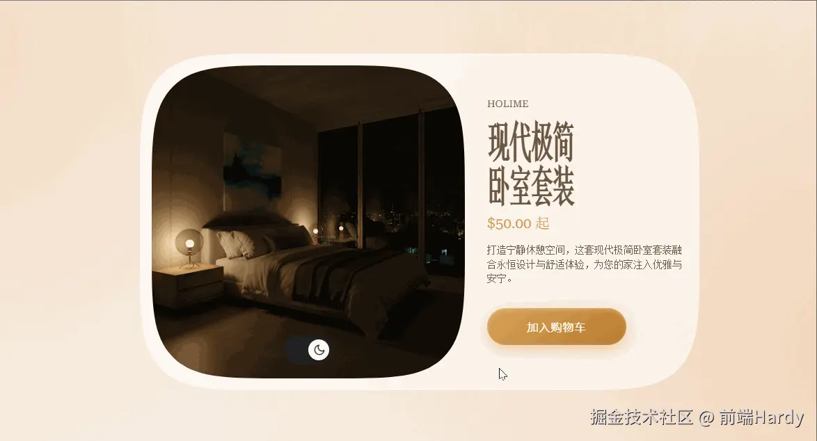
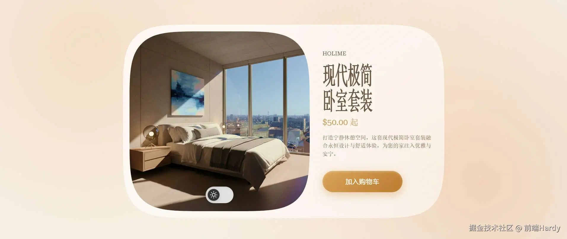
这是一个产品卡片页面 ,无 JS 实现图片切换 、主题切换 、全设备响应式适配,兼顾美观与实用性,值得大家学习。
大家复制代码时,可能会因格式转换出现错乱,导致样式失效。建议先少量复制代码进行测试,若未能解决问题,私信回复源码两字,我会发送完整的压缩包给你。
演示效果
HTML&CSS
html
<!DOCTYPE html>
<html lang="zh-CN">

<head>
    <meta charset="UTF-8">
    <meta name="viewport" content="width=device-width, initial-scale=1.0">
    <title>现代极简卧室套装</title>
    <style>
        body {
            font-family: "Roboto Serif", serif;
            display: flex;
            justify-content: center;
            align-items: center;
            margin: 0;
            min-height: 100vh;
            background-color: #f6f1ea;
            background-image: radial-gradient(circle at 15% 20%, rgba(232, 186, 142, 0.35) 0%, rgba(232, 186, 142, 0.18) 20%, rgba(232, 186, 142, 0.08) 35%, transparent 60%), radial-gradient(circle at 85% 75%, rgba(220, 160, 110, 0.35) 0%, rgba(220, 160, 110, 0.15) 25%, transparent 55%), radial-gradient(circle at 60% 10%, rgba(255, 210, 170, 0.25) 0%, transparent 50%);
            background-repeat: no-repeat;
            background-attachment: fixed;
        }

        body::after {
            content: "";
            position: fixed;
            inset: 0;
            pointer-events: none;
            z-index: 10;
            mix-blend-mode: saturation;
            background: radial-gradient(circle at 20% 25%, rgba(255, 200, 150, 0.35), rgba(255, 200, 150, 0.15) 30%, transparent 60%), radial-gradient(circle at 80% 70%, rgba(255, 170, 110, 0.3), transparent 60%);
            filter: blur(80px);
        }

        .product-card {
            border-radius: 12rem;
            corner-shape: squircle;
            padding: 1rem 1.5rem 1rem 1rem;
            max-width: 800px;
            background: linear-gradient(145deg, rgba(255, 255, 255, 0.75), rgba(255, 255, 255, 0.55));
            backdrop-filter: blur(20px);
            border: 1px solid rgba(255, 255, 255, 0.4);
            box-shadow: 0 40px 80px rgba(206, 168, 132, 0.1), 0 20px 40px rgba(0, 0, 0, 0.1), 0 0 120px rgba(198, 169, 126, 0.25), inset 0 1px 0 rgba(255, 255, 255, 0.6), -5px -5px 10px 0 #fffce9;
        }

        @media (max-width: 768px) {
            .product-card {
                border-radius: 5rem;
            }
        }

        .product-card .card-content {
            display: flex;
            justify-content: center;
            gap: 32px;
        }

        @media (max-width: 768px) {
            .product-card .card-content {
                flex-direction: column;
            }
        }

        .product-card .image-container {
            position: relative;
            border-radius: 12rem;
            width: 45vw;
            max-width: 450px;
            corner-shape: squircle;
            aspect-ratio: 1/1;
            overflow: hidden;
        }

        @media (max-width: 768px) {
            .product-card .image-container {
                width: 100%;
                border-radius: 5rem;
            }
        }

        .product-card .info-container {
            display: flex;
            flex-direction: column;
            justify-content: center;
            color: #5f5a55;
        }

        .product-card .info-container .brand {
            display: block;
            padding-bottom: 3rem;
            font-size: 0.85rem;
        }

        .product-card .info-container h1 {
            line-height: 100%;
            font-size: 2rem;
            font-weight: 600;
            letter-spacing: -0.1rem;
            margin: 0;
            padding: 0;
            transform: scaleY(2);
        }

        .product-card .info-container .price {
            font-size: 1.3rem;
            font-weight: 400;
            margin: 0;
            padding: 2.5rem 0 0;
            color: #c89b5e;
        }

        .product-card .info-container .description {
            max-width: 280px;
            font-size: 0.85rem;
            font-weight: 200;
            line-height: 150%;
            margin: 0;
            padding: 1rem 0;
        }

        .product-card .info-container .btn-primary {
            margin-top: 1rem;
            padding: 1rem 2rem;
            max-width: 200px;
            font-size: 1rem;
            letter-spacing: 1px;
            color: #ffffff;
            background: linear-gradient(145deg, #d8a45c, #b97a2f);
            border: none;
            border-radius: 40px;
            cursor: pointer;
            box-shadow: 0 8px 20px rgba(201, 155, 94, 0.35), 0 0 25px rgba(201, 155, 94, 0.15), inset 0 2px 6px rgba(255, 255, 255, 0.3);
            transition: 0.3s ease;
        }

        @media (max-width: 768px) {
            .product-card .info-container .btn-primary {
                max-width: none;
            }
        }

        .product-card .info-container .btn-primary:hover {
            transform: translateY(-2px);
            filter: brightness(1.05);
            box-shadow: 0 10px 25px rgba(185, 122, 47, 0.45), inset 0 2px 6px rgba(255, 255, 255, 0.3);
        }

        .product-card .info-container .btn-primary:active {
            transform: translateY(1px);
            box-shadow: 0 5px 15px rgba(185, 122, 47, 0.3), inset 0 3px 6px rgba(0, 0, 0, 0.15);
        }

        .image {
            aspect-ratio: 1/1;
            width: 100%;
            background: url("https://assets.codepen.io/662051/Gemini_Generated_Image_j4wi73j4wi73j4wi.png") center;
            background-size: cover;
            transition: 0.4s ease;
        }

        .theme-switch__input:checked~.image {
            background-image: url("https://assets.codepen.io/662051/Gemini_Generated_Image_2q32sc2q32sc2q32.png");
        }

        .theme-switch {
            position: absolute;
            left: 50%;
            bottom: 20px;
            transform: translateX(-50%);
            cursor: pointer;
        }

        .theme-switch__input {
            display: none;
        }

        .theme-switch__container {
            position: relative;
            width: 60px;
            height: 32px;
            padding: 5px;
            background-color: #e2e2e2;
            border-radius: 32px;
            display: flex;
            align-items: center;
            box-shadow: inset 0 2px 5px rgba(0, 0, 0, 0.1);
            transition: all 0.4s cubic-bezier(0.175, 0.885, 0.32, 1.275);
        }

        .theme-switch__circle {
            width: 30px;
            height: 30px;
            background-color: #333;
            border-radius: 50%;
            z-index: 2;
            box-shadow: 0 2px 10px rgba(0, 0, 0, 0.2);
            transition: all 0.4s cubic-bezier(0.175, 0.885, 0.32, 1.275);
        }

        .theme-switch__icons {
            position: absolute;
            width: 100%;
            box-sizing: border-box;
            z-index: 2;
        }

        .theme-switch .icon {
            width: 18px;
            height: 18px;
            transition: opacity 0.3s ease;
        }

        .theme-switch .icon--sun {
            opacity: 1;
            color: #fff;
            transform: translate(6px, 2px);
        }

        .theme-switch .icon--moon {
            opacity: 0;
            color: #333;
            transform: translate(15px, 2px);
        }

        .theme-switch__input:checked+.image+.theme-switch .theme-switch__container {
            background-color: #222;
        }

        .theme-switch__input:checked+.image+.theme-switch .theme-switch__circle {
            transform: translateX(30px);
            background-color: #fff;
        }

        .theme-switch__input:checked+.image+.theme-switch .icon--sun {
            opacity: 0;
        }

        .theme-switch__input:checked+.image+.theme-switch .icon--moon {
            opacity: 1;
            color: #333;
        }

        #dev {
            font-family: "Montserrat", sans-serif;
            position: fixed;
            top: 10px;
            left: 10px;
            padding: 1em;
            font-size: 14px;
            color: #333;
            background-color: white;
            border-radius: 25px;
            cursor: pointer;
        }

        #dev a {
            text-decoration: none;
            font-weight: bold;
            color: #333;
            transition: all 0.4s ease;
        }

        #dev a:hover {
            color: #ef5350;
            text-decoration: underline;
        }

        #dev span {
            display: inline-block;
            color: pink;
            transition: all 0.4s ease;
        }

        #dev span:hover {
            transform: scale(1.2);
        }
    </style>
</head>

<body>
    <div class="product-card">
        <div class="card-content">
            <div class="image-container">
                <input type="checkbox" id="theme-toggle" class="theme-switch__input">
                <div class="image"></div>
                <label for="theme-toggle" class="theme-switch">
                    <div class="theme-switch__container">
                        <div class="theme-switch__circle"></div>
                        <div class="theme-switch__icons">
                            <svg class="icon icon--sun" xmlns="http://www.w3.org/2000/svg" viewBox="0 0 24 24"
                                fill="none" stroke="currentColor" stroke-width="2" stroke-linecap="round"
                                stroke-linejoin="round">
                                <circle cx="12" cy="12" r="5"></circle>
                                <line x1="12" y1="1" x2="12" y2="3"></line>
                                <line x1="12" y1="21" x2="12" y2="23"></line>
                                <line x1="4.22" y1="4.22" x2="5.64" y2="5.64"></line>
                                <line x1="18.36" y1="18.36" x2="19.78" y2="19.78"></line>
                                <line x1="1" y1="12" x2="3" y2="12"></line>
                                <line x1="21" y1="12" x2="23" y2="12"></line>
                                <line x1="4.22" y1="19.78" x2="5.64" y2="18.36"></line>
                                <line x1="18.36" y1="5.64" x2="19.78" y2="4.22"></line>
                            </svg>
                            <svg class="icon icon--moon" xmlns="http://www.w3.org/2000/svg" viewBox="0 0 24 24"
                                fill="none" stroke="currentColor" stroke-width="2" stroke-linecap="round"
                                stroke-linejoin="round">
                                <path d="M21 12.79A9 9 0 1 1 11.21 3
                       7 7 0 0 0 21 12.79z"></path>
                            </svg>
                        </div>
                    </div>
                </label>
            </div>
            <div class="info-container">
                <header>
                    <span class="brand">HOLIME</span>
                    <h1 class="title">现代极简<br />卧室套装</h1>
                    <p class="price">$50.00 <span>起</span></p>
                    <p class="description">
                        打造宁静休憩空间,这套现代极简卧室套装融合永恒设计与舒适体验,为您的家注入优雅与安宁。
                    </p>
                </header>
                <button class="btn-primary">加入购物车</button>
            </div>
        </div>
    </div>
</body>

</html>
HTML
- prouct-card:产品卡片容器。核心视觉容器,用毛玻璃效果、圆角、渐变背景打造高级感
- card-content:卡片内容区。弹性布局,分「图片区 + 信息区」,移动端自动改为垂直布局
- image-container:产品图片容器。固定宽高比(1:1);② 包含切换图片的复选框、图片、切换按钮;圆角适配移动端
- info-container:产品信息区。垂直布局,包含品牌、标题、价格、描述、加入购物车按钮
- theme-toggle:图片切换复选框。隐藏的核心交互控件,通过「选中 / 未选中」切换产品图片
- theme-switch:切换按钮(夜间/白天)。视觉化的切换控件,绑定到隐藏的复选框,实现交互反馈
CSS
全局样式 & 背景
css
body {
  font-family: "Roboto Serif", serif;
  display: flex;
  justify-content: center;
  align-items: center;
  min-height: 100vh;
  /* 背景层:暖色调径向渐变,营造温馨的卧室氛围 */
  background-color: #f6f1ea;
  background-image: radial-gradient(...), radial-gradient(...), radial-gradient(...);
  background-repeat: no-repeat;
  background-attachment: fixed;
}
body::after {
  /* 叠加模糊渐变层,增强层次感,mix-blend-mode 提升饱和度 */
  content: "";
  position: fixed;
  inset: 0;
  pointer-events: none; /* 不遮挡交互 */
  mix-blend-mode: saturation;
  background: radial-gradient(...);
  filter: blur(80px);
}
核心:flex 实现页面居中 + 多层径向渐变背景 + 伪元素叠加模糊层,打造「柔和、有呼吸感」的视觉基底。
产品卡片核心样式
css
.product-card {
  border-radius: 12rem; /* 超大圆角,接近胶囊/圆角矩形 */
  corner-shape: squircle; /* 松鼠角(非标准但现代浏览器支持,更圆润的圆角) */
  padding: 1rem 1.5rem 1rem 1rem;
  max-width: 800px;
  /* 毛玻璃核心:半透明背景 + backdrop-filter */
  background: linear-gradient(145deg, rgba(255, 255, 255, 0.75), rgba(255, 255, 255, 0.55));
  backdrop-filter: blur(20px);
  border: 1px solid rgba(255, 255, 255, 0.4);
}
核心:backdrop-filter: blur(20px) 实现毛玻璃效果,linear-gradient 半透明白色渐变增强通透感,超大圆角提升现代感。
响应式布局
css
@media (max-width: 768px) {
  .product-card { border-radius: 5rem; }
  .product-card .card-content { flex-direction: column; }
  .product-card .image-container { width: 100%; border-radius: 5rem; }
  .product-card .info-container .btn-primary { max-width: none; }
}
核心:屏幕宽度 ≤768px(移动端)时,① 缩小卡片 / 图片圆角;② 图片 + 信息从「横向排列」改为「垂直排列」;③ 按钮宽度自适应,适配移动端交互。
图片切换交互
css
/* 默认图片 */
.image {
  aspect-ratio: 1/1;
  width: 100%;
  background: url("xxx.png") center;
  background-size: cover;
  transition: 0.4s ease;
}
/* 复选框选中时切换图片 */
.theme-switch__input:checked~.image {
  background-image: url("yyy.png");
}
核心:利用 CSS 相邻兄弟选择器 ~,监听复选框 :checked 状态,切换背景图片,配合 transition 实现平滑过渡。
开关按钮 & 按钮动效
css
/* 开关按钮样式切换 */
.theme-switch__input:checked+.image+.theme-switch .theme-switch__container {
  background-color: #222;
}
.theme-switch__input:checked+.image+.theme-switch .theme-switch__circle {
  transform: translateX(30px);
  background-color: #fff;
}
/* 加入购物车按钮 hover/active 动效 */
.btn-primary:hover {
  transform: translateY(-2px);
  filter: brightness(1.05);
  box-shadow: ...;
}
.btn-primary:active {
  transform: translateY(1px);
  box-shadow: ...;
}
核心:① 开关按钮的「白天 / 夜间」图标显隐、背景色、滑块位置随复选框状态变化;② 按钮 hover 时上移 + 亮度提升,active 时下移 + 阴影缩小,模拟「按压反馈」。
各位互联网搭子,要是这篇文章成功引起了你的注意,别犹豫,关注、点赞、评论、分享走一波,让我们把这份默契延续下去,一起在知识的海洋里乘风破浪!