前言
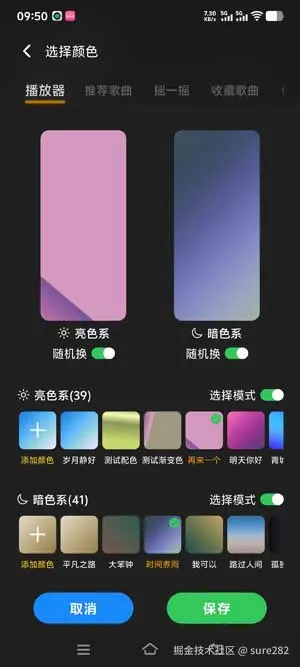
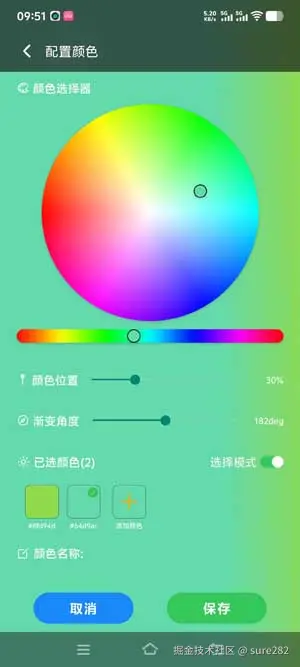
所谓自定义渐变色就是允许用户按需选择颜色以及颜色的位置,一个基本的CSS渐变色配置是这样的: experimental_backgroundImage: 'linear-gradient(135deg, #e2d7c8 0%, #d1c3a6 25%, #bdac86 50%, #a79368 75%, #8e794d 100%) ', 之前的文章提到过RN中实现渐变色的两种个方案,分别是RN的experimental_backgroundImage 和使用expo-linear-gradient 依赖库,以experimental_backgroundImage为例,如果我们想让用户实现自定义的渐变色方案应该允许用户配置 颜色 ,颜色停留的位置 ,渐变朝向角度。下面是界面样式:
依赖库选择
因为我们需要一个调色板供用户选择颜色,因此我们需要一个依赖库来提供颜色选择功能:
json
reanimated-color-picker它提供了多种颜色形式面板,比如圆形,条形,方形等选择界面UI组件,透明度控制和多种颜色格式获取,比如rgba格式和#ccc这种hex格式等,通常我们需要hex格式即可。该依赖库功能强大但是它没有详细文档,使用的最好方式是去它的项目中查看示例代码,非常详尽。由于我们想要创建渐变色效果应用于部分页面的渐变色背景,如果使用渐变色背景的页面是transparent_modal形式则不推荐使用透明度,将透明度始终设置为1,来避免显示底部页面内容。 以上我们创建了一个调色盘和颜色条,这二者便是以上依赖库为我们提供的样式UI:
tsx
import ColorPicker, { colorKit, HueSlider, Panel3, type ColorFormatsObject } from 'reanimated-color-picker';
    /**
     * ColorPick向外暴露onChange它是ui线程执行
     * onChangeJS和onCompleteJS都是在js线程执行的
     * ColorPick颜色选择行为会在点击调色盘和调整透明度时
     * 均会产生一个新颜色结果,而且渐变色的配置不适合调整透明度
     * 否则对于弹窗页面底部会显示出来
     * 它接收色彩对象,按需取制定格式即可
     */

                <ColorPicker
                    value={resultColor}
                    sliderThickness={16}
                    thumbSize={16}
                    thumbShape='circle'
                    onCompleteJS={onColorPick}
                    style={styles.picker}
                    boundedThumb
                >
                    <View
                        style={styles.panel}
                    >
                        <Panel3
                            style={styles.panelStyle}
                        />
                    </View>

                    <HueSlider
                        style={styles.sliderStyle}
                    />
                </ColorPicker>
它接收onChange事件函数以获取修改后的颜色,它内部使用react-native-reanimated依赖库因此动画控制以及值的变化有UI线程和JS线程之分,在这里我们使用js线程即可,因为我们要在值变化后修改组件接收的样式动态更新。
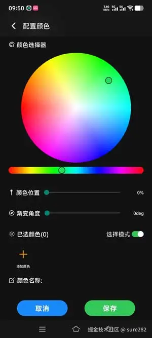
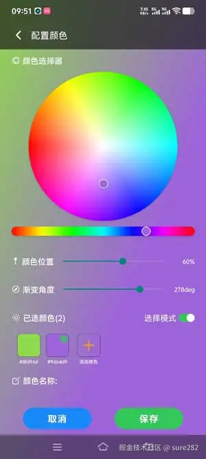
颜色位置
我们通常使用%百分比来控制颜色位置,这里我们使用一个slider,限定值的范围01或者0 100,它的值在每次新增颜色后更新位置则与新的颜色配置绑定,因为每个颜色都应该有一个不同的位置,所以每一个渐变色存储对象中都应该有一个颜色和位置
渐变角度
渐变角度则是整个渐变色的配置,因此整个渐变色结果对象中只需要一个角度值。因此我们需要在创建渐变色时应该保存:渐变颜色n个,颜色位置n个,渐变角度1个:
单个颜色的基本配置字段,它同时也是底部已选择的颜色栏元素所需字段:
ts
export interface ColorConfig {
    color: string,
    pos: number,
    id: string
};当用户选择颜色超过1个时就可以创建渐变色,构造linear-gradient(135deg, #e2d7c8 0%, #d1c3a6 25%, #bdac86 50%, #a79368 75%, #8e794d 100%):
ts
    const defaultColor = colorKit.randomRgbColor().hex();
    /** 记录当前选择的颜色项 */
    const [currentId, setCurrentId] = useState<string>('');
    /** 已选择的颜色数组 */
    const [colors, setColors] = useState<ColorConfig[]>([]);
    /** 删除模式还是新增模式 */
    const [mode, setMode] = useState<LinearMode>('select');
    /** 渐变色结果字符串,直接赋值给指定组件的样式 */
    const [experimental_backgroundImage, setExperimental_backgroundImage] = useState<string>('');

    const onColorPick = (color: ColorFormatsObject) => {
        setResultColor(color.hex);
        let obj = { color: color.hex, pos: sliderValue, id: generateId() };
        if (mode === 'select') {
            if (currentId) {
                setColors(prev => {
                    const newList = prev.map(el => {
                        if (el.id === currentId) {
                            return { ...el, color: color.hex };
                        };
                        return el;
                    });
                    if (newList.length > 1) {
                        const stopsStr = newList.slice().sort((a, b) => a.pos - b.pos).map(({ color, pos }) => `${color} ${(pos * 100).toFixed(0)}%`).join(', ');
                        const result = `linear-gradient(${angle}deg, ${stopsStr})`
                        setExperimental_backgroundImage(result);
                        if (viewItemsCount < newList.length) {
                            flatListRef.current?.scrollToOffset({ offset: newList.length * 55, animated: true });
                        };
                    };
                    return newList;
                });
            } else {
                setColors(prev => [...prev, obj]);
                setCurrentId(obj.id);
            };
        };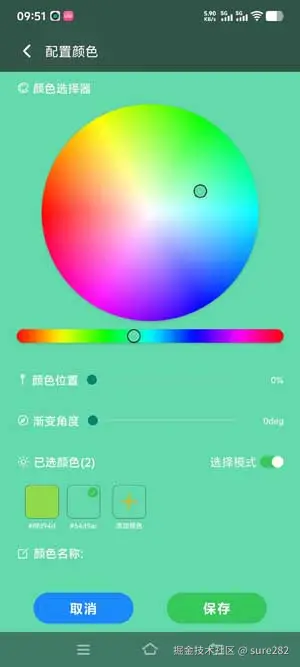
};以上有一个细节:在调色板组件中,底部颜色条,顶部圆盘以及颜色透明度的变化都视为颜色变化,触发onColorPick并生成一个新的颜色值结果,因此我们应该区分用户到底是在新增一个颜色还是在修改当前这个颜色,因此在颜色位置的Slider变化时应该有相同的逻辑处理:
ts
    const handleSliderChange = (val: number) => {
        setSliderValue(Number(val.toFixed(1)));
        if (currentId) {
            setColors(prev => {
                const newList = prev.map(el => {
                    if (el.id === currentId) {
                        return { ...el, pos: val }
                    };
                    return el;
                });
                const stopsStr = newList.slice().sort((a, b) => a.pos - b.pos).map(({ color, pos }) => `${color} ${(pos * 100).toFixed(0)}%`).join(', ');
                const result = `linear-gradient(${angle}deg, ${stopsStr})`
                setExperimental_backgroundImage(result);
                return newList;
            });

        };
    };
颜色值和位置值的变化最终会影响渐变色,因此需要重新生成experimental_backgroundImage
角度值变化时也应该重新生成experimental_backgroundImage:
ts
    /**
     * 角度值发生变化时执行
     * 添加节流处理,角度变化后
     * 会在已选颜色两种以上的情况下重新想修改
     * 渐变色
     */
    const handleAngelChange = (val: number) => {
        setAngle(Number(val.toFixed(0)));
        if (colors.length > 1) {
            const stopsStr = colors.slice().sort((a, b) => a.pos - b.pos).map(({ color, pos }) => `${color} ${(pos * 100).toFixed(0)}%`).join(', ');
            const result = `linear-gradient(${angle}deg, ${stopsStr})`
            setExperimental_backgroundImage(result);
        };
    };
完成以上三个控制后就是收获结果了将其转化为linear-gradient(135deg, #e2d7c8 0%, #d1c3a6 25%, #bdac86 50%, #a79368 75%, #8e794d 100%)格式保存,也没什么好说的,具体你想以哪种方式存储问题都不大,因为核心问题就是调色板,解决了它就是数据的修改保存,完整代码如下:
tsx
import { type FC, useState, useCallback, useRef } from 'react';
import PageTitleBar from '@/components/ui/PageTitleBar';
import StyledText from '@/components/ui/StyledText';
import { ThemedIonicons, ThemedView } from '@/components/theme/ThemedComponents';
import { View, StyleSheet, ScrollView, Platform, Pressable, TextInput, useWindowDimensions, KeyboardAvoidingView } from 'react-native';
import { useLocalSearchParams, router } from 'expo-router';
import type { ThemeType } from '@/types';
import { useSafeAreaInsets } from 'react-native-safe-area-context';
import CustomButton from '@/components/ui/CustomButton';
import ColorPicker, { colorKit, HueSlider, Panel3, type ColorFormatsObject } from 'reanimated-color-picker';
import Slider from '@react-native-community/slider';
import Switch from '@/components/ui/Switch';
import type { LinearMode } from '@/types/gradient';
import { useThemeConfig, useThemeNotification } from '@/hooks/useTheme';
import { generateId } from '@/utils';
import { insertGradient } from '@/libs/sqlite'
import { FlashList, type FlashListRef } from '@shopify/flash-list';
import ColorItem, { type ColorConfig } from '@/components/linearcolorselectpage/ColorItem';
import useProMusicStore from '@/store/proMusic';
const defaultColor = colorKit.randomRgbColor().hex();
const ColorPickerPage: FC = () => {
const { type } = useLocalSearchParams<{ type: ThemeType }>();
const { top, bottom } = useSafeAreaInsets();
const [resultColor, setResultColor] = useState(defaultColor);
const [colors, setColors] = useState<ColorConfig[]>([]);
const flatListRef = useRef<FlashListRef<ColorConfig>>(null);
const [sliderValue, setSliderValue] = useState<number>(0);
const { text } = useThemeConfig();
const { width } = useWindowDimensions()
const showNotification = useThemeNotification();
const [experimental_backgroundImage, setExperimental_backgroundImage] = useState<string>('');
const [angle, setAngle] = useState<number>(0);
const [mode, setMode] = useState<LinearMode>('select');
const [title, setTitle] = useState<string>('')
const [currentId, setCurrentId] = useState<string>('');
const viewItemsCount = Math.floor((width - 40) / 55);
/**
* ColorPick向外暴露onChange它是ui线程执行
* onChangeJS和onCompleteJS都是在js线程执行的
* ColorPick颜色选择行为会在点击调色盘和调整透明度时
* 均会产生一个新颜色结果,而且渐变色的配置不适合调整透明度
* 否则对于弹窗页面底部会显示出来
* 它接收色彩对象,按需取制定格式即可
*/
const onColorPick = (color: ColorFormatsObject) => {
setResultColor(color.hex);
let obj = { color: color.hex, pos: sliderValue, id: generateId() };
if (mode === 'select') {
if (currentId) {
setColors(prev => {
const newList = prev.map(el => {
if (el.id === currentId) {
return { ...el, color: color.hex };
};
return el;
});
if (newList.length > 1) {
const stopsStr = newList.slice().sort((a, b) => a.pos - b.pos).map(({ color, pos }) => `${color} ${(pos * 100).toFixed(0)}%`).join(', ');
const result = `linear-gradient(${angle}deg, ${stopsStr})`
setExperimental_backgroundImage(result);
if (viewItemsCount < newList.length) {
flatListRef.current?.scrollToOffset({ offset: newList.length * 55, animated: true });
};
};
return newList;
});
} else {
setColors(prev => [...prev, obj]);
setCurrentId(obj.id);
};
};
};
const handleBack = () => router.dismiss();
const handleConfirm = async () => {
if (colors.length < 2) {
showNotification({ tip: '请至少选择两个颜色', type: 'warning' });
return
};
if (!title) {
showNotification({ tip: '请填写渐变色标题', type: 'warning' });
return;
};
try {
const configId = await insertGradient({
id: generateId(),
theme_type: type,
title,
is_active: 1,
sort_order: 0,
stops: colors.map(({ color, pos }, index) => ({
color,
position: pos,
id: generateId(),
sort_order: index,
config_id: '' // 会在 insertGradient 内部统一设置
})),
metadata: {
config_id: '', // 会在 insertGradient 内部统一设置
gradient_type: 'linear',
angle,
},
});
if (configId) {
showNotification({ tip: '保存成功', type: 'success' });
const { setSignal } = useProMusicStore.getState();
setSignal('RNLinearColorSelectPage');
// 可以在这里执行保存后的操作,如返回上一页
handleBack();
} else {
showNotification({ tip: '保存失败', type: 'error' })
}
} catch (error) {
showNotification({ tip: '请稍后重试', type: 'warning' })
};
};
const handleChangeMode = () => {
setMode(prev => prev === 'select' ? 'delete' : 'select');
};
const handlePressColorItem = useCallback((item: ColorConfig, mode: LinearMode) => {
if (mode === 'delete') {
setColors(prev => prev.filter(({ id }) => id !== item.id));
} else {
const { id, color, pos } = item;
setCurrentId(id);
setResultColor(color);
setSliderValue(pos);
};
}, []);
const handleSliderChange = (val: number) => {
setSliderValue(Number(val.toFixed(1)));
if (currentId) {
setColors(prev => {
const newList = prev.map(el => {
if (el.id === currentId) {
return { ...el, pos: val }
};
return el;
});
const stopsStr = newList.slice().sort((a, b) => a.pos - b.pos).map(({ color, pos }) => `${color} ${(pos * 100).toFixed(0)}%`).join(', ');
const result = `linear-gradient(${angle}deg, ${stopsStr})`
setExperimental_backgroundImage(result);
return newList;
});
};
};
/**
* 角度值发生变化时执行
* 添加节流处理,角度变化后
* 会在已选颜色两种以上的情况下重新想修改
* 渐变色
*/
const handleAngelChange = (val: number) => {
setAngle(Number(val.toFixed(0)));
if (colors.length > 1) {
const stopsStr = colors.slice().sort((a, b) => a.pos - b.pos).map(({ color, pos }) => `${color} ${(pos * 100).toFixed(0)}%`).join(', ');
const result = `linear-gradient(${angle}deg, ${stopsStr})`
setExperimental_backgroundImage(result);
};
};
const handleTextChange = (val: string) => setTitle(val.trim());
const themeType = type === 'light';
const handleAddColor = useCallback(() => {
const id = generateId();
setCurrentId(id);
setColors(prev => {
const newItem = { ...prev[prev.length - 1], id };
return ([...prev, newItem]);
});
}, []);
return (<ThemedView
style={[styles.container, { paddingBottom: bottom + 10, experimental_backgroundImage }]}
>
<PageTitleBar
leftText='配置颜色'
onPressLeft={handleBack}
/>
<KeyboardAvoidingView
behavior={Platform.OS === 'ios' ? 'padding' : 'height'}
style={[styles.container, { paddingTop: top + 50 }]}
>
<ScrollView
showsVerticalScrollIndicator={false}
>
<View
style={styles.colorPicker}
>
<ThemedIonicons
name='color-palette-outline'
size={15}
/>
<StyledText
size='SM'
weight='BOLD'
>颜色选择器</StyledText>
</View>
<ColorPicker
value={resultColor}
sliderThickness={16}
thumbSize={16}
thumbShape='circle'
onCompleteJS={onColorPick}
style={styles.picker}
boundedThumb
>
<View
style={styles.panel}
>
<Panel3
style={styles.panelStyle}
/>
</View>
<HueSlider
style={styles.sliderStyle}
/>
</ColorPicker>
<View
style={styles.titleBar}
>
<View
style={styles.title}
>
<ThemedIonicons
name='pin-sharp'
size={14}
/>
<StyledText
size='SM'
weight='BOLD'
>颜色位置</StyledText>
</View>
<Slider
style={styles.slider}
value={sliderValue}
step={.01}
minimumValue={0}
maximumValue={1}
onSlidingComplete={handleSliderChange}
maximumTrackTintColor='#ccc'
/>
<StyledText
size='XXS'
textAlign='right'
weight='BOLD'
style={styles.sliderText}
>{`${Number(sliderValue.toFixed(2)) * 100}%`}</StyledText>
</View>
<View
style={styles.titleBar}
>
<View
style={styles.title}
>
<ThemedIonicons
name='compass-outline'
size={15}
/>
<StyledText
size='SM'
weight='BOLD'
>渐变角度</StyledText>
</View>
<Slider
style={styles.slider}
value={angle}
step={1}
minimumValue={0}
maximumValue={360}
maximumTrackTintColor='#ccc'
onSlidingComplete={handleAngelChange}
/>
<StyledText
size='XXS'
textAlign='right'
weight='BOLD'
style={styles.sliderText}
>{angle.toFixed(0)}deg</StyledText>
</View>
<View
style={styles.titleBar}
>
<View
style={styles.title}
>
<ThemedIonicons
name={themeType ? 'sunny-outline' : 'moon-outline'}
size={themeType ? 16 : 14}
/>
<StyledText
weight='BOLD'
size='SM'
>{`已选颜色(${colors.length})`}</StyledText>
</View>
<View
style={styles.title}
>
<StyledText
size='SM'
onPress={handleChangeMode}
color={mode === 'select' ? text : '#e44444'}
>{mode === 'select' ? '选择模式' : '删除模式'}</StyledText>
<Switch
style={styles.switch}
active={mode === 'select'}
onChange={handleChangeMode}
/>
</View>
</View>
<FlashList
ref={flatListRef}
style={styles.list}
data={colors}
keyExtractor={({ id }) => id}
horizontal
showsHorizontalScrollIndicator={false}
contentContainerStyle={styles.colorContent}
renderItem={({ item }) => <ColorItem
mode={mode}
item={item}
active={currentId === item.id}
onPress={handlePressColorItem}
/>}
ListFooterComponent={<ColorItem
onPress={handleAddColor}
isEmpty
/>}
/>
<View
style={styles.colorPicker}
>
<ThemedIonicons
name='create-outline'
size={16}
/>
<StyledText
weight='BOLD'
size='SM'
>颜色名称:</StyledText>
</View>
<View
style={styles.inputArea}
>
<TextInput
value={title}
onChangeText={handleTextChange}
placeholder='请输入颜色标题'
placeholderTextColor={text}
style={[styles.input, { color: text }]}
maxLength={15}
/>
<Pressable
style={{ display: title ? 'flex' : 'none' }}
onPress={() => handleTextChange('')}
>
<ThemedIonicons
name='close-circle'
size={18}
/>
</Pressable>
</View>
</ScrollView>
</KeyboardAvoidingView>
<View
style={styles.buttonArea}
>
<CustomButton
type='primary'
text='取消'
onPress={handleBack}
style={styles.buttonStyle}
/>
<CustomButton
type='success'
text='保存'
onPress={handleConfirm}
style={styles.buttonStyle}
/>
</View>
</ThemedView>);
};
const shadow = Platform.select({
web: { boxShadow: 'rgba(0, 0, 0, 0.3) 0px 0px 2px' },
default: {
shadowColor: '#000',
shadowOffset: {
width: 0,
height: 1,
},
shadowOpacity: 0.2,
shadowRadius: 1.41,
elevation: 2,
},
});
const styles = StyleSheet.create({
container: {
flex: 1
},
input: {
flex: 1,
height: 30,
paddingVertical: 2
},
slider: {
flex: 1,
},
sliderText: {
width: 40
},
list: {
height: 65,
width: '100%',
paddingHorizontal: 20
},
titleBar: {
width: '100%',
paddingHorizontal: 20,
flexDirection: 'row',
justifyContent: 'space-between',
alignItems: 'center',
paddingVertical: 15
},
colorPicker: {
paddingHorizontal: 20,
flexDirection: 'row',
gap: 4,
alignItems: 'center',
paddingVertical: 10
},
inputArea: {
flex: 1,
flexDirection: 'row',
alignItems: 'center',
gap: 2,
borderBottomColor: '#ccc',
borderBottomWidth: 1,
marginHorizontal: 20,
},
title: {
flexDirection: 'row',
alignItems: 'center',
gap: 4
},
previewContainer: {
alignItems: 'center',
paddingVertical: 10
},
colorContent: {
gap: 5,
},
colorCard: {
width: 40,
height: 40,
borderRadius: 10,
borderWidth: 1
},
buttonArea: {
flexDirection: 'row',
justifyContent: 'space-evenly',
alignContent: 'center',
paddingTop: 20,
width: '100%'
},
card: {
borderRadius: 10,
overflow: 'hidden'
},
tip: {
position: 'absolute',
right: 1,
top: 1
},
switch: {
width: 28,
height: 14
},
buttonStyle: {
width: 120
},
picker: {
paddingHorizontal: 20,
gap: 10,
paddingBottom: 20
},
panel: {
width: '100%',
alignItems: 'center'
},
panelStyle: {
width: 260,
...shadow,
},
sliderStyle: {
borderRadius: 20,
...shadow,
},
sliderVerticalStyle: {
borderRadius: 20,
height: 300,
...shadow,
},
previewTxt: {
color: '#707070',
fontFamily: 'Quicksand',
},
content: {
padding: 20,
}
});
export default ColorPickerPage;有任何疑问可以查看项目代码(expo rn: expo创建的react native的音乐播放器应用,专注视频转歌和本地歌曲播放)