最近在学习electron想做一个自己喜欢的桌面端的软件,这边选择了网易云音乐,这边记录一下自己实现布局和功能的思路

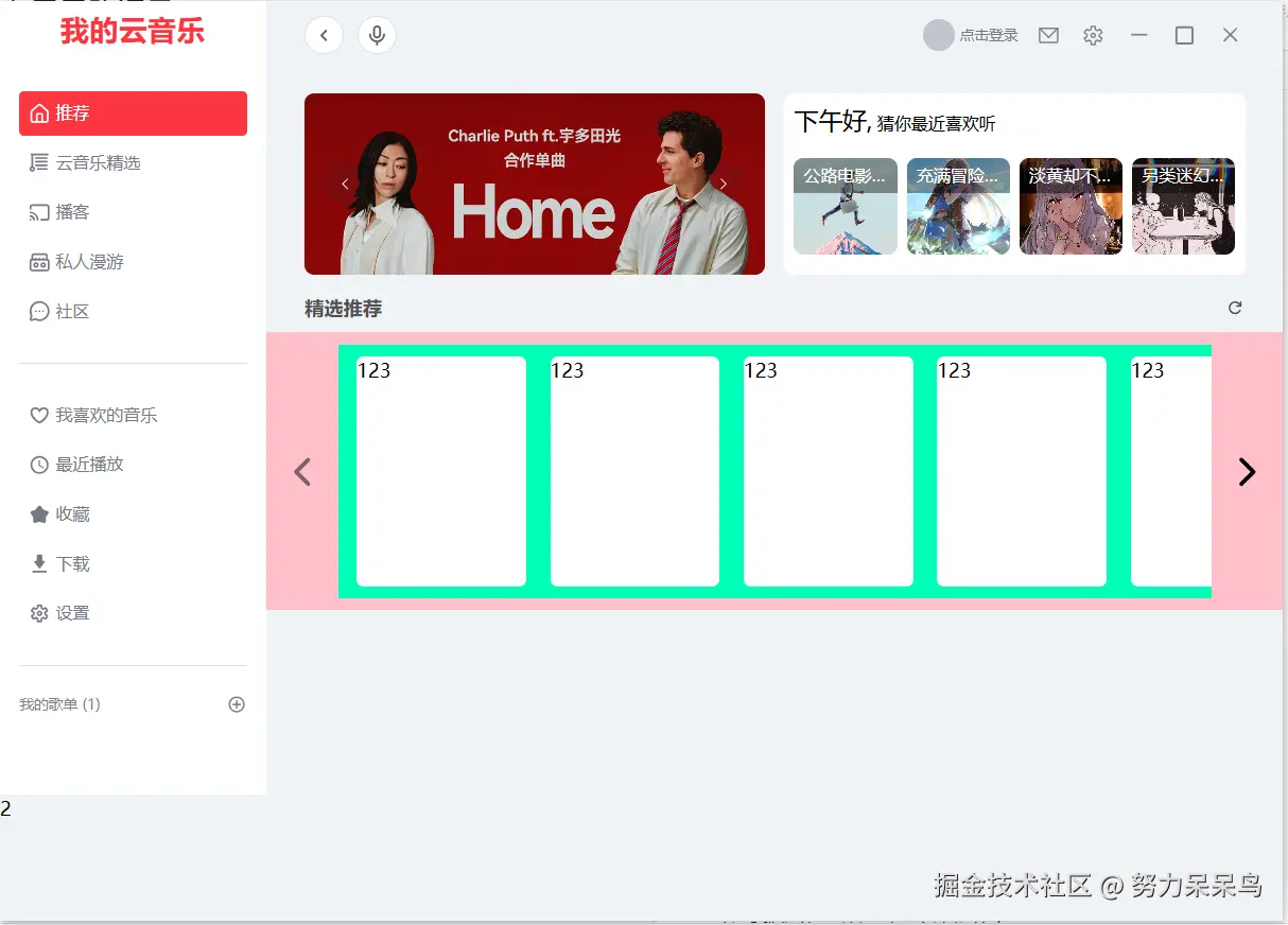
查看图片可以发现这个页面内容包含了三个部分,左边箭头,右边箭头,中间的内容区域,这边开始将基本的布局框架搭建出来
html
 <div class="scroll-warp group">
 <!-- 左箭头-->
    <div
      class="arrow left-arrow transition-opacity duration-300"
      :class="{ disabled: isAtStart }"
      @click="scroll('left')"
    >
      <Icon style="width: 100%; height: 100%" icon="tabler:chevron-left"></Icon>
    </div>
    <!--内容-->
    <div class="content" ref="contentRef" @scroll="handleScroll">
      <MusicItemCard v-for="(item, index) in 8" :key="index"></MusicItemCard>
    </div>
    <!-- 右箭头 -->
    <div
      class="arrow right-arrow transition-opacity duration-300"
      :class="{ disabled: isAtEnd }"
      @click="scroll('right')"
    >
      <Icon style="width: 100%; height: 100%" icon="tabler:chevron-right"></Icon>
    </div>
  </div>
有了基本的容器,我们就需要将样式完善出来
css
.scroll-warp {
  width: 100%;
  display: flex;
  align-items: center;
  justify-content: space-between;
  background-color: pink;
  padding: 10px;

  // 箭头的通用样式
  .arrow {
    display: flex;
    align-items: center;
    justify-content: center;
    width: 40px;
    height: 100%;
    min-height: 40px; // 防止高度为0
    cursor: pointer;
    z-index: 10;

    // 默认隐藏,父容器 hover 时显示
    opacity: 0;
    transition:
      opacity 0.3s ease,
      background-color 0.3s;

    // 禁用状态样式
    &.disabled {
      opacity: 0.5 !important; // 即使 hover 也保持半透明
      cursor: not-allowed;
      // background-color: #ccc; // 变灰
      pointer-events: none; // 禁止点击
    }
  }

  // 当鼠标移入 scroll-warp 时,显示箭头
  &:hover .arrow {
    opacity: 1;
  }

  .content {
    flex: 1;
    flex-shrink: 0;
    background-color: rgb(0, 255, 183);
    overflow-x: scroll;
    overflow-y: hidden;
    white-space: nowrap;
    display: flex;
    align-items: center;
    padding: 10px;
    gap: 10px;
    flex-wrap: nowrap;

    // 隐藏滚动条
    &::-webkit-scrollbar {
      display: none;
    }

    // 兼容其他浏览器隐藏滚动条
    -ms-overflow-style: none; /* IE and Edge */
    scrollbar-width: none; /* Firefox */

    margin: 0 10px;
  }
}
然后我们就可以得到一个这样的布局界面
接下来我们来实现一下js逻辑
js
import { ref, onMounted, onUnmounted } from 'vue'
import MusicItemCard from './MusicItemCard.vue'

// 获取内容区域的 DOM 引用
const contentRef = ref(null)

// 定义状态变量
const isAtStart = ref(true) // 是否在最左侧
const isAtEnd = ref(false) // 是否在最右侧

// 滚动处理函数
const scroll = (direction) => {
  if (!contentRef.value) return

  // 每次滚动的距离,这里设置为容器宽度的 80%,也可以设置为固定像素如 300
  const scrollAmount = contentRef.value.clientWidth * 0.8

  if (direction === 'left') {
    contentRef.value.scrollBy({ left: -scrollAmount, behavior: 'smooth' })
  } else {
    contentRef.value.scrollBy({ left: scrollAmount, behavior: 'smooth' })
  }
}

// 监听滚动事件,更新按钮状态
const handleScroll = () => {
  if (!contentRef.value) return

  const { scrollLeft, scrollWidth, clientWidth } = contentRef.value

  // 判断是否在起点(允许 1px 的误差)
  isAtStart.value = scrollLeft <= 1

  // 判断是否在终点(scrollLeft + clientWidth >= scrollWidth)
  // 这里减去 1 是为了处理浮点数计算可能存在的微小误差,或者为了留一点边距
  isAtEnd.value = Math.ceil(scrollLeft + clientWidth) >= scrollWidth - 1
}

// 组件挂载和卸载时处理窗口大小变化(可选,为了更严谨)
const updateScrollState = () => handleScroll()

onMounted(() => {
  // 初始化时检查一次状态
  updateScrollState()
  // 监听窗口大小变化,因为窗口变化可能导致可滚动宽度变化
  window.addEventListener('resize', updateScrollState)
})

onUnmounted(() => {
  window.removeEventListener('resize', updateScrollState)
})
这样我们就可以实现这种的布局切换容器和界面了
如何需要MusicItemCard代码
vue
<template>
  <div class="music-card">
    123
  </div>
</template>

<script setup>
import { ref,reactive,getCurrentInstance} from 'vue'
const { proxy } = getCurrentInstance()
</script>

<style scoped lang="scss">
.music-card {
  width: 140px;
  height: 190px;
  border-radius: 6px;
  background-color: #fff;
  flex-shrink: 0;
  margin: 0 5px;
}
</style>
完整代码
vue
<template>
  <div class="scroll-warp group">
    <!-- 左箭头 -->
    <!--
      1. 添加 @click 事件
      2. 动态绑定 class,当 isAtStart 为 true 时添加 disabled 样式
      3. 添加 opacity-0 和 group-hover:opacity-100 类实现鼠标移入显示
    -->
    <div
      class="arrow left-arrow transition-opacity duration-300"
      :class="{ disabled: isAtStart }"
      @click="scroll('left')"
    >
      <Icon style="width: 100%; height: 100%" icon="tabler:chevron-left"></Icon>
    </div>

    <!-- 内容区域 -->
    <!--
      1. 绑定 ref 以便在 JS 中获取 DOM 元素
      2. 监听 scroll 事件以更新状态
    -->
    <div class="content" ref="contentRef" @scroll="handleScroll">
      <!-- 这里的 item 只是演示,实际使用请传入你的数据 -->
      <MusicItemCard v-for="(item, index) in 8" :key="index"></MusicItemCard>
    </div>

    <!-- 右箭头 -->
    <div
      class="arrow right-arrow transition-opacity duration-300"
      :class="{ disabled: isAtEnd }"
      @click="scroll('right')"
    >
      <Icon style="width: 100%; height: 100%" icon="tabler:chevron-right"></Icon>
    </div>
  </div>
</template>

<script setup>
import { ref, onMounted, onUnmounted } from 'vue'
import MusicItemCard from './MusicItemCard.vue'

// 获取内容区域的 DOM 引用
const contentRef = ref(null)

// 定义状态变量
const isAtStart = ref(true) // 是否在最左侧
const isAtEnd = ref(false) // 是否在最右侧

// 滚动处理函数
const scroll = (direction) => {
  if (!contentRef.value) return

  // 每次滚动的距离,这里设置为容器宽度的 80%,也可以设置为固定像素如 300
  const scrollAmount = contentRef.value.clientWidth * 0.8

  if (direction === 'left') {
    contentRef.value.scrollBy({ left: -scrollAmount, behavior: 'smooth' })
  } else {
    contentRef.value.scrollBy({ left: scrollAmount, behavior: 'smooth' })
  }
}

// 监听滚动事件,更新按钮状态
const handleScroll = () => {
  if (!contentRef.value) return

  const { scrollLeft, scrollWidth, clientWidth } = contentRef.value

  // 判断是否在起点(允许 1px 的误差)
  isAtStart.value = scrollLeft <= 1

  // 判断是否在终点(scrollLeft + clientWidth >= scrollWidth)
  // 这里减去 1 是为了处理浮点数计算可能存在的微小误差,或者为了留一点边距
  isAtEnd.value = Math.ceil(scrollLeft + clientWidth) >= scrollWidth - 1
}

// 组件挂载和卸载时处理窗口大小变化(可选,为了更严谨)
const updateScrollState = () => handleScroll()

onMounted(() => {
  // 初始化时检查一次状态
  updateScrollState()
  // 监听窗口大小变化,因为窗口变化可能导致可滚动宽度变化
  window.addEventListener('resize', updateScrollState)
})

onUnmounted(() => {
  window.removeEventListener('resize', updateScrollState)
})
</script>

<style scoped lang="scss">
.scroll-warp {
  width: 100%;
  display: flex;
  align-items: center;
  justify-content: space-between;
  background-color: pink;
  padding: 10px;
  position: relative; // 如果箭头需要绝对定位可以开启

  // 箭头的通用样式
  .arrow {
    display: flex;
    align-items: center;
    justify-content: center;
    width: 40px;
    height: 100%;
    min-height: 40px; // 防止高度为0
    cursor: pointer;
    z-index: 10;

    // 默认隐藏,父容器 hover 时显示 (Tailwind CSS 写法: opacity-0 group-hover:opacity-100)
    opacity: 0;
    transition:
      opacity 0.3s ease,
      background-color 0.3s;

    &:hover {
      // background-color: darkorange;
    }

    // 禁用状态样式
    &.disabled {
      opacity: 0.5 !important; // 即使 hover 也保持半透明
      cursor: not-allowed;
      // background-color: #ccc; // 变灰
      pointer-events: none; // 禁止点击
    }
  }

  // 当鼠标移入 scroll-warp 时,显示箭头
  &:hover .arrow {
    opacity: 1;
  }

  .content {
    flex: 1;
    flex-shrink: 0;
    background-color: rgb(0, 255, 183);
    overflow-x: scroll;
    overflow-y: hidden;
    white-space: nowrap;
    display: flex;
    align-items: center;
    padding: 10px;
    gap: 10px; // 使用 gap 代替 margin 控制间距
    flex-wrap: nowrap;

    // 隐藏滚动条
    &::-webkit-scrollbar {
      display: none;
    }

    // 兼容其他浏览器隐藏滚动条
    -ms-overflow-style: none; /* IE and Edge */
    scrollbar-width: none; /* Firefox */

    margin: 0 10px;
  }
}
</style>