npm i swper 安装 下载 swper 插件
父组件
<div class="carouse-box" v-if="itemsDataList.length > 0">
<carouselss :images="itemsDataList" :mealVipTypeCodeItem="mealVipTypeCodeItem" :items-to-show="3"
@switchHandler="switchHandler">
</carouselss>
</div>
javascript
<template>
  <div class="membership-page">
    <h2>会员套餐</h2>
    <CarouselComponent
      :images="mixedData"
      @switchHandler="handlePackageSelect"
    />
  </div>
</template>

<script setup>
import { ref } from 'vue'
import CarouselComponent from '@/components/CarouselComponent.vue'
import businessCard from '@/assets/images/businessCard.png'

// 混合数据 - 包含普通卡片和企业卡片
const mixedData = ref([
  {
    number: 1,
    unit: 'month',
    factualCost: 29.9,
    originalCost: 39.9,
    typeCode: 'A1'
  },
  {
    number: 3,
    unit: 'month',
    factualCost: 79.9,
    originalCost: 119.7,
    typeCode: 'A2'
  },
  {
    number: 6,
    unit: 'month',
    factualCost: 149.9,
    originalCost: 239.4,
    typeCode: 'A3'
  },
  {
    number: 12,
    unit: 'year',
    factualCost: 299.9,
    originalCost: 479.9,
    typeCode: 'A4'
  },
  {
    // 企业卡片 - 使用imageUrl
    imageUrl: businessCard,
    typeCode: 'A5'
  }
])

// 处理套餐选择
const handlePackageSelect = (selectedPackage) => {
  if (selectedPackage.typeCode && selectedPackage.typeCode === 'A5') {
    console.log('点击了企业卡片,不处理选择')
    return
  }
  console.log('选择的套餐:', selectedPackage)
  // 这里可以处理套餐选择的业务逻辑
}
</script>
javascript
<template>
<div class="carousel-container">
<swiper
:modules="modules"
:slides-per-view="slidesPerView"
:space-between="spaceBetween"
:navigation="false"
:pagination="false"
:loop="false"
class="carousel-swiper"
@swiper="onSwiperInit"
>
<swiper-slide v-for="(item, index) in images" :key="index">
<div
class="carousel-item"
:class="{ 'active': currentIndex === index }"
@click="switchItem(index, item)"
>
<!-- 普通卡片 -->
<div class="carousel-content" v-if="!item.imageUrl">
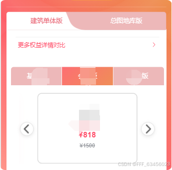
<div class="month">{{ item.number }}{{ item.unit === 'month' ? '个月' : '年' }}</div>
<div class="special" :class="{ 'hidden': item.originalCost === item.factualCost }">
限时特价
</div>
<div class="price">¥{{ item.factualCost }}</div>
<div class="old-price" :class="{ 'hidden': item.originalCost === item.factualCost }">
¥{{ item.originalCost }}
</div>
</div>
<!-- 企业卡片 -->
<div class="carousel-content" v-else>
<img class="business-card-img" :src="item.imageUrl || businessCard" alt="">
</div>
</div>
</swiper-slide>
</swiper>
<!-- 导航按钮 -->
<div class="nav-button prev" :class="{ 'hidden-nav': images.length <= slidesPerView }" @click="prevSlide">
<el-icon :size="24">
<ArrowLeftBold />
</el-icon>
</div>
<div class="nav-button next" :class="{ 'hidden-nav': images.length <= slidesPerView }" @click="nextSlide">
<el-icon :size="24">
<ArrowRightBold />
</el-icon>
</div>
</div>
</template>
<script setup>
import { ref, computed, onMounted, onUnmounted } from 'vue'
import { Swiper, SwiperSlide } from 'swiper/vue'
import { Navigation } from 'swiper/modules'
import { ElIcon } from "element-plus";
import { ArrowLeftBold, ArrowRightBold } from '@element-plus/icons-vue'
import businessCard from '@/assets/images/businessCard.png'
import { useMembershipStore } from '@/store/modules/membershipStore'
// 导入 Swiper 样式
import 'swiper/css'
const membershipStore = useMembershipStore()
const props = defineProps({
images: {
type: Array,
default: () => []
}
})
const emits = defineEmits()
const currentIndex = ref(0)
const swiperInstance = ref(null)
const windowWidth = ref(window.innerWidth)
const modules = [Navigation]
// 响应式配置
const slidesPerView = computed(() => {
if (windowWidth.value < 650) return 1
if (windowWidth.value < 768) return 2
if (windowWidth.value <= 1024) return 2
return 3
})
const spaceBetween = computed(() => {
if (windowWidth.value <= 480) return 6
if (windowWidth.value <= 640) return 8
if (windowWidth.value <= 768) return 10
if (windowWidth.value <= 1024) return 12
return 15
})
// 卡片最大宽度 - 详细的响应式设置
const cardMaxWidth = computed(() => {
if (windowWidth.value <= 375) return '220px'
if (windowWidth.value <= 480) return '240px'
if (windowWidth.value <= 640) return '250px'
if (windowWidth.value <= 768) return '260px'
if (windowWidth.value <= 900) return '270px'
if (windowWidth.value <= 1024) return '280px'
if (windowWidth.value <= 1200) return '290px'
return '300px'
})
// 更新窗口宽度
const updateWidth = () => {
windowWidth.value = window.innerWidth
}
onMounted(() => {
window.addEventListener('resize', updateWidth)
})
onUnmounted(() => {
window.removeEventListener('resize', updateWidth)
})
// Swiper 初始化
const onSwiperInit = (swiper) => {
swiperInstance.value = swiper
}
// 导航方法
const prevSlide = () => {
if (swiperInstance.value) {
swiperInstance.value.slidePrev()
}
}
const nextSlide = () => {
if (swiperInstance.value) {
swiperInstance.value.slideNext()
}
}
// 点击卡片
const switchItem = (index, item) => {
if (item.typeCode && item.typeCode == 'A5') return
currentIndex.value = index
membershipStore.setSelectedPackage(null)
membershipStore.setSelectedPackage(item)
emits('switchHandler', item)
}
</script>
<style scoped lang="scss">
// .carousel-container {
// position: relative;
// width: 100%;
// max-width: 900px;
// margin: 0 auto;
// padding: 20px 0 30px;
// box-sizing: border-box;
// @media (max-width: 1024px) {
// max-width: 850px;
// padding: 18px 0 25px;
// }
// @media (max-width: 1000px) {
// max-width: 810px;
// padding: 18px 0 25px;
// }
// @media (max-width: 900px) {
// max-width:550px;
// padding: 16px 0 22px;
// }
// @media (max-width: 910px) {
// max-width:640px;
// padding: 16px 0 22px;
// }
// @media (max-width: 920px) {
// max-width:640px;
// padding: 16px 0 22px;
// }
// @media (max-width: 930px) {
// max-width:640px;
// padding: 16px 0 22px;
// }
// @media (max-width: 940px) {
// max-width:650px;
// padding: 16px 0 22px;
// }
// @media (max-width: 950px) {
// max-width:650px;
// padding: 16px 0 22px;
// }
// @media (max-width: 768px) {
// max-width: 525px;
// padding: 15px 0 20px;
// }
// @media (max-width: 640px) {
// padding: 12px 0 18px;
// }
// @media (max-width: 480px) {
// padding: 10px 0 15px;
// }
// }
.carousel-container {
position: relative;
width: 100%;
max-width: 900px;
margin: 0 auto;
padding: 20px 0 30px;
box-sizing: border-box;
// 1200px 以上保持默认 900px
// 1025px - 1200px
@media (max-width: 1200px) and (min-width: 1025px) {
max-width:755px;
padding: 20px 0 28px;
}
// 977px - 1024px
@media (max-width: 1024px) and (min-width: 977px) {
max-width: 705px;
padding: 19px 0 26px;
}
// 951px - 976px
@media (max-width: 976px) and (min-width: 951px) {
max-width: 700px;
padding: 18px 0 25px;
}
// 921px - 950px
@media (max-width: 950px) and (min-width: 921px) {
max-width: 645px;
padding: 18px 0 24px;
}
// 901px - 920px
@media (max-width: 920px) and (min-width: 901px) {
max-width: 640px;
padding: 17px 0 23px;
}
// 861px - 900px
@media (max-width: 900px) and (min-width: 861px) {
max-width: 620px;
padding: 17px 0 23px;
}
// 821px - 860px
@media (max-width: 860px) and (min-width: 821px) {
max-width:68vw;
padding: 16px 0 22px;
}
// 769px - 820px
@media (max-width: 820px) and (min-width: 769px) {
max-width: 525px;
padding: 16px 0 22px;
}
// 641px - 768px
@media (max-width: 768px) and (min-width: 641px) {
max-width: 65vw;
padding: 15px 0 20px;
}
// 481px - 640px
@media (max-width: 640px) and (min-width: 481px) {
max-width: 420px;
padding: 12px 0 18px;
}
// 375px - 480px
@media (max-width: 480px) and (min-width: 376px) {
max-width: 340px;
padding: 10px 0 15px;
}
// 374px 以下
@media (max-width: 375px) {
max-width: 300px;
padding: 8px 0 12px;
}
}
.carousel-swiper {
padding: 0 45px;
width: 100%;
box-sizing: border-box;
@media (max-width: 1024px) {
padding: 0 40px;
}
@media (max-width: 900px) {
padding: 0 35px;
}
@media (max-width: 768px) {
padding: 0 30px;
}
@media (max-width: 640px) {
padding: 0 25px;
}
@media (max-width: 480px) {
padding: 0 20px;
}
@media (max-width: 375px) {
padding: 0 15px;
}
:deep(.swiper-wrapper) {
display: flex;
align-items: stretch;
}
:deep(.swiper-slide) {
height: auto;
display: flex;
justify-content: center;
}
}
// 卡片样式
.carousel-item {
width: 100%;
max-width: v-bind(cardMaxWidth);
height: 190px;
border-radius: 10px;
cursor: pointer;
border: 2px solid #ddd;
background: #ffffff;
box-sizing: border-box;
overflow: hidden;
transition: all 0.3s ease;
@media (max-width: 1024px) {
height: 180px;
}
@media (max-width: 900px) {
height: 175px;
}
@media (max-width: 768px) {
height: 170px;
}
@media (max-width: 640px) {
height: 165px;
}
@media (max-width: 480px) {
height: 160px;
}
@media (max-width: 375px) {
height: 155px;
}
&:hover {
transform: translateY(0px);
box-shadow: 0 4px 12px rgba(0, 0, 0, 0.1);
}
&.active {
border-color: #e96877;
background-color: #ffe2e2;
box-shadow: 0 8px 24px rgba(233, 104, 119, 0.2);
}
}
// 卡片内容
.carousel-content {
width: 100%;
height: 100%;
display: flex;
flex-direction: column;
justify-content: center;
align-items: center;
padding: 15px 10px;
box-sizing: border-box;
background: inherit;
.month {
font-weight: 600;
font-size: 18px;
color: #333;
margin-bottom: 8px;
text-align: center;
@media (max-width: 1024px) {
font-size: 17px;
margin-bottom: 7px;
}
@media (max-width: 900px) {
font-size: 16.5px;
}
@media (max-width: 768px) {
font-size: 16px;
margin-bottom: 6px;
}
@media (max-width: 640px) {
font-size: 15.5px;
}
@media (max-width: 480px) {
font-size: 15px;
}
@media (max-width: 375px) {
font-size: 14px;
}
}
.special {
color: #e96877;
font-size: 15px;
margin-bottom: 10px;
text-align: center;
@media (max-width: 1024px) {
font-size: 14px;
margin-bottom: 9px;
}
@media (max-width: 900px) {
font-size: 13.5px;
}
@media (max-width: 768px) {
font-size: 13px;
margin-bottom: 8px;
}
@media (max-width: 640px) {
font-size: 12.5px;
}
@media (max-width: 480px) {
font-size: 12px;
}
&.hidden {
visibility: hidden;
}
}
.price {
font-weight: 700;
font-size: 24px;
color: #ff4c67;
margin-bottom: 8px;
text-align: center;
@media (max-width: 1024px) {
font-size: 22px;
margin-bottom: 7px;
}
@media (max-width: 900px) {
font-size: 21px;
}
@media (max-width: 768px) {
font-size: 20px;
margin-bottom: 6px;
}
@media (max-width: 640px) {
font-size: 19px;
}
@media (max-width: 480px) {
font-size: 18px;
}
@media (max-width: 375px) {
font-size: 17px;
}
}
.old-price {
color: #909399;
font-size: 15px;
text-decoration: line-through;
text-align: center;
@media (max-width: 1024px) {
font-size: 14px;
}
@media (max-width: 900px) {
font-size: 13.5px;
}
@media (max-width: 768px) {
font-size: 13px;
}
@media (max-width: 640px) {
font-size: 12.5px;
}
@media (max-width: 480px) {
font-size: 12px;
}
&.hidden {
visibility: hidden;
}
}
.business-card-img {
width: 100%;
height: 100%;
object-fit: contain;
max-width: 100%;
max-height: 100%;
}
}
// 导航按钮
.nav-button {
position: absolute;
top: 50%;
transform: translateY(-50%);
width: 38px;
height: 38px;
background: white;
border-radius: 50%;
display: flex;
align-items: center;
justify-content: center;
cursor: pointer;
z-index: 1;
border: 1px solid #e0e0e0;
box-shadow: 0 2px 8px rgba(0, 0, 0, 0.1);
transition: all 0.3s ease;
@media (max-width: 1024px) {
width: 36px;
height: 36px;
}
@media (max-width: 900px) {
width: 35px;
height: 35px;
}
@media (max-width: 768px) {
width: 34px;
height: 34px;
}
@media (max-width: 640px) {
width: 32px;
height: 32px;
}
@media (max-width: 480px) {
width: 30px;
height: 30px;
}
&.prev {
left: 5px;
@media (max-width: 768px) {
left: 3px;
}
@media (max-width: 480px) {
left: 2px;
}
}
&.next {
right: 5px;
@media (max-width: 768px) {
right: 3px;
}
@media (max-width: 480px) {
right: 2px;
}
}
&.hidden-nav {
opacity: 0;
pointer-events: none;
}
&:hover {
background: #f5f5f5;
transform: translateY(-50%) scale(1.1);
box-shadow: 0 4px 12px rgba(0, 0, 0, 0.15);
.el-icon {
color: #e96877;
}
}
.el-icon {
transition: color 0.3s ease;
color: #666;
font-size: 24px;
@media (max-width: 1024px) {
font-size: 22px;
}
@media (max-width: 900px) {
font-size: 21px;
}
@media (max-width: 768px) {
font-size: 20px;
}
@media (max-width: 640px) {
font-size: 19px;
}
@media (max-width: 480px) {
font-size: 18px;
}
}
}
.hidden {
visibility: hidden;
}
.hidden-nav {
opacity: 0;
pointer-events: none;
}
</style>