前言:
没什么好说的,别说AI来了这些技术不重要,AI是生产力工具,你真一点不懂,凭什么有竞争力,人家能发现AI生成的问题,你发现不了,你就Out了。
Flutter25讲,不会讲得很深,但一定全,入门一定快。力求在AI时代,让你快速的学会Flutter的全局,纲举目张后,俯瞰之下,再开发,事半功倍。
这也是作为一个后端架构师,在修行前端的经验之路。
一 核心思想:一切皆 Widget
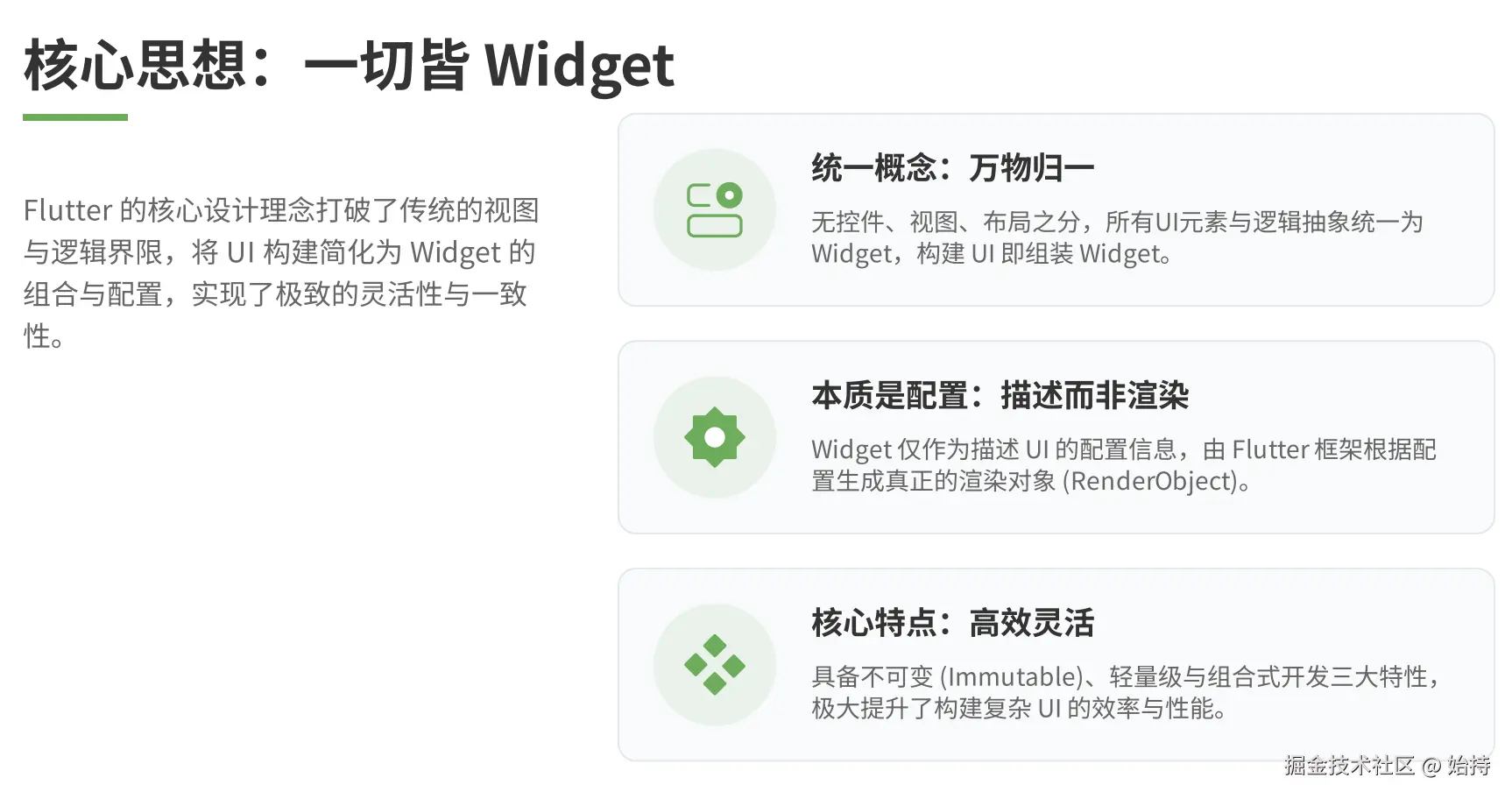
Flutter 中没有「控件/视图/布局」的区分,所有可见的UI元素(文字、按钮、图片)、不可见的逻辑元素(主题、路由、手势检测)、布局容器(Row、Column)本质上都是 Widget。
可以把 Widget 理解为:描述UI的「配置信息」,Flutter 会根据这些配置构建出真正的渲染对象(RenderObject)。
关键特点
- Widget 是不可变的(immutable):一旦创建就不能修改属性,更新UI需要创建新的 Widget
- Widget 是轻量级的:仅保存配置信息,不直接参与渲染
- 组合式设计:复杂UI由多个简单 Widget 嵌套组合而成
二 布局核心原则:约束向下传递,尺寸向上返回
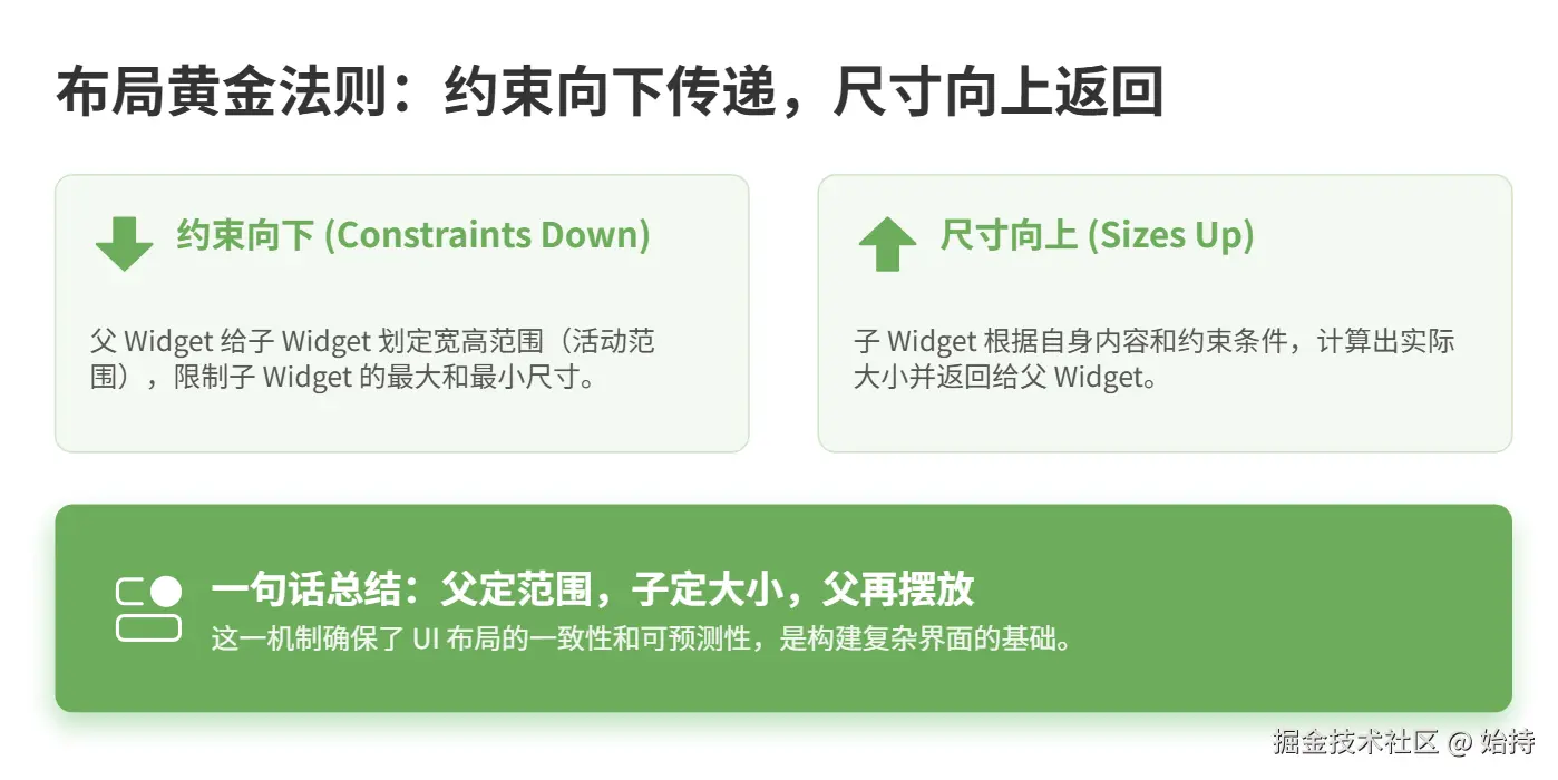
这是 Flutter 布局的「黄金法则」,决定了所有 Widget 的大小计算逻辑:
1. 约束向下传递
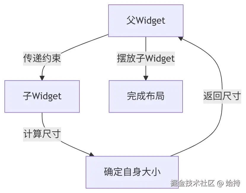
父 Widget 会给子 Widget 传递一组「约束条件」(比如最大/最小宽高、是否强制填充),子 Widget 必须在这个约束范围内确定自己的尺寸。
- 示例:Row 会告诉子 Widget「你可以在我的横向空间内调整宽度,但高度和我一致」
- 通俗理解:父母给孩子划定了活动范围,孩子不能超出这个范围
2. 尺寸向上返回
子 Widget 根据父 Widget 的约束,计算出自己的实际尺寸后,把这个尺寸返回给父 Widget,父 Widget 再决定如何摆放这个子 Widget(比如居中、靠左)。
可视化流程
三 基础布局组件实战
核心组件
基础组件(Container/Center/Align/SizedBox)是布局的基石,用于控制单个组件的尺寸、位置和样式。
(1)Container:万能容器
Container 是最常用的基础组件,可设置宽高、背景、边距、内边距、装饰等,相当于「盒子」。
示例代码:
less
import 'package:flutter/material.dart';

void main() {
  runApp(const MyApp());
}

class MyApp extends StatelessWidget {
  const MyApp({super.key});

  @override
  Widget build(BuildContext context) {
    return MaterialApp(
      home: Scaffold(
        appBar: AppBar(title: const Text('基础布局实战')),
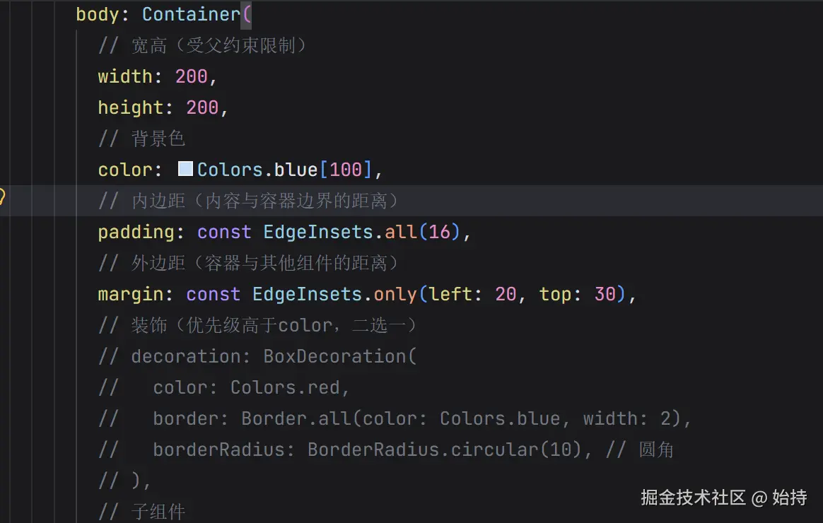
        body: Container(
          // 宽高(受父约束限制)
          width: 200,
          height: 200,
          // 背景色
          color: Colors.blue[100],
          // 内边距(内容与容器边界的距离)
          padding: const EdgeInsets.all(16),
          // 外边距(容器与其他组件的距离)
          margin: const EdgeInsets.only(left: 20, top: 30),
          // 装饰(优先级高于color,二选一)
          decoration: BoxDecoration(
            border: Border.all(color: Colors.blue, width: 2),
            borderRadius: BorderRadius.circular(10), // 圆角
          ),
          // 子组件
          child: const Text(
            '我是Container的子组件',
            style: TextStyle(fontSize: 18),
          ),
        ),
      ),
    );
  }
}
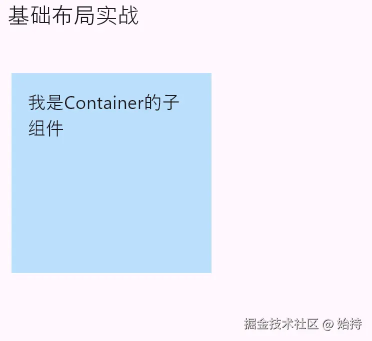
关键属性说明:
-
width/height:设置容器尺寸(若不设置,会自适应子组件或父约束) -
padding/margin:内边距/外边距,使用EdgeInsets配置(all/left/top/symmetric等) -
color/decoration:背景色/装饰(不能同时设置,decoration功能更丰富,支持边框、圆角、渐变等),color本质是decoration: BoxDecoration(color: color)的简写形式。两者不能共存,否则会触发断言color == null || decoration == null失败

(2)Center:居中组件
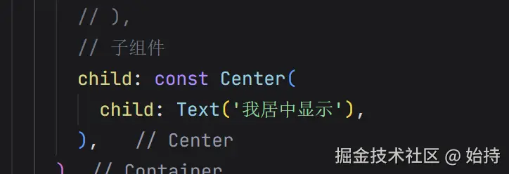
将子组件在自身范围内水平+垂直居中,是 Align 的简化版(对齐方式固定为居中)。
示例代码:
less
// 替换上面的body部分
body: Container(
  width: 300,
  height: 300,
  color: Colors.grey[200],
  child: const Center(
    child: Text('我居中显示'),
  ),
),
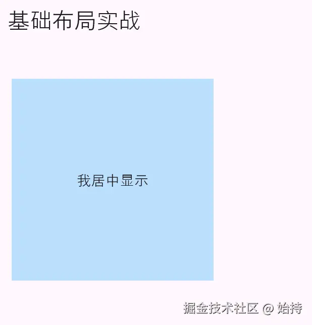
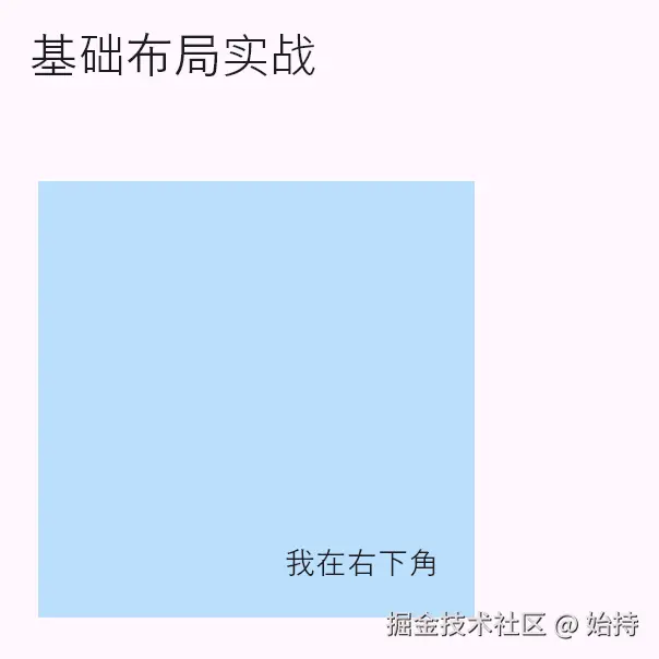
(3)Align:对齐组件
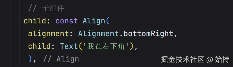
可自定义子组件的对齐位置(如靠左上、靠右下、居中),比 Center 更灵活。
示例代码:
less
// 替换body部分
body: Container(
  width: 300,
  height: 300,
  color: Colors.grey[200],
  child: const Align(
    // 对齐方式:右下(可选topLeft、center、bottomRight等)
    alignment: Alignment.bottomRight,
    // 也可使用百分比:Alignment(0.8, 0.8) (x/y范围-1到1)
    child: Text('我在右下角'),
  ),
),
(4)SizedBox:固定尺寸组件
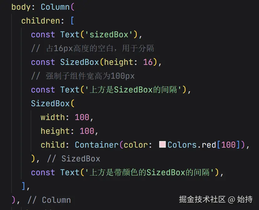
强制设置子组件的宽高,或仅占指定空间(无子女时),常用于控制组件间距。
示例代码:
php
// 替换body部分
body: Column(
  children: [
    const Text('上方文字'),
    // 占16px高度的空白,用于分隔
    const SizedBox(height: 16),
    // 强制子组件宽高为100px
    SizedBox(
      width: 100,
      height: 100,
      child: Container(color: Colors.red[100]),
    ),
  ],
),
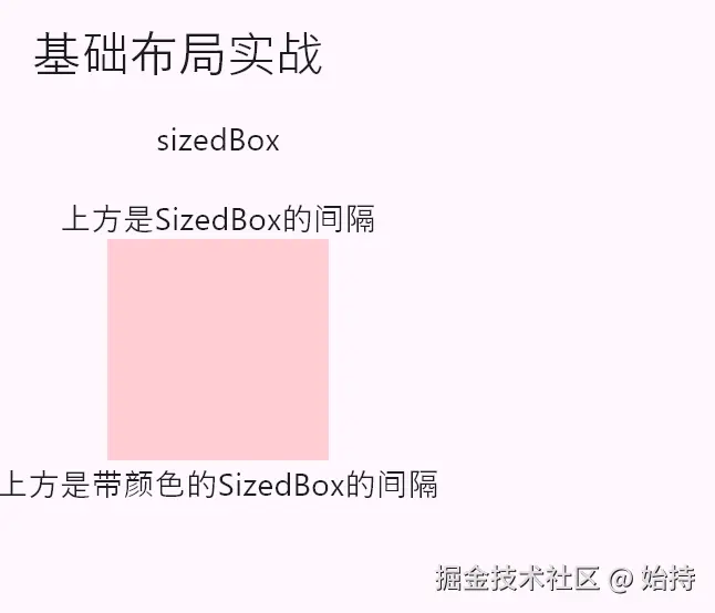
SizedBox在开发中基本都以空白的身份出现,作为上下或者左右的一个间隔符,一般使用const声明,减少损耗。
常用布局容器
常用布局容器(Row/Column/Stack+Positioned)用于实现多组件的线性/层叠排列,是构建复杂UI的核心。
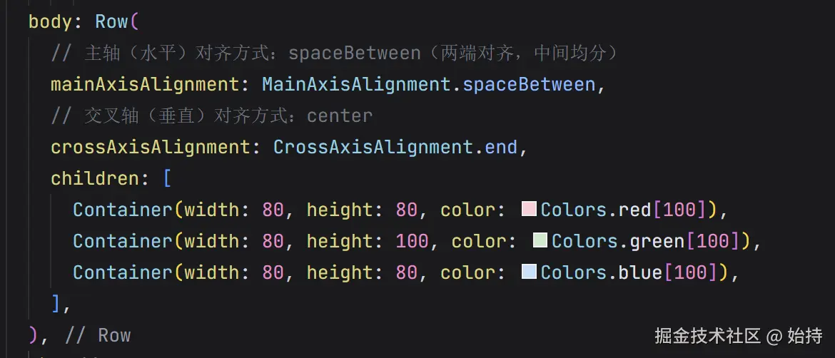
(1)Row:水平布局(行)
将子组件沿水平方向排列,核心是「线性布局」,类似 Android 的 LinearLayout(horizontal)。
示例代码:
php
  body: Row(
    // 主轴(水平)对齐方式:spaceBetween(两端对齐,中间均分)
    mainAxisAlignment: MainAxisAlignment.spaceBetween,
    // 交叉轴(垂直)对齐方式:center
    crossAxisAlignment: CrossAxisAlignment.center,
    children: [
      Container(width: 80, height: 80, color: Colors.red[100]),
      Container(width: 80, height: 100, color: Colors.green[100]),
      Container(width: 80, height: 80, color: Colors.blue[100]),
    ],
  ),
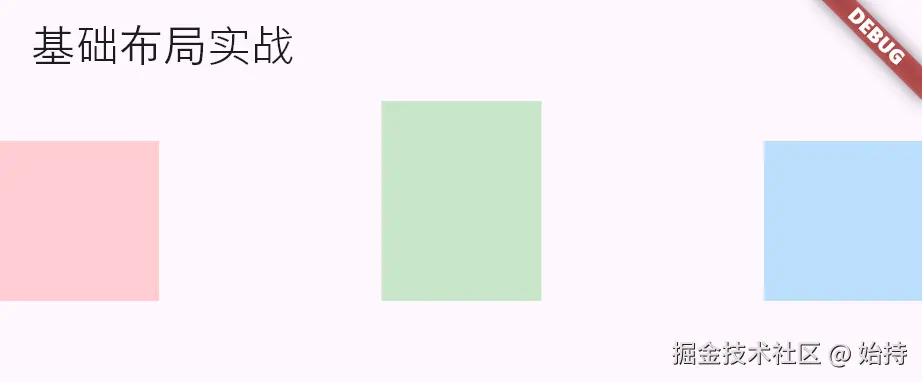
关键属性说明:
-
mainAxisAlignment:主轴(Row为水平)对齐方式start:靠左(默认)、end:靠右、center:居中、spaceBetween:两端对齐、spaceAround:均匀分布(含左右边距)
-
crossAxisAlignment:交叉轴(Row为垂直)对齐方式start:靠上、end:靠下、center:居中(默认)、stretch:拉伸填满交叉轴,可以改变一下,看看这几个的差别
(2)Column:垂直布局(列)
将子组件沿垂直方向排列,与 Row 逻辑一致,仅主轴方向不同(Column 主轴为垂直)。
示例代码:
less
// 替换body部分
body: Padding(
  padding: const EdgeInsets.all(20),
  child: Column(
    // 主轴(垂直)对齐方式:center
    mainAxisAlignment: MainAxisAlignment.center,
    // 交叉轴(水平)对齐方式:stretch(拉伸填满)
    crossAxisAlignment: CrossAxisAlignment.stretch,
    children: [
      Container(height: 60, color: Colors.red[100]),
      const SizedBox(height: 10),
      Container(height: 60, color: Colors.green[100]),
      const SizedBox(height: 10),
      Container(height: 60, color: Colors.blue[100]),
    ],
  ),
),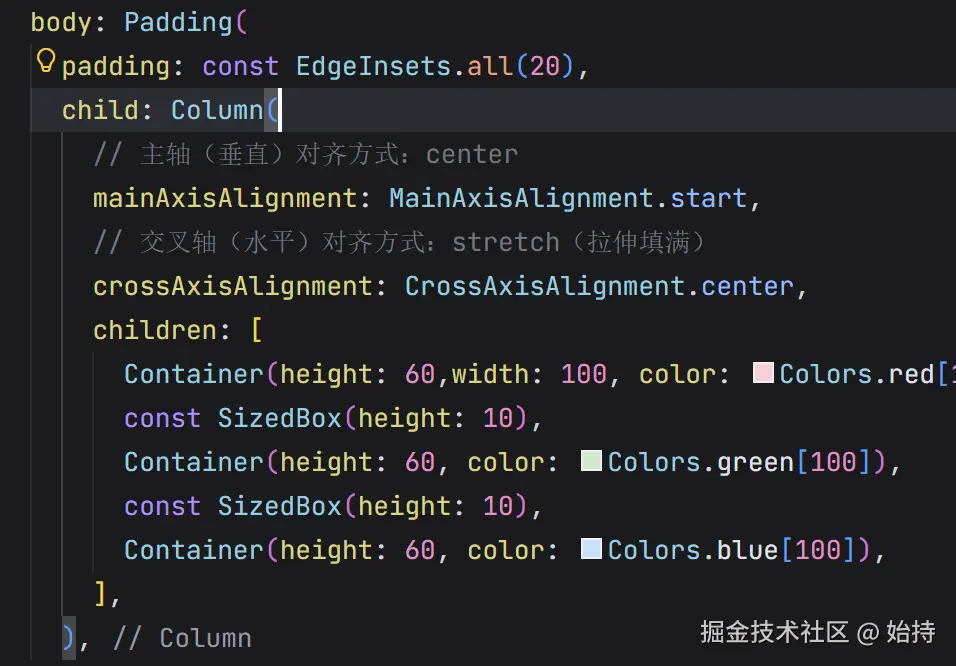
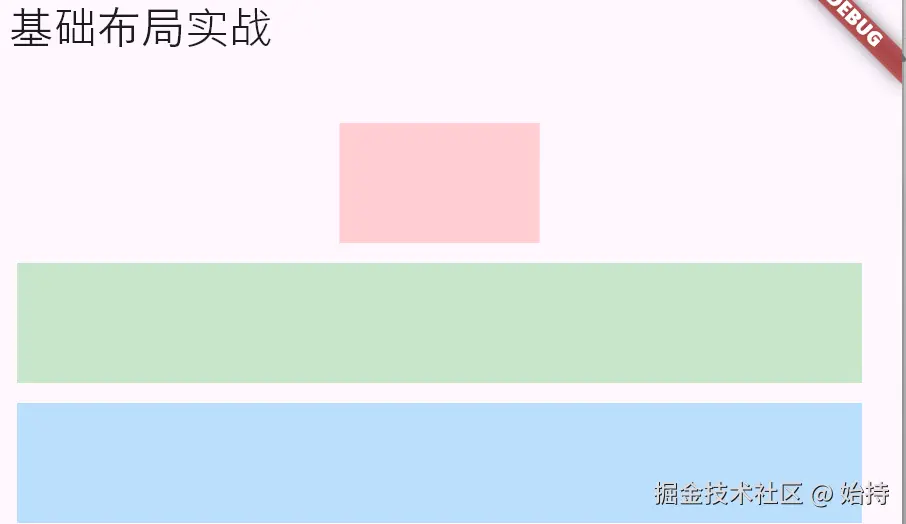
可以看到,CrossAxisAlignment(交叉轴)属性,如果是行,他与高绑定,如果是列,他与宽绑定,这点要注意。
(3)Stack + Positioned:层叠布局
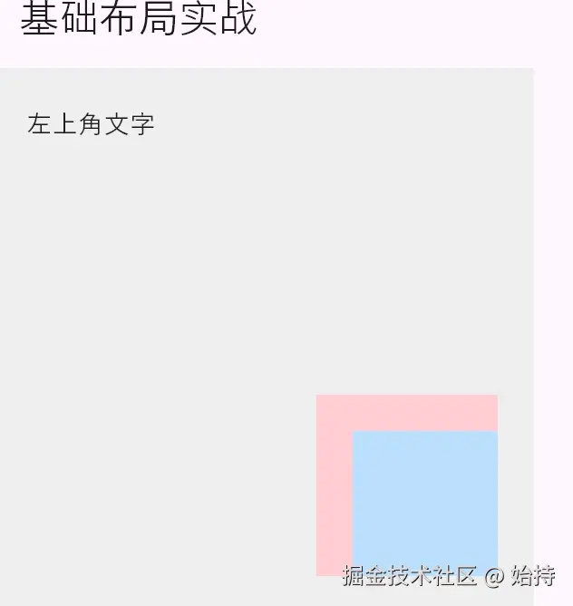
Stack:让子组件层叠显示(后添加的组件在上方),理解一下概念,铺床,一层一层的,先铺的在下面,看到的是后面的。Positioned:配合 Stack 使用,精准定位子组件的位置(左、右、上、下、宽高)
Positioned 关键属性:
left/right/top/bottom:距离 Stack 对应边界的距离(至少设置2个方向+宽/高,或4个方向)width/height:定位组件的尺寸
示例代码:
less
// 替换body部分
body: Stack(
  children: [
    // 底层容器
    Container(
      width: 300,
      height: 300,
      color: Colors.grey[200],
    ),
    // 定位在左上角
    const Positioned(
      left: 20,
      top: 20,
      child: Text('左上角文字'),
    ),
    // 定位在右下角,指定宽高
    Positioned(
      right: 20,
      bottom: 20,
      width: 100,
      height: 100,
      child: Container(color: Colors.red[100]),
    ),
    // 定位在右下角,指定宽高
    Positioned(
      right: 20,
      bottom: 20,
      width: 80,
      height: 80,
      child: Container(color: Colors.blue[100]),
    ),
  ],
),
四 组合布局实现简单卡片
less
import 'package:flutter/material.dart';

void main() {
  runApp(const MyApp());
}

class MyApp extends StatelessWidget {
  const MyApp({super.key});

  @override
  Widget build(BuildContext context) {
    return MaterialApp(
      home: Scaffold(
        appBar: AppBar(title: const Text('组合布局实战')),
        body: Padding(
          padding: const EdgeInsets.all(16),
          child: Container(
            width: double.infinity, // 拉伸填满父宽度
            padding: const EdgeInsets.all(16),
            decoration: BoxDecoration(
              color: Colors.white,
              borderRadius: BorderRadius.circular(12),
              boxShadow: const [
                BoxShadow(color: Colors.grey, blurRadius: 3, offset: Offset(0, 2))
              ],
            ),
            child: Row(
              children: [
                // 左侧图标
                Container(
                  width: 60,
                  height: 60,
                  decoration: BoxDecoration(
                    color: Colors.blue[100],
                    borderRadius: BorderRadius.circular(8),
                  ),
                  child: const Icon(Icons.person, size: 30, color: Colors.blue),
                ),
                // 中间间距
                const SizedBox(width: 16),
                // 右侧文字区域(垂直排列)
                Expanded( // 占满剩余水平空间
                  child: Column(
                    crossAxisAlignment: CrossAxisAlignment.start,
                    children: const [
                      Text('用户名', style: TextStyle(fontSize: 18, fontWeight: FontWeight.bold)),
                      SizedBox(height: 4),
                      Text('用户ID:123456', style: TextStyle(fontSize: 14, color: Colors.grey)),
                    ],
                  ),
                ),
                // 右侧箭头
                const Icon(Icons.arrow_forward_ios, size: 16, color: Colors.grey),
              ],
            ),
          ),
        ),
      ),
    );
  }
}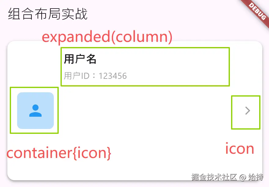
案例说明:
- 用
Container实现卡片样式(圆角、阴影)
less
          child: Container(
            width: double.infinity, // 拉伸填满父宽度
            padding: const EdgeInsets.all(16),
            decoration: BoxDecoration(
              color: Colors.white,
              borderRadius: BorderRadius.circular(12),
              boxShadow: const [
                BoxShadow(color: Colors.grey, blurRadius: 3, offset: Offset(0, 2))
              ],
            ),
child:Row()), - 用
Row实现水平布局(图标+文字+箭头)
scss
Row(
    children:[
        //左侧图标
        Container(),
        //中间间距
        SizedBox(),
        //右侧文字区域
        Expanded(),
        //右侧箭头
        Icon()
    ]
)- 用
Expanded让文字区域占满剩余空间(避免溢出) - 用
SizedBox控制组件间距 - 用
Column实现文字的垂直排列
less
                Expanded( // 占满剩余水平空间
                  child: Column(
                    crossAxisAlignment:  CrossAxisAlignment.start,
                    children: const [
                      Text('用户名', style: TextStyle(fontSize: 18, fontWeight: FontWeight.bold)),
                      SizedBox(height: 4),
                      Text('用户ID:123456', style: TextStyle(fontSize: 14, color: Colors.grey)),
                    ],
                  ),
                ),
五 常见问题
- 组件溢出 :Row/Column 子组件总尺寸超过父约束时,会出现黄色溢出警告 → 解决方案:使用
Expanded/Flexible分配空间,或限制子组件尺寸 - 约束冲突:同时设置过严的约束(如父强制宽度200,子设置宽度300)→ 子组件会忽略自身约束,适配父约束
- Stack 子组件未定位:未使用 Positioned 的子组件,会默认居中显示,且尺寸自适应内容