前言
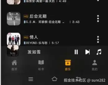
目前大部分应用的界面设计底部都有Tabbar,很多应用也会在底部tabbar整一些花活,也就是说我们在编写tabbar时需要更多的自定义空间,比如我的音乐播放器应用中,在tabbar的上面有一个简易播放器控制栏,包含正在播放的歌曲封面,歌曲名称和播放,下一曲,当前播放列表按钮,起初没有使用自定义tabbar方案,就只能将简易播放器控制栏以定位的方式定到tabbar上方,这时具体定位的位置值就需要动态计算,非常容易出现不同机型显示偏差,比如我的手机上和tabbar没有间隙,但是在模拟器上有间隙,很明显,如果它融入tabbar布局的话就不会出现这个问题:
基础方案
当前项目使用的是expo创建的rn项目,因此使用了expo-router,它提供了基础的底部tab 配置组件,如果没有特殊要求,使用非常方便:
tsx
import { Ionicons } from '@expo/vector-icons';
import { Tabs } from 'expo-router';
import type { FC } from 'react';
import Animated, { useAnimatedStyle, withSpring } from 'react-native-reanimated';
import { Platform } from 'react-native';
import { useThemeConfig, useTheme } from '@/hooks/useTheme';
import type { IoniconsNameType } from '@/types';
/**
 * 底部导航栏组件
 * @returns 底部导航栏UI
 */
const list: { name: string; icon: IoniconsNameType; label: string }[] = [
    {
        name: 'index',
        icon: 'home-outline',
        label: '首页',
    },
    {
        name: 'audiobook',
        icon: 'book-outline',
        label: '听书',
    },
    {
        name: 'local',
        icon: 'archive-outline',
        label: '音乐',
    },
    {
        name: 'profile',
        icon: 'person-outline',
        label: '我的',
    },
];
const { Text, View } = Animated;
/**
 * Screen组件的options参数类型是BottomTabNavigationOptions
 * @returns
 */
const AndroidTabs: FC = () => {
    const { Screen } = Tabs;
    const { backgroundColor } = useThemeConfig();
    const theme = useTheme();
    return (<Tabs
        screenOptions={{
            headerShown: false,
            // tabBarBackground: TabBarBackground,
            tabBarStyle: Platform.select({
                ios: {
                    // Use a transparent background on iOS to show the blur effect
                    position: 'absolute',
                },
                default: {
                    height: 90,
                    backgroundColor,
                },
            }),
        }}
    >
        {
            list.map(({ name, icon, label }) => (<Screen
                key={name}
                name={name}
                options={{
                    // title: '234',
                    // tabBarBadge: '9',
                    // tabBarShowLabel: false,
                    /**
                     * tabrBarIcon: ({ focused, color }) => ()
                     * 即使返回null仍然会占据icon的位置且没有配置项可以隐藏
                     * 但是可以设置tabBarIconStyle的height为0来隐藏icon
                     * 而且内部返回的icon无法应用Animation动画,因此将其高度设置为0
                     * 将图标渲染到tabBarLabel中,单独为其添加animation动画
                     */
                    // tabBarIcon({ focused, color }) {
                    //     return null;
                    // },
                    tabBarIconStyle: { display: 'none' },
                    /**item的样式 */
                    // tabBarItemStyle: { borderWidth: 1, borderColor: '#e44444' },
                    tabBarLabel({ focused }) {
                        const color = focused ? 'orange' : 'grey';
                        const aniStyle = useAnimatedStyle(() => ({
                            transform: [{ scale: withSpring(focused ? 1.1 : 1, { damping: 20, stiffness: 400 }) }],
                        }));
                        return <>
                            <View style={aniStyle}>
                                <Ionicons
                                    name={icon}
                                    size={19}
                                    color={color}
                                />
                            </View>
                            <Text style={{ color, fontSize: 10, marginTop: 3 }}>{label}</Text>
                        </>;
                    },
                    /**
                     * 可以为tab页面切换添加动画效果
                     * fade shift none
                     * 有些页面切换时元素会有闪烁问题
                     * 可以在tab页面监听useFocusEffect来添加动画效果
                     */
                    // animation: 'fade',
                    /**
                     * 用于配置该页面所在场景的样式,默认白色,如果页面进入时
                     * 有缩放,就会看到该背景,添加背景色设置
                     */
                    sceneStyle: { backgroundColor: name === 'profile' ? theme === 'dark' ? '#000' : '#f5f5f5' : backgroundColor }
                }}
            />))
        }
    </Tabs>);
};

export default AndroidTabs;
以上定义了基础的tabbar并且添加了点击tabbar时的动画效果,我们在map中创建动画样式,非常不灵活,而且它不允许在tab的布局中添加除了tabbar之外的额外元素,会导致显示失效,而我们的目标效果就是底部tabbar上方再添加简易播放器控制栏
自定义方案
接下来我们使用expo-router的自定义方案Tabs, TabList, TabTrigger, TabSlot组件来创建tabbar和tabbar页面布局:
tsx
import type { FC } from 'react';
import Animated, { useAnimatedStyle, withSpring } from 'react-native-reanimated';
import { Pressable, StyleSheet, View, Text } from 'react-native';
import { Tabs, TabList, TabTrigger, TabSlot, type TabTriggerSlotProps } from 'expo-router/ui';
import { useSafeAreaInsets } from 'react-native-safe-area-context';
import { Ionicons } from '@expo/vector-icons';
import type { IoniconsNameType } from '@/types';
import MusicPlayerBar from '@/components/music/musicPro/MusicPlayerBar';
import BlurContainer from '@/components/ui/BlurContainer';
interface TabButtonProps extends TabTriggerSlotProps {
    icon?: IoniconsNameType;
    name: string
};
const list: { name: string; icon: IoniconsNameType; label: string, href: string }[] = [
    {
        name: 'index',
        href: '/',
        icon: 'home',
        label: '首页',
    },
    {
        name: 'audiobook',
        href: '/audiobook',
        icon: 'book',
        label: '听书',
    },
    {
        name: 'local',
        href: '/local',
        icon: 'archive',
        label: '音乐',
    },
    {
        name: 'profile',
        href: '/profile',
        icon: 'person',
        label: '我的',
    },
];
const { View: AnimatedView } = Animated;
/**
 * 当TabTrigger设置了asChild时将会向下转发所有属性
 * 然后可以按需定义自己的tab选项,在Press中如果想要触发额外事件处理程序
 * 注意额外调用TabTrigger传递的onPress事件以及参数,保证tab切换触发
 * @returns
 */
const TabItem: FC<TabButtonProps> = ({ icon, children, name, isFocused, ...props }) => {
    const color = isFocused ? 'orange' : 'grey';
    const aniStyle = useAnimatedStyle(() => ({
        transform: [{ scale: withSpring(isFocused ? 1.2 : 1, { damping: 20, stiffness: 400 }) }],
    }));
    return (<Pressable
        {...props}
        style={styles.tabItem}
    >
        <AnimatedView
            style={aniStyle}
        >
            <Ionicons
                name={icon}
                size={19}
                color={color}
            />
        </AnimatedView>
        <Text
            style={{ color, fontSize: 10 }}
        >{children}</Text>
    </Pressable>)
};
/**
 * Android底部标签栏自定义组件
 * 将TabList设置display: 'none',并渲染TabTrigger
 * 组件是自定义tab的最佳实践,而不是设置TabList的asChild
 * 然后在TabList内部使用自定义组件,这在使用半透明图片作为背景时无法生效
 * @returns
 */
const AndroidTabs: FC = () => {
    const { bottom } = useSafeAreaInsets();
    return (<Tabs>
        <TabSlot />
        <BlurContainer
            style={[styles.tabbar, { height: 90 + bottom }]}
        >
            <MusicPlayerBar
                showBlurView={false}
            />
            <View
                style={[styles.tabs, { height: bottom + 50 }]}
            >
                {
                    list.map(({ name, icon, label, href }) => (<TabTrigger
                        key={name}
                        name={name}
                        href={href as any}
                        asChild
                    >
                        <TabItem
                            name={name}
                            icon={icon}
                        >{label}</TabItem>
                    </TabTrigger>))
                }
            </View>
        </BlurContainer>
        <TabList
            style={styles.list}
        >
            {
                list.map(({ name, href }) => (<TabTrigger
                    key={name}
                    name={name}
                    href={href as any}
                />))
            }
        </TabList>
    </Tabs >);
};

const styles = StyleSheet.create({
    tabs: {
        flexDirection: 'row',
        justifyContent: 'space-around',
        alignItems: 'flex-start',
    },
    tabItem: {
        gap: 5,
        width: 50,
        height: 50,
        justifyContent: 'center',
        alignItems: 'center',
    },
    list: {
        display: 'none'
    },
    tabbar: {
        position: 'absolute',
        bottom: 0,
        width: '100%',
    },
});
export default AndroidTabs;
, 这次我们使用Tabs作为外层容器,它包含了tabbar和tabbar对应的页面,而页面则是在TabSlot中展示,tab的具体内容则是使用TabList和TabItem进行渲染,这时你可以创建一个容器包裹你要渲染的任意内容,最终它将渲染到应用底部tab上。如果你仔细看,应该发现底部的TabList并没有展示,这是因为将其隐藏但是需要它触发页面导航,否则它的样式本金无法灵活的自定义,这里我们使用了BlurView模糊化效果,而上面map循环的是我们真正看到的底部tabbar! 也就是说TabTrigger组件是用来触发导航的,TabItem是我们真正要自定义的tab内容,此时MusicPlayerBar可以优雅地放入tabbar的范围,不必考虑定位值的问题了!
当然除此之外也可以隐藏tabbar再自定义tabbar,但是它不会像当前方案,保留缓存tabbar页面,而且需要自己手动控制跳转。我的场景中想要解决tab的额外内容展示问题。具体选择哪一种看业务需求。具体可以查看 项目地址(expo rn: expo创建的react native的音乐播放器应用,专注视频转歌和本地歌曲播放) 欢迎star交流学习