核心特点
可以混合使用 ListView、GridView、SliverAppBar 等
所有子组件统一滚动,像一整个页面
性能优秀,支持懒加载
可以实现复杂的滚动效果(视差、粘性头部等)
架构
Dart
CustomScrollView
├── SliverAppBar (可折叠的应用栏)
├── SliverList (列表)
├── SliverGrid (网格)
├── SliverPadding (内边距)
├── SliverToBoxAdapter (适配普通 Widget)
├── SliverPersistentHeader (固定头部)
├── SliverFillRemaining (填充剩余空间)
└── SliverOpacity (透明度效果)
①SliverAppBar - 可收缩的 AppBar,这个比较常用
所有属性
Dart
    //基础显示参数
    super.key,
    this.leading, //导航栏左侧按钮
    this.automaticallyImplyLeading = true,//是否自动显示返回按钮
    this.title, //标题
    this.actions,//右侧按钮列表
    this.automaticallyImplyActions = true, //是否自动显示右侧按钮(当有空间时)
    this.flexibleSpace, //可收缩区域的组件,会随滚动缩放
    this.bottom,

    //滚动行为参数
    this.collapsedHeight, //导航栏收缩时的高度
    this.expandedHeight, //导航栏完全展开时的高度
    this.floating = false, //是否浮动
    this.pinned = false, //滚动时是否始终固定在顶部
    this.snap = false, //是否自动收缩
    this.stretch = false, //是否允许下拉拉伸效果
    this.stretchTriggerOffset = 100.0, //触发拉伸回调的偏移量
    this.onStretchTrigger, //拉伸达到触发偏移量时调用的回调

     //阴影与视觉参数
    this.elevation, //导航栏的阴影高度
    this.scrolledUnderElevation,//滚动时导航栏下方的阴影高度
    this.shadowColor, //阴影颜色
    this.surfaceTintColor, //表面的色调颜色
    this.forceElevated = false,//是否强制显示阴影
    this.backgroundColor, //导航栏背景颜色
    this.foregroundColor,//导航栏前景色(图标和文字)
    this.iconTheme, //导航栏图标的主体样式
    this.shape, //导航栏的形状
    this.clipBehavior, //裁剪行为

    this.actionsIconTheme,
    this.primary = true, //是否为主要导航栏
    this.centerTitle, //标题是否居中显示
    this.excludeHeaderSemantics = false,
    this.titleSpacing,
    this.actionsPadding, //右侧按钮的内边距
    this.toolbarHeight = kToolbarHeight,//工具栏的高度
    this.leadingWidth, //左侧组件的宽度
    this.toolbarTextStyle,
    this.titleTextStyle,
    this.systemOverlayStyle, //系统状态栏样式
    this.forceMaterialTransparency = false,
    this.useDefaultSemanticsOrder = true, //是否强制Material透明效果
使用案例
Dart
@override
Widget build(BuildContext context) {
return MaterialApp(
home: Scaffold(
body: CustomScrollView(
slivers: [
// 可收缩的 AppBar
SliverAppBar(
automaticallyImplyLeading: true, //自动显示返回按钮
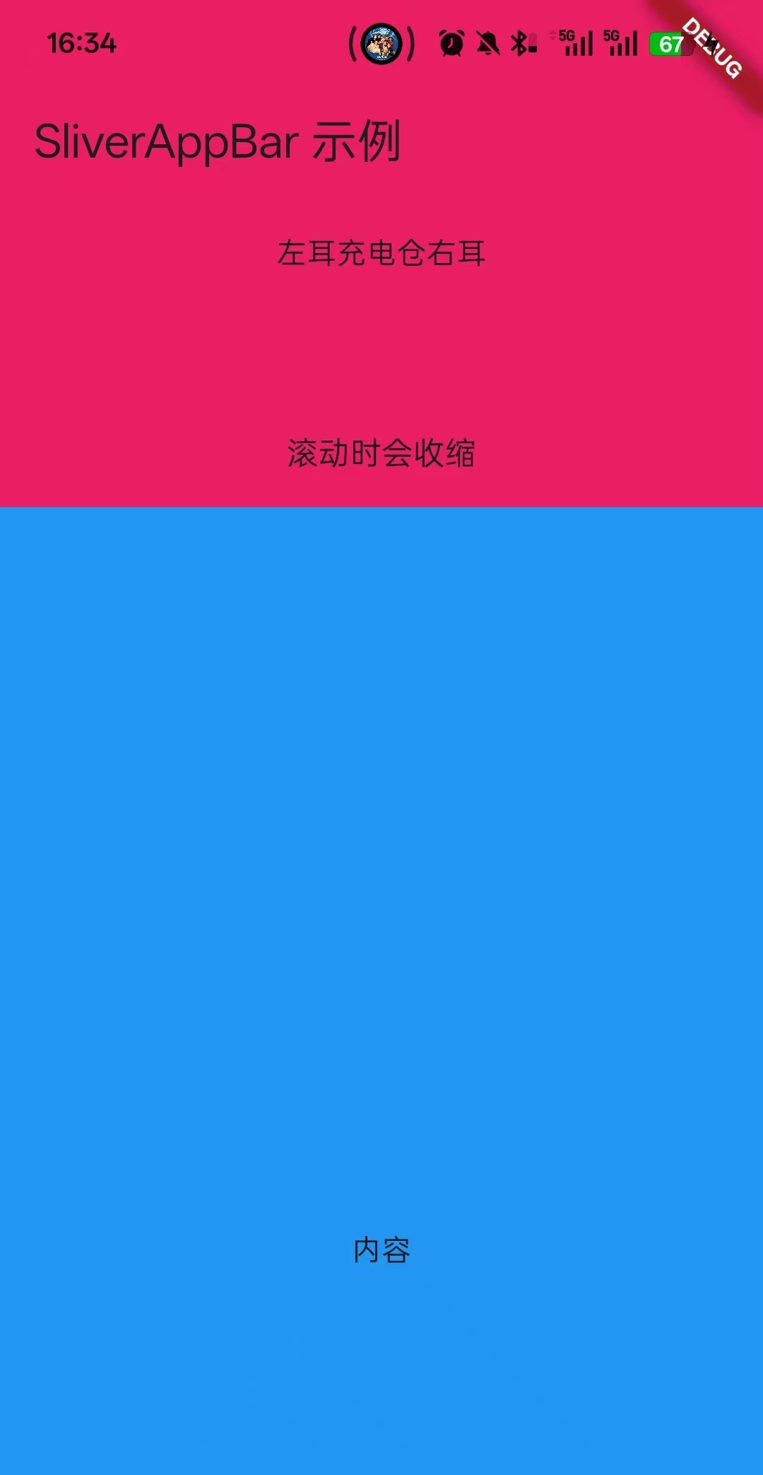
title: Text("SliverAppBar 示例"),//标题
actions: [],//标题行右侧按钮
automaticallyImplyActions:true,
expandedHeight: 200, // 展开高度
collapsedHeight: 60,//收缩时的高度,必须大于toolbarHeight(默认56)
floating: true, // 滚动时是否显示
pinned: true, // 是否固定在顶部,标题会固定在顶部,不随着滑动消失
snap: true, //是否自动收缩
flexibleSpace: FlexibleSpaceBar(
title: Text("滚动时会收缩",style: TextStyle(fontSize: 10),),
centerTitle: true,
background:Container(
color: Colors.pink,
child: Column(
mainAxisAlignment: MainAxisAlignment.center,
children: [
Row(
mainAxisAlignment: MainAxisAlignment.center,
children: [
Text("左耳"),
Text("充电仓"),
Text("右耳"),
],
)
],
),
)
),
),
// 普通内容
SliverToBoxAdapter(
child: Container(
height: 700,
color: Colors.blue,
child: Center(child: Text("内容")),
),
),
],
),
),
);
}效果图
②使用剩余容器
Dart
import 'package:flutter/material.dart';
import 'package:flutter/rendering.dart';

class HomePage extends StatefulWidget {
  const HomePage({super.key});

  @override
  State<StatefulWidget> createState() => _HomePageState();
}

class _HomePageState extends State<HomePage> with TickerProviderStateMixin {


  @override
  Widget build(BuildContext context) {
    return MaterialApp(
      home: Scaffold(
        body: CustomScrollView(
          slivers: [

            // 可收缩的 AppBar
            SliverAppBar(
              automaticallyImplyLeading: true,  //自动显示返回按钮
              title: Text("SliverAppBar 示例"),//标题
              actions: [],//标题行右侧按钮
              automaticallyImplyActions:true,
              expandedHeight: 200,  // 展开高度
              collapsedHeight: 60,//收缩时的高度,必须大于toolbarHeight(默认56)
              floating: true,       // 滚动时是否显示,不用滚动到底部就可以看到
              pinned: true,         // 是否固定在顶部,标题会固定在顶部,不随着滑动消失
              snap: true,           //是否自动收缩

              flexibleSpace: FlexibleSpaceBar(
                title: Text("滚动时会收缩",style: TextStyle(fontSize: 10),),
                centerTitle: true,
                background:Container(
                  color: Colors.pink,
                  child: Column(
                    mainAxisAlignment: MainAxisAlignment.center,
                    children: [
                      Row(
                        mainAxisAlignment: MainAxisAlignment.center,
                        children: [
                          Text("左耳"),
                          Text("充电仓"),
                          Text("右耳"),
                        ],
                      )
                    ],
                  ),
                )
              ),
            ),

            //列表1
            SliverList(
              delegate: SliverChildBuilderDelegate(
                    (context, index) {
                  return ListTile(
                    title: Text('Item $index'),
                  );
                },
                childCount: 10,
              ),
            ),

            //列表2
            SliverList(
              delegate: SliverChildListDelegate([
                ListTile(title: Text('-----------Item 1-----------')),
                ListTile(title: Text('-----------Item 2-----------')),
                ListTile(title: Text('-----------Item 3-----------')),
              ]),
            ),

            //表格1
            SliverGrid(
              delegate: SliverChildBuilderDelegate(
                    (context, index) {
                  return Container(
                    color: Colors.blue[100 * (index % 9)],
                    child: Center(child: Text('$index')),
                  );
                },
                childCount: 10,
              ),
              gridDelegate: SliverGridDelegateWithFixedCrossAxisCount(
                crossAxisCount: 2,           // 列数
                mainAxisSpacing: 10.0,       // 主轴间距
                crossAxisSpacing: 10.0,      // 交叉轴间距
                childAspectRatio: 1.0,       // 宽高比
              ),
            ),

            //表格2
            SliverGrid(
              gridDelegate: SliverGridDelegateWithMaxCrossAxisExtent(
                maxCrossAxisExtent: 200.0,   // 最大宽度
                mainAxisSpacing: 10.0,
                crossAxisSpacing: 10.0,
                childAspectRatio: 1.0,
              ),
              delegate: SliverChildBuilderDelegate(
                    (context, index) => Container(color: Colors.red),
                childCount: 10,
              ),
            ),

            //普通容器
            SliverToBoxAdapter(
              child: Container(
                height: 200,
                color: Colors.purple,
                child: Center(child: Text('普通容器')),
              ),
            ),

            //加内边距的普通容器
            SliverPadding(
              padding: EdgeInsets.all(16.0),
              sliver: SliverList(
                delegate: SliverChildBuilderDelegate(
                      (context, index) => ListTile(title: Text('Item $index')),
                  childCount: 10,
                ),
              ),
            )
          ],
        ),
      ),
    );
  }


}