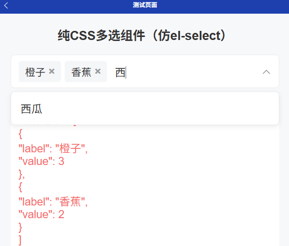
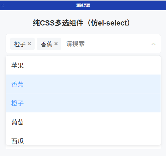
基础多选,支持模糊搜索,单项删除
html
<template>
<view class="multi-select-container" ref="containerRef">
<!-- 选中标签 + 搜索输入框 + 右侧图标 -->
<view class="select-input-box">
<view class="selected-tags">
<view
class="tag-item"
v-for="(item, index) in selectedList"
:key="index"
>
<text class="tag-label">{{ item[labelProp] }}</text>
<text class="tag-close" @click.stop="deleteTag(item)">×</text>
</view>
</view>
<input
v-model="searchKey"
class="search-input"
placeholder="请搜索"
@input="handleSearch"
@focus="showDropdown = true"
@click.stop
/>
<!-- 右侧官方 uni-icons 切换 -->
<uni-icons
:type="showDropdown ? 'up' : 'down'"
size="26"
color="#999"
class="select-icon"
/>
</view>
<!-- 下拉选项面板 -->
<view class="dropdown-panel" v-show="showDropdown">
<view class="empty-tip" v-if="filterList.length === 0"> 暂无数据 </view>
<view
class="option-item"
v-for="(item, index) in filterList"
:key="index"
:class="{ active: isSelected(item) }"
@click.stop="handleSelect(item)"
>
{{ item[labelProp] }}
</view>
</view>
</view>
</template>
<script setup>
import { ref, computed, watch, onMounted, onUnmounted } from "vue";
const props = defineProps({
options: { type: Array, default: () => [] },
labelProp: { type: String, default: "label" },
valueProp: { type: String, default: "value" },
modelValue: { type: Array, default: () => [] },
});
const emit = defineEmits(["update:modelValue"]);
const containerRef = ref(null);
const showDropdown = ref(false);
const searchKey = ref("");
const selectedList = ref([...props.modelValue]);
// 搜索过滤
const filterList = computed(() => {
if (!searchKey.value) return props.options;
return props.options.filter((item) => {
return item[props.labelProp]
?.toLowerCase()
.includes(searchKey.value.toLowerCase());
});
});
// 判断是否选中
const isSelected = (item) => {
return selectedList.value.some(
(s) => s[props.valueProp] === item[props.valueProp]
);
};
// 选择选项
const handleSelect = (item) => {
const index = selectedList.value.findIndex(
(s) => s[props.valueProp] === item[props.valueProp]
);
if (index > -1) {
selectedList.value.splice(index, 1);
} else {
selectedList.value.push(item);
}
emit("update:modelValue", selectedList.value);
};
// 删除标签
const deleteTag = (item) => {
selectedList.value = selectedList.value.filter(
(s) => s[props.valueProp] !== item[props.valueProp]
);
emit("update:modelValue", selectedList.value);
};
// 输入搜索
const handleSearch = () => {
showDropdown.value = true;
};
// 点击外部关闭下拉
const handleClickOutside = (e) => {
// #ifndef H5
return;
// #endif
if (!showDropdown.value) return;
try {
const el = containerRef.value.$el || containerRef.value;
if (el && !el.contains(e.target)) {
showDropdown.value = false;
}
} catch {
showDropdown.value = false;
}
};
onMounted(() => {
// #ifdef H5
document.addEventListener("click", handleClickOutside);
// #endif
});
onUnmounted(() => {
// #ifdef H5
document.removeEventListener("click", handleClickOutside);
// #endif
});
watch(
() => props.modelValue,
(val) => {
selectedList.value = [...val];
},
{ deep: true }
);
</script>
<style scoped>
/* 全部使用 rpx 移动端适配 */
.multi-select-container {
position: relative;
width: 100%;
}
.select-input-box {
min-height: 80rpx;
padding: 12rpx 20rpx;
border: 1rpx solid #e5e7eb;
border-radius: 10rpx;
display: flex;
flex-wrap: wrap;
align-items: center;
background: #fff;
position: relative;
box-sizing: border-box;
}
.selected-tags {
display: flex;
flex-wrap: wrap;
gap: 10rpx;
margin-right: 10rpx;
}
.tag-item {
display: flex;
align-items: center;
padding: 8rpx 16rpx;
background-color: #f4f6f8;
border-radius: 6rpx;
font-size: 26rpx;
color: #333;
}
.tag-close {
margin-left: 8rpx;
color: #999;
font-size: 28rpx;
font-weight: bold;
}
.tag-close:active {
color: #f56c6c;
}
.search-input {
flex: 1;
height: 60rpx;
font-size: 28rpx;
padding: 0 10rpx;
border: none;
outline: none;
background: transparent;
}
/* 右侧图标间距 */
.select-icon {
margin-left: 10rpx;
}
/* 下拉面板 */
.dropdown-panel {
position: absolute;
top: calc(100% + 8rpx);
left: 0;
right: 0;
max-height: 400rpx;
background: #fff;
border: 1rpx solid #e5e7eb;
border-radius: 10rpx;
z-index: 999;
overflow-y: auto;
box-shadow: 0 4rpx 12rpx rgba(0, 0, 0, 0.08);
}
.option-item {
padding: 22rpx 24rpx;
font-size: 28rpx;
color: #333;
}
.option-item.active {
background-color: #e8f3ff;
color: #409eff;
}
.option-item:active {
background-color: #f5f7fa;
}
.empty-tip {
padding: 30rpx;
text-align: center;
color: #999;
font-size: 26rpx;
}
</style>实现