欢迎加入开源鸿蒙跨平台社区:https://openharmonycrossplatform.csdn.net
📌 开发环境声明:本文基于 React Native 0.72.90 版本进行开发适配
🚀 一、开篇引言
骨架屏(Skeleton Screen)是一种优秀的加载占位方案,在内容加载完成前显示灰色的占位区块,给用户一种内容即将呈现的预期,相比传统的加载转圈,骨架屏能提供更好的用户体验。react-native-shimmer-placeholder 是 React Native 社区中流行的骨架屏组件,支持闪烁动画效果,可以与渐变组件配合使用,实现更加精美的加载占位效果。本文将带你深入了解如何在 HarmonyOS 平台上集成和使用这个实用的 UI 组件。
1.1 你将学到什么?
- ✅ ShimmerPlaceholder 的核心概念与工作原理
- ✅ HarmonyOS 平台的完整集成流程
- ✅ 基础骨架屏与闪烁效果
- ✅ API 属性的深度解析
- ✅ 实际应用场景的最佳实践
1.2 适用人群
- 正在进行 React Native 鸿蒙化迁移的开发者
- 需要优化加载体验的开发者
- 对跨平台 UI 组件开发感兴趣的技术爱好者
1.3 为什么选择 ShimmerPlaceholder?
| 特点 | 说明 |
|---|---|
| 优雅加载 | 提供内容即将加载的视觉预期 |
| 闪烁动画 | 流畅的闪烁效果提升用户体验 |
| 跨平台一致 | iOS、Android、HarmonyOS 表现一致 |
| 灵活配置 | 支持自定义样式、颜色、动画参数 |
| 渐变支持 | 可与 LinearGradient 配合使用 |
📦 二、库概览
2.1 基本信息
| 项目 | 内容 |
|---|---|
| 库名称 | react-native-shimmer-placeholder |
| 版本信息 | 2.0.9 |
| 官方仓库 | https://github.com/tomzaku/react-native-shimmer-placeholder |
| 开源协议 | MIT |
2.2 版本兼容性
| 三方库版本 | 支持RN版本 |
|---|---|
| 2.0.9 | 0.72 / 0.77 |
2.3 依赖说明
⚠️ 重要 :本库依赖
react-native-linear-gradient,需要先完成该库的配置。可以先看这篇文章进行适配:https://blog.csdn.net/Easonmax/article/details/159132315
| 依赖库 | 版本 | 说明 |
|---|---|---|
| react-native-linear-gradient | 3.0.0-0.4.5 | 用于实现渐变闪烁效果 |
2.4 核心能力矩阵
| 能力项 | 描述 | HarmonyOS 支持 |
|---|---|---|
| 骨架占位 | ShimmerPlaceholder | ✅ 完全支持 |
| 闪烁动画 | shimmer 动画 | ✅ 完全支持 |
| 渐变效果 | LinearGradient | ✅ 完全支持 |
| 可见状态切换 | visible 属性 | ✅ 完全支持 |
| 自定义样式 | shimmerStyle | ✅ 完全支持 |
| 动画控制 | stopAutoRun | ✅ 完全支持 |
2.5 技术架构图
平台层
动画层
React Native 应用层
ShimmerPlaceholder
createShimmerPlaceholder
LinearGradient 渐变
Animated API
闪烁动画
渐变移动
Android
iOS
HarmonyOS
2.6 典型应用场景
| 场景 | 描述 | 示例 |
|---|---|---|
| 列表加载 | 列表项占位 | 📋 新闻列表、商品列表 |
| 卡片加载 | 卡片内容占位 | 🃏 商品卡片、文章卡片 |
| 用户信息 | 头像和信息占位 | 👤 个人主页、评论列表 |
| 图片加载 | 图片占位 | 🖼️ 图片列表、相册 |
📖 三、安装与配置
3.1 安装依赖
首先确保已安装 react-native-linear-gradient,然后安装本库:
bash
npm install react-native-shimmer-placeholder@2.0.9或使用 yarn:
bash
yarn add react-native-shimmer-placeholder@2.0.93.2 验证安装
安装完成后,检查 package.json 文件中是否包含以下依赖:
json
{
  "dependencies": {
    "react-native-shimmer-placeholder": "2.0.9",
    "react-native-linear-gradient": "^3.0.0-0.4.5"
  }
}
3.3 基本导入
tsx
import { createShimmerPlaceholder } from 'react-native-shimmer-placeholder';
import LinearGradient from 'react-native-linear-gradient';

const ShimmerPlaceholder = createShimmerPlaceholder(LinearGradient);
📖 四、API 详解
4.1 createShimmerPlaceholder 函数
创建骨架屏组件的工厂函数,需要传入渐变组件。
签名:
typescript
createShimmerPlaceholder(LinearGradient: ComponentType): ComponentType用法:
tsx
import { createShimmerPlaceholder } from 'react-native-shimmer-placeholder';
import LinearGradient from 'react-native-linear-gradient';

const ShimmerPlaceholder = createShimmerPlaceholder(LinearGradient);
4.2 属性详解
visible - 可见状态
控制是否显示真实内容,false 时显示骨架屏。
类型: boolean
默认值: false
tsx
const [visible, setVisible] = useState(false);

<ShimmerPlaceholder visible={visible}>
  <Text>真实内容</Text>
</ShimmerPlaceholder>
width - 宽度
骨架屏的宽度。
类型: number
tsx
<ShimmerPlaceholder width={200} height={20} />height - 高度
骨架屏的高度。
类型: number
tsx
<ShimmerPlaceholder width={200} height={20} />shimmerStyle - 闪烁样式
骨架屏的样式。
类型: ViewStyle
tsx
<ShimmerPlaceholder
  width={100}
  height={100}
  shimmerStyle={{ borderRadius: 50 }}
/>
shimmerColors - 闪烁颜色
闪烁动画的颜色数组。
类型: string[]
默认值: ['#f0f0f0', '#e0e0e0', '#f0f0f0']
tsx
<ShimmerPlaceholder
  width={200}
  height={20}
  shimmerColors={['#e0e0e0', '#c0c0c0', '#e0e0e0']}
/>
duration - 动画持续时间
闪烁动画的持续时间(毫秒)。
类型: number
默认值: 1000
tsx
<ShimmerPlaceholder width={200} height={20} duration={1500} />shimmerWidthPercent - 闪烁宽度百分比
闪烁区域的宽度百分比。
类型: number
默认值: 1
tsx
<ShimmerPlaceholder width={200} height={20} shimmerWidthPercent={0.5} />location - 闪烁位置
闪烁渐变的位置数组。
类型: number[]
tsx
<ShimmerPlaceholder width={200} height={20} location={[0.3, 0.5, 0.7]} />isReversed - 反向动画
是否反向播放闪烁动画。
类型: boolean
默认值: false
tsx
<ShimmerPlaceholder width={200} height={20} isReversed={true} />stopAutoRun - 停止自动运行
是否在挂载时停止闪烁动画。
类型: boolean
默认值: false
tsx
<ShimmerPlaceholder width={200} height={20} stopAutoRun={true} />isInteraction - 交互句柄
是否在 InteractionManager 上创建交互句柄。
类型: boolean
默认值: false
tsx
<ShimmerPlaceholder width={200} height={20} isInteraction={true} />style - 容器样式
外层容器的样式。
类型: ViewStyle
tsx
<ShimmerPlaceholder
  width={200}
  height={20}
  style={{ marginBottom: 10 }}
/>
contentStyle - 内容样式
可见时内容的样式。
类型: ViewStyle
tsx
<ShimmerPlaceholder
  visible={true}
  contentStyle={{ backgroundColor: '#fff' }}
>
  <Text>内容</Text>
</ShimmerPlaceholder>
4.3 静态方法
getAnimated() - 获取动画对象
获取骨架屏的 Animated 对象,用于自定义动画控制。
返回值: Animated.Value
tsx
const shimmerRef = useRef<any>(null);
const animatedValue = shimmerRef.current?.getAnimated();
💡 五、使用示例
5.1 基础骨架屏
最简单的使用方式,显示占位效果。
适用场景: 简单的加载占位。
tsx
import React from 'react';
import { View, StyleSheet } from 'react-native';
import { createShimmerPlaceholder } from 'react-native-shimmer-placeholder';
import LinearGradient from 'react-native-linear-gradient';

const ShimmerPlaceholder = createShimmerPlaceholder(LinearGradient);

const BasicShimmer = () => {
  return (
    <View style={styles.container}>
      <ShimmerPlaceholder width={200} height={20} style={styles.item} />
      <ShimmerPlaceholder width={150} height={20} style={styles.item} />
      <ShimmerPlaceholder width={180} height={20} style={styles.item} />
    </View>
  );
};

const styles = StyleSheet.create({
  container: {
    flex: 1,
    padding: 20,
    backgroundColor: '#fff',
  },
  item: {
    marginBottom: 15,
    borderRadius: 4,
  },
});

export default BasicShimmer;
代码解析:
createShimmerPlaceholder创建组件width和height设置占位尺寸- 自动显示闪烁动画
5.2 图片加载占位
图片加载完成前显示骨架屏。
适用场景: 图片列表、头像加载。
tsx
import React, { useState, useRef } from 'react';
import { View, Image, StyleSheet } from 'react-native';
import { createShimmerPlaceholder } from 'react-native-shimmer-placeholder';
import LinearGradient from 'react-native-linear-gradient';

const ShimmerPlaceholder = createShimmerPlaceholder(LinearGradient);

const ImageWithShimmer = () => {
  const [visible, setVisible] = useState(false);

  return (
    <View style={styles.container}>
      <ShimmerPlaceholder
        width={200}
        height={200}
        visible={visible}
        shimmerStyle={{ borderRadius: 12 }}
      >
        <Image
          source={{ uri: 'https://picsum.photos/200/200' }}
          style={styles.image}
          onLoadEnd={() => setVisible(true)}
        />
      </ShimmerPlaceholder>
    </View>
  );
};

const styles = StyleSheet.create({
  container: {
    flex: 1,
    justifyContent: 'center',
    alignItems: 'center',
    backgroundColor: '#f5f5f5',
  },
  image: {
    width: 200,
    height: 200,
    borderRadius: 12,
  },
});

export default ImageWithShimmer;
代码解析:
visible={false}显示骨架屏onLoadEnd图片加载完成后设置visible={true}shimmerStyle设置骨架屏圆角
5.3 列表项骨架屏
模拟列表项的骨架屏效果。
适用场景: 列表加载占位。
tsx
import React, { useState, useEffect } from 'react';
import { View, Text, StyleSheet, FlatList } from 'react-native';
import { createShimmerPlaceholder } from 'react-native-shimmer-placeholder';
import LinearGradient from 'react-native-linear-gradient';

const ShimmerPlaceholder = createShimmerPlaceholder(LinearGradient);

const ListItemSkeleton = () => (
  <View style={styles.item}>
    <ShimmerPlaceholder
      width={60}
      height={60}
      shimmerStyle={{ borderRadius: 30 }}
    />
    <View style={styles.content}>
      <ShimmerPlaceholder width={150} height={16} style={styles.titleLine} />
      <ShimmerPlaceholder width={200} height={14} style={styles.descLine} />
      <ShimmerPlaceholder width={100} height={12} />
    </View>
  </View>
);

const ListItem = ({ item }: { item: any }) => (
  <View style={styles.item}>
    <View style={styles.avatar} />
    <View style={styles.content}>
      <Text style={styles.title}>{item.title}</Text>
      <Text style={styles.desc}>{item.desc}</Text>
      <Text style={styles.time}>{item.time}</Text>
    </View>
  </View>
);

const ListShimmer = () => {
  const [loading, setLoading] = useState(true);
  const [data, setData] = useState([]);

  useEffect(() => {
    setTimeout(() => {
      setData([
        { id: 1, title: '标题一', desc: '描述内容描述内容', time: '2分钟前' },
        { id: 2, title: '标题二', desc: '描述内容描述内容', time: '5分钟前' },
        { id: 3, title: '标题三', desc: '描述内容描述内容', time: '10分钟前' },
      ]);
      setLoading(false);
    }, 2000);
  }, []);

  if (loading) {
    return (
      <View style={styles.container}>
        {[1, 2, 3].map((i) => (
          <ListItemSkeleton key={i} />
        ))}
      </View>
    );
  }

  return (
    <View style={styles.container}>
      {data.map((item: any) => (
        <ListItem key={item.id} item={item} />
      ))}
    </View>
  );
};

const styles = StyleSheet.create({
  container: {
    flex: 1,
    backgroundColor: '#fff',
    padding: 16,
  },
  item: {
    flexDirection: 'row',
    paddingVertical: 12,
    borderBottomWidth: 1,
    borderBottomColor: '#f0f0f0',
  },
  avatar: {
    width: 60,
    height: 60,
    borderRadius: 30,
    backgroundColor: '#007AFF',
  },
  content: {
    marginLeft: 12,
    flex: 1,
  },
  titleLine: {
    marginBottom: 8,
    borderRadius: 4,
  },
  descLine: {
    marginBottom: 6,
    borderRadius: 4,
  },
  title: {
    fontSize: 16,
    fontWeight: '600',
    color: '#333',
  },
  desc: {
    fontSize: 14,
    color: '#666',
    marginTop: 4,
  },
  time: {
    fontSize: 12,
    color: '#999',
    marginTop: 4,
  },
});

export default ListShimmer;
代码解析:
- 创建
ListItemSkeleton组件模拟列表项结构 - 加载完成后切换到真实列表
- 使用
setTimeout模拟网络请求
5.4 自定义颜色和动画
自定义骨架屏的颜色和动画参数。
适用场景: 深色主题、品牌色定制。
tsx
import React from 'react';
import { View, StyleSheet } from 'react-native';
import { createShimmerPlaceholder } from 'react-native-shimmer-placeholder';
import LinearGradient from 'react-native-linear-gradient';

const ShimmerPlaceholder = createShimmerPlaceholder(LinearGradient);

const CustomShimmer = () => {
  return (
    <View style={styles.container}>
      <ShimmerPlaceholder
        width={200}
        height={20}
        shimmerColors={['#2a2a3e', '#3a3a5e', '#2a2a3e']}
        duration={800}
        shimmerWidthPercent={0.6}
        style={styles.item}
      />
      <ShimmerPlaceholder
        width={150}
        height={20}
        shimmerColors={['#2a2a3e', '#3a3a5e', '#2a2a3e']}
        duration={1200}
        isReversed
        style={styles.item}
      />
    </View>
  );
};

const styles = StyleSheet.create({
  container: {
    flex: 1,
    padding: 20,
    backgroundColor: '#1a1a2e',
    justifyContent: 'center',
    alignItems: 'center',
  },
  item: {
    marginBottom: 15,
    borderRadius: 4,
  },
});

export default CustomShimmer;
代码解析:
shimmerColors自定义闪烁颜色duration调整动画速度isReversed反向动画
❓ 八、常见问题
8.1 遗留问题
⚠️ 重要提示:当前版本在 HarmonyOS 平台上暂无已知遗留问题。
8.2 常见问题解答
Q1: 为什么闪烁效果不显示?
A: 确保已正确配置 react-native-linear-gradient 依赖。
Q2: 如何实现圆角骨架屏?
A: 使用 shimmerStyle={``{ borderRadius: 8 }} 设置圆角。
Q3: 如何停止闪烁动画?
A: 设置 stopAutoRun={true} 或调用 getAnimated() 手动控制。
Q4: 支持哪些渐变组件?
A: 支持 react-native-linear-gradient 和 expo-linear-gradient。
8.3 最佳实践
- 结构匹配:骨架屏结构应与真实内容结构相似
- 动画速度 :
duration设置在 800-1500ms 效果较好 - 颜色搭配:骨架屏颜色应与应用主题协调
- 及时切换 :内容加载完成后立即切换
visible状态
💻 九、完整示例代码
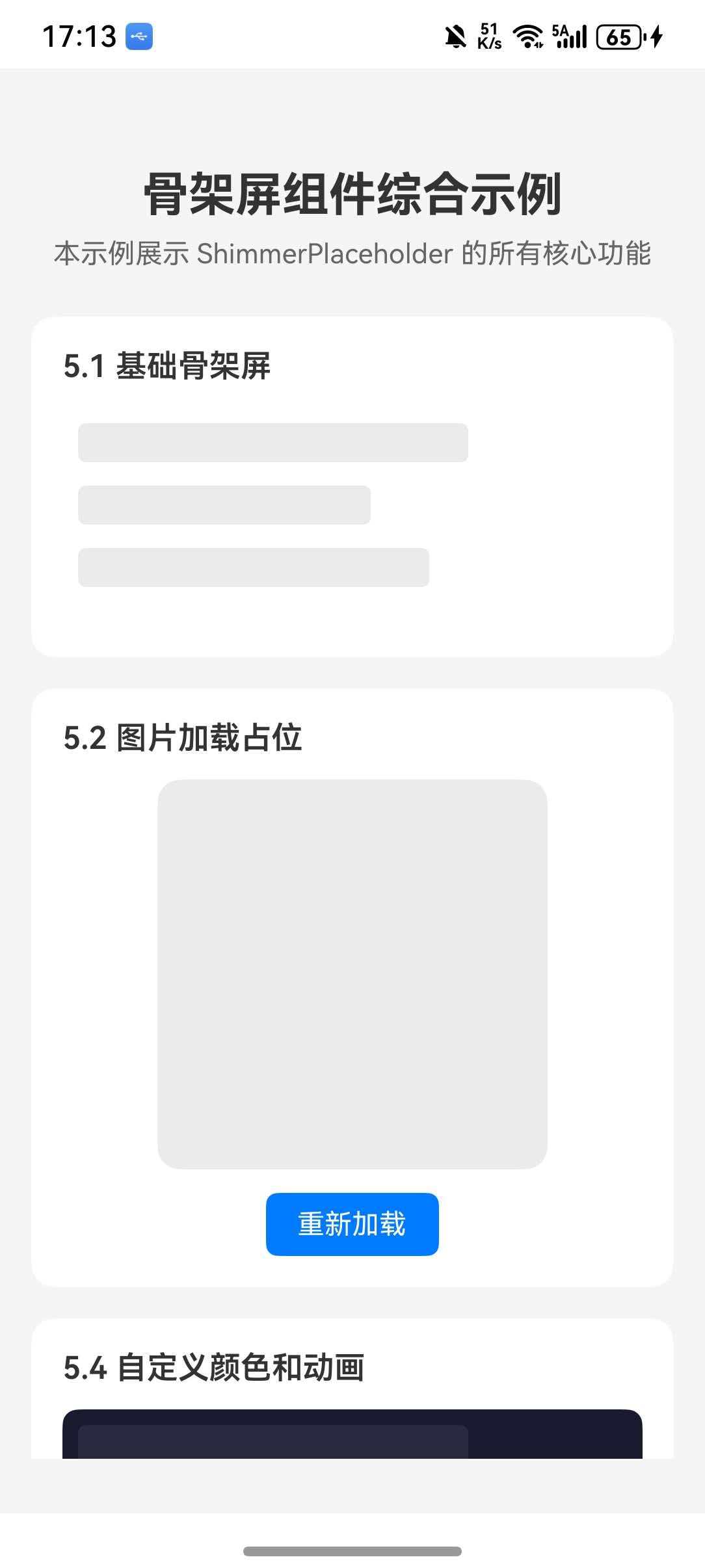
综合示例
本示例整合了前面所有章节的功能点,包括:基础骨架屏、图片加载占位、列表项骨架屏、自定义颜色动画、可见状态切换等。
ts
import React, { useState, useEffect, useRef } from 'react';
import {
View,
Text,
StyleSheet,
SafeAreaView,
ScrollView,
TouchableOpacity,
Image,
FlatList,
RefreshControl,
} from 'react-native';
import { createShimmerPlaceholder } from 'react-native-shimmer-placeholder';
import LinearGradient from 'react-native-linear-gradient';
const ShimmerPlaceholder = createShimmerPlaceholder(LinearGradient);
const BasicShimmerDemo = () => {
return (
<View style={styles.section}>
<Text style={styles.sectionTitle}>5.1 基础骨架屏</Text>
<View style={styles.basicContainer}>
<ShimmerPlaceholder width={200} height={20} style={styles.shimmerItem} />
<ShimmerPlaceholder width={150} height={20} style={styles.shimmerItem} />
<ShimmerPlaceholder width={180} height={20} style={styles.shimmerItem} />
</View>
</View>
);
};
const ImageShimmerDemo = () => {
const [imageVisible, setImageVisible] = useState(false);
useEffect(() => {
const timer = setTimeout(() => setImageVisible(true), 2000);
return () => clearTimeout(timer);
}, []);
return (
<View style={styles.section}>
<Text style={styles.sectionTitle}>5.2 图片加载占位</Text>
<View style={styles.imageContainer}>
<ShimmerPlaceholder
width={200}
height={200}
visible={imageVisible}
shimmerStyle={{ borderRadius: 12 }}
>
<Image
source={{ uri: 'https://picsum.photos/200/200' }}
style={styles.demoImage}
/>
</ShimmerPlaceholder>
<TouchableOpacity
style={styles.reloadButton}
onPress={() => setImageVisible(false)}
>
<Text style={styles.reloadText}>重新加载</Text>
</TouchableOpacity>
</View>
</View>
);
};
const ListShimmerItem = () => (
<View style={styles.listItem}>
<ShimmerPlaceholder
width={60}
height={60}
shimmerStyle={{ borderRadius: 30 }}
/>
<View style={styles.listContent}>
<ShimmerPlaceholder width={150} height={16} style={styles.shimmerLine} />
<ShimmerPlaceholder width={200} height={14} style={styles.shimmerLine} />
<ShimmerPlaceholder width={100} height={12} />
</View>
</View>
);
const ListShimmerDemo = ({ data, loading }: { data: any[]; loading: boolean }) => {
return (
<View style={styles.section}>
<Text style={styles.sectionTitle}>5.3 列表项骨架屏</Text>
{loading ? (
<>
<ListShimmerItem />
<ListShimmerItem />
<ListShimmerItem />
</>
) : (
data.map((item: any) => (
<View key={item.id} style={styles.listItem}>
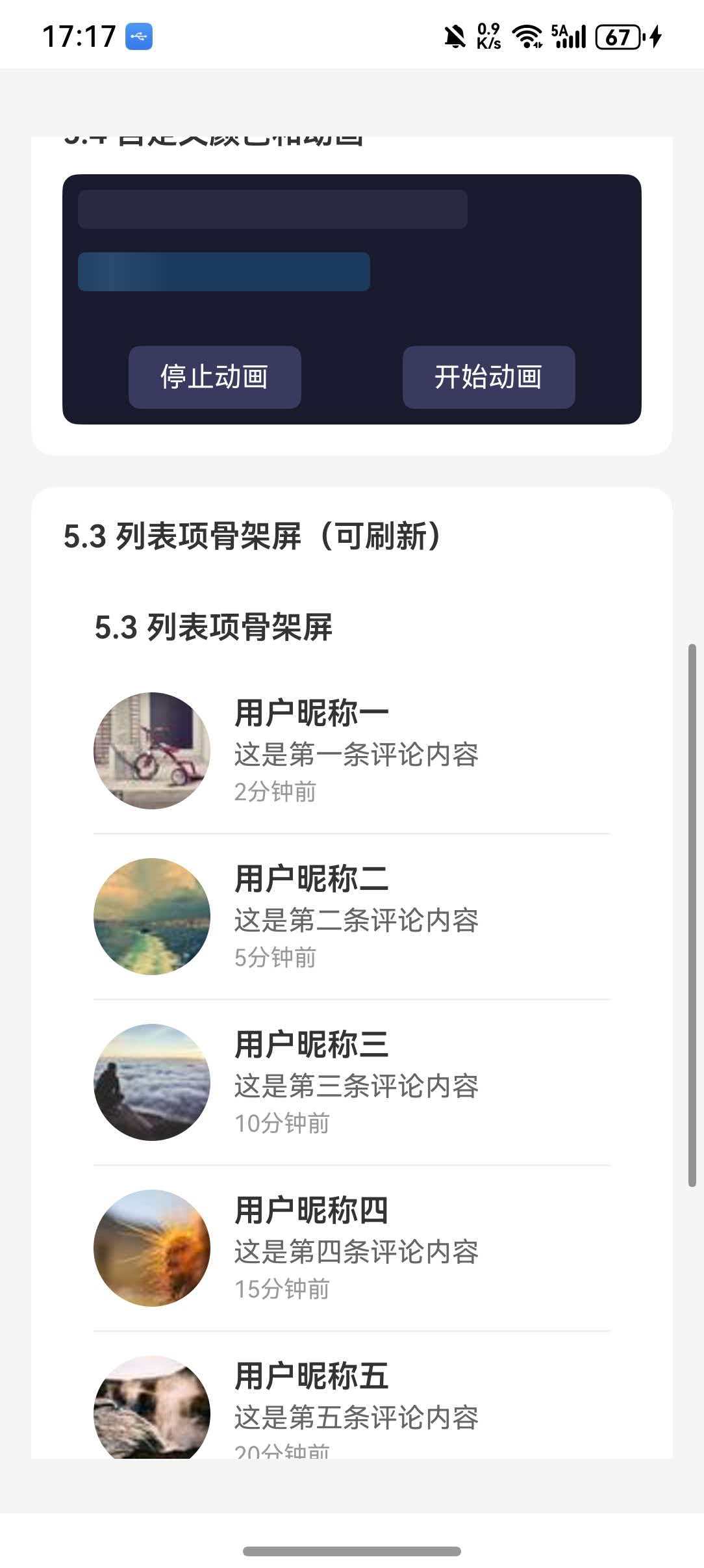
<Image source={{ uri: item.avatar }} style={styles.avatar} />
<View style={styles.listContent}>
<Text style={styles.listTitle}>{item.name}</Text>
<Text style={styles.listDesc}>{item.desc}</Text>
<Text style={styles.listTime}>{item.time}</Text>
</View>
</View>
))
)}
</View>
);
};
const CustomShimmerDemo = () => {
const [stopAnimation, setStopAnimation] = useState(false);
return (
<View style={styles.section}>
<Text style={styles.sectionTitle}>5.4 自定义颜色和动画</Text>
<View style={styles.customContainer}>
<ShimmerPlaceholder
width={200}
height={20}
shimmerColors={['#2a2a3e', '#3a3a5e', '#2a2a3e']}
duration={800}
shimmerWidthPercent={0.6}
stopAutoRun={stopAnimation}
style={styles.shimmerItem}
/>
<ShimmerPlaceholder
width={150}
height={20}
shimmerColors={['#1a3a5e', '#2a4a6e', '#1a3a5e']}
duration={1200}
isReversed
stopAutoRun={stopAnimation}
style={styles.shimmerItem}
/>
<View style={styles.controlRow}>
<TouchableOpacity
style={styles.controlButton}
onPress={() => setStopAnimation(true)}
>
<Text style={styles.controlText}>停止动画</Text>
</TouchableOpacity>
<TouchableOpacity
style={styles.controlButton}
onPress={() => setStopAnimation(false)}
>
<Text style={styles.controlText}>开始动画</Text>
</TouchableOpacity>
</View>
</View>
</View>
);
};
const generateListData = () => [
{ id: 1, name: '用户昵称一', desc: '这是第一条评论内容', time: '2分钟前', avatar: 'https://picsum.photos/60/60?random=1' },
{ id: 2, name: '用户昵称二', desc: '这是第二条评论内容', time: '5分钟前', avatar: 'https://picsum.photos/60/60?random=2' },
{ id: 3, name: '用户昵称三', desc: '这是第三条评论内容', time: '10分钟前', avatar: 'https://picsum.photos/60/60?random=3' },
{ id: 4, name: '用户昵称四', desc: '这是第四条评论内容', time: '15分钟前', avatar: 'https://picsum.photos/60/60?random=4' },
{ id: 5, name: '用户昵称五', desc: '这是第五条评论内容', time: '20分钟前', avatar: 'https://picsum.photos/60/60?random=5' },
];
export default function App() {
const [loading, setLoading] = useState(true);
const [listData, setListData] = useState<any[]>([]);
const [refreshing, setRefreshing] = useState(false);
useEffect(() => {
loadData();
}, []);
const loadData = () => {
setLoading(true);
setTimeout(() => {
setListData(generateListData());
setLoading(false);
}, 2500);
};
const handleRefresh = () => {
setRefreshing(true);
setTimeout(() => {
setListData(generateListData());
setRefreshing(false);
}, 2500);
};
return (
<SafeAreaView style={styles.container}>
<ScrollView
contentContainerStyle={styles.content}
refreshControl={
<RefreshControl refreshing={refreshing} onRefresh={handleRefresh} />
}
>
<Text style={styles.title}>骨架屏组件综合示例</Text>
<Text style={styles.subtitle}>
本示例展示 ShimmerPlaceholder 的所有核心功能
</Text>
<BasicShimmerDemo />
<ImageShimmerDemo />
<CustomShimmerDemo />
<View style={styles.section}>
<Text style={styles.sectionTitle}>5.3 列表项骨架屏(可刷新)</Text>
<ListShimmerDemo data={listData} loading={loading} />
<TouchableOpacity style={styles.refreshButton} onPress={loadData}>
<Text style={styles.refreshButtonText}>重新加载列表</Text>
</TouchableOpacity>
</View>
<View style={styles.infoSection}>
<Text style={styles.infoTitle}>功能说明</Text>
<Text style={styles.infoText}>• 5.1 基础骨架屏:最基本的占位效果</Text>
<Text style={styles.infoText}>• 5.2 图片加载:图片加载完成前显示占位</Text>
<Text style={styles.infoText}>• 5.3 列表骨架:模拟列表项加载状态</Text>
<Text style={styles.infoText}>• 5.4 自定义:自定义颜色、动画方向和速度</Text>
<Text style={styles.infoText}>• 下拉刷新:支持 Pull-to-Refresh</Text>
</View>
</ScrollView>
</SafeAreaView>
);
}
const styles = StyleSheet.create({
container: {
flex: 1,
backgroundColor: '#f5f5f5',
},
content: {
padding: 16,
},
title: {
fontSize: 24,
fontWeight: 'bold',
color: '#333',
textAlign: 'center',
},
subtitle: {
fontSize: 14,
color: '#666',
textAlign: 'center',
marginTop: 8,
marginBottom: 24,
},
section: {
backgroundColor: '#fff',
borderRadius: 12,
padding: 16,
marginBottom: 16,
},
sectionTitle: {
fontSize: 16,
fontWeight: '600',
color: '#333',
marginBottom: 12,
},
basicContainer: {
padding: 8,
},
shimmerItem: {
marginBottom: 12,
borderRadius: 4,
},
shimmerLine: {
marginBottom: 8,
borderRadius: 4,
},
imageContainer: {
alignItems: 'center',
},
demoImage: {
width: 200,
height: 200,
borderRadius: 12,
},
reloadButton: {
marginTop: 12,
paddingVertical: 8,
paddingHorizontal: 16,
backgroundColor: '#007AFF',
borderRadius: 6,
},
reloadText: {
color: '#fff',
fontSize: 14,
},
customContainer: {
padding: 8,
backgroundColor: '#1a1a2e',
borderRadius: 8,
},
controlRow: {
flexDirection: 'row',
justifyContent: 'space-around',
marginTop: 16,
},
controlButton: {
paddingVertical: 8,
paddingHorizontal: 16,
backgroundColor: '#3a3a5e',
borderRadius: 6,
},
controlText: {
color: '#fff',
fontSize: 14,
},
listItem: {
flexDirection: 'row',
paddingVertical: 12,
borderBottomWidth: 1,
borderBottomColor: '#f0f0f0',
},
avatar: {
width: 60,
height: 60,
borderRadius: 30,
},
listContent: {
marginLeft: 12,
flex: 1,
justifyContent: 'center',
},
listTitle: {
fontSize: 16,
fontWeight: '600',
color: '#333',
},
listDesc: {
fontSize: 14,
color: '#666',
marginTop: 4,
},
listTime: {
fontSize: 12,
color: '#999',
marginTop: 4,
},
refreshButton: {
backgroundColor: '#007AFF',
padding: 14,
borderRadius: 8,
alignItems: 'center',
marginTop: 16,
},
refreshButtonText: {
color: '#fff',
fontSize: 16,
fontWeight: '600',
},
infoSection: {
backgroundColor: '#e8f4ff',
borderRadius: 12,
padding: 16,
marginTop: 8,
},
infoTitle: {
fontSize: 16,
fontWeight: '600',
color: '#007AFF',
marginBottom: 8,
},
infoText: {
fontSize: 14,
color: '#333',
lineHeight: 22,
},
});