欢迎加入开源鸿蒙跨平台社区:https://openharmonycrossplatform.csdn.net
1. 引言
在 Flutter 应用开发中,动画是提升用户体验的重要手段。animations 是 Google 官方提供的 Flutter 动画库,遵循 Material Design 规范,提供了多种预定义的过渡动画效果。在 OpenHarmony 平台上,该库已经完成了适配工作,开发者可以直接引入使用。
当前环境说明:
- Flutter 版本:3.27.5
- HarmonyOS 版本:6.0
- animations 版本:2.0.11(OpenHarmony 适配版)
源码仓库:
- OpenHarmony 适配版本:https://atomgit.com/openharmony-sig/flutter_packages.git(分支:
br_animations-v2.0.11_ohos)
2. animations 库概述
2.1 库简介
animations 库提供了以下核心动画组件:
| 组件名称 | 功能说明 | 适用场景 |
|---|---|---|
OpenContainer |
容器展开/收起动画 | 列表项展开为详情页 |
showModal |
模态弹窗动画 | 底部弹窗、对话框 |
FadeScaleTransition |
淡入缩放过渡 | 弹窗进入/退出 |
FadeThroughTransition |
淡入穿透过渡 | 底部导航栏页面切换 |
SharedAxisTransition |
共享轴过渡 | 分步表单、水平/垂直滑动 |
PageTransitionSwitcher |
页面切换器 | 自定义页面切换动画 |
2.2 引入方式
在 pubspec.yaml 文件中添加以下依赖配置:
yaml
dependencies:
  animations:
    git:
      url: https://atomgit.com/openharmony-sig/flutter_packages.git
      path: packages/animations
      ref: br_animations-v2.0.11_ohos
说明: 必须使用 OpenHarmony 适配版本,通过
git方式引入。不能使用官方 pub.dev 的版本,因为官方版本不包含 OpenHarmony 平台支持。
3. 核心 API 讲解
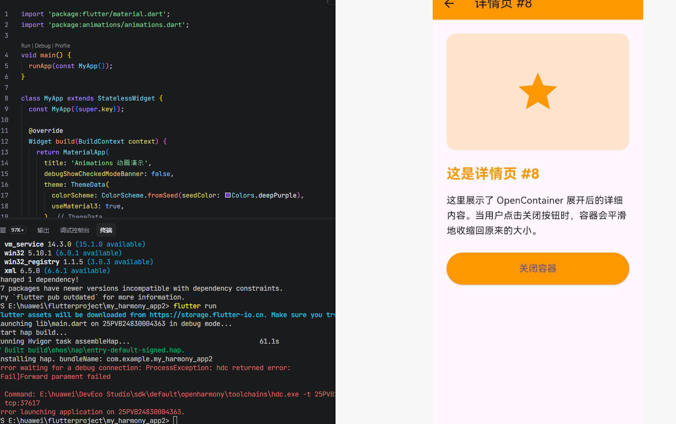
3.1 OpenContainer - 容器展开动画
OpenContainer 是 animations 库中最具特色的组件之一,实现了 Material Design 中的"转换容器"模式。当用户点击一个容器时,它会平滑地展开并填满整个屏幕,同时展示新的内容。
构造函数
dart
const OpenContainer({
  super.key,
  this.closedColor = Colors.white,
  this.openColor = Colors.white,
  this.middleColor,
  this.closedElevation = 1.0,
  this.openElevation = 4.0,
  this.closedShape = const RoundedRectangleBorder(
    borderRadius: BorderRadius.all(Radius.circular(4.0)),
  ),
  this.openShape = const RoundedRectangleBorder(),
  this.onClosed,
  required this.closedBuilder,
  required this.openBuilder,
  this.tappable = true,
  this.transitionDuration = const Duration(milliseconds: 300),
  this.transitionType = ContainerTransitionType.fade,
  this.useRootNavigator = false,
  this.routeSettings,
  this.clipBehavior = Clip.antiAlias,
})
核心参数详解
| 参数 | 类型 | 默认值 | 说明 |
|---|---|---|---|
closedBuilder |
CloseContainerBuilder |
必填 | 构建关闭状态下的 Widget,接收 (context, action) 参数,action 用于打开容器 |
openBuilder |
OpenContainerBuilder<T> |
必填 | 构建打开状态下的 Widget,接收 (context, action) 参数,action 用于关闭容器 |
closedColor |
Color |
Colors.white |
关闭状态下的背景颜色 |
openColor |
Color |
Colors.white |
打开状态下的背景颜色 |
middleColor |
Color? |
Theme.canvasColor |
过渡期间的中间颜色(仅用于 fadeThrough 类型) |
closedElevation |
double |
1.0 |
关闭状态下的阴影高度 |
openElevation |
double |
4.0 |
打开状态下的阴影高度 |
closedShape |
ShapeBorder |
圆角矩形 | 关闭状态下的形状 |
openShape |
ShapeBorder |
矩形 | 打开状态下的形状 |
tappable |
bool |
true |
是否可点击整个容器打开 |
transitionDuration |
Duration |
300ms | 过渡动画时长 |
transitionType |
ContainerTransitionType |
fade |
过渡类型:fade 或 fadeThrough |
onClosed |
ClosedCallback<T?>? |
null |
容器关闭时的回调,接收返回值 |
过渡类型说明
dart
enum ContainerTransitionType {
  /// 在传出元素上方淡入传入元素
  fade,

  /// 先淡出传出元素,完全淡出后再淡入传入元素
  fadeThrough,
}
使用示例
dart
OpenContainer<String>(
  closedBuilder: (context, action) {
    return ListTile(
      title: Text('点击展开'),
      subtitle: Text('查看详情'),
    );
  },
  openBuilder: (context, action) {
    return Scaffold(
      appBar: AppBar(title: Text('详情页')),
      body: Center(
        child: ElevatedButton(
          onPressed: () => action(returnValue: '返回的数据'),
          child: Text('关闭'),
        ),
      ),
    );
  },
  onClosed: (data) {
    print('容器关闭,返回值: $data');
  },
)
3.2 showModal - 模态弹窗
showModal 用于显示一个模态弹窗,支持自定义过渡动画配置。
函数签名
dart
Future<T?> showModal<T>({
  required BuildContext context,
  ModalConfiguration configuration = const FadeScaleTransitionConfiguration(),
  bool useRootNavigator = true,
  required WidgetBuilder builder,
  RouteSettings? routeSettings,
  ui.ImageFilter? filter,
})
参数详解
| 参数 | 类型 | 默认值 | 说明 |
|---|---|---|---|
context |
BuildContext |
必填 | 用于查找 Navigator 的上下文 |
configuration |
ModalConfiguration |
FadeScaleTransitionConfiguration() |
弹窗配置,定义过渡动画和屏障属性 |
useRootNavigator |
bool |
true |
是否使用根 Navigator |
builder |
WidgetBuilder |
必填 | 构建弹窗内容的函数 |
ModalConfiguration 配置类
dart
abstract class ModalConfiguration {
  const ModalConfiguration({
    required this.barrierColor,        // 屏障颜色
    required this.barrierDismissible,  // 是否可点击屏障关闭
    this.barrierLabel,                 // 无障碍标签
    required this.transitionDuration,  // 进入动画时长
    required this.reverseTransitionDuration, // 退出动画时长
  });

  Widget transitionBuilder(
    BuildContext context,
    Animation<double> animation,
    Animation<double> secondaryAnimation,
    Widget child,
  );
}
FadeScaleTransitionConfiguration
这是 showModal 的默认配置,实现了 Material Design 的淡入缩放效果:
dart
const FadeScaleTransitionConfiguration({
  super.barrierColor = Colors.black54,
  super.barrierDismissible = true,
  super.transitionDuration = const Duration(milliseconds: 150),
  super.reverseTransitionDuration = const Duration(milliseconds: 75),
  String super.barrierLabel = 'Dismiss',
})
动画特点:
- 进入时:从 80% 缩放到 100%,同时淡入(150ms)
- 退出时:仅淡出,不缩放(75ms)
- 这种不对称设计强调新内容的重要性
使用示例
dart
showModal(
  context: context,
  configuration: FadeScaleTransitionConfiguration(),
  builder: (context) {
    return Container(
      height: 300,
      child: Center(child: Text('模态弹窗内容')),
    );
  },
)
3.3 FadeScaleTransition - 淡入缩放过渡
FadeScaleTransition 是一个独立的过渡动画 Widget,可以单独使用,也可以配合 showModal 使用。
构造函数
dart
const FadeScaleTransition({
  super.key,
  required this.animation,
  this.child,
})
参数详解
| 参数 | 类型 | 说明 |
|---|---|---|
animation |
Animation<double> |
驱动过渡的动画控制器 |
child |
Widget? |
要应用过渡的子 Widget |
动画曲线详解
dart
// 淡入曲线:0.0 到 0.3 区间内完成
static final Animatable<double> _fadeInTransition = CurveTween(
  curve: const Interval(0.0, 0.3),
);

// 缩放曲线:从 0.80 到 1.00,使用减速曲线
static final Animatable<double> _scaleInTransition = Tween<double>(
  begin: 0.80,
  end: 1.00,
).chain(CurveTween(curve: decelerateEasing));

// 淡出曲线:全程淡出
static final Animatable<double> _fadeOutTransition = Tween<double>(
  begin: 1.0,
  end: 0.0,
);
使用场景
通常与 DualTransitionBuilder 配合使用,区分进入和退出动画:
dart
DualTransitionBuilder(
  animation: animation,
  forwardBuilder: (context, animation, child) {
    return FadeScaleTransition(animation: animation, child: child);
  },
  reverseBuilder: (context, animation, child) {
    return FadeTransition(
      opacity: animation,
      child: child,
    );
  },
  child: yourWidget,
)
3.4 FadeThroughTransition - 淡入穿透过渡
FadeThroughTransition 适用于没有强关联关系的 UI 元素之间的过渡,例如底部导航栏的页面切换。
构造函数
dart
const FadeThroughTransition({
  super.key,
  required this.animation,
  required this.secondaryAnimation,
  this.fillColor,
  this.child,
})
参数详解
| 参数 | 类型 | 说明 |
|---|---|---|
animation |
Animation<double> |
驱动进入动画的主动画 |
secondaryAnimation |
Animation<double> |
驱动退出动画的次级动画 |
fillColor |
Color? |
过渡期间的背景颜色,默认为 Theme.canvasColor |
child |
Widget? |
要应用过渡的子 Widget |
动画特点
- 退出动画:先淡出(前 30% 时间),然后完全消失
- 进入动画:等待退出完成后,从 92% 缩放到 100%,同时淡入
- 缩放仅应用于进入元素,强调新内容
配合 PageTransitionSwitcher 使用
dart
PageTransitionSwitcher(
  transitionBuilder: (child, primaryAnimation, secondaryAnimation) {
    return FadeThroughTransition(
      animation: primaryAnimation,
      secondaryAnimation: secondaryAnimation,
      child: child,
    );
  },
  child: yourWidget,
)
3.5 SharedAxisTransition - 共享轴过渡
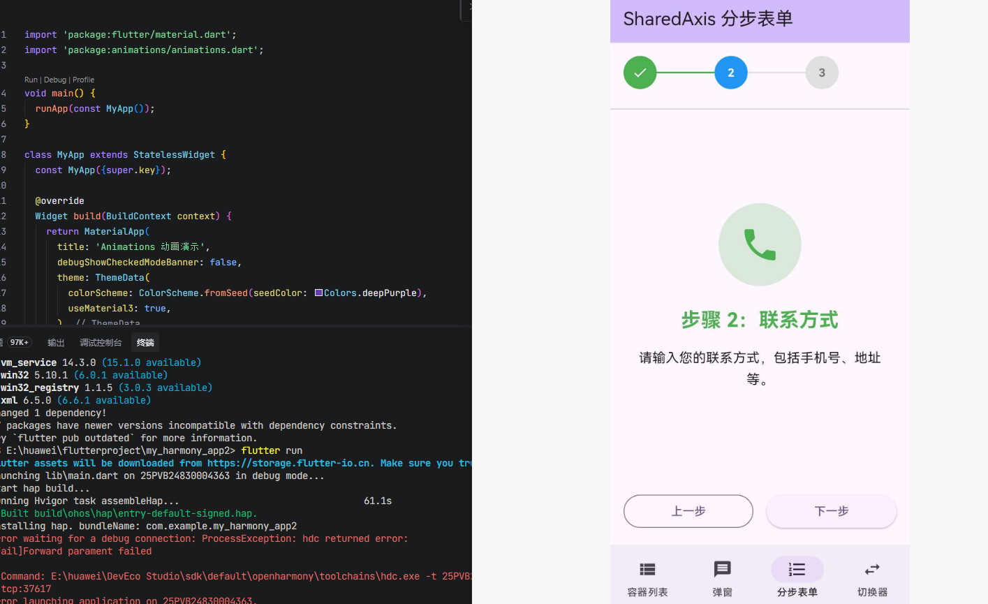
SharedAxisTransition 适用于具有空间或导航关系的 UI 元素之间的过渡,例如分步表单。
构造函数
dart
const SharedAxisTransition({
  super.key,
  required this.animation,
  required this.secondaryAnimation,
  required this.transitionType,
  this.fillColor,
  this.child,
})
过渡类型
dart
enum SharedAxisTransitionType {
  /// 垂直(Y 轴)共享轴过渡
  vertical,

  /// 水平(X 轴)共享轴过渡
  horizontal,

  /// 缩放(Z 轴)共享轴过渡
  scaled,
}
动画参数详解
| 过渡类型 | 进入动画 | 退出动画 |
|---|---|---|
horizontal |
从右侧 30px 滑入 + 淡入 | 向左侧 30px 滑出 + 淡出 |
vertical |
从下方 30px 滑入 + 淡入 | 向上方 30px 滑出 + 淡出 |
scaled |
从 80% 缩放到 100% + 淡入 | 从 100% 缩放到 110% + 淡出 |
使用示例
dart
PageTransitionSwitcher(
  transitionBuilder: (child, primaryAnimation, secondaryAnimation) {
    return SharedAxisTransition(
      animation: primaryAnimation,
      secondaryAnimation: secondaryAnimation,
      transitionType: SharedAxisTransitionType.horizontal,
      child: child,
    );
  },
  child: yourWidget,
)
3.6 PageTransitionSwitcher - 页面切换器
PageTransitionSwitcher 是一个通用的页面切换容器,当 child 变化时,使用指定的过渡动画进行切换。
构造函数
dart
const PageTransitionSwitcher({
  super.key,
  this.duration = const Duration(milliseconds: 300),
  this.reverse = false,
  required this.transitionBuilder,
  this.layoutBuilder = defaultLayoutBuilder,
  this.child,
})
参数详解
| 参数 | 类型 | 默认值 | 说明 |
|---|---|---|---|
child |
Widget? |
null |
当前显示的子 Widget |
duration |
Duration |
300ms | 过渡动画时长 |
reverse |
bool |
false |
是否反向切换(新孩子在旧孩子下方) |
transitionBuilder |
PageTransitionSwitcherTransitionBuilder |
必填 | 构建过渡动画的函数 |
layoutBuilder |
PageTransitionSwitcherLayoutBuilder |
defaultLayoutBuilder |
布局函数,默认为 Stack 居中 |
关键机制
- 当
child变化时,旧孩子使用secondaryAnimation退出,新孩子使用primaryAnimation进入 - 如果切换速度足够快(在
duration内),可以同时存在多个正在过渡的孩子 - 必须使用 Key :如果新旧孩子是相同类型但参数不同,需要设置
Key(通常用ValueKey)来触发过渡
动画方向说明
dart
// reverse = false(默认):新孩子覆盖旧孩子
// 类似 push 新页面
- 旧孩子:secondaryAnimation 正向运行
- 新孩子:primaryAnimation 正向运行

// reverse = true:新孩子在旧孩子下方
// 类似 pop 页面
- 旧孩子:primaryAnimation 反向运行
- 新孩子:secondaryAnimation 反向运行
4. 完整应用示例
dart
import 'package:flutter/material.dart';
import 'package:animations/animations.dart';
void main() {
runApp(const MyApp());
}
class MyApp extends StatelessWidget {
const MyApp({super.key});
@override
Widget build(BuildContext context) {
return MaterialApp(
title: 'Animations 动画演示',
debugShowCheckedModeBanner: false,
theme: ThemeData(
colorScheme: ColorScheme.fromSeed(seedColor: Colors.deepPurple),
useMaterial3: true,
),
home: const MainScreen(),
);
}
}
class MainScreen extends StatefulWidget {
const MainScreen({super.key});
@override
State<MainScreen> createState() => _MainScreenState();
}
class _MainScreenState extends State<MainScreen> {
int _currentIndex = 0;
final List<Widget> _pages = const [
ContainerListPage(),
ModalDemoPage(),
StepFormPage(),
SwitcherDemoPage(),
];
@override
Widget build(BuildContext context) {
return Scaffold(
body: PageTransitionSwitcher(
duration: const Duration(milliseconds: 400),
transitionBuilder: (child, primaryAnimation, secondaryAnimation) {
return FadeThroughTransition(
animation: primaryAnimation,
secondaryAnimation: secondaryAnimation,
fillColor: Theme.of(context).scaffoldBackgroundColor,
child: child,
);
},
child: _pages[_currentIndex],
),
bottomNavigationBar: NavigationBar(
selectedIndex: _currentIndex,
onDestinationSelected: (index) {
setState(() {
_currentIndex = index;
});
},
destinations: const [
NavigationDestination(
icon: Icon(Icons.view_list),
label: '容器列表',
),
NavigationDestination(
icon: Icon(Icons.popup),
label: '弹窗',
),
NavigationDestination(
icon: Icon(Icons.steps),
label: '分步表单',
),
NavigationDestination(
icon: Icon(Icons.swap_horiz),
label: '切换器',
),
],
),
);
}
}
// ==================== 页面 1:OpenContainer 容器列表 ====================
class ContainerListPage extends StatelessWidget {
const ContainerListPage({super.key});
@override
Widget build(BuildContext context) {
return Scaffold(
appBar: AppBar(
title: const Text('OpenContainer 容器展开'),
backgroundColor: Theme.of(context).colorScheme.inversePrimary,
),
body: ListView.builder(
padding: const EdgeInsets.all(16),
itemCount: 10,
itemBuilder: (context, index) {
return Padding(
padding: const EdgeInsets.only(bottom: 12),
child: OpenContainer<String>(
closedColor: Colors.white,
openColor: Colors.white,
closedElevation: 2,
openElevation: 4,
closedShape: RoundedRectangleBorder(
borderRadius: BorderRadius.circular(16),
),
openShape: const RoundedRectangleBorder(),
transitionDuration: const Duration(milliseconds: 500),
transitionType: ContainerTransitionType.fadeThrough,
closedBuilder: (context, openAction) {
return _ClosedCard(index: index);
},
openBuilder: (context, closeAction) {
return _OpenDetail(index: index, closeAction: closeAction);
},
onClosed: (data) {
if (data != null) {
ScaffoldMessenger.of(context).showSnackBar(
SnackBar(content: Text('收到返回值: $data')),
);
}
},
),
);
},
),
);
}
}
class _ClosedCard extends StatelessWidget {
final int index;
const _ClosedCard({required this.index});
@override
Widget build(BuildContext context) {
final colors = [
Colors.blue,
Colors.purple,
Colors.green,
Colors.orange,
Colors.red,
];
final color = colors[index % colors.length];
return Material(
child: ListTile(
contentPadding: const EdgeInsets.all(16),
leading: Container(
width: 50,
height: 50,
decoration: BoxDecoration(
color: color.withOpacity(0.2),
borderRadius: BorderRadius.circular(12),
),
child: Icon(
Icons.star,
color: color,
size: 30,
),
),
title: Text(
'卡片 $index',
style: const TextStyle(
fontSize: 18,
fontWeight: FontWeight.bold,
),
),
subtitle: Text('点击展开查看详情 #$index'),
trailing: Icon(
Icons.arrow_forward_ios,
size: 16,
color: Colors.grey[400],
),
),
);
}
}
class _OpenDetail extends StatelessWidget {
final int index;
final CloseContainerActionCallback<String> closeAction;
const _OpenDetail({
required this.index,
required this.closeAction,
});
@override
Widget build(BuildContext context) {
final colors = [
Colors.blue,
Colors.purple,
Colors.green,
Colors.orange,
Colors.red,
];
final color = colors[index % colors.length];
return Scaffold(
appBar: AppBar(
title: Text('详情页 #$index'),
backgroundColor: color,
leading: IconButton(
icon: const Icon(Icons.arrow_back),
onPressed: () => closeAction(returnValue: '来自详情页 #$index 的返回'),
),
),
body: SingleChildScrollView(
padding: const EdgeInsets.all(24),
child: Column(
crossAxisAlignment: CrossAxisAlignment.start,
children: [
Container(
width: double.infinity,
height: 200,
decoration: BoxDecoration(
color: color.withOpacity(0.2),
borderRadius: BorderRadius.circular(16),
),
child: Center(
child: Icon(
Icons.star,
size: 80,
color: color,
),
),
),
const SizedBox(height: 24),
Text(
'这是详情页 #$index',
style: TextStyle(
fontSize: 24,
fontWeight: FontWeight.bold,
color: color,
),
),
const SizedBox(height: 16),
const Text(
'这里展示了 OpenContainer 展开后的详细内容。'
'当用户点击关闭按钮时,容器会平滑地收缩回原来的大小。',
style: TextStyle(fontSize: 16, height: 1.6),
),
const SizedBox(height: 24),
SizedBox(
width: double.infinity,
child: ElevatedButton(
onPressed: () => closeAction(returnValue: '来自详情页 #$index 的返回'),
style: ElevatedButton.styleFrom(
backgroundColor: color,
padding: const EdgeInsets.symmetric(vertical: 16),
),
child: const Text('关闭容器', style: TextStyle(fontSize: 16)),
),
),
],
),
),
);
}
}
// ==================== 页面 2:showModal 弹窗演示 ====================
class ModalDemoPage extends StatelessWidget {
const ModalDemoPage({super.key});
@override
Widget build(BuildContext context) {
return Scaffold(
appBar: AppBar(
title: const Text('showModal 弹窗演示'),
backgroundColor: Theme.of(context).colorScheme.inversePrimary,
),
body: Center(
child: Column(
mainAxisAlignment: MainAxisAlignment.center,
children: [
_buildModalButton(
context,
label: 'FadeScale 弹窗',
icon: Icons.zoom_in,
configuration: const FadeScaleTransitionConfiguration(),
content: '这是一个使用 FadeScaleTransition 的模态弹窗。'
'进入时从 80% 缩放到 100%,退出时仅淡出。',
),
const SizedBox(height: 20),
_buildModalButton(
context,
label: '自定义配置弹窗',
icon: Icons.settings,
configuration: const _CustomModalConfiguration(),
content: '这是一个使用自定义配置的模态弹窗。'
'过渡时间更长,屏障颜色不同。',
),
],
),
),
);
}
Widget _buildModalButton(
BuildContext context, {
required String label,
required IconData icon,
required ModalConfiguration configuration,
required String content,
}) {
return ElevatedButton.icon(
onPressed: () {
showModal(
context: context,
configuration: configuration,
builder: (context) {
return _ModalContent(
content: content,
configuration: configuration,
);
},
);
},
icon: Icon(icon),
label: Text(label),
style: ElevatedButton.styleFrom(
padding: const EdgeInsets.symmetric(horizontal: 32, vertical: 16),
),
);
}
}
class _ModalContent extends StatelessWidget {
final String content;
final ModalConfiguration configuration;
const _ModalContent({
required this.content,
required this.configuration,
});
@override
Widget build(BuildContext context) {
return Container(
margin: const EdgeInsets.all(24),
padding: const EdgeInsets.all(24),
decoration: BoxDecoration(
color: Colors.white,
borderRadius: BorderRadius.circular(20),
boxShadow: [
BoxShadow(
color: Colors.black.withOpacity(0.1),
blurRadius: 20,
offset: const Offset(0, 10),
),
],
),
child: Column(
mainAxisSize: MainAxisSize.min,
children: [
Icon(
Icons.check_circle,
size: 60,
color: Theme.of(context).colorScheme.primary,
),
const SizedBox(height: 16),
Text(
'弹窗标题',
style: TextStyle(
fontSize: 24,
fontWeight: FontWeight.bold,
color: Theme.of(context).colorScheme.primary,
),
),
const SizedBox(height: 16),
Text(
content,
textAlign: TextAlign.center,
style: const TextStyle(fontSize: 16, height: 1.6),
),
const SizedBox(height: 24),
SizedBox(
width: double.infinity,
child: ElevatedButton(
onPressed: () => Navigator.pop(context),
style: ElevatedButton.styleFrom(
padding: const EdgeInsets.symmetric(vertical: 16),
),
child: const Text('关闭弹窗'),
),
),
],
),
);
}
}
class _CustomModalConfiguration extends ModalConfiguration {
const _CustomModalConfiguration()
: super(
barrierColor: Colors.black87,
barrierDismissible: true,
barrierLabel: '关闭',
transitionDuration: const Duration(milliseconds: 300),
reverseTransitionDuration: const Duration(milliseconds: 200),
);
@override
Widget transitionBuilder(
BuildContext context,
Animation<double> animation,
Animation<double> secondaryAnimation,
Widget child,
) {
return FadeScaleTransition(
animation: animation,
child: child,
);
}
}
// ==================== 页面 3:SharedAxisTransition 分步表单 ====================
class StepFormPage extends StatefulWidget {
const StepFormPage({super.key});
@override
State<StepFormPage> createState() => _StepFormPageState();
}
class _StepFormPageState extends State<StepFormPage> {
int _currentStep = 0;
final List<Widget> _steps = [
const StepContent(
title: '步骤 1:基本信息',
icon: Icons.person,
color: Colors.blue,
description: '请输入您的基本信息,包括姓名、邮箱等。',
),
const StepContent(
title: '步骤 2:联系方式',
icon: Icons.phone,
color: Colors.green,
description: '请输入您的联系方式,包括手机号、地址等。',
),
const StepContent(
title: '步骤 3:确认提交',
icon: Icons.check,
color: Colors.orange,
description: '请确认您填写的信息,然后点击提交。',
),
];
@override
Widget build(BuildContext context) {
return Scaffold(
appBar: AppBar(
title: const Text('SharedAxis 分步表单'),
backgroundColor: Theme.of(context).colorScheme.inversePrimary,
),
body: Column(
children: [
// 步骤指示器
_buildStepIndicator(),
const Divider(),
// 步骤内容
Expanded(
child: PageTransitionSwitcher(
duration: const Duration(milliseconds: 400),
reverse: false,
transitionBuilder: (child, primaryAnimation, secondaryAnimation) {
return SharedAxisTransition(
animation: primaryAnimation,
secondaryAnimation: secondaryAnimation,
transitionType: SharedAxisTransitionType.horizontal,
fillColor: Theme.of(context).scaffoldBackgroundColor,
child: child,
);
},
child: _steps[_currentStep],
),
),
// 底部按钮
_buildBottomButtons(),
],
),
);
}
Widget _buildStepIndicator() {
return Padding(
padding: const EdgeInsets.all(16),
child: Row(
children: List.generate(3, (index) {
final isActive = index == _currentStep;
final isCompleted = index < _currentStep;
return Expanded(
child: Row(
children: [
Container(
width: 40,
height: 40,
decoration: BoxDecoration(
color: isActive
? Colors.blue
: isCompleted
? Colors.green
: Colors.grey[300],
shape: BoxShape.circle,
),
child: Center(
child: isCompleted
? const Icon(Icons.check, color: Colors.white, size: 20)
: Text(
'${index + 1}',
style: TextStyle(
color: isActive || isCompleted
? Colors.white
: Colors.grey[600],
fontWeight: FontWeight.bold,
),
),
),
),
if (index < 2)
Expanded(
child: Container(
height: 2,
color: index < _currentStep
? Colors.green
: Colors.grey[300],
),
),
],
),
);
}),
),
);
}
Widget _buildBottomButtons() {
return Padding(
padding: const EdgeInsets.all(16),
child: Row(
children: [
if (_currentStep > 0)
Expanded(
child: OutlinedButton(
onPressed: () {
setState(() {
_currentStep--;
});
},
child: const Text('上一步'),
),
),
if (_currentStep > 0) const SizedBox(width: 16),
Expanded(
child: ElevatedButton(
onPressed: () {
if (_currentStep < 2) {
setState(() {
_currentStep++;
});
} else {
ScaffoldMessenger.of(context).showSnackBar(
const SnackBar(content: Text('提交成功!')),
);
setState(() {
_currentStep = 0;
});
}
},
child: Text(_currentStep < 2 ? '下一步' : '提交'),
),
),
],
),
);
}
}
class StepContent extends StatelessWidget {
final String title;
final IconData icon;
final Color color;
final String description;
const StepContent({
super.key,
required this.title,
required this.icon,
required this.color,
required this.description,
});
@override
Widget build(BuildContext context) {
return Padding(
padding: const EdgeInsets.all(24),
child: Column(
mainAxisAlignment: MainAxisAlignment.center,
children: [
Container(
width: 100,
height: 100,
decoration: BoxDecoration(
color: color.withOpacity(0.2),
shape: BoxShape.circle,
),
child: Icon(
icon,
size: 50,
color: color,
),
),
const SizedBox(height: 24),
Text(
title,
style: TextStyle(
fontSize: 24,
fontWeight: FontWeight.bold,
color: color,
),
),
const SizedBox(height: 16),
Text(
description,
textAlign: TextAlign.center,
style: const TextStyle(fontSize: 16, height: 1.6),
),
],
),
);
}
}
// ==================== 页面 4:PageTransitionSwitcher 切换器演示 ====================
class SwitcherDemoPage extends StatefulWidget {
const SwitcherDemoPage({super.key});
@override
State<SwitcherDemoPage> createState() => _SwitcherDemoPageState();
}
class _SwitcherDemoPageState extends State<SwitcherDemoPage> {
int _selectedIndex = 0;
String _transitionType = 'fadeThrough';
final List<_ColorItem> _items = [
_ColorItem(Colors.blue, '蓝色', Icons.water),
_ColorItem(Colors.red, '红色', Icons.local_fire_department),
_ColorItem(Colors.green, '绿色', Icons.eco),
_ColorItem(Colors.orange, '橙色', Icons.wb_sunny),
];
@override
Widget build(BuildContext context) {
return Scaffold(
appBar: AppBar(
title: const Text('PageTransitionSwitcher'),
backgroundColor: Theme.of(context).colorScheme.inversePrimary,
),
body: Column(
children: [
// 切换类型选择
Padding(
padding: const EdgeInsets.all(16),
child: SegmentedButton<String>(
segments: const [
ButtonSegment(
value: 'fadeThrough',
label: Text('FadeThrough'),
icon: Icon(Icons.opacity),
),
ButtonSegment(
value: 'sharedAxis',
label: Text('SharedAxis'),
icon: Icon(Icons.swap_horiz),
),
],
selected: {_transitionType},
onSelectionChanged: (Set<String> selection) {
setState(() {
_transitionType = selection.first;
});
},
),
),
// 切换内容
Expanded(
child: PageTransitionSwitcher(
duration: const Duration(milliseconds: 500),
reverse: false,
transitionBuilder: (child, primaryAnimation, secondaryAnimation) {
if (_transitionType == 'fadeThrough') {
return FadeThroughTransition(
animation: primaryAnimation,
secondaryAnimation: secondaryAnimation,
fillColor: Theme.of(context).scaffoldBackgroundColor,
child: child,
);
} else {
return SharedAxisTransition(
animation: primaryAnimation,
secondaryAnimation: secondaryAnimation,
transitionType: SharedAxisTransitionType.scaled,
fillColor: Theme.of(context).scaffoldBackgroundColor,
child: child,
);
}
},
child: _buildColorCard(_items[_selectedIndex]),
),
),
// 颜色选择器
Padding(
padding: const EdgeInsets.all(16),
child: Wrap(
spacing: 12,
children: List.generate(_items.length, (index) {
final isSelected = index == _selectedIndex;
return GestureDetector(
onTap: () {
setState(() {
_selectedIndex = index;
});
},
child: Container(
width: 60,
height: 60,
decoration: BoxDecoration(
color: _items[index].color,
shape: BoxShape.circle,
border: Border.all(
color: isSelected ? Colors.white : Colors.transparent,
width: 3,
),
boxShadow: [
BoxShadow(
color: _items[index].color.withOpacity(0.3),
blurRadius: 8,
offset: const Offset(0, 4),
),
],
),
child: Icon(
_items[index].icon,
color: Colors.white,
size: 30,
),
),
);
}),
),
),
],
),
);
}
Widget _buildColorCard(_ColorItem item) {
return Container(
margin: const EdgeInsets.all(24),
padding: const EdgeInsets.all(32),
decoration: BoxDecoration(
color: item.color.withOpacity(0.1),
borderRadius: BorderRadius.circular(24),
border: Border.all(
color: item.color.withOpacity(0.3),
width: 2,
),
),
child: Column(
mainAxisAlignment: MainAxisAlignment.center,
children: [
Icon(
item.icon,
size: 80,
color: item.color,
),
const SizedBox(height: 24),
Text(
item.name,
style: TextStyle(
fontSize: 32,
fontWeight: FontWeight.bold,
color: item.color,
),
),
const SizedBox(height: 16),
Text(
'这是 ${item.name} 的展示页面',
style: TextStyle(
fontSize: 18,
color: item.color.withOpacity(0.8),
),
),
],
),
);
}
}
class _ColorItem {
final Color color;
final String name;
final IconData icon;
_ColorItem(this.color, this.name, this.icon);
}5. 常见问题解答
Q1: 为什么我的 PageTransitionSwitcher 没有触发动画?
原因: 新旧孩子被认为是同一个 Widget。
解决方案: 为每个孩子设置不同的 Key:
dart
PageTransitionSwitcher(
  child: Container(
    key: ValueKey<int>(_selectedIndex), // 必须设置 Key
    color: _colors[_selectedIndex],
  ),
)
Q2: OpenContainer 展开后如何返回数据?
解决方案: 使用 action 回调的 returnValue 参数:
dart
openBuilder: (context, action) {
  return ElevatedButton(
    onPressed: () => action(returnValue: '返回的数据'),
    child: Text('关闭'),
  );
},
onClosed: (data) {
  print('收到返回值: $data');
},
Q3: 如何自定义 showModal 的过渡动画?
解决方案: 继承 ModalConfiguration 并实现 transitionBuilder:
dart
class CustomModalConfiguration extends ModalConfiguration {
  const CustomModalConfiguration()
      : super(
          barrierColor: Colors.black54,
          barrierDismissible: true,
          barrierLabel: '关闭',
          transitionDuration: const Duration(milliseconds: 300),
          reverseTransitionDuration: const Duration(milliseconds: 200),
        );

  @override
  Widget transitionBuilder(
    BuildContext context,
    Animation<double> animation,
    Animation<double> secondaryAnimation,
    Widget child,
  ) {
    // 自定义过渡动画
    return SlideTransition(
      position: Tween<Offset>(
        begin: const Offset(0, 1),
        end: Offset.zero,
      ).animate(animation),
      child: child,
    );
  }
}
Q4: SharedAxisTransition 的三种类型有什么区别?
| 类型 | 动画方向 | 适用场景 |
|---|---|---|
horizontal |
水平滑动 ±30px | 左右切换的页面 |
vertical |
垂直滑动 ±30px | 上下切换的页面 |
scaled |
缩放 80% → 100% | 层级关系页面 |
Q5: 如何控制 PageTransitionSwitcher 的切换方向?
解决方案: 使用 reverse 参数:
dart
// reverse = false(默认):新孩子覆盖旧孩子,类似 push
PageTransitionSwitcher(reverse: false, ...)

// reverse = true:新孩子在旧孩子下方,类似 pop
PageTransitionSwitcher(reverse: true, ...)
Q6: animations 库在 OpenHarmony 上有哪些已知问题?
目前 animations 库在 OpenHarmony 平台上运行正常,没有已知的兼容性问题。该库纯 Dart 实现,不依赖平台特定代码,因此在 OpenHarmony 上的表现与 Android/iOS 一致。
Q7: 如何优化动画性能?
建议:
- 避免在动画过程中重建 Widget 树
- 使用
const构造函数减少不必要的重建 - 对于复杂动画,考虑使用
RepaintBoundary隔离重绘区域 - 控制动画时长在 200-500ms 之间,过长会影响用户体验
6. 总结
animations 库为 Flutter 应用提供了丰富的 Material Design 动画效果,在 OpenHarmony 平台上已经完成了完整适配。文章介绍了:
- OpenContainer:实现容器展开/收起的流畅动画
- showModal:显示模态弹窗,支持自定义过渡配置
- FadeScaleTransition:淡入缩放过渡效果
- FadeThroughTransition:淡入穿透过渡,适合底部导航切换
- SharedAxisTransition:共享轴过渡,适合分步表单
- PageTransitionSwitcher:通用页面切换器,可组合各种过渡效果
这些动画组件可以单独使用,也可以组合使用,为应用带来更加流畅和专业的用户体验。在实际开发中,建议根据具体的业务场景选择合适的动画效果,并注意保持动画的一致性和性能优化。